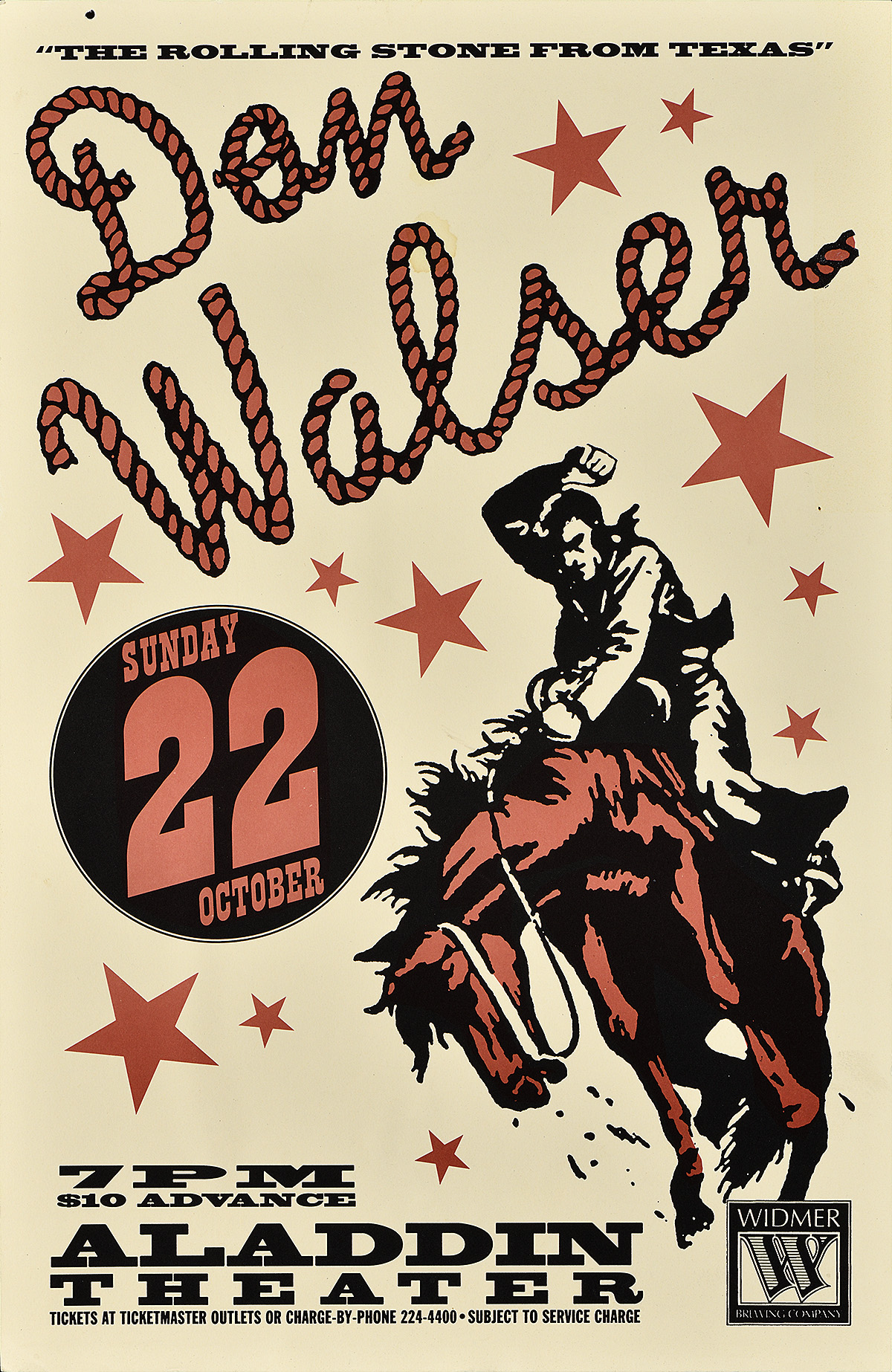
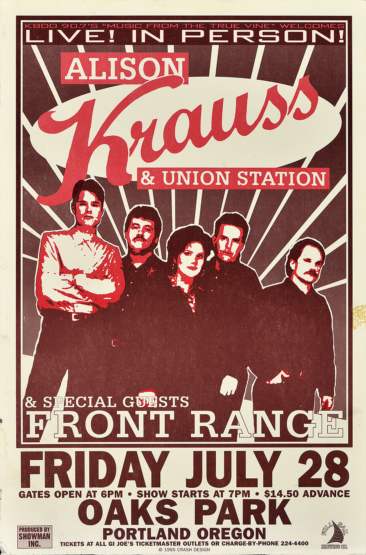
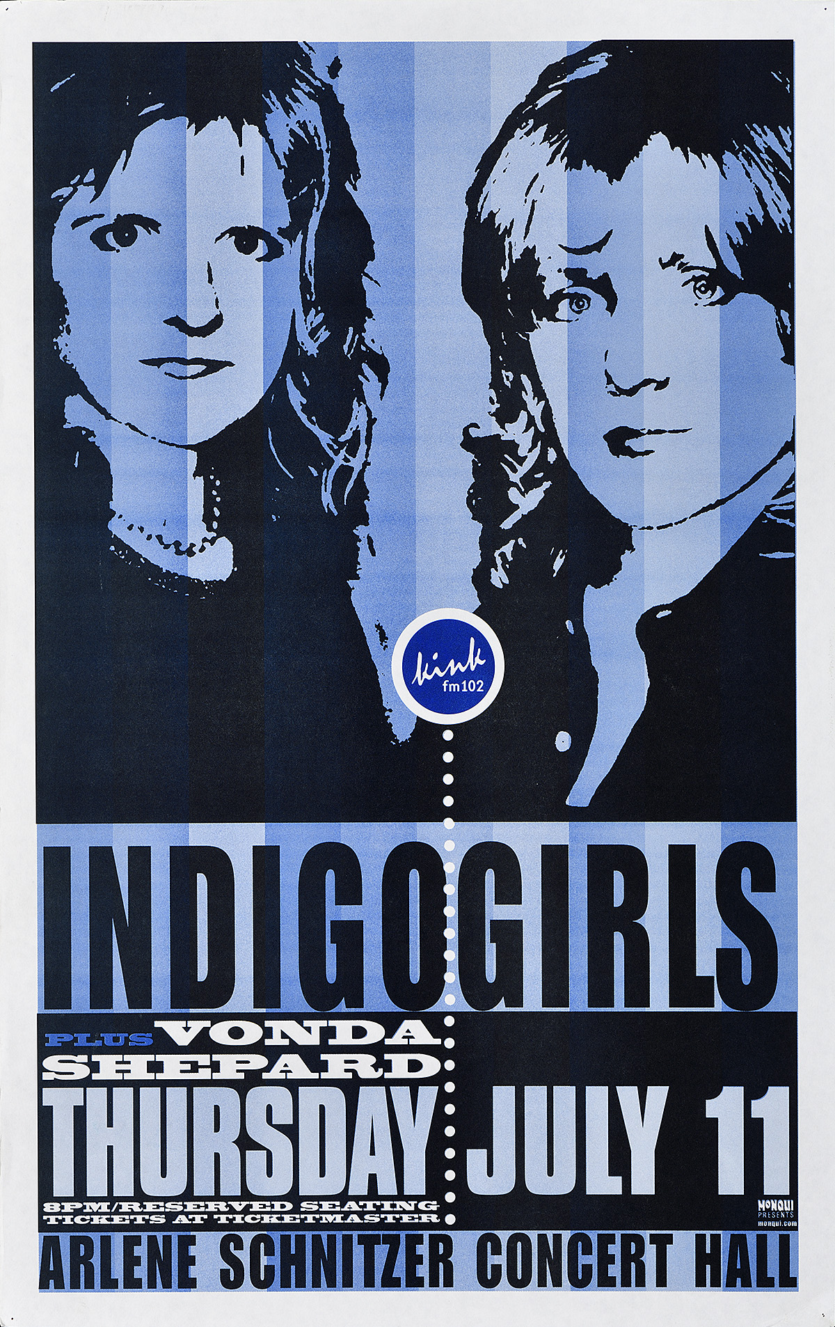
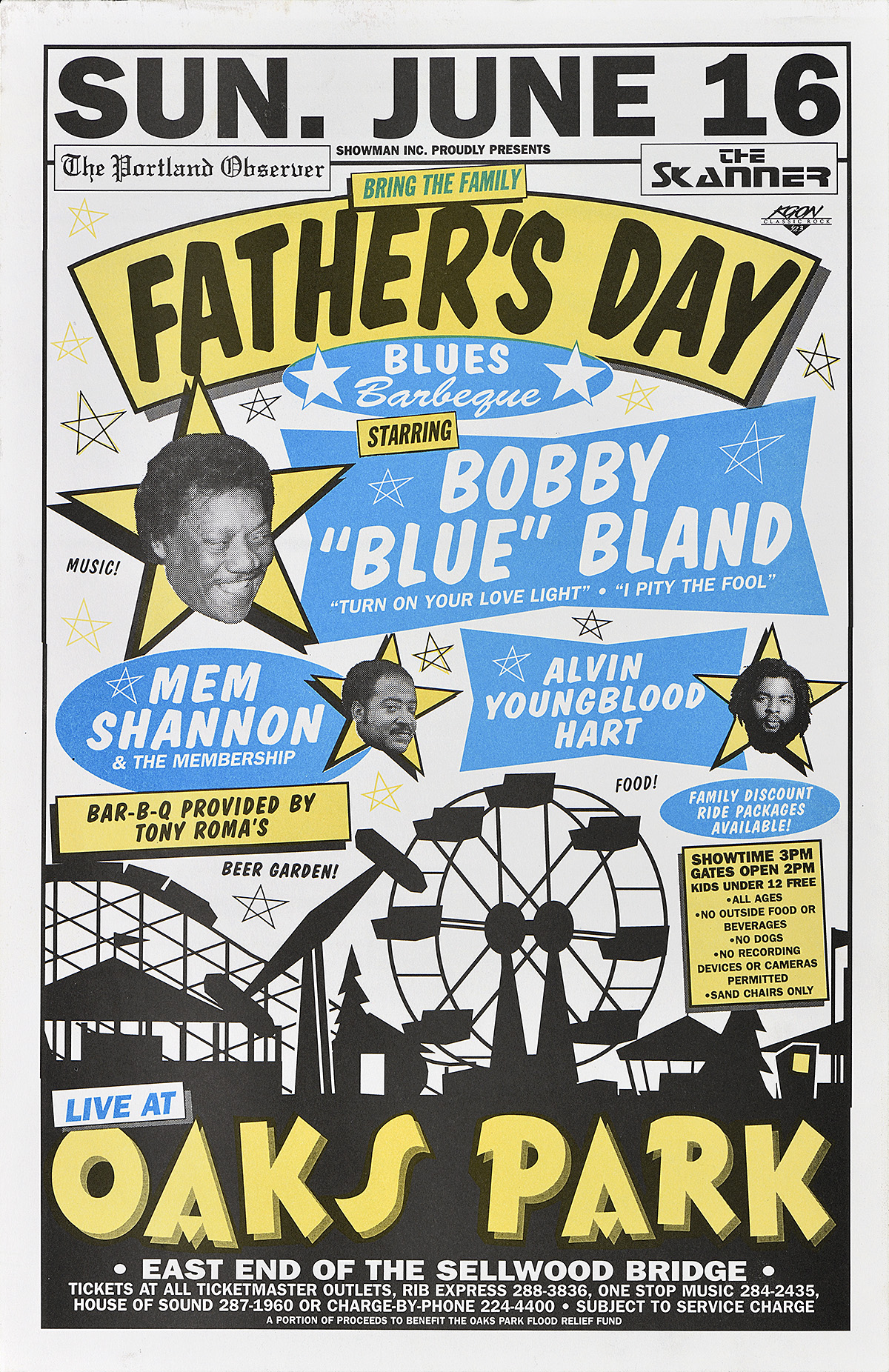
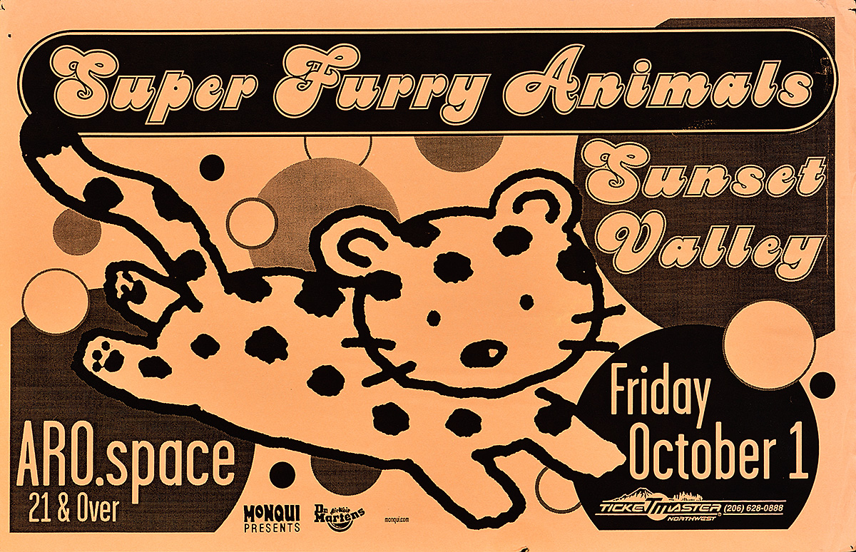
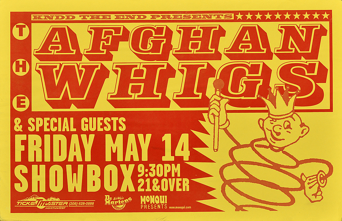
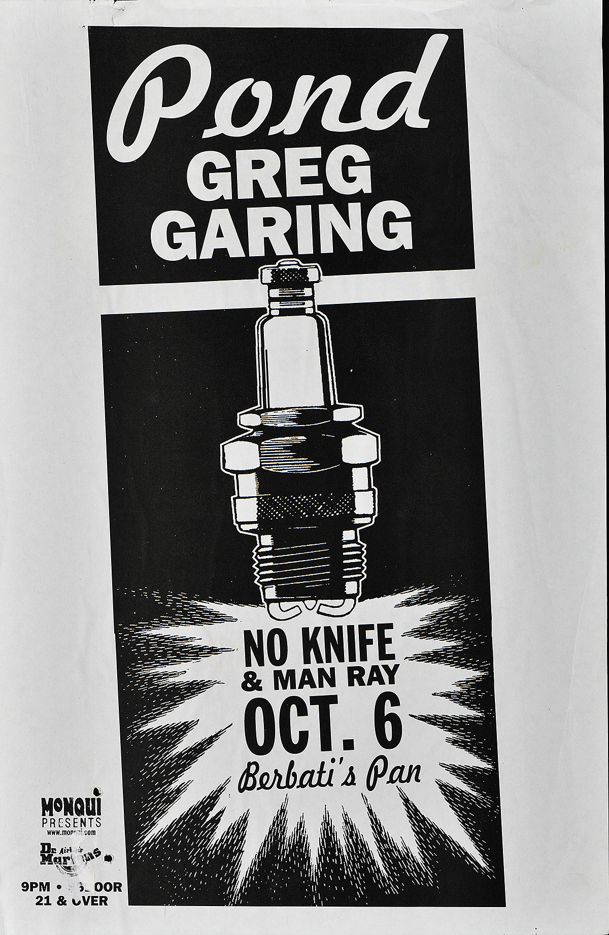
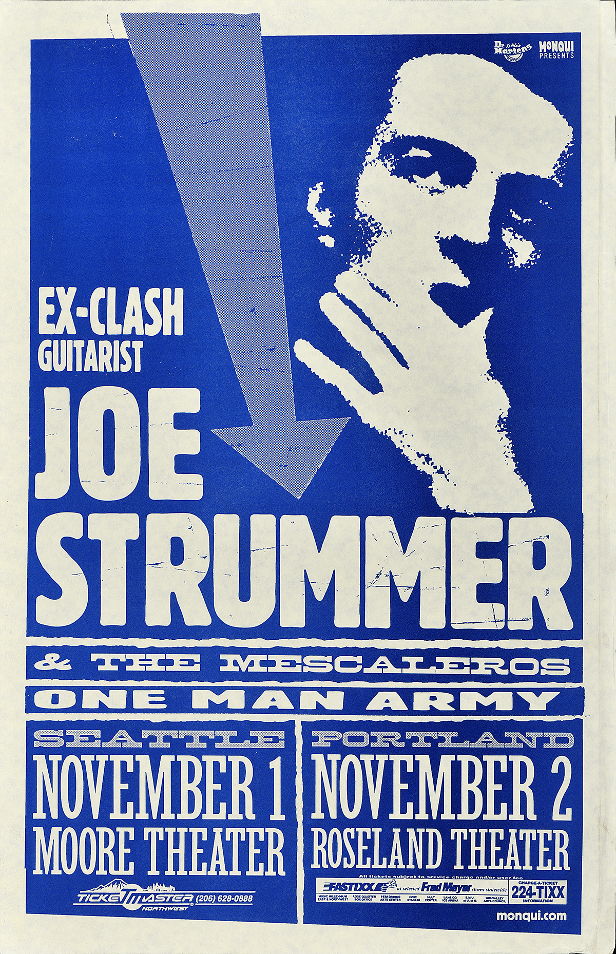
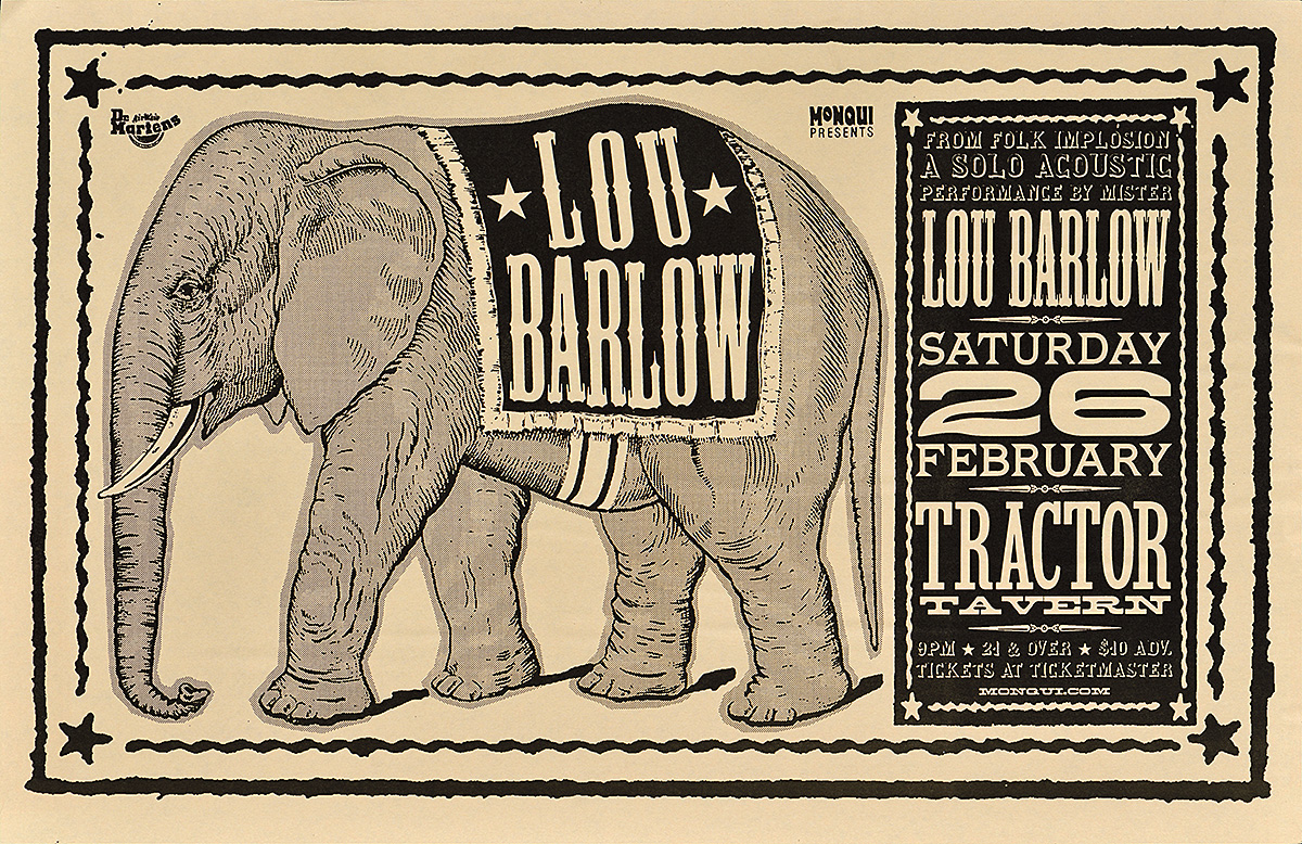
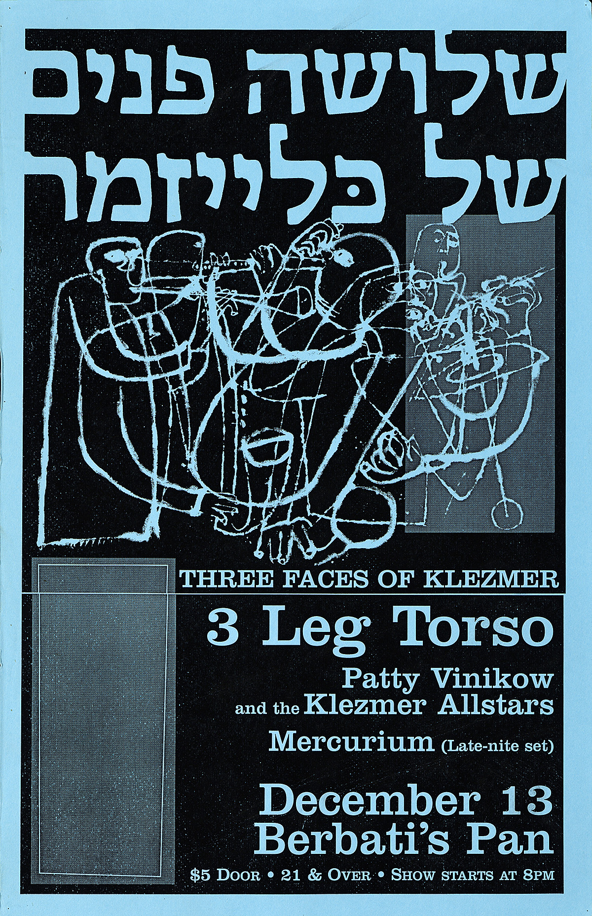
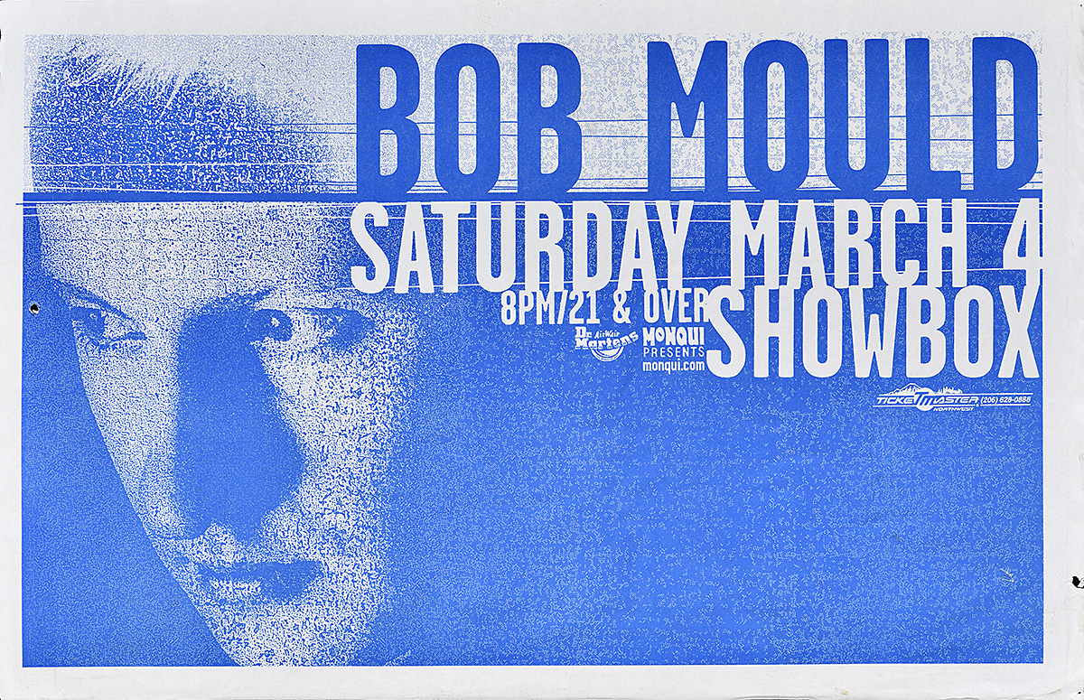
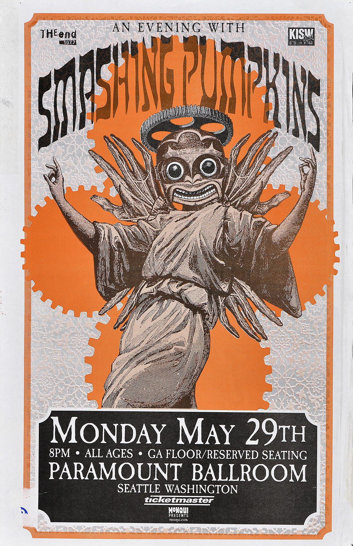
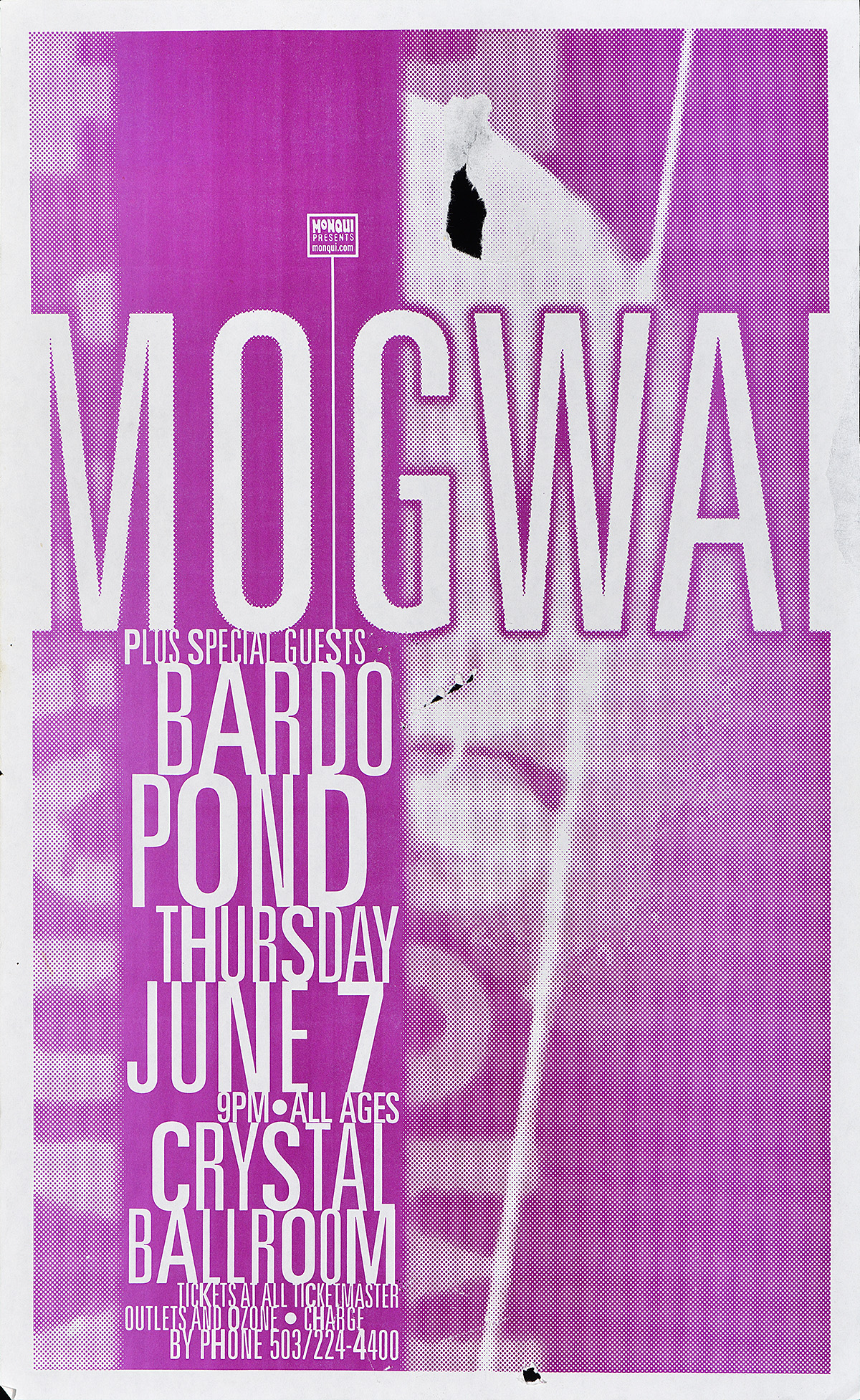
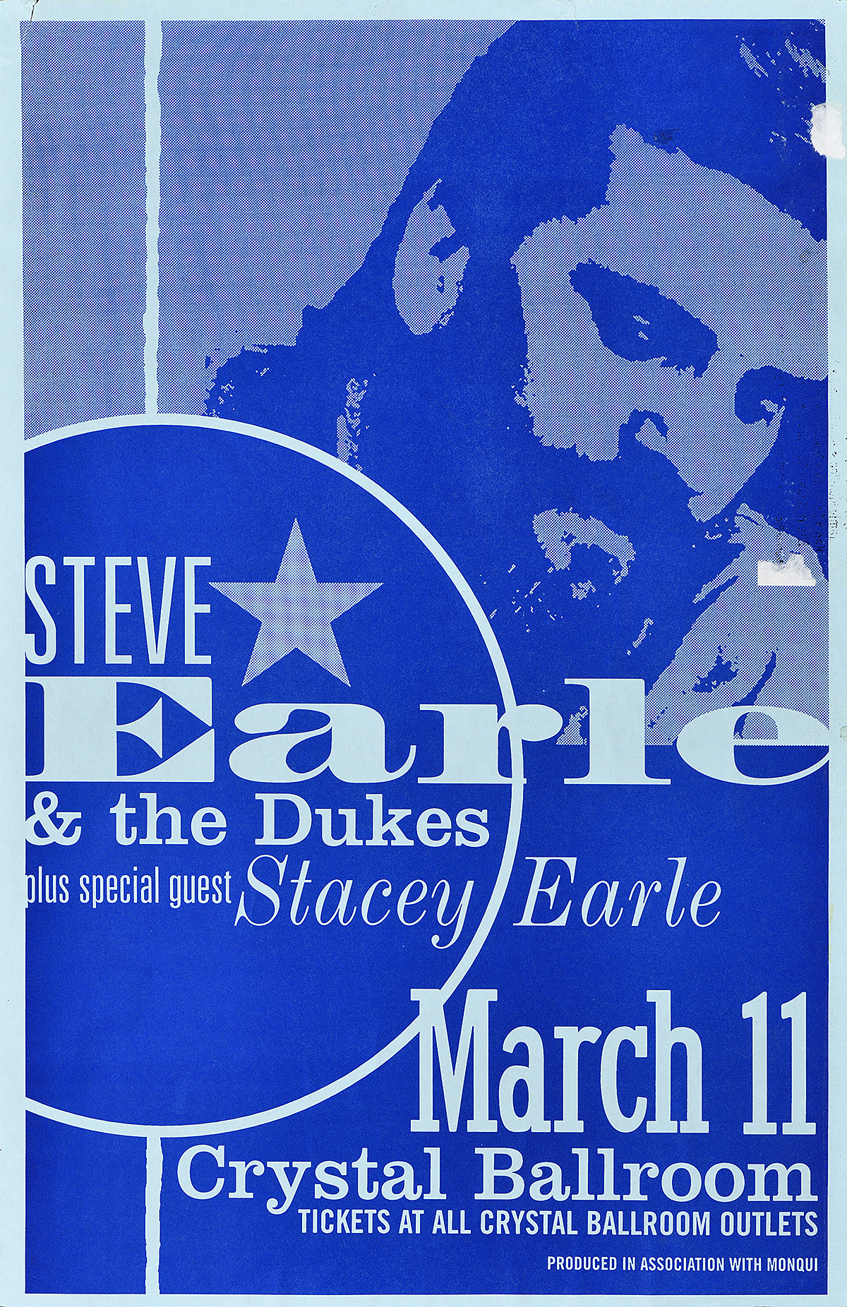
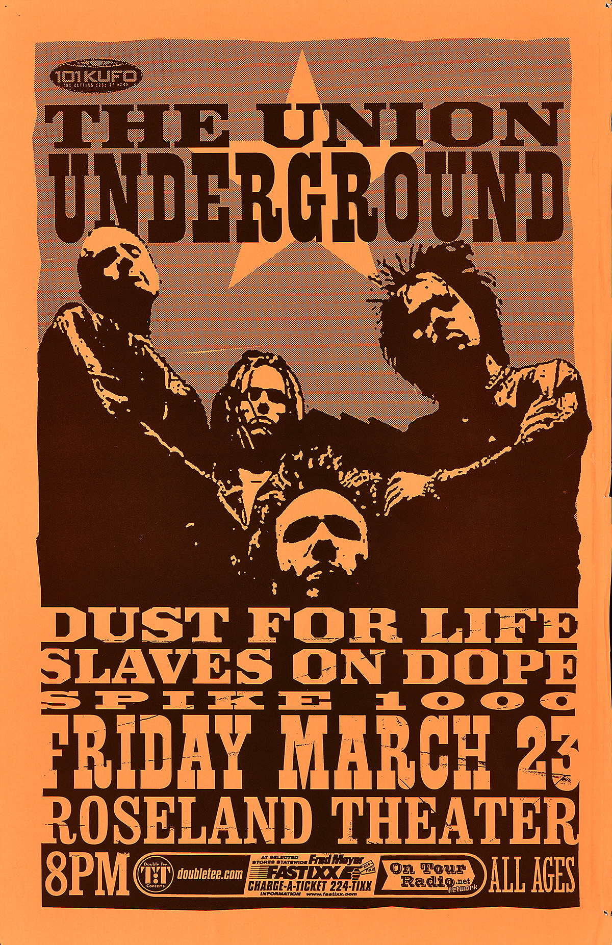
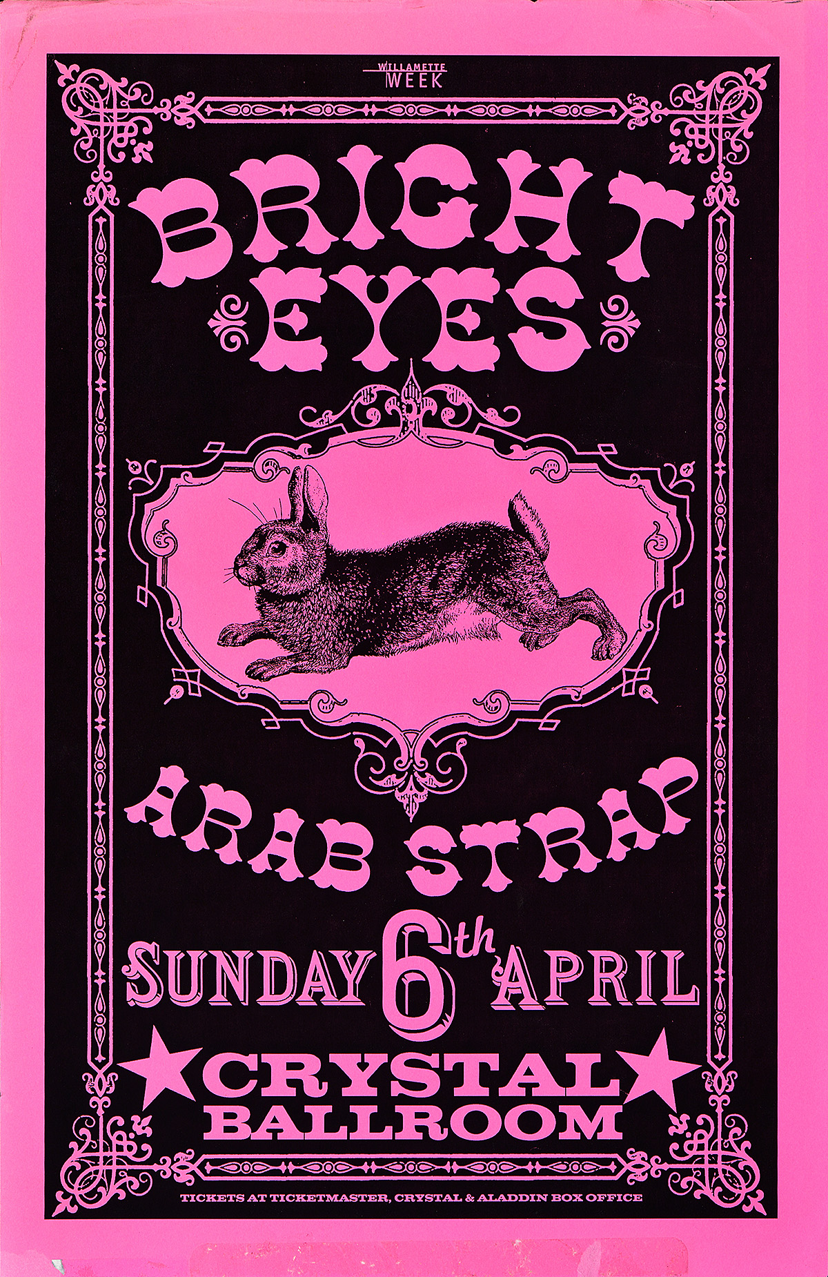
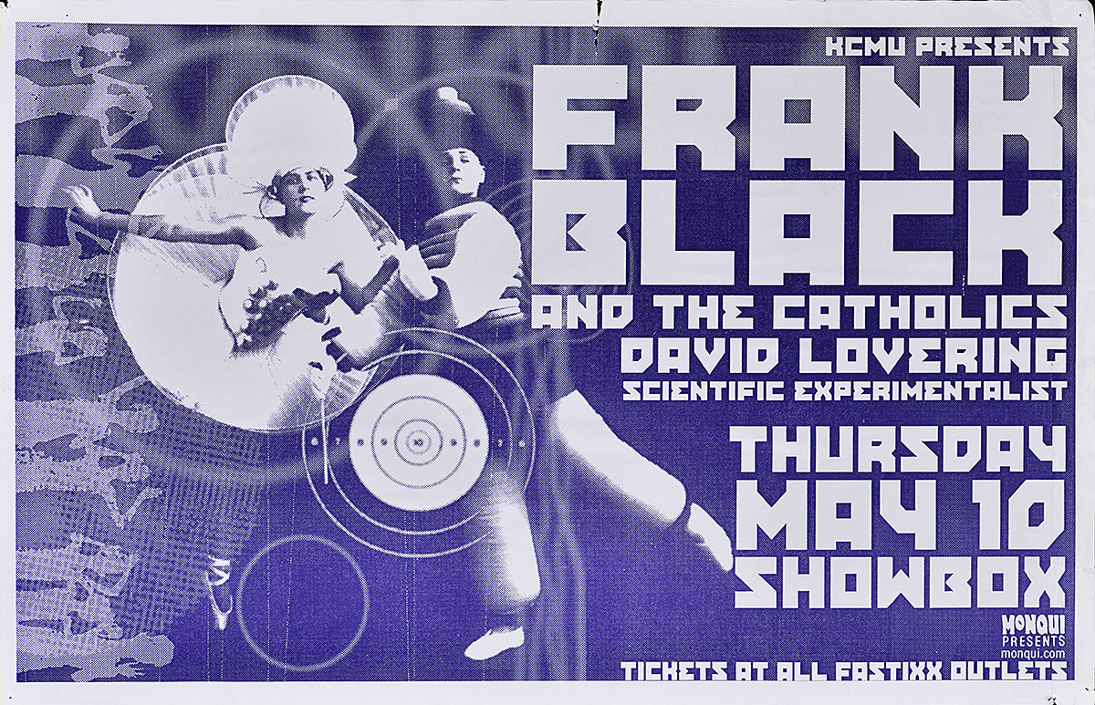
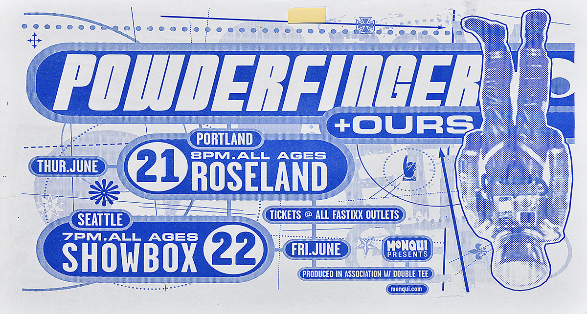
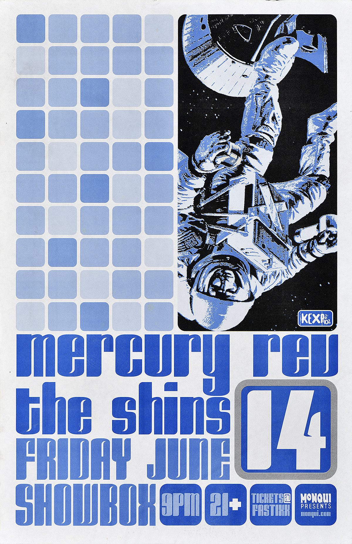
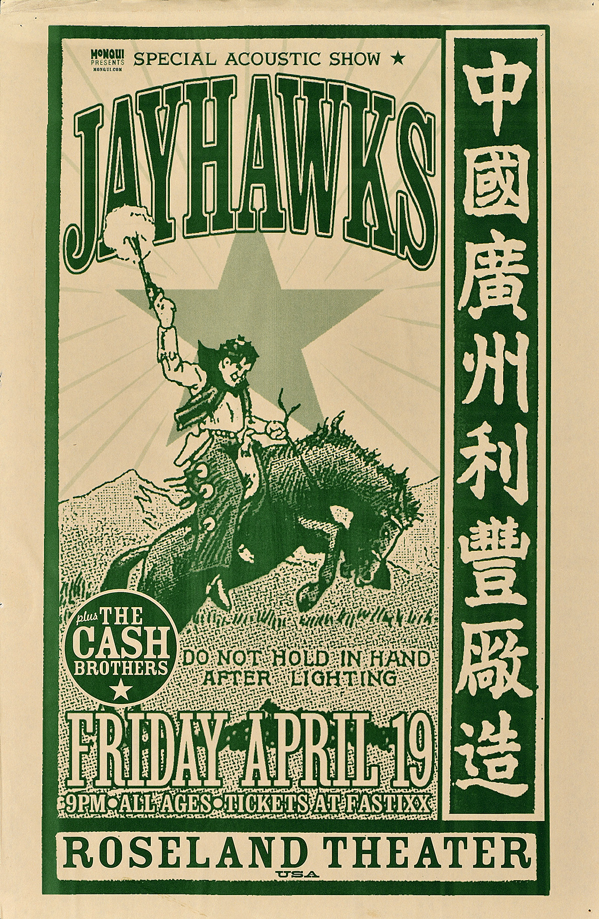
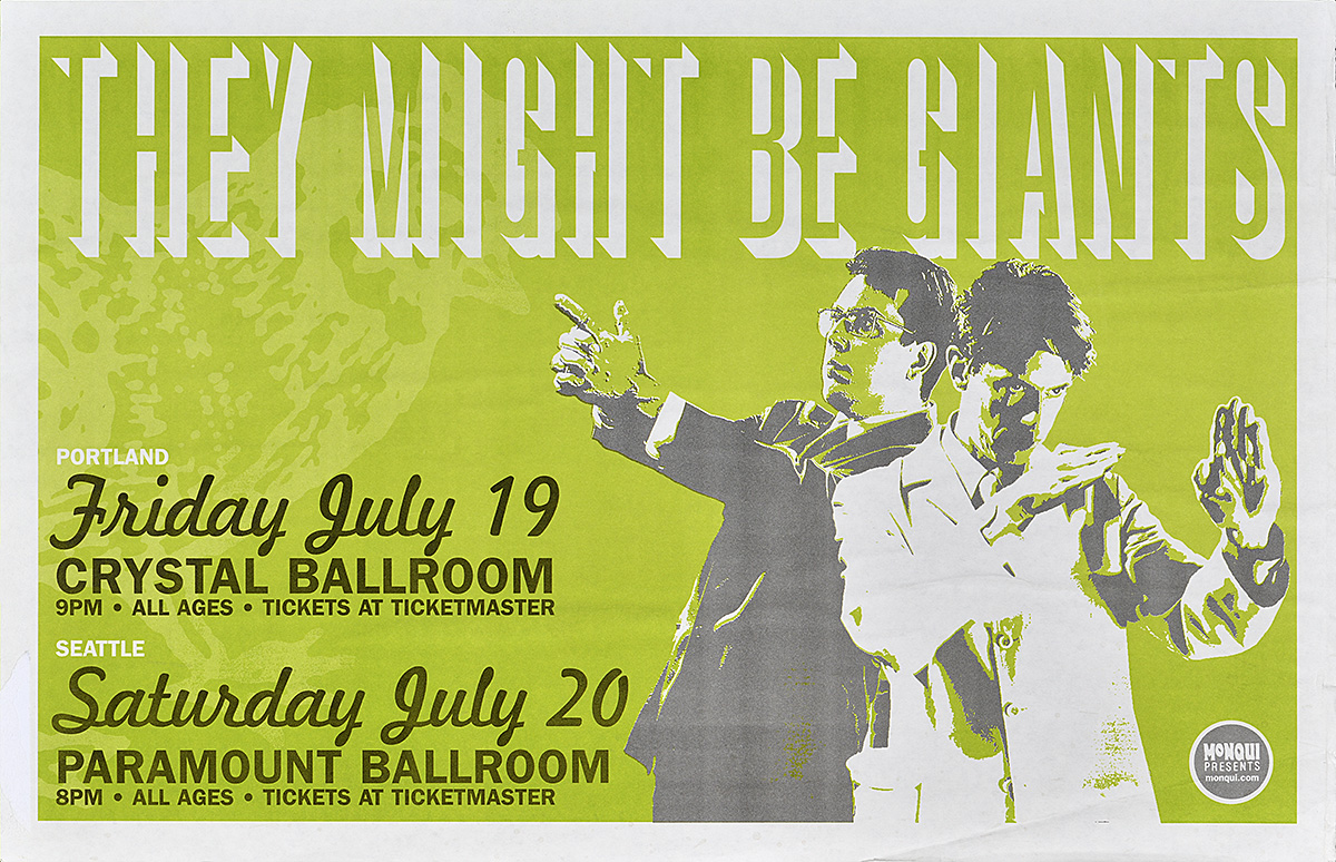
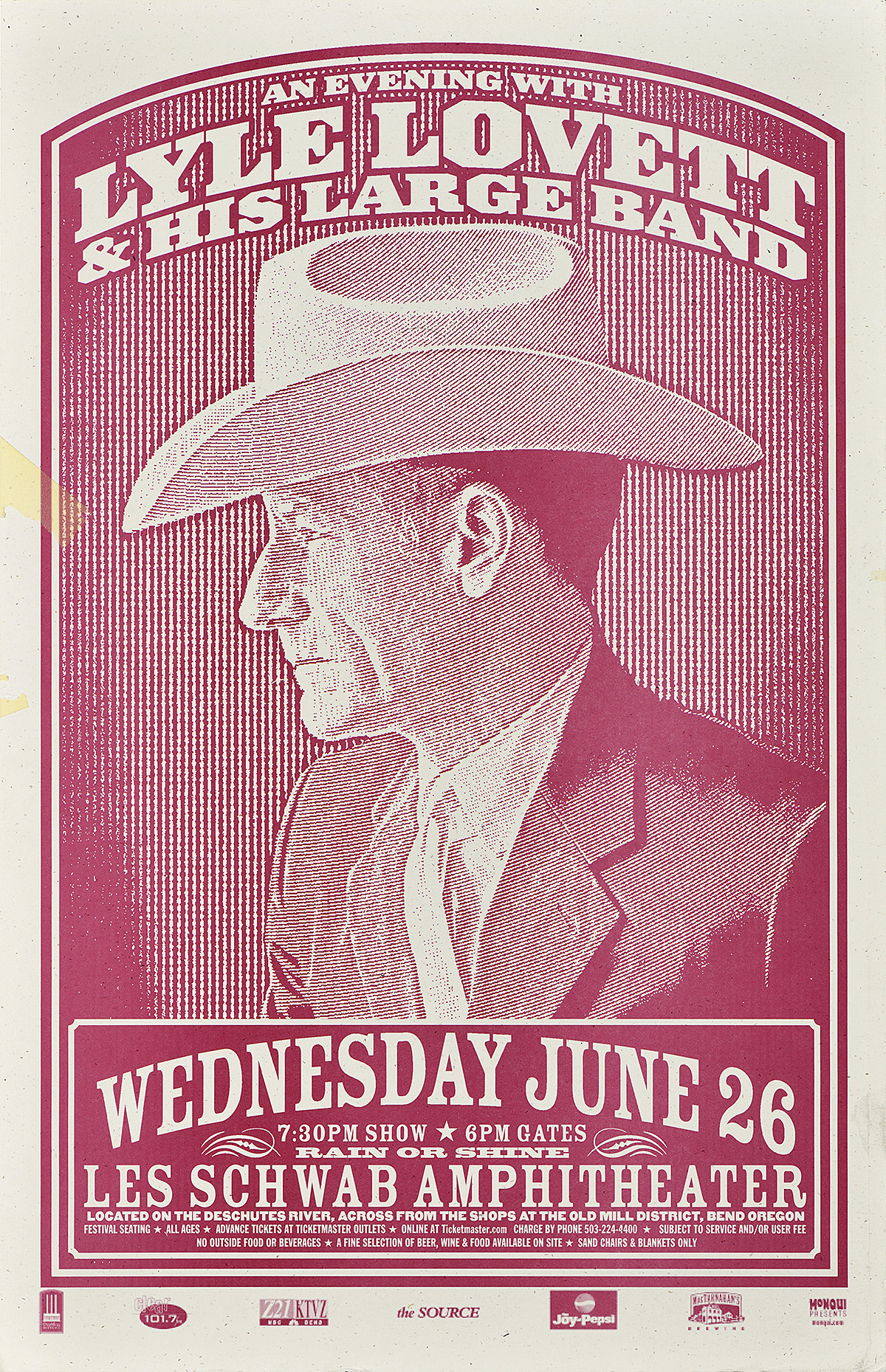
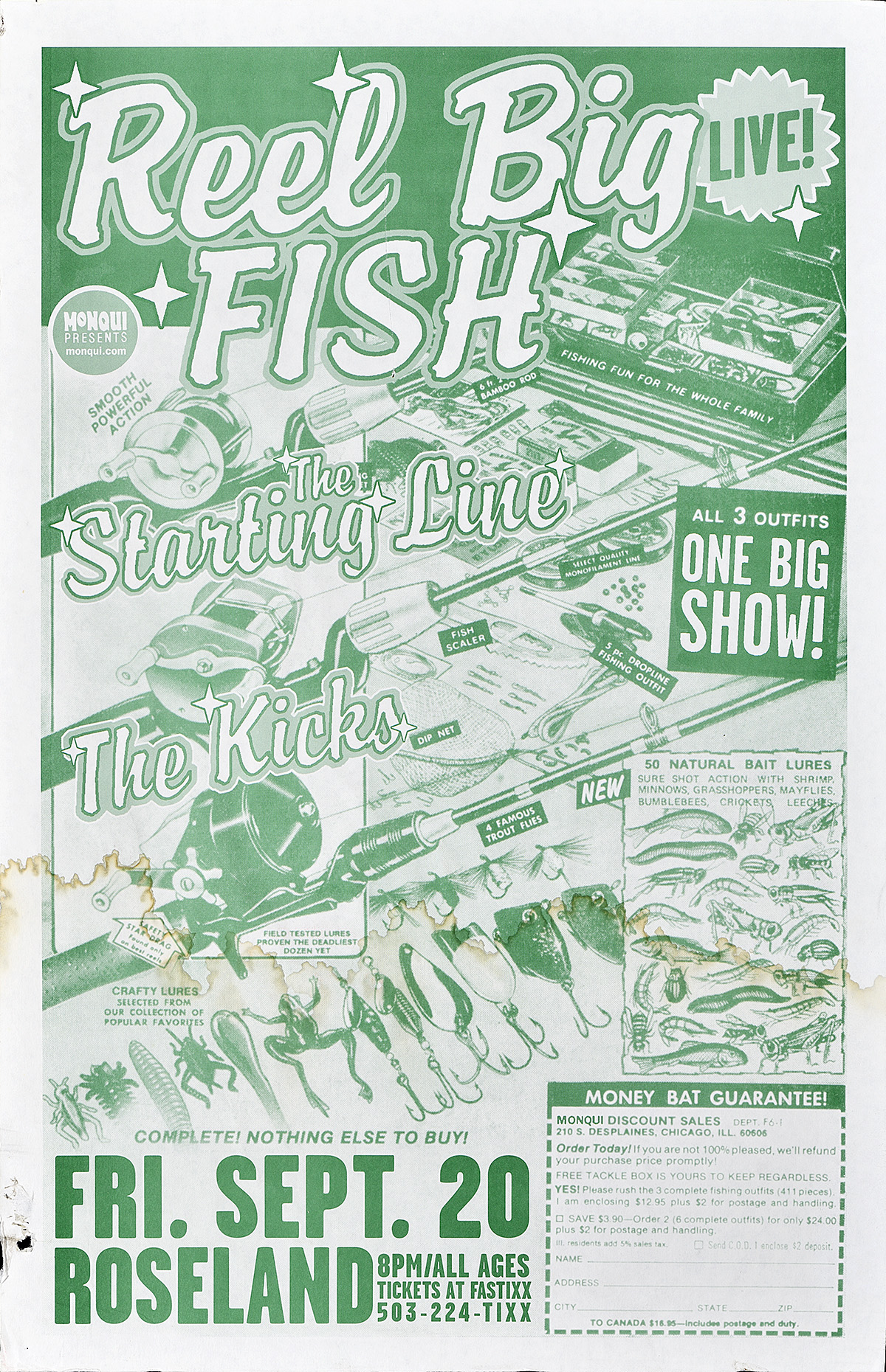
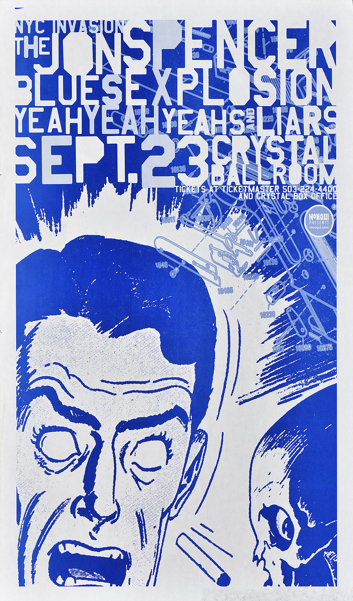
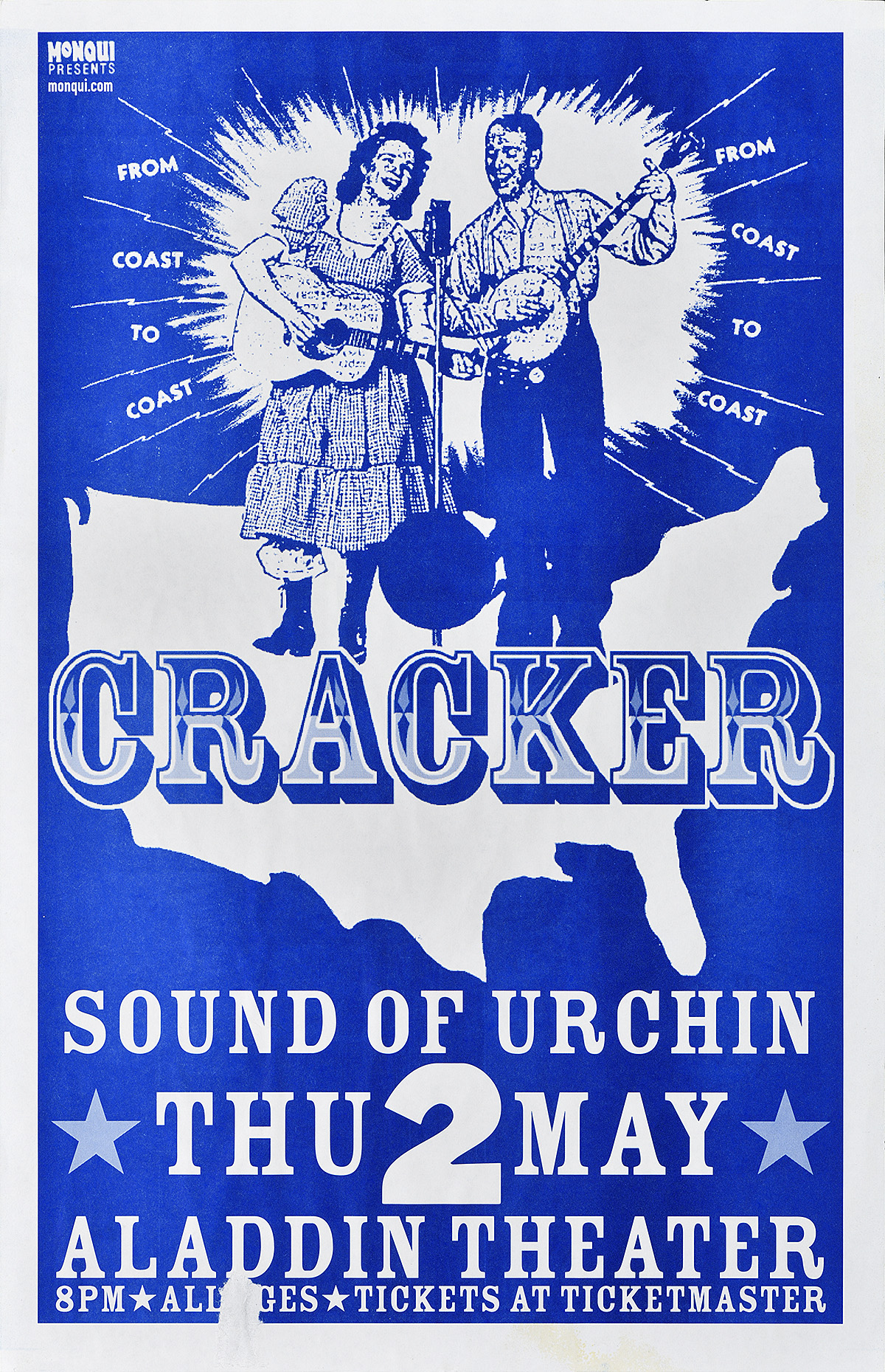
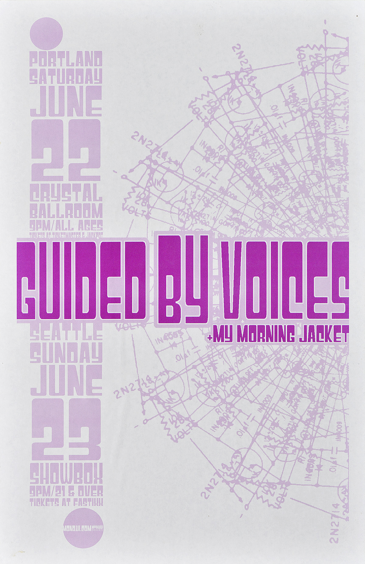
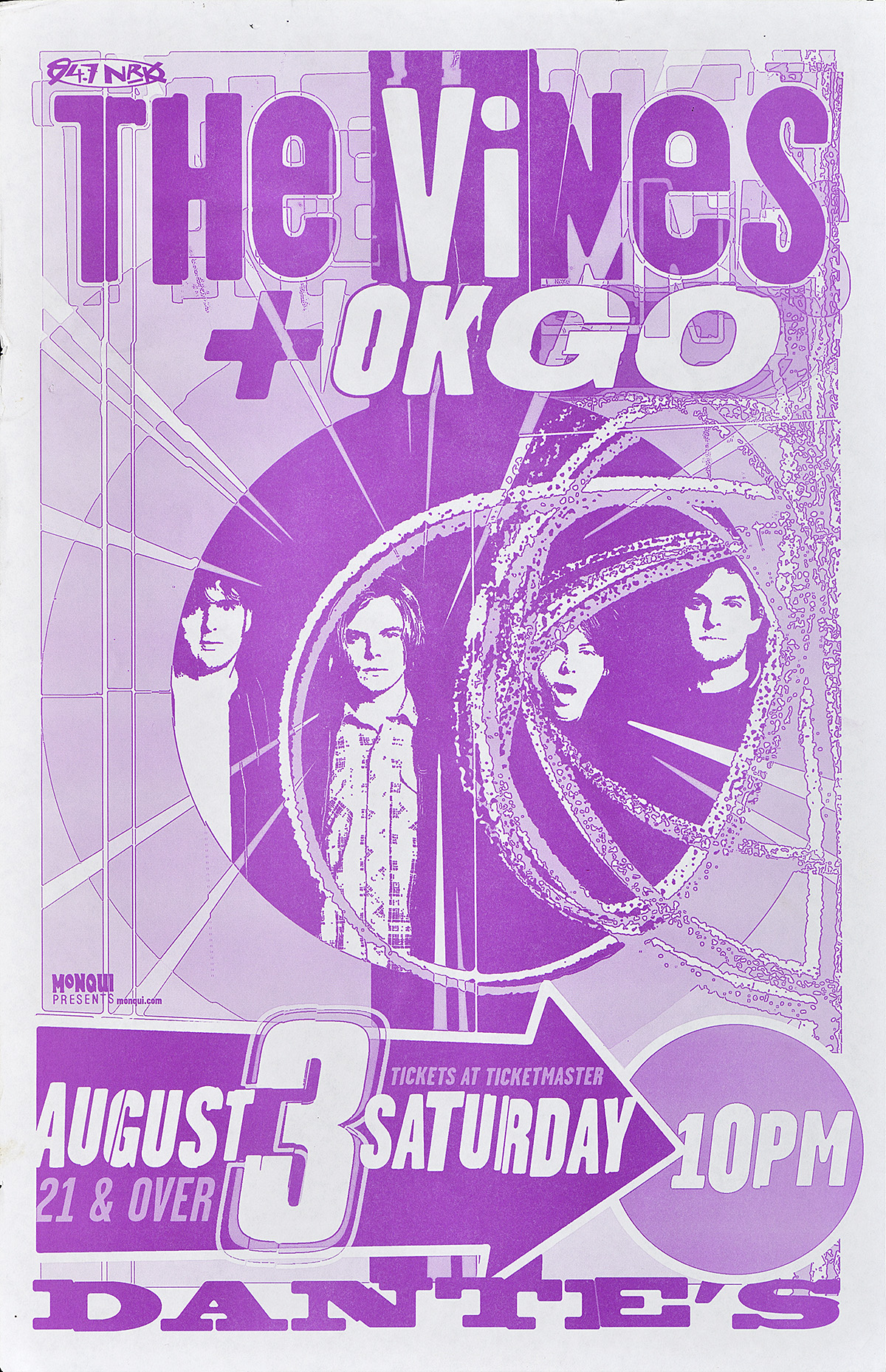
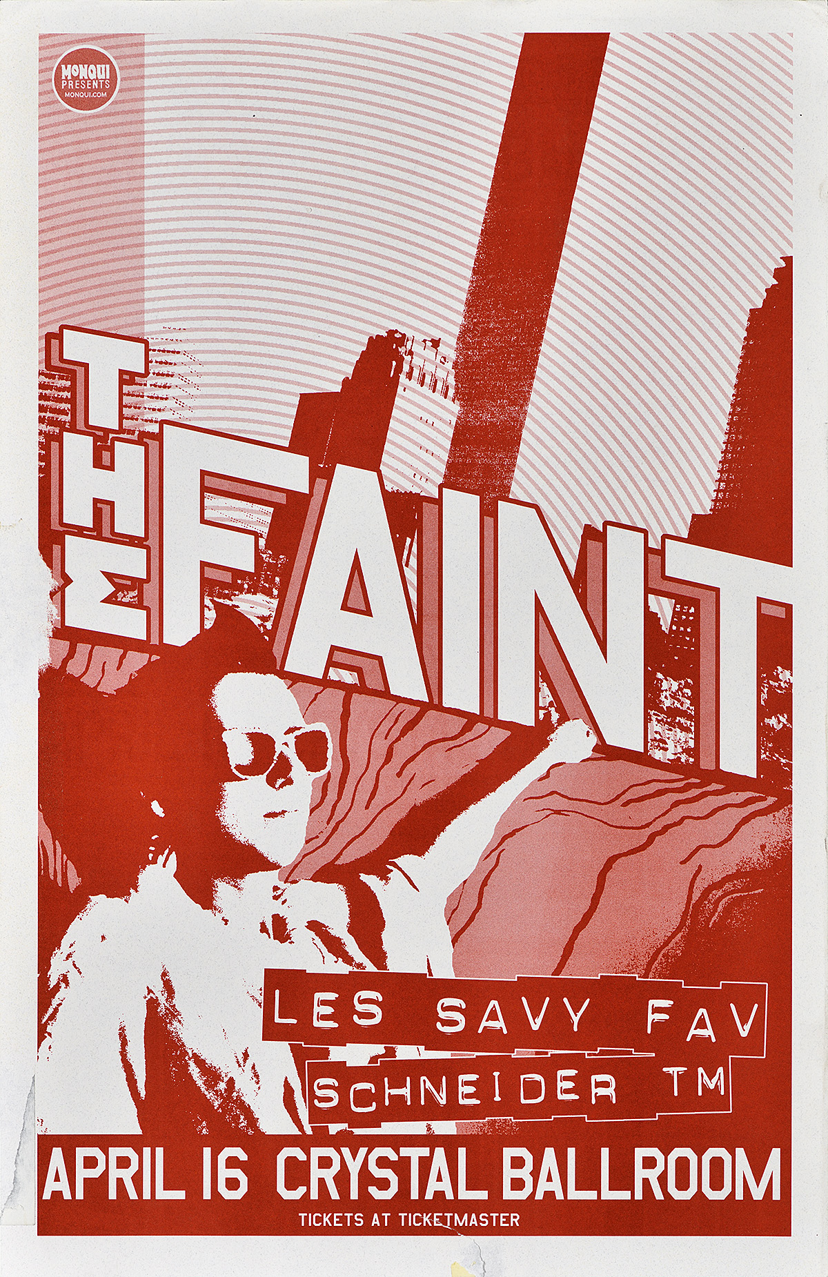
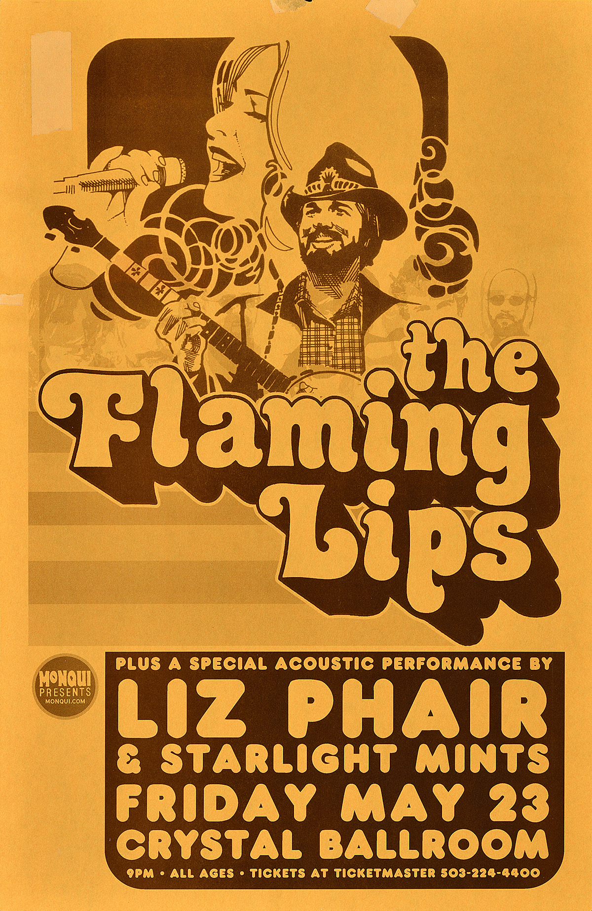
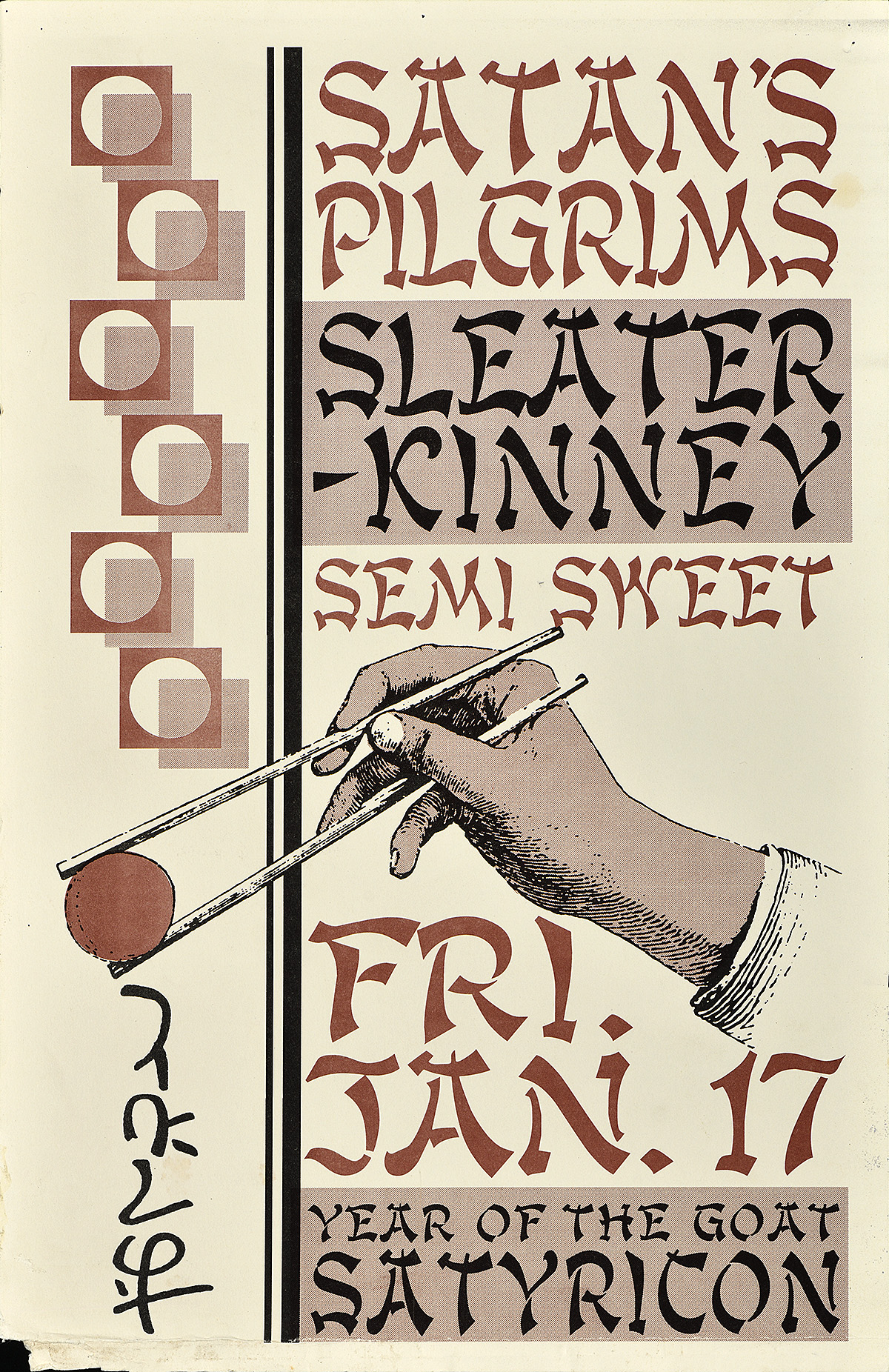
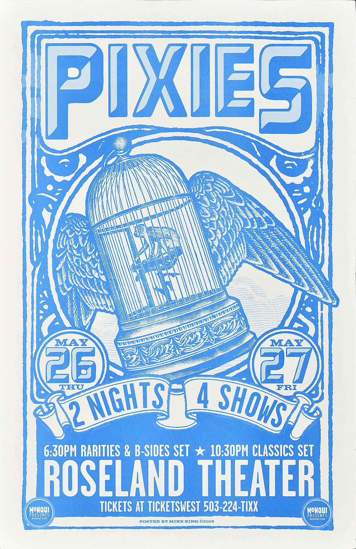
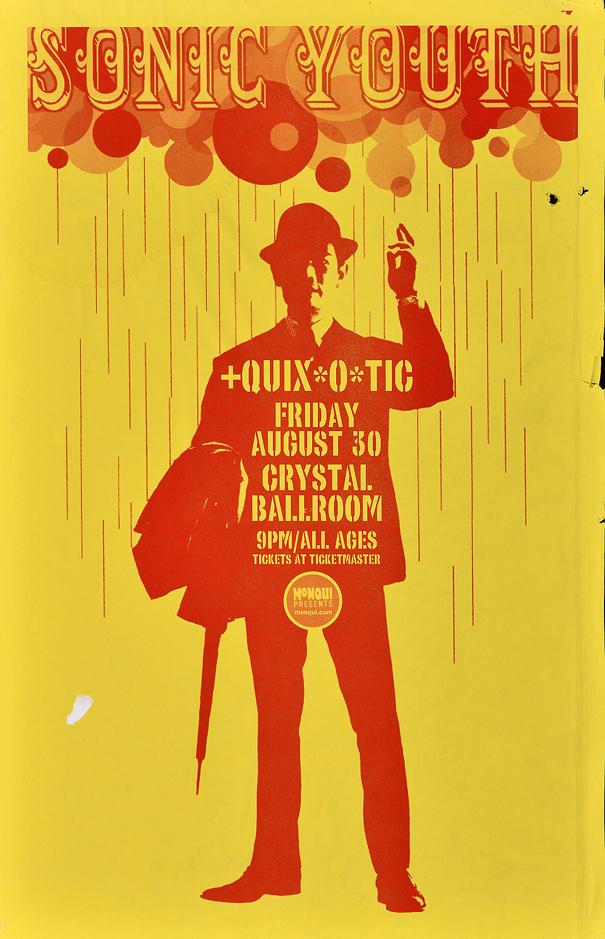
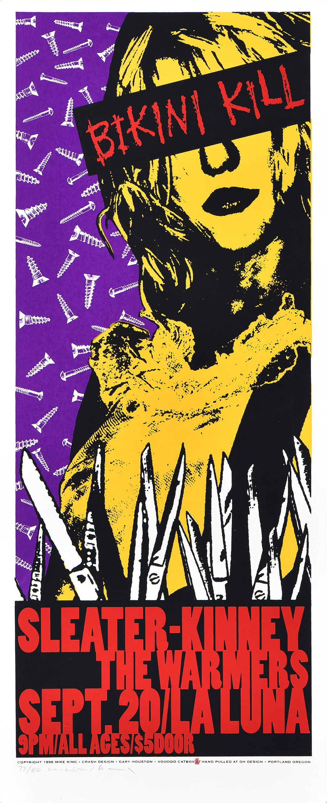
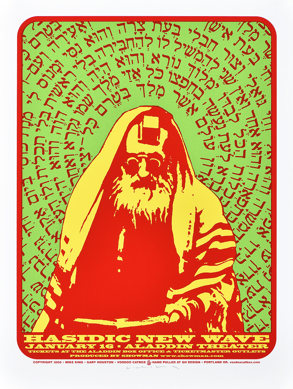
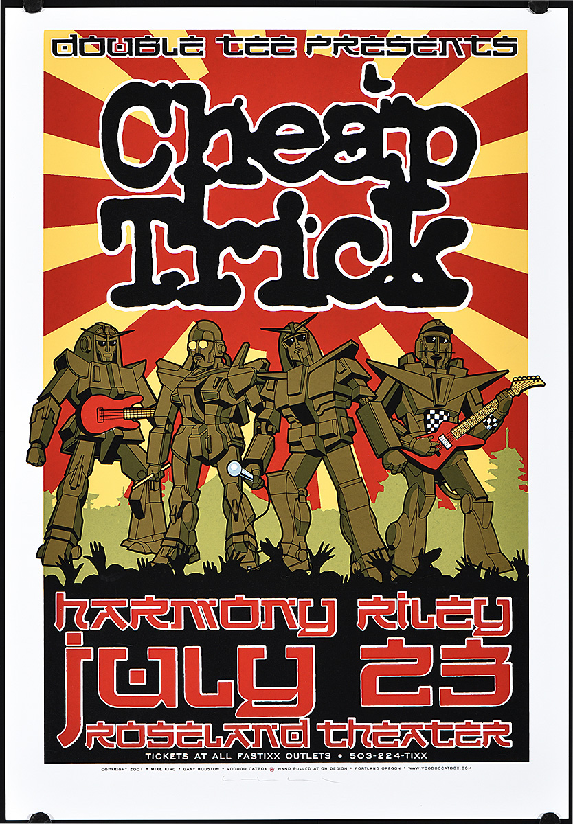
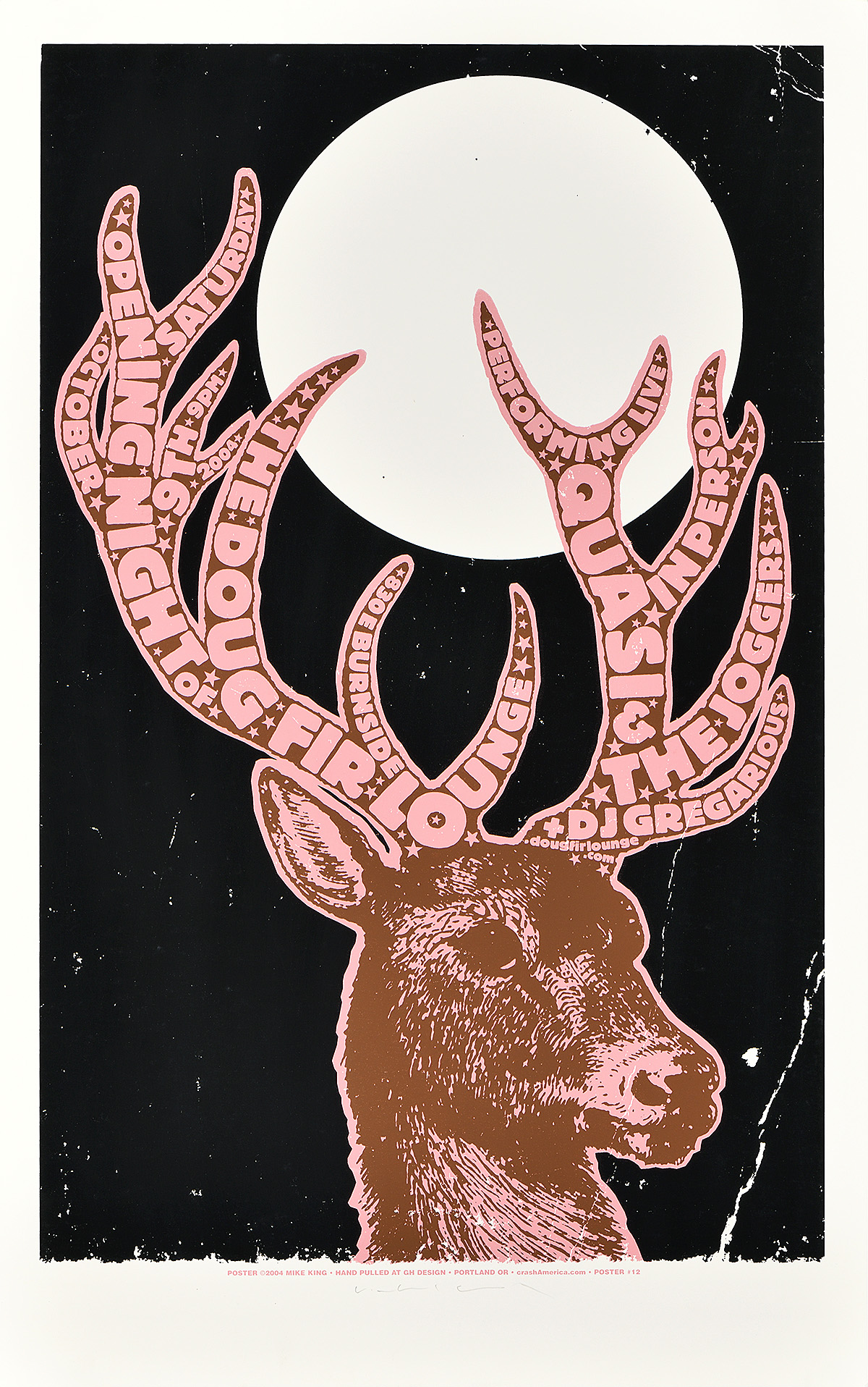
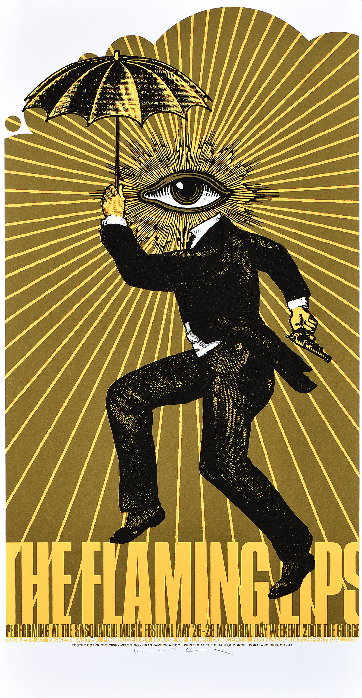
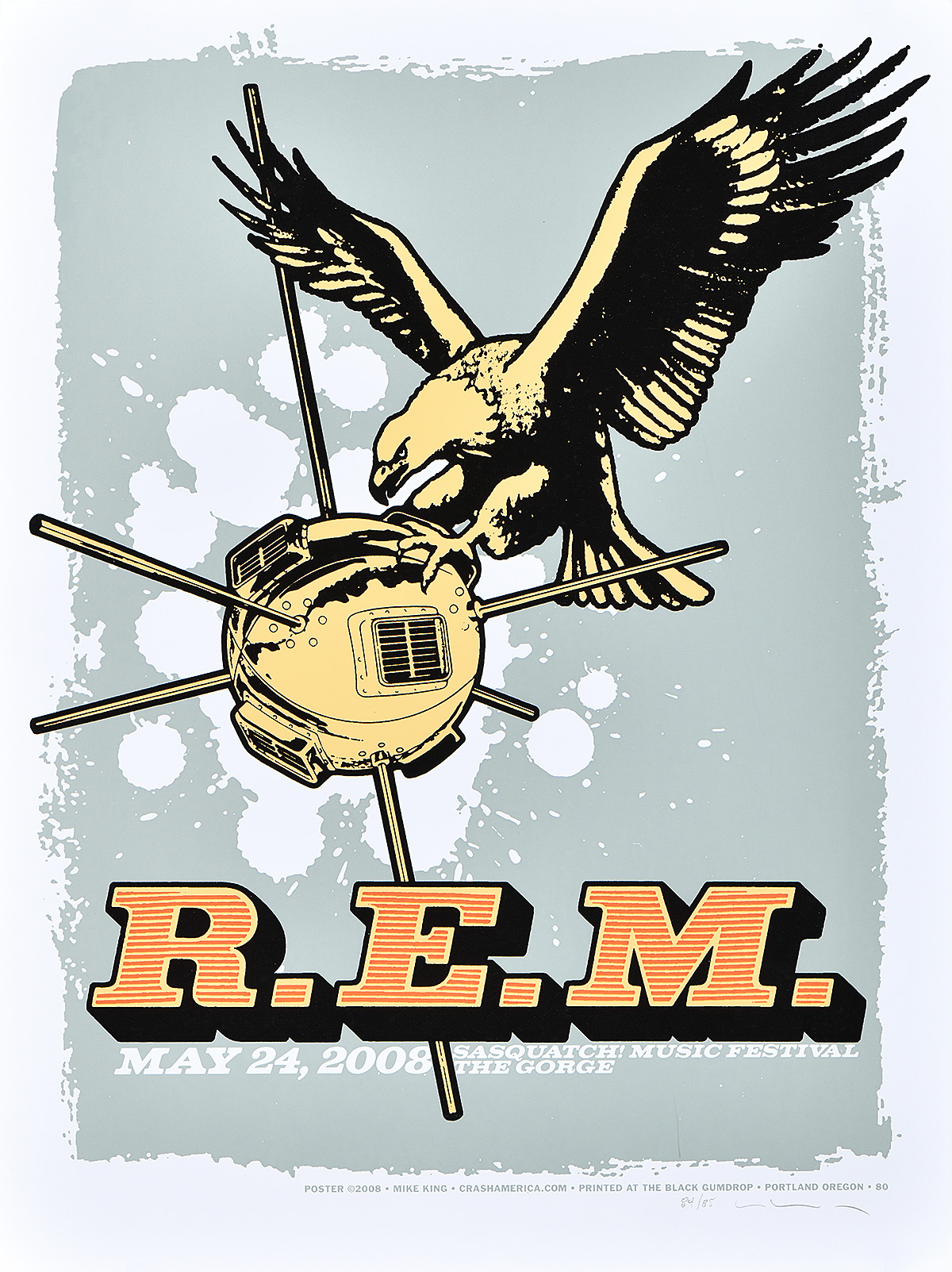
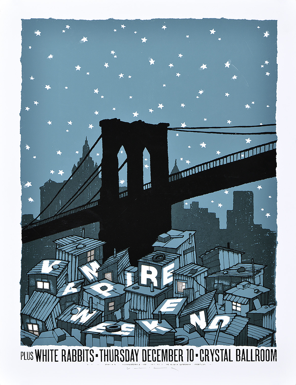
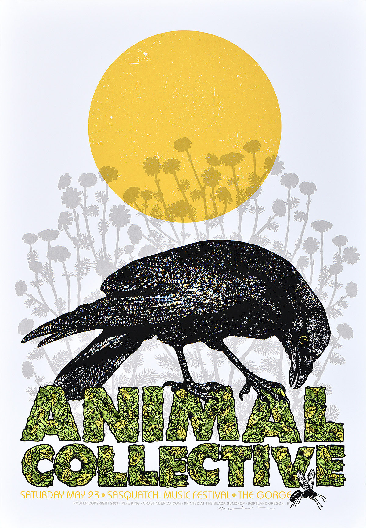
Copy/Paste/Print/Repeat: Mike King & the Art of the Gig Poster

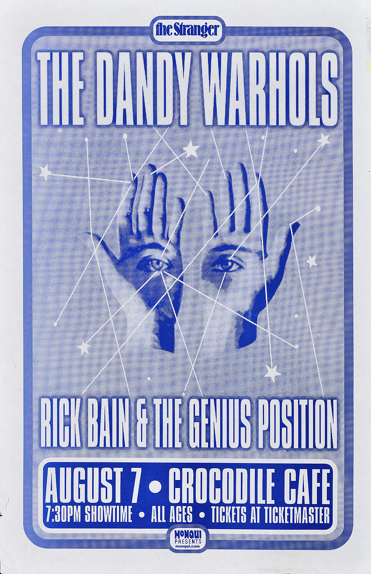
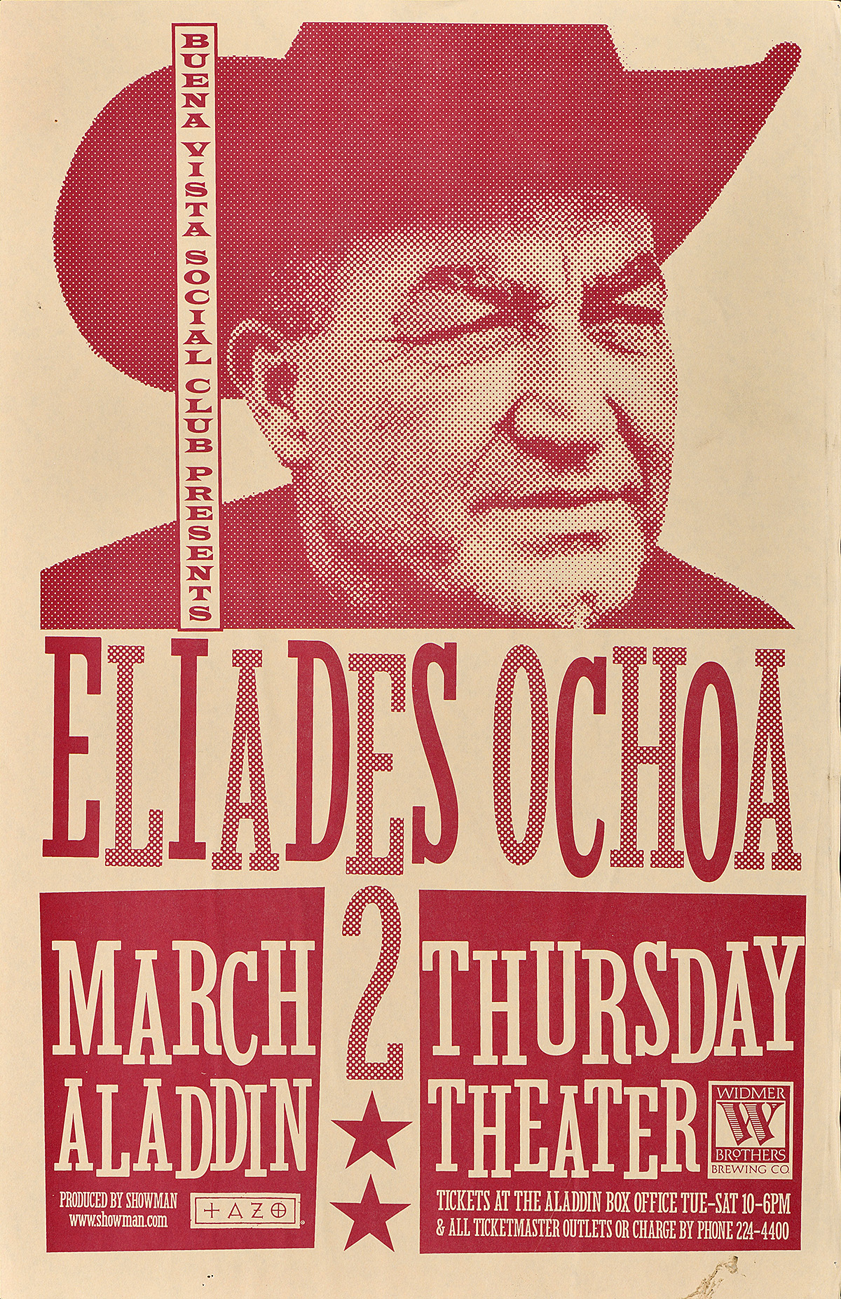
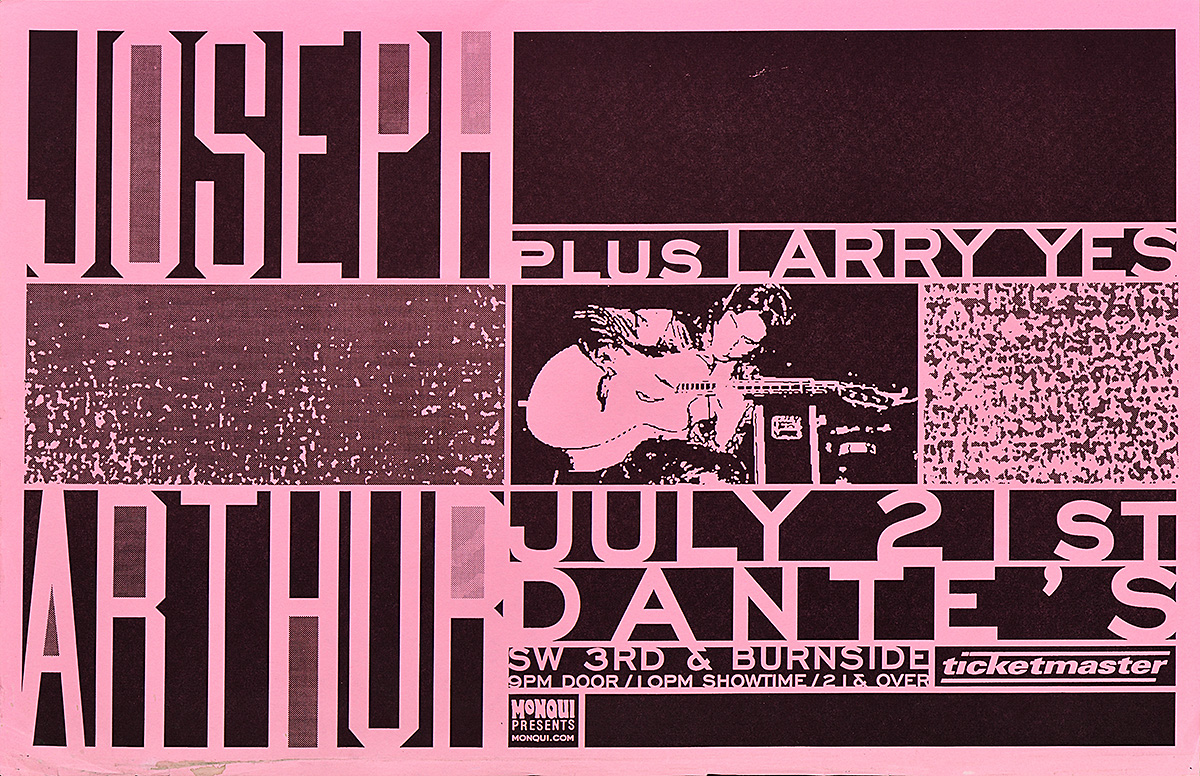
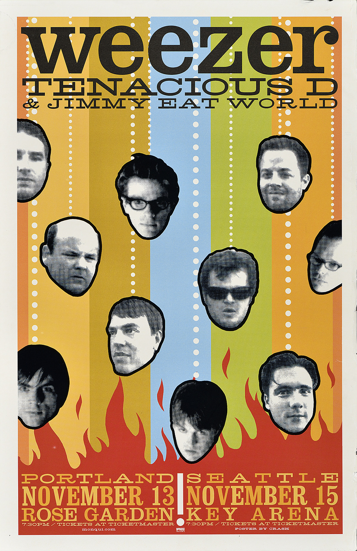
Mike King is America’s most prolific gig-poster artist. What began as a means of promoting his own bands’ shows in the late 1970s gradually morphed into a full-time specialty in the art of the eye-catching concert poster. Today, there are few major venues or bands that have not worked with him—his imagery has saturated the tapestry of American music culture, appearing on album covers, T-shirts, and, most importantly, posters. 


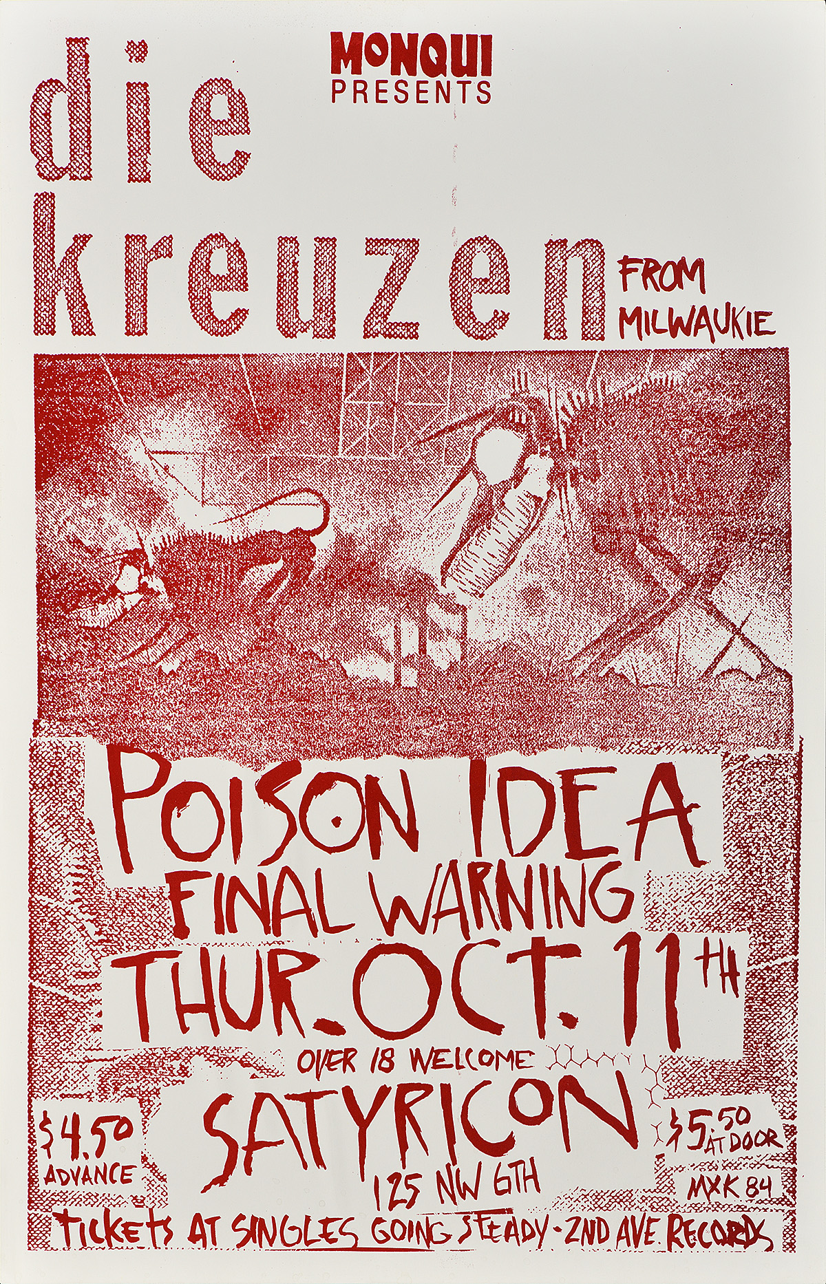
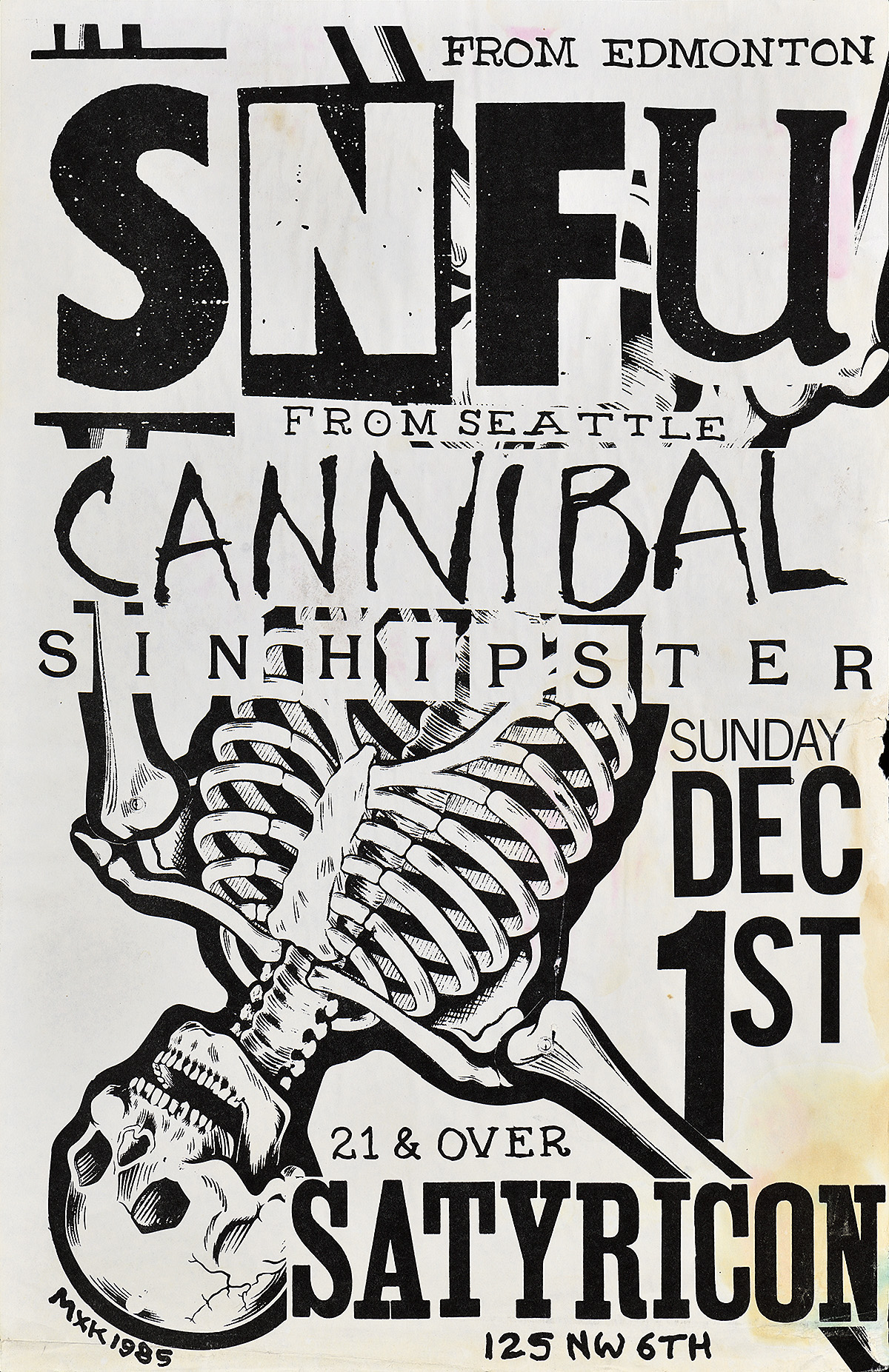
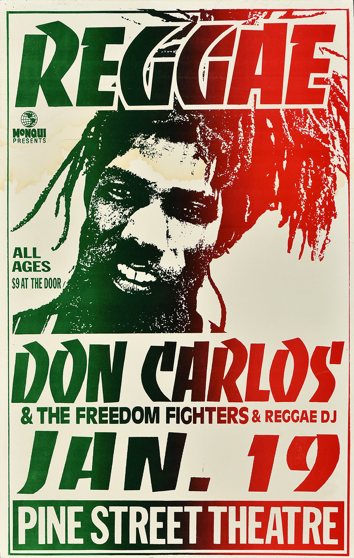
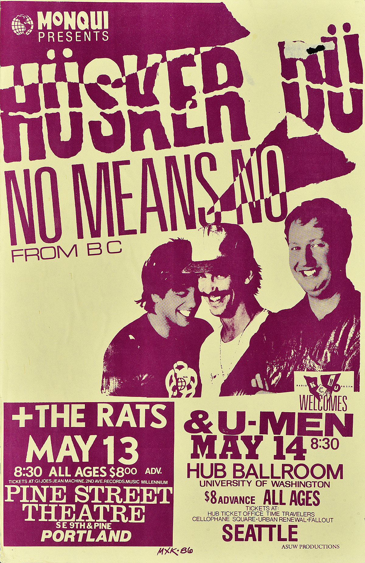
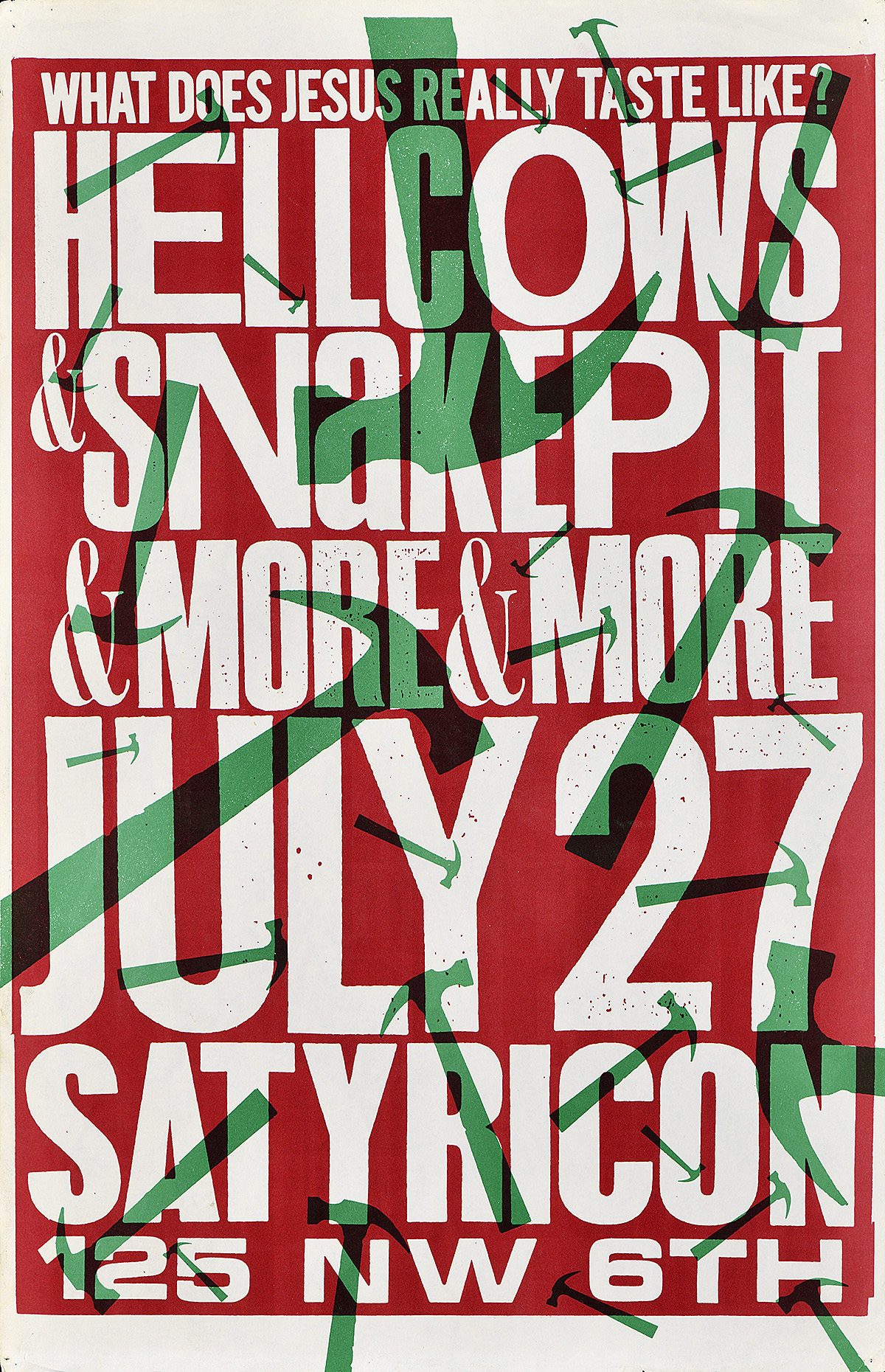
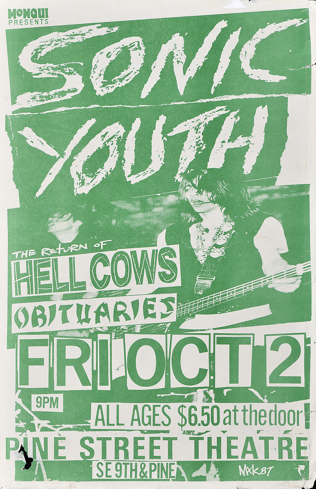
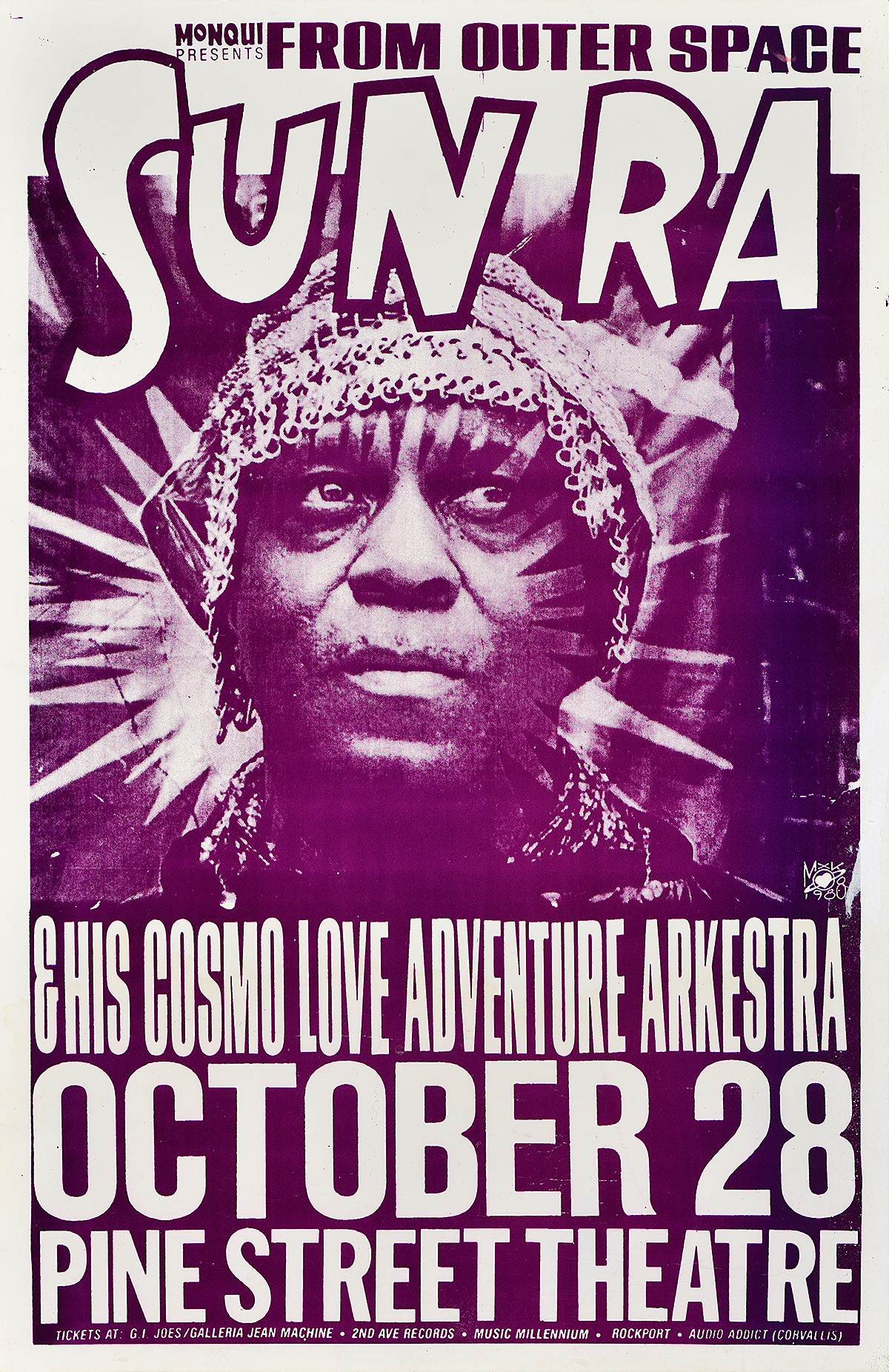
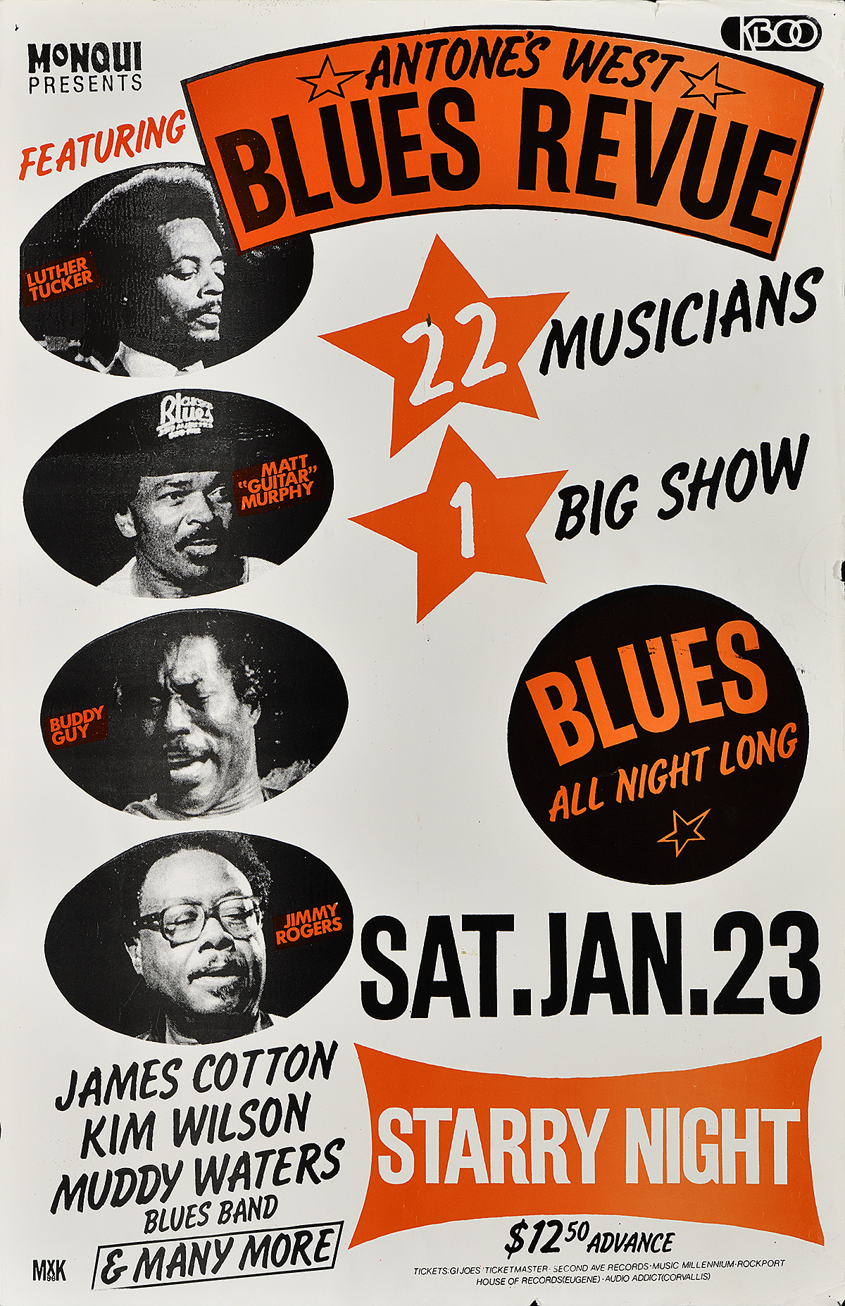
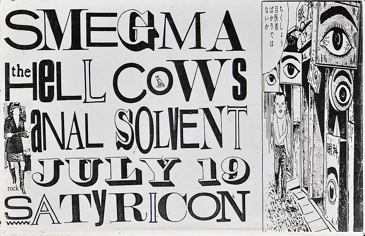
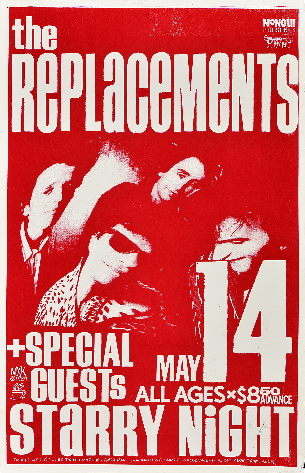
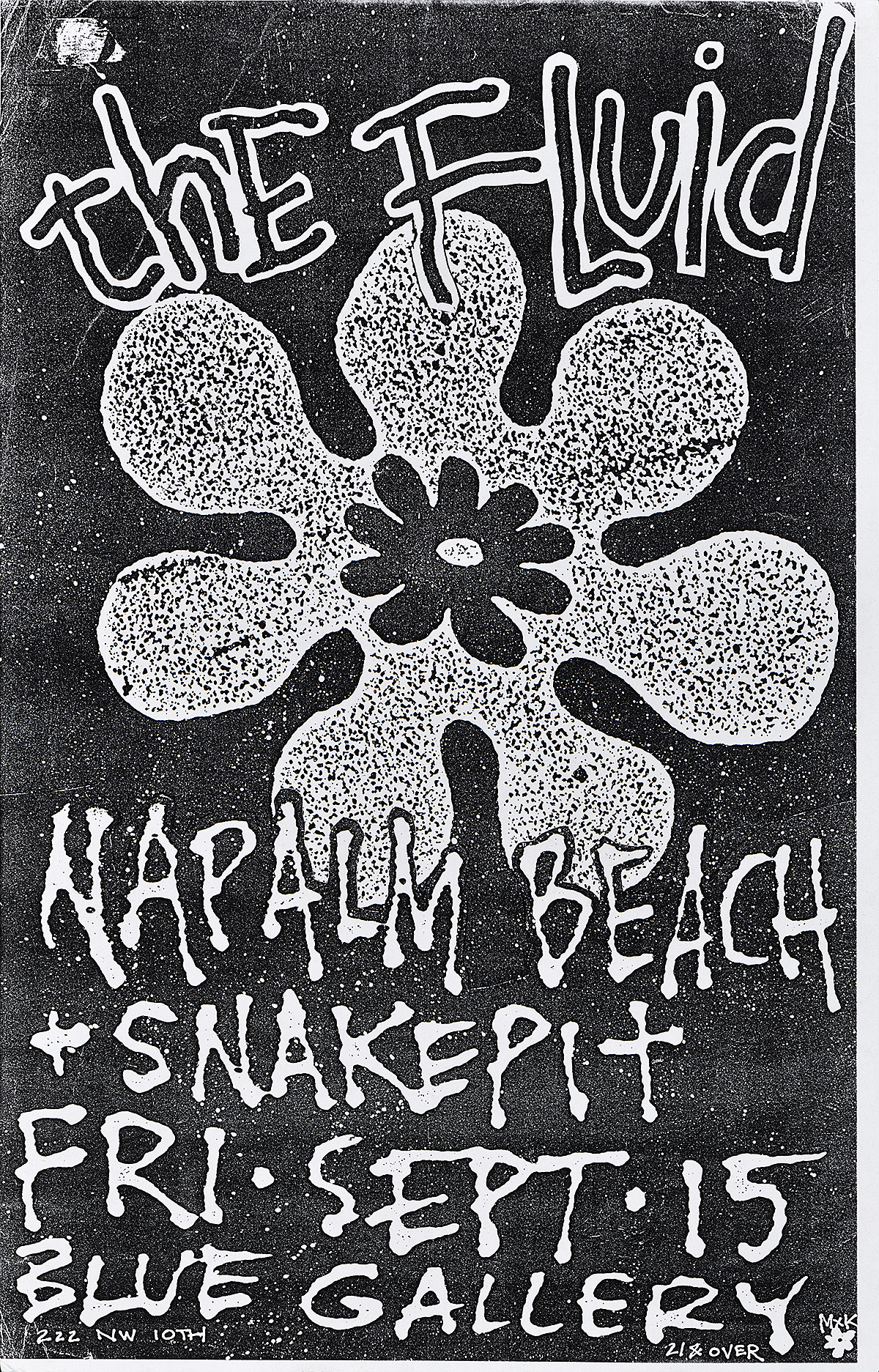
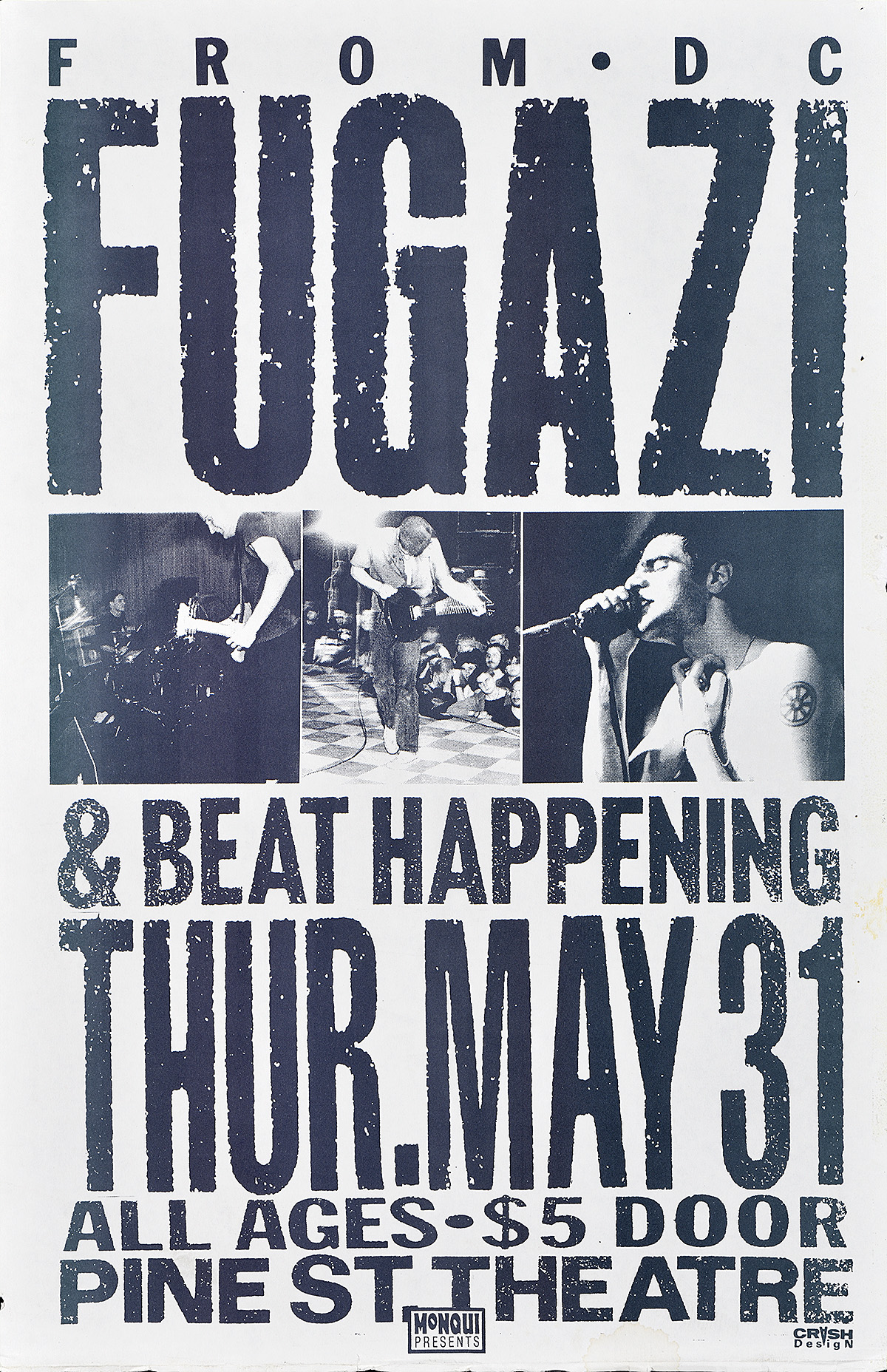
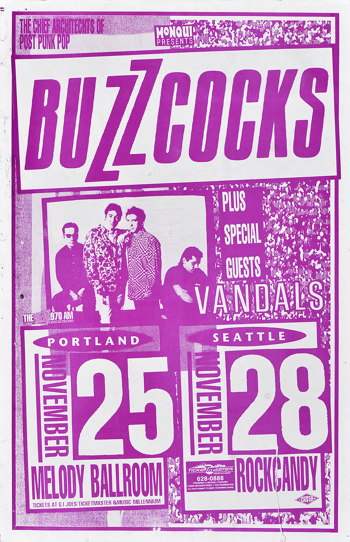
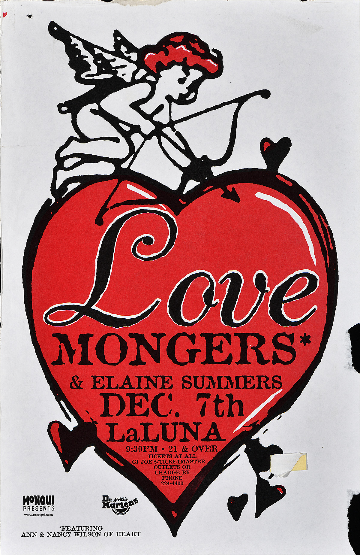
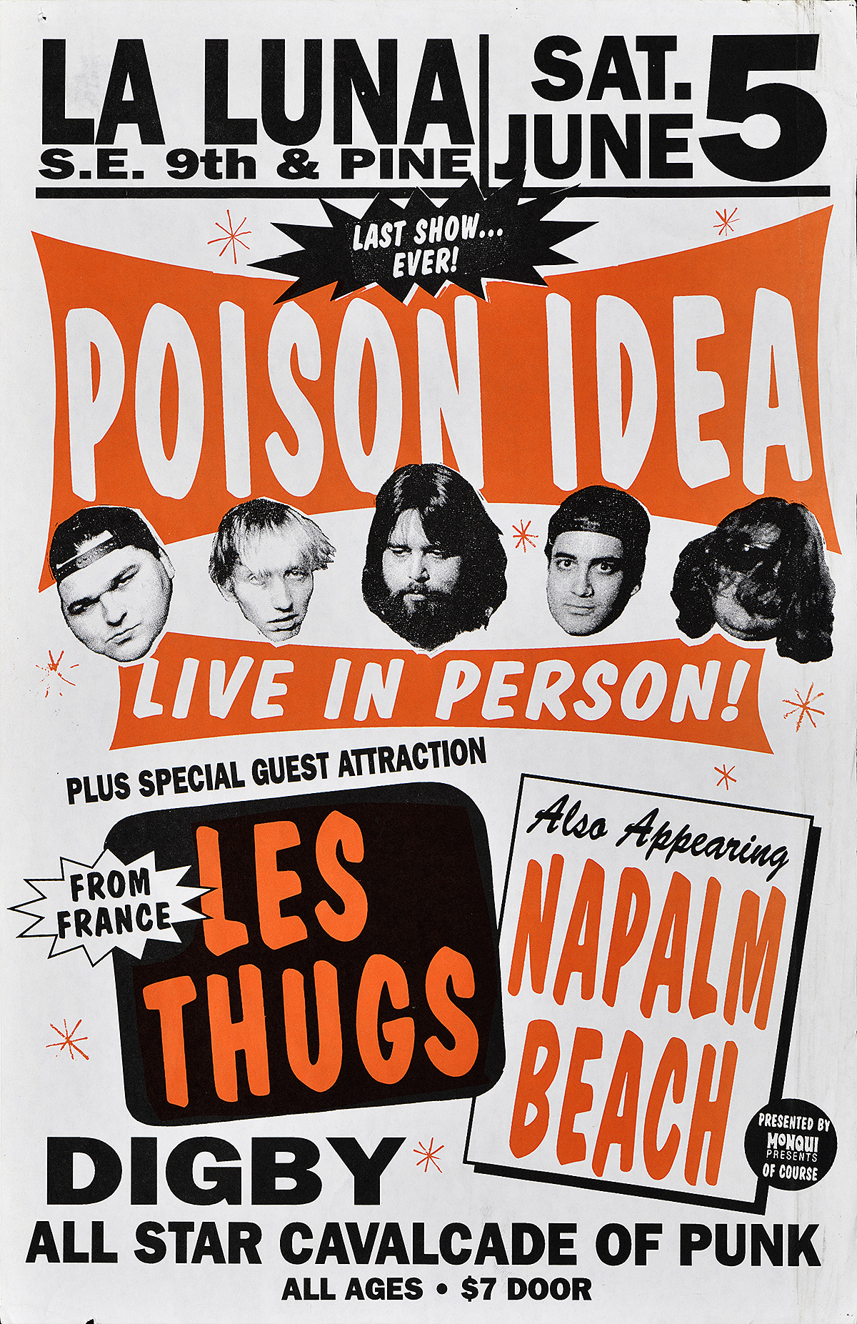
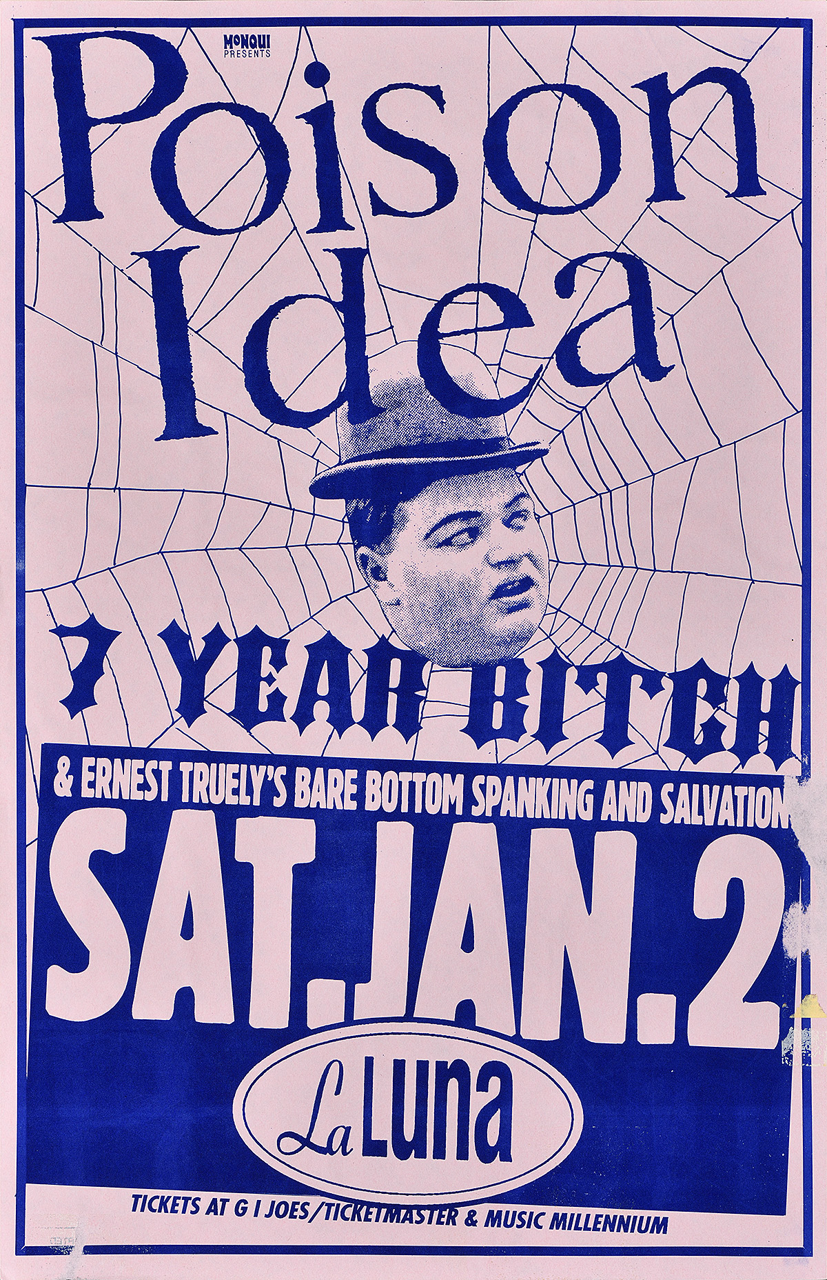
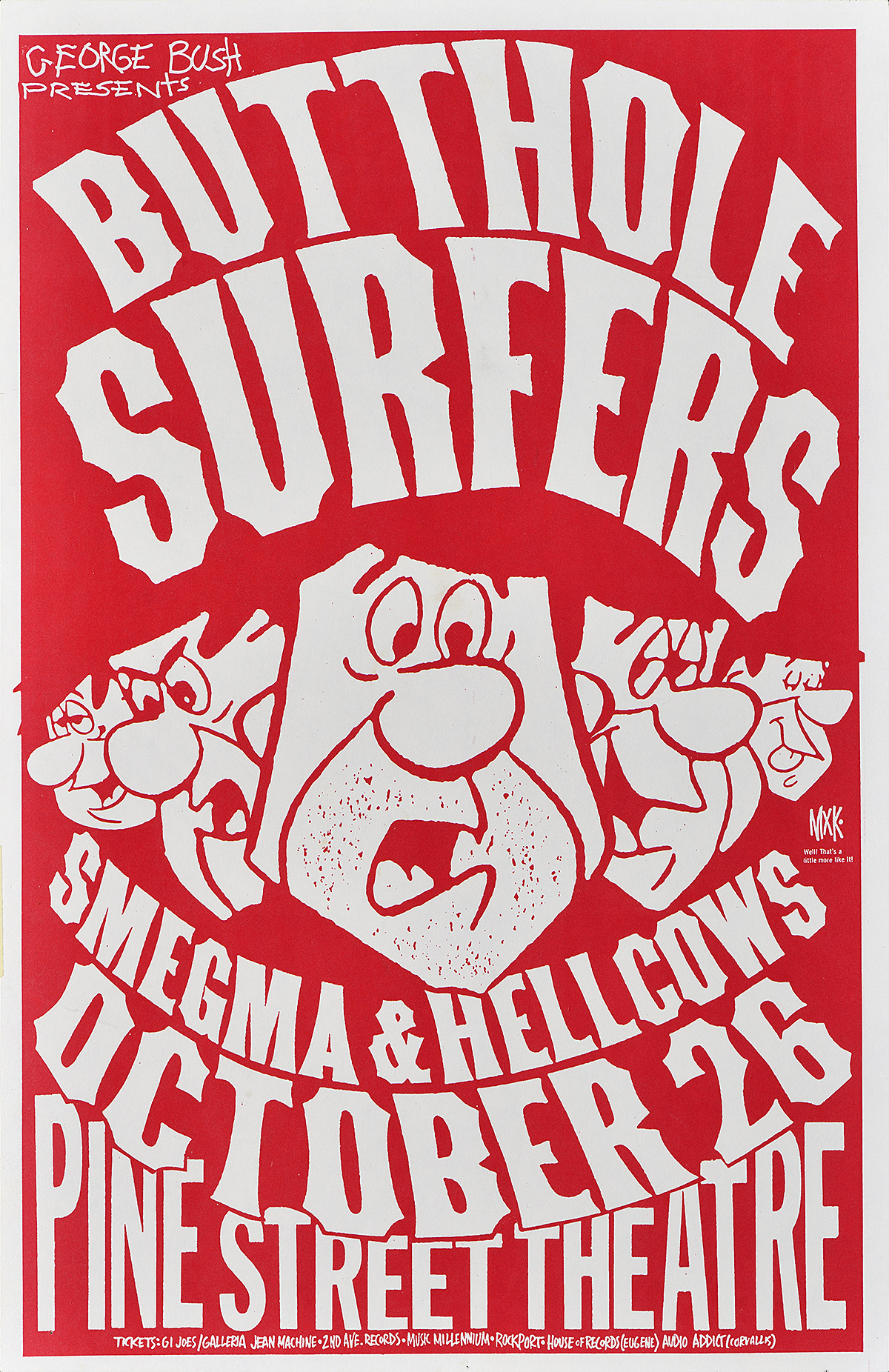
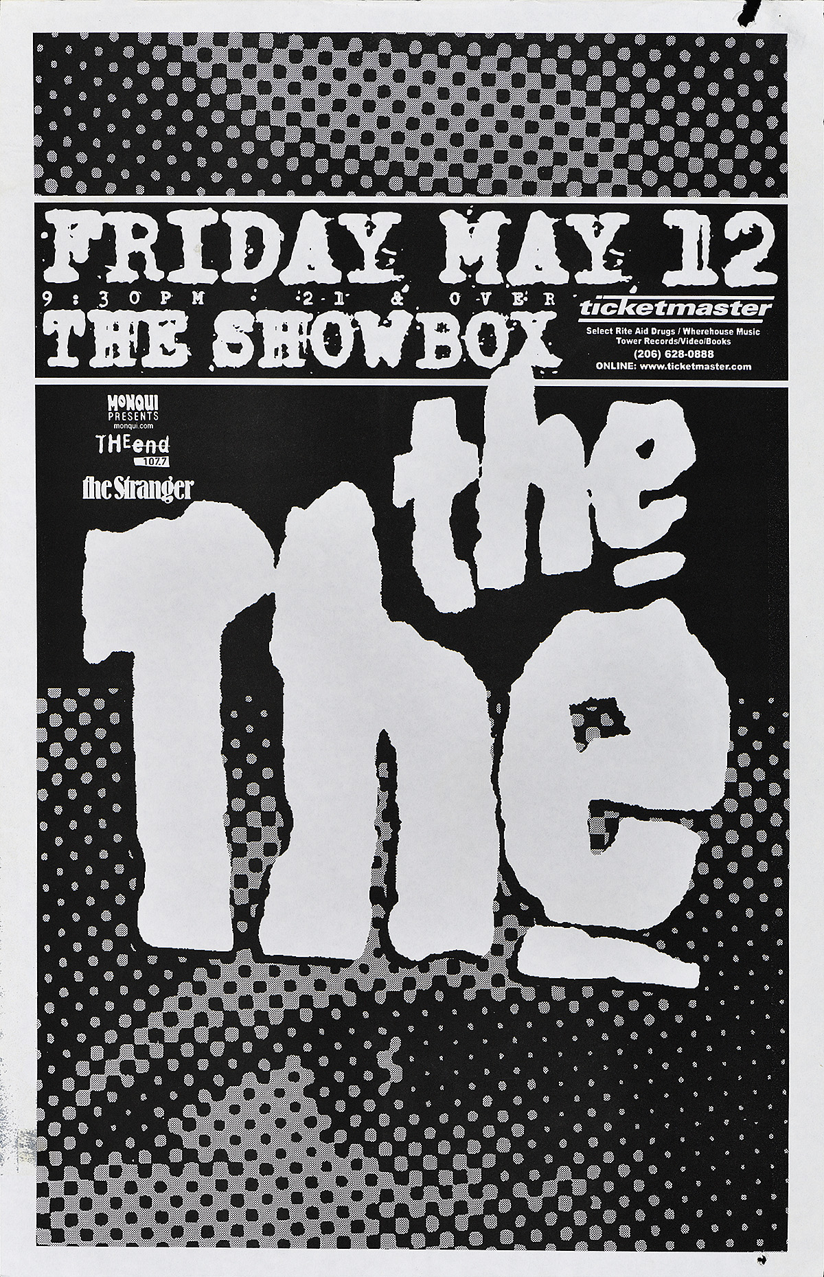
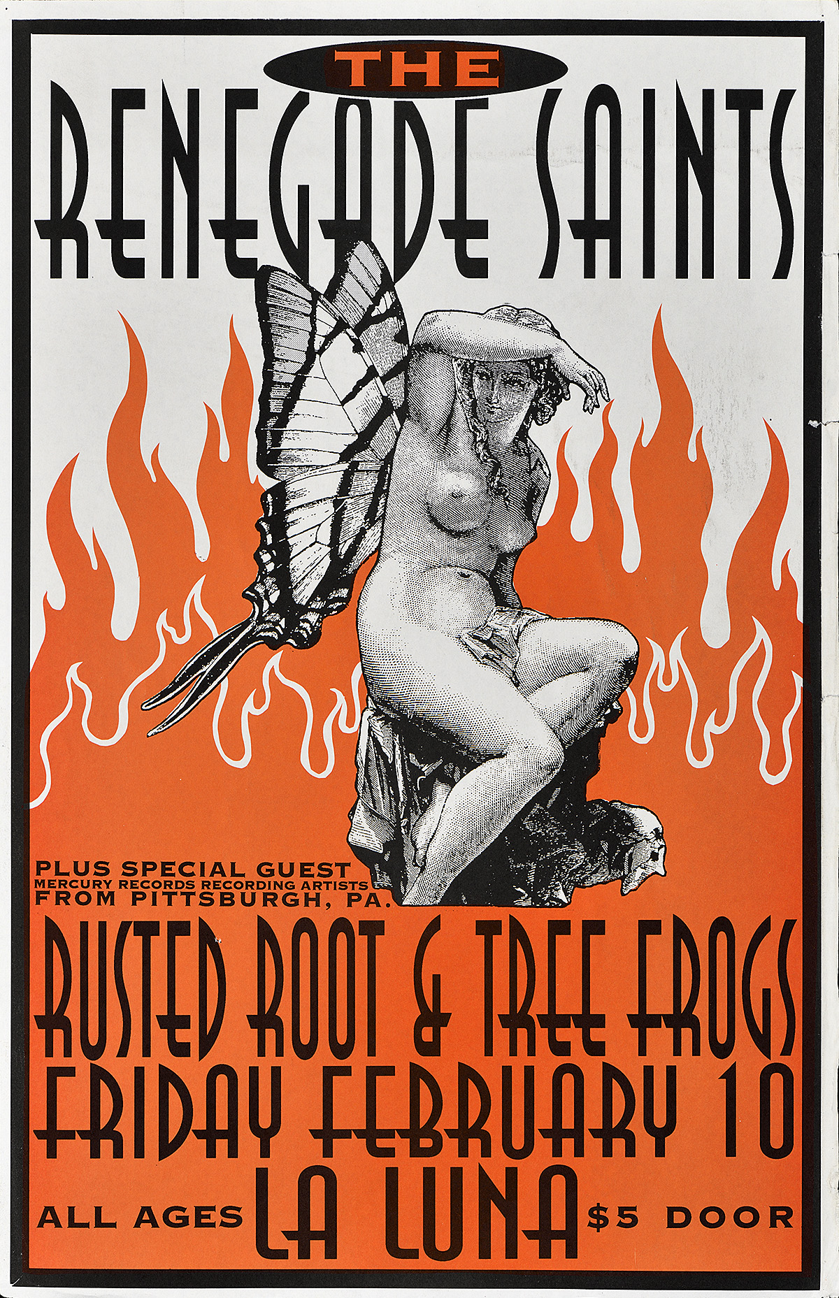
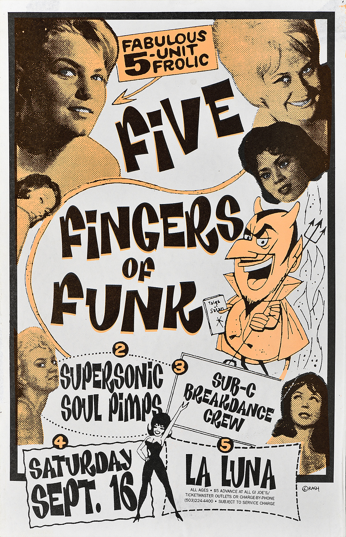
In 1983, Mike walked into a promoter’s office in Portland, Oregon, looking to book a gig for S.P.I.K.E. (Society’s Problem is Killing Everything), a band in which he performed. He noticed a guy in the corner struggling to make a half-decent flyer for another group, and, ever precocious, announced that he could do it better. A few hours later, he returned with a finished poster and the promoter gave him the job of creating posters for various bands. 


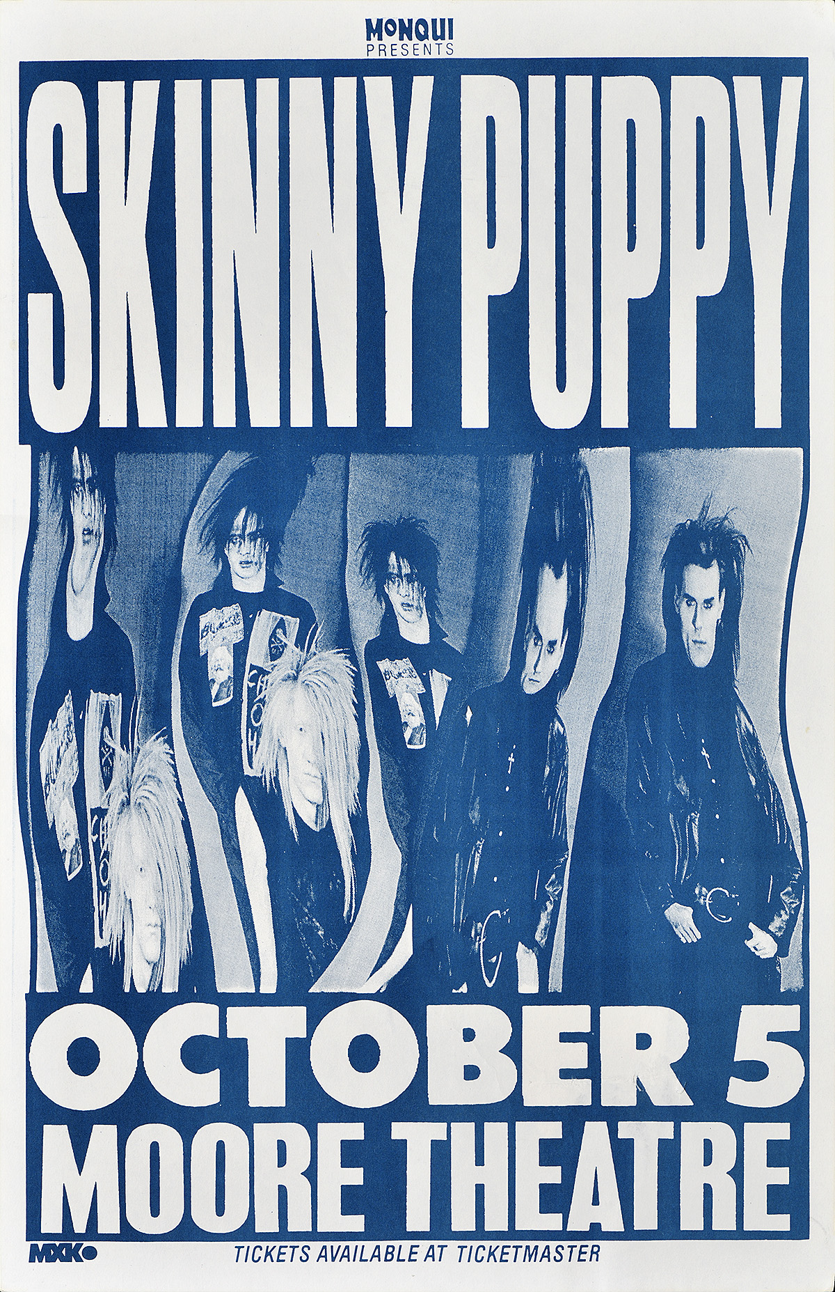
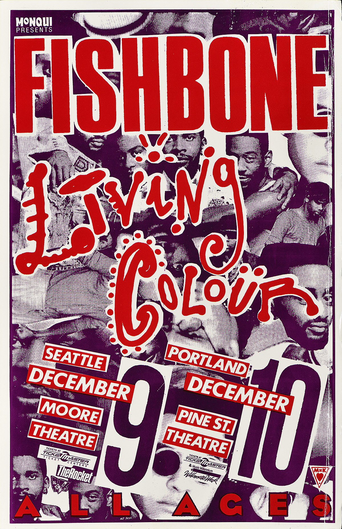
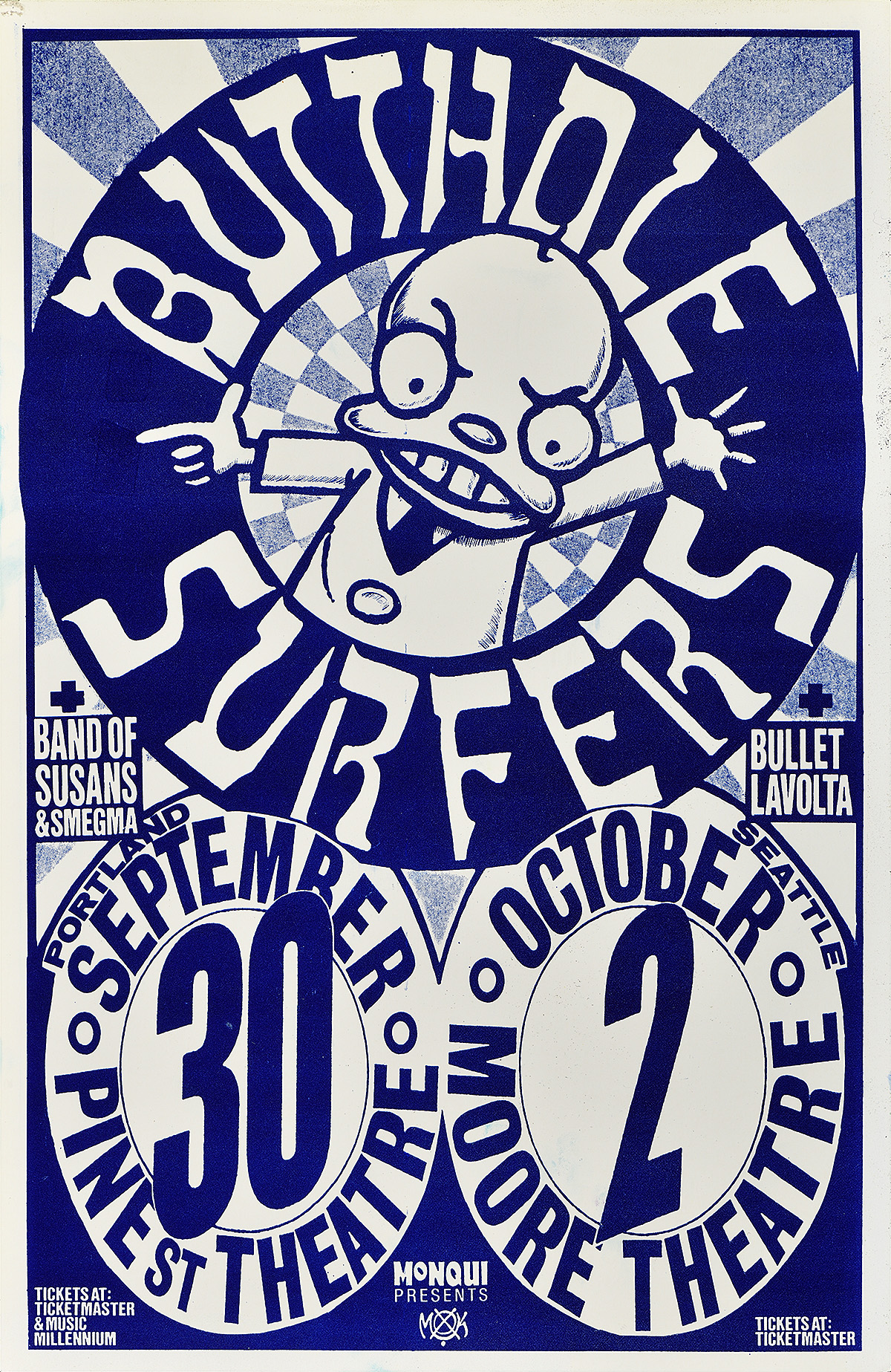
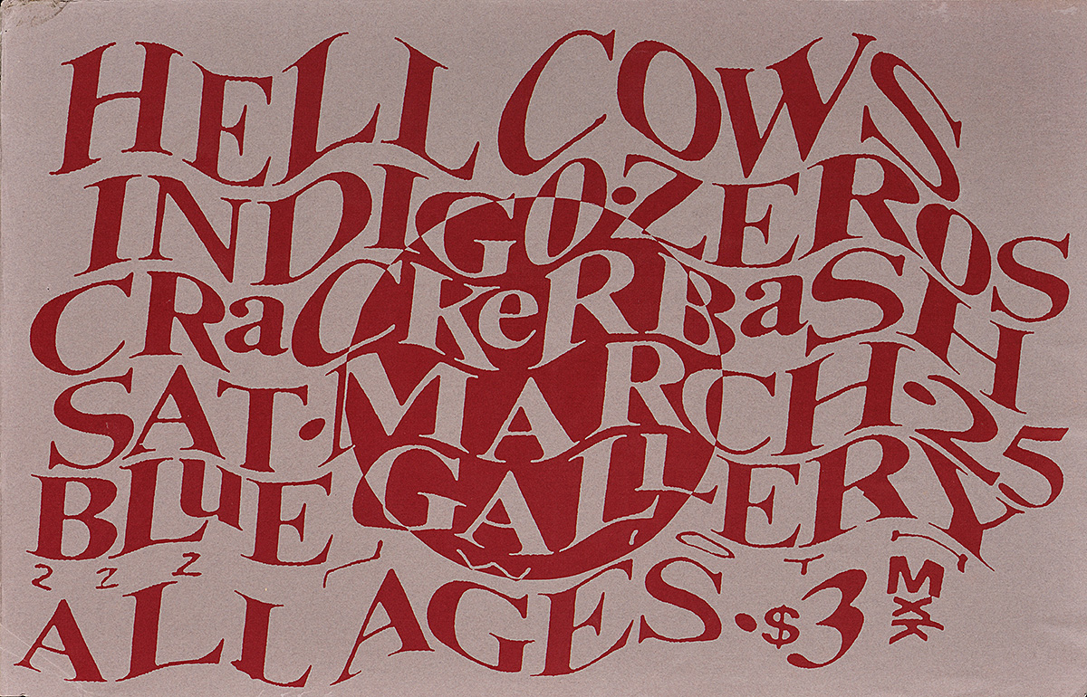
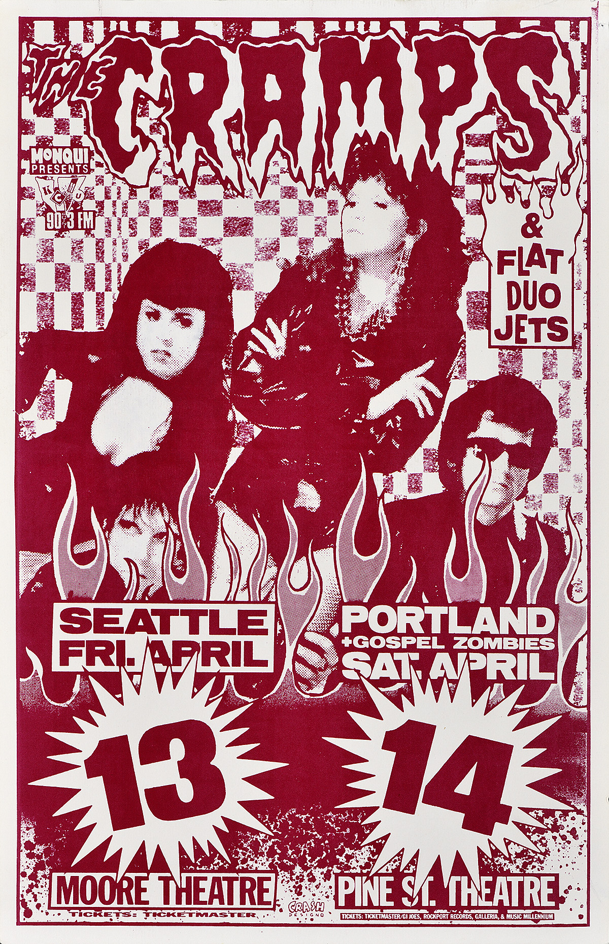
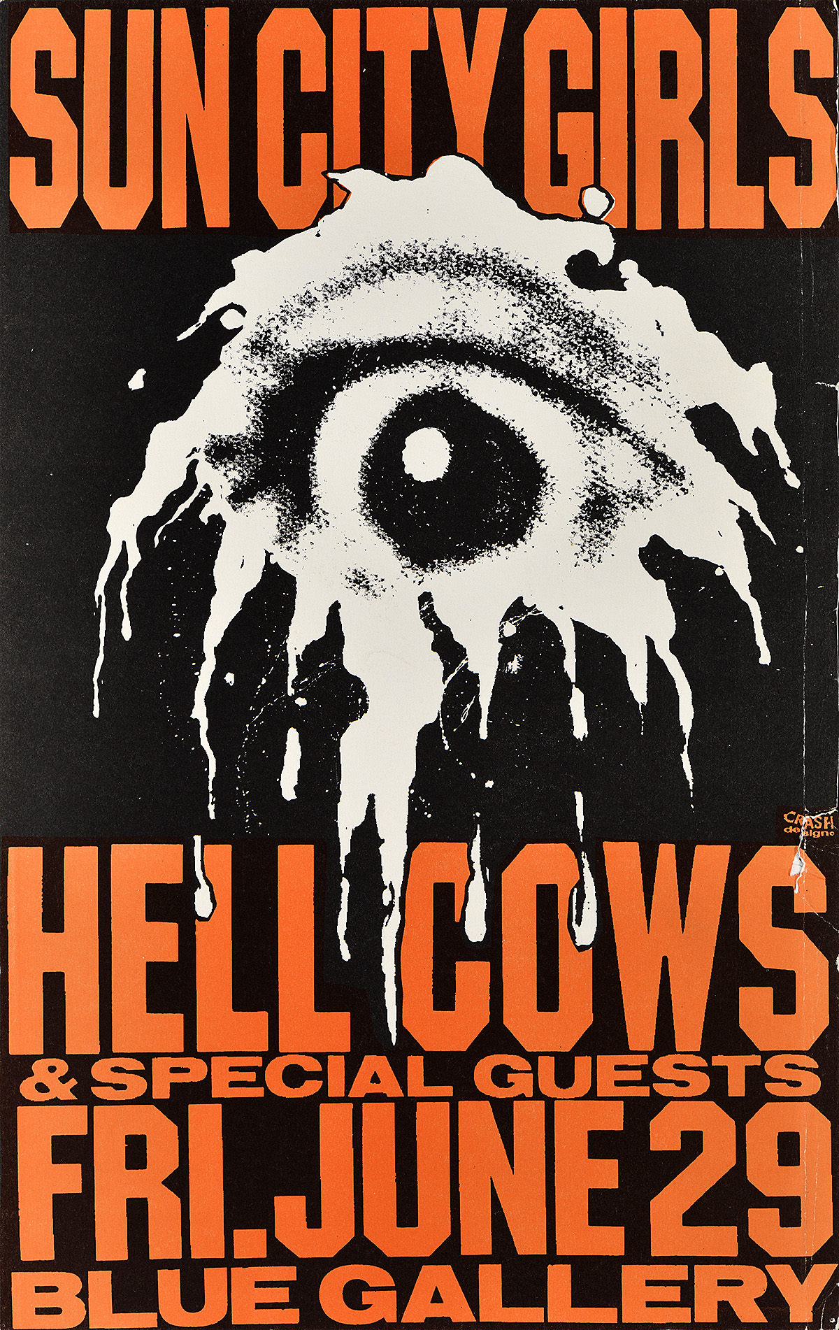
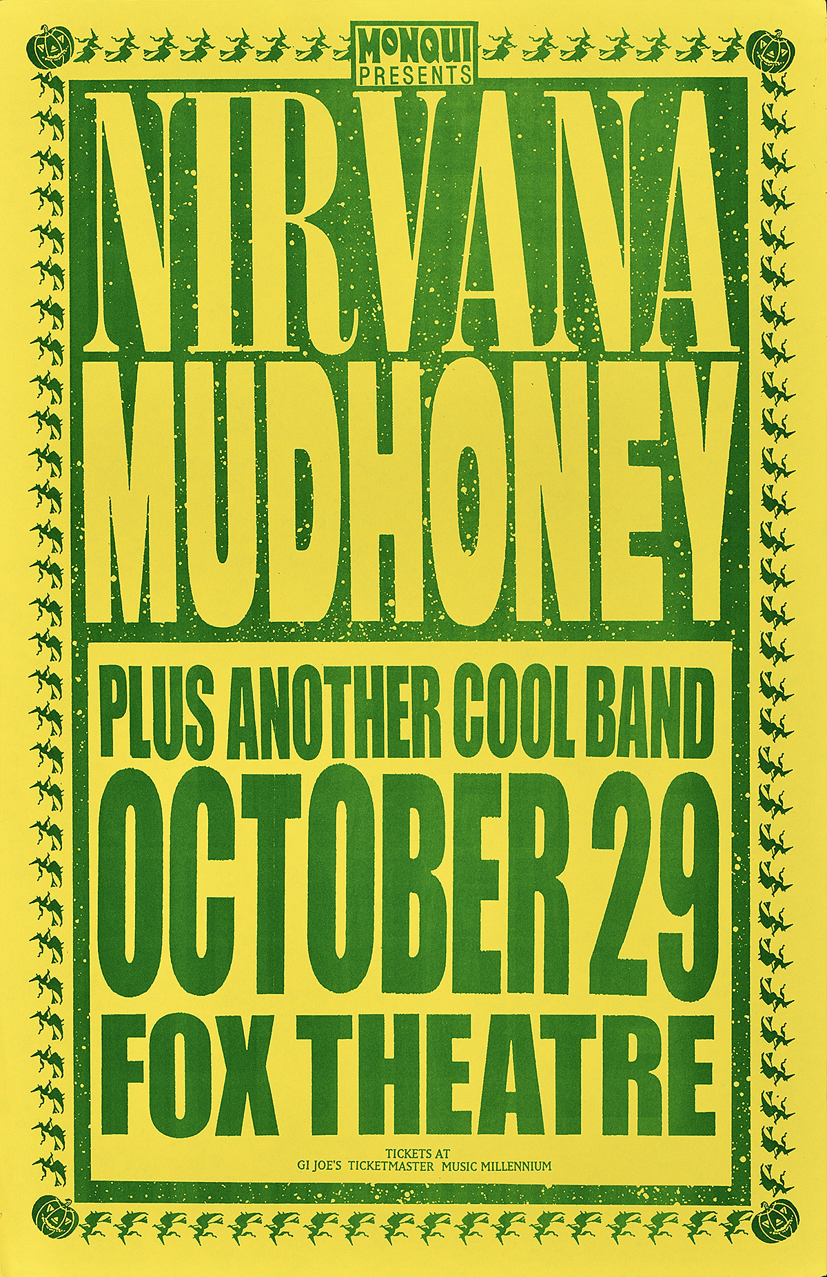
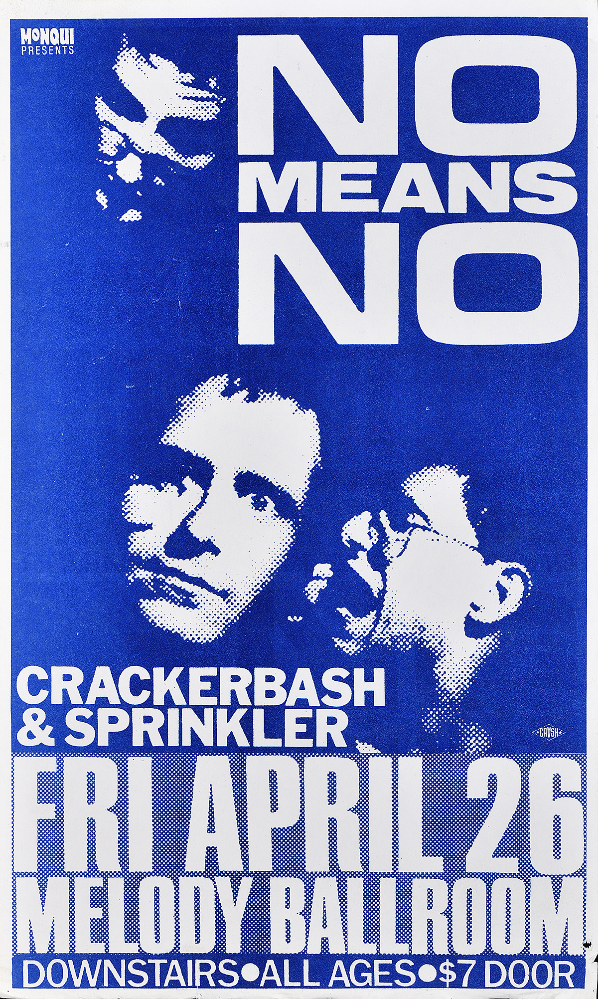
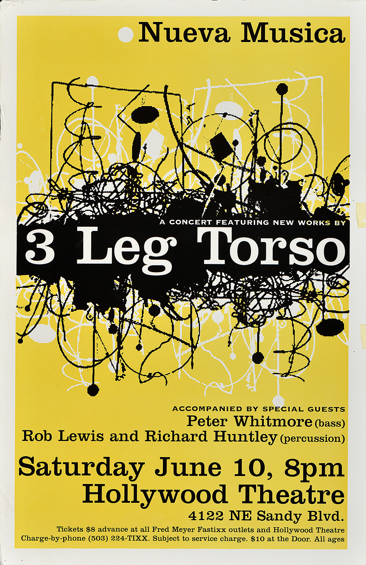
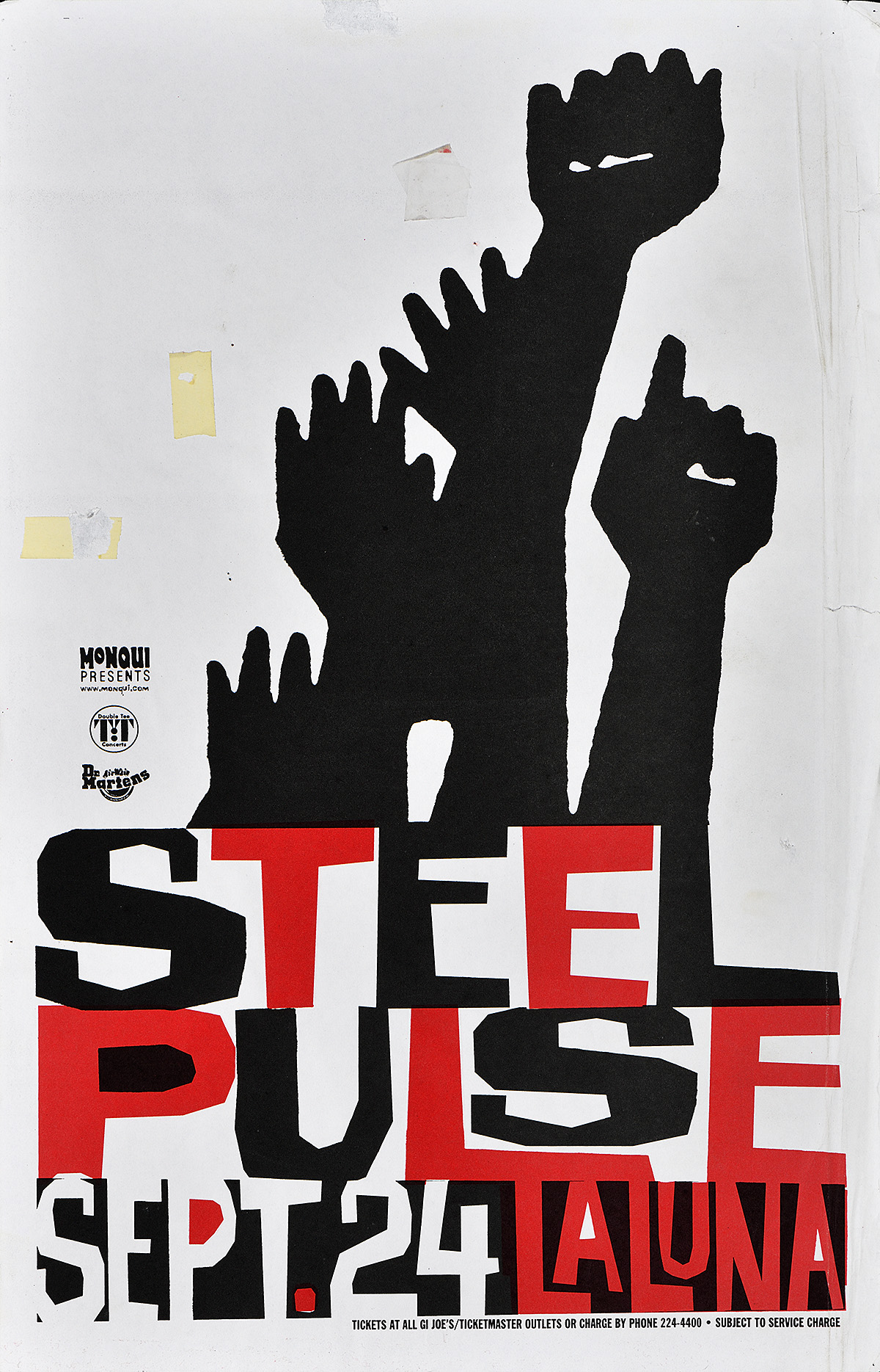
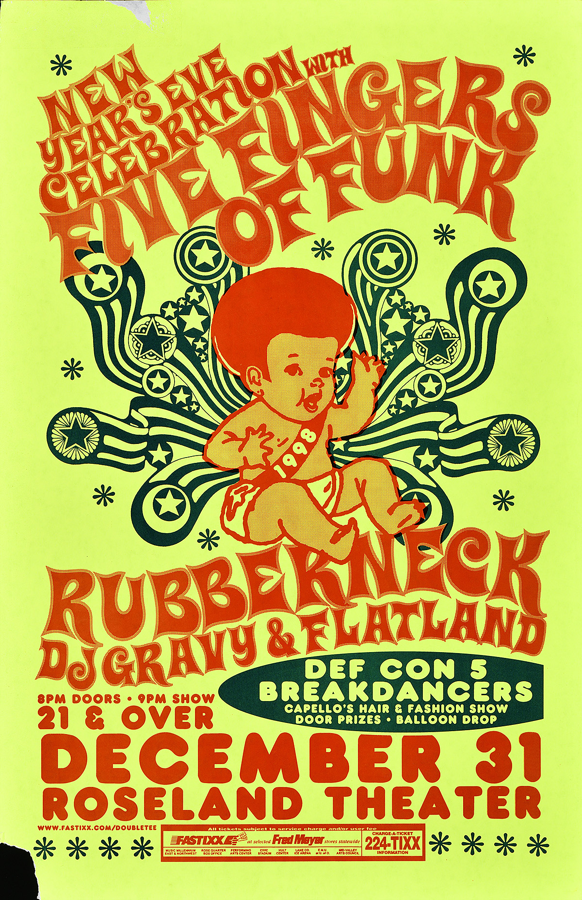
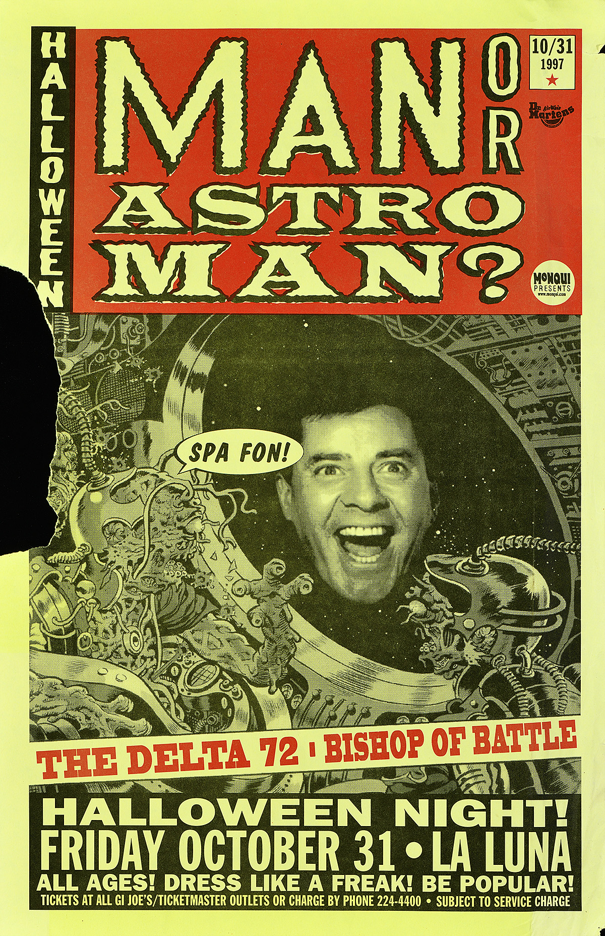
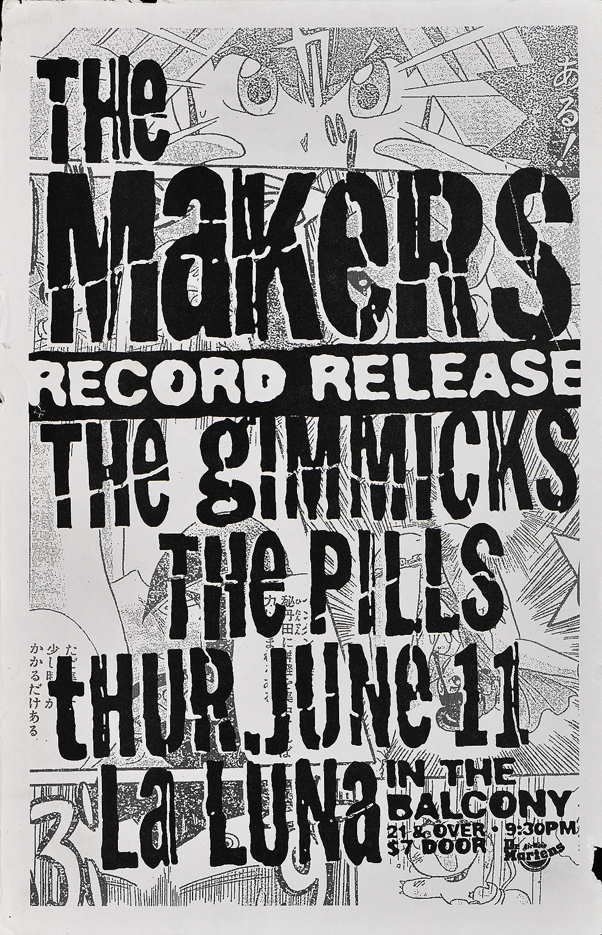
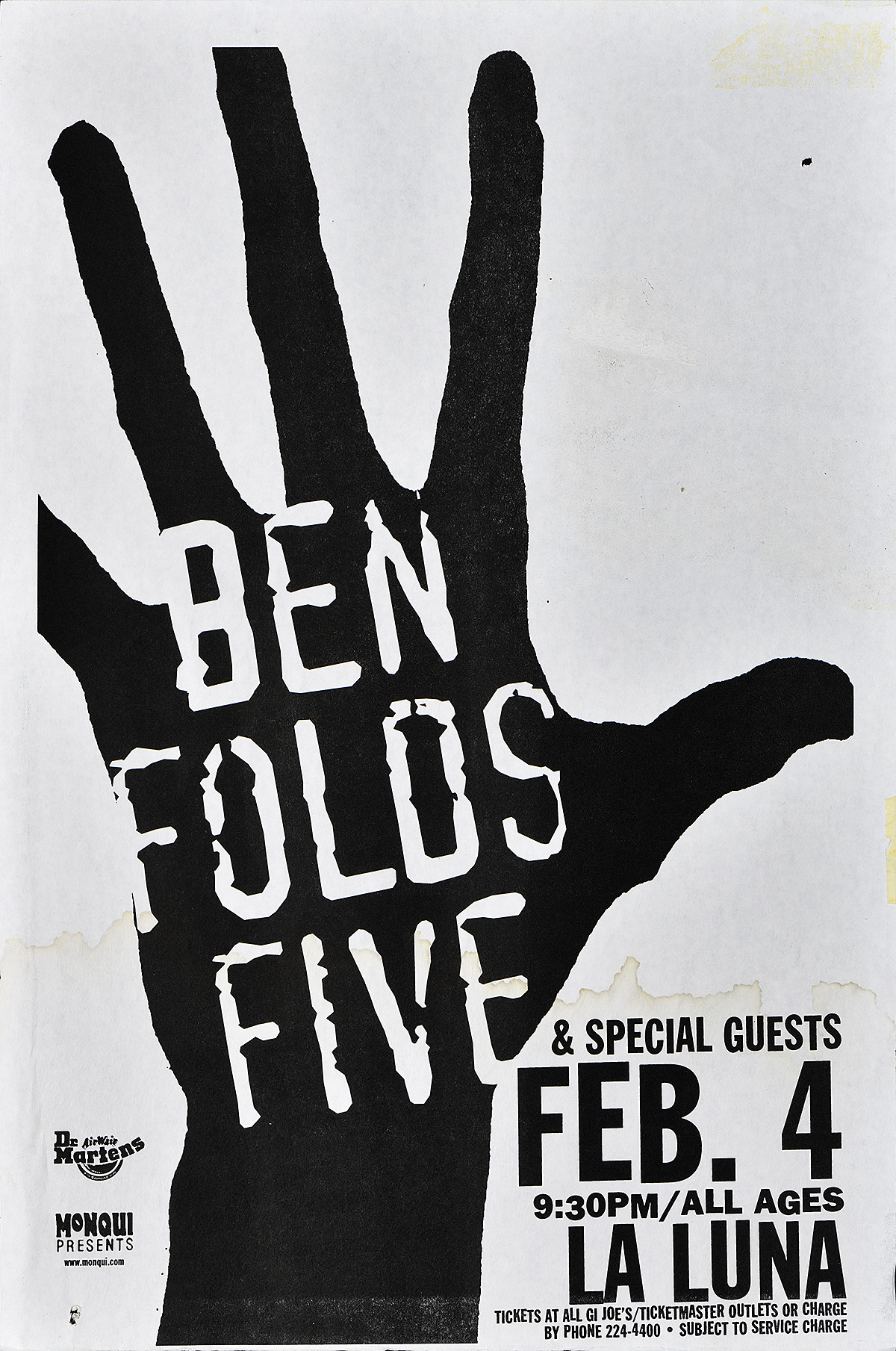
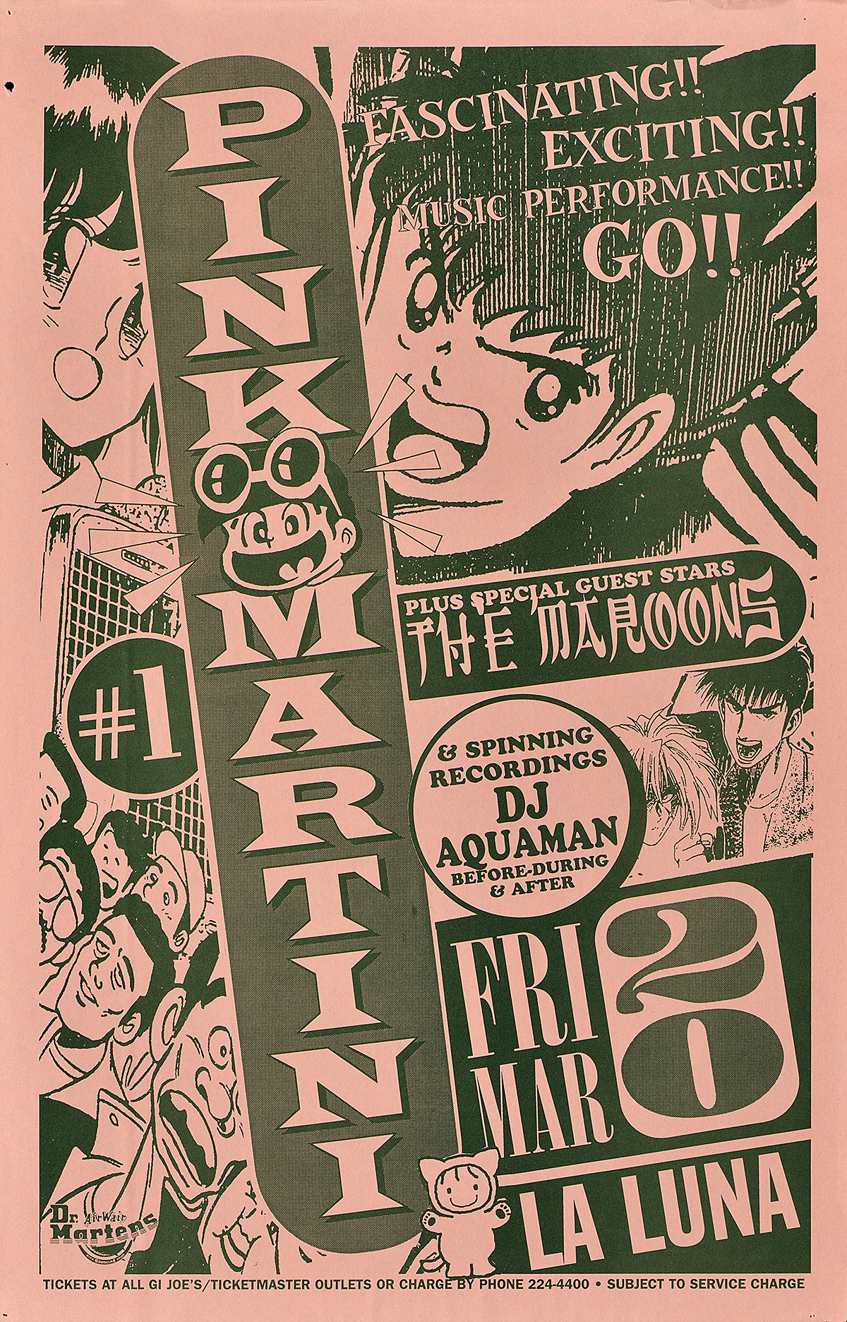
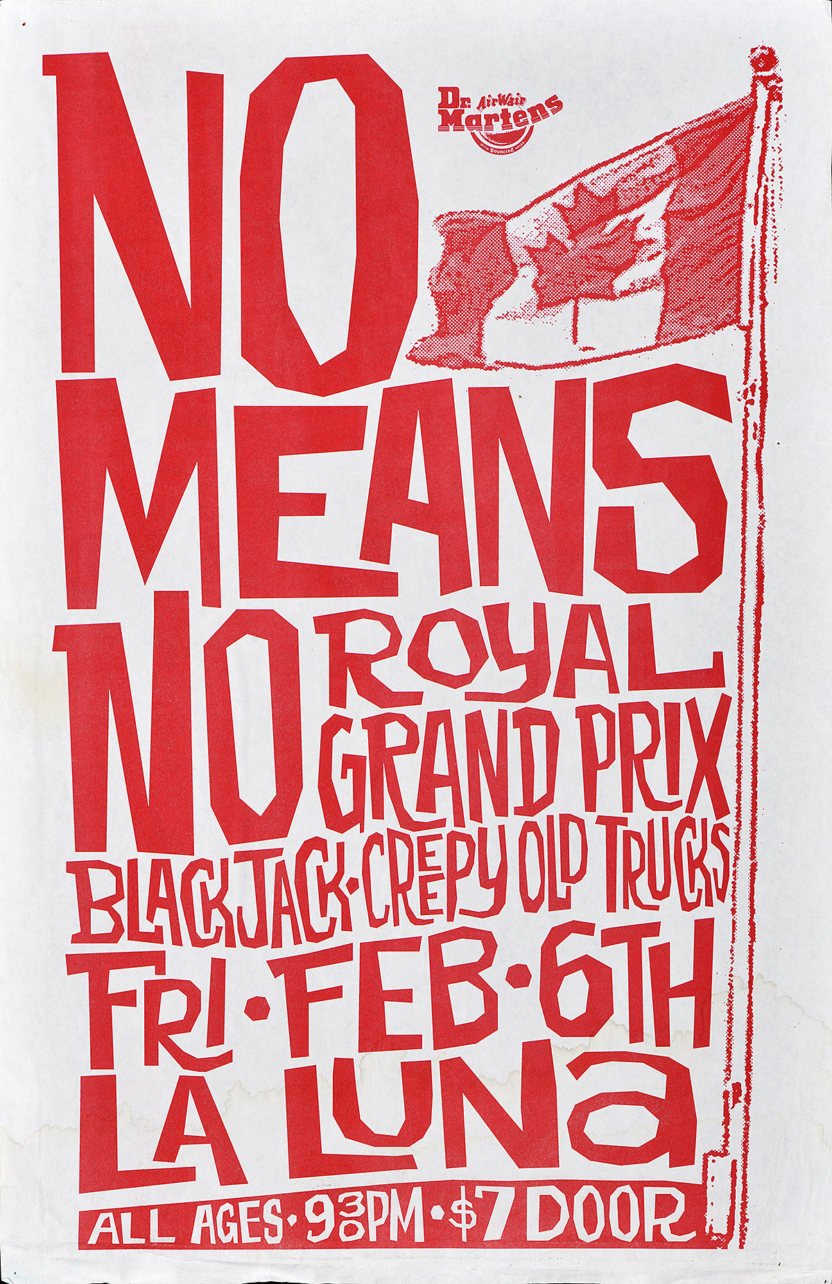
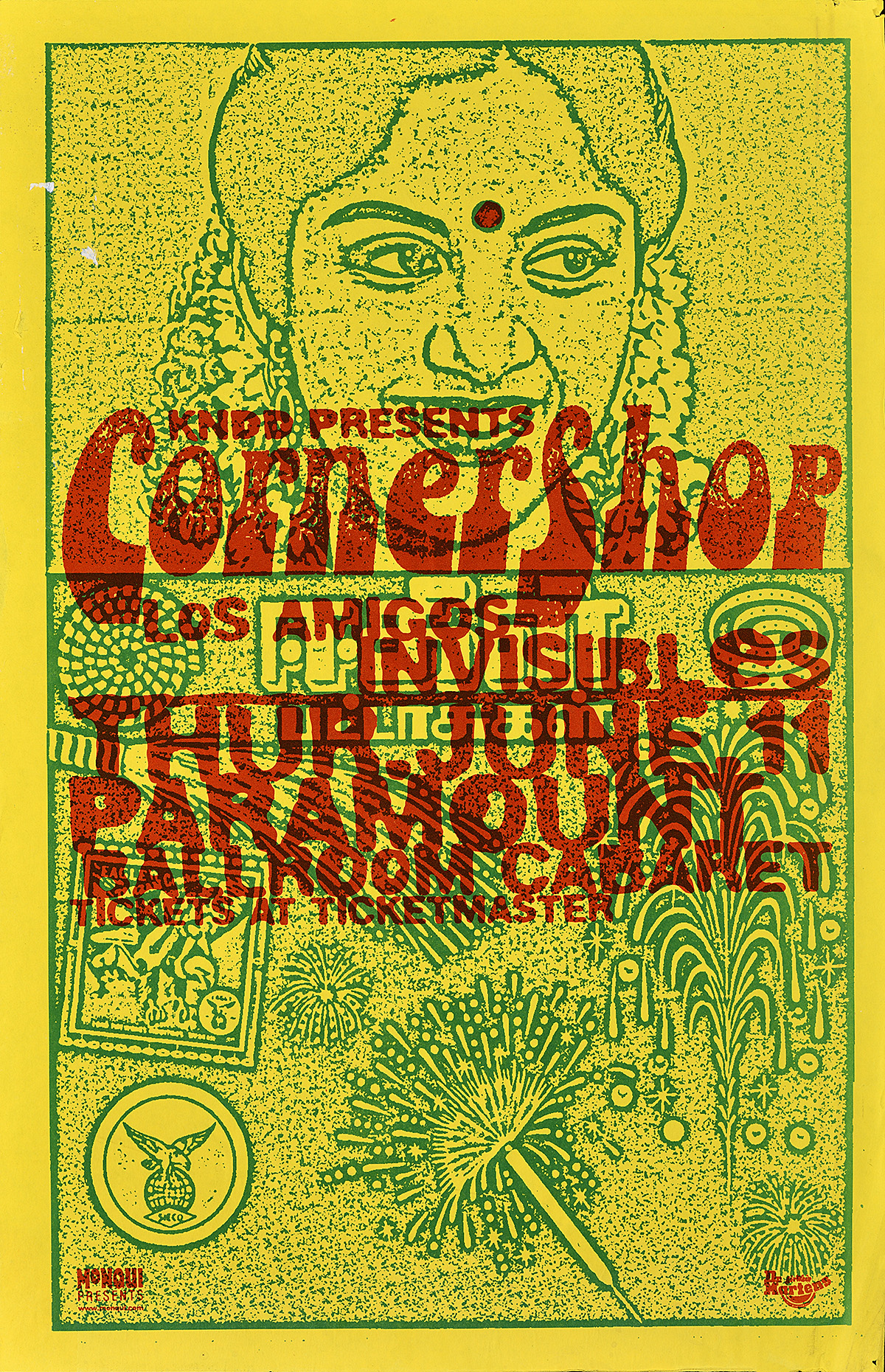
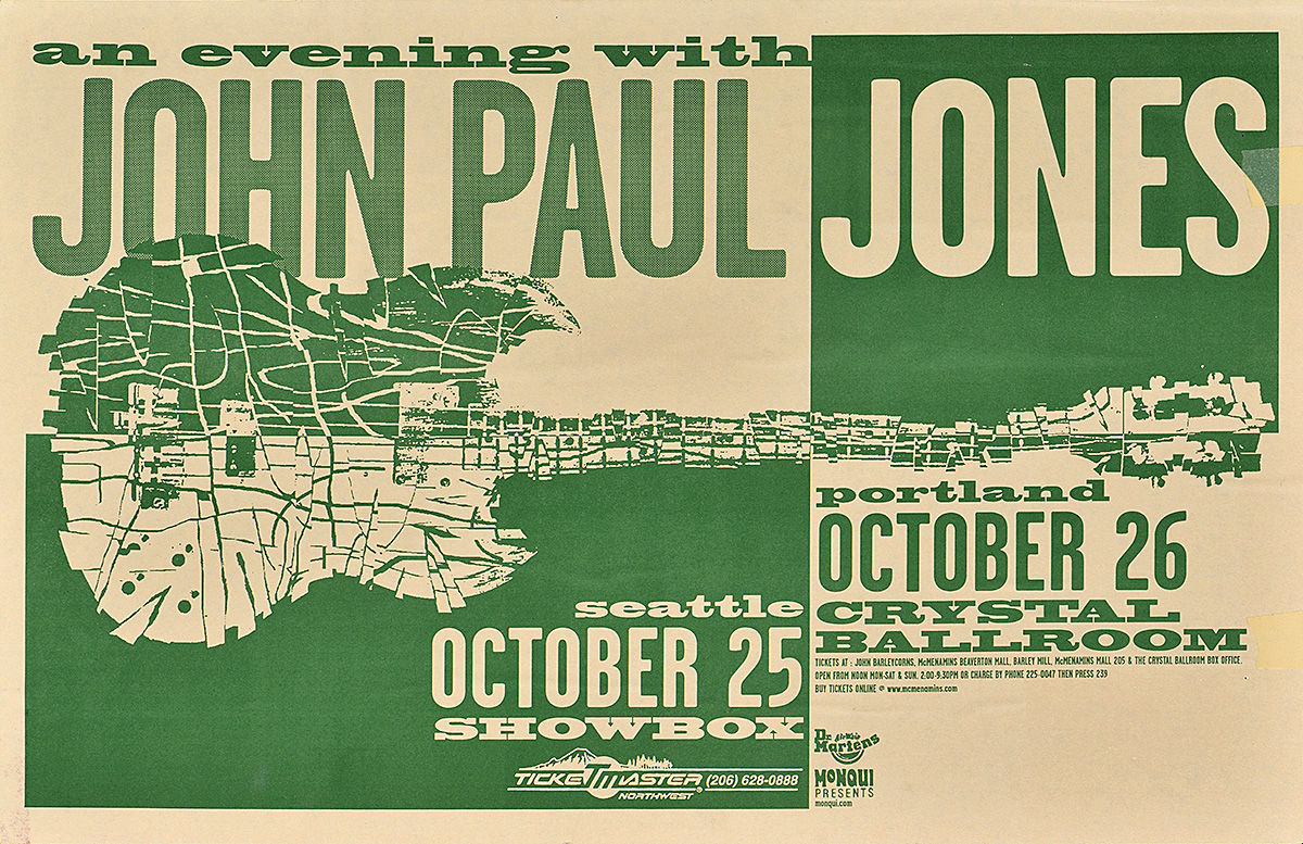
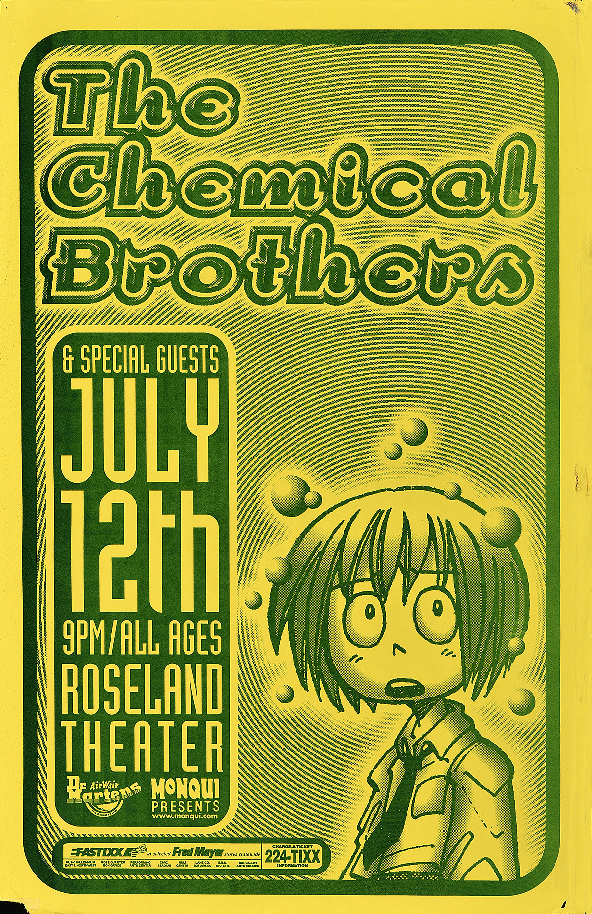
At the time, Mike worked at a copyshop, allowing him unfettered access to a photocopy machine that would become the primary tool for most of his early work. He had learned the basics of graphic design from a friend’s mother when he was a kid, realizing that if one did not have access to expensive rub-down type or a complete alphabet from which to make a zine or flyer, large text photocopied from magazines was the next best thing. Over the years, he scoured publications for interesting lettering and copied pages from Dover typography books that he would then cut up, rearrange, and paste to a sheet of paper alongside swiped images to create everything from zines to handbills. Armed with X-Acto knives and a glue stick, Mike became a one-man design studio reflecting the current of the Pacific Northwest’s late-20th century counterculture of grunge and punk.   


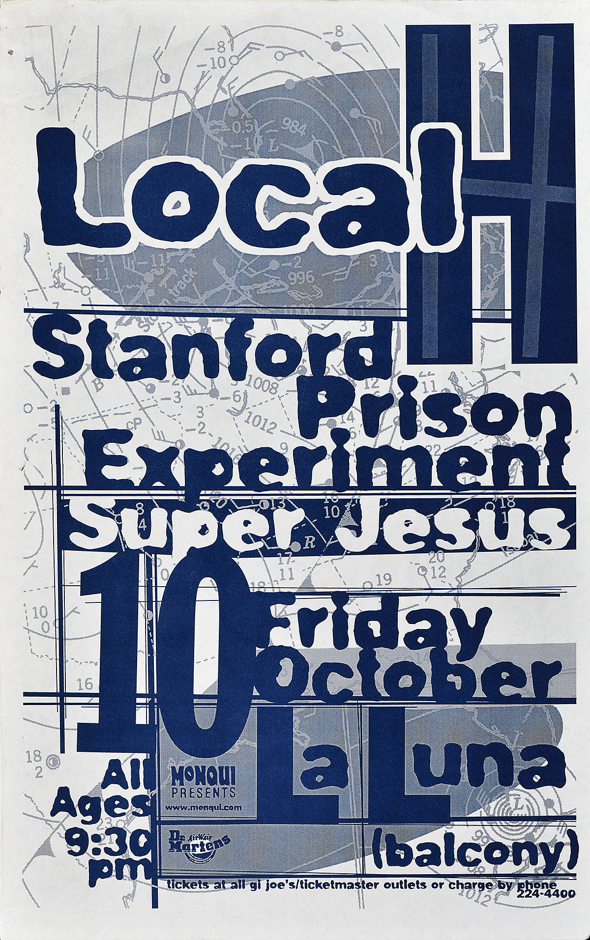
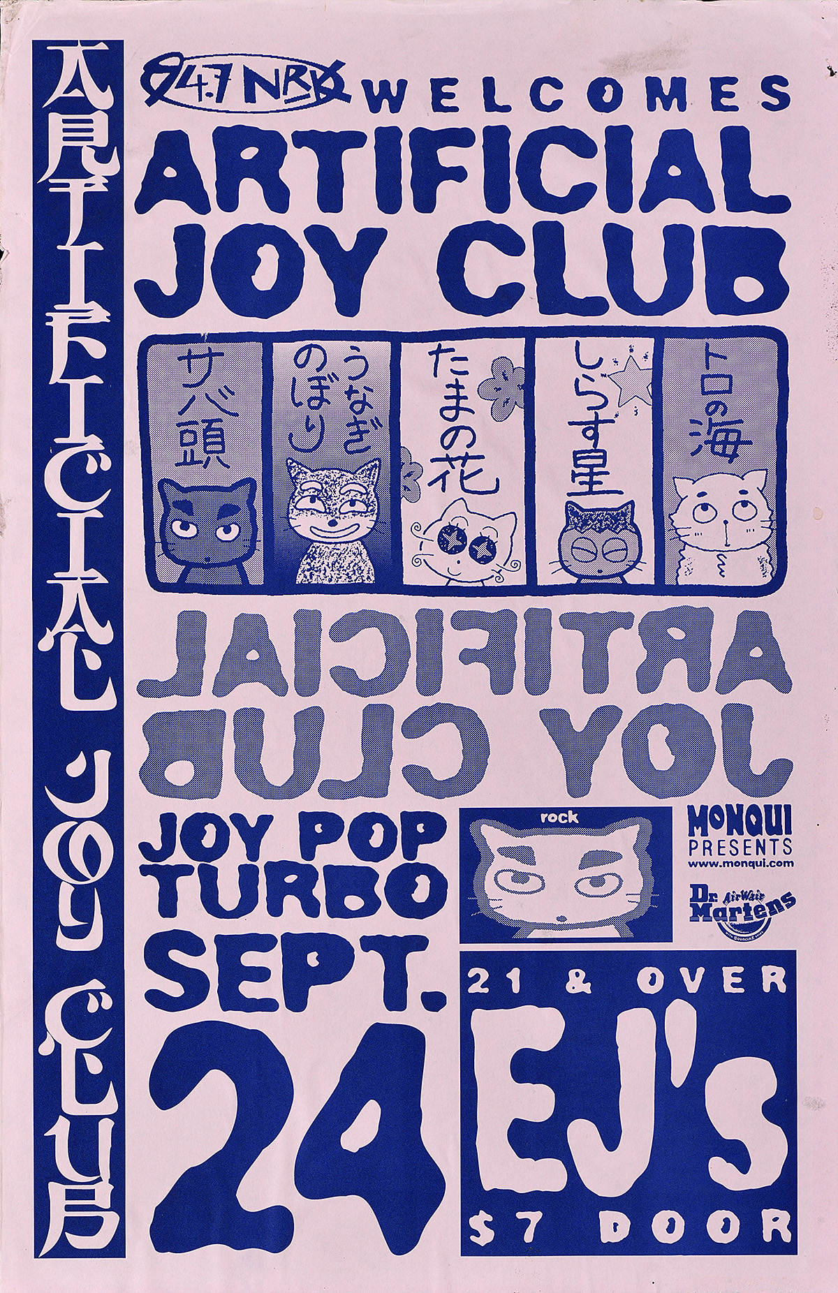
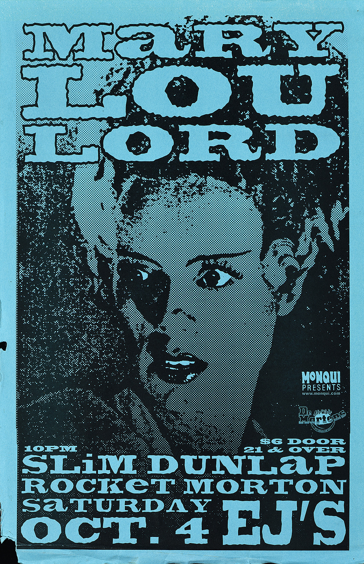
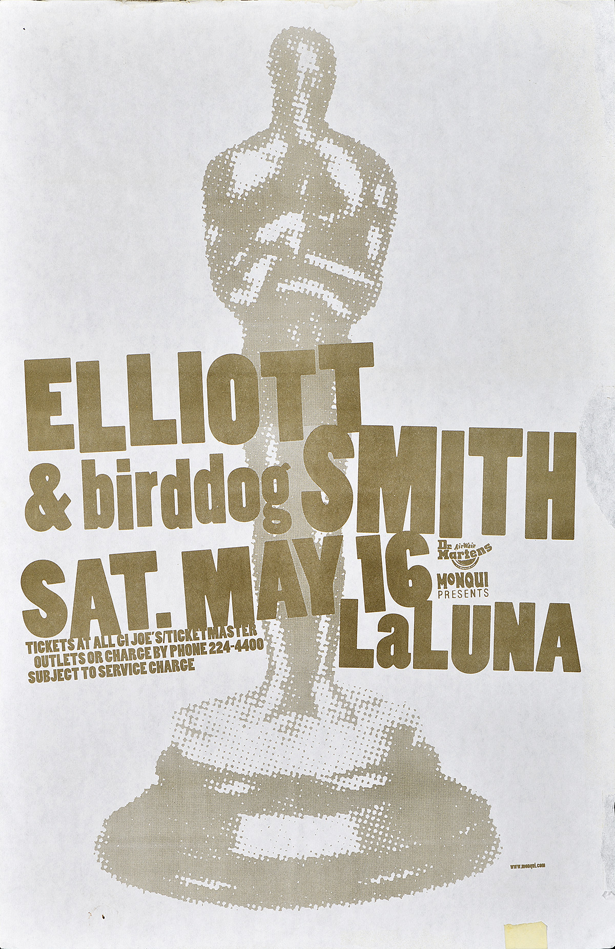
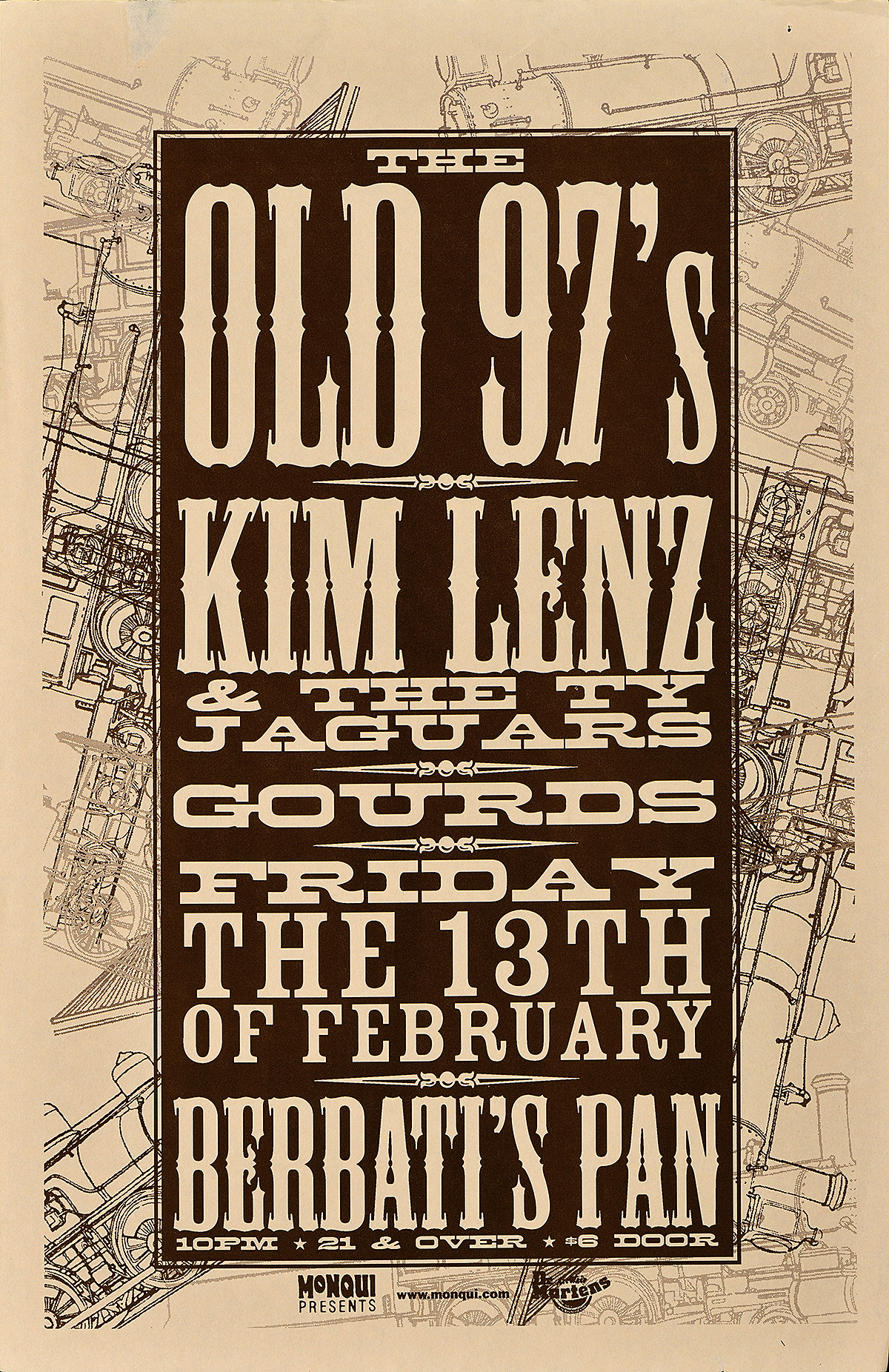
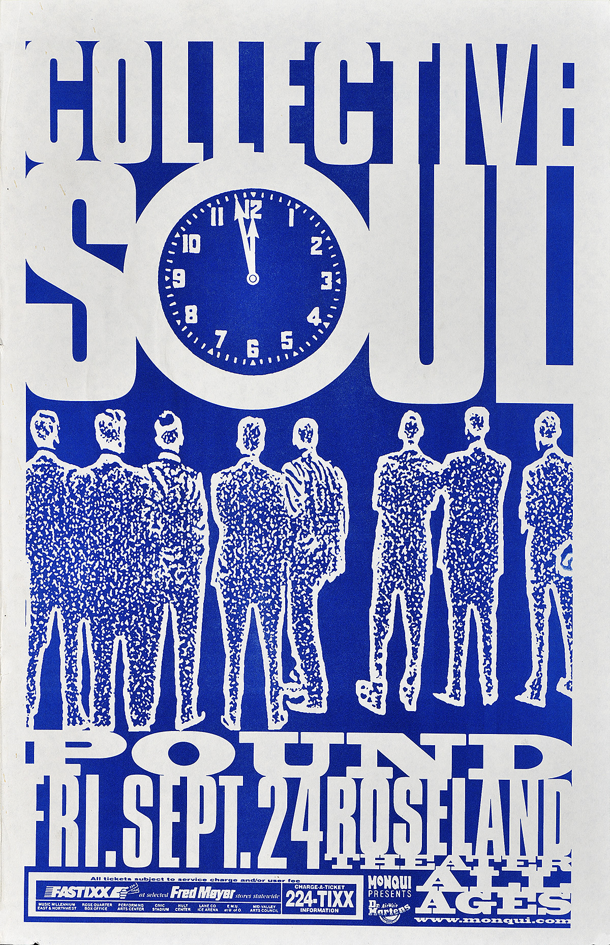
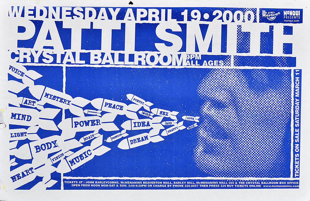
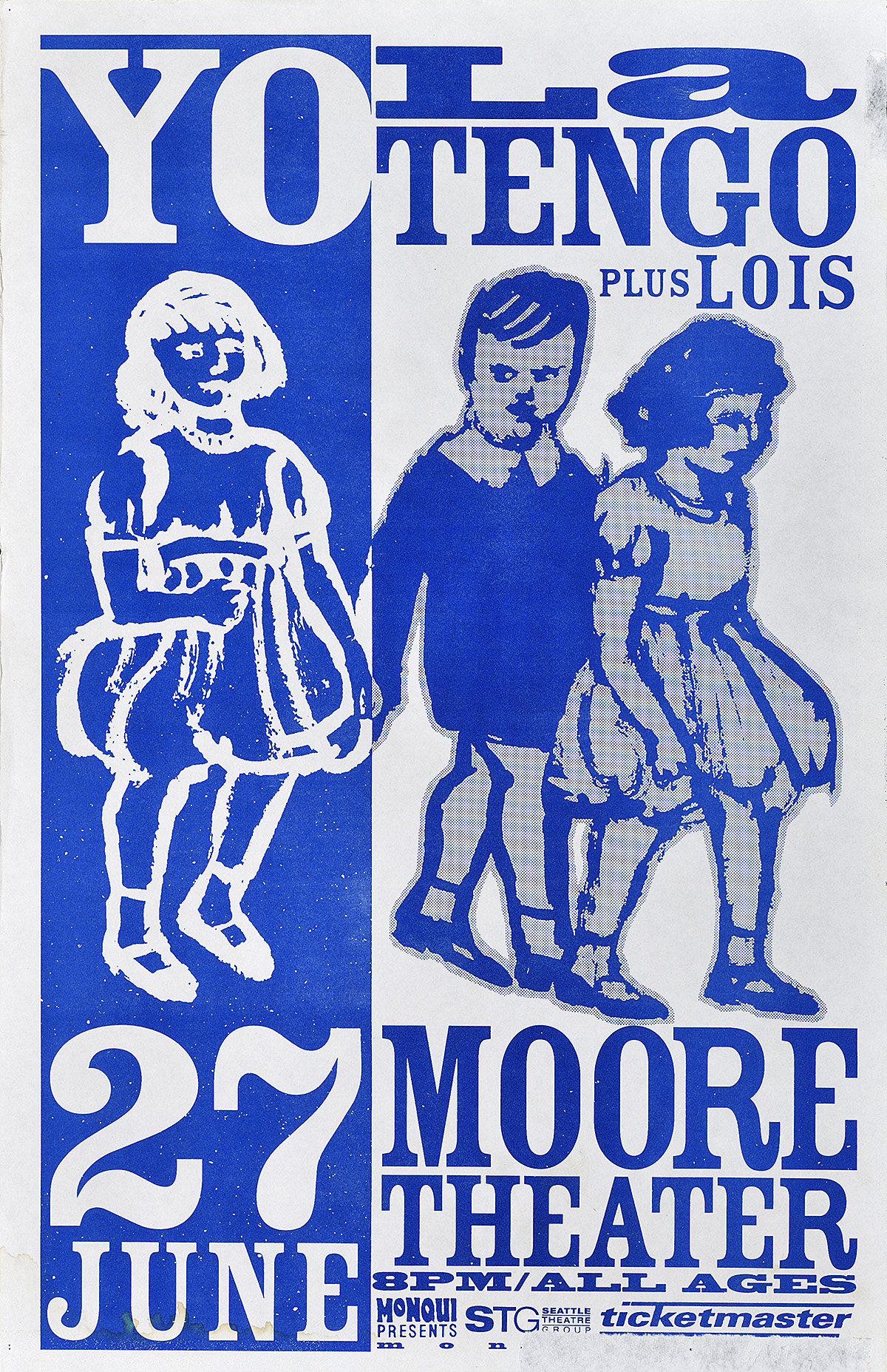
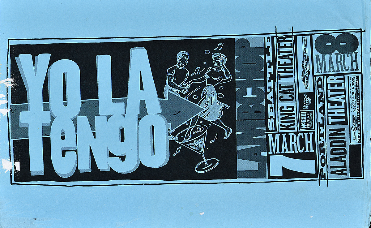
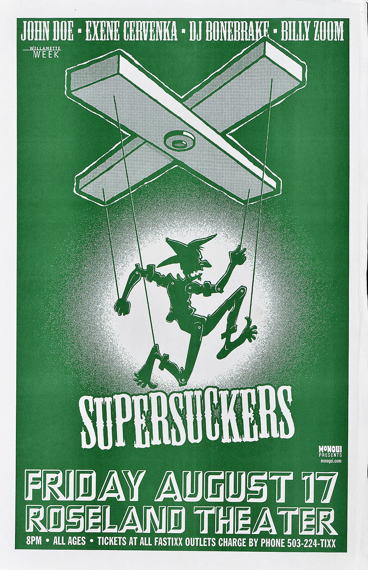
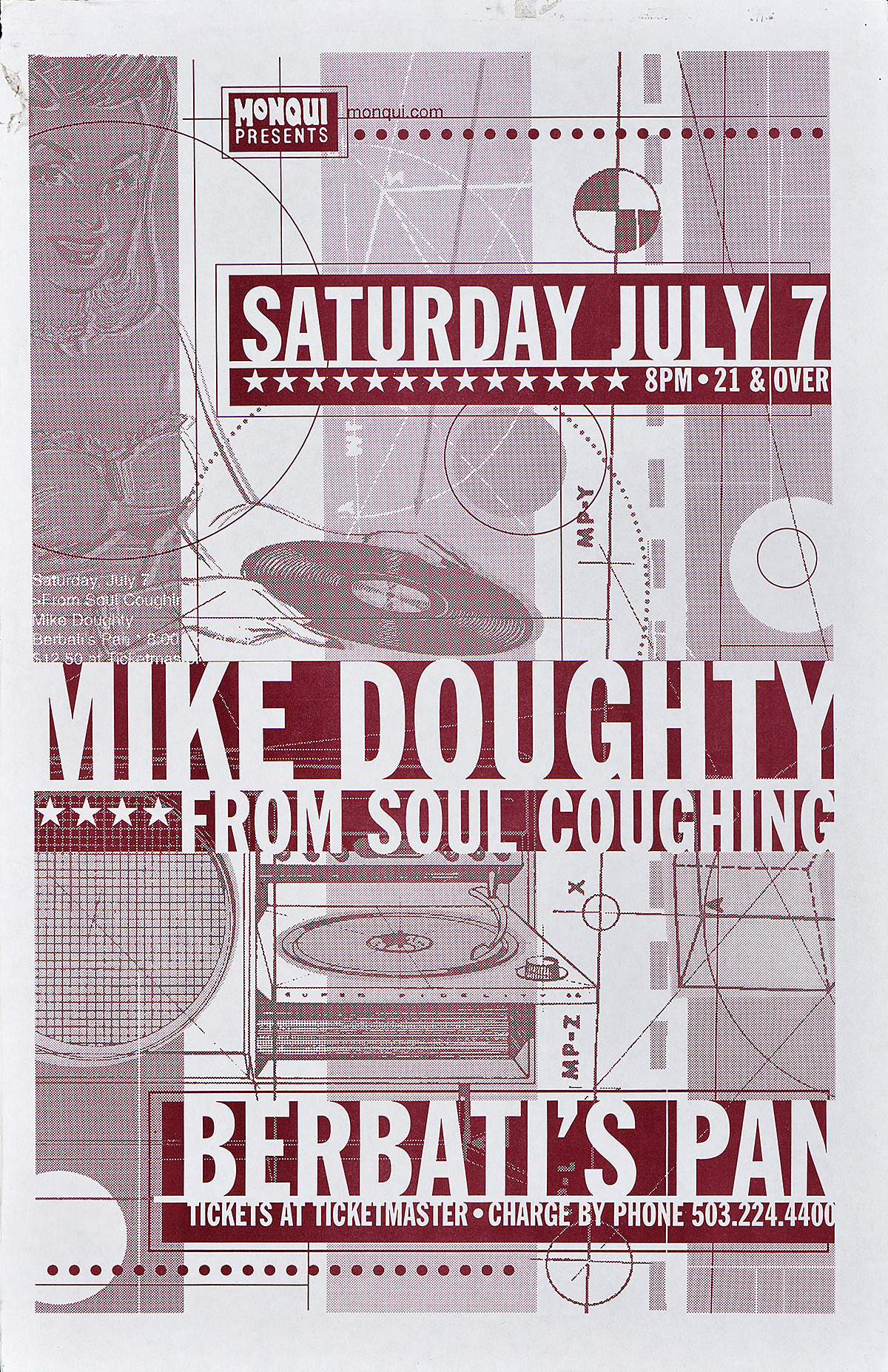
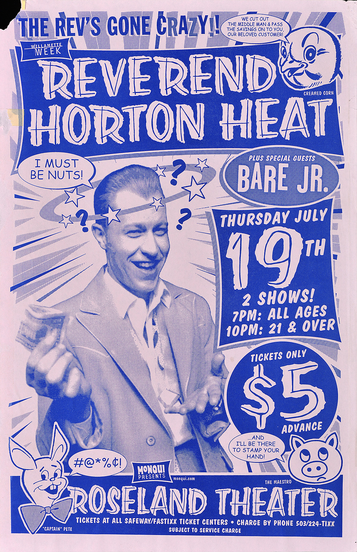
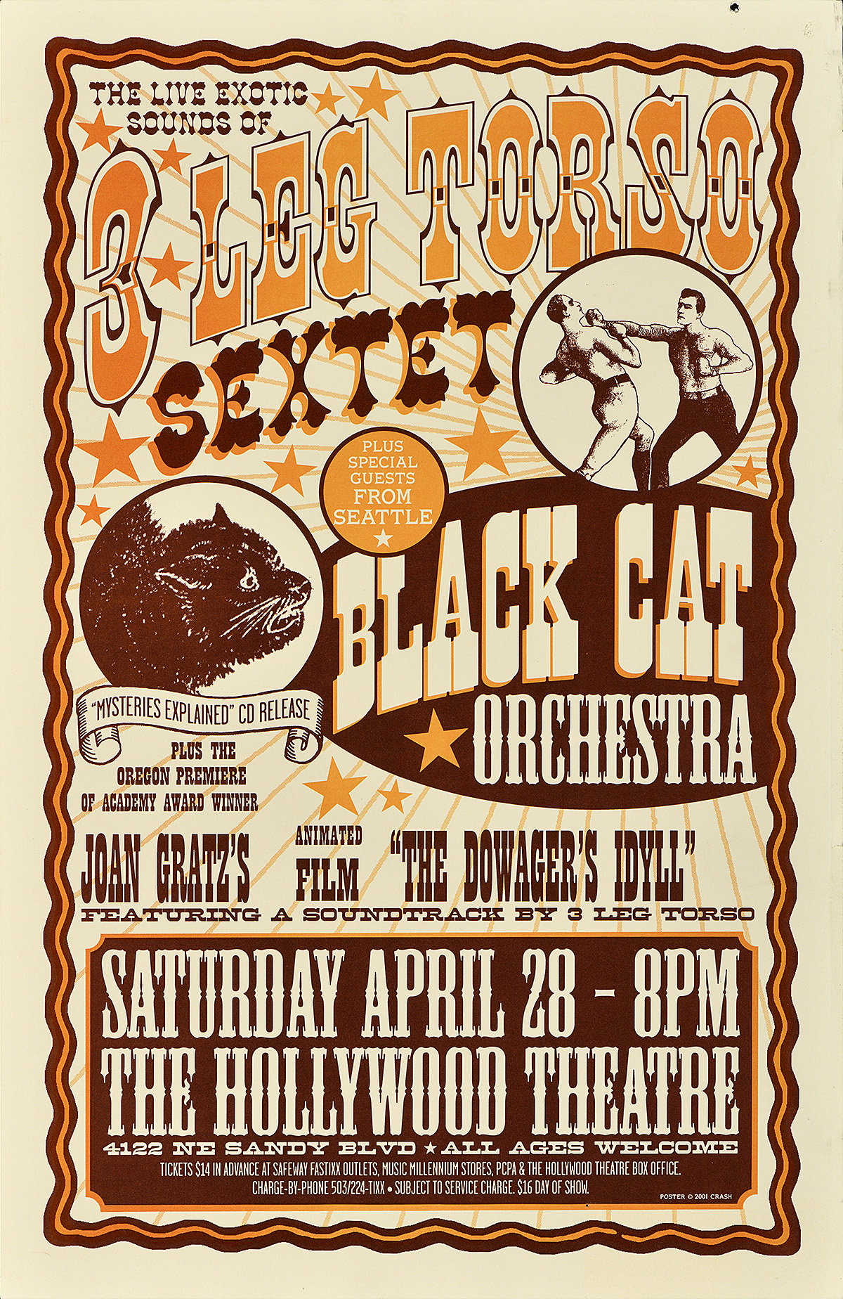
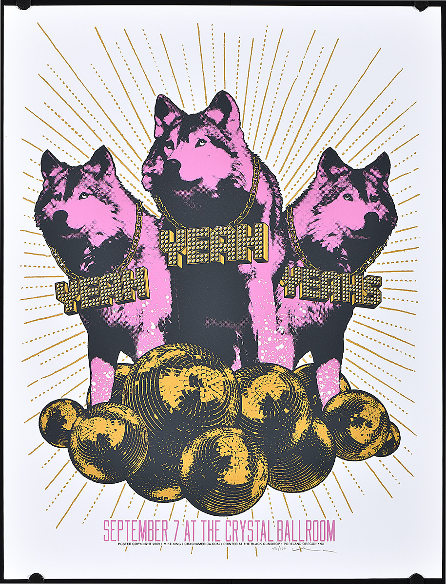
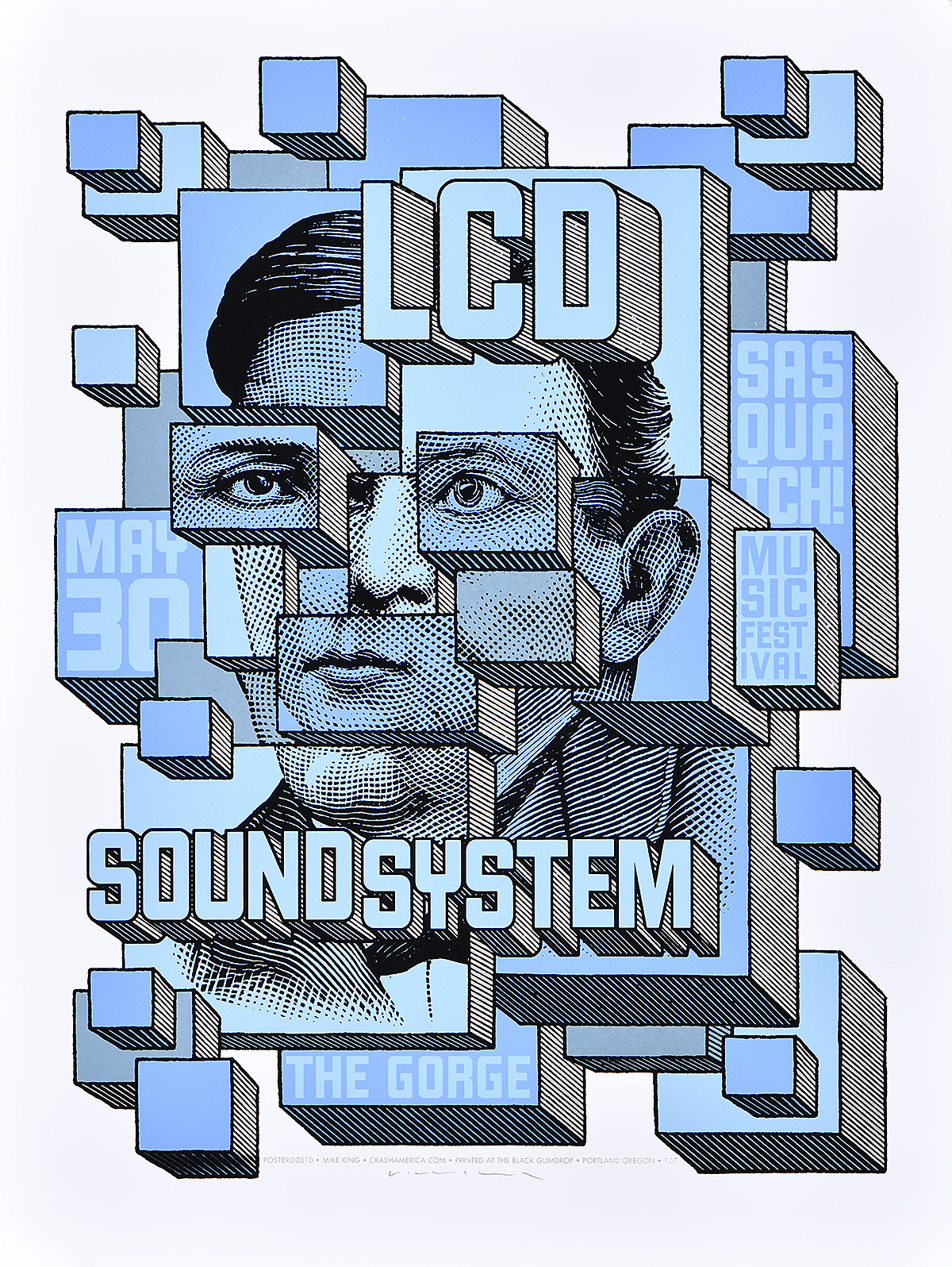
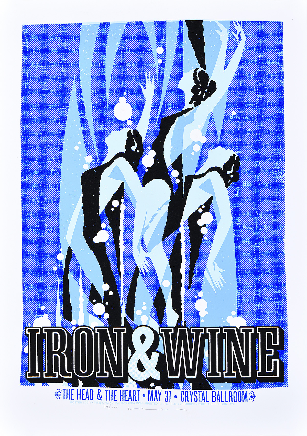
The posters in this exhibition represent a mere slice of a much larger visual pie, a taste of some of Mike’s posters—both common and rare—from a 30-year spread within his ongoing career. They highlight shifts in the available technology for making posters, from fully analog to digital, and demonstrate how the function of gig posters has evolved from advertising to collectible merchandise. Rather than being presented strictly chronologically, each section focuses on Mike’s process for creating the pasteup or digital file necessary to produce each type of poster. 


All posters in this exhibition are part of the Poster House Permanent Collection.


Whenever feasible, Poster House reuses materials from previous shows to drive sustainable practice.


Large text and Spanish translation are available via the QR code and at the Info Desk. 

Guías con letra grande y la traducción al español están disponibles en atención al público y a través del código QR.

Copyshop Designer 


Mike’s earliest posters predate the digital era, meaning every element had to be manipulated by hand without the use of a computer before being passed on to a commercial printer for execution. The final object given to the printer during this period is known as a pasteup or makeready, a piece of paper typically measuring 11 x 17 inches that included glued-down black-and-white text and imagery. The type and color of the paper, as well as the ink, were usually decided by the printer, not the designer. 


Mike typically starts a poster with the text. During this period, this often included a combination of lettering taken from proper typography manuals and commercial publications as well as hand-drawn letters and, occasionally, the band’s official logo. He would lay out this cut-up text on pale-blue graph paper, the lines of which would not show up when run through a copy machine, creating a seamless grid as the foundation for every design. 


His imagery was equally random, ranging from official publicity photographs of a band to whatever visuals he felt properly expressed the essence of a group’s style. While he may not have been able to listen to every performer before he produced a poster, Mike was always aware of their particular genre within the music scene and found novel ways to convey that in his work. His best posters from this time mix elements of pop culture, like a photograph of Tammy Faye Bakker with Alice Cooper-style gothic eye makeup or a bevy of Fred Flintstones, both used years apart to advertise the iconically named Butthole Surfers. 


During this early part of his official career as a gig-poster artist in the late 1980s, Mike teamed up with fellow graphic designer Steve Birch to form Crash Design, a ragtag studio that was essentially a landline phone and a Canon NP9030—one of the first copy machines that allowed the user to enlarge imagery and text along both the x and y axes and put halftone screens over photographs (a process that turns images into dot patterns of various sizes and densities). Texture could be added by reversing elements (flipping imagery from positive to negative), drawing on them, and then reversing them back—the drawings appear as white on the page, filled by the color of the paper, while the original lettering or photography shows up in black. Additional copy-machine “tricks” included putting vellum between a design element and the glass to make it appear fuzzy and moving the text as the copy bar shifted to stretch or distort it.

The Pacific Northwest’s Music Scene


The Pacific Northwest had a music-advertising culture that was distinct from that of the rest of the United States. The region’s notorious rain meant that posters might not even survive a day before being turned to sludge on the side of the road. When combined with the explosive concert scene of the 1980s and ’90s, this resulted in a visual cacophony of announcements wallpapering Seattle’s and Portland’s many telephone poles alongside the detritus of yesterday’s gigs. The newfound popularity of the copy machine as a means of creating cheap, effective design meant that almost all of these posters were the same size and were often printed on the same Dayglo-colored papers that visually popped even in the most overcast weather conditions. 


As local promoters often worked for venues rather than directly with a band, there was no requirement (or even ability) for a band to approve the poster—the only requisite was that the advertisement would be legible from a passing car and that it stood out from the visual noise of the dozens of other announcements. Work would be assigned three to six weeks in advance of an event, and Mike could typically turn around a project in a few days. At his busiest, he could create two posters in a single day—a number that may sound low today; however, in an era when everything had to be done by hand and any edits could mean restarting a composition from scratch, it emphasizes his commitment to the quality of his designs and his skill at executing them. 

A poster of animal skeletons drawn in red chasing one another above shaky red text

Die Kreuzen, 1984


A poster of an upside down skeleton underneath black text

SNFU, 1985


A poster of a Black man with dreadlocks and bold text printed in a green, black, and red gradient

Don Carlos & The Freedom Fighters, c. 1986


A poster of three white men below shattered text printed in purple on a yellow background

Hüsker Dü/Nomeansno, 1986


A poster of green hammers printed on top of white text on a red background

Hellcows/Snakepit/More & More, 1986


A poster of a white man playing guitar surrounded by text in mixed fonts on a green and white background

Sonic Youth/Hell Cows, 1987


A poster of a Black man in a spiked headdress and bold text printed in purple on a white background

Sun Ra, 1988


A poster of four Black men printed in ovals surrounded by orange stars and text blocks on a white background

Antone’s West Blues Revue, 1988


A poster of distorted white men in between bold white text on a blue background

Skinny Puppy, 1988


A poster of collaged photographs of Black men with funky red text on top

Fishbone/Living Colour, 1988


A poster of a bald cartoon character gesturing wildly surrounded by circular text on a blue background

Butthole Surfers, 1989


A poster of wavy red text on a pink background

Hell Cows/Indigo Zeros/Crackerbash, 1989


A poster of text in mixed fonts next to a city street with eyes on the walls

Smegma/The Hell Cows/Anal Solvent, 1989


A poster of a group of white men printed in white on a red background

The Replacements, 1989


A poster of a wavy flower surrounded by handdrawn text on a black background

The Fluid, 1989


A poster of three photographs of white men performing on a stage surrounded by bold text

Fugazi/Beat Happening, 1989


A poster of white men and women crouching on a red checkerboard background

The Cramps, 1990


A poster of a large eye looming over a city skyline in between bold orange text on a black background

Sun City Girls/Hell Cows, 1990


A poster of green and yellow bold text on a yellow background

Nirvana/Mudhoney, 1991


A poster of three white men yelling at one another printed on a blue background

Nomeansno, 1991


A poster of a group of white men posing printed on a purple and white background

Buzzcocks, 1992


A poster of a cartoon heart and cupid on a white background

Love Mongers/Elaine Summers, 1992


A poster of a group fo white men's heads printed in a line on a white background with orange text

Poison Idea, 1993


A poster of a white man's head at the center of a spider web

Poison Idea/7 Year Bitch, 1993


A poster of cartoon men's heads printed in white on a red background

Butthole Surfers, 1995


The Dawn of Digital 


The advent of computers resulted in a more efficient way to generate lettering for posters. Rather than spending hours cutting out photocopied alphabets, Mike could now easily print out lines of text to scale in a variety of fonts that he would then recompose manually within a pasteup. While early versions of TypeStyler and other software came with basic font families, most of what Mike incorporated into his posters were alphabets, all stolen in some manner, passed around by like-minded designers. 


Photocopiers were still essential during this period, as they allowed designers to manipulate traditional typography through various tricks during the copying process. More importantly, imagery still had to be sourced from preexisting publications or drawn by hand, as bringing those elements into the digital space would have required a designer to go to a third party for a scan of the image on a floppy disc and then import it into Photoshop, a software still in its infancy. Building the composition in a half-analog fashion proved far more flexible. 


By the late 1990s, Mike slowly transitioned from creating fully manual pasteups of a poster to composing entire designs on a computer. This shift resulted in the death of the old-fashioned cut-and-paste makeready and secured the primacy of digital files that could be sent to printers over the internet.

A poster of an eye with large white text printed on top of it on a black background

The The, 1995


A poster of a naked white woman with butterfly wings on a firey background

The Renegade Saints, 1995


A poster of white women and a cartoon devil on a white background

Five Fingers of Funk, 1995


A poster of a cartoon horseback rider and orange stars below text made out of a rope

Don Walser, 1995


A poster of a group of white men and a woman in front of radiating lines and cursive text

Alison Krauss & Union Station, 1995


A poster of two white women's faces printed on a blue striped background

Indigo Girls, 1996


A poster of Black men's heads printed on top of a county fair silhouette

Bobby “Blue” Bland, 1996


A poster of white text printed on top of black squiggly lines on a yellow background

3 Leg Torso, 1996


A poster of raised black hands over blocky red and black text on a white background

Steel Pulse, 1997


A poster of a Black baby with an afro and psychedelic text on a neon yellow background

Five Fingers of Funk/Rubberneck, 1997


A poster of a smiling white man's face inside a space ship filled with aliens

Man or Astro Man?, 1997


A poster of stacked bubble text printed in blue on a white background

Local H/Stanford Prison Experiment/The Superjesus, 1997


A poster of cartoon cats below Japanese script and pseudo-Japanese script on a pink background

Artificial Joy Club, 1997


A poster of a shocked white woman's face printed in black on a blue background

Mary Lou Lord, 1997


A poster of a bronze trophy of a man behind bold bronze text

Elliott Smith, 1998


A poster of shattered black text with cartoon strips printed behind it

The Makers, 1998


A poster of a black hand with white text printed on it on a white background

Ben Folds Five, 1998


A poster of anime characters printed in green on a pink background

Pink Martini, 1998


A poster of western style text printed in brown on a beige background

The Old 97’s/Kim Lenz & The TY Jaguars/Gourds, 1998


A poster of funky red text and a Canadian flag printed on a white background

Nomeansno/Royal Grand Prix, 1998


A poster of an Indian woman printed in green on a yellow background with red text on top

Cornershop, 1998


A poster of a guitar made out of a city map below green and white text

John Paul Jones, 1999


A poster of a cartoon character with bubbles around their head printed in yellow and green

The Chemical Brothers, 1999


A poster of a cartoon spotted cat on a polkadot background

Super Furry Animals/Sunset Valley, 1999


A poster of a cartoon man with a crown made out of a spiral on a yellow and red background

Afghan Whigs, 1999


A poster of stacked white text above an unidentifiable mechanical object on a black and white background

Pond/Greg Garing, 1999


A poster of a white man with his hand over his face printed with white text on a blue background

Joe Strummer & The Mescaleros, 1999


A poster of blue and white figures in a line below bold white text with a clock inside of it

Collective Soul, 1999


A poster of a white woman's face with cartoon bombs with words on them coming out of her mouth

Patti Smith, 2000


A poster of cartoon boys and girls printed in blue on a blue and white background

Yo La Tengo, 2000


A poster of a cartoon man and woman dancing surrounded by text laid out like a ticket on a blue background

Yo La Tengo, 2000


A poster of a cartoon elephant with text printed like a circus ticket

Lou Barlow, 2000


A poster of Hebrew text and abstract musicians printed on a blue and black background

3 Leg Torso, 2000


A poster of a white man's face looking to the left printed on a blue background

Bob Mould, 2000


A poster of an ominous figure with cartoon eyes and angel wings made out of hands on a white and orange background

Smashing Pumpkins, 2000


A poster of two outstretched hands with eyes on their palms on a blue background

The Dandy Warhols/Rick Bain & the Genius Position, 2000


A poster of a white man in a cowboy hat above bouncing text on a red and white background

Eliades Ochoa, 2000


A poster of a white man playing guitar surrounded by blocky text on a pink and black background

Joseph Arthur, 2000


A poster of white men's faces on a fiery striped background

Weezer/Tenacious D/Jimmy Eat World, 2001


A poster of a dancing marionette puppet on a green background

X/Supersuckers, 2001


A poster of a diagram for a record player with bold text printed in pink on a white background

Mike Doughty, 2001


A poster of a white man with stars and question marks around his head printed in blue on a pink background

Reverend Horton Heat, 2001


A poster set up like a Western wanted poster with boxers and a black cat

3 Leg Torso Sextet/Black Cat Orchestra, 2001


A poster of bold stacked text printed in white on a pink background

Mogwai, 2001


A poster of a white man looking down with text on a blue background

Steve Earle & the Dukes, 2001


A poster of a group of white men holding one another printed in black on an orange background

The Union Underground, 2002


A poster of a cartoon rabbit surrounded by elaborate text on a pink background

Bright Eyes/Arab Strap, 2001


A poster of ballet dancers in elaborate costumes printed on a blue background

Frank Black, 2001


A poster of an upside down astronaut and bold text printed in blue on a white background

Powderfinger/Ours, 2001


A poster of an upside down astronaut and blue squares above modern blue text

Mercury Rev/The Shins, 2002


A poster of a rodeo rider next to Chinese script printed in green on a beige background

Jayhawks, 2002


A poster of two white men posing with finger guns printed in green on a white background

They Might Be Giants, 2002


A poster of a white man in a cowboy hat printed in red on a white background

Lyle Lovett & His Large Band, 2002


A poster of a table full of food and elaborate text printed in green and white

Reel Big Fish/The Starting Line/The Kicks, 2002


A poster of a screaming cartoon man with a cigarette falling out of his mouth printed in blue on a white background

The Jon Spencer Blues Explosion/Yeah Yeah Yeahs, 2002


A poster of a man and a woman with banjos and guitars playing on top of a map of the United States

Cracker/Sound of Urchin, 2002


A poster of pink text on top of an abstract pink circle on a white background

Guided by Voices/My Morning Jacket, 2002


A poster of a group of white men printed in pink on a white background

The Vines/OK Go, 2002


A poster of a white man in front of a cartoon city with 3d text printed in red

The Faint, 2003


A poster of a cartoon man and woman performing music printed with bubble text on a yellow background

The Flaming Lips/Liz Phair, 2003


A poster of a hand using chopsticks surrounded by pseudo-Asian script

Satan’s Pilgrims/Sleater-Kinney, 2003


A poster of a bird in a cage with wings printed on an elaborate blue background

Pixies, 2005


A poster of a cartoon man in a bowler hat below psychedelic text printed in red on a yellow background

Sonic Youth, 2007


When Advertising Becomes Merch


While Mike first learned screen printing in high school, he did not really experiment with the medium until 1981 when he created a poster for his own band, Jungle Nausea. Even then, these designs were very simple and consisted of one or two colors, as he had difficulty mastering the necessary registration (alignment between screens) to produce more complex compositions. This changed around 1993 when he began collaborating with a silkscreen printer who demystified the craft for him. 


Creating a screen-printed poster requires a few specialty tools. First, the design needs to be separated out into individual colors. This is most easily achieved by digitally converting each color to an image so all of its elements print separately in black onto transparent film (i.e. all the blue parts print as one layer, all the red parts as another). Each of these transparencies is then pasted onto a screen that has been covered with a light-sensitive emulsion, and is then exposed to a very bright light. The light hardens the areas of the screen that are not covered by the silhouette of those particular design elements. After washing off the screen, the only part where ink can transfer through it are those places originally covered by the design. Making sure to retain the same registration on each screen, the artist then builds the composition one color at a time, typically starting with the lightest and ending in black. While Mike has produced posters with up to ten different colors (and therefore ten unique screens), most of his designs incorporate between three and six colors. 


By the early 2000s, the music business was no longer making massive amounts of money through record sales. From Napster to LimeWire, digital files were increasingly how people experienced music, the proceeds from which were significantly lower for all parties involved. Desperate for new revenue streams, bands switched their focus to live performance as the main source of income, tapping into the power of the poster as an additional way to generate cash—limited-edition designs, many of which were printed through silkscreen and signed and numbered by the artist began appearing at each venue. Mike was the ideal adapter for this new era in gig posters, creating some of the most memorable concert imagery of the 21st century for both mainstream and indie bands. Today, he continues to make hundreds of unique posters each year, all of which retain the same dark humor and distinctive visual sensibility that defined his earliest work.

A poster of a white person with text over their face surrounded by screws and scissors

Bikini Kill/Sleater-Kinney, 1996


A poster of a Jewish man in a tallis surrounded by spiraling hebrew text

Hasidic New Wave, 2000


A poster of cartoon robot musicians in front of a crowd

Cheap Trick, 2001


A poster of a cartoon deer with text printed in its antlers in front of a full moon

Quasi/The Jogger, 2004


A poster of a dancing man with an eye for a head holding an umbrella

The Flaming Lips, 2006


A poster of an eagle touching down onto an astronaut helmet above 3d cartoon text

R.E.M., 2008


A poster of a bridge at night over buildings with letters printed on the roofs

Vampire Weekend, 2009


A poster of a crow pecking green text in front of a sun and flowers

Animal Collective, 2009


A poster of three pink wolves above yellow disco balls with diamond necklaces that read

Yeah Yeah Yeahs, 2009


A poster of a man's face made out of blue layered rectangular blocks

LCD Soundsystem, 2010


A poster of abstract dancing women printed in blue above bold text

Iron & Wine, 2011


PULL QUOTES:


“His thumbprint is as heavily laid on the Northwest music scene as any band that started up here. And he’s outlasted most of them”—Colin Meloy, The Decemberists


“Mike King’s graphic art has always intrigued me in how he uses other images, text and graphics to create something new and interesting.”—Larry Crane, Tape Op magazine


“Low-budget design is where the excitement happens.”—Sean Tejaratchi, designer


“His posters are chaotic, off-kilter, full of layers and motion.”—Sean Tejaratchi, designer


“When life gives you lemons, make lemonade, right? Mike’s early work was always lemonade.”—Art Chantry, designer


“His humor became the glue that actually held his design together.”—Art Chantry, designer


“The idea that I could take something I didn’t draw, chop it up, and make something new from it was a revelation.”—Mike King


“The act of making something from leftovers, trash, and stolen things seemed at the time a subversive act.”—Mike King


“He is at the forefront of his movement in keeping rock-and-roll poster art living, breathing and thriving”—Ben Harper


“Mike runs the gamut, crossing modern technology with old school methods.”—Ben Harper


“I can’t imagine how many posters Mike has done, but I know very few might suck.”—Mike Quinn, concert promoter

Curator

Angelina Lippert


Exhibition Designer

Randee Ballinger

John F. Lynch


Registrar
Melanie Papathomas


Special Thanks

Catherine Bindman, editor

Randy Ferreiro, proofreader

Sofía Jarrín, Spanish translator