Blazing A Trail: Dorothy Waugh’s National Parks Posters

A Groundbreaking Campaign 


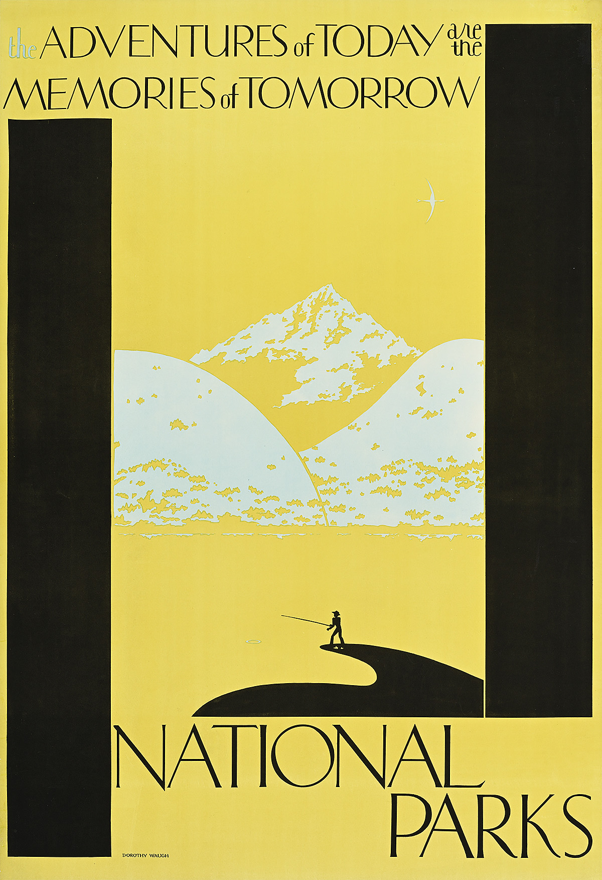
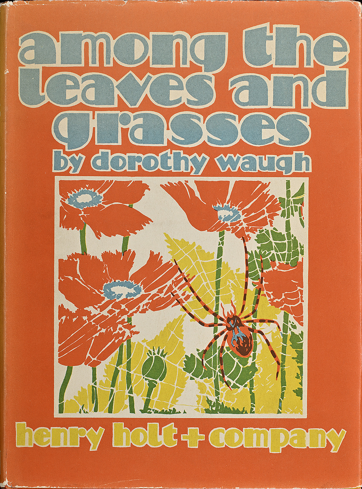
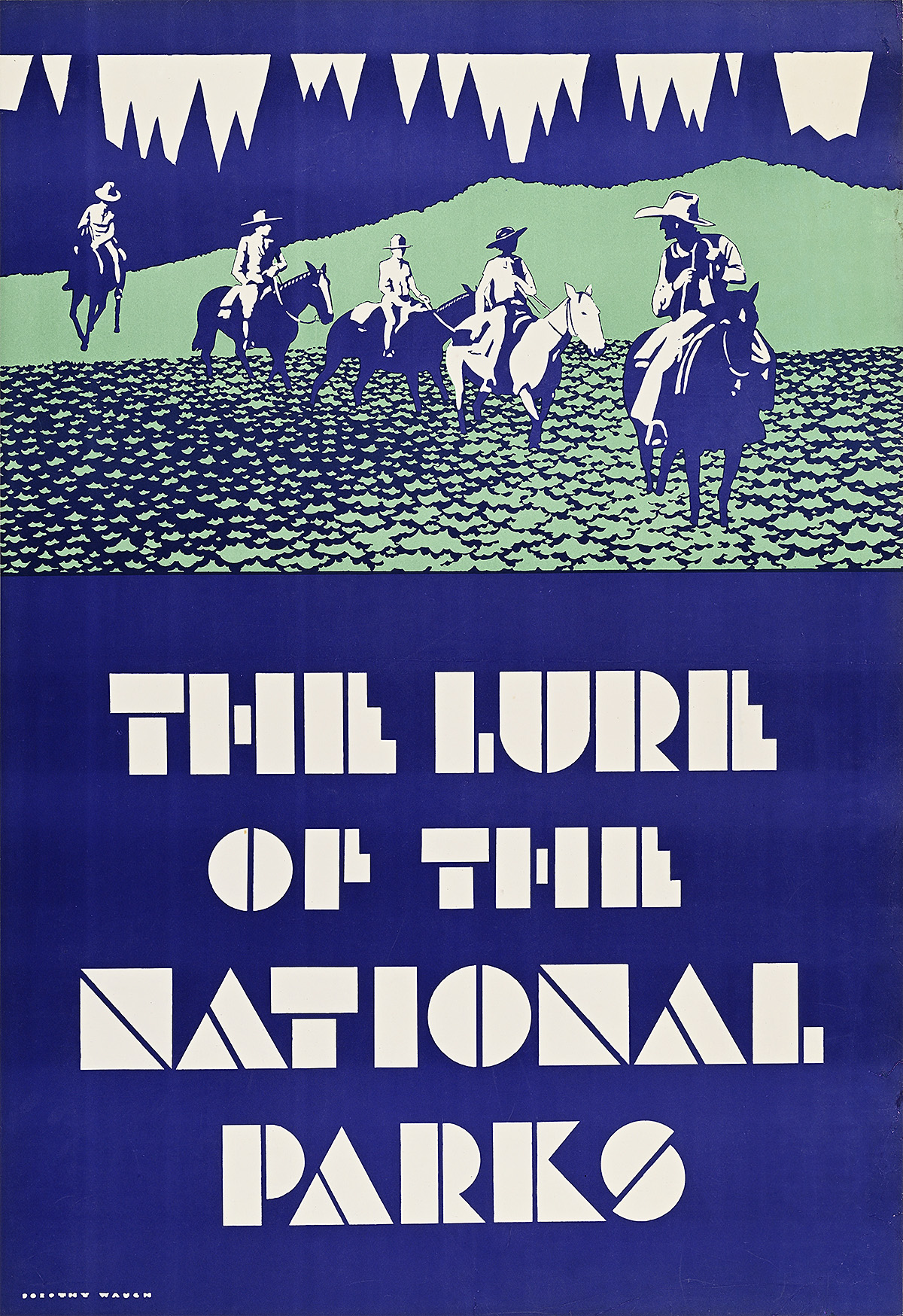
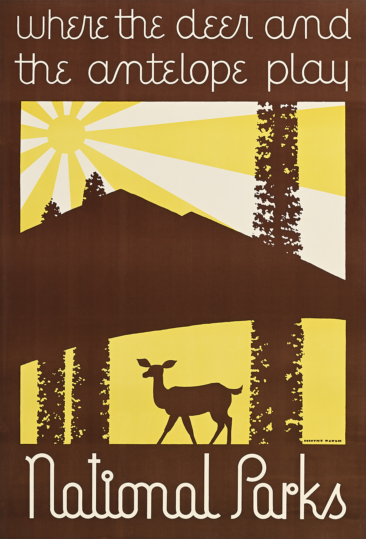
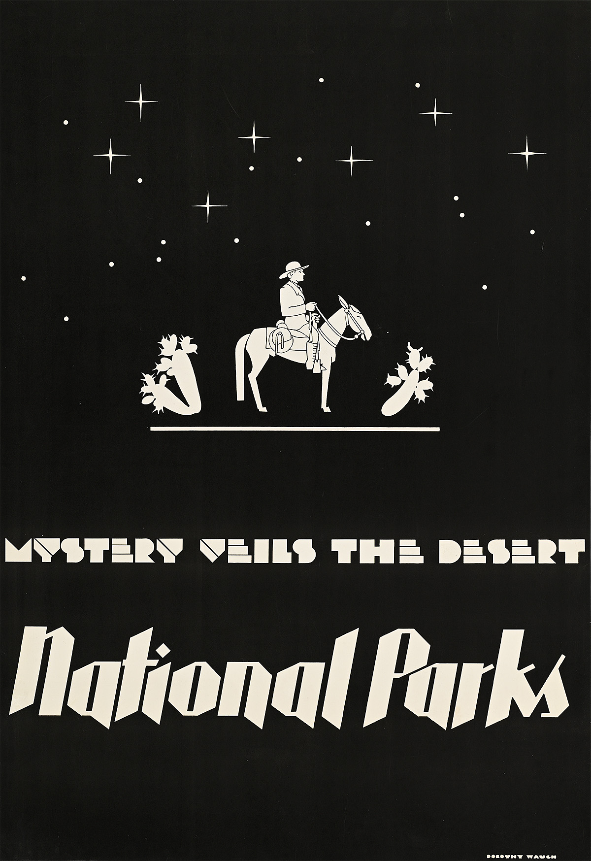
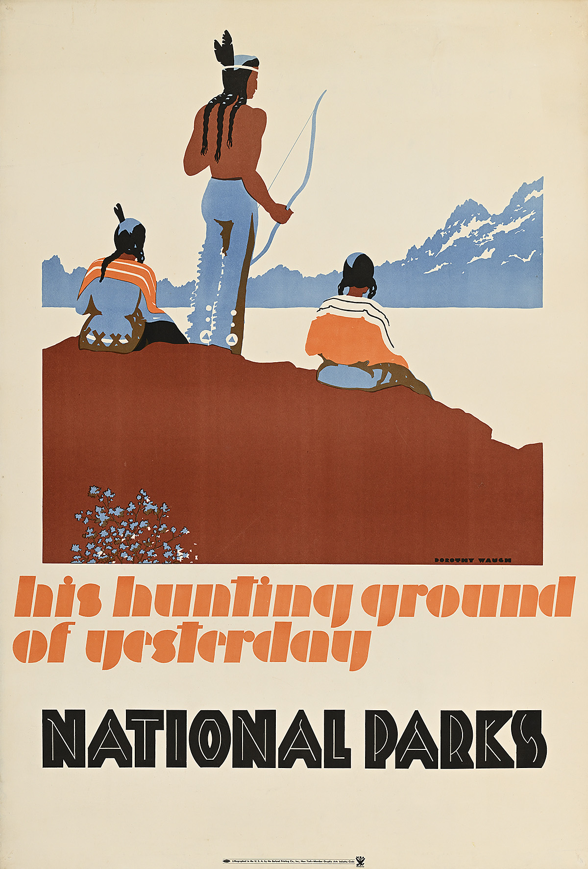
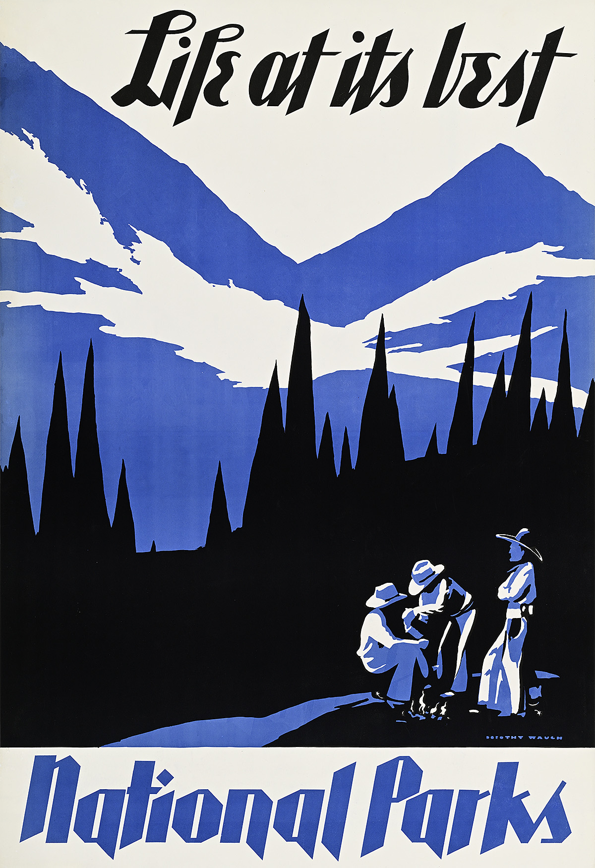
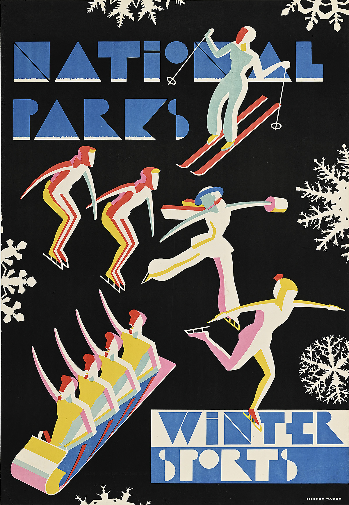
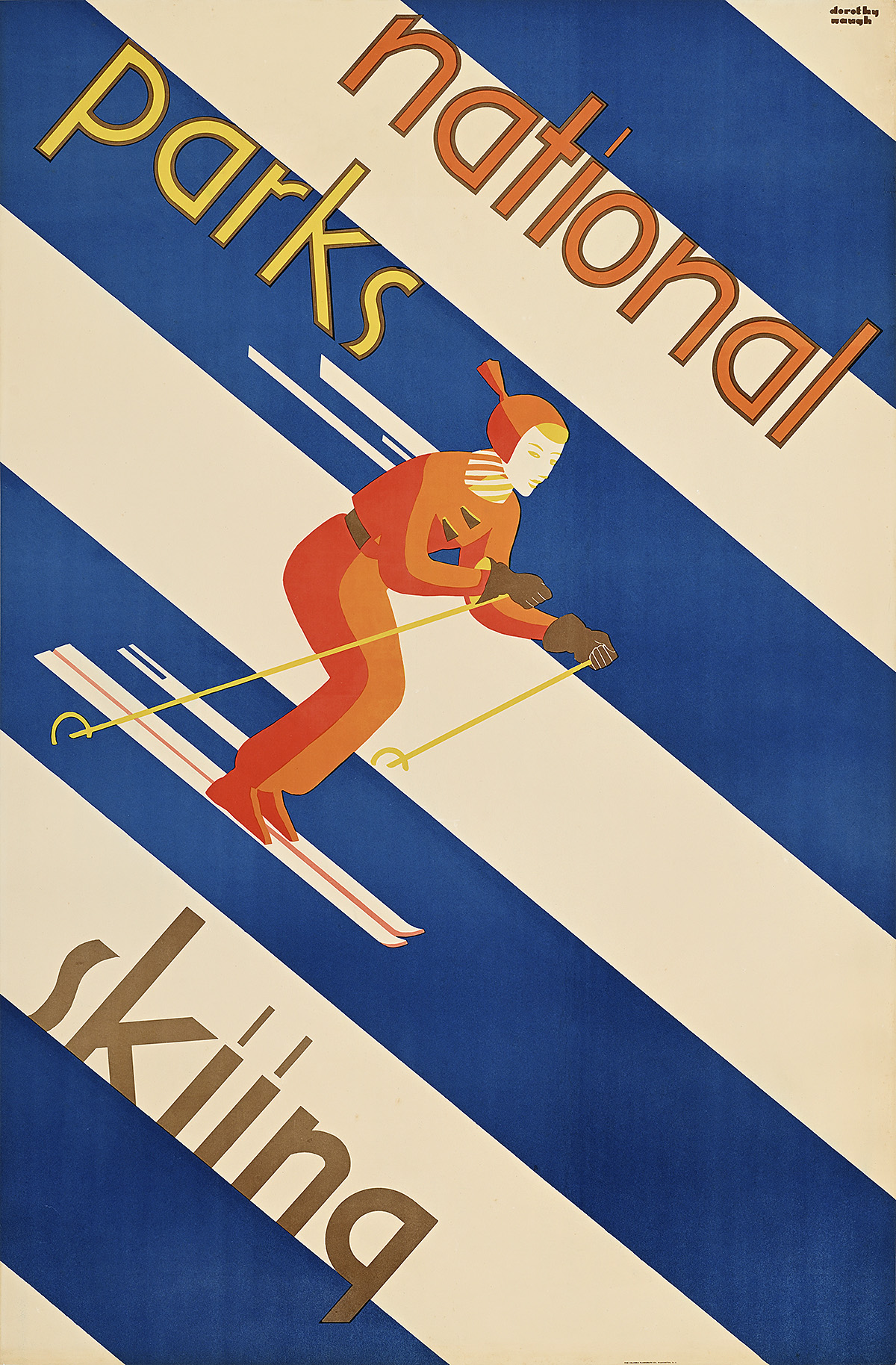
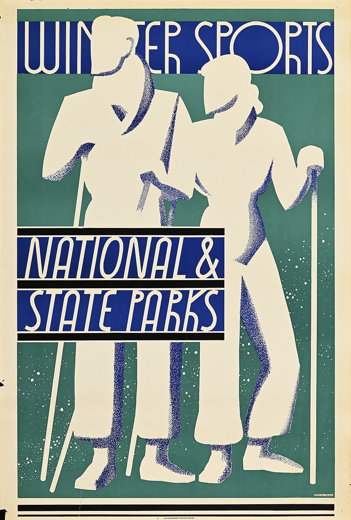
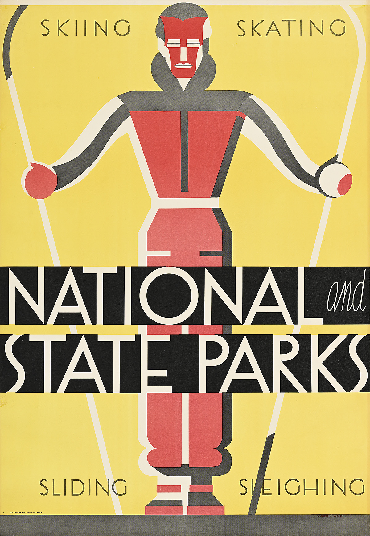
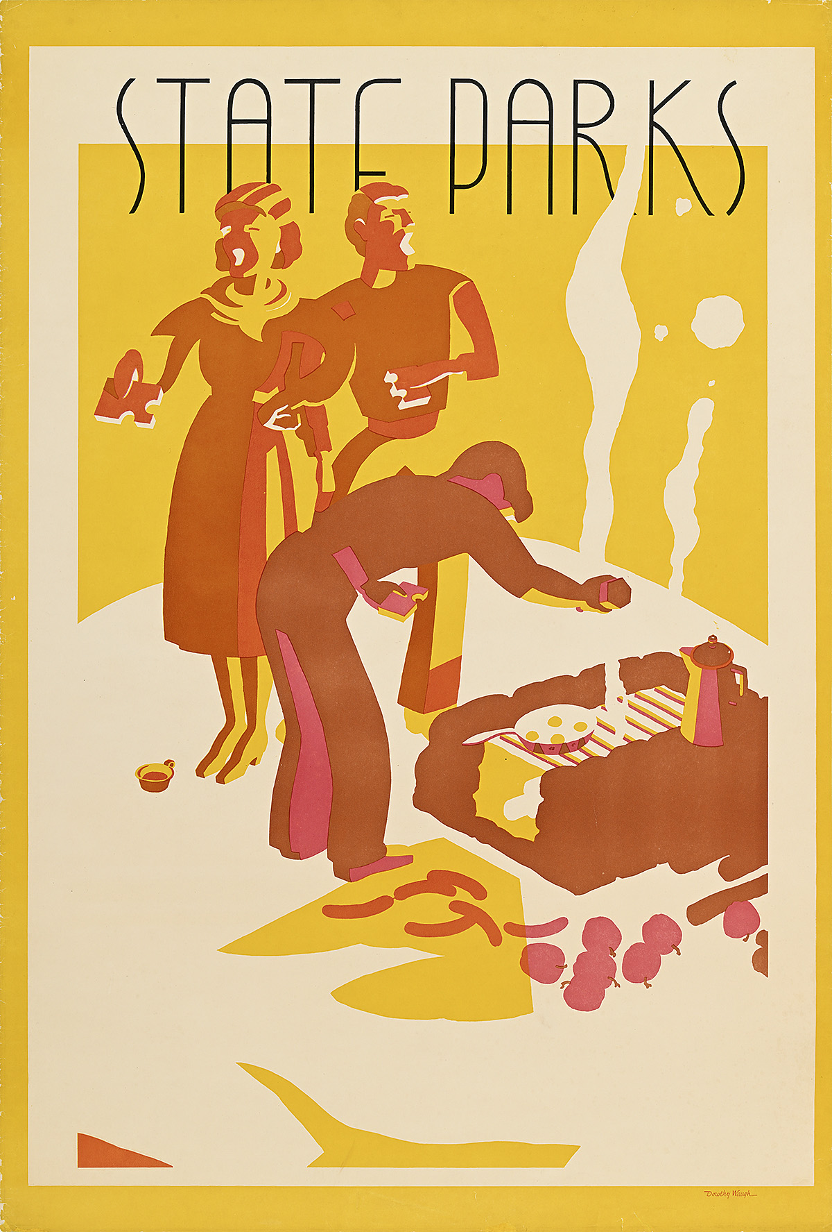
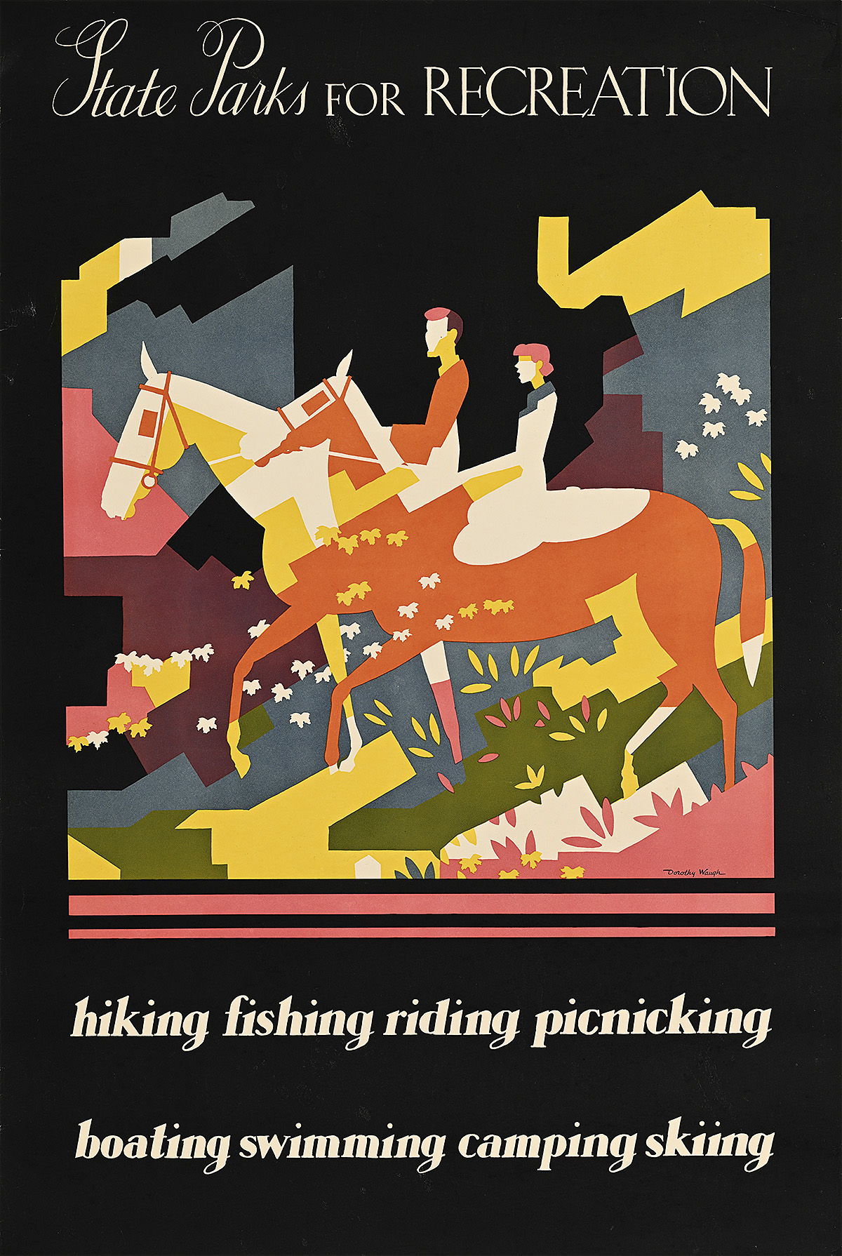
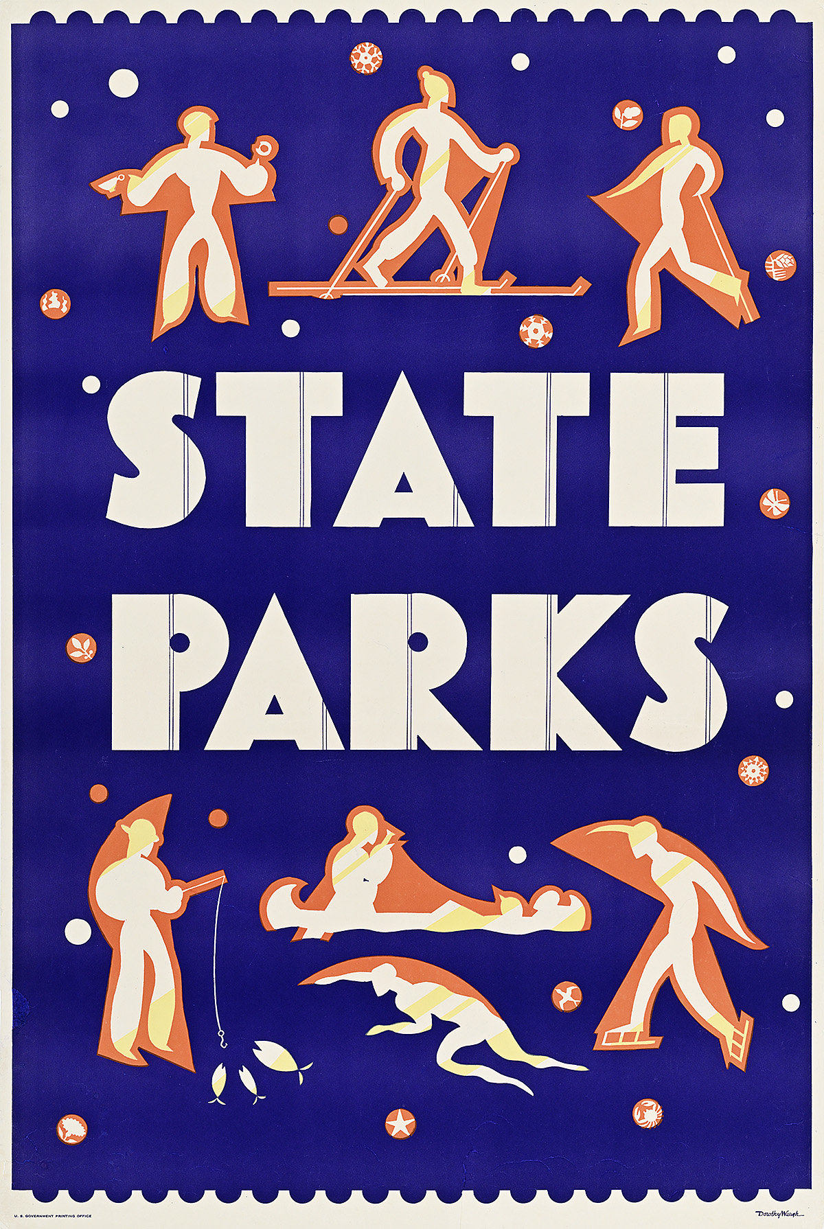
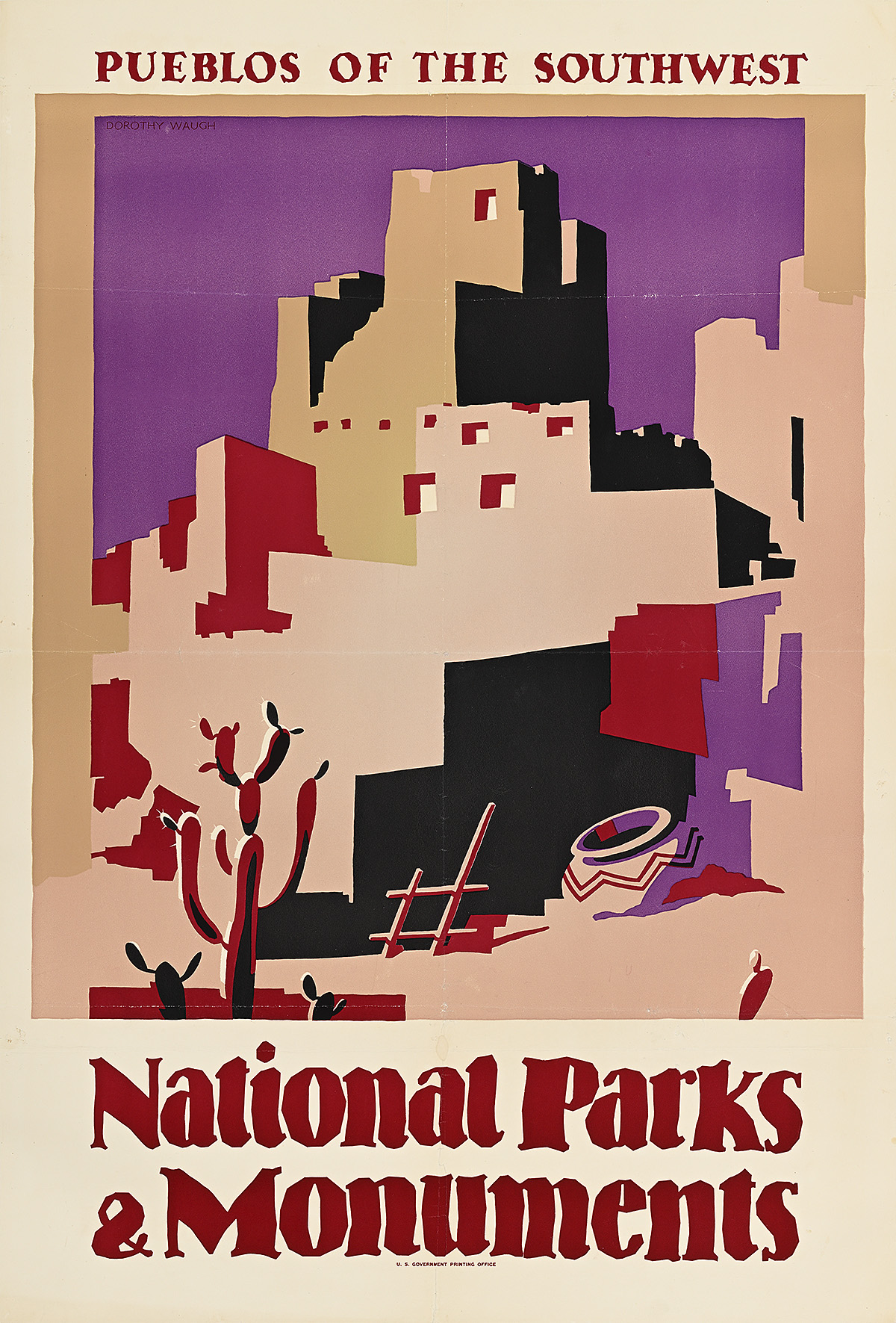
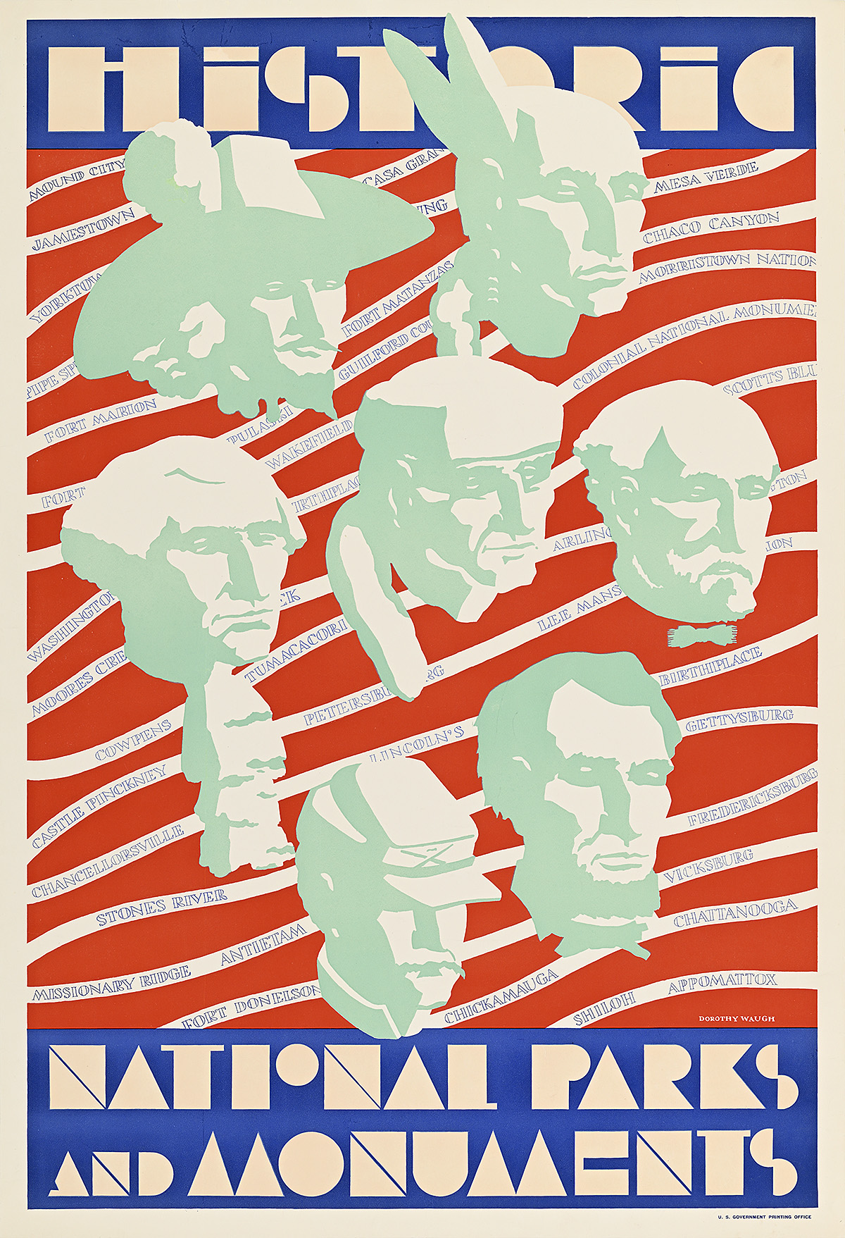
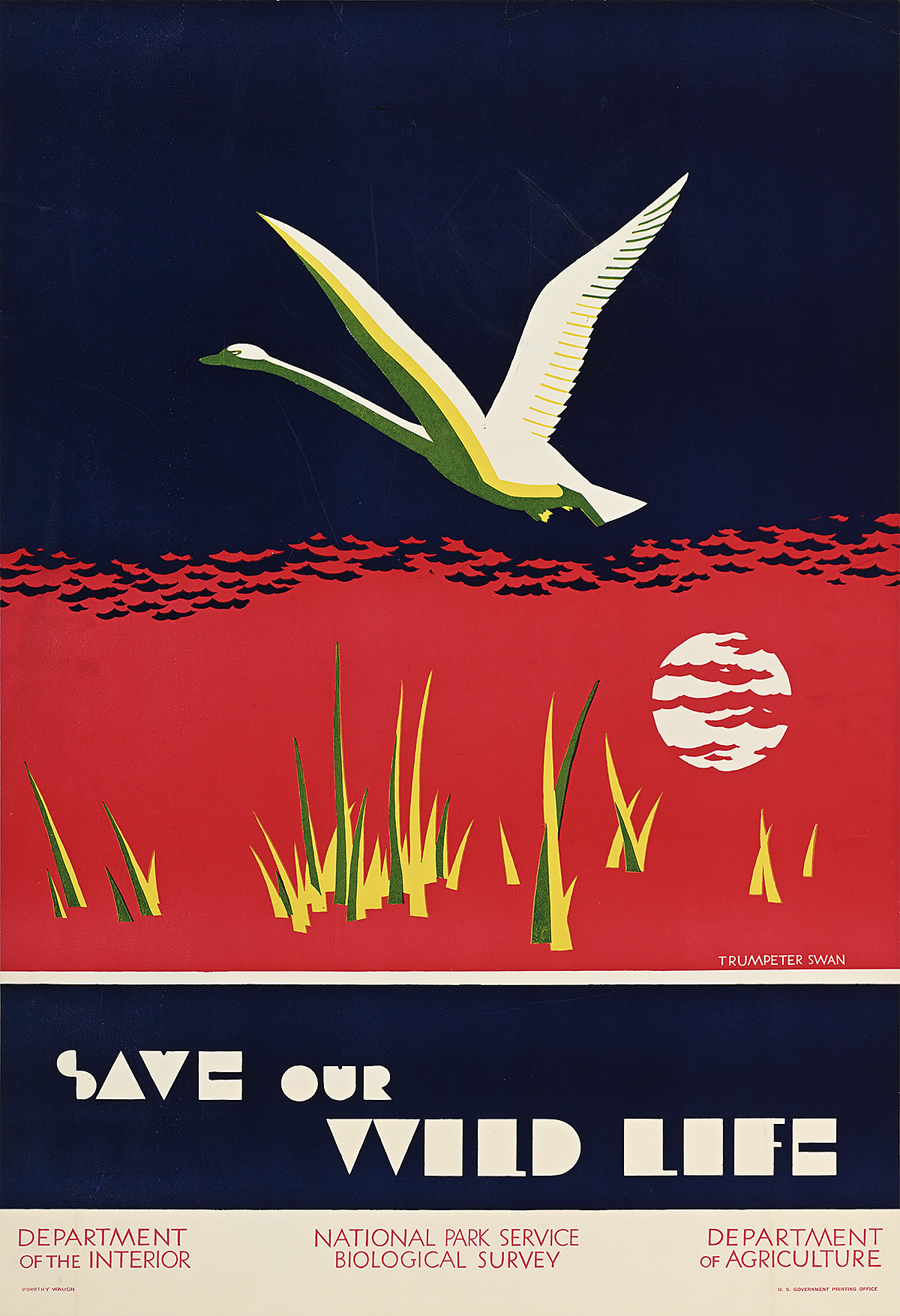
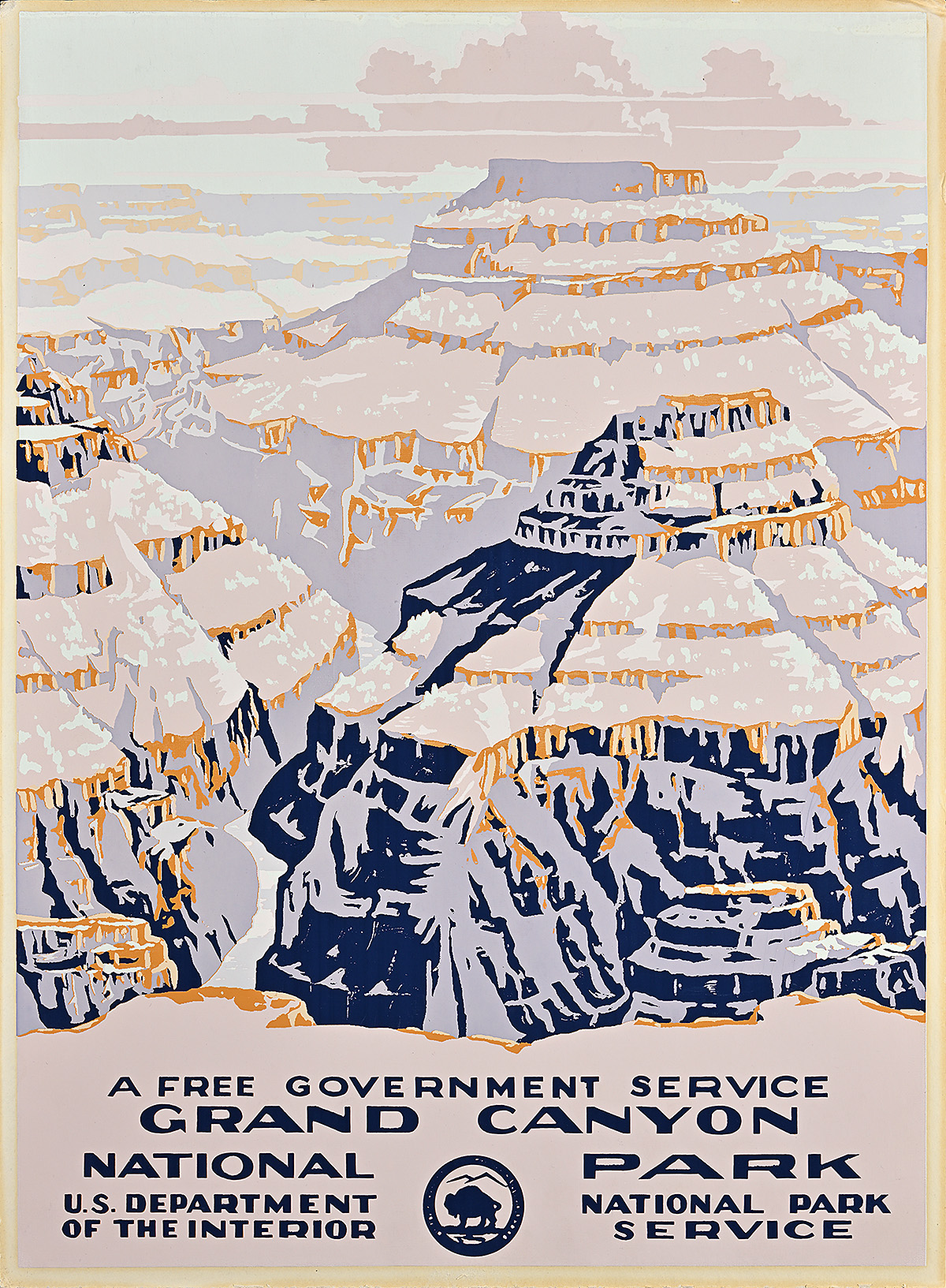
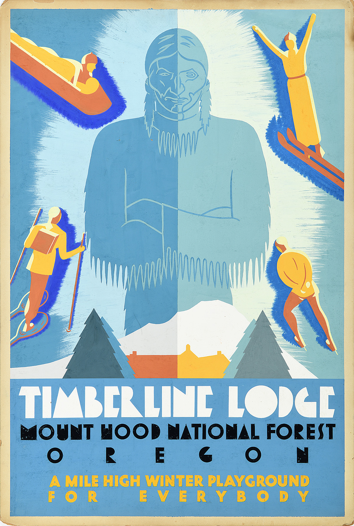
The 17 travel posters Dorothy Waugh created for the National Park Service (NPS) between 1934 and 1936 are significant cultural records of the Great Depression and mark a turning point in American graphic design. Until now, however, there has been little research on them or on their originator. This exhibition, based on private and government documents, is the first dedicated to Waugh and the first to show all of the campaign’s surviving posters.


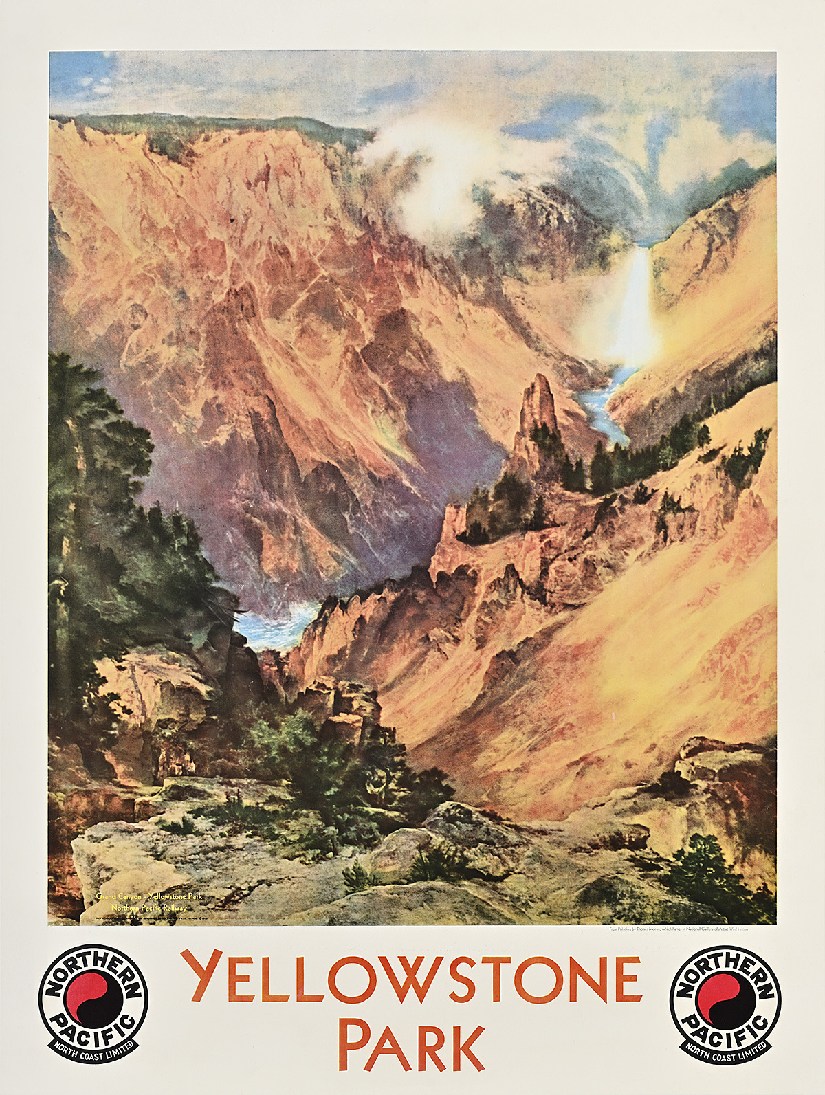
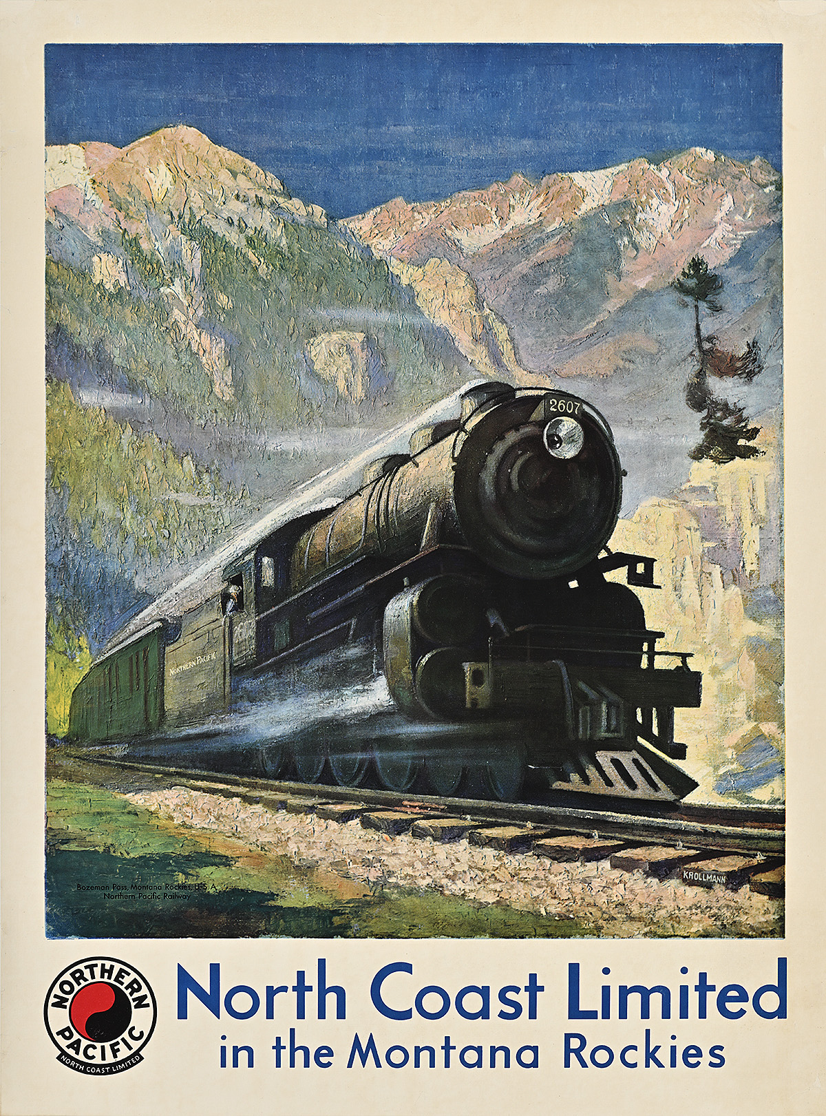
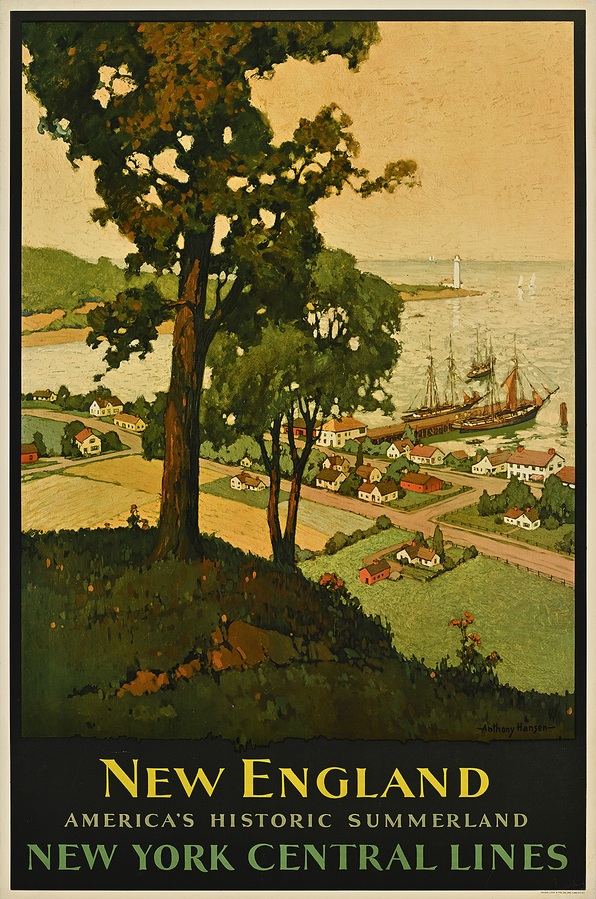
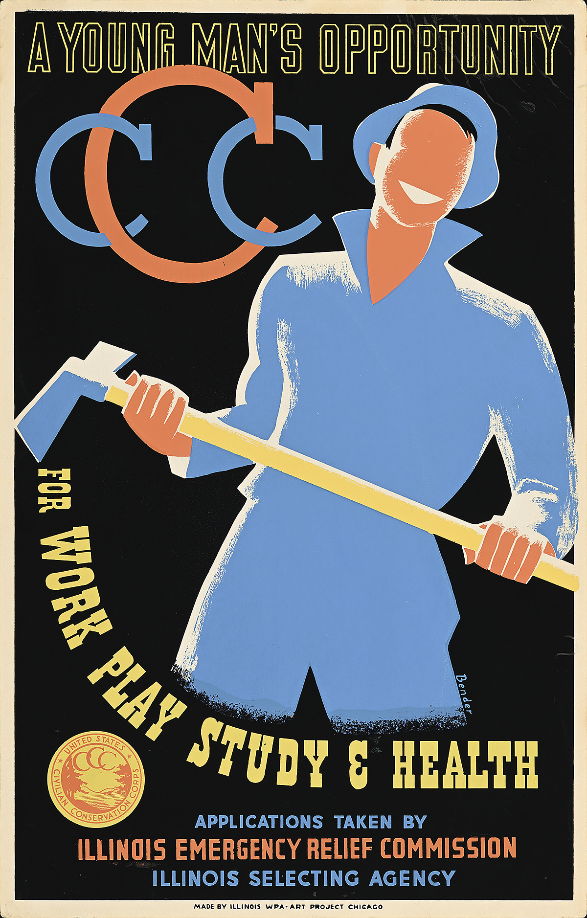
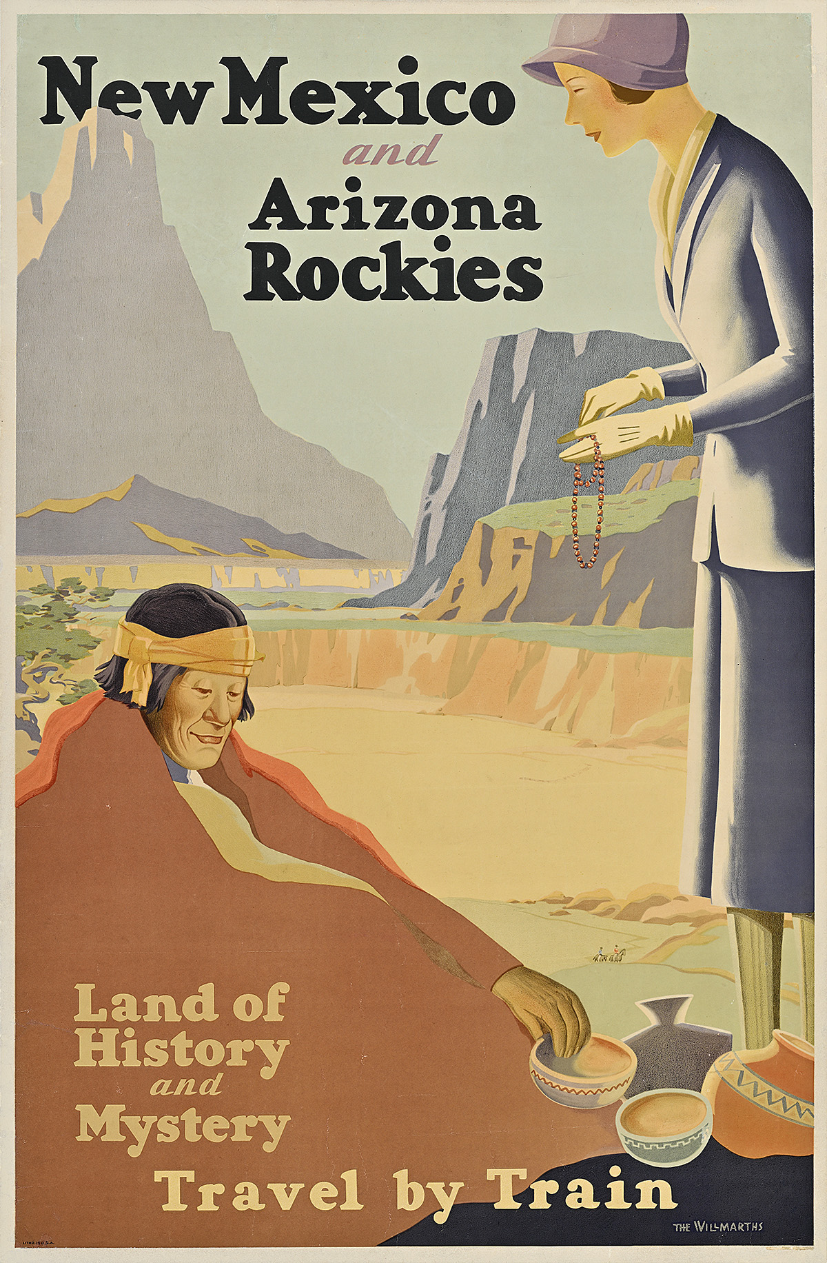
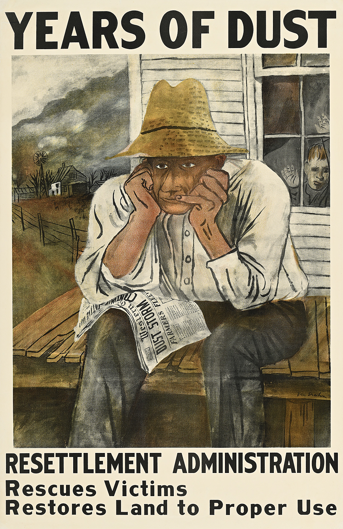
From the 1870s, America’s railroad companies played a critical role in promoting the national parks as tourist destinations in order to increase passenger numbers. Even after the founding of the NPS under President Woodrow Wilson in 1916, the railroads continued to be the main source of such advertising; they issued a steady stream of attractive if conventional posters popularizing the parks and the beautiful landscapes on the routes to them. During the Depression, the parks took on new importance. President Franklin D. Roosevelt invested heavily in park tourism, convinced that it would bolster both the beleaguered nation’s morale and its devastated economy.


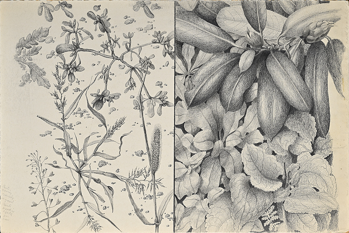
Although Waugh began her work for the NPS in 1933 as a landscape architect, she was also a highly trained artist. She soon advocated for the bureau to produce its own poster campaign, separate from those of the railroads and with its own style and messaging. In 1934, the Roosevelt administration launched National Parks Year, a public-relations initiative that included money for the campaign, whose design was entrusted to Waugh. It was the first time the government had assigned such an ambitious project to a single designer, let alone a female modernist. Waugh also received the backing of her very senior male supervisor at the NPS, who was well aware of her artistic talent. The resulting series of posters, at once avant-garde and accessible, put Waugh at the forefront of the government’s increasingly expansive presence in American visual culture.

Large text, Spanish translation, and a Plain Language summary are available via the QR code and at the Info Desk.

El texto con letra grande, la traducción al español y un resumen en lectura fácil están disponibles a través del código QR y en atención al público.

A poster of a canyon surrounded by orange cliffs.

Yellowstone Park, 1924 

D’après Thomas Moran (1837–1926)          

Poster House Permanent Collection

A poster of a train traveling through towering mountains.

North Coast Limited/Montana Rockies, 1929

Gustav W. Krollman (1888–1962)

Poster House Permanent Collection

  • These Northern Pacific Railway posters from the 1920s follow the typical formula of much classic railroad advertising of the period: they each depict a specific park and route served by the railway or the train itself, and incorporate a dramatic landscape after a painting by a fine artist. A logo identifies the railroad and minimal text indicates the destination.
  • The poster for Yellowstone reproduces the central portion of Thomas Moran’s famous oil painting, The Grand Canyon of the Yellowstone, completed between 1893 and 1901 and now in the collection of the Smithsonian American Art Museum in Washington, D.C. A Hudson River School painter, Moran was celebrated for his depictions of the American West. In 1871, he joined the Hayden Geological Survey on its expedition to the area that would become Yellowstone National Park. Moran worked closely with survey photographer William Henry Jackson, making sketches and watercolors that he would use as the basis for his first version of a painting by this name. Along with Jackson’s photographs, the painting hung in Congress and played a pivotal role in convincing legislators to designate Yellowstone as the first national park.
  • The poster for the Montana Rockies reproduces a painting by Gustav Krollman commissioned directly by the railroad company. It depicts the mighty locomotive required to navigate the Bozeman Pass near Yellowstone. As passenger numbers declined in the 1930s, due in part to the rise of automobile travel, the railroad companies emphasized both the power and comfort of trains.

A poster of a tiny man fishing in front of towering white mountains on a yellow background.

National Parks/The Adventures of Today Are the Memories of Tomorrow, 1934

Dorothy Waugh (1896–1996)

Private Collection  

  • Waugh’s National Parks poster stands in stark contrast to the typical railroad posters of the period. Although it, too, features a dramatic landscape, it is largely abstract and does not represent an identifiable location. The text presents a poetic message and is not part of a corporate logo, and Waugh’s choice of yellow for the water and sky, along with the framing device of staggered black bars, leans toward the avant-garde. 
  • The image here subtly complements the poster’s text: the “adventure” is in the contemplative and silent act of fishing in a mountain lake.
  • The poster also evokes the harmonious coexistence of human beings and nature that has been a core principle and practice of Indigenous people in the Americas for millennia. It was also espoused by such American naturalists, philosophers, and social reformers of the 19th century as Henry David Thoreau, who cautioned that modern society alienates human beings from nature’s physical and spiritual sustenance.

Preparation

Dorothy Waugh was first exposed to landscape architecture as a child, when she would sit in on the college classes of her father, Frank Waugh, who founded one of the nation’s earliest landscape architecture programs at Massachusetts Agricultural College (now the University of Massachusetts Amherst). Her focus on the landscape would inform much of her later work, particularly her National Park Service posters.


In 1916, Waugh enrolled at the School of the Art Institute of Chicago (SAIC) but her studies were disrupted after only a year by the entry of the United States into World War I. Over the next 10 years, she would continue in her father’s program, work as a landscape architect in a number of states, and take art classes at night. Waugh reenrolled at SAIC in 1926 at the age of 30. There, she was exposed to European avant-garde art and design then gaining traction in the United States. She began to develop her own distinctive brand of American modernism, in which she freely combined elements from those movements while embracing a commercial approach to illustration and incorporating American subject matter and iconography. 

After graduating in 1928, Waugh worked as an illustrator and copywriter for various publishing and advertising firms in Chicago. In 1931, Henry Holt & Co. published Among the Leaves and Grasses, her book for young adults; Waugh’s modernist illustrations here anticipate the visual language of her subsequent posters for the National Park Service. In spite of the Depression, the book’s success encouraged her to move to New York that year to pursue a career in publishing.

A black and white photograph of a white man playing a flute above a creek.

Frank Waugh , c. 1925   

Photographer Unknown       

Collection of Annaliese Bischoff, ASLA, Professor Emerita

A black and white photograph of a white girl painting at an easel outdoors while a white boy watches.

Dorothy & Sidney Waugh, c. 1915

Photographer Unknown

Courtesy of The Jones Library, Inc., Amherst, Massachusetts

  • Frank Waugh, like his daughter Dorothy, was a polymath. He was an accomplished printmaker, photographer, and musician whose interdisciplinary approach to teaching landscape architecture was also evidenced in frequent field trips with his young children, all of whom went on to have illustrious careers. He assigned them projects based on their observation of nature, including specimen drawings, poems, essays, and musical performances.  
  • Dorothy is photographed painting from nature during her high-school years, observed by her younger brother, Sidney. After graduating, Dorothy moved to Boston for a year where she studied at the Massachusetts College of Art and worked at a landscape architecture firm before enrolling in the School of the Art Institute of Chicago (SAIC).

An orange book cover featuring a spider crawling through a field of colorful poppies.

Among the Leaves and Grasses, 1931

Dorothy Waugh (1896–1996)

Courtesy of The Jones Library, Inc., Amherst, Massachusetts

  • This children’s book likely started as one of Waugh’s art-school projects. She created the sketches for its advanced Art Deco illustrations and lettering in watercolor, just as she did later for the National Park Service posters. Waugh’s mastery of this medium allowed her to create areas of flat color usually associated with modernist woodblock or silkscreen printing.
  • The book was aimed at young readers curious about insects, highlighting seven of the most common species in vibrant detail. Vetted by an entomologist, it also reflected Waugh’s own aptitude for science and was the first of many publications that showcased her talent for accessible scholarship.
  • The book became a calling card as Waugh embarked on a publishing career that would see her write, illustrate, design, and edit some 50 books and numerous periodicals. Several of her books won the American Institute of Graphic Arts’ contest for the 50 best-designed books of the year, held annually from 1941.
  • In the late 19th and early 20th centuries, female artists, generally excluded from art classes featuring human models, frequently focused on natural subjects, especially plants, insects, and animals. For many of them, the illustration of books on nature as well as travelogues and periodicals became a regular source of income.

Thoughts from a Little Town, 1928

Dorothy Waugh (1896–1996)

Courtesy of The Jones Library, Inc., Amherst, Massachusetts

  • Waugh created this booklet while at SAIC and presented it to the Jones Library in Amherst, Massachusetts, as a rough study, hoping for a commission (unrealized) to produce it as a promotional item for the library and town during the Christmas season. It features illustrated poems by local luminaries, including Robert Frost and Emily Dickinson—the latter a lifelong subject of Waugh’s own art and writing. 
  • The booklet’s design is heavily influenced by the Arts and Crafts movement, an artistic response to industrialization that flourished in the United States roughly between 1900 and 1920. Celebrating the artist-maker, the movement emphasized traditional craft skills and making by hand; motifs and materials derived from nature; and simplicity of design and quality in construction, with ornament as a complement to function.
  • Nineteenth-century education reform had opened the door for women to attend art schools. They became central to the Arts and Crafts movement as professional artists, designers, teachers, authors, and entrepreneurs across all of the fine and applied arts.
  • Thoughts from a Little Town reflects the movement’s decrial of the uniformity of machine-made books and bindings. The booklet, entirely handmade by Waugh, features her pencil lettering and drawings while the painted tree and border on its cover epitomize the Arts and Crafts aesthetic.

A poster of a tree-covered hill looking out over a busy port full of ships.

New England/New York Central Lines, c. 1930

Anthony Hansen (Dates Unknown)

Courtesy of David and Lucinda Pollack

  • A composite of New England scenery, this poster captures the pastoral region that inspired Waugh’s lifelong study of nature. It also reflects the illustrational style that prevailed in American travel posters throughout much of the 1930s.
  • Late in her life, Waugh wrote of Amherst, “this wonderful environment became the playground of six Waugh children” who also happily assisted “in the college’s model orchards, vineyards, prize herds, arboretums, and sheepcotes.” 
  • Commercial artist Anthony Hansen’s picturesque design champions travel to “America’s Historic Summerland.” He presents the landscape in realistic depth, color, and detail without the abstraction that Waugh employed in her posters for the National Park Service. His serif lettering, reminiscent of typefaces popular in the 18th and 19th centuries, further underscores the poster’s promotion of the relatively unchanged countryside as a retreat from modernity.

A New Deal & the Civilian Conservation Corps

When Franklin D. Roosevelt became president in March 1933, the country was in the depths of the Depression. His response was a New Deal for Americans that included the introduction of regulatory agencies, social-service programs, and public-works projects. His most successful and popular jobs program was the Civilian Conservation Corps (CCC), established in his first month with a mandate to address the country’s economic and environmental crises. It was the fastest peacetime mobilization and the largest conservation effort in U.S. history, ultimately putting 3 million unemployed young men to work in parks, plains, and forests.


A staunch conservationist, Roosevelt believed that stewardship of the country’s magnificent yet neglected public lands would also dramatically increase tourism—stimulating the economy and restoring Americans’ decimated pride and well-being on both the national and the local level. Although most Americans could not afford to travel abroad, they might be enticed to travel domestically, spending what they could and thus contributing to the country’s economic recovery. 

A broad range of basic structures, including campgrounds, cabins, and administrative facilities were soon required to accommodate an increasing number of visitors to national and state parks. Conrad Wirth, an assistant director of the NPS, oversaw the massive project in the state parks through the CCC. The young men hired to build the new park infrastructure (often referred to as the CCC Boys) were, however, inexperienced and had no instruction manual to guide them. In August 1933, Wirth therefore hired Waugh as a landscape architect to gather blueprints of exemplary buildings from around the country, translate them into accurate yet easily understood illustrational drawings supplemented by basic construction guidelines, and oversee their publication in the Portfolio of Park Structures and Facilities. Rushed to the field in loose-leaf installments, the straightforward yet artistic Portfolio was considered a major success, keeping the young men working while ensuring the building program’s nationwide consistency and quality. It also provided Waugh with a deeper understanding of the National Park Service that would prove indispensable as she tackled the subsequent poster campaign. By 1934, Waugh, one of only two women in prominent positions within the NPS, had become the key figure in the bureau’s production of important graphic-design materials.

A poster of a smiling man with light skin holding an ax below three interlocking Cs.

CCC/A Young Man’s Opportunity, 1941

Albert M. Bender (Dates Unknown)

Private Collection

  • The CCC employed young men between the ages of 18 and 25 to conserve and develop public land through manual labor. Participants usually arrived at a given site with little work experience. Only 11 percent of them had received a high-school education and up to 70 percent were malnourished and poorly clothed, reflecting the poverty caused by the Depression and the devastation to farmlands generated by the Dust Bowl. 
  • In addition to providing the men with employment, the CCC improved their health, morale, and education, and enabled them to develop specialized and marketable vocational skills. Approximately 85 percent of their monthly salaries of $30 ($728 today) was sent home to support their families. The economy of each community in which a CCC camp was located also benefited, due to government procurements and the men’s incidental spending. The program operated until 1942 when the United States entered the war and the young men were needed by the military.
  • This poster was created several years after Waugh’s NPS designs by Albert Bender, a designer in the Federal Art Project (FAP). The FAP, created under the auspices of the Works Progress Administration, was a New Deal initiative that provided work for unemployed artists of all kinds. It included poster divisions located in various regions of the country that served the promotional needs of an exhaustive list of federal, state, and local-government clients as well as some in the private sector.

A black and white photograph of a white man in a suit signing papers at a desk.

Conrad Wirth, 1934

Photographer Unknown          

National Park Service History Collection

A black and white photograph of a middle aged white woman with short hair looking to the side and smiling.

Dorothy Waugh, c. 1930

Photographer Unknown

Courtesy of The Jones Library, Inc., Amherst, Massachusetts

  • Conrad Wirth first met Dorothy Waugh around 1917 when he was studying under her father at Massachusetts Agricultural College (now the University of Massachusetts Amherst). Wirth recognized Waugh’s talent and employed her between 1926 and 1927 as a landscape architect at his firm.
  • NPS records indicate that their working relationship was characterized above all by mutual respect and an insistence on quality. From Wirth’s position of growing authority—he would ultimately head the NPS—he invariably acknowledged Waugh’s ability, actively supported her creative efforts, and furthered her advancement, in both title and salary, within the bureau.
  • Waugh brought a unique set of skills to the NPS and was extremely confident about them, once stating that “I know of no other illustrator who has my landscape architecture experience…and no other landscape architect who has my experience with illustration, type arrangement, and writing.”

A green book cover with ornamented text below two bold black lines.

Portfolio of Park Structures and Facilities, 1933–34

Dorothy Waugh (1896–1996)

National Park Service History Collection

A drawing of three rustic buildings made out of stone and wood.

Diagram for Small Comfort Station, 1933

Dorothy Waugh (1896–1996)             

National Park Service History Collection 

  • The structures included in the Portfolio were built by the CCC using local stone and timber in the rustic style to complement the surrounding landscape. Among other visitor amenities, these buildings included cabins, sanitary facilities, picnic and camping grounds, lodges, amphitheaters, museums, and administrative quarters—many of which survive today. 
  • Here, Waugh presents her plans for a “small comfort station” (restroom with flush toilets) to guide the CCC’s construction. These facilities made travel to national and state parks more appealing and increasingly incorporated modern, electricity-driven plumbing of a kind that was still lacking in much of the country.
  • Although Waugh initially worked alone on the drawings for the Portfolio, the size and urgency of the project meant that she was eventually authorized to hire and supervise a team of male draftsmen to help her complete it. In the field, the information in the drawings could be supplemented as necessary by professional architects hired by the government to oversee construction.

If You Promote It, They Will Come


In order to encourage tourism, the new development and stewardship of the parks had to be aggressively promoted. Waugh, who knew the power of the medium, advocated for a poster campaign. Wirth, however, was hamstrung: not only had the National Park Service never issued its own posters, it also lacked the money to do so. An opening finally came when the Roosevelt administration designated 1934 “National Parks Year” and allocated a small sum for a marketing campaign. Between 1934 and 1936, Waugh delivered poster designs in batches. For each design, she created a watercolor composition on a paper board that was the same size as the final poster and then oversaw its translation into a lithographic print. With no money for extra materials, she had to get both the idea and its execution exactly right on the first attempt. 


Wirth allowed Waugh a great deal of creative freedom. Her posters for the NPS would have looked quite new and modern to the public, especially in comparison to those issued by the railroad companies. Waugh’s imagery ranged in style from illustrational in the manner of children’s books to distinctively modernist, and each design incorporated its own, often innovative, lettering. Waugh’s posters also conveyed new messages, focusing variously on the regenerative spirit of the parks (and, by extension, the New Deal); the national park system as a unified whole; the burgeoning state parks; the parks as places for year-round, affordable recreation; and the parks and national monuments as repositories of the country’s history.


Thousands of copies of Waugh’s posters were printed and distributed throughout the United States (and a few internationally). Displayed in bus and railroad stations, travel agencies, post offices, and other public places, they contributed to a two-and–a-half fold increase in the number of visitors to national parks by 1937.

A poster of men in uniforms on horseback riding through a forest above bold geometric text.

The Lure of the National Parks, 1934

Dorothy Waugh (1896–1996)

Private Collection

  • By 1933, there were twice as many national parks and monuments as there had been when the National Park Service was founded in 1916, many of them in states that previously had none. Amidst this strategic growth, Waugh’s first 10 posters (referred to by the NPS as the “Spring” and “Winter” posters) were broadly institutional designs that did not reference any particular park. They typify Waugh’s artistic approach: modernist yet accessible, never entirely abandoning the American taste for realistic depiction.
  • Evoking the magnetic pull of the parks and the great outdoors, the horizontal, tightly cropped image in this poster suggests a sequence from a Western.
  • Hollywood had long produced films in this quintessentially American genre featuring such scenes of cowboys on horseback, and moviegoing was enormously popular during the Depression, peaking in 1936 at a weekly audience of 88 million viewers. Here, Waugh captured some of the appeal of the movies to promote the park system.
  • Waugh used slogan-like captions only within the Spring series. Although versions of the text were provided by the NPS’s publicity department, she heavily edited them, making them shorter and more catchy.

A poster of a silhouette of a deer in front of a lake surrounded by mountains in between curling text.

National Parks/Where the Deer and the Antelope Play, 1934

Dorothy Waugh (1896–1996)

Private Collection

  • The campaign also highlighted three key aspects of parks tourism: engagement with nature, recreation, and culture. Here, nature is ascendant as a deer roams undisturbed in an unadulterated landscape. The subtext is that the preservation of nature is compatible with parks tourism.
  • The title of this design comes from Roosevelt’s favorite song, “Home On the Range.”  The singer Bing Crosby had made this traditional song a popular hit just as Waugh started working at the NPS. An anthem of the American West, it was based on a poem written in the early 1870s by Kansas homesteader Dr. Brewster M. Higley and was gradually spread to other ranching states by cowboys working the cattle trade.
  • Due to extreme budget constraints, Waugh often used only one or two colors in her posters, a design challenge that further sparked her creativity. Here, the yellow rays of sun that backlight the scene enhance the brown silhouettes of the natural forms. Waugh’s homespun cursive lettering, itself in keeping with the style of the folk song, incorporates the white of the paper as a third color.

A poster of a horseback rider against a starry sky above bold slanted text.

National Parks/Mystery Veils the Desert, 1934

Dorothy Waugh (1896–1996)

Private Collection

  • With the establishment of Death Valley as a national monument in 1933 and Joshua Tree in 1936, the NPS added two major sites to its desert portfolio (they would both be designated national parks in 1994).
  • Even with the CCC’s development efforts, many Americans hesitated to visit these remote locations, fearing both the harsh desert climate and the unfamiliar wildlife. Waugh’s poster contributed to efforts to reassure them, emphasizing the special and enduring qualities of the desert: the exceptional clarity of the night sky and the solitude and mystery to be found in its otherworldly landscape. 
  • Standing in for the entire Southwest, this desert scene evokes a quiet drama in which a lone horseman is dwarfed by the seemingly infinite cosmos. Waugh’s simple, almost pictographic handling of the image recalls her talent as a children’s book illustrator.

A poster of Native American men sitting on a cliff holding bows and arrows.

National Parks/His Hunting Ground of Yesterday, 1934

Dorothy Waugh (1896–1996)

Private Collection

  • The formation of many of the national parks resulted in the forced removal of Native Americans from their ancestral lands, the destruction of their ways of life, and the misrepresentation of their diverse cultures. This poster, relying on the spectacle of a “vanishing race” to promote tourism, romanticizes this displacement and cultural erasure.
  • Indigenous people were typically portrayed by others in dehumanizing stereotypes that reduced them to “noble savages,” brutal warlords, and cigar-and-trinket sellers, without individual characteristics or tribal identifiers. While Waugh’s representation of Indigenous people is relatively dignified, it does rely on many tropes of the genre and includes a generic feathered headdress, bow, and clothing.
  • Unusually, Waugh based this design directly on an existing image, specifically a staged photograph of Blackfeet Indians at Glacier National Park, Montana, published in The National Parks Portfolio of 1931. She chose, however, to replace the staff of the figure in the photograph with a bow, thus reinforcing the idea of Native Americans as hunters— once a reality but by then a hollow stereotype.

A poster of a white woman purchasing beads from a seated Native American man in front of large mountains.

New Mexico and Arizona Rockies, 1932

Kenneth Willmarth (1889–1975) & William Willmarth (1898–1984)

Poster House Permanent Collection

  • In 1932, with passenger numbers declining due to the economic downturn and competition from the automobile, a collective of railroad companies held a contest aimed at updating their poster designs. 
  • The winning posters made stylistic advances, deploying somewhat more abstract forms and a greater variety of lettering than their predecessors. Although this poster reflects some of those changes, it is still less modernist than Waugh’s designs from around the same time, particularly in its reliance on detailed illustration to advance the narrative. 
  • Posters that featured Native Americans continued to incorporate stereotypes that would persist in advertising for decades. This scene highlights the gross power imbalance between a well-heeled tourist and a Native American craftsman. The woman, towering over the submissive Indigenous figure, appears to haggle with him over a strand of beads. This implied dominance underscores the prevailing notion that white people were the best stewards of the land and its resources.

A poster of three men sitting next to a river surrounded by mountains and trees.

National Parks/Life at Its Best, 1934

Dorothy Waugh (1896–1996)

Private Collection

  • Waugh’s image of wilderness, fellowship, and living off the land promotes the national parks as a tonic for the stifling constraints of the Depression and of urban life in general. Its successful design relies on a complex visual rhythm in which each set of forms, rising and falling, echoes another: the long slopes of the mountain peaks, the staccato arrangement of the treeline, and the three cowboys around a comforting fire. Even the lettering of the words “National Parks” evokes the outline of a mountain range.
  • Waugh’s depiction may have been influenced by the “campfire origin story” of the first national park. On September 19, 1870, three explorers gathered around a campfire near the junction of two rivers in the Yellowstone area. One of them, Cornelius Hedges, came up with the idea, quickly embraced by the other two men, of setting aside Yellowstone’s geyser basins and adjacent lands as a national park. Although many historians have challenged the accuracy of this creation story, its symbolic power persists.
  • Conceived during the Depression, the tagline “life at its best” may seem absurdly optimistic. It nonetheless reflects the prevailing sentiment of the campaign: that America remains a land of abundant beauty and natural resources, and that the national parks system offers everyone access to these riches.

A poster of a worried farmer with his head in his hands sitting in front of a dusty house.

Years of Dust, 1937

Ben Shahn (1898–1969)

Private Collection

  • The sunniness of Waugh’s posters offered viewers a respite from much of the imagery produced during the Depression. Ben Shahn’s Years of Dust is a prime example of Social Realism, an art movement that exposed the period’s social ills in its frank depictions of the struggles of ordinary people.
  • Shahn, who had been hired in 1935 as a documentary photographer for the federal government, based this design on one of his photographs of the Dust Bowl—an ecological disaster in the Great Plains states caused by unprecedented drought and erosion that decimated livestock, crops, and wildlife while displacing millions of people.

A poster of colorful figures skiing, sledding, and ice skating in between large white snowflakes.

National Parks/Winter Sports, 1935

Dorothy Waugh (1896–1996)

Private Collection

  • For the greatest economic impact, parks tourism had to be enticing year-round, especially during the colder months when travel was less popular.
  • In her Winter series, Waugh dispensed with majestic scenery and wildlife in favor of stylized figures reveling in a panoply of winter sports.
  • This complex yet carefully balanced Art Deco montage demonstrates the sophistication of Waugh’s approach to design. She plays with scale, cropping, and detail: the snowflakes, even when shown only in part, are painstakingly intricate and as large as the figures, whose faces remain featureless. Waugh further defies convention by substituting a black background for snow and ice, enhancing the visual impact and three-dimensionality of the poster’s more colorful elements. The text reinforces the illusion of depth as the phrase “winter sports” appears to project while “national parks” recedes. 
  • The poster, featuring seven colors, also reflects Waugh’s strategic use of a fixed budget. By employing a limited, cost-saving palette in most of her designs, she could be more lavish with color in a few posters like this one.

A poster of a skier skiing down a slope made out of blue and white stripes.

National Parks/Skiing, 1935

Dorothy Waugh (1896–1996)

Collection of Cathy M. Kaplan

  • Skiing soon became an attraction in select national parks, with the CCC helping to create ski trails. The young men cut them in various parts of the country—from New Hampshire, where they were brought in to finish the first trail ever attempted on a 4,000-ft. mountain, to national parks in the western states. In the 1930s, some national parks also hosted high-stakes ski competitions.
  • Although skiing was very appealing to some tourists, conservationists objected to its impact on the land, first due to the trails and then to the ski lifts and other structures. Their complaints reflected a longstanding divide between those favoring the public use of parks and those dedicated to preservation—a tension that continues today as the parks balance economic concerns with fears about the effects of overtourism.
  • Here, Waugh promotes the exciting new opportunities for downhill skiing offered by the parks. She depicts a lone woman speeding fearlessly down a slope comprised of blue- and-white stripes, which she combines with red accents in a subtle nod to the federal government’s role in the project.

A poster of a man and woman dressed in ski clothes posing in between lines of winding text.

National and State Parks/Winter Sports, 1936

Dorothy Waugh (1896–1996)

Private Collection

  • For those not interested in downhill skiing, this poster points to the advantages of trekking on flat ground: a couple can spend extended time together at a slower pace in a beautiful setting, interrupted only by gently falling snow.
  • Waugh’s poster epitomizes Art Deco romance, from the elegant, fused forms of the stylish couple—a sculptural “snow man” and “snow woman” against a flat teal background—to the stylized lettering in banners that establishes a sense of perspective.

A poster of a red figure holding skis on a yellow background.

National and State Parks, 1936                                                      

Dorothy Waugh (1896–1996)         

Collection of Cathy M. Kaplan

A poster of a smiling white woman holding up two wooden skiis.

Keen’s, c. 1940

Sascha Maurer (1897–1961)

Poster House Permanent Collection

  • Waugh’s poster, at right, is unlike any previously created by an American designer. Its basic geometric elements, clean lines, primary colors, and sans-serif lettering reflect her  fusion of several European avant-garde styles with her own unique visual language. 
  • The reduction of the skier’s form to bold geometric shapes gives it a robotic or futuristic quality that does not appear in the rest of Waugh’s work. The black banners in front of the skier also cleverly double as a ski-racing gate, reinforcing the poster’s theme. 
  • The audacity of Waugh’s design is perhaps best understood in comparison to Sascha Maurer’s take on the same subject. A well-known European modernist, Maurer is often credited as one of the artists who brought avant-garde poster design to the United States. Here, however, he avoids aesthetic risk, using realistic illustration to identify and sell a specific product.
  • Although Waugh was free of most of the commercial restraints that faced poster designers employed by private companies, she still had to “sell” the parks. Yet she had considerable creative freedom: she was not usually obliged to depict an identifiable place or event and Wirth clearly trusted her to devise a compelling new look for the NPS.

A poster of three figures grilling food outdoors on top of snow.

State Parks [Grilling], 1936

Dorothy Waugh (1896–1996)

Private Collection

  • Tasked with supervising the expansion of the state park system, Conrad Wirth implemented a mutually beneficial approach: if a state supplied the land, the CCC would provide free labor to develop it. In support of the program, Waugh’s State Parks poster series emphasizes these parks as a whole, along with the scenic and recreational opportunities now within geographic reach of virtually all Americans.
  • Campfire cooking in the national parks was common from the outset, and in the larger parks it became a feature of package trips arranged by the lodges. By the 1920s, visitors using the parks’ free automobile camps often brought along their own camp stoves. By the mid-1930s, outdoor grilling had become a quintessential part of American culture, and grills and picnic pavilions constructed by the CCC were pervasive. 
  • Waugh’s succinct poster reinforces the public’s association of this beloved activity with the NPS in just two words: “State Parks.” The family here, depicted in the warmest of color palettes while standing in snow, radiates contentment.

A poster of a man and woman each on horseback riding through a colorful field of flowers.

State Parks for Recreation, 1936

Dorothy Waugh (1896–1996)

Private Collection

  • Although the number of national parks had grown steadily since the establishment of Yellowstone National Park, by the 1920s they were already struggling to keep up with urbanites’ demand for diversion. After a long and costly journey—the parks were still remote for most Americans—visitors would frequently arrive to find a park overrun by other tourists. 
  • It was not easy to create additional national parks as the law required that any new site be unique, representing “the highest type of its particular features [with] duplication to be avoided.” On the other hand, parks established by the states were not subject to such lofty standards. From 1933, Roosevelt, keen to stimulate local economies, responded to the popular clamor for more state parks at sites of local or regional significance.
  • In a Fauvist palette bursting with vibrant contrasting colors, Waugh’s fragmented yet peaceful composition features two horseback riders crossing a lush plain. The text in the lower register inventories the various seasonal possibilities.

A poster of seven figures performing outdoor recreational activities around text on a blue background.

State Parks [Year-Round Recreation], 1936

Dorothy Waugh (1896–1996)

Private Collection

  • Between 1933 and 1942, 771 state parks were built or enlarged in almost every state—an explosive level of growth that advanced the state-park movement by some 50 years and changed the recreational habits of the nation.
  • Public recreation in the state parks met so many of the Roosevelt administration’s aspirations: it was accessible, affordable (admission was generally free), and generated health, social, and economic benefits through wholesome activities in nature.  
  • With seven figures organized into warm- and cold-weather sections, Waugh’s poster, like its counterparts, highlights year-round recreation. The composition presents a montage of activities, and since the figures are what matter most, scenic elements are restricted to tiny balls.

A page of a report with black text on a tan background.

Recreational Use of Land in the United States, 1934                                   

Illustrator: Dorothy Waugh (1896–1996)       

Courtesy of The Jones Library, Inc., Amherst, Massachusetts

A report page featuring bar graphs made to look like people above blocks of text.

Recreational Use of Land in the United States, 1934                                   

Illustrator: Dorothy Waugh (1896–1996) 

National Park Service History Collection 

  • As it implemented the most extensive recreation program in the nation’s history, the Roosevelt administration directed the National Park Service to prepare this massive report. Waugh oversaw its production.
  • Because of the report’s density, Wirth also enlisted Waugh to create accompanying images and diagrams that would distill data, illustrate the report’s “story,” and even inject some humor. Today, Waugh’s contributions would be called “infographics.”  
  • The administration’s preoccupation with recreation in nature derived partly from its concern about how unemployed city dwellers were using their time. The New Dealers asserted that “commercialized” diversions and “lying about” decreased productivity, undermined health and community, and increased crime and even subversiveness. Time spent in nature, on the other hand, might diminish the undesirable effects of “unnatural” urban environments.

A poster of abstracted adobe buildings in the desert.

National Parks and Monuments/Pueblos of the Southwest, 1935

Dorothy Waugh (1896–1996)

Private Collection

  • The NPS’s expanded oversight of the nation’s monuments provided an opportunity to enhance the bureau’s profile, increase the number of visitors to these notable and underpublicized sites, and encourage support for historic preservation.
  • In 1906, President Theodore “Teddy” Roosevelt (Franklin D. Roosevelt’s distant cousin) had established Mesa Verde National Park in Colorado as the first park to “preserve the works of man.” Abandoned for centuries before the foundation of the park, the area features magnificent structures made by the Ancestral Puebloans between 550 and 1300 A.D., including stone dwellings several stories high and built into the sheltering alcoves of the canyon wall. Today, the park is a UNESCO World Heritage Site. 
  • By the time Waugh produced this poster, there were several other national parks and monuments once occupied by Ancestral Puebloans; her design promotes them all. She further enlivens this compelling subject with an earthy southwestern palette, distinctive lettering, and an unusual purple sky.

A poster of seven floating heads of men on top of horizontal red stripes with abstracted text.

Historic National Parks and Monuments, 1935

Dorothy Waugh (1896–1996)

Private Collection

  • There was great popular interest in all things American during the Depression. Many looked to the country’s history, often critically, in an effort to make sense of the wrenching and divisive crisis. The Roosevelt administration, however, sought to affirm positive aspects of the American experience. New Dealers believed that a cultural understanding based on Americans’ shared history and traditions could unite the nation, fragmented by economic calamity and political turmoil, around a “usable past”—and contribute to a better future. They further asserted that a knowledge of the country’s history was a mark of good citizenship.
  • The national parks and monuments of the NPS contributed significantly to this cause. The monuments are sites designated as important in archaeological, natural, and national history. Although their oversight had originally been spread among several agencies, in 1933 the Roosevelt administration consolidated it under the NPS, resulting in 57 new areas for the bureau to manage—an immediate threefold increase.
  • The posters Waugh created for this series are her first to depict specific locations and people. This Art Deco poster, intended to promote many monuments simultaneously, serves as both a travel poster and as a historical document. Secretary of the Interior Harold Ickes reportedly loathed the design but it had already been distributed.
  • The seven floating commemorative busts here represent a Puebloan, Captain John Smith, George Washington, a frontiersman, Abraham Lincoln, Robert E. Lee, and a Union soldier. The names of the associated locations are simply lettered on white stripes—unsurprising, as many of these places were by that time overgrown fields that offered little of visual interest. The meandering stripes also make for a kind of tourist road map and, given the poster’s red, white, and blue palette, evoke a waving American flag.

A poster of a swan in flight over a marsh of black and red with blades of grass and a reflection of the moon.

Save Our Wildlife [Trumpeter Swan], 1935

Dorothy Waugh (1896–1996) 

Private Collection                         

  • The Dust Bowl disasters encouraged the development of ecological and wildlife management systems, with the federal government establishing or reinforcing agencies and staffing them with scientists. 
  • In 1935, for a joint campaign by the National Park Service and the Department of Agriculture’s Biological Survey,  Waugh was to design posters featuring five emblematic endangered animals—starting with a trumpeter swan, whose preservation had motivated the Survey to create a wildlife refuge near Yellowstone. Characteristically, Waugh’s dramatic poster combined realistic and abstract elements. 
  • NPS scientists called Waugh’s proposal sketch for the next poster of a bighorn sheep “well-nigh perfect,” and, at substantial expense, printed five thousand copies to ensure its broad distribution to conservationists, park officials, nature and game clubs, and schools. The Survey, however, deemed the poster insufficiently realistic and disliked the style of its lettering. With great reluctance, the NPS subsequently destroyed all five thousand copies.
  • The NPS was not in a position to force the series upon a partner agency that considered Waugh’s modernism ill-suited to the purpose.

Poster Stickers, 1936

Dorothy Waugh (1896–1996)

Private Collection

  • In 1936, Waugh designed 50 small “poster stickers” for the NPS. As the stickers generally depicted specific locations and subjects, their style was more realistic than the full-size posters of the campaign. Printed in very large runs, they were intended as free souvenirs for those who visited the parks or requested them from the government. An untold number of Americans affixed them to letters, packages, and the like. The director of the NPS praised the stickers as offering a new way to “spread the gospel of the parks.”
  • The stickers represented all of the national parks as well as some national monuments and state parks, and referred to recreation, history, and wildlife.
  • Perhaps reflecting ambivalence about automobiles in the parks, one sticker shows just a glimpse of a tire. Although increased park access by car improved visitor numbers, preservationists considered the automobile, along with the necessary roads and park development, a curse.

A botanical sketch of various leaves and plants.

Original illustration for Warm Earth, 1943 

Dorothy Waugh (1896–1996)

Courtesy of The Jones Library, Inc., Amherst, Massachusetts

  • Although the Save Our Wildlife series was cancelled because of its modernism, Waugh had in fact frequently been promoted as a “master of scientific illustration.”
  • Waugh’s book Warm Earth is one of many examples of that specific talent. The text and illustrations highlight aspects of the natural world, from soil formation to the growth of plants. The New York Times noted that Waugh’s compositions were “drawn with the beauty that the artist’s eye sees…and accuracy that comes from careful observation.”

A Legacy of Government Posters 


In 1937, Waugh left the National Park Service to head Alfred A. Knopf’s Books for Young People in New York. Although she never returned to poster design, Waugh’s NPS campaign set the stage for the subsequent deluge of government-issued posters. Many other agencies, including the Federal Art Project, the Rural Electrification Administration, and multiple World War II propaganda bureaus soon mounted highly ambitious campaigns of their own. 


Aided by the rapid growth of the graphic-design profession, the surge in government posters would continue through much of the 20th century. Officials used the succinct and visually powerful medium to convey an expanding range of messages that differed vastly from those of private enterprise. Posters addressed public health, the Cold War, the space program, social concerns, and national security. Their proliferation was also a matter of necessity, helping to secure the public’s attention amidst increasingly ubiquitous private-sector advertising.

A poster of a black and white photograph of the base of a cliff.

National Parks USA, 1968 

Ansel Adams (1902–84)

Poster House Permanent Collection

A poster of two peaks from an overlook at the Grand Canyon with a cloudy sky.

Grand Canyon National Park, 1938  

Designer Unknown                                                      

Grand Canyon National Park Museum Collection

  • In the decades following Waugh’s campaign, the NPS commissioned many other striking posters, works that continued Waugh’s legacy even as they employed different styles and printing methods. Two compelling examples are shown here.
  • Between 1938 and 1941, WPA and CCC artists working at the NPS Western Museum Laboratories (WML) in Berkeley, California designed at least 15 silkscreen posters promoting the parks, including this one for the Grand Canyon. Stylized but still more realistic than Waugh’s posters, they promoted the ranger naturalist service and other programs for visitors. Very few copies from this series have survived; two are known only from photographs, and one only from a WML monthly report.
  • In 1968, a series of six posters featuring photography by Ansel Adams ushered in a new heyday for NPS posters that would last through the mid-1980s. Like the other five in the series, this image of the Canyon de Chelly features Adams’s renowned black-and-white photography. His image stands in stark contrast to the colorful geometries of Waugh’s depiction of the same ancient Puebloan structures.

A poster of five converging white lines with a torch surrounded by small red and blue squares on a blue background.

Boston, a new national park, 1975

Paul Rand (1914–96)

Private Collection

A poster of small silhouettes of the Statue of Liberty and an airplane on top of a pink and red background.

Liberté Liberty, 1986

Massimo Vignelli (1931–2014)   

Massimo and Lella Vignelli papers, Vignelli Center for Design Studies, Rochester Institute of Technology 

  • Designated a national park in late 1974, Boston National Historical Park is a collection of landmarks that showcase the city’s role in the American Revolution. This poster by Paul Rand, a towering figure of mid-20th century graphic design, celebrates the new park in a characteristically simple and playful design (belying Rand’s renowned personal discipline) that uses symbols open to interpretation. The star motif also serves as a stick figure holding a light that, in a thoroughly patriotic composition, recalls the torch of liberty. 
  • Massimo Vignelli’s 1986 poster of the Statue of Liberty National Monument uses many of the design elements of the Unigrid—a comprehensive system he designed for use across virtually all NPS publications when he created the bureau’s new visual identity in 1977. In order to increase efficiency and decrease costs, the Unigrid, still in use today, standardizes formatting and production with an array of consistent graphic components and an unseen grid layout. In this poster, Vignelli joins the Waugh lineage but in his uniquely systematic way.

A poster of a caricatured Native American man surrounded by people playing winter sports.

Timberline Lodge/Mount Hood National Forest, c. 1939

Kenneth Whitley (1918–79)

Poster House Permanent Collection

  • By August 1935, when President Roosevelt established the Federal Art Project (FAP),  Waugh had already completed the designs for most of the NPS posters. FAP officials consulted with her early in the program’s formation (details of the meeting are unknown) but it is not true that she was an FAP artist as some historians have suggested. Equally inaccurate are claims that she worked in the FAP’s preferred medium of silkscreen.
  • The FAP ultimately produced some thirty thousand designs, usually promoting a single event or topical subject for a government or civic client; only two thousand of these have survived. This poster for the U.S. Forest Service, clearly influenced by Waugh’s designs, highlights the government venture Timberline Lodge in Oregon, built and operated by the Works Progress Administration on Forest Service land.
  • The lodge opened in 1938 and began operating its Magic Mile Chairlift, then the world’s longest, in 1939. Originating in 1936 at Idaho’s Sun Valley Resort, passenger chairlifts represented a milestone in the popularization of downhill skiing, soon supplanting rope tows.

A poster of a gloved hand gripping a wrench with slanted text.

Production/America’s Answer!, 1941

Jean Carlu (1900–97)

Private Collection

  • By the time the United States entered World War II in December 1941, posters were playing a critical role in widespread government messaging; during the war, the United States produced more posters than any other combatant. Some estimates of the number of individual designs reach two hundred thousand—a questionable figure, perhaps, but the actual number is undoubtedly extremely high. 
  • In May 1940, as the country’s anxiety was mounting over the war in Europe, Roosevelt hurriedly established the Office for Emergency Management (OEM). The OEM hired Charles Coiner, the highly regarded art director of the N.W. Ayer & Son advertising agency, as an art consultant. During the agency’s brief lifespan, Coiner enlisted modernist designers like French émigré Jean Carlu to create propaganda posters like this one.
  • Until the United States entered the war, America’s answer, as the poster’s tagline suggests, was to support the Allies by producing munitions and other military supplies under the Lend-Lease Act of March 1941. Here, Carlu executes Coiner’s preliminary design concept: a disembodied gloved hand grips a wrench, a weapon of production, in an image suggesting the nation’s impending release of its mighty power.
  • In June 1942, six months after his declaration of war, Roosevelt replaced the OEM with the Office of War Information. The agency launched a huge, multimedia propaganda effort in which posters continued to play a prominent role but now relied on realistic or literal depictions to convey their messages. Modernist compositions fell decisively from favor, succumbing to the same aesthetic objections Waugh had experienced with her aborted Wildlife series.

A poster of 5 white arrows pointing to a washing machine on a blue-and-yellow ground.

Rural Electrification Administration/Wash Day, 1937

Lester Beall (1903–69)

Private Collection

  • Another federal agency would soon follow the NPS’s lead, producing an extended poster campaign to advance its agenda. In 1937, the Rural Electrification Administration (REA), tasked with bringing affordable electricity to rural America, hired Lester Beall to design a campaign highlighting the advantages of electrification. When he began work on his now-celebrated 3 series of posters for the REA, Beall was a relatively unknown designer; 4 years and 18 posters later, he was world-renowned.
  • Here, a washing machine, a device almost unheard of in 1930s rural America, dominates the interior of a silhouetted farmhouse, emphasizing that laundry can now be done inside the home with the hot and cold running water provided by electricity.
  • Although Waugh had worked as a full-time employee in continuous contact with NPS authorities, Beall and many subsequent designers worked for the government at arm’s length, maintaining private practices that served other clients.

Acknowledgements


Curator

Mark Resnick


Exhibition Design & Production

Ola Baldych

Mihoshi Fukushima Clark

Randee Ballinger


Installation

John F. Lynch

Rob Leonardi

Diego Cadena Bejarano 


Registrar

Melanie Papathomas


Woodwork 

Rob Leonardi
South Side Design & Building


Graphic Installation

Keith Immediato


Printers

Full Point Graphics

XD Four

Installation INK


Special Thanks

Dr. Mary Okin, Living New Deal

Nancy Russell, NPS History Collection

Catherine Bindman, editor

Randy Ferreiro, proofreader

Sofía Jarrín, Spanish translator 

Whenever feasible, Poster House reuses materials from previous shows to drive sustainable practice.

This program is supported, in part, by public funds from the New York City Department of Cultural Affairs in partnership with the City Council, and the New York State Council on the Arts (NYSCA).

Pull Quotes

Dorothy Waugh is the greatest 20th century American graphic designer that no one knows about.”—Christopher Long, architecture and design historian

“There is nothing so American as our national parks. The fundamental idea…is that the country belongs to the people…for the enrichment of the lives of all of us.”—President Franklin D. Roosevelt 

“Americans have always looked to history for a sense of national cohesiveness, especially in times of crisis, when cohesiveness is under siege.”—Peter Conn, historian

“My father sent me to the School of the Art Institute of Chicago to make me more independent. It worked too well!”—Dorothy Waugh

“In no small measure, artists saved [the National Parks] by making them unforgettable. The parks themselves were never enough.”—Alfred Runte, environmental historian

“If taste, high purpose and skill add up to anything in the graphic arts—and they certainly do—Dorothy Waugh should be considered one of our best people.”—A-D magazine, 1941

We didn’t have food. We didn’t have jobs. I don’t think people realize how close this nation came to having a revolution.”—Vincente Ximenes, Civilian Conservation Corps worker