- Poster History Timeline
- The Belle Époque
- Chocolat Klaus, 1903
- Art Deco
- Cordial Campari, 1926
- Constructivism
- The Last Flight (Posledni polet), 1929
- Swiss International Style
- Stadttheater Basel, Saison 60–61, 1960
- Psychedelic
- The Charlatans, 1967
- Traffic, 1968
- Eric Burdon & The Animals, 1967
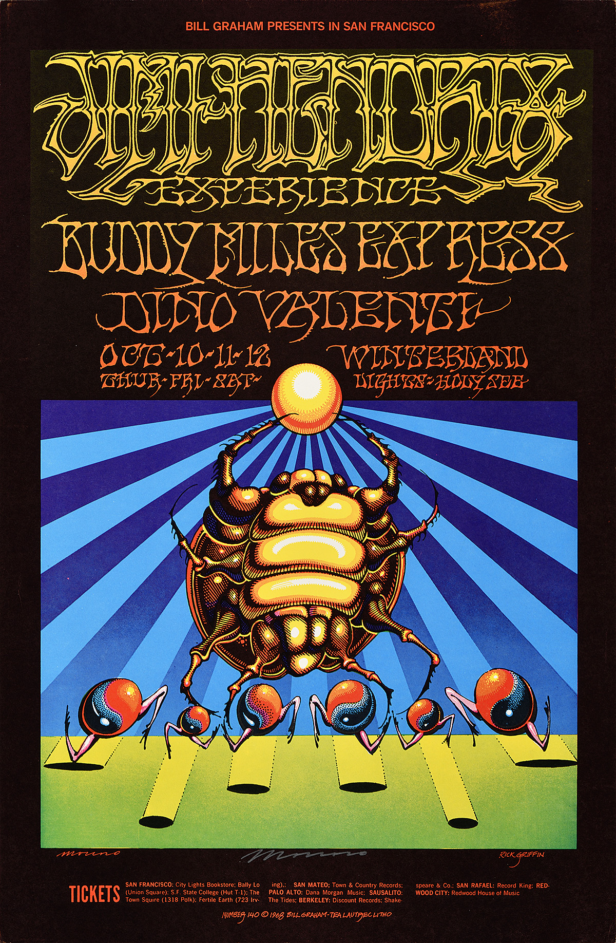
- Jimi Hendrix Experience, 1968
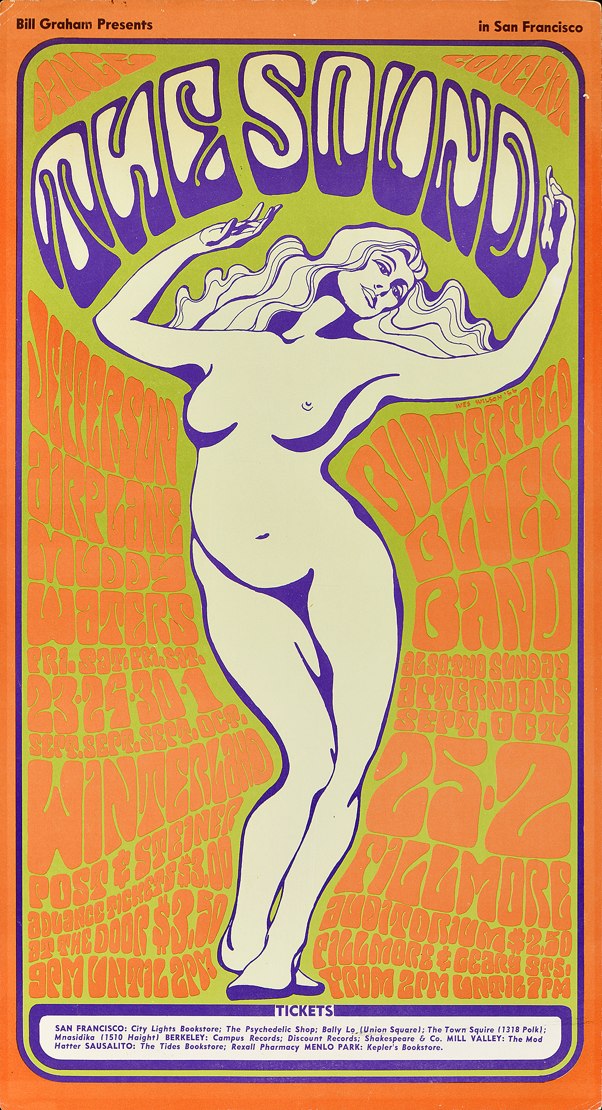
- The Sound, 1966
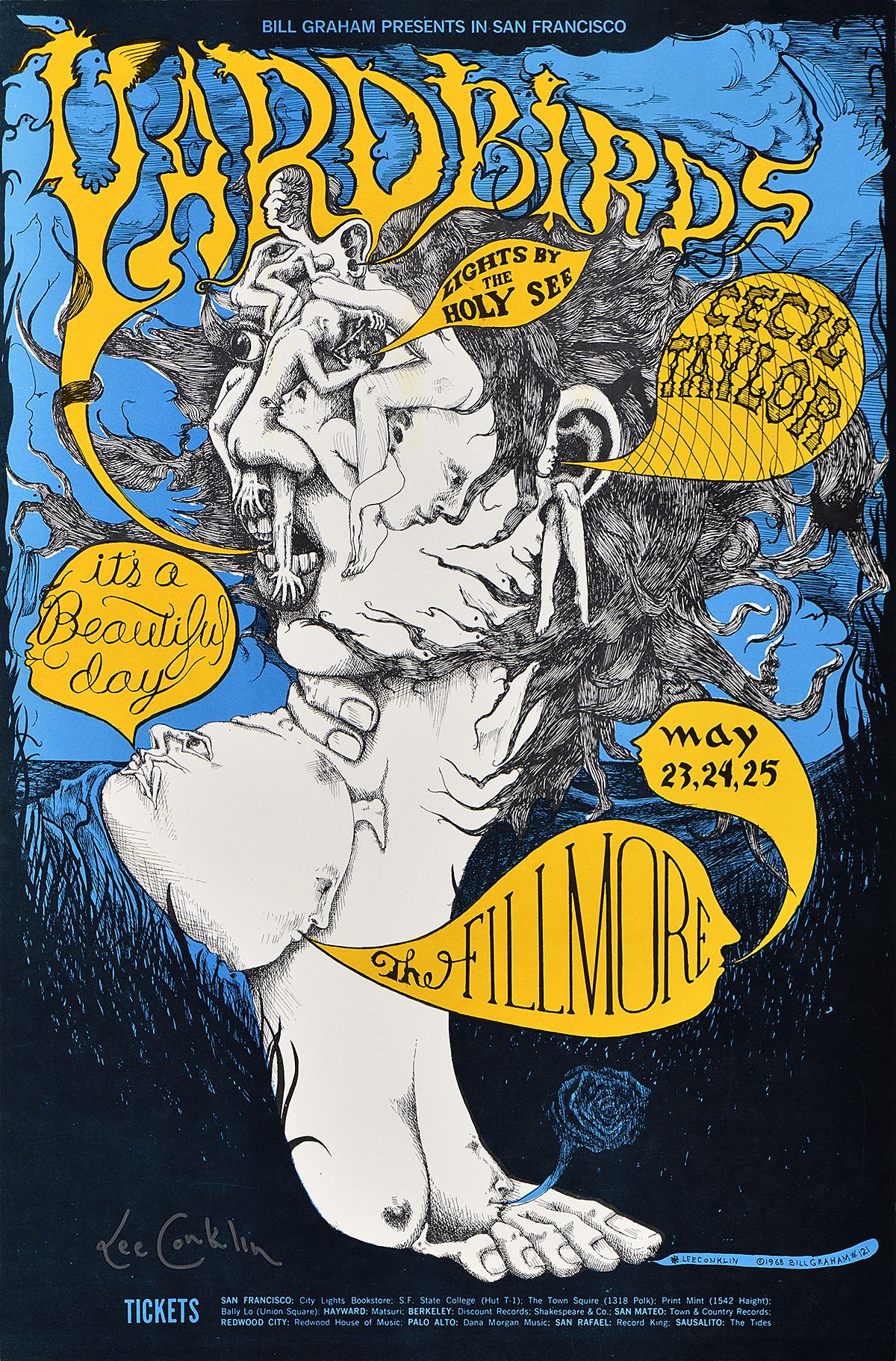
- Yardbirds, 1968
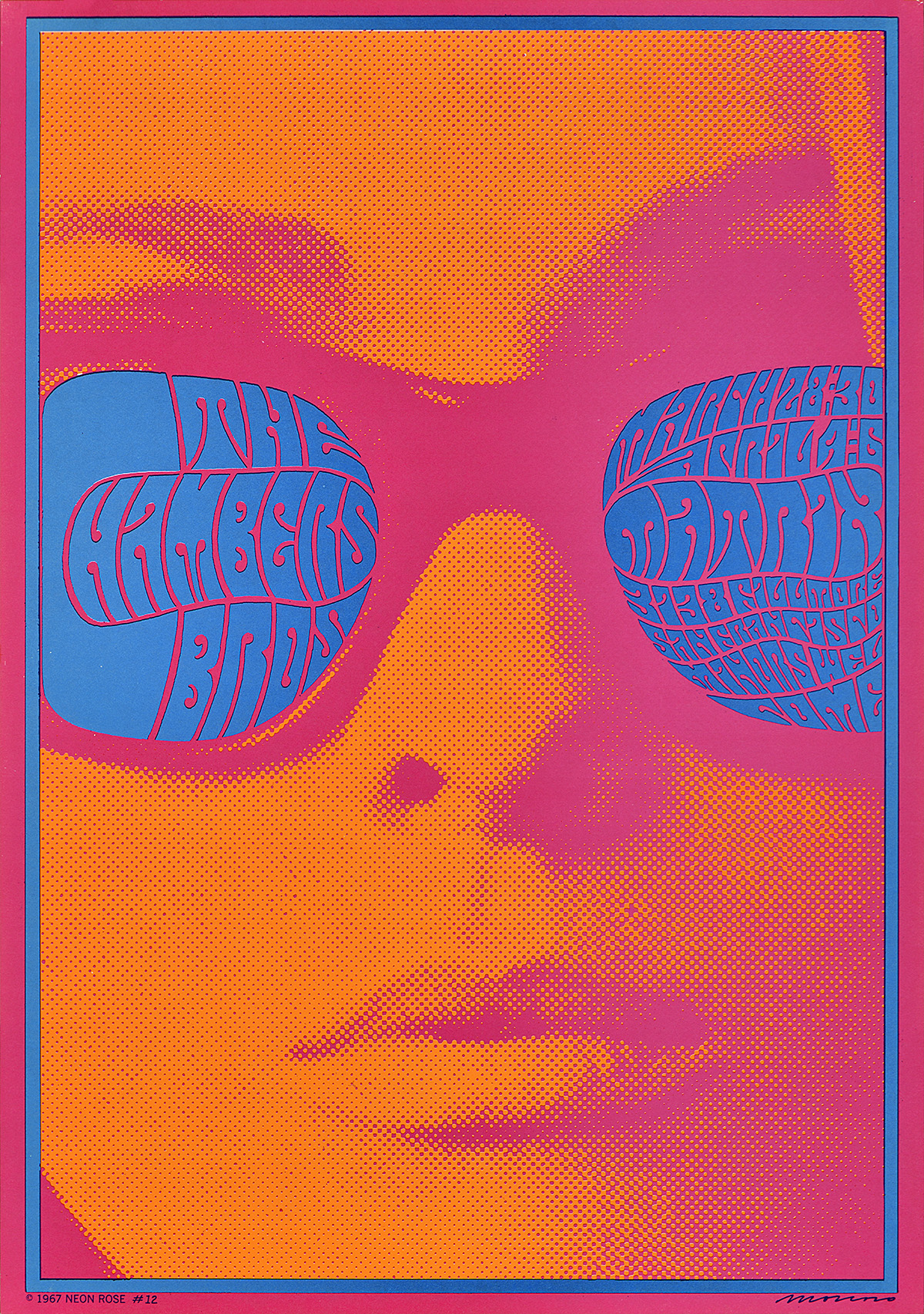
- The Chambers Brothers, 1967
- John Sebastian, 1970
- Jim Kweskin Jug Band, 1966
- Contemporary Design
- Bring in ‘Da Noise, Bring in ‘Da Funk, 1995
- Silkscreen
- Carlos Gardel, c. 1940
- Letterpress
- Tee’s Lounge, c. 2003
- Grand Festival of Arts & Books, 2011
- Juneteenth, 2005
- Langston Hughes African American Film Festival, 2010
- The Café Posters
- Push Pin Studios Posters, 1981
- Cafe Plendl, 1911
- Herman Miller Picnic, 1985
- Heute Metzgete, 2011
- Wisconsin Cheese, 2016
- Medaglia d’Oro, c. 1954
Poster History Timeline
Libraire Ed. Sagot, 1891
Jules Chéret (1836–1932)
Jules Chéret is known as the “Father of the Poster” because he perfected the large-format color printing process that allowed posters to be made cheaply and quickly. He designed more than 1,000 posters in his lifetime. This series of progressive proofs shows how the stone lithographic process works. The image is drawn onto a stone or metal plate using a greasy medium, followed by a solution of gum arabic and nitric acid to fix both the printing and non-printing areas. A roller loaded with oil-based ink is then rolled over this wet printing surface, with the ink only sticking to the desired image. When pushed through a press, paper picks up the ink in reverse. As indicated by these proofs, each color required a separate design and printing stone, meaning that a single sheet of paper would go through a different press multiple times until a final, composite image emerged. Proofs like this would only have been made to allow the printer to check that the individual plates lined up correctly and printed cleanly. Afterwards, they were often discarded. It is therefore a small miracle that this complete series survives.
This image was originally designed for (and rejected by) a Parisian department store. Luckily, the poster and print dealer Edmund Sagot—one of the first people to sell posters to the public—bought the composition and used it to promote his shop. His great-granddaughter still works as a poster dealer today in Paris.
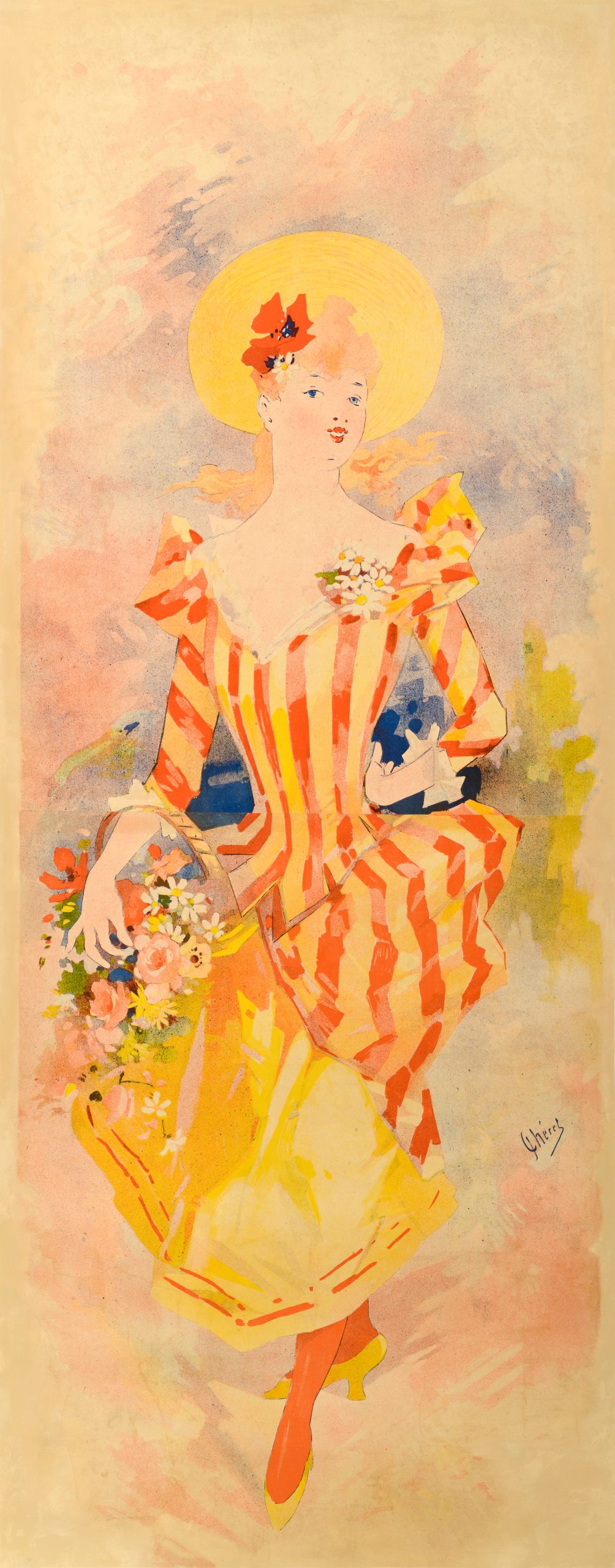
The Belle Époque
The Belle Époque (1871–1914) describes a golden age in France and other parts of Europe characterized by decadence, optimism, and intellectualism. This era saw the emergence of the “poster craze,” a proliferation of poster fairs, and, most importantly, the development of the idea that a poster could be more than just a text-based advertising tool. While artists show off a variety of styles, many posters from this period, printed through stone lithography, feature rich, primary colors, splashy compositions, and heavy outlines. The images are all about exuberance, flirtation, and entertainment.
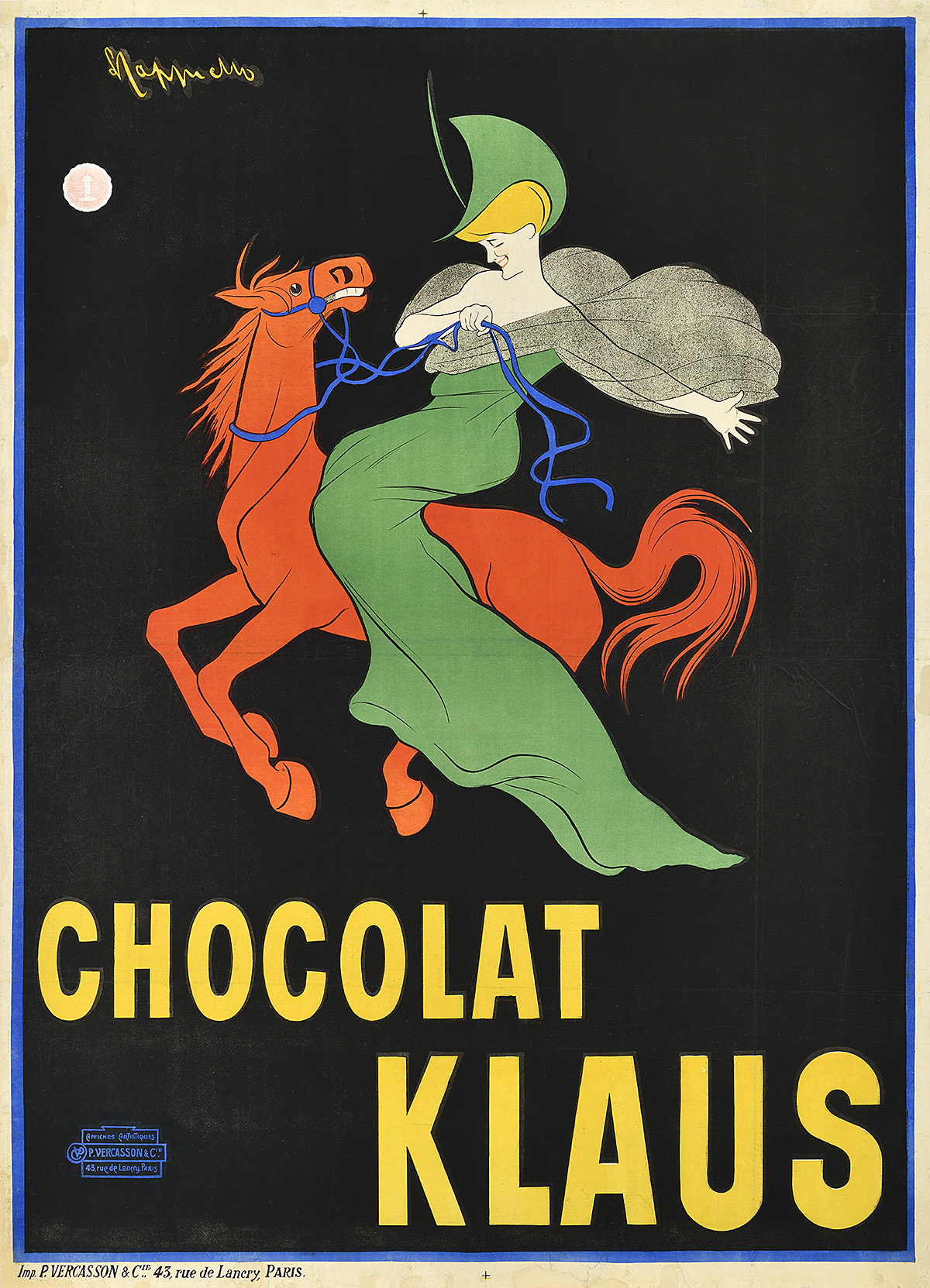
Chocolat Klaus, 1903
Leonetto Cappiello (1875–1942)
Leonetto Cappiello is known as the “Father of Modern Advertising” thanks to his design innovations within the poster field, specifically his lively compositions full of movement and color offset by flat, saturated backgrounds. This poster for a chocolate brand is especially important as it introduced the concept of a mascot to advertising. Rather than show the product, Cappiello chose to present a distinctive image of a woman riding a red horse. This was so novel that people soon began to ask for the chocolate by describing the image rather than mentioning the brand’s name.
Art Deco
The Art Deco period (1920–39) focuses on luxurious expressions of mechanization and uniformity. The sinuous fluidity and lighthearted humor that preceded it is replaced by harder, more geometric lines, while colors become cooler. The resulting compositions appear formal, expensive, and masculine. Designers begin to use extreme perspective, showing objects that seem to tower over the viewer as well as figures which suggest a sense of weight and volume. Typefaces are standardized but still hand-drawn, and an affinity for airbrushing further links the style with commodification and the machine age.
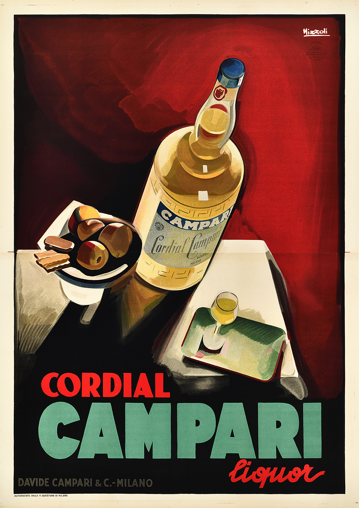
Cordial Campari, 1926
Marcello Nizzoli (1887–1969)
Campari has an especially varied and lively history of advertising posters. This design by Nizzoli, however, is particularly distinctive for its moody interpretation of Art Deco space and perspective. The bottle and table setting are placed at extreme, almost unstable angles, as if they could fall toward the viewer at any moment. This tension combined with the moody color palette suggests a possible nod to the popularity of Cubism at the time in addition to typical Deco drama.
Constructivism
After World War I, Constructivism (1913–34) emerged within the Soviet Union as an aggressive response to the optimism and organic lines of the Belle Époque. Like Art Deco, the style reflects a modern preoccupation with technology and progress; however, political imperatives led artists to imbue their designs with a sense of necessary revolution. Composed of harsh diagonals and bold colors, these lithographic posters were intended to jar viewers out of complacency and into political action.
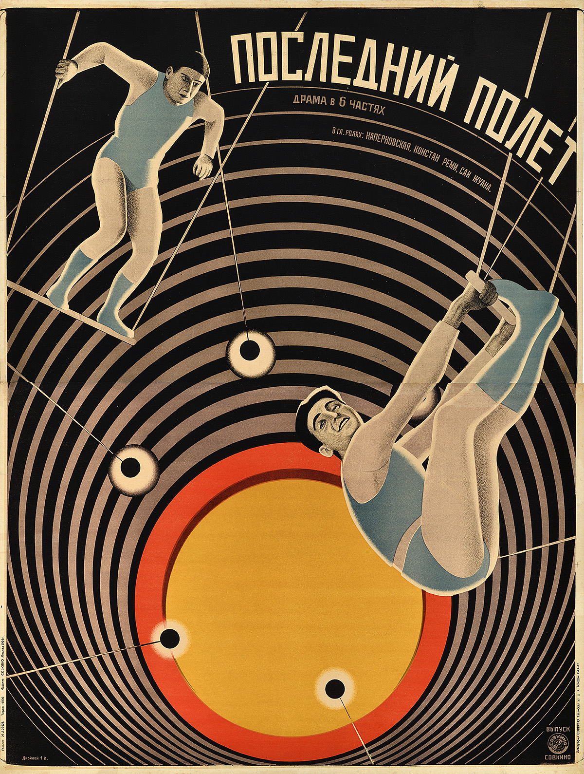
The Last Flight (Posledni polet), 1929
Vladimir Stenberg (1899–1982)
Georgii Stenberg (1900–33)
The Stenberg Brothers are two of the most famous Constructivist poster designers. They are responsible for creating the visual language of the era, pushing posters to a new level of creativity and excitement. In Soviet Russia, artists were rarely able to see a film before designing its poster, thereby relying entirely on a plot description, film stills, or, sometimes, just a title when conceiving a design. To replicate photographic imagery, the Stenbergs frequently projected film stills onto the paper and traced the figures into the composition, creating a proto-photomontage technique. In the 1930s, Stalin would ban entertainment posters in this style in favor of Socialist Realism.
Swiss International Style
Also known as the International Typographic Style (1950–70), this period is defined by simplicity and precision. Designers pared down compositions to more effectively and clearly communicate information, shunning illustration and excessive use of color. New developments in printing technology allowed for the incorporation of photomontage (the insertion of photography into large-scale printing), and sans-serif typefaces like Univers and Akzidenz Grotesk became the standard in all forms of graphic media. Posters were generally produced using photo-offset printing, a technique that came to dominate the postwar period as it was cheaper than stone lithography. Key elements of this style, such as the use of a grid to map out a composition, are still taught to design students today.
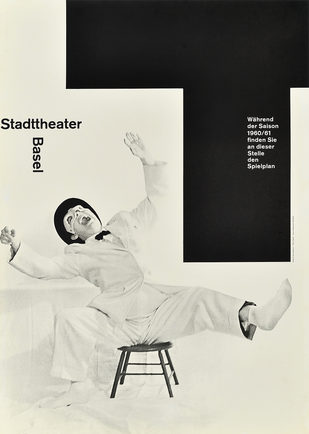
Stadttheater Basel, Saison 60–61, 1960
Armin Hofmann (b. 1920)
Hofmann was one of the masters of this style. His posters appear both effortless and precise, concerned only with direct, impactful communication. Here, he represents both the acts of listening to and watching an enjoyable performance, the “t” for “theater” entering the image as both a reminder of the institution as well as a demarcated area for posting the weekly schedule. This design won the Swiss Poster Award in 1960 for its humor, balance, and effective storytelling.
Psychedelic
A particularly American phenomenon, the psychedelic style (1966–72) emerged on the West Coast and quickly became a signifier of youth counterculture. Inspired by the use of hallucinogens, the designs combine contrasting colors with nearly illegible, swirling text—supposedly best viewed when high. In many cases, the compositions are so complex that some viewers cannot decipher them at first glance, bucking the idea that posters must be instantly and universally comprehensible. Many of the artists also draw on Art Nouveau and Victorian motifs. Contrary to popular myth, all of these posters were printed using photo-offset lithography—the cheapest method of mass printing at the time.
Concert promoters Bill Graham and Chet Helms played key roles in establishing the visual language of the psychedelic rock scene of the 1960s. They discovered and commissioned most of the posters on display here, used to advertise performances at legendary San Francisco venues the Fillmore West and the Avalon Ballroom. A few posters in this collection also feature Graham’s foray in New York with the Fillmore East. These nine designers became the most prominent concert posterists of the era, influencing fashion, art, and culture around the world.
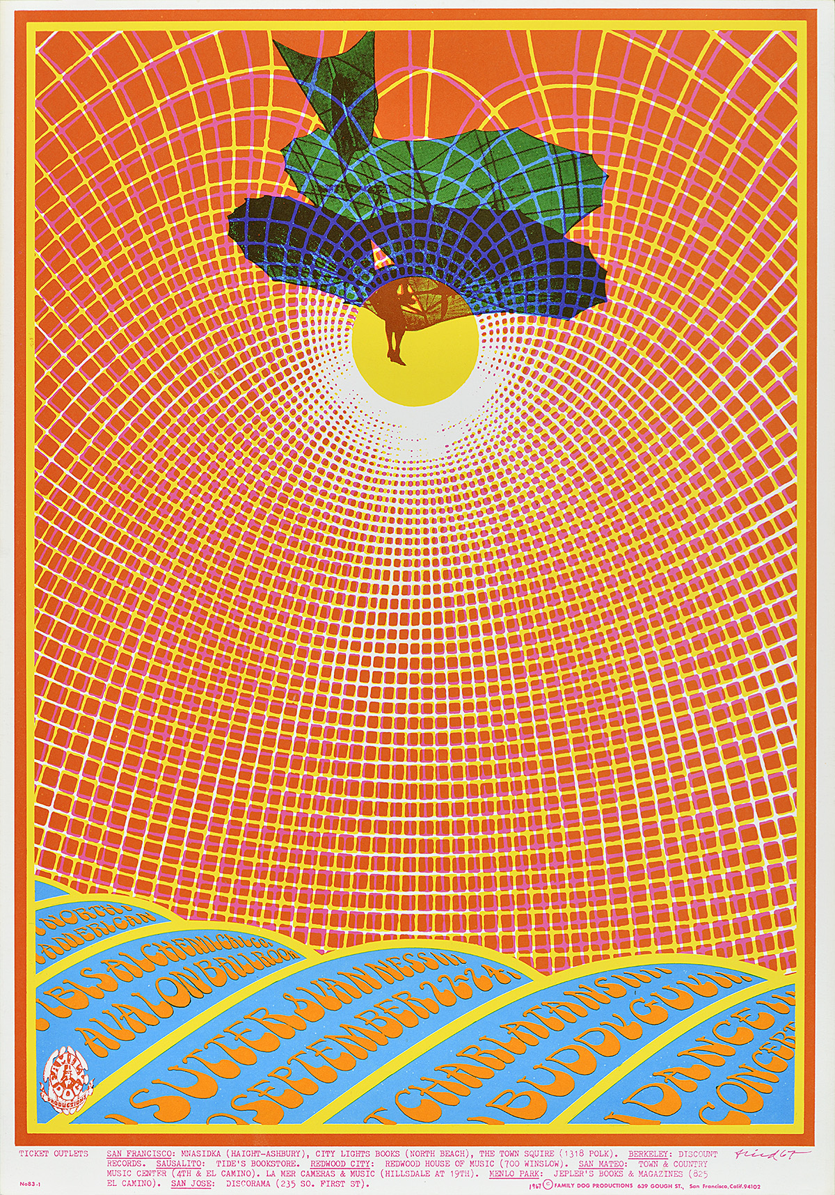
The Charlatans, 1967
Bob Fried (1937–75)
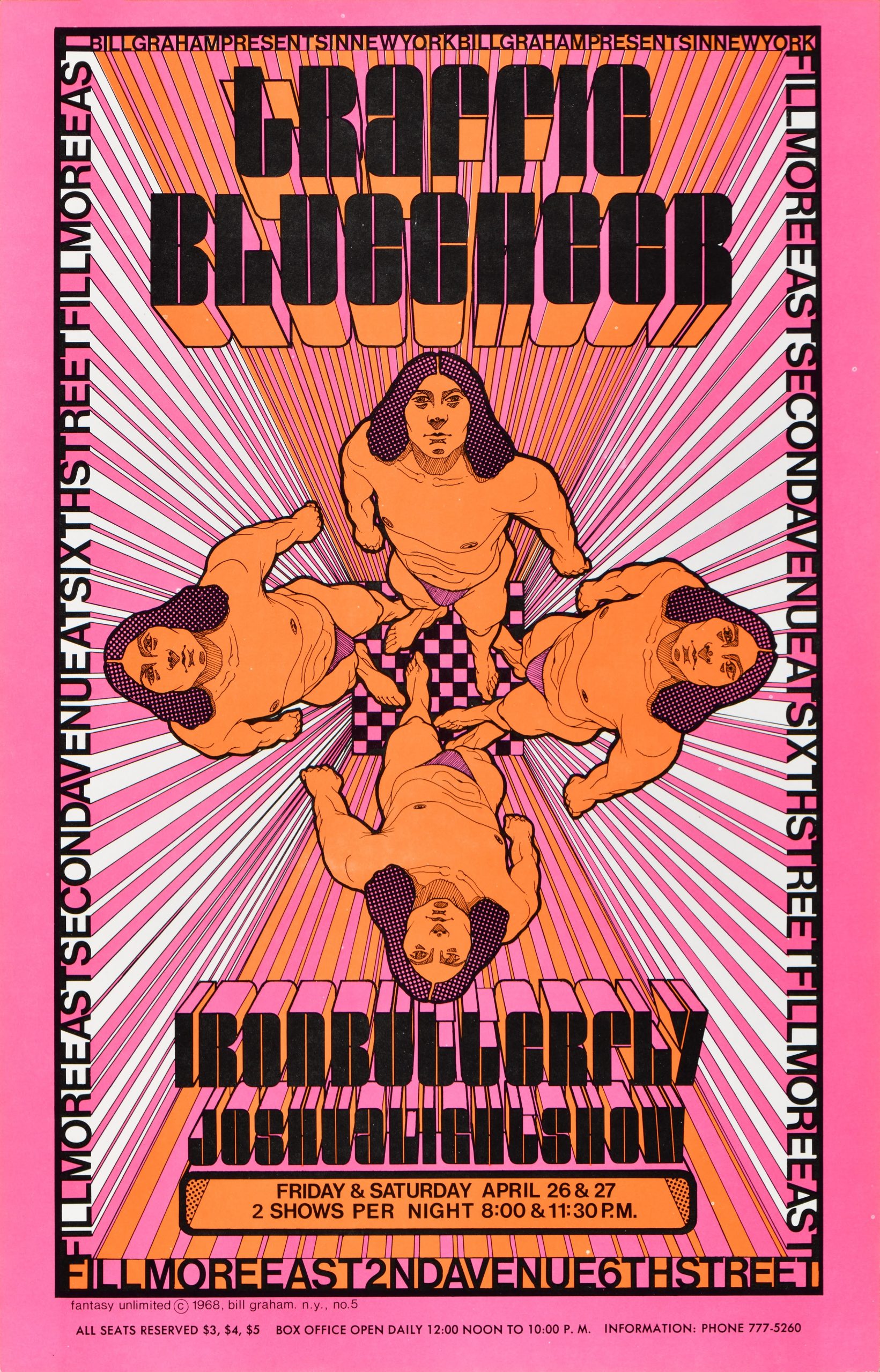
Traffic, 1968
David Byrd (b. 1941)
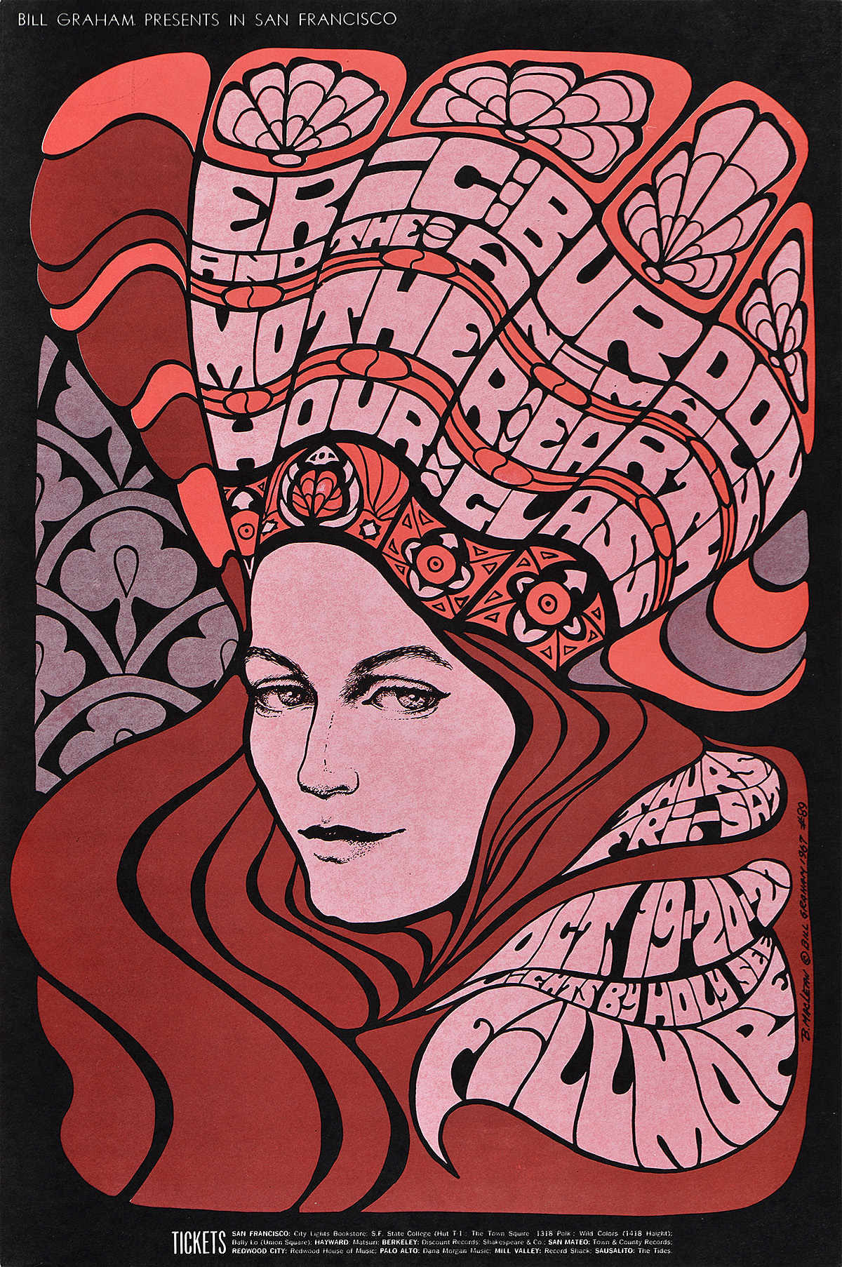
Eric Burdon & The Animals, 1967
Bonnie MacLean (1939–2020)
Jimi Hendrix Experience, 1968
Rick Griffin (1944–91) & Victor Moscoso (b. 1936)
The Sound, 1966
Wes Wilson (1937–2020)
Yardbirds, 1968
Lee Conklin (b. 1941)
The Chambers Brothers, 1967
Victor Moscoso (b. 1936)
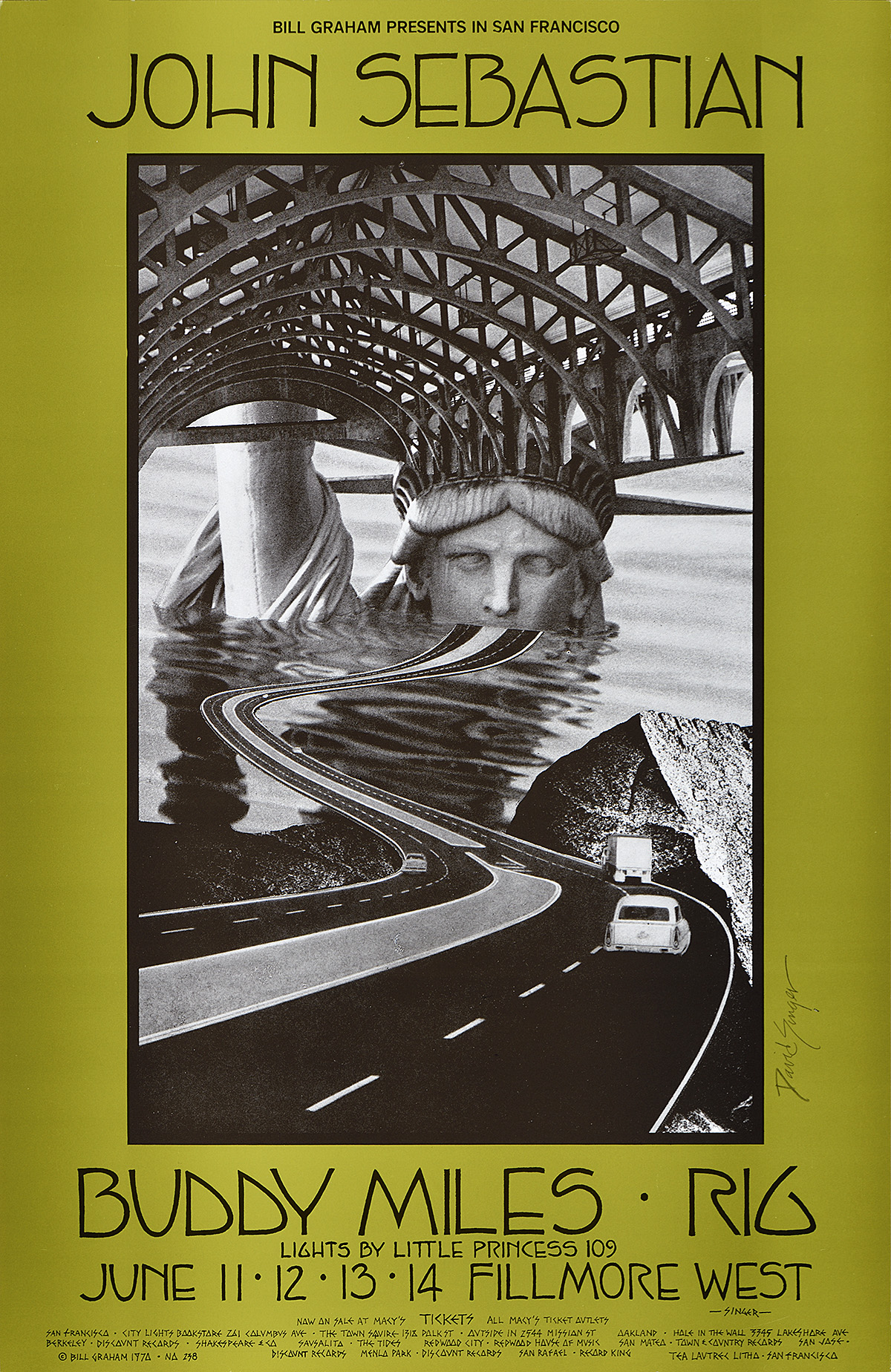
John Sebastian, 1970
David Singer (b. 1941)
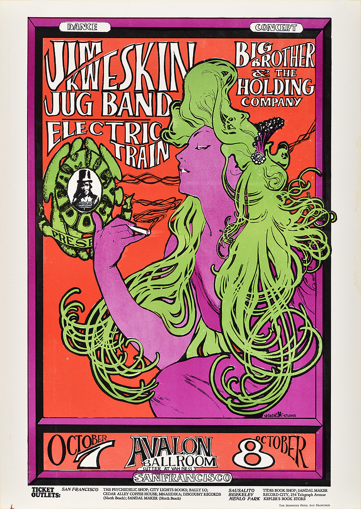
Jim Kweskin Jug Band, 1966
Stanley Mouse (b. 1940)
Alton Kelley (1940–2008)
Contemporary Design
The contemporary poster movement could not be more varied or exciting. With the advent of Photoshop in the 1990s, designers have been able to manipulate imagery and text in a seemingly limitless digital frontier. Rules established by previous generations have been shattered, giving way to stylistic pastiche. Companies frequently commission posters from branding agencies rather than from a specific artist, resulting in most poster advertising being “designed by committee.” Today, the printed poster is rapidly being replaced by the digital sign, leaving the artistic future of the medium in jeopardy.
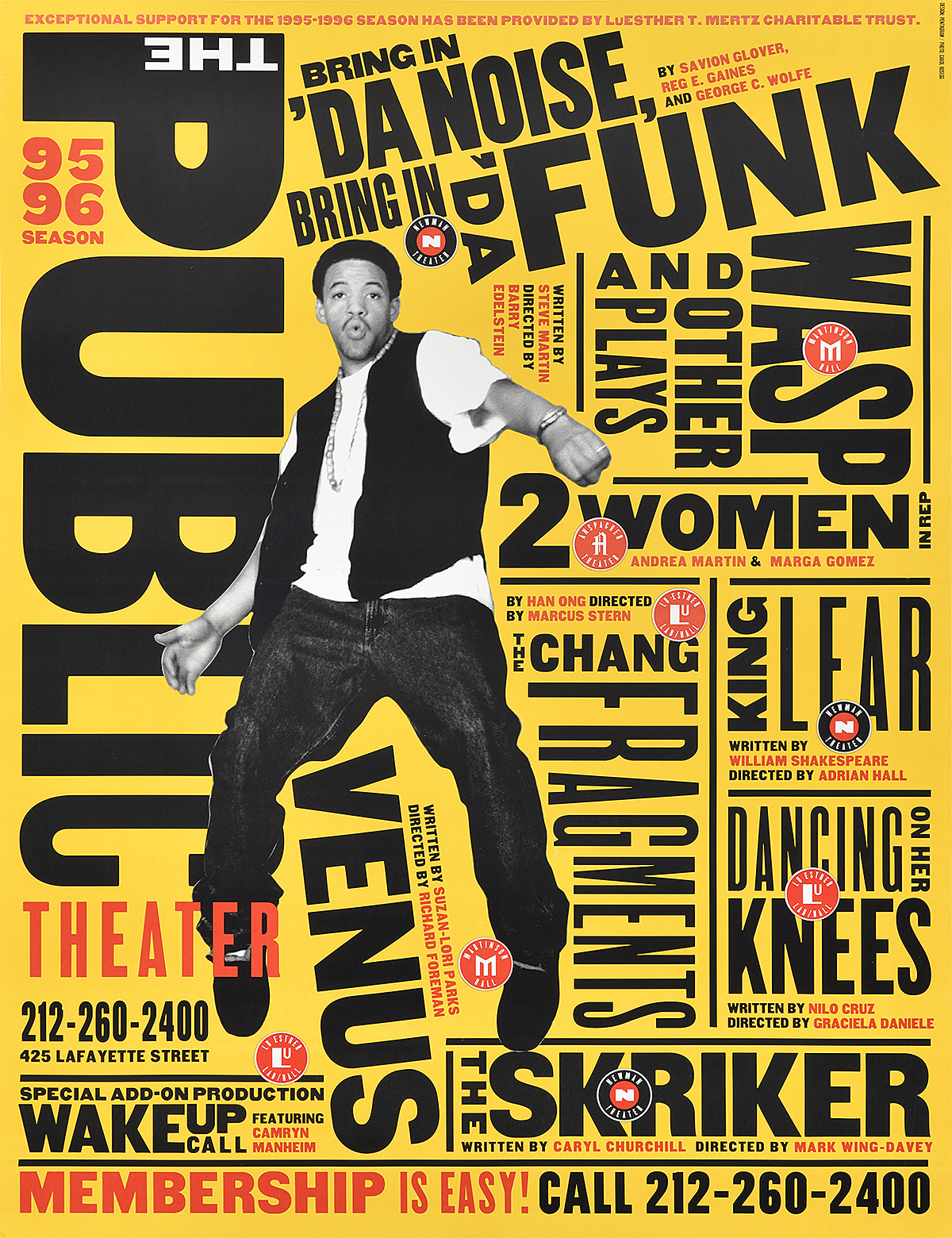
Bring in ‘Da Noise, Bring in ‘Da Funk, 1995
Paula Scher (b. 1948)
This is Paula Scher’s first poster for The Public Theater, created while she was a partner at Pentagram. The dynamic, nonlinear placement of text combined with a bold cutout figure of one of the performers redefined theater advertising in New York City. While many posters in the city are now printed on vinyl stickers, this design was printed through photo-offset lithography on paper. Scher continues to work with The Public today, continuously editing the brand to reflect the vibrancy of both its programming and the city itself.
Silkscreen
Silkscreen printing is an age-old technique dating back to 13th century China, in which color is passed through a tightly-woven screen stenciled with a design. Traditionally, the screen has been made of silk, although today they are more commonly made of polyester mesh. The image transfers in reverse onto a sheet of paper, leaving the unstenciled areas blank. Additional colors can be added using more screens, creating a layered, highly tactile final product. During the 20th century, silkscreen posters are most often associated with protest and revolution as the materials are both cheap and can be quite compact and easy to move or hide. The Paris riots of May 1968 are best remembered through silkscreen posters, as are images of the Cuban Revolution.
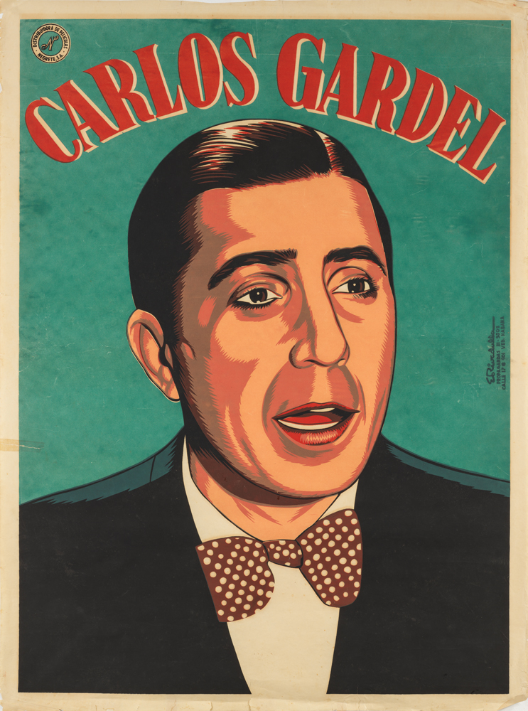
Carlos Gardel, c. 1940
Eladio Rivadulla Martínez (1923–2011)
Rivadulla is considered one of the masters of Cuban poster design, creating hundreds of images for films imported into Cuba during the 1940s and ‘50s. After the Cuban Revolution, he continued producing posters for political films and ideological campaigns until his death. Here, he announces the release of a cinematic biopic of French-Argentinian singer Carlos Gardel, the most important figure in tango history who was beloved throughout Cuba. Gardel died tragically in a plane crash at the age of 44 in 1935.
Letterpress
While relief printing with movable type was first developed in China around 1040 AD, Johannes Gutenberg is typically credited with the invention of the wooden printing press and corresponding cast metal type. Numerous additions and improvements to press printing have occurred since then; however, the general method remains the same—type and image are arranged and laid in reverse on the bed of a press (or a “chase”), ink is applied to those raised surfaces, and paper is pressed over that composition to create an impression. For each color, there is typically another pass through the press.
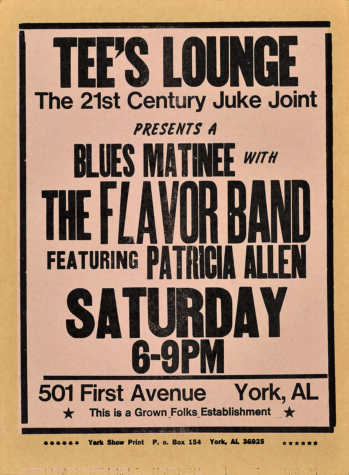
Tee’s Lounge, c. 2003
Amos Paul Kennedy Jr. (b. 1948)
Amos Paul Kennedy Jr. is a contemporary letterpress printer. His work primarily focuses on documenting Black cultural events in the rural South, embracing the medium as the perfect means of unpretentious communication. The four examples on display show the breadth of his skill, combining a variety of techniques in the poster-making process.
Tee’s Lounge is the most straightforward letterpress poster in this display, combining a variety of type styles, but also incorporating Amos’s fabulous sense of humor with an upside down “7” being used as the “L” in “Flavor.”
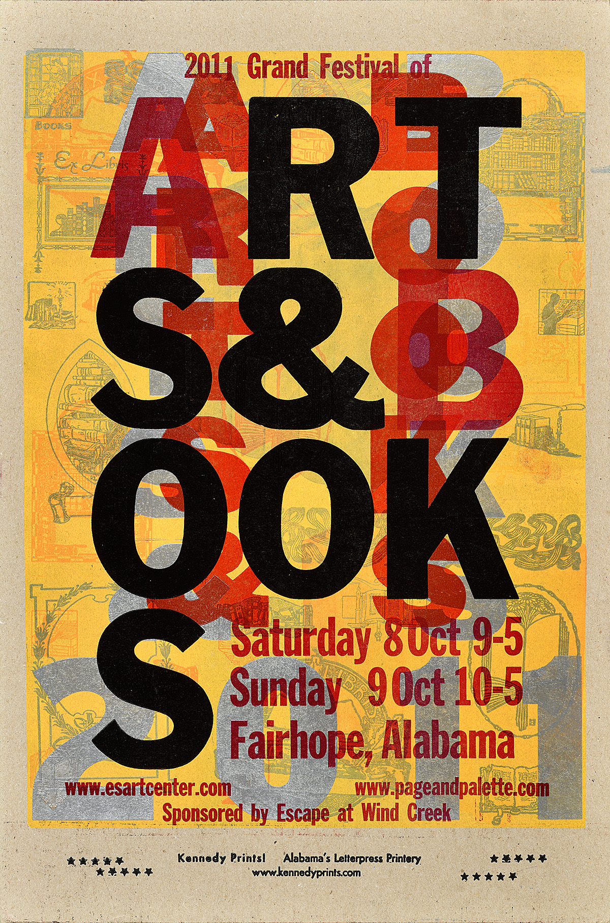
Grand Festival of Arts & Books, 2011
Amos Paul Kennedy Jr. (b. 1948)
The Grand Festival of Arts & Books shows off Amos’s signature layering effect as well as his collection of vintage printers cuts (small images on blocks).
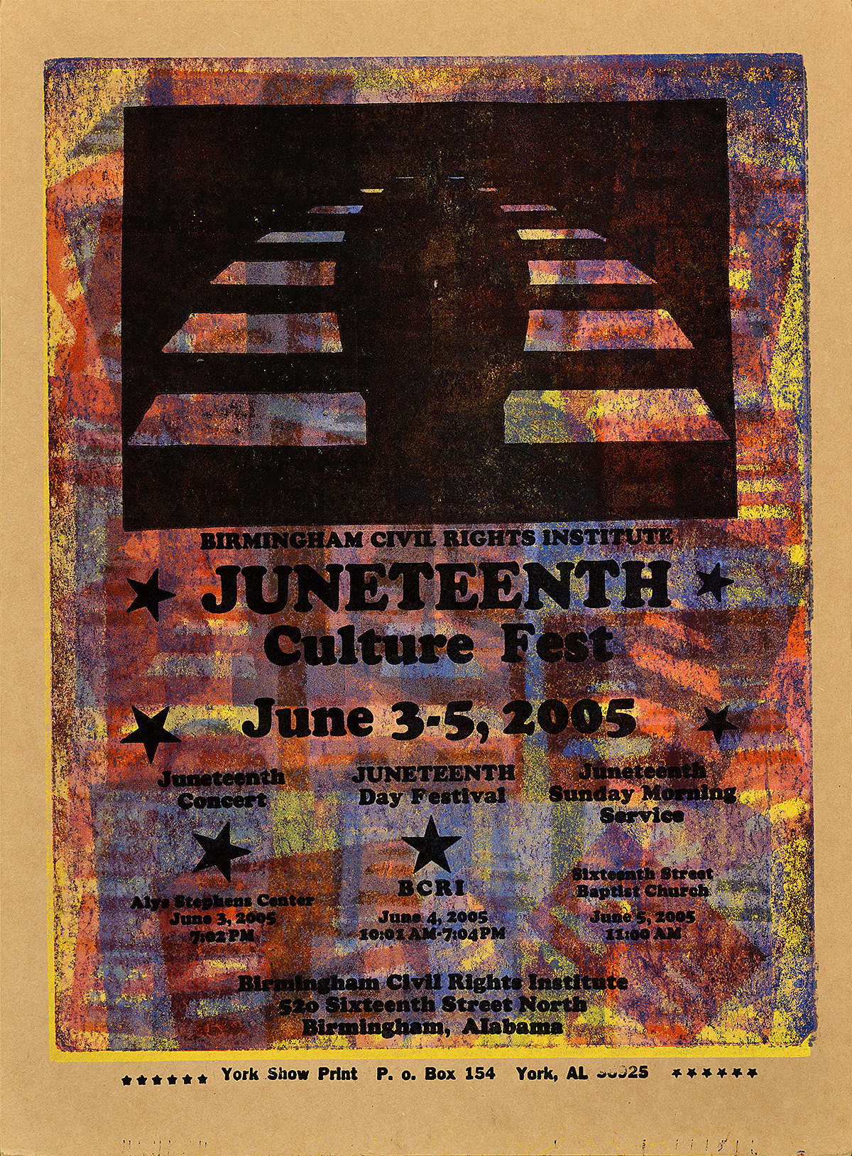
Juneteenth, 2005
Amos Paul Kennedy Jr. (b. 1948)
Juneteenth—an annual celebration of African American freedom from slavery—includes the sponsoring organization’s logo repeated as a pressure print throughout the background.
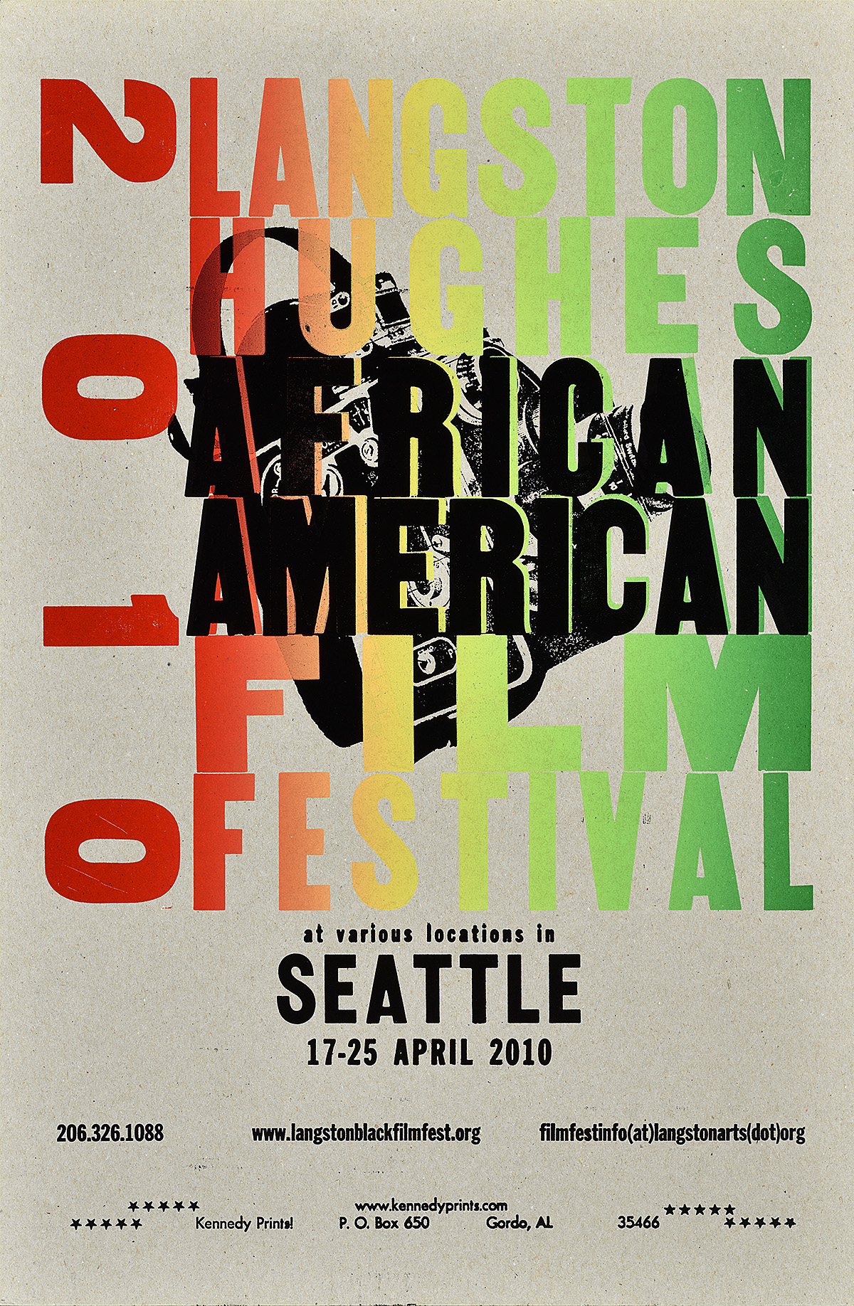
Langston Hughes African American Film Festival, 2010
Amos Paul Kennedy Jr. (b. 1948)
The title of Langston Hughes African American Film Festival is created through the use of a rainbow roll (a high-impact printing method wherein dollops of ink are spaced along the printing cylinder and, when spread thin, combine to create a rainbow effect).
The Café Posters
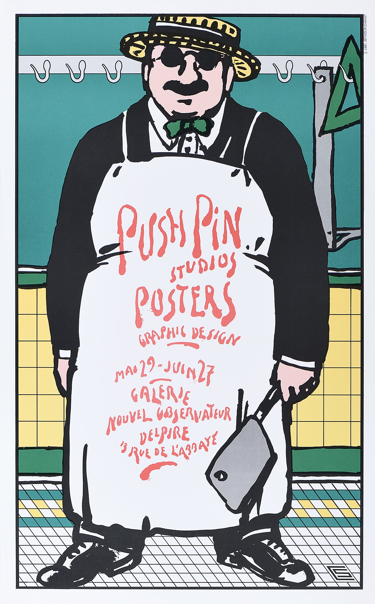
Push Pin Studios Posters, 1981
Seymour Chwast (b. 1931)
The formation of Push Pin Studios marked a return to illustration in the world of American advertising. A direct counterpoint to the grid-based simplicity of European posters of the 1950s and ‘60s, Push Pin’s collaborative, tongue-in-cheek ethos resulted in a new generation of poster designers whose influence is still felt today. Created through photo-offset lithography, this design advertises an exhibition of the studio’s work in Paris. Chwast notes that he was inspired by a 19th-century poster featuring a similarly corpulent butcher. While he originally aimed at changing the blood-lettering for a variety of subsequent shows, the poster was only ever used once.
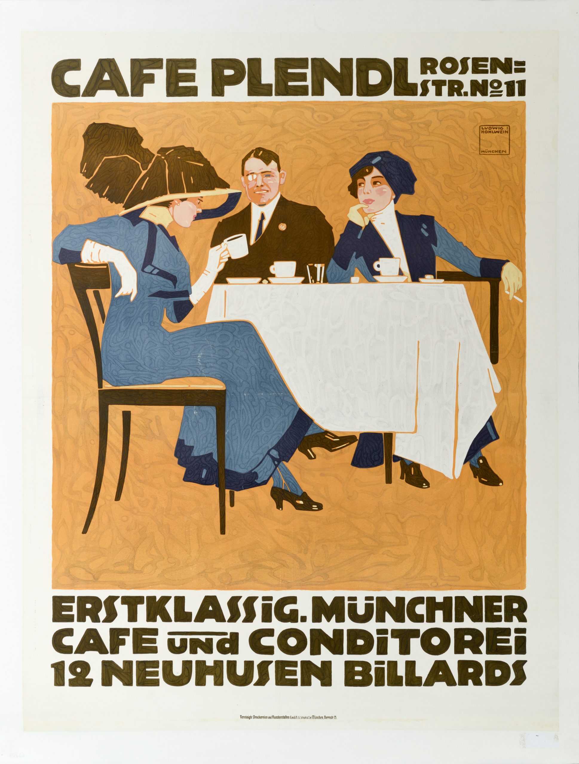
Cafe Plendl, 1911
Ludwig Hohlwein (1874–1949)
Hohlwein was a master of the German counterpoint to Art Deco. Through the use of flat planes of color and subtle patterns, he created figures without outlines and space without depth. This lithographic poster advertises a “first class” coffee and pastry shop in Munich, filled with elegant clientele.
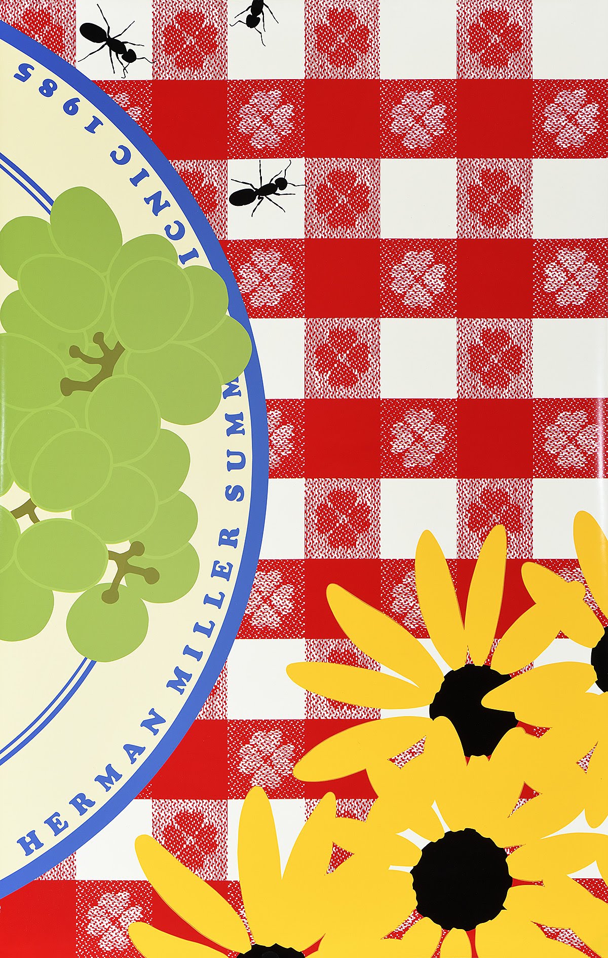
Herman Miller Picnic, 1985
Steve Frykholm (b. 1942)
In 1970, Steve Frykholm created the first in an iconic series of silkscreen posters advertising the annual picnic at the Herman Miller furniture company. Each image, printed in bright colors and in a loose, illustrational style, presents an element of an outdoor picnic in extreme closeup.
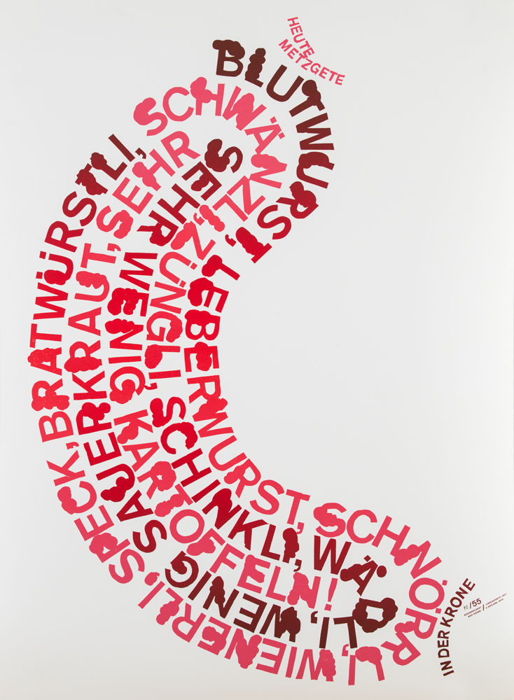
Heute Metzgete, 2011
Dafi Kühne (b. 1982)
Printed in various shades of red, this clever design twists type into the shape of a sausage to promote Metzgete at a local restaurant. Metzgete is a traditional Swiss meal featuring various nose-to-tail preparations of a freshly-slaughtered pig, all accompanied by potatoes and sauerkraut. Kühne printed this poster as a linocut using his own letterpress.
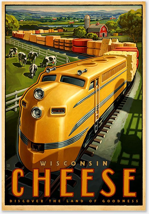
Wisconsin Cheese, 2016
Shine United, WI
American posters promoting rail travel during the mid-20th century typically showcased a weighty, impressive train charging across the landscape. Often drawn with an acute depth of field, the locomotive typically vanishes into the horizon. This poster promoting Wisconsin cheese takes the most recognizable elements from that genre and updates them in a humorous, eye-catching design printed by offset lithography.
Above Café
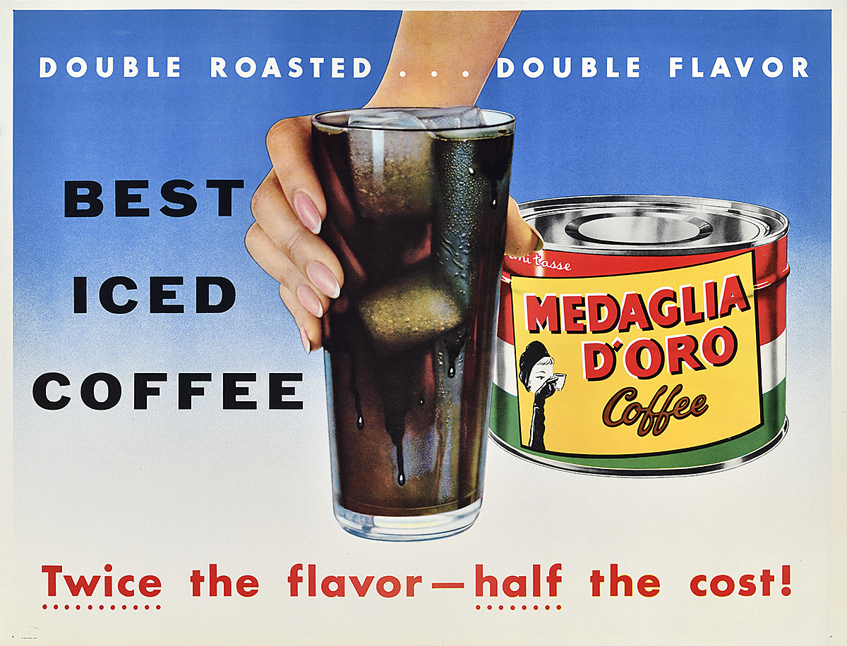
Medaglia d’Oro, c. 1954
Designer Unknown
In the 1950s, Medaglia d’Oro came out with a series of posters promoting various ways to enjoy their signature Italian-style espresso. Referencing the classic Swiss Object Poster, each design, printed via photo-offset lithography, focuses solely on the product itself accompanied by bold, simple text. This poster advertises the joys of iced coffee (which, incidentally, you can buy right here in our café!).