Leaving the Smoke Behind: Enjoying an Awayday

The majority of the works in this exhibition date from the golden age of London Passenger Transport Board posters—broadly speaking the 1920s and ’30s—when many artists were commissioned to produce designs, primarily for the London Underground (colloquially known as the Tube) and its various connecting networks of tram and bus lines. Frank Pick, the managing director of the Transport Board, shaped the network’s unified approach to industrial design, commissioning everything from award-winning buildings and railway vehicles to strikingly modern posters. In this post-World War I era, the overarching concept behind the poster campaigns was to encourage off-peak travel across the wider network through eye-catching, attractive designs, thus driving up revenues for underused lines that were not reaching anticipated profit targets.

Most of these posters did not advertise the train lines themselves but focused on images of pastoral and other unspoiled destinations suitable for weekend day trips such as historic country houses and beaches, or on sporting events like rowing races, all on the outer reaches of the Tube lines. At the time, this kind of aspirational advertising was rare, but both enthusiasts and critics of the poster campaigns labeled them as effective propaganda. 

By representing a variety of destinations, these campaigns also emphasized the breadth of the network. Although popularly thought of as an urban rail system, by 1910, the Tube had branches that stretched via the 60-mile-long District Line to the greenery of Wimbledon and the riverside of Richmond, via the 42-mile-long Metropolitan Line to bucolic Buckinghamshire, and via the 36-mile-long Northern Line past the vast expanse of Hampstead Heath and beyond to suburban Hertfordshire. By contrast, the longest line on the New York City subway is the 31-mile-long A train, which did not open until 1932. 

The designers of these vividly colored posters frequently juxtaposed the inherent grayness of inner-city London with  images of  vibrant locations available just a short Tube ride away. There was a certain reality to this, however: before the Clean Air Act was ratified in 1956, mandating that only smokeless fuels could be burned in London, the city was known to many as “The Smoke” due to the legendary smog that hung over it like a putrid blanket. Ironically, one of the most famous Tube posters—Power (1931) by Edward McKnight Kauffer—features Lots Road Power Station, the main provider of electricity to the Tube, proudly belching dark clouds produced by the 700 tons of coal it burned each day. The Thames, the main river that runs through London, was no better. Although frequently depicted in appealing hues, the reality was always very different, and in a 1957 environmental survey the Thames was declared “biologically dead.” The city was extremely polluted, and these posters let riders know that London Transport provided an affordable respite from such unpleasant conditions.


Unless otherwise noted, all posters on display are courtesy of the Hall Art Foundation. 

Whenever feasible, Poster House reuses materials from previous shows to drive sustainable practice.


Large text is available at the Info Desk. 

Guías con letra grande están disponibles en atención al público.


No beverages beyond this point.
Over the Hills and Far Away

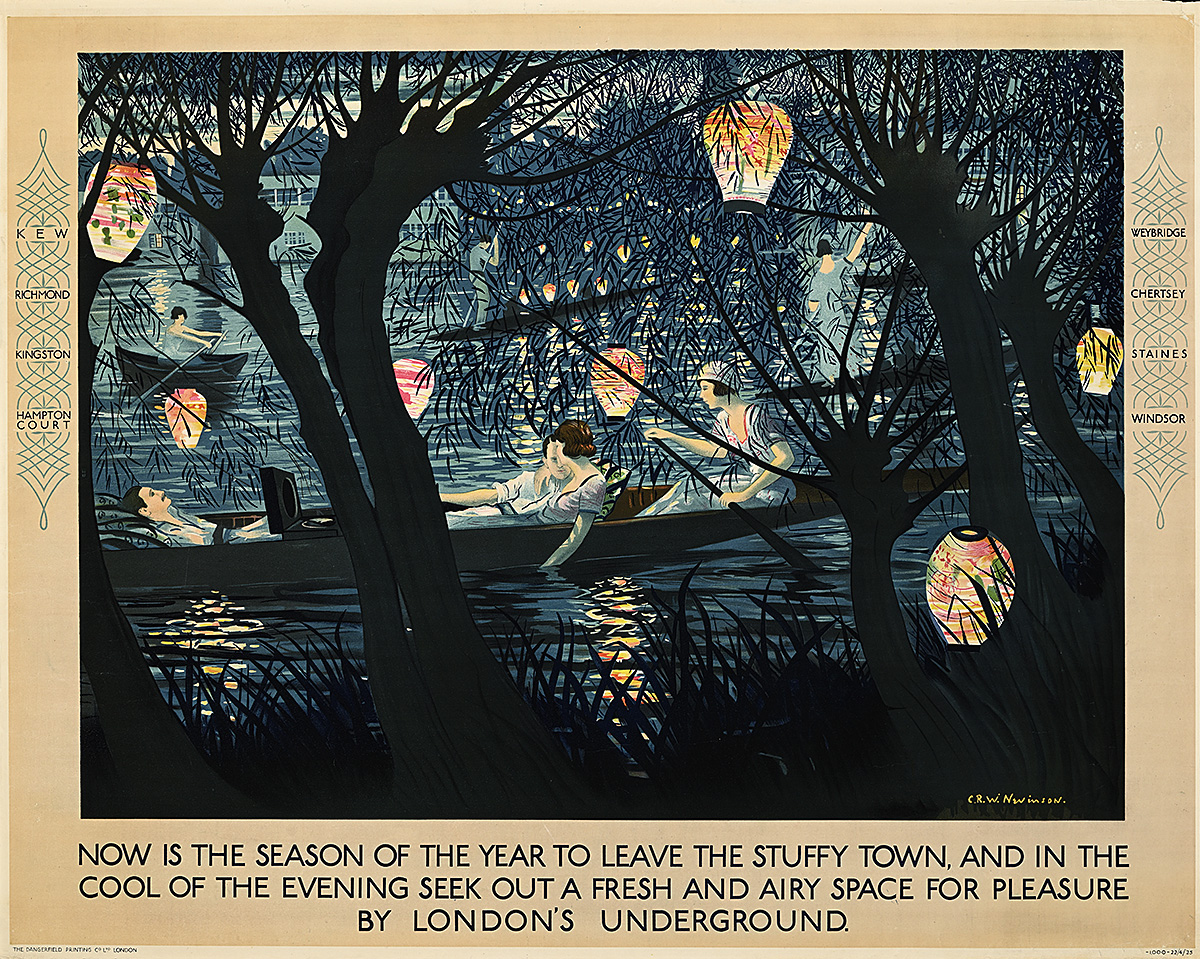
Now is the Season of the Year, 1925

A poster of 2 couples in a rowboat on the river at night, framed by trees and paper lanterns.

Christopher Richard Wynne Nevinson (1889–1946)

Hall Art Foundation

  • In this incredibly romantic design, Nevinson depicts a moonlit summer night along the Thames. Young people enjoy a peaceful boat ride illuminated by Japanese paper lanterns hanging from trees along the river bank. 
  • While no specific destination is mentioned, various towns along the river that can be reached via the District Line are listed in the left and right margins, indicating that the poster is meant to evoke a wide range of appealing locations. 
  • Many of the posters in the show can be classified as aspirational, since most of the people using the Tube were not “dressed to the nines” for a day out. This depiction of an upscale evening along the river is a classic of its type. Here, the revelers are shown in fashionable clothing, and one group even has a record player in its boat to provide musical entertainment. 
  • Most interestingly, the rower of the boat in the foreground is female—a nod to the growing women’s movement in England; three years after this poster was issued, women over the age of 21 were finally given the right to vote. 

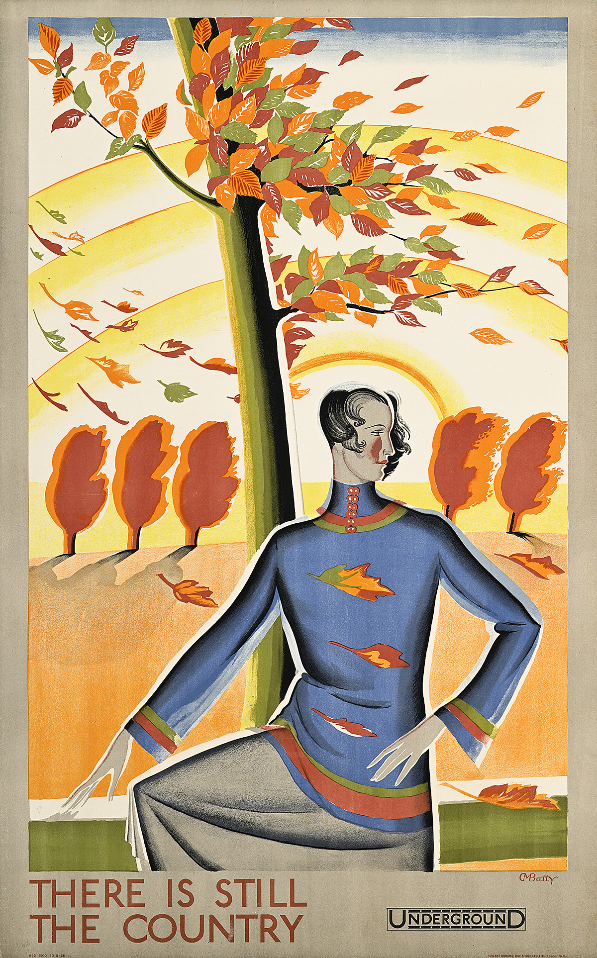
There is Still the Country, 1926

A poster of a woman standing before windswept trees with green, red, and orange leaves.

Dora M. Batty (1891–1966) 

Private Collection, VT

  • While most of the posters in this exhibition feature specific destinations, some simply emphasize the allure of easy travel to the countryside via the Tube. Here, viewers are reminded that “there is still the country” whenever that autumn chill hits the air, encouraging them to depart the city for a crisp, pastoral walk. 
  • Between 1921 and 1938, Dora Batty was the leading female poster designer for the London Underground, producing more than 60 posters. Women artists designed approximately 30 percent of the posters for London Transport during its golden age—a notably high percentage in an era known for strong gender disparity, and one unrivaled by any similar corporate publicity campaign. 
  • Batty was an accomplished graphic artist but she was also a textile designer who taught at the Central School of Arts and Crafts in London, later becoming Head of School. Her sensitivity for fabric is demonstrated here in the handling of the relaxed folds of the figure’s modern, knit outfit.

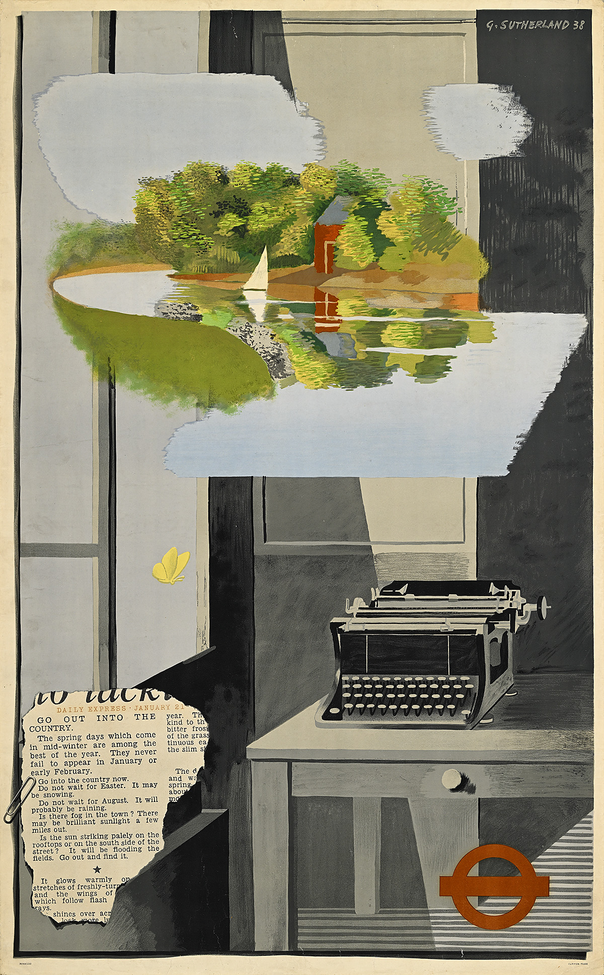
Go Out Into the Country, 1938

A poster of a typewriter on a desk and a river scene with a red house and sailboat hovering above it.

Graham Sutherland (1903–80) 

Hall Art Foundation

  • In this Surrealist design, the artist juxtaposes a gray city desk and an abandoned typewriter with a dreamy, idyllic vision of a riverside park. At the lower left, a newspaper clipping from the Daily Express encourages readers to “go out into the country” to experience “spring days which come in mid-winter,” emphasizing that just a few miles outside the city one can experience “brilliant sunlight.” The absence of a person at the desk suggests that the journalist has followed his own advice. 
  • Frank Pick gave artists relative freedom in their designs for the Underground, and this often resulted in sophisticated compositions that introduced the public to modern, avant-garde styles and movements. Graham Sutherland began experimenting with Surrealism in the 1930s, and produced a handful of posters for the Tube—this was the most avant-garde of these designs.
  • In keeping with Pick’s belief that “design is not a mode that enters in here and there and may be omitted elsewhere. Design must enter everywhere,” the logo for the various iterations of the London Transport companies was constantly being updated—a visual evolution that is demonstrated in the posters. This culminated in the famous bar and circle design, or roundel, that is now globally associated with the Tube. 

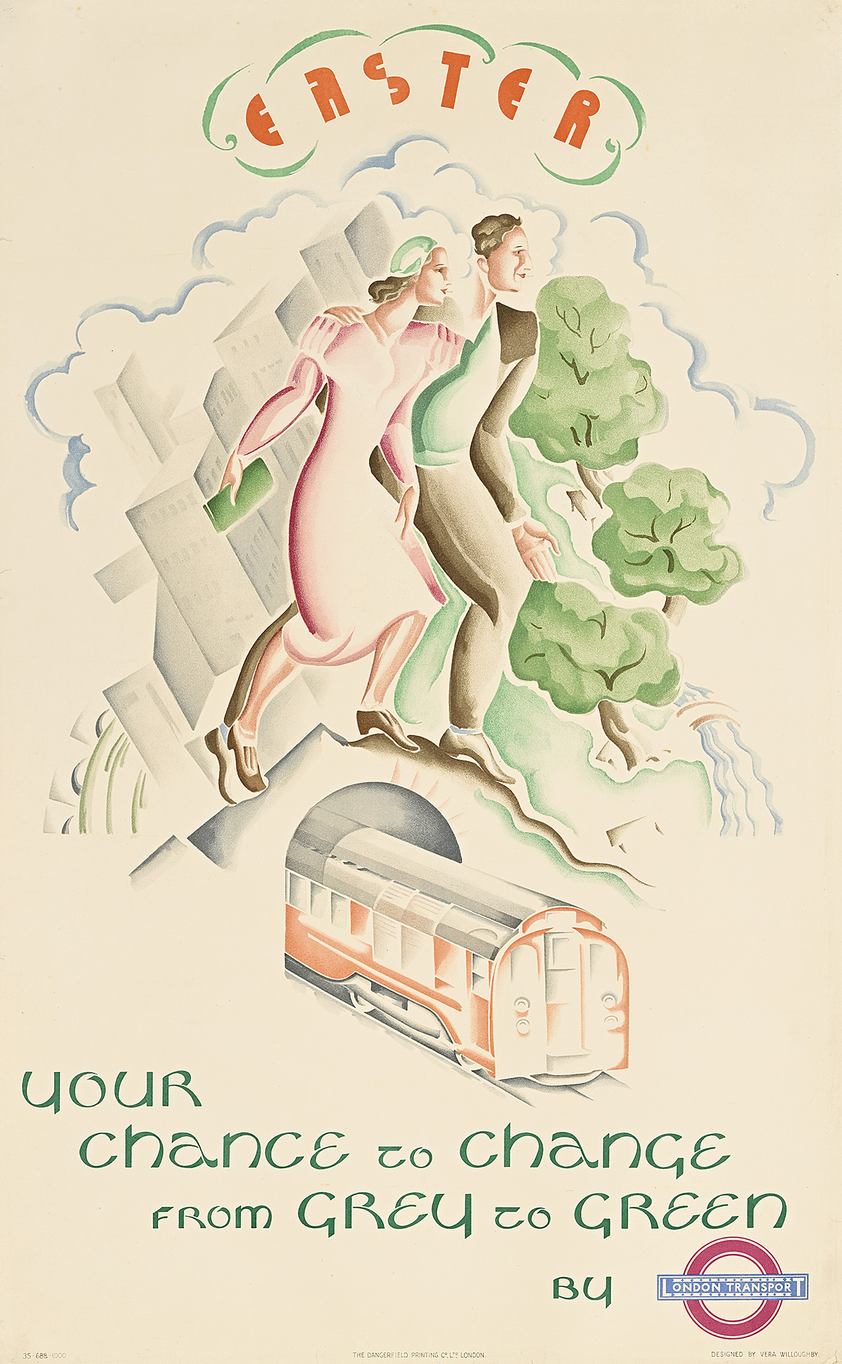
Easter/Your Chance to Change from Grey to Green, 1935

A poster of a man and a woman walking across a railway bridge from a gray city to green woods.

Vera Willoughby (1870–1939)

Poster House Permanent Collection

  • Few posters emphasize the stark difference between central London and the outer edges of the city as explicitly as this design, which states that London Transport is the best way to seek “green” outside of the city’s “grey.” The couple is also shown walking away from dreary buildings toward lush parkland. 
  • Public holidays like Easter provided London Transport with a great opportunity to convince city dwellers to take advantage of the convenience and affordability of the Underground and enjoy a day trip or what was known as an “awayday.” 
  • It is impossible to know how many women designers contributed to these poster campaigns as many of the compositions are unattributed; however, Frank Pick appreciated the fact that both the Arts and Crafts and Bauhaus movements accorded a degree of equality to women. Moreover, unlike other advertising agencies of the time that hired women specifically to promote goods and services to other women, Pick commissioned artists based on talent, often resulting in women artists taking on stereotypically “masculine” subjects.

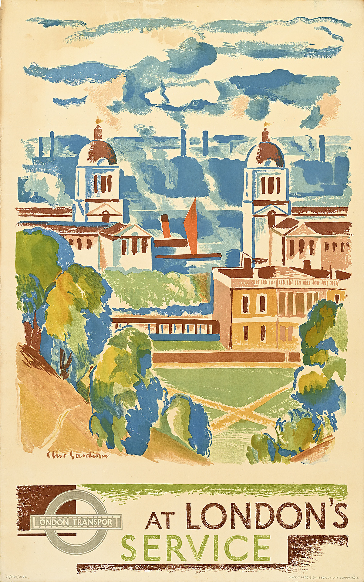
At London’s Service/Greenwich, 1934

A poster with a view of smoky factories behind a building with 2 towers and a green space.

Clive Gardiner (1891–1960) 

Poster House Permanent Collection

  • Located less than an hour outside of London, Greenwich’s Royal Naval College provided advanced training for officers between 1873 and 1998. The campus was designed by celebrated architect Sir Christopher Wren, and is situated on 271 acres along the Thames. In 1997, it was designated a UNESCO World Heritage Site, described as the “finest and most dramatically sited architectural and landscape ensemble in the British Isles.”
  • Clive Gardiner contrasts the naval college’s vibrant, stately beauty with the darkened, smoke-filled city of London in the background, emphasizing that Greenwich offered a break from polluted city life that could easily be obtained by Tube. 
  • The tagline “at London’s service” was used on numerous posters at the time and denotes the democratic nature of the Tube, which was intended to provide city dwellers with affordable, accessible transportation to pleasant, rejuvenating destinations.

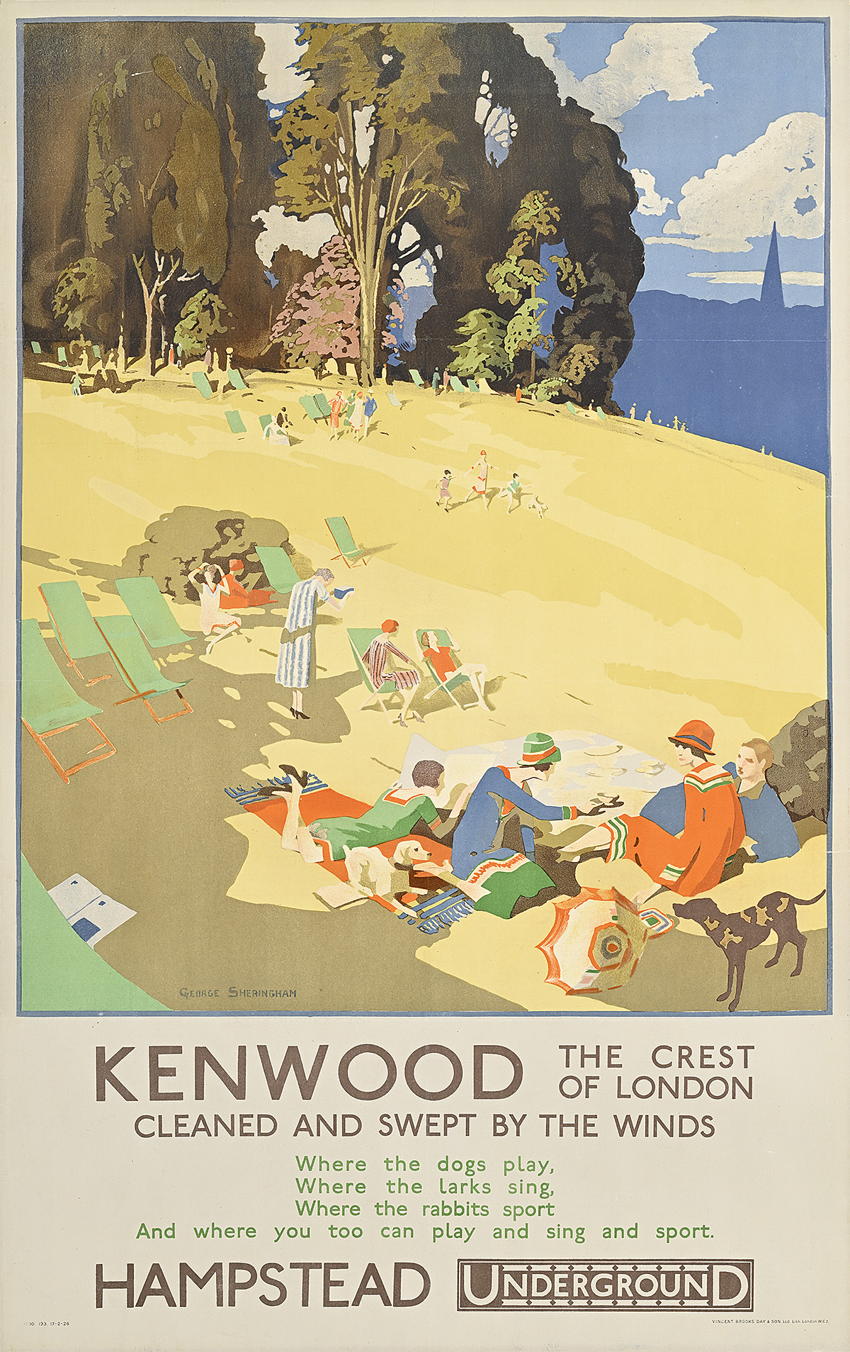
Kenwood/The Crest of London, 1926

A poster of people picknicking and lounging in green deck chairs on a yellow hill.

George Sheringham (1884–1937)

Private Collection, VT

  • Kenwood House is a grand 17th-century home once occupied by the Earls of Mansfield. In 1924, a portion of its land was given to the London County Council for public use. 
  • This poster highlights the newly opened park area situated on Hampstead Heath, the highest point in London, covering around eight hundred acres. As was common in many London Underground designs of the time, the accompanying text is presented in the form of a poem or limerick, enticing the public to take the Tube to visit a peaceful place “cleaned and swept by the winds” where one can “play and sing and sport.”
  • Early 20th-century England was still an especially class-bound society and much of the Underground’s advertising imagery therefore appears aspirational, with figures typically decked out in stylish, modern, and relatively fancy attire. While Kenwood was indeed a posh destination, visitors would have represented a broader social mix than the one depicted in this poster. 
  • Hampstead formally became part of London in 1888, with Hampstead Underground Station—the deepest in the London Underground network—opening in 1907. The Tube’s expansion into the outer edges of the city encouraged what became known as “commuting” due to the fact that regular users were offered commuted (reduced) fares.

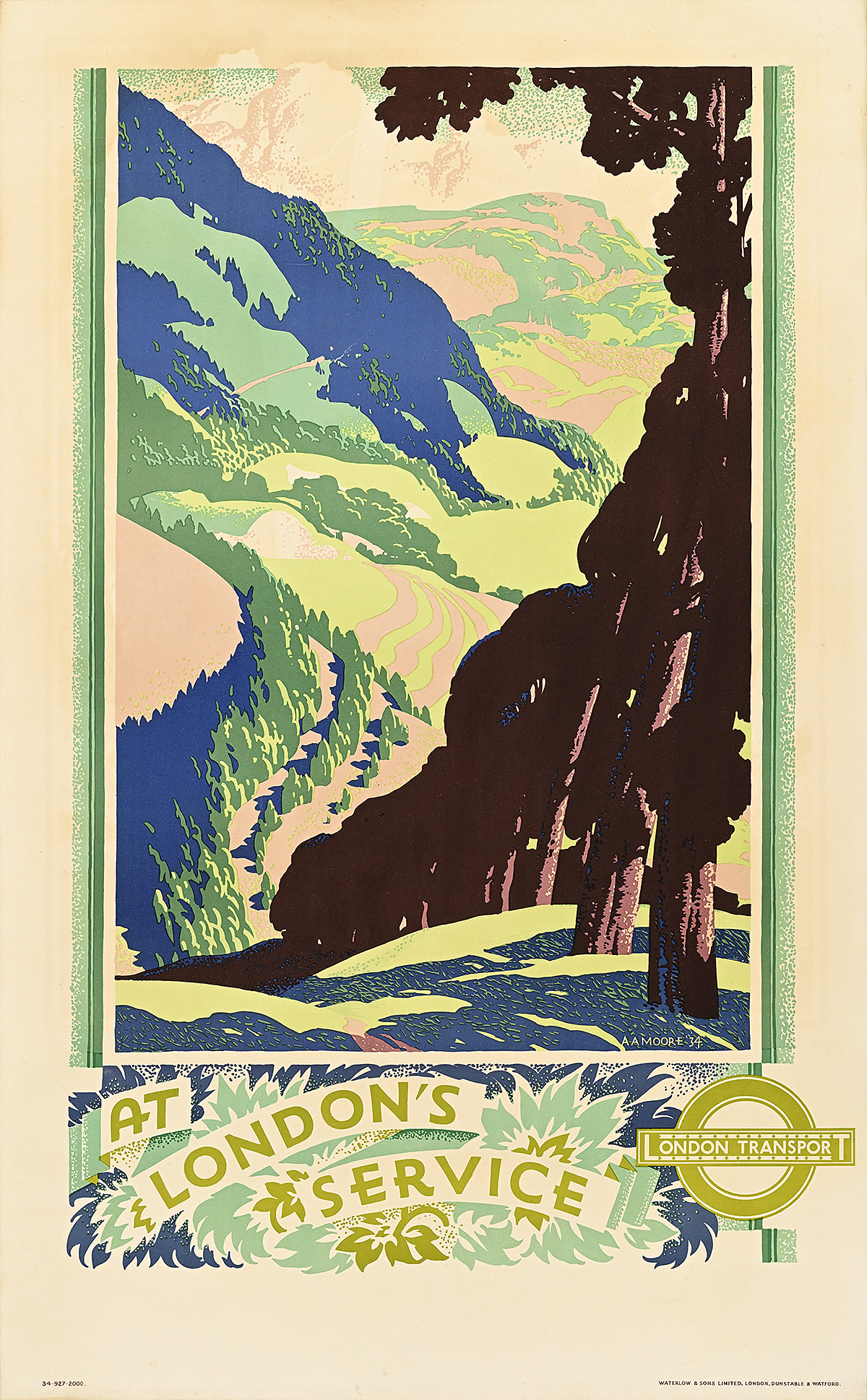
At London’s Service, 1934

A poster with a receding line of brown trees against a hilly background.

A. A. Moore (Dates Unknown)

Poster House Permanent Collection

  • While this poster does not mention a specific destination, the vista most likely represents a portion of Epping Forest—a 5,900-acre woodland on the border of East London and Essex. This public space provides city dwellers with ample access to nature, and reflects the fact that more than 40 percent of public land in London is green space—the largest proportion in any European city. 
  • In the late 19th century, Epping Forest was designated as common land (shared space people could use as they saw fit); however, since it was surrounded by urban areas and had no official guardian, it was threatened by destruction as a result of excessive timber harvesting and overgrazing. In a very early example of environmental activism, public outcry over the land’s misuse led to it being purchased and saved by the City of London Corporation, which still owns it today along with Hampstead Heath. 
  • A. A. Moore designed numerous posters for London Transport, almost all of which feature tree-filled landscapes that could stand in for any number of rural destinations.

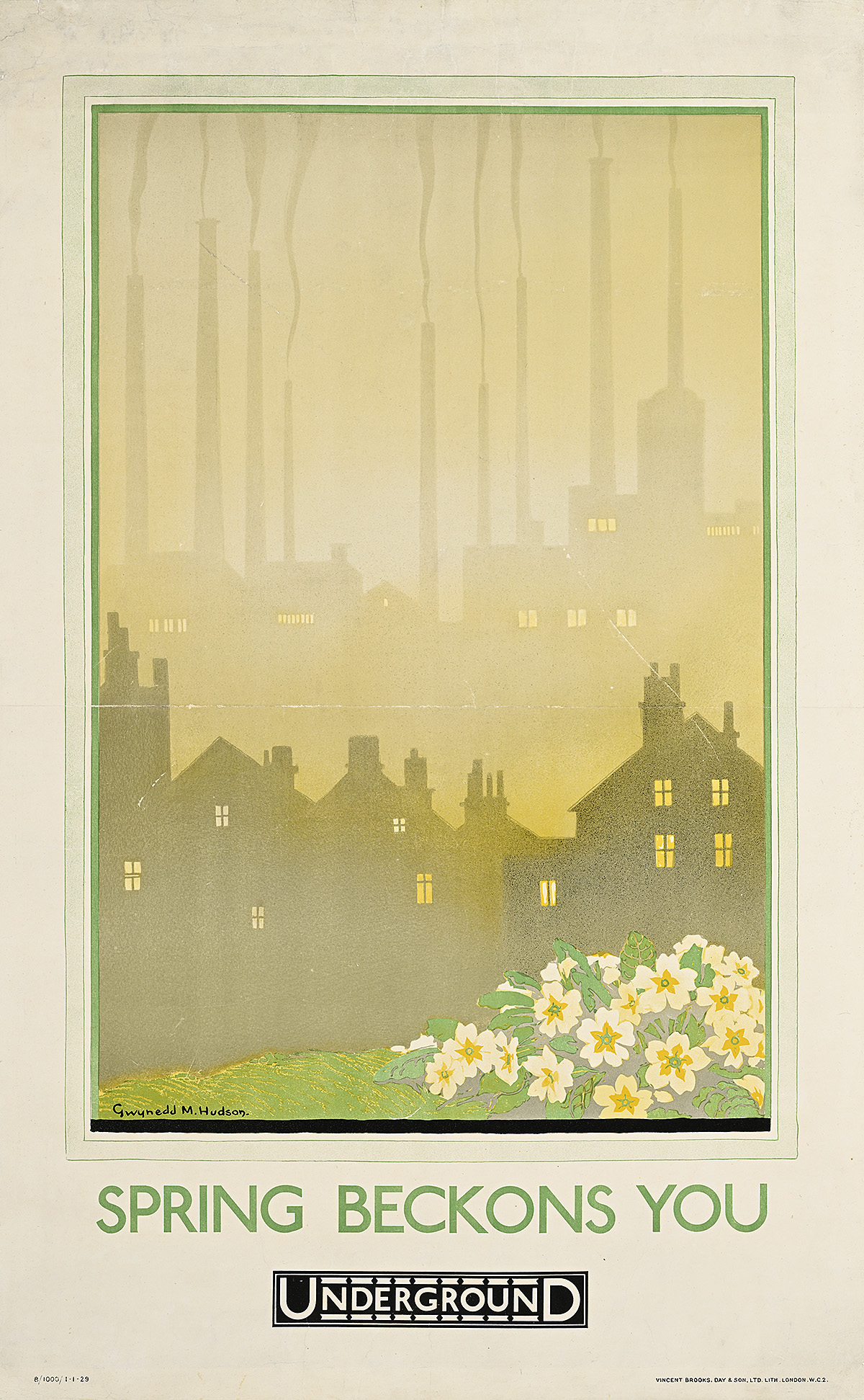
Spring Beckons You, 1929

A poster of yellow flowers on a hill and a gray, smoky city in the background.

Gwynedd M. Hudson (1881–1935)

Poster House Permanent Collection

  • This evocative composition juxtaposes a smog-laden central London with the first spring flowers. No specific destination is given, just the invitation to take the Underground to escape the gloom and general pollution of the city now that nature is reawakening. 
  • While the smokestack factories in the background are not representative of a particular location within London, the image does accurately reflect the appearance of certain areas in the city at the time, most notably the East End. 
  • Gwynedd Hudson was best known for this kind of dreamy, escapist imagery, most notably in her illustrations for the 1922 edition of Alice’s Adventures in Wonderland

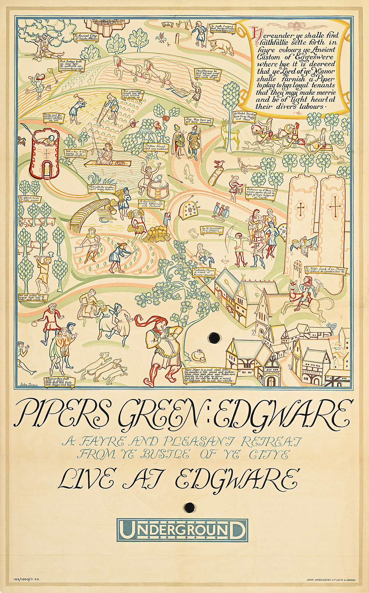
Pipers Green: Edgware, 1928

A poster of a medieval-style village with farmers working the land around it.

John Dixon (Dates Unknown)

Poster House Permanent Collection

  • Located in North London, Edgware Tube Station opened in 1924—just four years before this poster was printed—when the area was still more akin to a small village with open fields. 
  • This design plays on British medieval illustration, with peasants shown being distracted by a piper as they go about their daily work, accompanied by faux Middle English captions written in the style of Geoffrey Chaucer (author of The Canterbury Tales). 
  • The expansion of Tube lines into the outer reaches of London was partly intended to encourage suburban development. This is one of a handful of posters explicitly promoting outward migration from the city rather than merely a day trip, with much of the language and imagery appropriated from the Metropolitan Railway’s famous “Metroland” advertising.

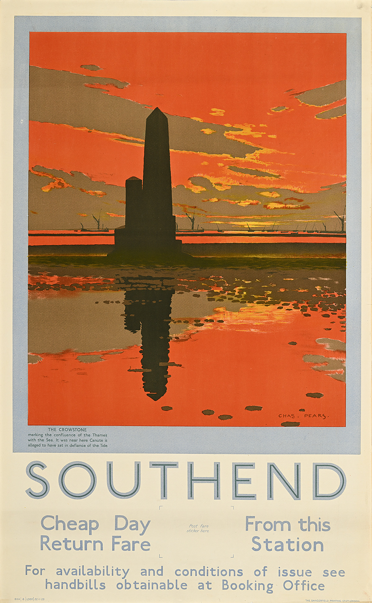
Southend, 1929

A poster of a dark pointed pillar against an orange sky reflected in the water in the foreground.

Charles Pears (1873–1958)

Hall Art Foundation

  • Located about 40 miles east of London in the county of Essex, Southend was one of the most accessible seaside towns from the capital, with direct service available by way of the District Line. It was the only seaside resort advertised on the Tube. 
  • This dramatic sunset image highlights the Crowstone, a granite obelisk erected in 1836 to indicate the outermost limits of the Thames under the City of London’s jurisdiction. A curiosity for tourists, it is only accessible by foot during low tide. 
  • Adding historic relevance to the attraction, the text inside the blue frame indicates that this is also the location where Canute, king of England during the 11th century, “sat in defiance of the Tide”—a reference to the legend in which he commanded the incoming tide to halt but failed to assert his power over it. The story was commonly told to English children to teach them that man must respect nature.

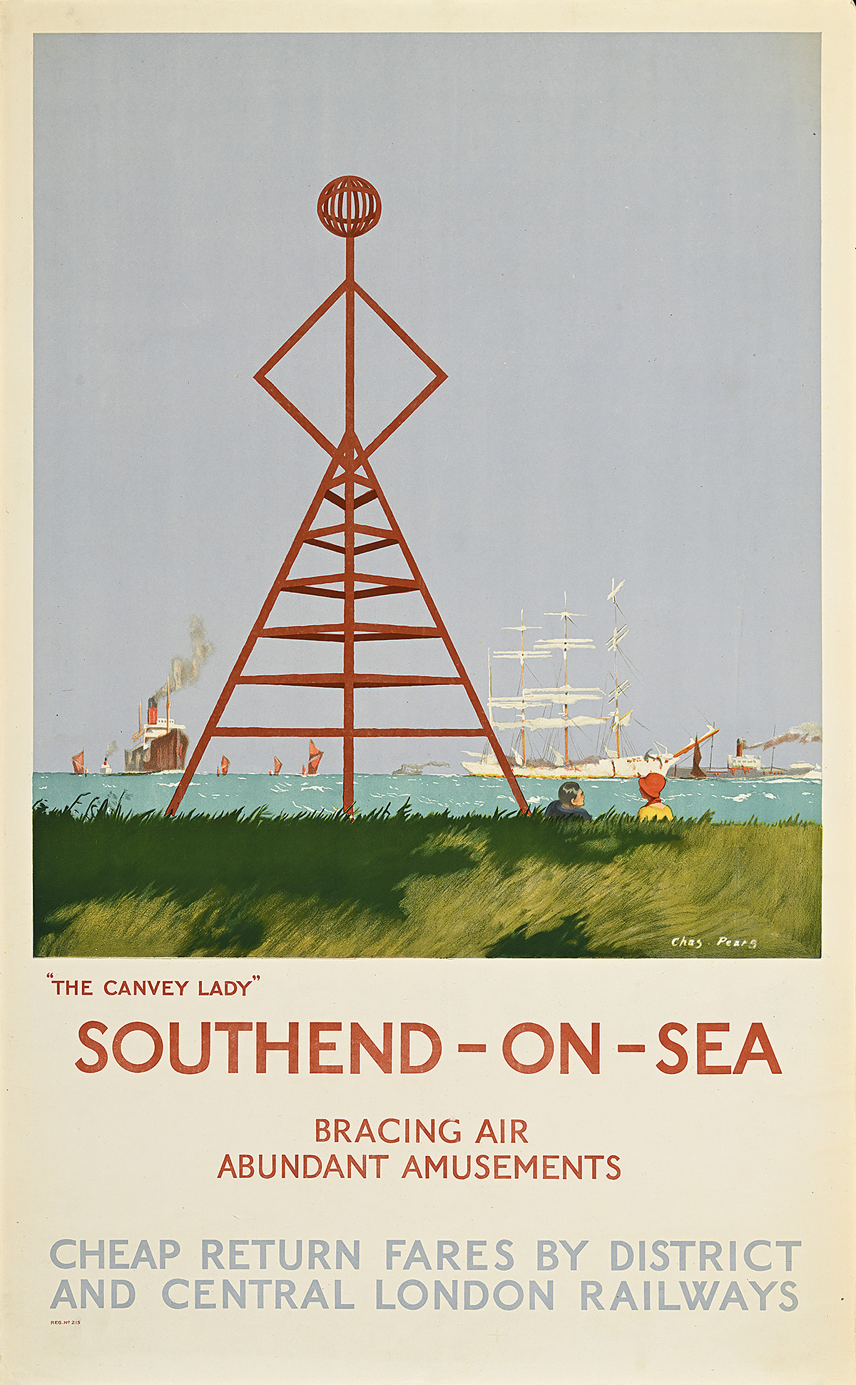
Southend-on-Sea/”The Canvey Lady, 1926

A poster of a navigation beacon in the shape of a woman in a skirt against a seascape.

Charles Pears  (1873–1958)

Hall Art Foundation

  • Another tourist attraction in Southend, the Canvey Lady (also known as the Old Lady of Canvey) was a navigation beacon located near the sea wall at Thorney Bay. While little is known about its purpose or history, by the 1910s it was no longer in use and by the 1950s it was no longer standing. Period photographs show children playing on the 58-foot structure, whose silhouette resembles that of a woman in a dress. 
  • From 1910 to 1939, the District Line offered special excursion services to Southend from Ealing Broadway tube station, encouraging Londoners to take advantage of the seaside town’s “bracing air” and “abundant amusements.”
  • While Charles Pears produced numerous posters for London Transport, a notable 14 of them advertised travel to this location, suggesting its profound popularity. It might also reflect Pears’s background as a maritime artist and amateur sailor. 
  • Southend was famously a destination for people who lived in the East End of London, known colloquially as Cockneys. After World War II, during the “Cockney diaspora,” a significant part of that population relocated to Southend and the surrounding area. 

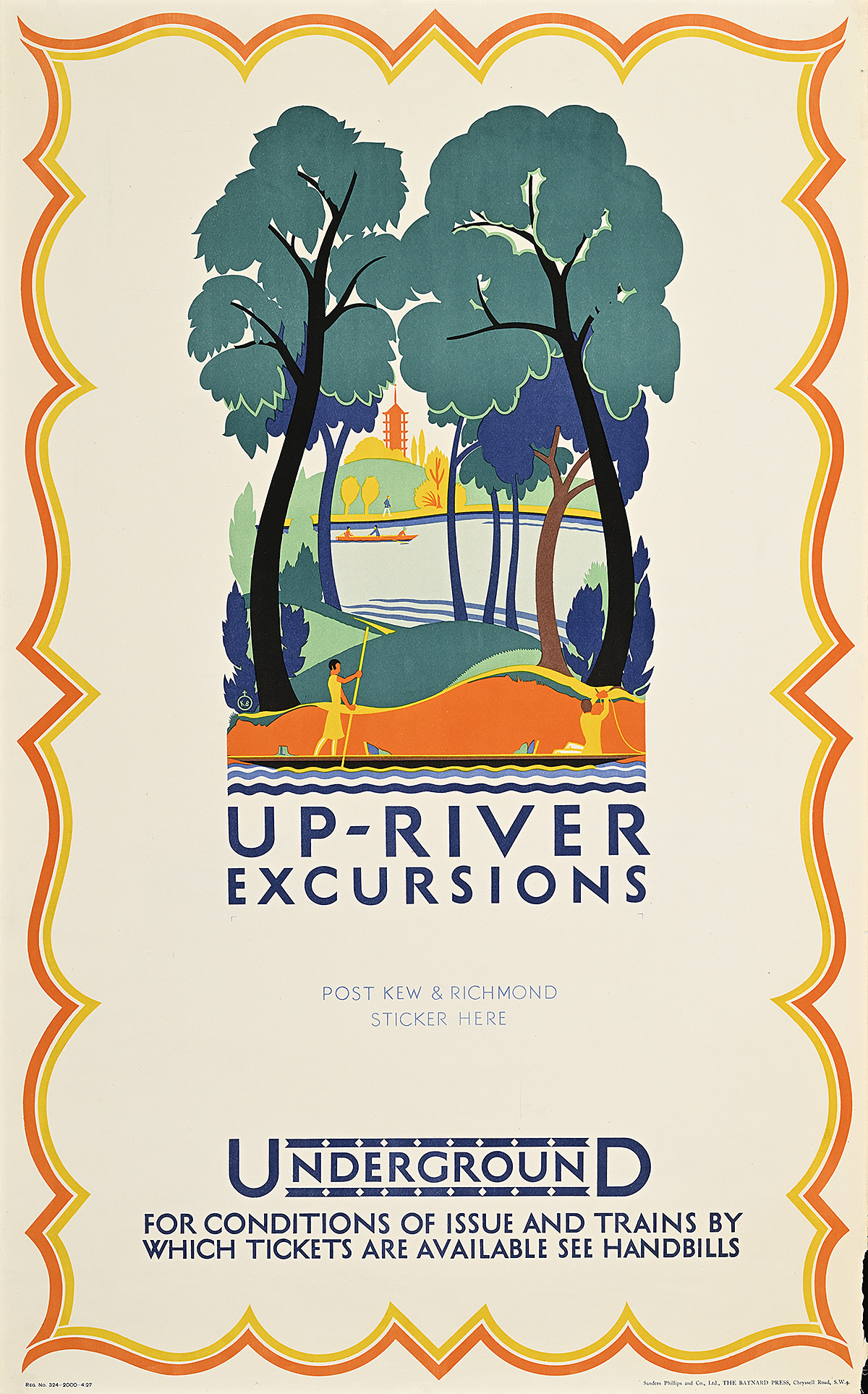
Up-River Excursions, 1927 

A poster of a couple in a boat on the river, framed by 2 trees.

Kate M. Burrell (Dates Unknown)

Hall Art Foundation

  • Between 1924 and 1934, Kate Burrell produced a number of posters for London Transport, almost all of which promote nature excursions accessible via the Tube. She was also one of the founders of Clement Dane Studio, a progressive and popular advertising agency.  
  • This modern composition depicts the Thames by Kew Gardens, with the famed Pagoda, completed in 1762, shown in the background. Equality between the genders is suggested by the couple in the foreground; the woman steadies the boat or punts (uses the pole to push the boat along) while the man moors the vessel to a tree. 
  • As in some of these posters, there is a notice within the printing to affix a sticker over the blank area. Known as a “tip-on,” this type of panel would have included information that was subject to change, such as train fares based on a particular station’s location in relation to the destination. 

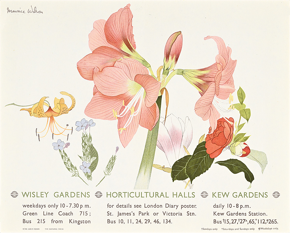
Wisley Gardens/Horticultural Halls/Kew Gardens, 1955

A poster with detailed images of 5 different flowers, including a huge pink lily.

Maurice Wilson (1914–87) 

Hall Art Foundation

  • The Underground did not give artists strict instructions about how to represent advertised destinations. As a result, some interpreted a location literally, while others tempted viewers by evoking the essence of a place. Here, Maurice Wilson promotes three different gardens with a detailed floral illustration. 
  • The artist provides abbreviated information below the name of each destination, highlighting their specific transport options—while Wisley Gardens in Surrey is fairly easy to get to by bus (not Underground), bus travel to the Royal Botanic Gardens in Kew is subject to a variety of service exceptions. Meanwhile, the Horticultural Halls in central London suggest that the viewer consult the London Diary poster, a full-size panel issued monthly that detailed events, exhibitions, and holidays throughout the city and how to reach them. 

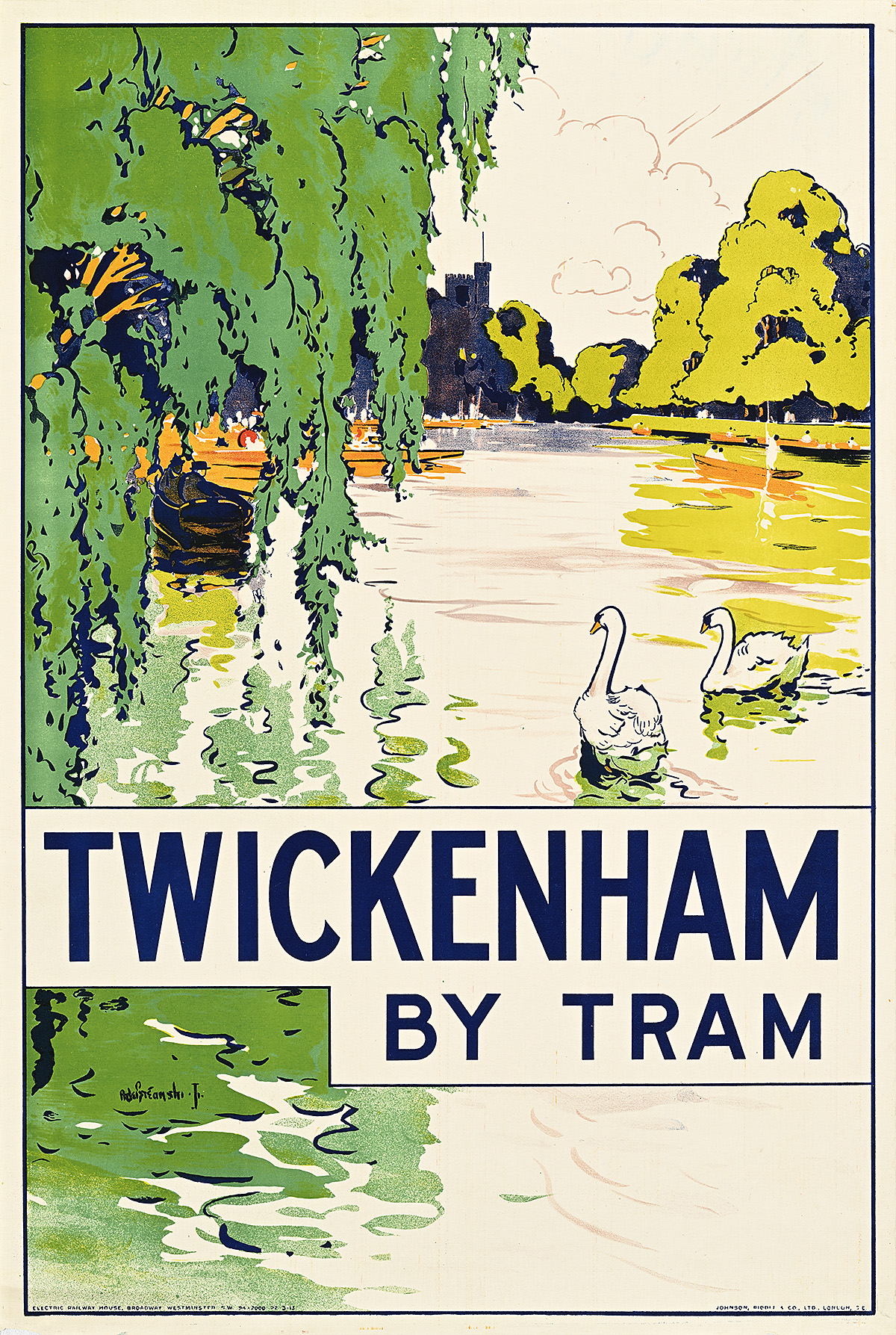
Twickenham, 1915

A poster of 2 swans on the river surrounded by rowing crews in long boats and hanging foliage.

Alfred Fontville de Breanski (1877–1957)

Hall Art Foundation

  • Located along the Thames, Twickenham is a suburb of central London that, at the time this poster was issued, was best reached by tram. Many of the posters in this exhibition mention tram service in addition to Tube service as, in the 1910s, London had the largest tram network in Europe. After World War I, however, buses, which were cheaper to operate, gradually began replacing trams. By 1952, the London tram service had been entirely phased out. 
  • While the standard boating couples are scattered throughout the background as a means of promoting one of the area’s leisure activities, the central focus of this poster is a pair of swans. One of the peculiarities of the royal patronage system in the United Kingdom is that all mute swans in the country are the official property of the monarch. Part of this arrangement involves the annual Swan Upping, a five-day-long swan census on the Thames. 
  • It is notable that most of the other posters promoting Twickenham follow similar compositional conceits, focusing on swans or a sparsely populated river view.

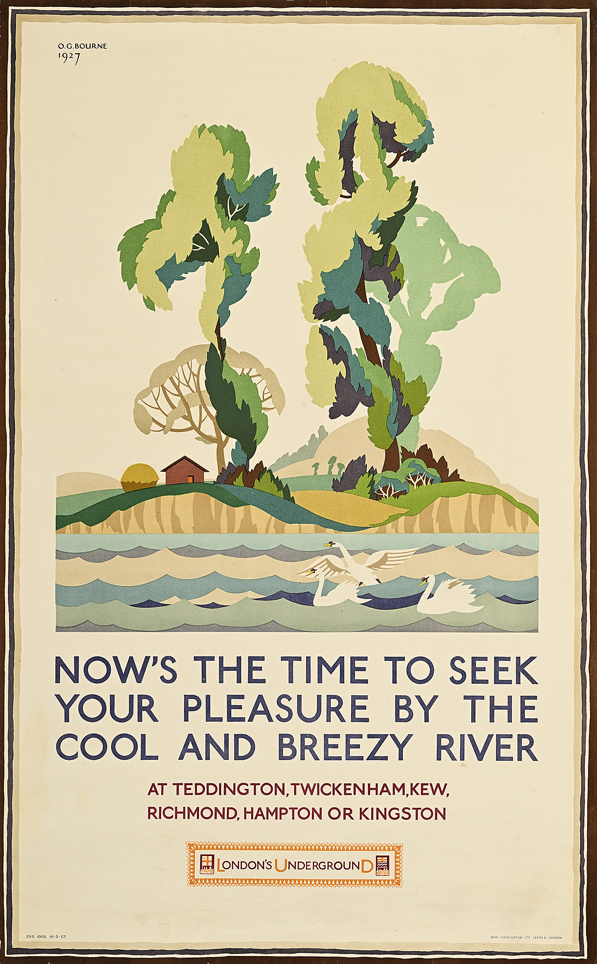
Now’s the Time to Seek Your Pleasure by the Cool and Breezy River, 1927

A poster of 3 swans on the river in front of a hilly landscape with 2 large trees.

Olive Grace Bourne (1897–1962)

Hall Art Foundation

  • Many posters for the Underground feature poetic phrases. Here, a slant rhyme (when spoken with an English accent) encourages the reader to seek pleasure by the river at one of several destinations along the District Line in the south-west of London. 
  • The pastoral vista is generic enough to represent any one of the six listed suburbs, all of which were experiencing rapid growth during the interwar period. 
  • Transit service of the kind advertised in these posters not only brought Londoners out into the countryside but also encouraged them to seek more space and greater access to nature by moving further away from the city. 

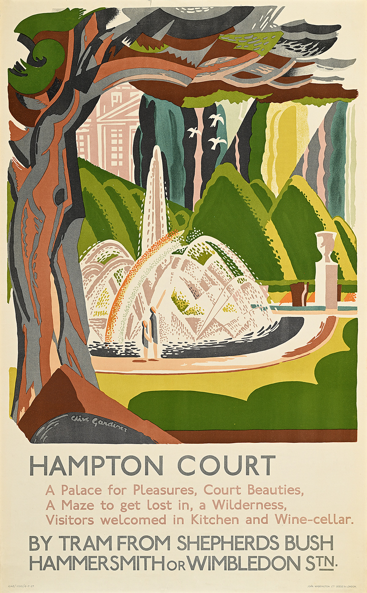
Hampton Court, 1927

A poster of a formal garden with triangular bushes and a central fountain, framed by a tree.

Clive Gardiner (1891–1960)

Hall Art Foundation

  • Rather than focusing on a single element of the estate, this poster features several special locations within Hampton Court, in particular the Great Fountain Garden with its 300-year-old yew trees. The artist also provides the viewer with a glimpse of the palace, designed by Sir Christopher Wren, behind it. 
  • The accompanying text mentions additional attractions, including the world’s oldest puzzle maze, a nearby forest, and indoor access to the kitchen and wine cellar of the historic building. 
  • The text on the poster also notes that Hampton Court is reachable by tram from three different Tube stations. Starting in the 1930s, electric trams in London were replaced by diesel buses that provided a more flexible mode of transportation. This trend accelerated after World War II when the United Kingdom suffered from a shortage of steel for both rails and electrical machinery.

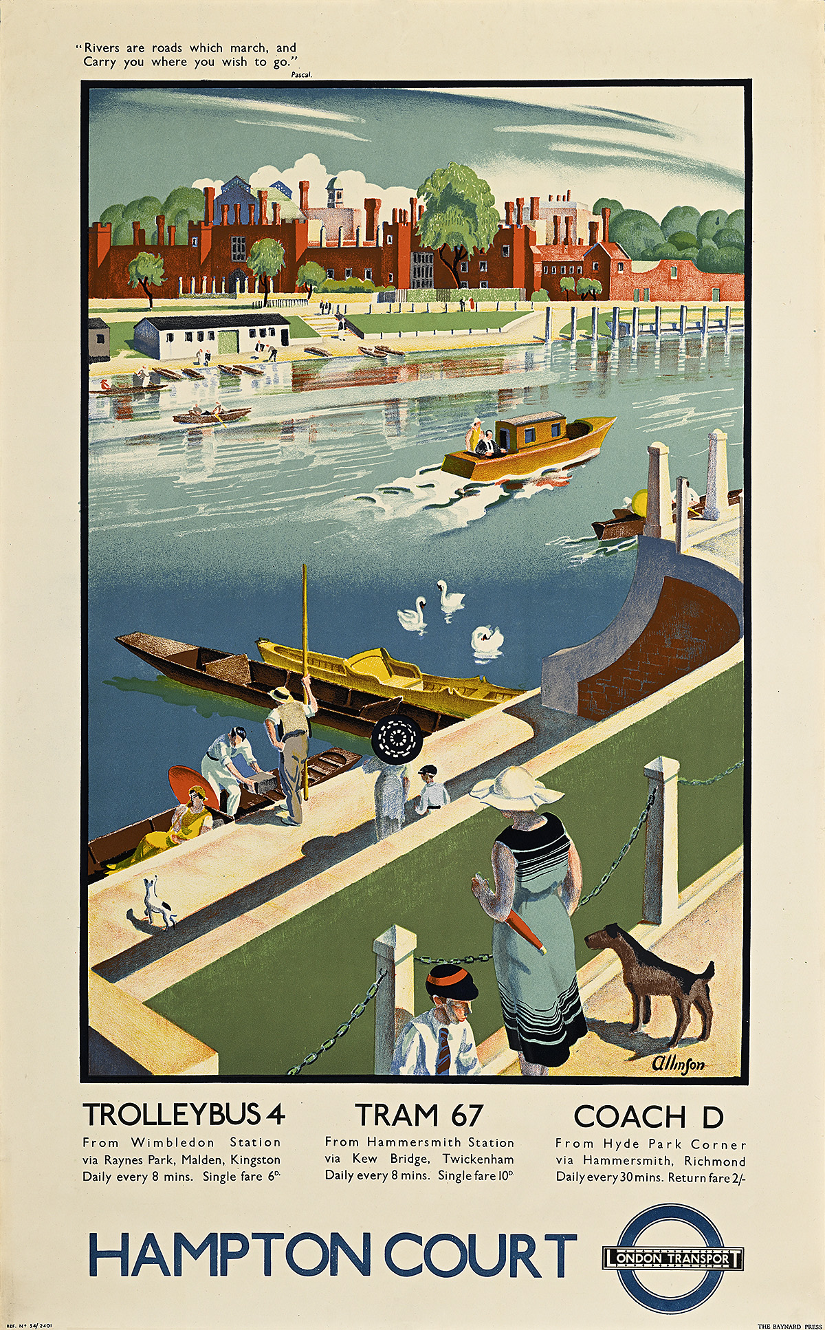
Hampton Court, 1934

A poster of people on a riverbank with boats in the water and a palace in the background.

Adrian Allinson (1890–1959)

Hall Art Foundation

  • The building of Hampton Court Palace for Cardinal Thomas Wolsey began in 1514, and was occupied by Henry VIII and succeeding monarchs before opening to the public in 1838. 
  • A major tourist attraction, the palace is reachable by a number of rail services; however, this poster highlights a few of the less familiar vehicles operated by London Transport at the time, including the trolleybus, tram, and coach. The trolleybus was an electric tram-like vehicle with overhead power but no rails, unlike the tram itself. A coach is simply another name for a bus. 
  • The artist has incorporated a quote by the 17th-century philosopher Blaise Pascal in the upper-left margin of the poster, underscoring the idea that the viewer should follow the river outside of central London toward more desirable locales.

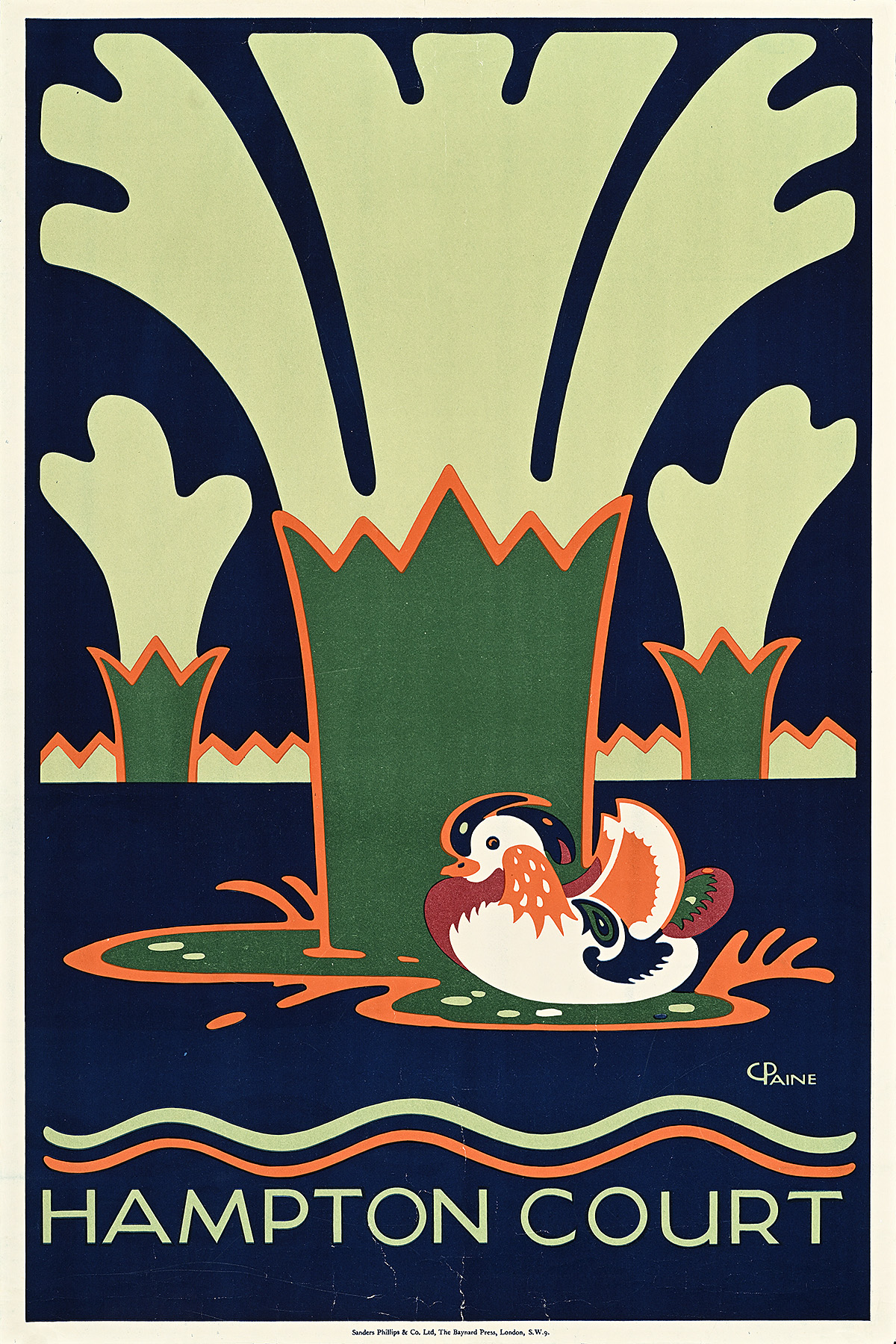
Hampton Court, 1921

A poster of a Mandarin duck swimming in front of 3 gushing, green fountains.

Charles Paine (1895–1967)

Hall Art Foundation

  • During the 1920s, Hampton Court’s custodians focused on maintaining the estate’s gardens, leading to many posters highlighting the palace’s beautiful outdoor spaces. 
  • Here, the artist depicts some of the many fountains at Hampton Court, made more visually interesting by the presence of a charmingly rendered Mandarin duck. This non-native species was introduced to London during the early 20th century, and continues to be seen in the city.

 Row, Row, Row Your Boat

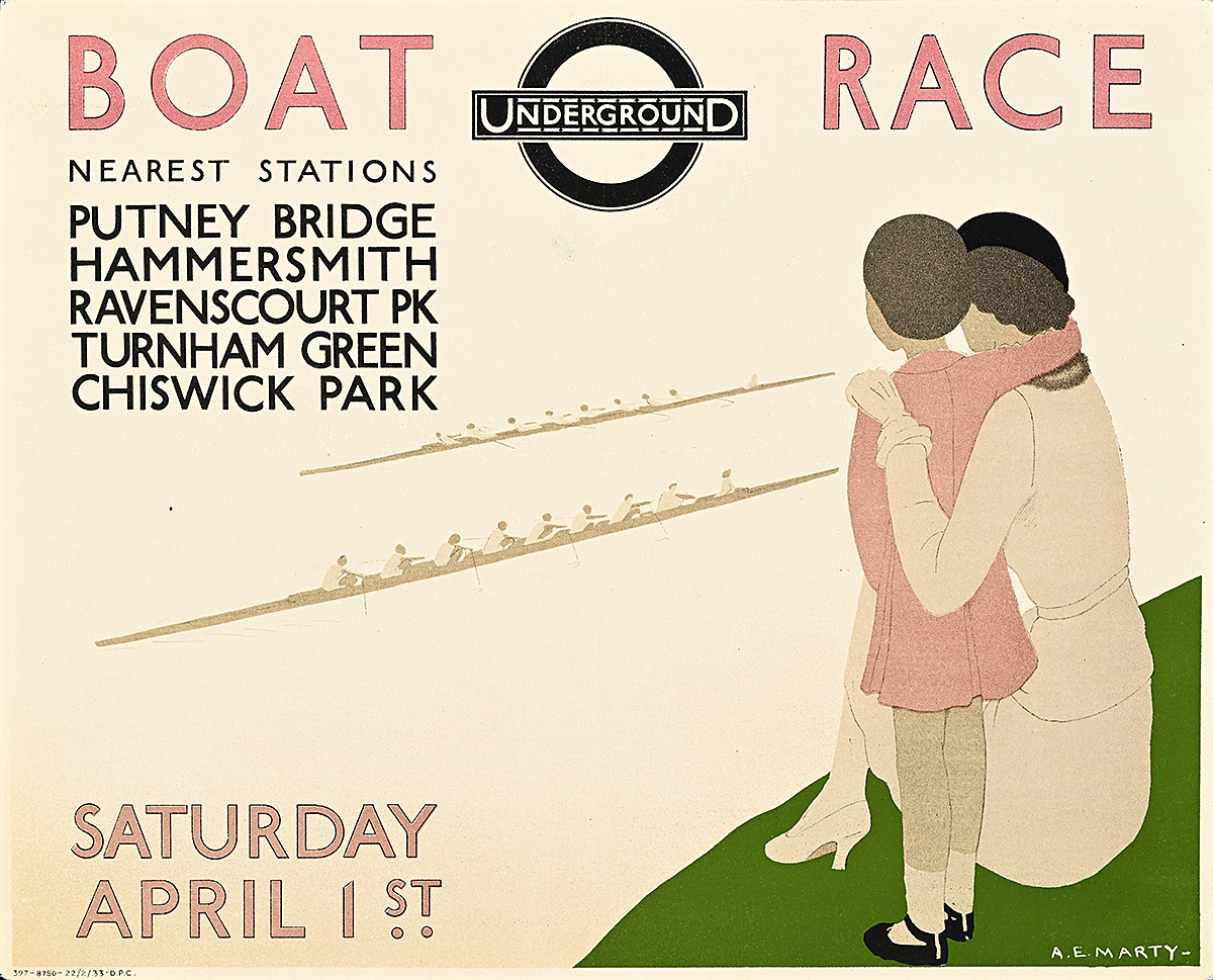
Boat Race, 1933

A poster of a mother and daughter watching rowing crews in 2 long boats from the riverbank.

André Édouard Marty (1882–1974)

Hall Art Foundation

  • This delicate design emphasizes the family-friendly aspect of a day watching the annual Oxford-Cambridge Boat Race. With an average in-person audience of 250,000 people, though, a peaceful viewing experience like the one depicted here would have been unlikely. Today, with the inclusion of television broadcasting, more than 15 million spectators tune in to the race. 
  • André Marty created numerous posters for the Underground featuring the same mother and daughter figures, almost all of which promote daytime outings into nature by way of the Tube. Other images highlight the Royal Air Force’s aviation show as well as “bluebell time,” when the flowers blossom. 
  • The 1933 race was held during the depth of Britain’s Depression (known as the “Great Slump”) when the country faced massive unemployment. Regattas like this one represented a form of public entertainment that was relatively low-cost for attendees, especially if they traveled by Tube.

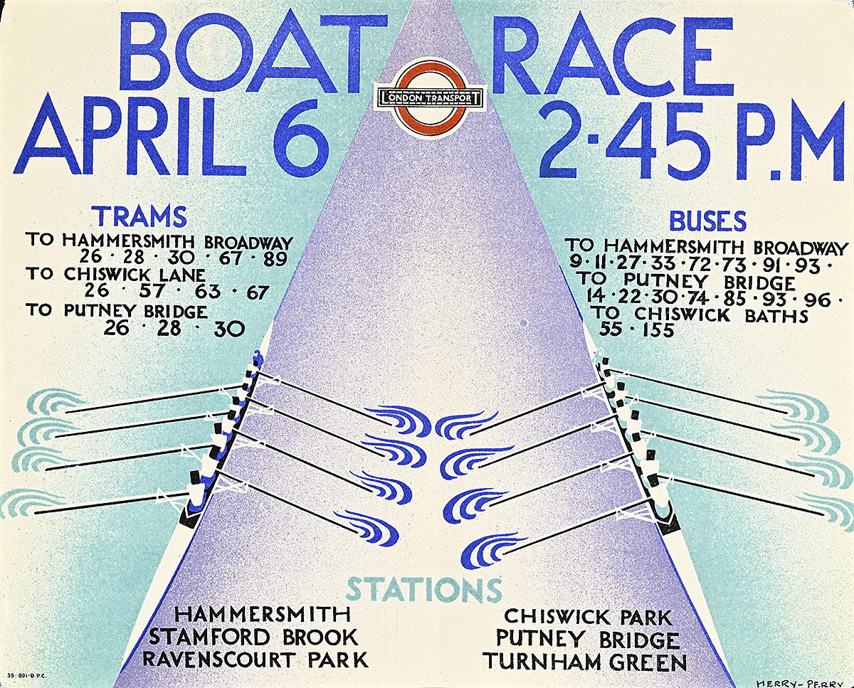
Boat Race, 1935

A poster with an aerial view of 2 crews in long boats rowing on the river.

Herry Perry (1897–1962)

Hall Art Foundation

  • Like Percy Brookshaw, Anne Erica Thackeray Perry (professionally known as Herry Perry), deftly incorporates elements of Vorticism into this dynamic design for the annual Oxford-Cambridge Boat Race. Her choice of colors reflects those of the two universities—but rather than using them on the jerseys of the rowers, she cleverly employs the light and dark blues in the water, especially where the oars disturb the surface.  
  • Between 1927 and 1938, Perry produced more than 50 posters for London Transport, making her one of the most prolific women in its employment. She produced both lithographic and woodcut designs, and her larger professional output included projects as varied as murals for the RMS Queen Mary and pub signs. 
  • Posters of this size are commonly known as panel posters or car cards, and were meant to be displayed inside subway cars, most often on the draught screens between seating areas or at the end of the carriages. Some artists created full-size companion posters for these designs; however, like this one, many are often unique to the format. 

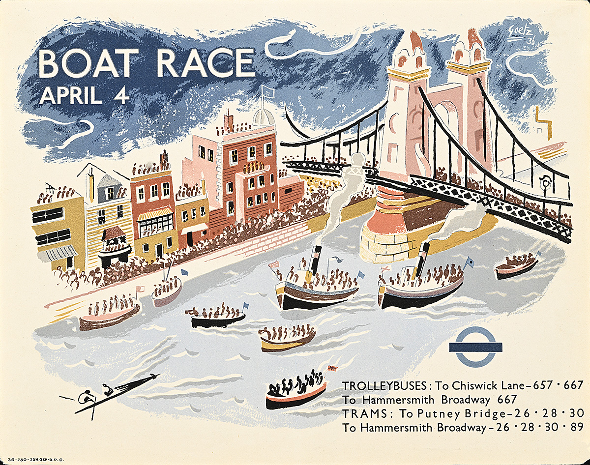
Boat Race, 1936

A poster of 9 boats on the water, watched by spectators from the riverbank and bridge.

Walter Goetz (1911–95) 

Hall Art Foundation

  • This cartoonlike design perfectly captures the boat race’s popularity prior to its first television broadcast in 1938. Throngs of spectators are shown spilling out onto the streets, invading rooftops, piling aboard ships, and crowding Hammersmith Bridge in order to watch the event. 
  • The gray, choppy water and ominously dark sky are also more representative of the actual weather conditions than those suggested by other designs. On a few occasions, one or both teams have sunk during the race; however, the event has only ever been canceled due to war and the COVID-19 pandemic.  
  • Until very recently, the Thames was considered one of the cleanest rivers in the world that runs through a major city; however, in March 2024, in the lead-up to the annual Oxford-Cambridge Boat Race, its polluted waters were described as a “national disgrace” after dangerous levels of E.coli were recorded due to an abundance of raw sewage.

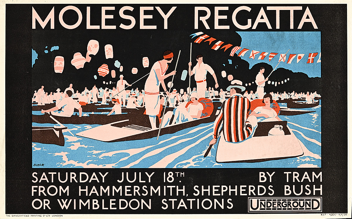
Molesey Regatta, 1925

A poster of well-dressed people in boats on the river, with flags and paper lanterns hanging from the trees.

L.B. Black (Dates Unknown)

Hall Art Foundation

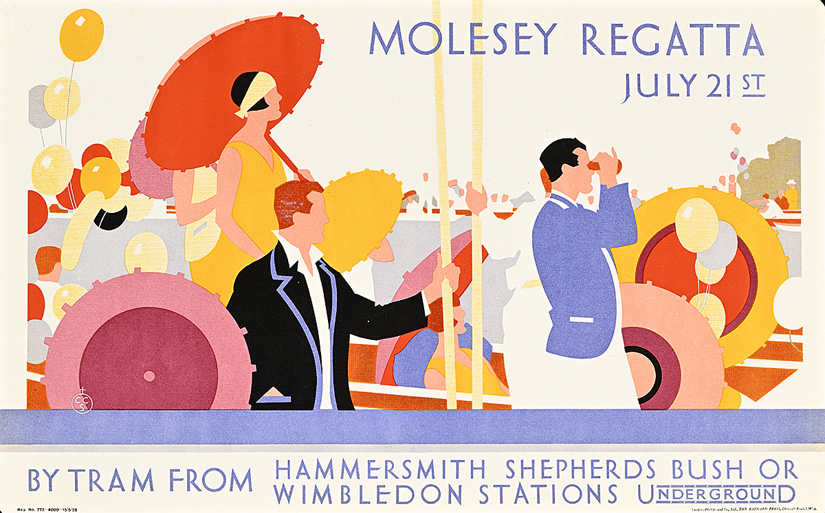
Molesey Regatta, 1928

A poster of fashionable spectators watching a boat race, several with colorful parasols.

Constance Castle (1902–66) 

Hall Collection

  • First held in 1867, the Molesey Regatta follows a course along the Thames near Hampton Court. Today, it attracts rowers from all over the United Kingdom and typically features around four hundred separate races held over two days.   
  • Although the Tube itself had only one class of carriage, these compositions highlight the fashionable spectators rather than the participants, emphasizing the allure of people-watching and the excitement of attending such a key event in the London summer season. 
  • During the day, these regattas offered live music, a fairground, and various food and beverage options in addition to the races themselves. After hours, however, the accompanying events often became more exclusive and geared toward the well-to-do audience depicted in the designs.

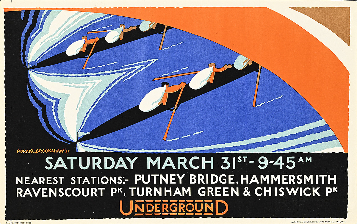
Saturday March 31, 1928

A poster with an abstracted, aerial view of 2 long rowboats racing under a river bridge.

Percy Drake Brookshaw (1907–93) 

Hall Art Foundation

  • Some scholars have questioned which race is promoted in this poster, as the annual Oxford-Cambridge Boat Race in 1928 was officially recorded as being held on March 28; however, that seems unlikely as the event typically occurs on a Saturday. 
  • Like McKnight Kauffer, Percy Drake Brookshaw brought elements of modern art into his posters, incorporating motifs associated with the work of the Grosvenor School of  Printmakers into this design. This particularly British movement had emerged in 1914 and its artists typically expressed the vibrancy and dynamism of modern life in geometric forms and bold colors. 
  • This poster was printed the year after the first women’s rowing event took place. Since 2015, it has been held on the same day and along the same course as the men’s event.

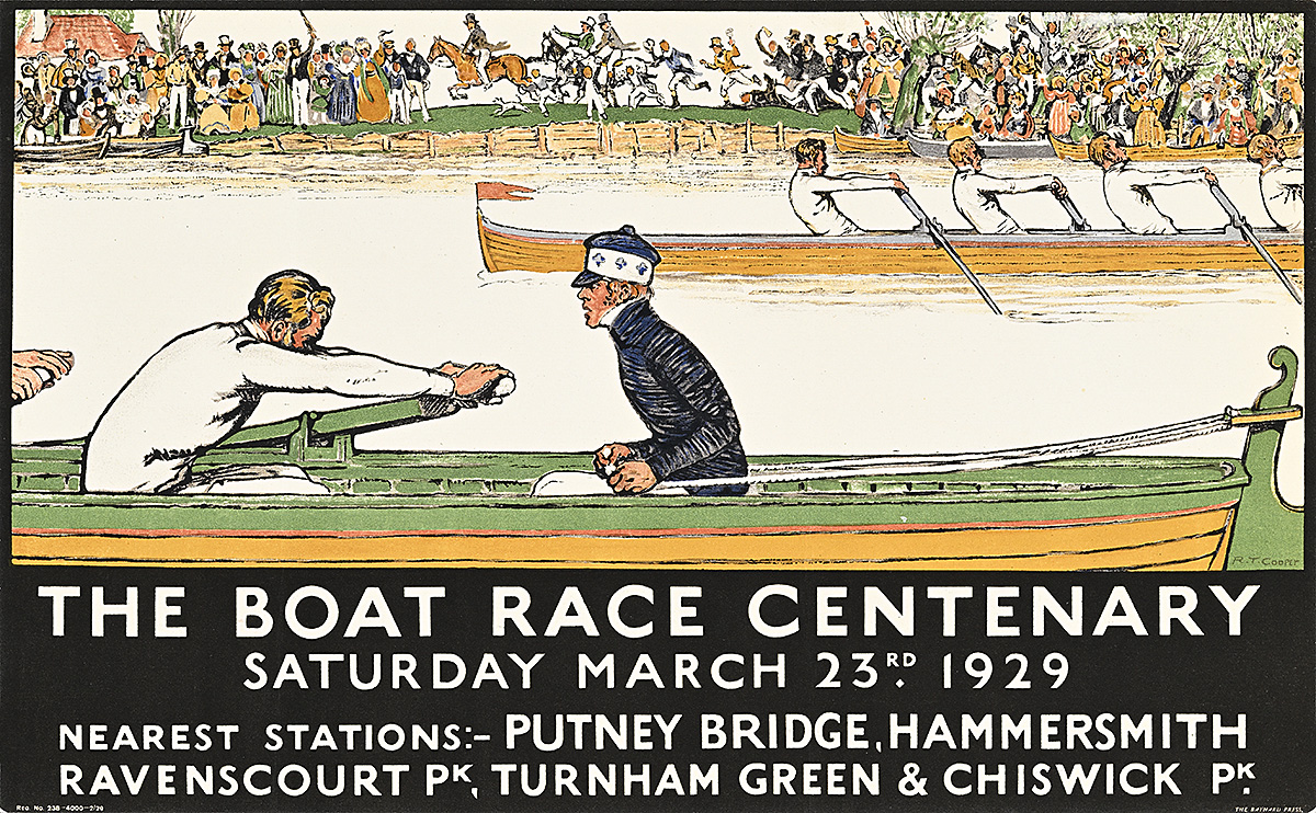
The Boat Race Centenary, 1929

A poster of 2 boats in a race watched from the riverbank by a crowd of spectators.

Richard T. Cooper (1885–1957)

Hall Art Foundation

  • This poster announces the centenary boat race between Oxford and Cambridge universities, first held in 1829. Although the competition did not become an annual event until 1856, the anniversary produced numerous special publications and other commemorative objects. 
  • Richard Cooper’s composition presents a subtle and interesting conceit: the spectators in the background are dressed in 19th-century attire, including top hats and Victorian domed skirts. Some attendees are even shown galloping their horses on the riverbank alongside the boats. Cooper thus suggests the continuum of British tradition within the design—a narrative element he used in numerous London Transport posters throughout his career.  
  • While it was most likely a design choice given the cost of additional colors in lithographic printing, the decision to make all the oarsmen blond underscores the ethnic homogeneity of the participants in the race at this time. It was not until 2023 that the competition welcomed its first Black rower: Noam Mouelle of France.

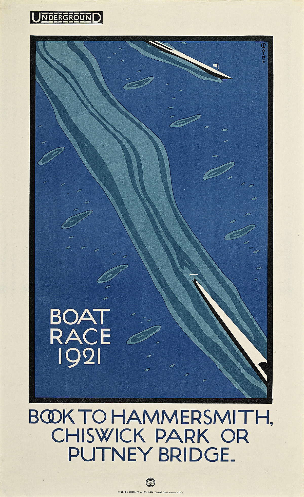
Boat Race, 1921

A poster of an aerial, abstracted view of a water ripple in the wake of a racing rowboat.

Charles Paine (1895–1967)

Hall Art Foundation

  • The first recorded rowing race on the Thames River took place in 1715 between six watermen—oarsmen who usually ferried passengers across the river. From those proletarian beginnings, boat races of all sorts gradually became major social events in England, attracting a vast cross-section of society. 
  • Held annually on the Thames since 1856, the Boat Race is an eight-man crew rowing competition between the elite Oxford and Cambridge universities. It takes place on a 4.2-mile stretch of the river between Putney and Mortlake in South West London, on what is known as the Championship Course. The route is more than three times the length of the standard Olympic rowing course. 
  • This is the first of two designs Charles Paine created for the event, both of which depict the Thames with azure-blue water more typical of the Mediterranean. In reality, the river is tidal and therefore brackish, with a silt bed that gives it a brownish hue. 

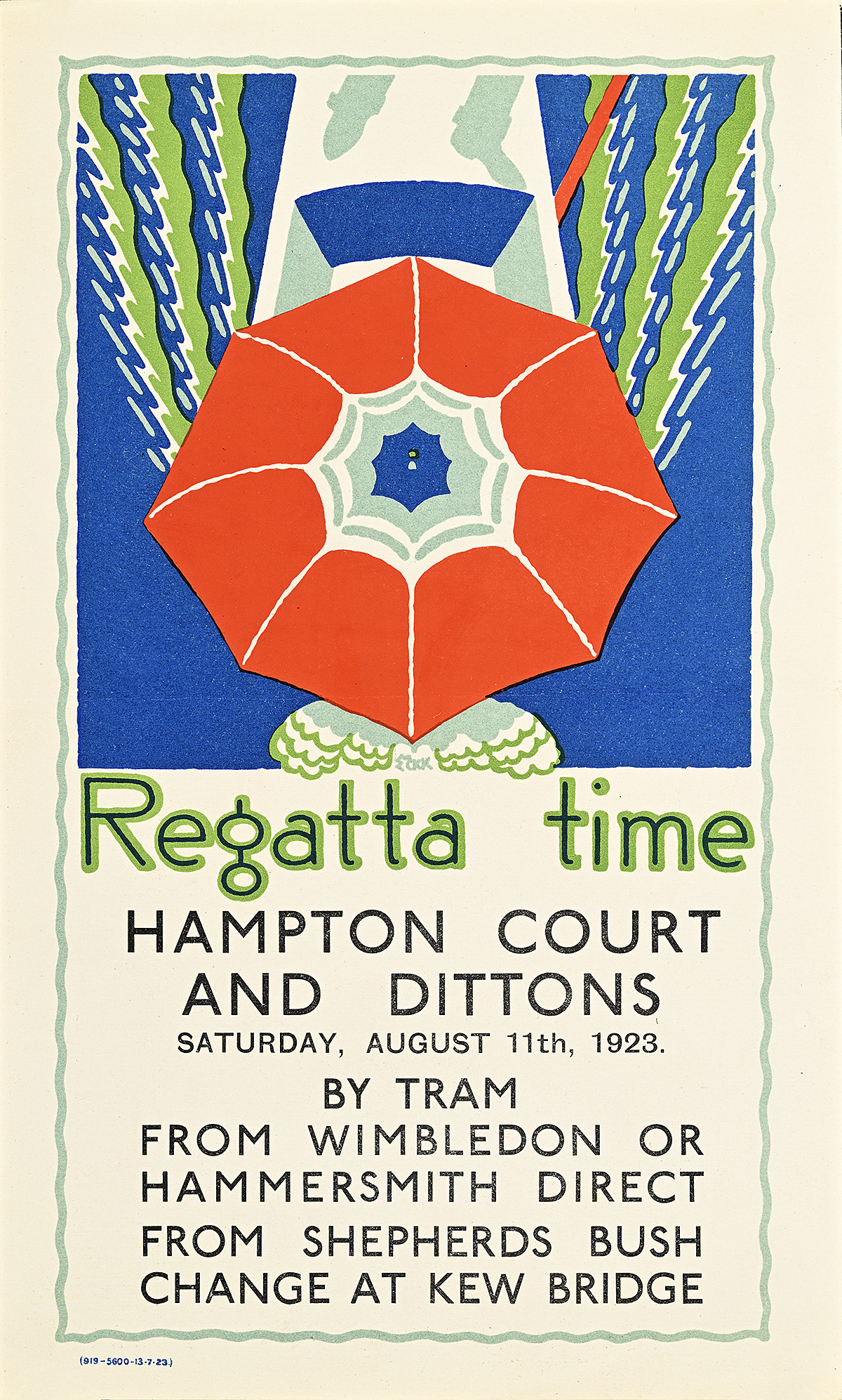
Regatta Time, 1923

A poster of an aerial view of a poppy-like parasol held by a concealed figure in a small rowboat.

Edward McKnight Kauffer (1890–1954)

Hall Art Foundation

  • Regattas are boat races often accompanied by various social events. Given, however, that rowing is a sport most commonly associated with private schools (half of Eton’s pupils are reputed to row recreationally), these races are also historically linked with the British class system. 
  • This poster shows an almost abstract aerial view of a poppy-colored parasol held by someone aboard a small boat, highlighting the experience of the spectator (most likely a woman) rather than someone racing. 
  • Edward McKnight Kauffer produced a remarkable 140 designs for London Transport—more than any other artist of the prewar period. He was especially adept at incorporating elements of various modern art movements into his compositions; in 1935, the art historian Anthony Blunt wrote of him that his imagery “lured [sophisticated viewers] into liking the poster before realizing it is the type of thing they loathe.”
  • This poster also features the Johnston typeface, commissioned by Frank Pick in 1913. It was rapidly adopted by the Underground for use on its enamel signs as well as on its posters. It was under copyright until 2015, and remains one of the longest-running elements of corporate branding.

Curation

Tim Medland

Exhibition Design

Ola Baldych

Special Thanks

David Bownes, Twentieth Century Posters

Oliver Green, London Transport Museum

Catherine Bindman, editor

Anita Sheih, proofreader

Sofía Jarrín, Spanish translator

Pull Quotes

“Art is not an affair of collectors and connoisseurs but of the people and for the people.”—Frank Pick 


“There can be no doubt that all credit for the earliest consistent use of good posters belongs to the London underground.”—London Times art critic


“Pick thought in terms of visual propaganda in whatever he did.”—Nikolaus Pevsner, art historian


“Where there is life there is art.”—Frank Pick