Lester Beall & A New American Identity

Beall’s American Modernism 

Lester Beall was born into an America on the cusp of broad social revolution as it entered the 20th century. Still tied to the values and slower way of life of the late 1800s, it was a time when only a wealthy minority in major cities could afford or have access to amenities many Europeans already took for granted, including electricity and indoor plumbing. With its sprawling landmass and fragmented population, the United States lagged behind the rest of the Western world—most especially in rural areas—with many of its inhabitants embracing the ideals of self-reliance, small government, and isolationism over modernity and social progress. Beall was all too familiar with such realities of rural life; in his youth, he had spent summers on his family’s midwestern farm. By the time he was in his 20s, the Great Depression would bring into sharp focus the economic and cultural disparities between these two very different versions of America. 

Most American artists drew upon narrative and representational styles popular with U.S. audiences rather than incorporating elements of the avant-garde that were then flourishing in Europe. In terms of poster design, Americans were far more literal-minded and did not respond well to abstraction or other tenets of modernism. As a result, most American posters produced in the early 20th century were illustrational and restrained, reflecting an understated, old-fashioned sensibility.  

At school, Beall had been inspired by the new art coming out of Europe, often attempting to copy the work of Aubrey Beardsley and other popular illustrators. These styles, however, did not suit his talent. He began to order issues of the Art Directors Club of New York annual while also building his own library of secondhand art books and periodicals. Through these publications, he was exposed to a new world of design possibilities, including Soviet photomontage, Swiss grid systems, and German layouts. 

Aware that Americans were generally distrustful of overly intellectual and visually obtuse European modernism, Beall deftly translated and advanced these artistic concepts to create a new kind of American art, one that distilled the essence of various avant-garde movements and combined it with clear communication and a commercial sensibility.

After graduating with a degree in art history from the Art Institute of Chicago in 1926, Beall opened his own studio in the city’s South Side, noting that the only way for an artist to make a living in the United States was as a commercial illustrator. Not wanting to work for a larger agency, he created hundreds of illustrations on spec, hoping that a company would purchase one of his designs. By the end of the 1930s, his unique brand of American modernism would change how the U.S. government communicated with its diverse population, anticipating the juggernaut of American mid-century corporate design and branding. 


This exhibition would not be possible without the support of Mark and Maura Resnick and Michael Kleeman.

This exhibition is supported, in part, by public funds from the New York State Council on the Arts (NYSCA) and the New York City Department of Cultural Affairs in partnership with the City Council.
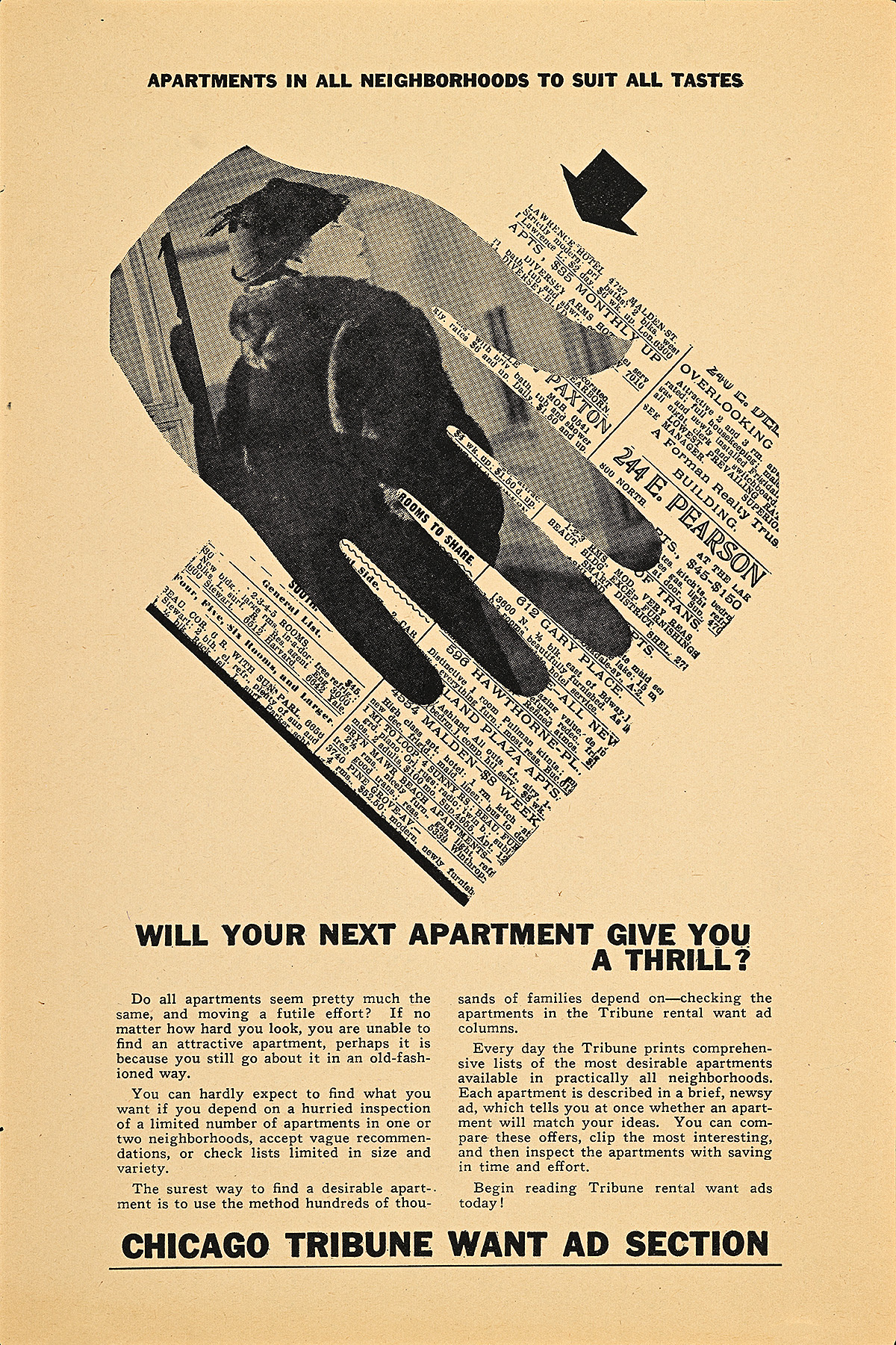
Apartments in All Neighborhoods to Suit All Tastes, 1933

A housing advertisement of a hand with an image of a fancy woman on it, overlaying text.

Lester Beall (1903–69)

Merrill C. Berman Collection

  • Starting in 1932, Beall began experimenting with photography. He was primarily inspired by the work of avant-garde artists like Man Ray who removed the camera from a traditional studio setting to capture situations, objects, and people at unusual angles, creating compositions that were at once representational and abstract. 
  • By cutting photographs into unique shapes, Beall transforms realistic imagery into a two-dimensional graphic element within the composition. This visual tension is perhaps best exemplified by the picture of a woman inspecting an apartment within a large hand that rests on a reproduction of the newspaper’s classified advertisements. The viewer is simultaneously meant to identify with her as well as with the hand. 
  • Beall would continue to use photography throughout his career, often staging photoshoots for clients in his own professional studio. Further inspired by many of the Bauhaus photographers, he also frequently incorporated photograms (photographic images created without the use of a traditional camera, often made with light-sensitive paper) into his work.  

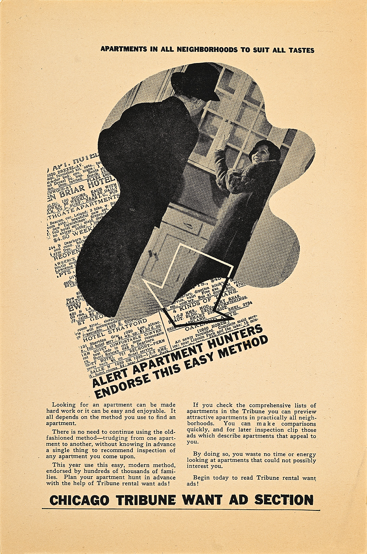
Apartments in All Neighborhoods to Suit All Tastes, 1933

An newspaper advertisement of a man and woman looking at an apartment in an oblong shape, overlaying text.

Lester Beall (1903–69)

Display, Graphic Design Collection

  • In 1933, Lester Beall landed a job with the Chicago Tribune, creating promotional pieces to entice people and companies to purchase classified advertisements in the newspaper. This professional relationship lasted through 1935, providing Beall with a steady income during the economic precariousness of the leanest years of the Great Depression. 
  • The publication gave Beall free rein, allowing him to experiment with many of the European design ideas that he would soon make his own. These early pieces highlight his penchant for directional arrows, cut-out photography, and the positioning of typography at unusual angles. 
  • This and the accompanying advertisement are from a series Beall designed to encourage people to look for and list apartments for rent in the Tribune. The roaring 1920s created a boom in the construction of apartment buildings in Chicago and other major cities, initially resulting in a glut of options; however, as more Americans moved to cities during the 1920s and ’30s to escape abject poverty in the country’s rural areas, demand often outstripped supply.

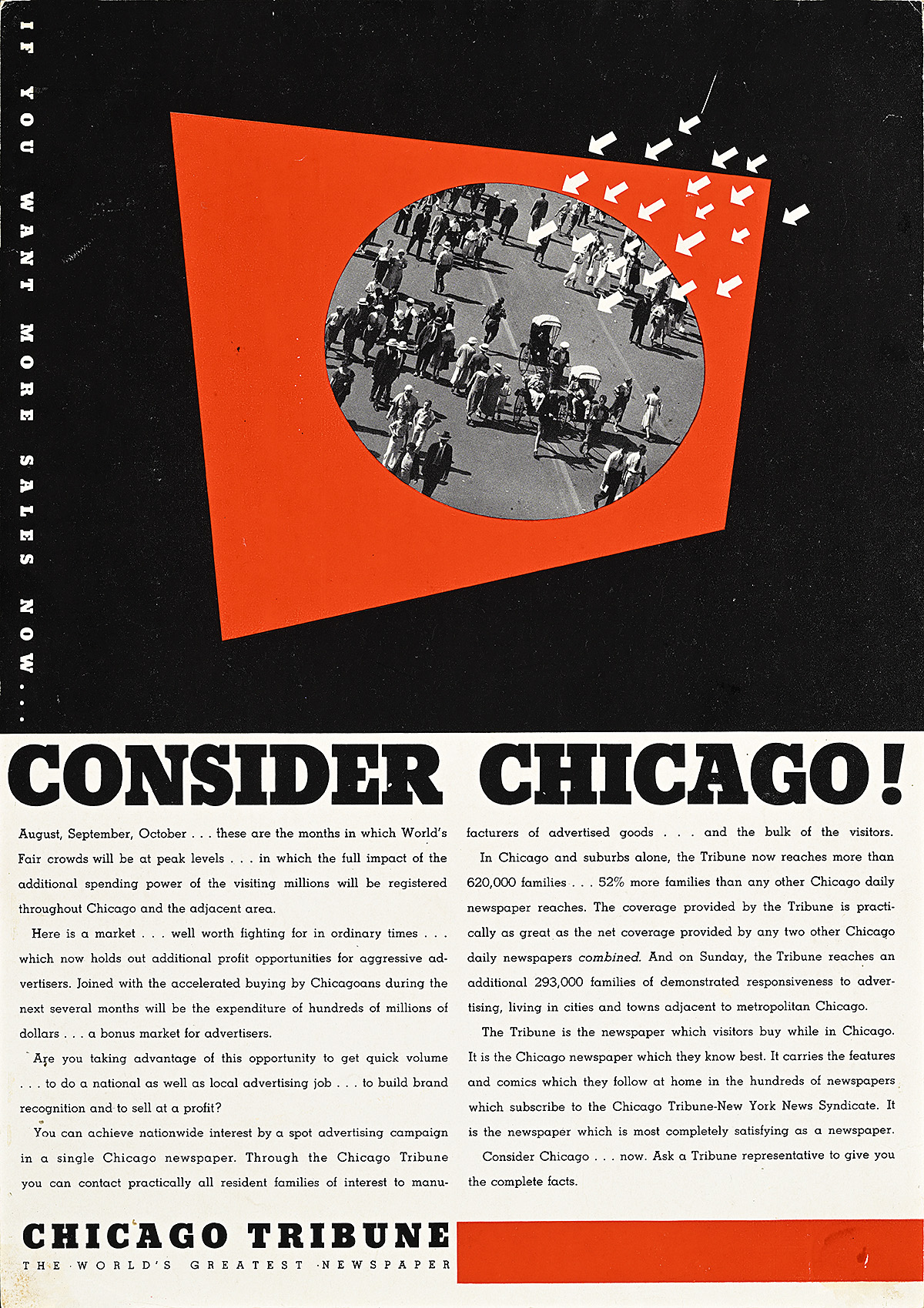
Consider Chicago!, 1934

A newspaper advertisement of tourists in a circle over a red rectangular shape with arrows pointing at it.

Lester Beall (1903–69)

Merrill C. Berman Collection

  • In 1933, the Chicago World’s Fair (officially known as A Century of Progress International Exposition) opened in honor of the city’s centennial. Now a well-known independent designer, Beall was commissioned to create a mural for the Public Service Company of Northern Illinois as well as exhibition design for the Crane Company (a plumbing and heating corporation).
  • This particular advertisement for the Tribune highlights the influx of tourists to Chicago for the fair during the period from August to October, indicating that this is when clients’ advertisements are likely to get the most attention. 
  • This is one of Beall’s most sophisticated compositions from the early 1930s, elegantly combining black-and-white photography, illustrated graphics, and eye-catching text (much of which was often written by Beall himself). The array of small arrows would continue to appear as a motif throughout his career.  

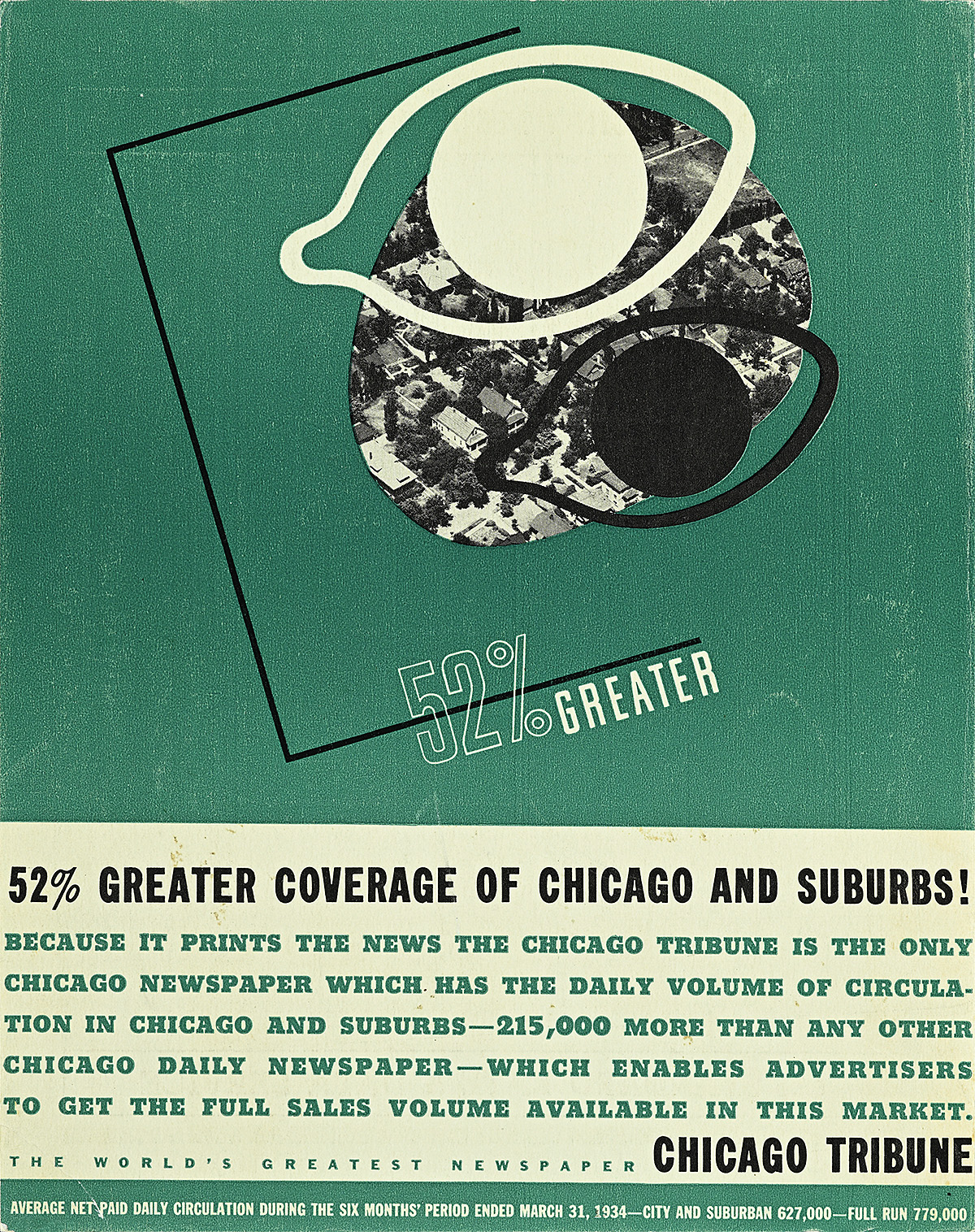
Chicago Tribune: 52% Greater, 1934

A newspaper advertisement of 2 stylized eyes overlooking an aerial photograph of a suburban neighborhood.

Lester Beall (1903–69)

Merrill C. Berman Collection

  • After the success of his initial series for the classified section of the Tribune, Beall was hired to design all of the trade advertising for the newspaper for the next two years. These images would solidify his status as the premiere American modernist.
  • His layouts proved so unique that the prestigious Swiss typographic journal, the Typografische Monatsblätter, referred to them in 1935 as “the finest and most progressive American advertising designs.”
  • Here, Beall incorporates contrasting silhouettes of eyes over an aerial photograph of a suburban neighborhood to emphasize that the Tribune has more readers than any other Chicago-based paper. His use of a thin, black line to draw the eye from a powerful graphic motif to a repeated statistic foreshadows the kind of sleek, dynamic design that he would master in his poster series for the Rural Electrification Administration (REA).

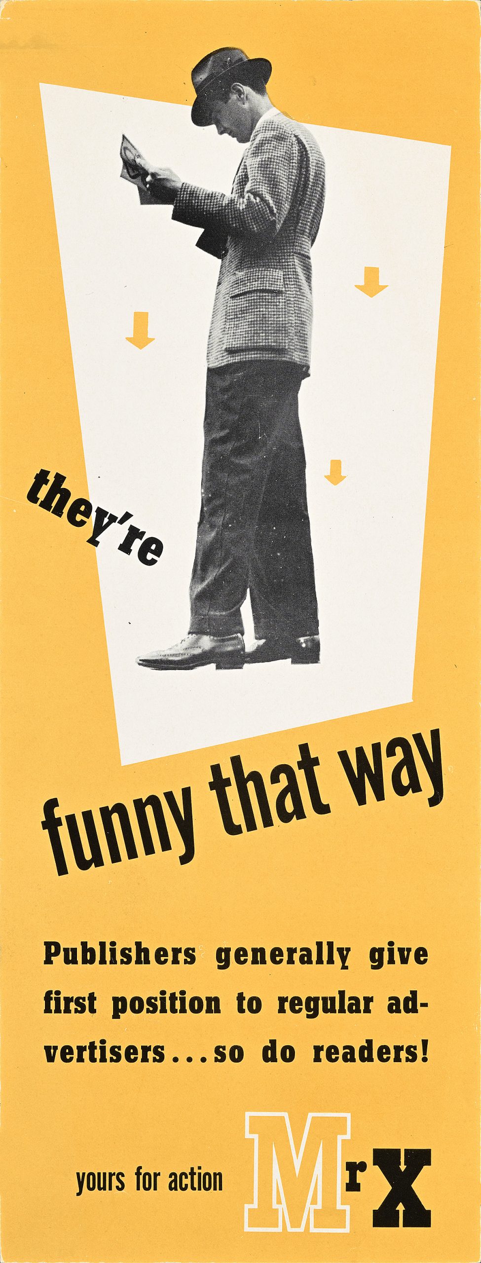
Mr. X, 1938

An insert of a standing white man in a suit reading with an arrow pointing at his feet.

Lester Beall (1903–69)

Display, Graphic Design Collection

  • In 1937 and ’38, the Crowell Publishing Company hired Beall to create a series of trade promotions that offered potential advertisers insight into the minds of average Americans through “the letters of Mr. X.” Sourced from the editors of its various magazines around the country, they were seen as unfiltered, honest reports on the American male psyche. 
  • This insert is a particularly rare piece within the series, showcasing many of the motifs Beall used throughout the 1930s and ’40s, including miniature directional arrows, a single bold color, cut-out photography against a unique geometric shape, and dynamic type. 
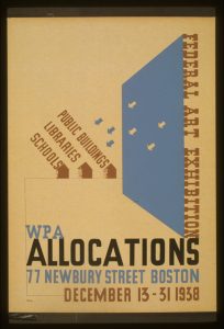
  • Beall’s signature style inspired other American designers almost immediately, with copycat posters and advertisements appearing around the country. Ben Nason’s 1938 silkscreen image for the Works Progress Administration, reproduced on this label, incorporates a nearly identical array of miniature arrows to those in the Consider Chicago! composition, as well as the red, white, and blue palette Beall used in his REA series. An advertisement depicting arrows pointing to 3 buildings.

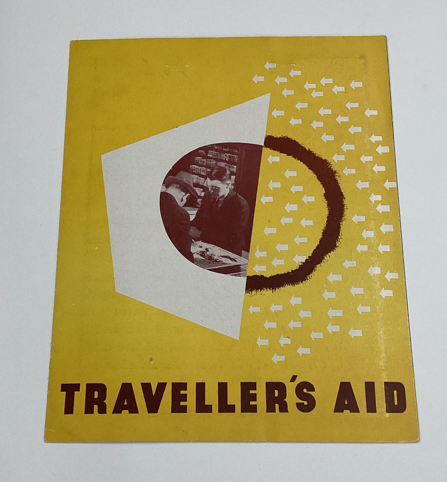
Traveller’s Aid, 1935

A pamphlet with a circle split in half with 2 men at a desk and a half circle with arrows.

Lester Beall (1903–69)

RIT Cary Graphic Arts Collection

  • In addition to printing a newspaper, the Chicago Tribune offered a variety of free resources through its Public Service Office, including a bureau that helped locals choose the best educational institutions for their children and this Traveller’s [sic] Aid pamphlet to assist people planning vacations. 
  • Created in the late 19th century as a means to familiarize immigrants and tourists with Chicago, the Traveller’s Aid Society evolved into a type of travel agency for Tribune readers, providing recommendations for hotels, restaurants, and attractions in both domestic and international destinations. 
  • Beall designed individual listings for potential trips based on themes ranging from Mardi Gras to Alaska that would appear in the paper and direct people to the Tribune’s offices for help in planning their travel. This pamphlet included clippings of these advertisements, encouraging businesses around the world to submit their material for review with the hope of becoming recommended vendors. The cover closely mimics the design Beall produced for the Consider Chicago! series, linking it to the brand’s overall visual identity. 

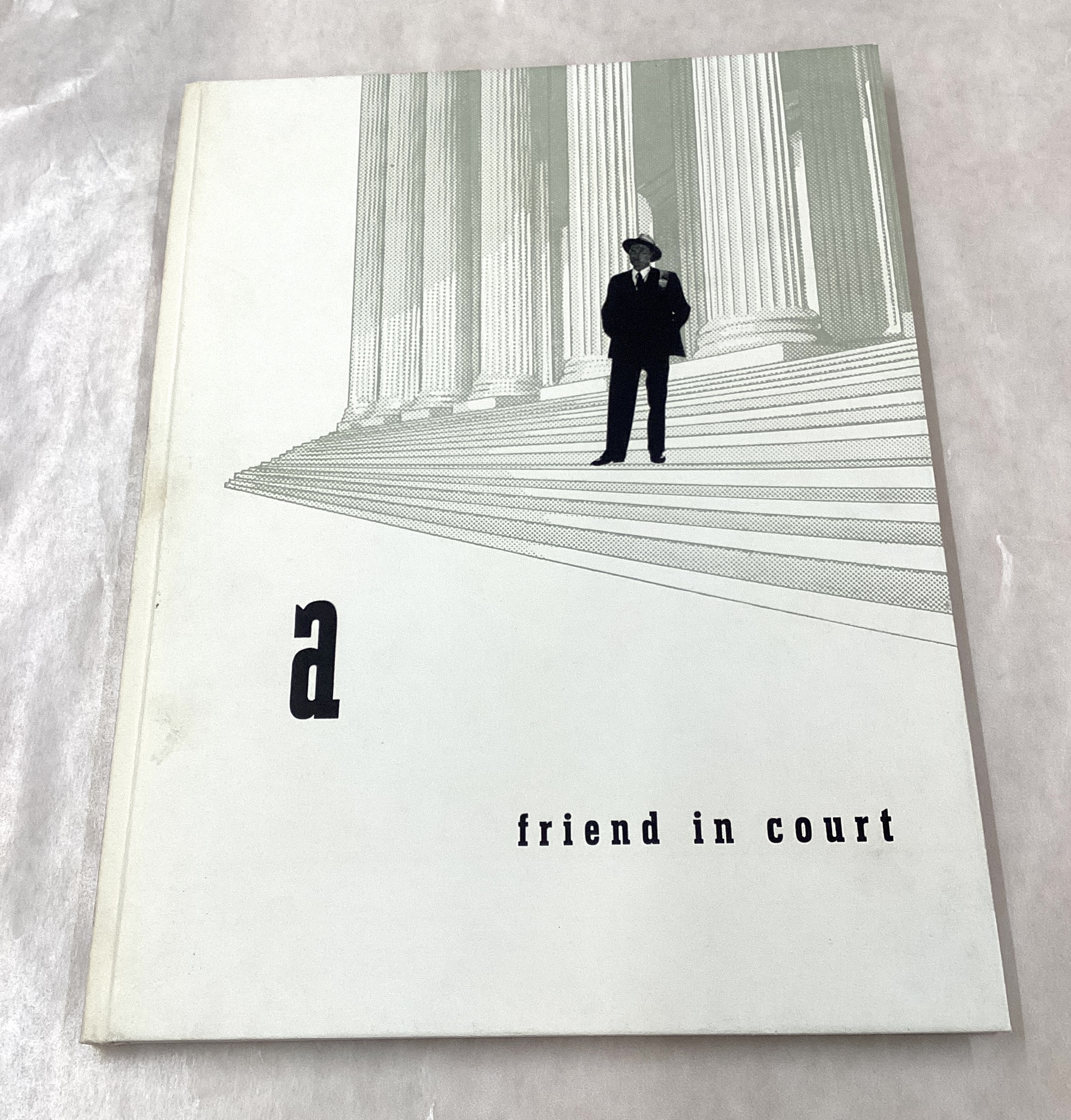
A Friend in Court, 1938

A book with a black-and-white image of a man in a suit on the steps of a courthouse.

Lester Beall (1903–69)

RIT Cary Graphic Arts Collection

  • Beall produced this hardbound booklet as another promotional item for the Crowell Publishing Company, intended to convince advertisers to promote their brands within Country Home Magazine
  • The entire volume emphasizes the importance of a rural audience, most notably farmers—“one of the largest occupational groups” in America. More than 20 pages highlight graphs and statistics indicating that this demographic is more involved with local government than its urban counterparts, voting more frequently and having deeper ties to their representatives. Moreover, 33 percent of senators and assemblymen at the time were farmers. 
  • Although designed to sell advertisements, the content of this book underscores Beall’s sensitivity to and respect for the rural population—a position also reflected in his three series for the Rural Electrification Administration.

Beall & the Rural Electrification Administration

From 1933 to 1935, Beall worked almost exclusively for the Chicago Tribune, producing all of its trade advertising in what would become his signature style. Relying on what he referred to as “thrusts and counterthrusts” (compositional elements that force the viewer’s eye to move a specific way across the page), these layouts quickly caught the attention of designers in Europe, reinforcing his reputation as the preeminent American graphic modernist. Such accolades, however, failed to bring him new clients in Chicago, and as his work prospects dwindled during the Depression, Beall was forced to see if he could do better in New York City. He moved there in September 1935, joining the ranks of European artistic luminaries like Joseph Binder, Erik Nitsche, Josef Albers, and Alexey Brodovitch. While his reception in New York was positive, it was not until two years later that he became arguably the most celebrated designer in the city with the release of the first of his three series for the Rural Electrification Administration. These posters would define a turning point in American modernism, becoming the focus of the Museum of Modern Art’s first show dedicated to an American graphic designer. 

While the Great Depression is often associated solely with the Wall Street Crash of 1929, the origins of the financial crisis date back to World War I and the undue burden it put on the American agricultural system. In 1914, farmers were asked by the government to increase production in order to provide food as foreign aid to Allied nations. The introduction of the gas-powered tractor helped expedite this process, with millions of farmers taking out loans to modernize their farming practices with such equipment. At the same time, millions of farm animals, most commonly horses and mules, were slaughtered as they were no longer needed to pull plows, freeing up vast tracts of pasture to serve as additional farmland for planting and grazing for the dairy industry. When the war ended in 1918, no plan was in place to redirect this overproduction, resulting in devastating price cuts, a glut of unneeded crops, exhausted farmland, and no means for farmers to repay the crippling debt they were now facing due to the government’s wartime request that they mechanize. 

During the 1920s, millions of farms went into foreclosure, pushing many citizens out of the countryside in search of employment. For the first time in U.S. history, the majority of Americans were not working in rural communities, with factories in urban centers now becoming the largest employers in the country. Still, 44 percent of the population remained in remote areas, where day-to-day existence more closely resembled life as it had been in the 1880s—45 million people still did not have indoor plumbing and hardly anyone living outside a major city had access to electricity. Drought and soil erosion also led to the Dust Bowl, a deadly environmental crisis that devastated many farming communities. In 1933, the newly elected President Roosevelt initiated what became known as the New Deal, a series of federal programs and agencies designed to spearhead economic recovery through public services, regulation, and new jobs. Among the programs his administration created in 1935 was the Rural Electrification Administration (REA). Managed by the Department of Agriculture, this agency helped build energy infrastructure in areas where private companies refused to operate, extending electricity to small populations in remote locations. Lester Beall was hired to advertise the REA’s work, designing three series of posters over a five-year span.

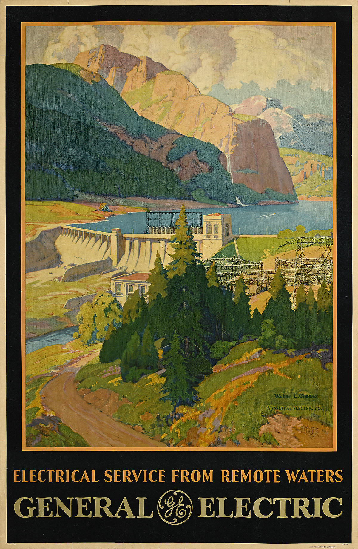
General Electric, c. 1935

A poster of a river landscape and a dam with mountains in the background.

Walter L. Greene (1870–1956)

Poster House Permanent Collection

  • While private companies that specialized in electrical appliances (like General Electric) had made attempts to expand their consumer base in rural areas as far back as the 1880s, their efforts had been largely unsuccessful. The biggest hurdle, apart from consumer resistance, was the difficulty in generating enough volts of power that were sustainable over long distances (most urban systems could only maintain enough voltage for about four miles), making most of their advertising futile. 
  • This design highlights a hydroelectric dam, not dissimilar to those built in the early 1930s by the Tennessee Valley Authority, a New Deal agency created to develop electricity infrastructure (and therefore low-cost power) and jobs in Appalachia. 
  • The compositional differences between this poster by Walter L. Greene and those designed by Lester Beall for the REA are stark. Greene’s poster embraces the classic illustrational style favored by the majority of American poster artists at this time. He also designed numerous posters for the New York Central Railroad, all of which feature similarly bucolic vistas that modernists would have considered “nostalgic” or “quaint” rather than progressive.

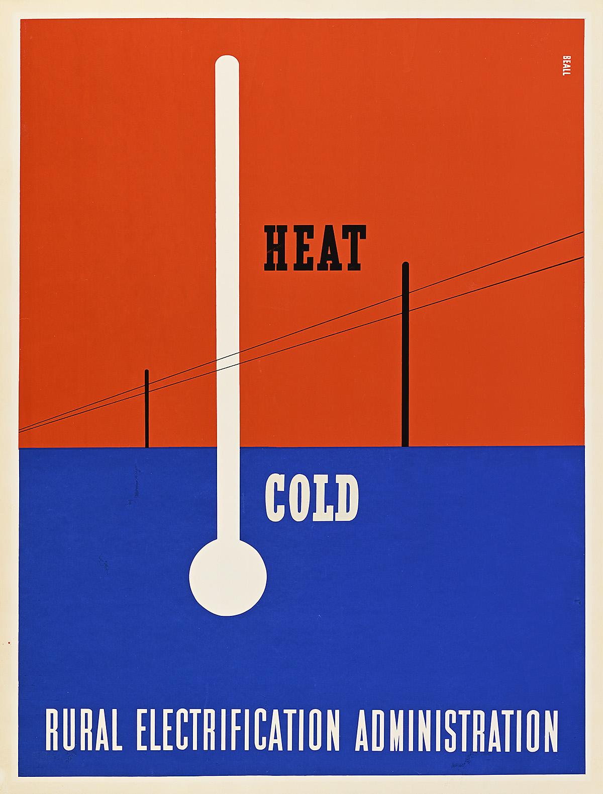
Heat/Cold/Rural Electrification Administration, 1937

A poster of a thermometer labeled

Lester Beall (1903–69)

  • The introduction of electricity to rural America was not a straightforward process. Originally, the REA attempted to strike deals with private power companies, asking that they provide both the infrastructure and the service to remote locations. These organizations viewed the task as a money-losing venture, not only because of the large upfront cost and the higher rates they would need to charge people, but also because they did not see farmers as eager or lucrative customers. 
  • The REA faced an additional challenge: its $100 million budget mandated that at least 90 percent of the labor used for a project had to be performed by those registered as unemployed. Given the skills needed to install and maintain power lines, however, there were not enough qualified workers in that pool. 
  • Since neither negotiating with private companies nor building the infrastructure itself was feasible, the REA dedicated its efforts to building a mass loan program managed by unemployed individuals, inviting citizens to form cooperatives to construct, manage, and pay for electrification in their areas.

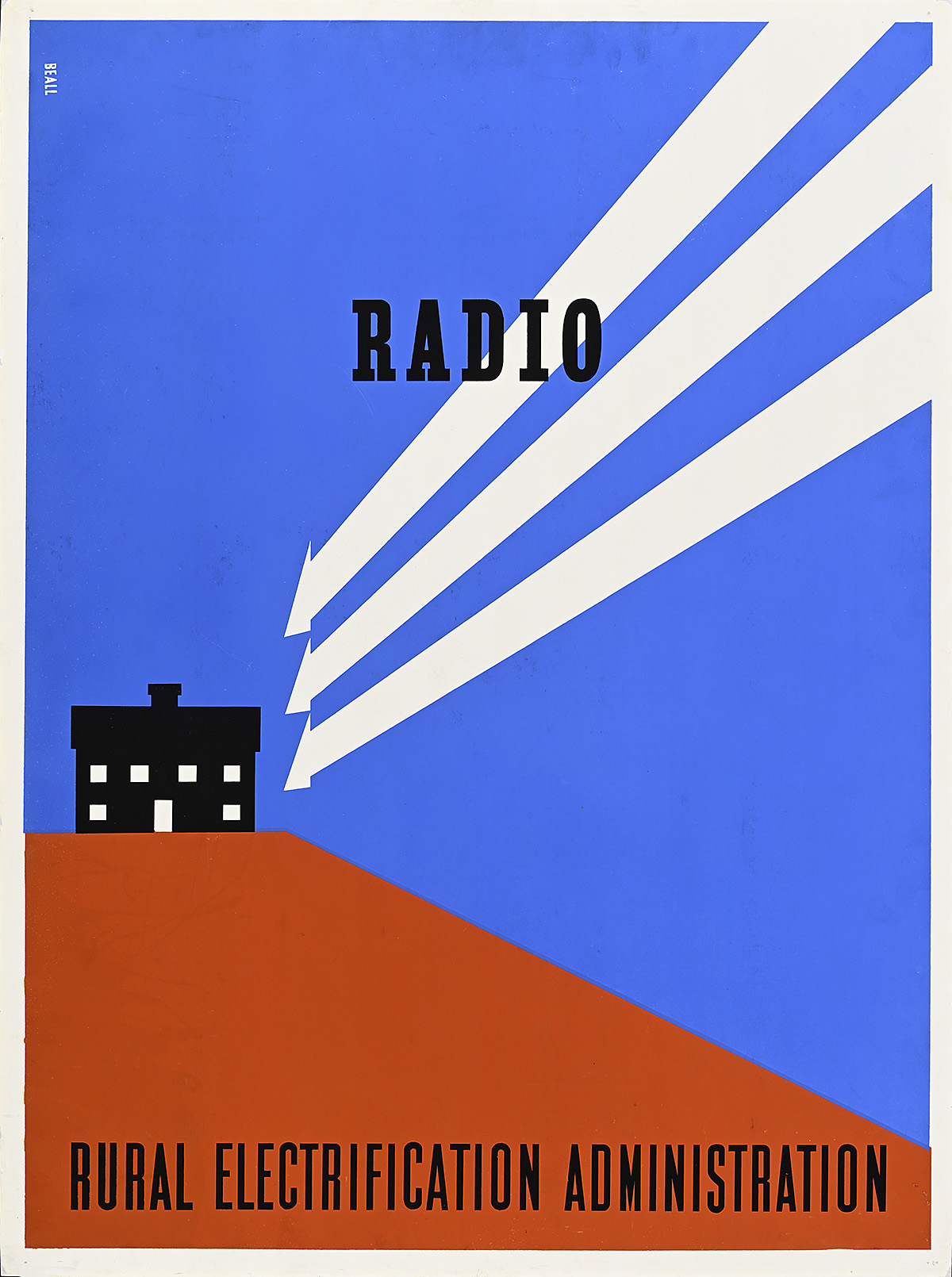
Radio/Rural Electrification Administration, 1937

A poster of 3 white arrows leading to a black building with illuminated windows on a red-and-blue ground.

Lester Beall (1903–69)

  • The REA dispatched groups popularly known as “Electric Circuses” around the country, armed with novel appliances like radios and refrigerators to help convince farmers that electricity would better their lives. These roadshows were accompanied by electricians who could install wiring in a home in a day so it was ready to be hooked up to local lines once they were laid. 
  • Unlike the Tennessee Valley Authority that was overseen by the government, a unique aspect of these rural power companies was that they were all cooperatively owned by the farmers who signed up for the program and to whom the government had provided startup loans. These cooperatives would purchase the electricity wholesale and distribute it to members on lines managed by them, creating local jobs while supplying power to rural homes. 
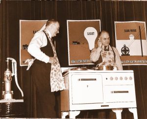
  • The posters in this first series accompanied the Electric Circuses on their national tours (typically mounted to boards and displayed alongside presenters), and were also on view in major cities, most especially Washington, D.C., in an effort to win political support for the program. At the time, President Roosevelt was subjected to tremendous vitriol for his progressive ideas, and using posters to promote them to the portion of the population that had the most influence over Congress (almost all of whom were urban, male, and white) was essential.

A photograph of 2 men showing off appliances in front of posters.

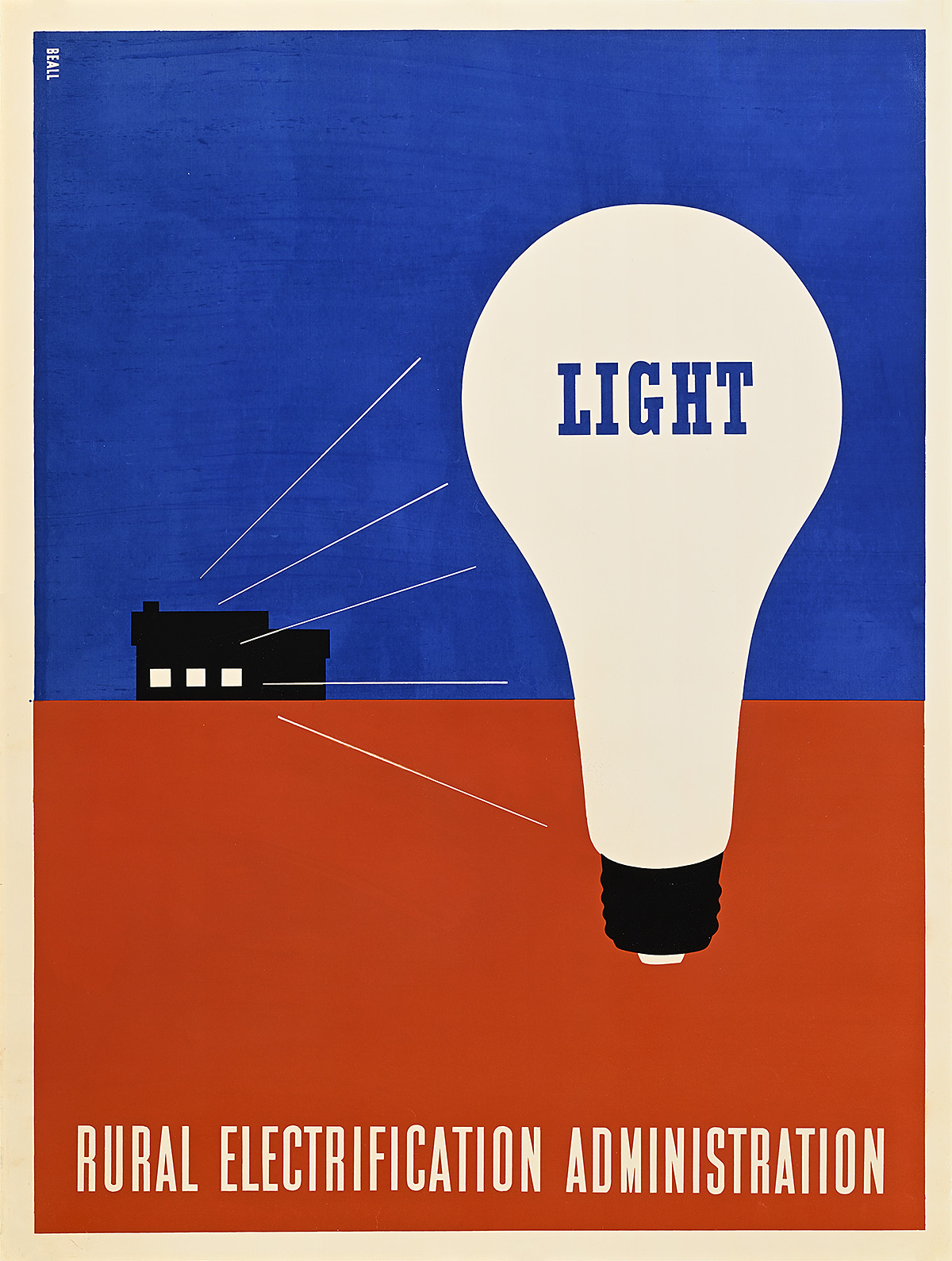
Light/Rural Electrification Administration, 1937

A poster of a light bulb on a red-and-blue ground with white lines emanating from the windows of a black house behind it.

Lester Beall (1903–69)

  • In May 1935, President Roosevelt created the Rural Electrification Administration managed by the Department of Agriculture. Its sole goal was to bring affordable electricity to rural areas in America. A year later, Congress passed the Rural Electrification Act, allowing the government to provide loans to fund large construction projects such as power plants and electricity in single-family homes.
  • Rural Americans were skeptical about accepting federal loans that would allow them to bring electricity into their homes. Already devastated by the Great Depression, which many felt was the fault of the government and big business, and angry about their perceived abandonment by the administration after the need for their crops dwindled in the aftermath of World War I, farmers were hesitant to let the government interfere further with their lives. 
  • In 1937, Bill Phillips, one of the information officers for the Department of Agriculture, recognized that the REA needed a promotional campaign. He was introduced to Lester Beall through a mutual acquaintance in the advertising world. While it is not known why Phillips chose Beall to create the REA poster series, Beall’s independence from the large advertising agencies combined with his incredibly modern approach to design made him an attractive choice to become one of the first graphic artists hired by the federal government.

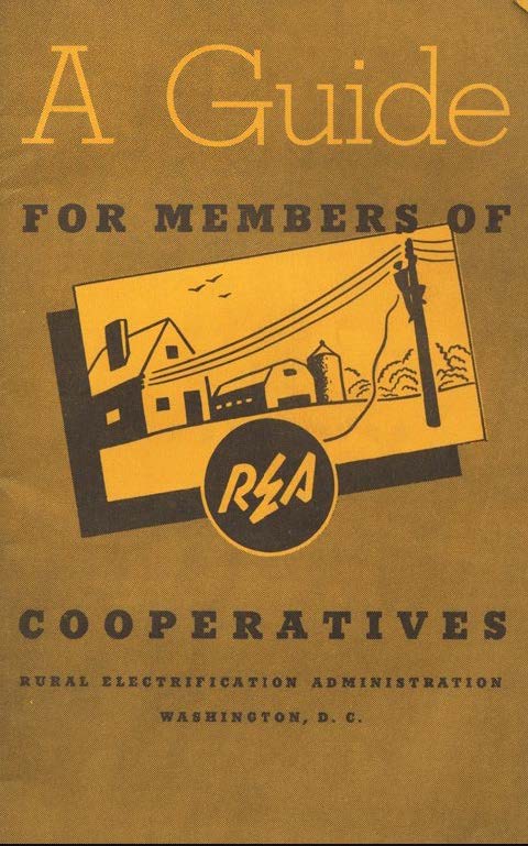
A Guide for Members of REA Cooperatives and Accompanying Letter, 1939

A booklet with telephone wires connecting to a house; shown with a typed letter.

The Wolfsonian–Florida International University, Miami Beach, Florida, Gift of Francis Xavier Luca and Clara Helena Palacio Luca

  • Booklets like this one were sent to new REA cooperatives as well as to those in rural areas considering forming cooperatives. They outline how cooperatives work, the role of the government in the project, and the benefits of becoming an electrified community. 
  • To appeal to both men and women, each spread features illustrations highlighting typically gendered jobs, demonstrating how electricity will make those tasks easier. More interestingly, the publication emphasizes that at least one woman should be on the board of each cooperative, and that membership cannot be denied to anyone based on race—both of which would have been seen as quite progressive policies in rural areas in the 1930s.
  • This particular copy was sent to a cooperative in northern Vermont, asking the local government to encourage people to wire their homes while they wait for electricity to be installed. The accompanying letter also asks farmers to allow electricity poles to be installed on their land.

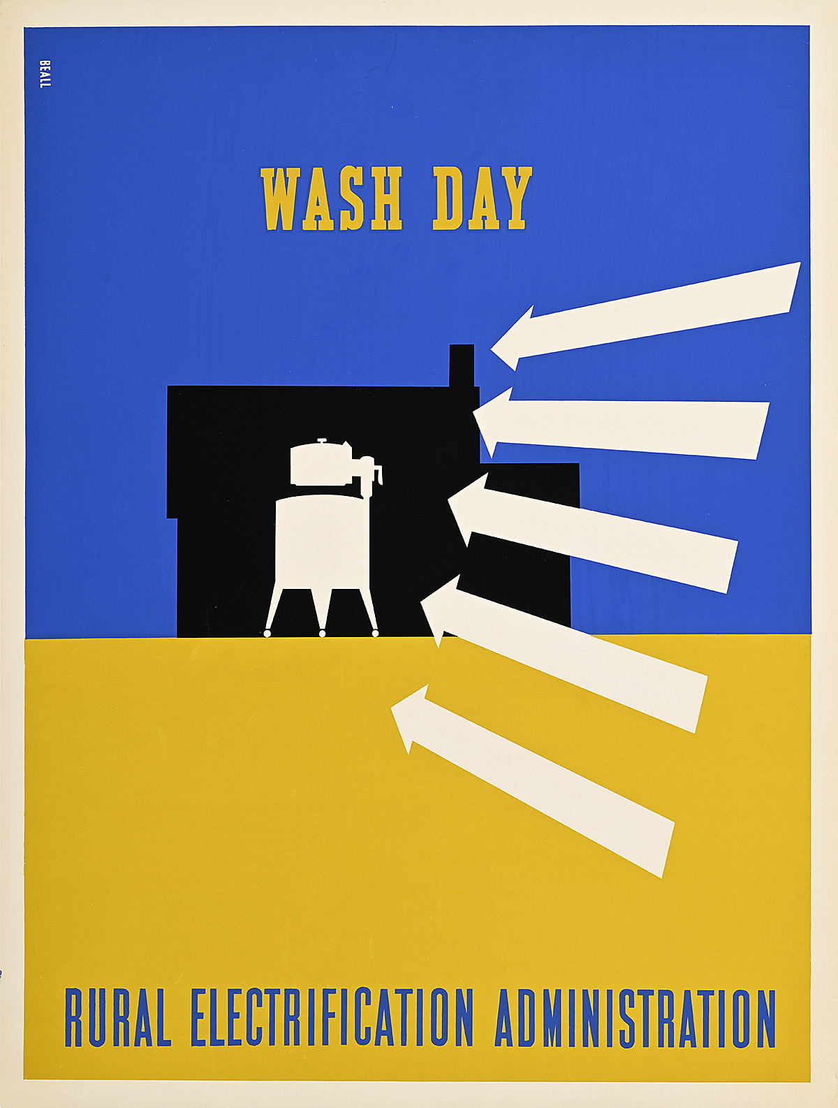
Wash Day/Rural Electrification Administration, 1937

A poster of 5 white arrows pointing to a washing machine on a blue-and-yellow ground.

Lester Beall (1903–69)

  • The Electric Circuses made their roadshows entertaining experiences meant for entire families to attend as part of community gatherings. They employed targeted marketing techniques aimed separately at men and women to demonstrate the benefits of electrifying their homes. These efforts relied heavily on gender stereotypes, often ignoring the fact that women were frequently just as active in farm labor as men.
  • This design, so similar to many of the advertising layouts Beall created during his time in Chicago, speaks to the traditionally female job of doing laundry, but presents it in an ultramodern fashion without sentimentality. Like all of the posters in the first series, it would have been accompanied by a same-size panel of simple text outlining the benefits of electrifying the task depicted.  
  • One of the many life-changing modern amenities of the 1920s and ’30s was the domestic washing machine. Before this, laundry could be a three-day task, with women having to make lye soap (typically by boiling leftover fat from a butchered pig), carry buckets of water from an outdoor source, heat the water on a stove, circulate the laundry in that water with a paddle or crank agitator, carry in fresh water to rinse it, wring it out, hang it on an outdoor line (which meant it often froze in the winter), and later heat multiple heavy irons on the fire to press the clothes. 

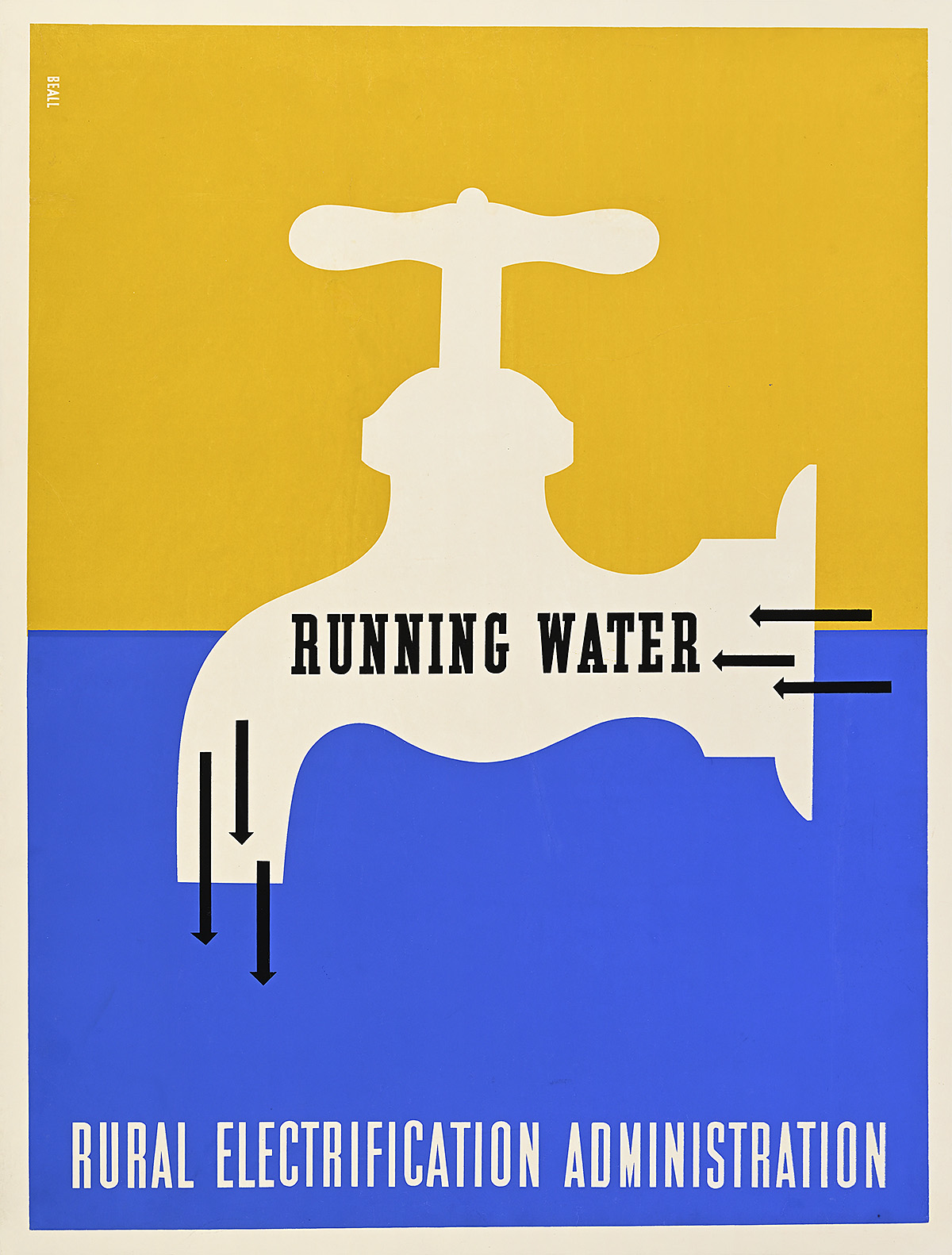
Running Water/Rural Electrification Administration, 1937

A poster of a water faucet on a blue-and-yellow ground.

Lester Beall (1903–69)

  • In the 1930s, less than 10 percent of the rural population of the United States had access to modern amenities like indoor plumbing and electricity, and farmers lived their lives much in the same manner as their ancestors had for hundreds of years. 
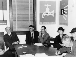
  • Beall’s first series of six posters, printed in the summer of 1937, received international attention and praise, appearing in the prestigious French journal Arts et Métiers Graphiques and earning him the first solo exhibition for an American graphic designer at the Museum of Modern Art in New York that same year. 
  • The two-week exhibition was put together very quickly, so much so that the press release incorrectly notes that the posters were created through stone lithography rather than silkscreen. At the time, MoMA was pointedly Eurocentric in its outlook, rarely championing American modern art. This made the selection of Beall for the institution’s second poster exhibition (the first being dedicated to the work of A.M. Cassandre) especially notable, and emphasizes his unique position in the country’s design pantheon.

A group of individuals sitting around a table with posters on the wall.

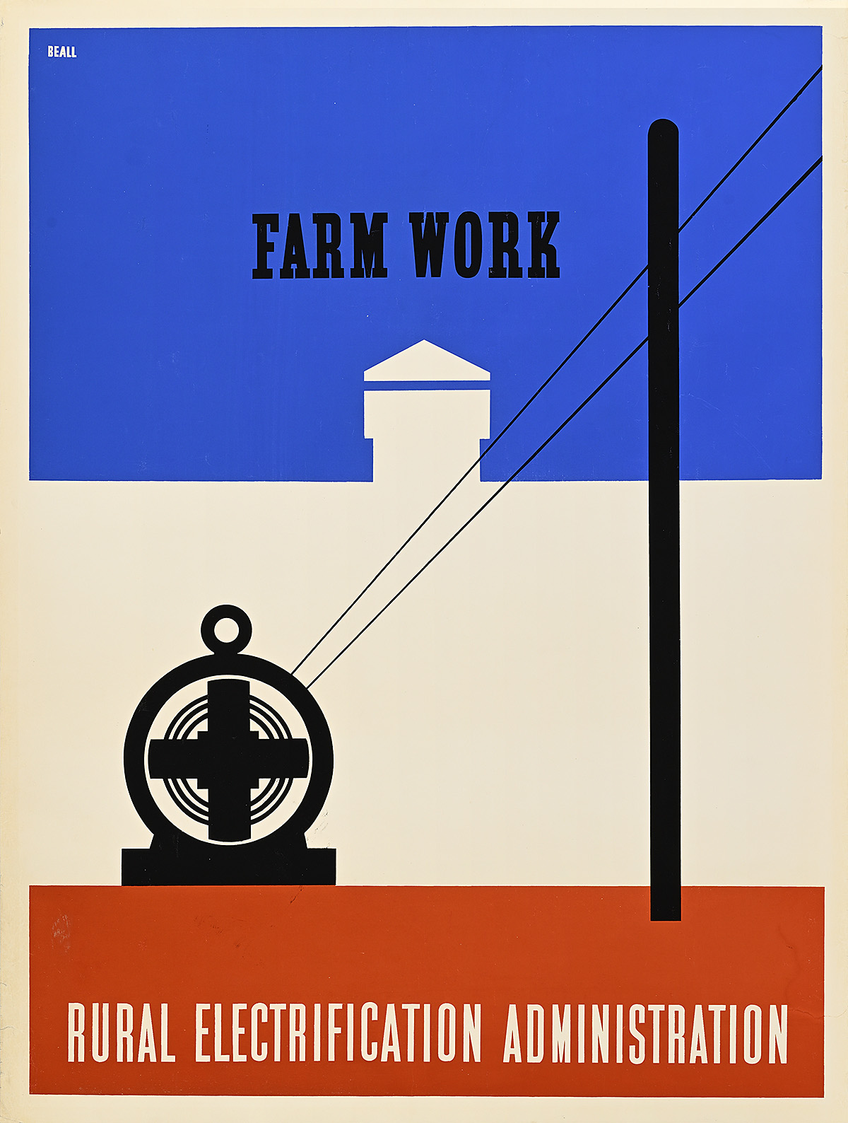
Farm Work/Rural Electrification Administration, 1937

A poster of a generator connected to a power line on a red, white, and blue background.

Lester Beall (1903–69)

  • Beall’s use of negative space in this first series is particularly sophisticated, creating shapes and depth in the images without the need for too many costly inks. Here, the mere outline of a cupola (air vent) indicates that the viewer is looking at a barn, yet no structure is actually defined. 
  • While many scholars have claimed that this series relies on stark, direct imagery in order to communicate with a largely illiterate or semiliterate rural population, that presumption is unlikely accurate. In 1930, only around four percent of Americans were unable to read. Considering the rest of Beall’s oeuvre, it is more likely that these posters, like all of his compositions, were designed to be understood immediately from a great distance as well as to catch the eye with bold colors. 
  • Beall also had a personal knowledge of and sensitivity to rural life. Born in Missouri, he spent every summer until he was 20 on his mother’s family’s farm where he experienced firsthand the long and grueling hours of farm labor as well as the pride of those who performed it. Even when he moved to New York City, he soon purchased a farm (albeit, a rather upscale one) in Connecticut where he eventually lived and worked full time while raising livestock alongside his graphic-design business.

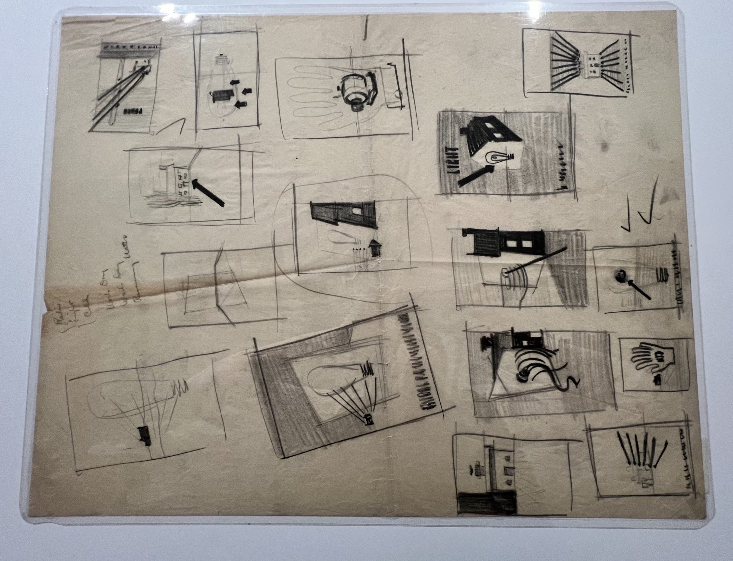
14 black-and-white sketches on one sheet for posters about electricity, including notes and checkmarks.

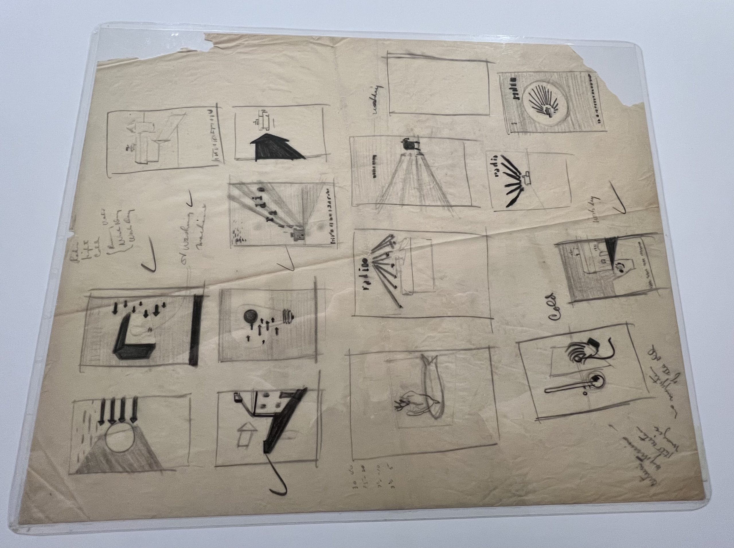
16 black-and-white sketches on one sheet for posters about electricity, including notes and checkmarks.

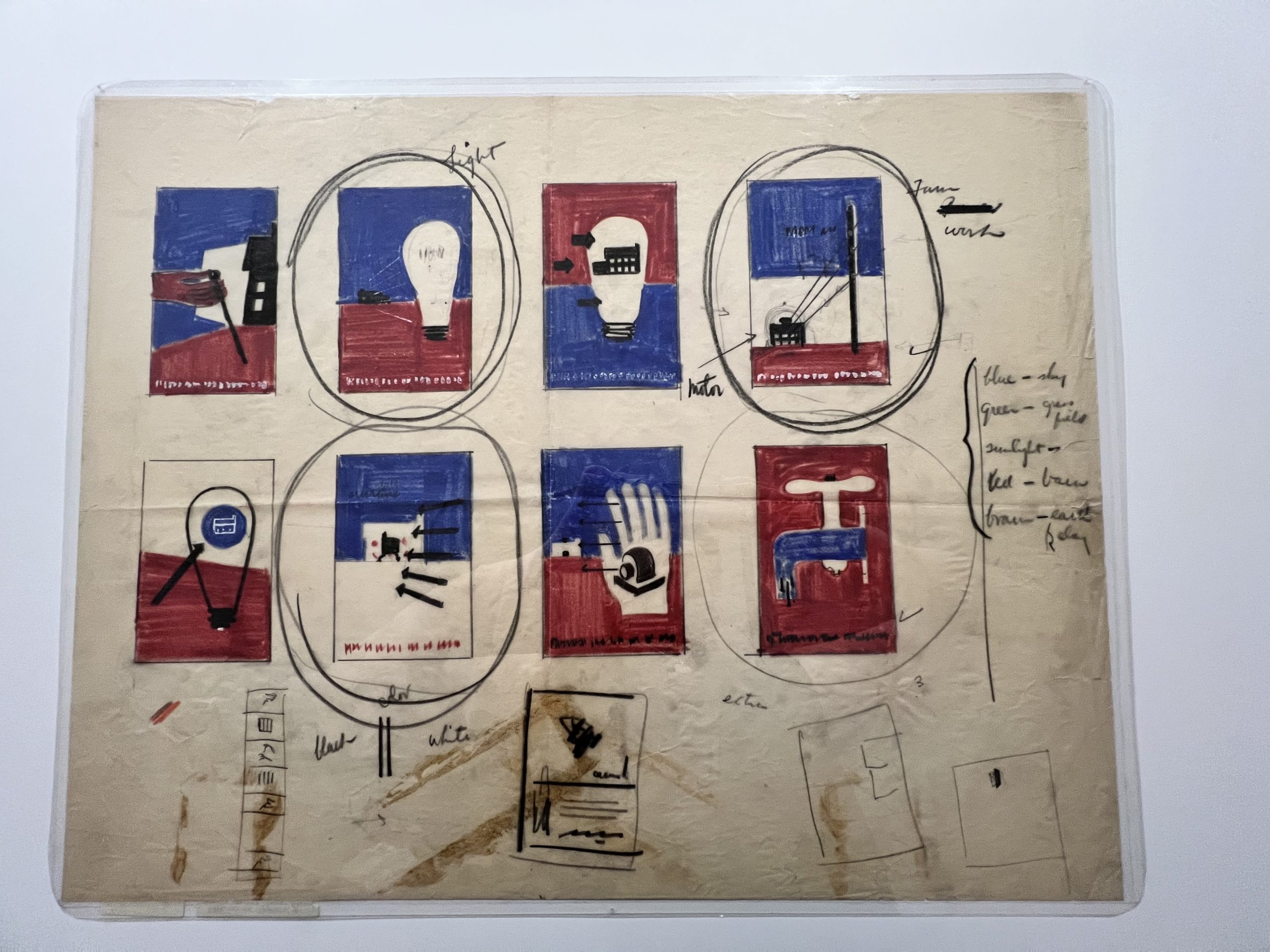
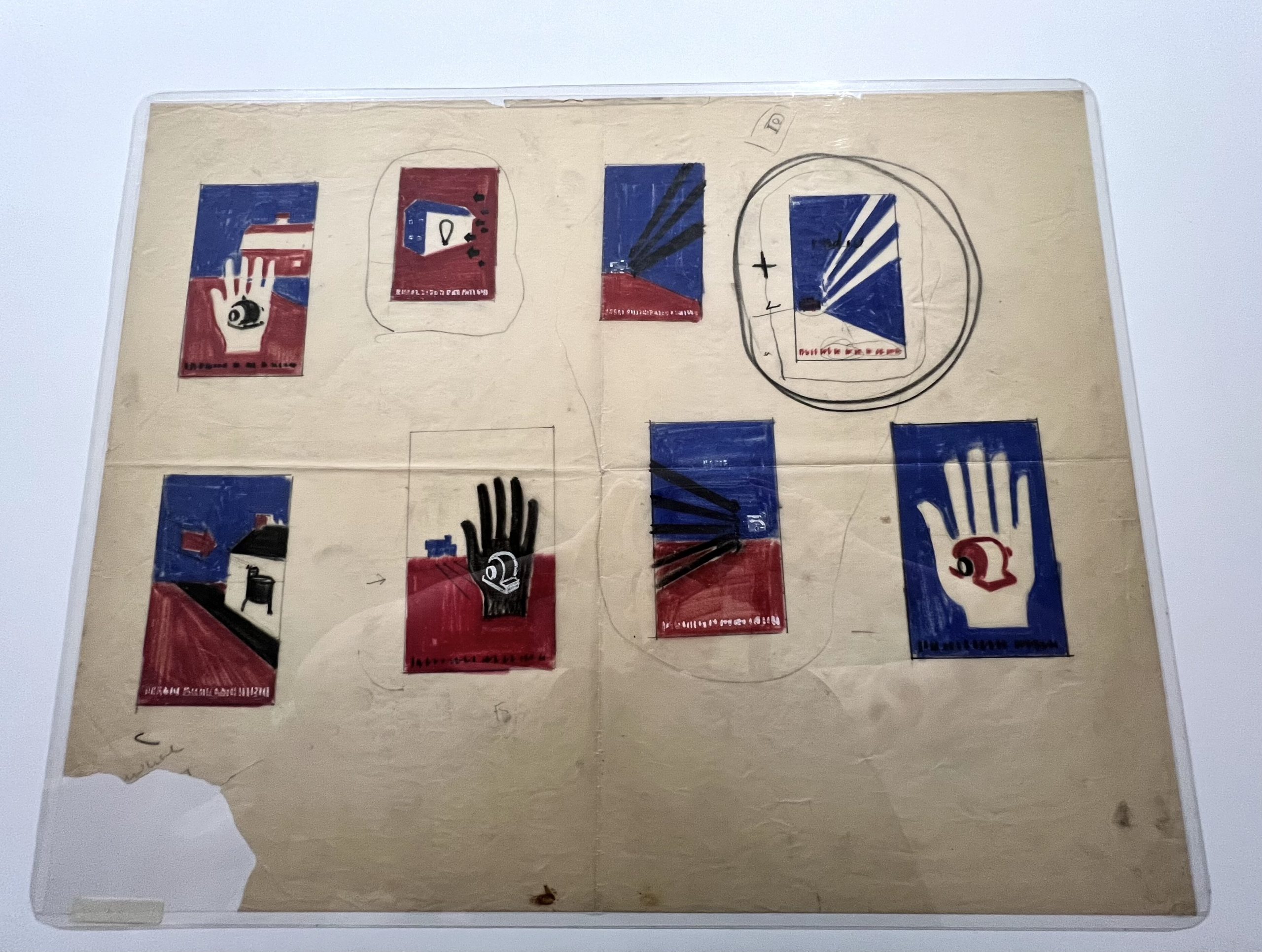
8 sketches on one sheet covered in notes for red-and-blue posters about electrification, including a light bulb and a faucet.

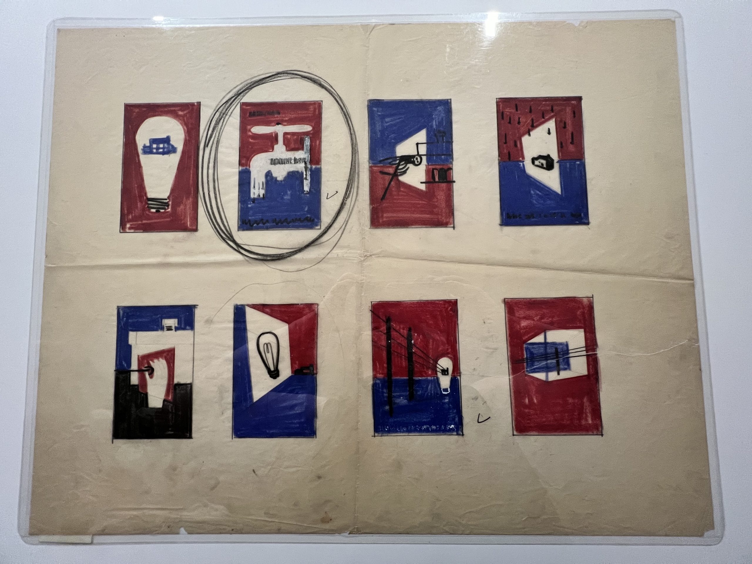
8 sketches on one sheet for red-and-blue posters about electricity; a poster of a faucet is circled several times.

8 sketches on one sheet for red-and-blue posters about electricity; 2 of them are circled and conncted by a line.

REA Sketches, 1937

Lester Beall (1903–69)

RIT Cary Graphic Arts Collection

  • These five sheets feature thumbnail sketches in pastel, graphite pencil, and China white of Beall’s ideas for the initial Rural Electrification Administration poster series. They provide a unique glimpse into the designer’s mind as he attempts to clearly and effectively communicate the essence of the project through graphics. 

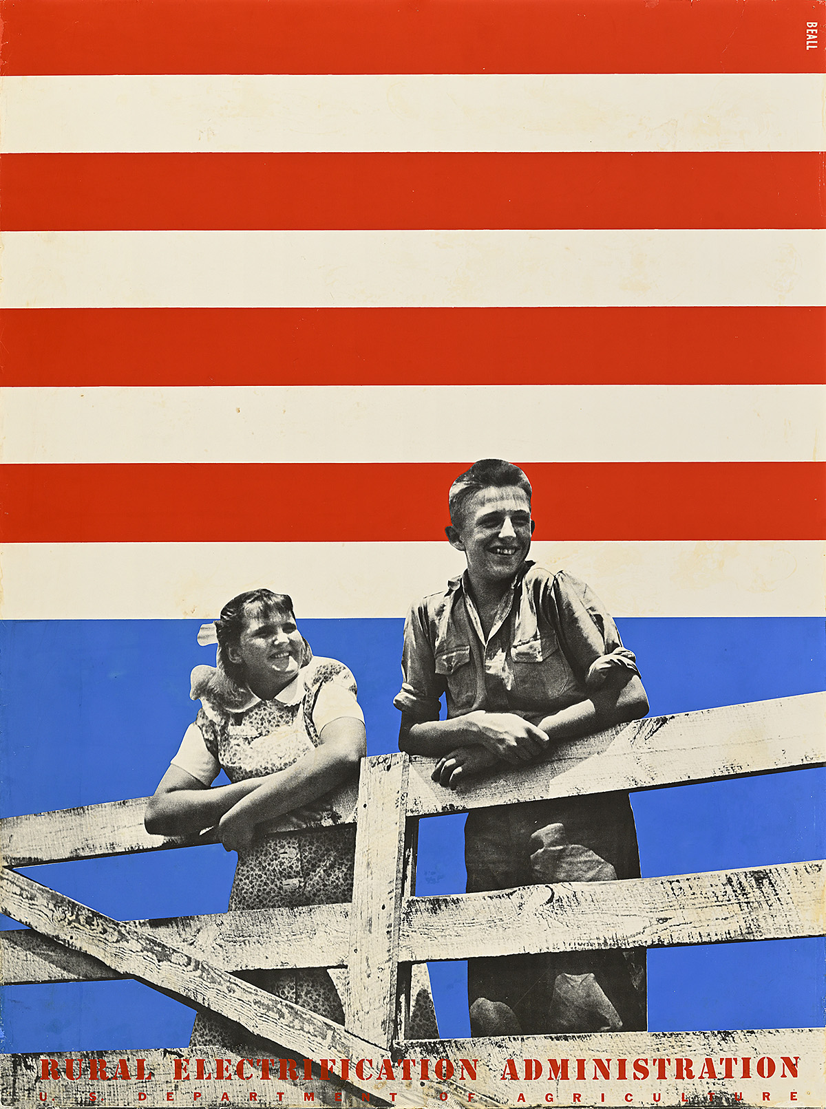
Rural Electrification Administration, 1939

A poster of 2 smiling white children hanging on a wooden gate against a background of red, white, and blue stripes.

Lester Beall (1903–69)

  • While most scholarship covers Beall’s first series for the REA, his second and third series demonstrate an even more advanced understanding of modern design, deftly incorporating photomontage with silkscreened graphics. The year before the second series was released, Beall worked on an article with writer L. Sandusky that exposed him to the author’s European avant-garde visual archive and expanded his existing interest in photomontage.
  • By 1939, around 25 percent of rural households had been electrified, with more than 400 electric cooperatives established around the country. While these numbers were positive, many more citizens would have to sign up for electricity before the program could be seen as successful. Beall created this and a third series two years later to support those continuing efforts. 
  • The second and third REA series focus less on the basic functions of electricity and more on how access to it will provide the basis for a brighter future. This shift is perfectly exemplified in this particularly patriotic design in which children serve as emblems of security and prosperity. It was published just before the start of World War II as the country stood firm on maintaining domestic peace by avoiding intervention abroad. 

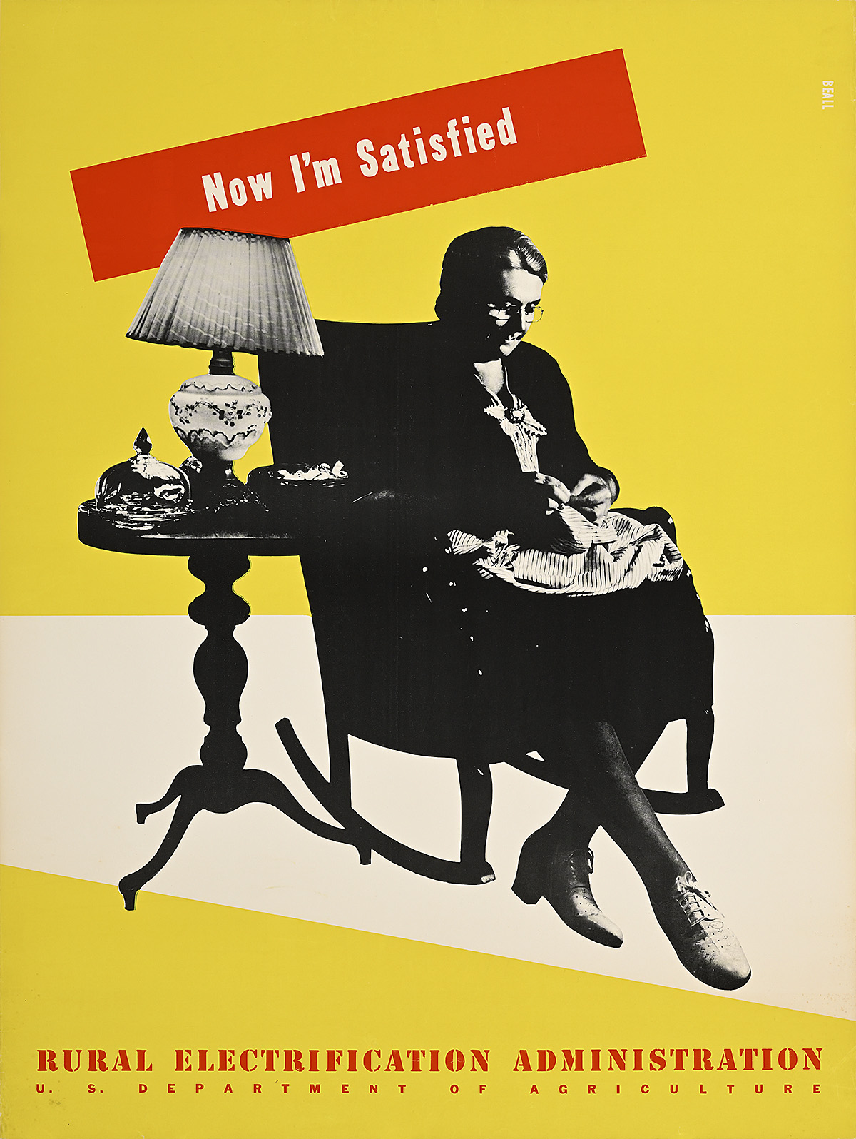
Now I’m Satisfied/Rural Electrification Administration, 1939

A poster of an older white woman sewing in an armchair by the light of an electric lamp on a yellow-and-white ground.

Lester Beall (1903–69)

  • A hallmark of Beall’s second series for the REA was taglines accompanying each image that indicate a positive mindset toward progress. As he had been writing the copy for most of his advertising campaigns since the beginning of his career, it is likely that he came up with these slogans himself.
  • In the 1930s, most critics dismissed the work of American artists, who they saw as poor copyists of European styles. Silkscreen, however, helped to define American modernism; it had not been adopted by many European artists and allowed for crisp lines, bold colors, and a link to commercial design. As part of President Roosevelt’s Federal Art Project, more than two million copies of around thirty-five thousand different posters were produced, mostly using silkscreen, by 1943. 
  • Before electrification, rural households operated on agricultural time, meaning that activities were performed based on daylight, and many indoor chores were done by windows, candlelight, or kerosene lamps. One of the talking points of the Electric Circuses was that adequate, good light not only extended available working hours but also helped preserve people’s eyesight—a fact emphasized here by the image of an older woman mending clothes next to a lamp.

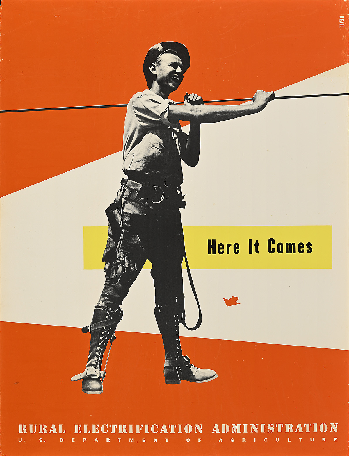
Here It Comes/Rural Electrification Administration, 1939

A poster of a smiling, white male worker holding a power line against a geometric red-and-white ground.

Lester Beall (1903–69)

  • A cooperative had to be established in a particular area before electricity could be installed. Citizens were instructed to convince as many of their neighbors as possible to sign up for the program so as to have the best chance of having their loan approved by the REA. They also had to obtain promises of land from each other that could be used to house the power lines. Plans indicating where lines were to be laid had to be submitted along with the loan request.
  • Once the request was approved, the REA provided the cooperative with funds to clear the land, dig holes for the power lines, and install the poles, wiring, and other equipment—most of which was done by trained electricians. The group would then purchase the electricity wholesale from private power companies or a government supplier like the Tennessee Valley Authority. 
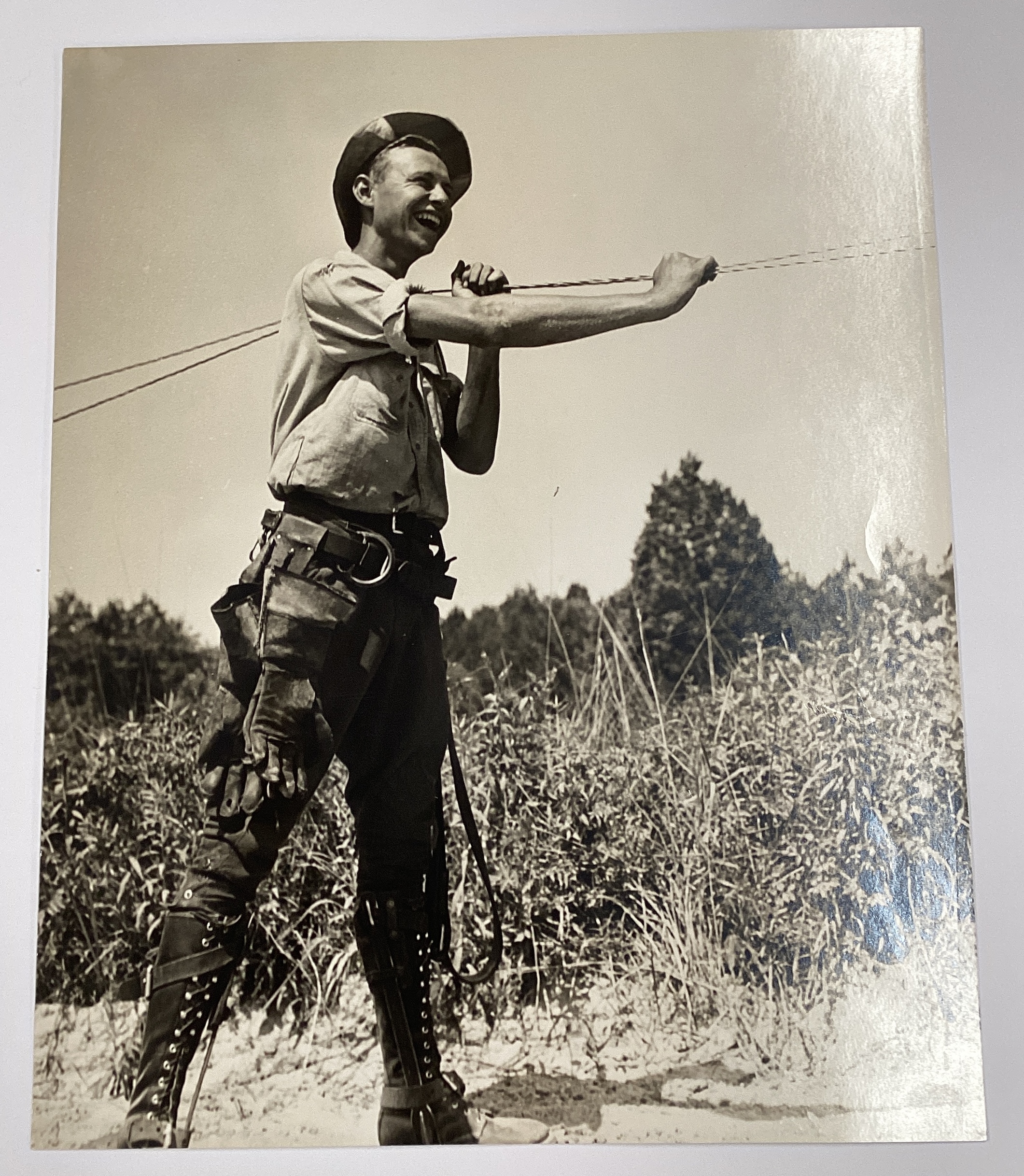
  • In this poster, a young electrical engineer carries a cable. When compared to the original photograph, the wire has been made taut to appear more visually dynamic. The figure is wearing climbing spikes around his boots and has a harness hanging off his belt that would be clipped around the pole so he could lean back and be supported while jointing the cables. On his right side is also a pair of insulated gloves to protect him from electric shock.

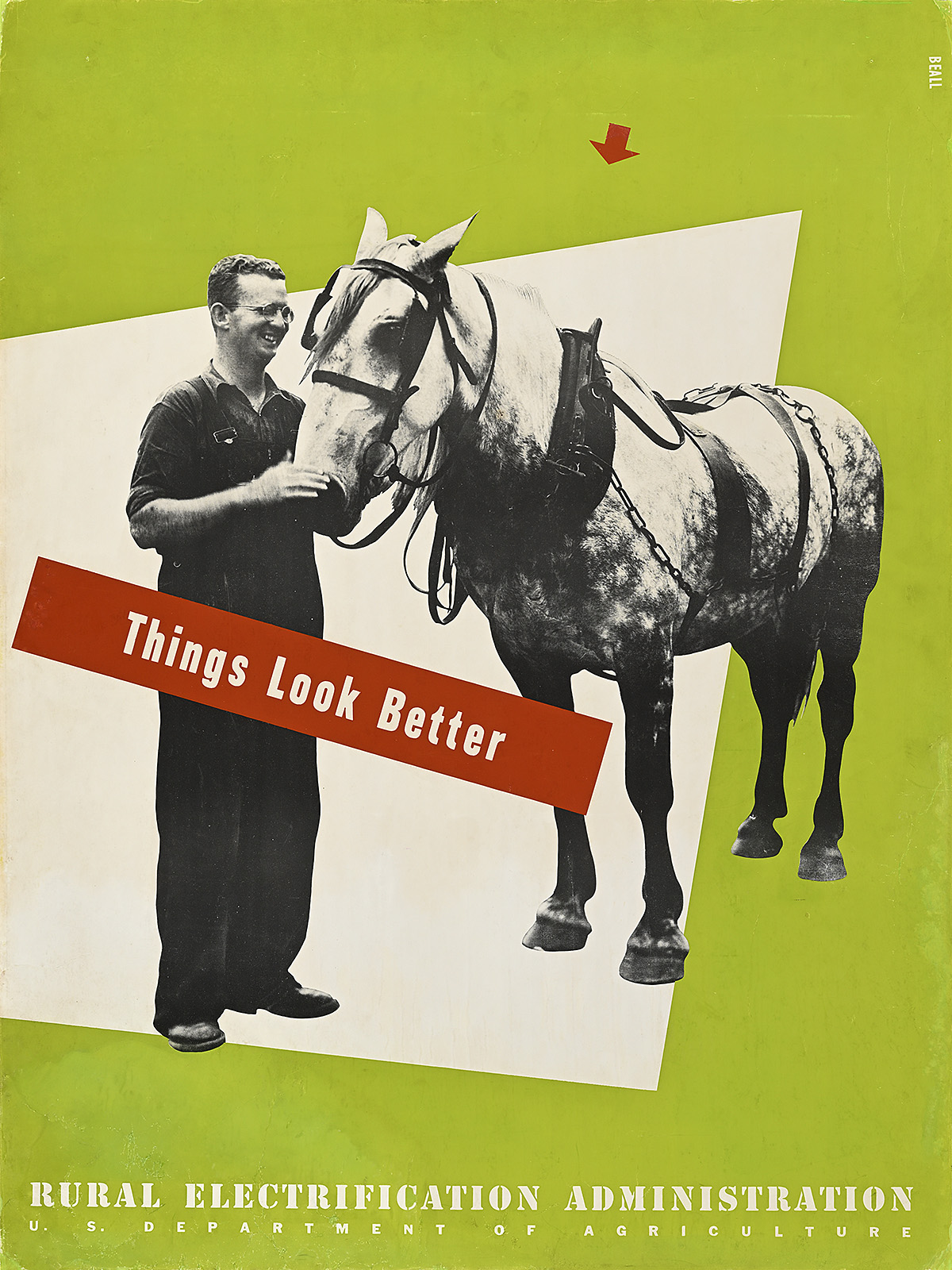
Things Look Better/Rural Electrification Administration, 1939

A poster of a smiling white man standing with a horse against a geometric white-and-yellow ground.

Lester Beall (1903–69)

  • Before World War I, horses and mules played a significant role in farm labor. They were also the primary means of rural transportation until the mid-1920s, after which they were largely replaced by automobiles. 
  • This poster indicates that the lives of farm animals, like those of humans, are improved by electricity. Barns could now be better cooled and ventilated, enhancing air quality and overall cleanliness. Through increased production, farmers could also provide their livestock with more and better food. 
  • During the worst part of the Great Depression and the Dust Bowl, millions of farm animals were dying of starvation. With much pasture land destroyed due to overfarming and drought, and farmers unable to grow or buy grain in many areas, most especially the Great Plains, desperate people tried feeding their livestock cactuses with the thorns burned off or ground Russian thistle (tumbleweeds).   
  • In 1935, the government began a program that would buy 8.3 million starving animals from farmers. Those deemed fit for human consumption would fetch as much as $16 each and be used to feed the poor in urban shanty towns. The majority of these animals, however, were so weak that they were shot in mass graves by the thousands, providing farmers with only $1 per animal. Many farmers lost their entire source of livelihood in a single afternoon.

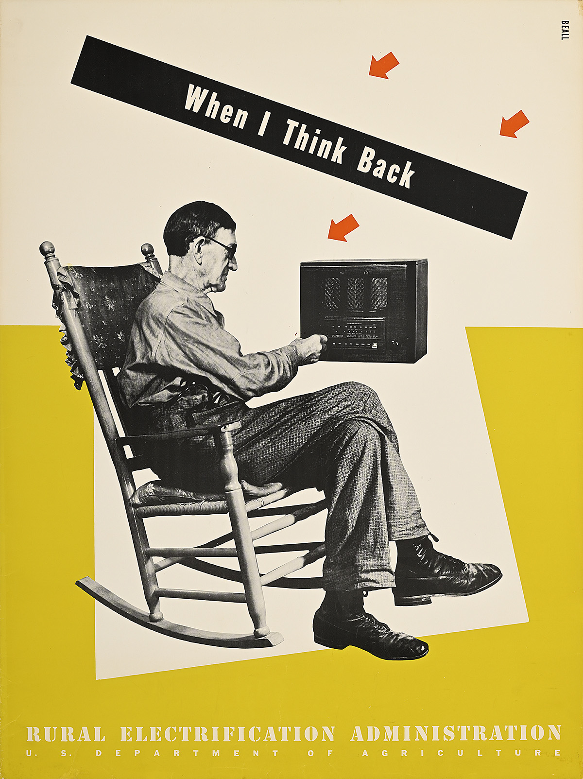
When I Think Back/Rural Electrification Administration, 1939

A poster of a white man in a rocking chair using a radio against a white-and-yellow geometric ground with red arrows.

Lester Beall (1903–69)

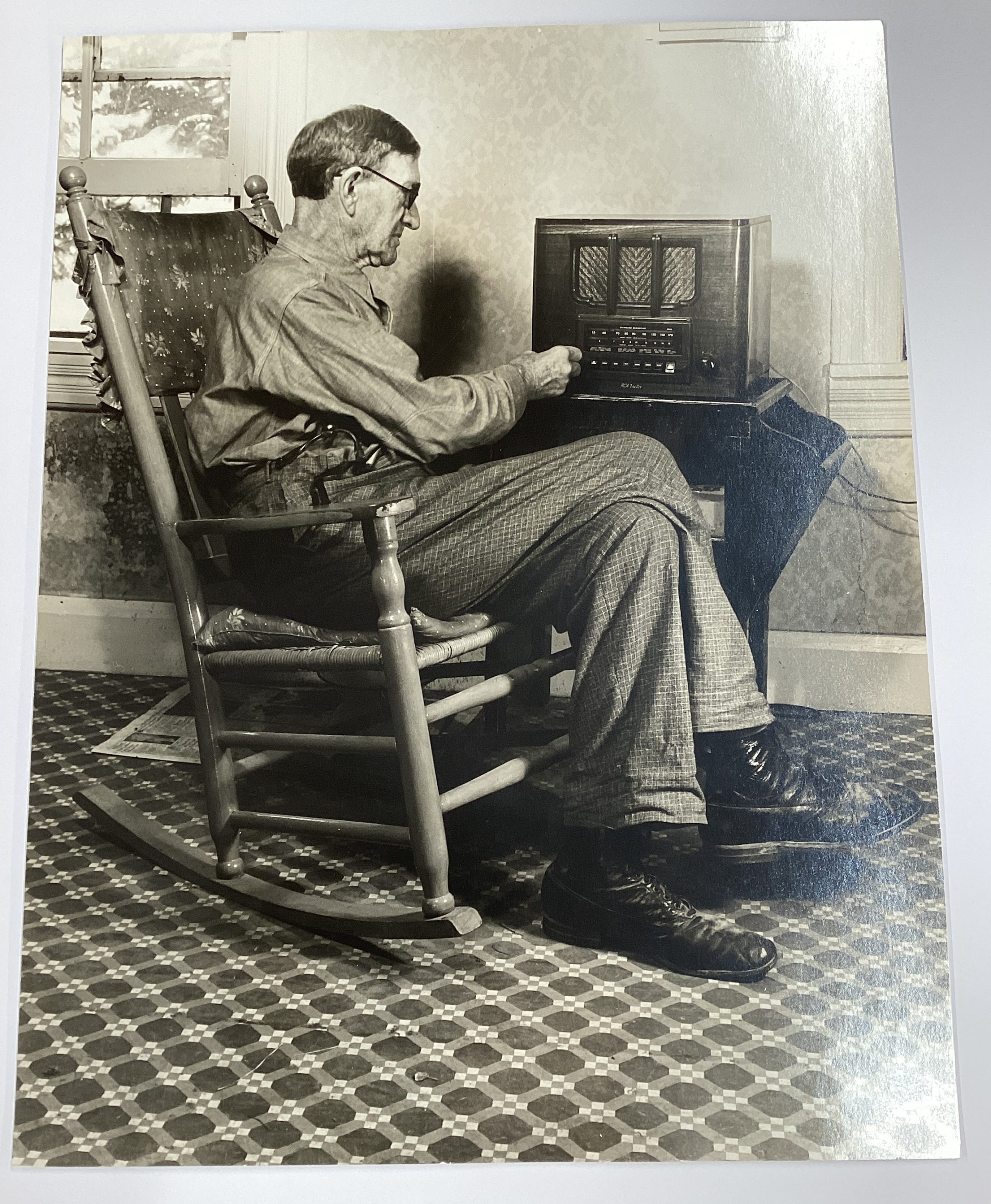
  • Radios were originally powered by hand crank or expensive batteries that did not last very long, and were often connected to individual headsets so that only one listener at a time could enjoy them. 
  • In the 1920s, most radio signals only extended a few miles, resulting in highly localized programs typically run by specialized groups like labor unions, religious congregations, and ethnic organizations. This changed in 1928 when the first 10,000-watt transmitter was introduced, allowing for national programming. 
  • President Roosevelt harnessed the power of radio in his fireside chats, presenting his policies and ideas directly to the public in a warm, informal way rather than having them introduced by potentially biased commentators like church leaders and local politicians. 
  • National radio also contributed to a common sense of American cultural identity for the first time, with citizens all over the country enjoying, simultaneously, the same entertainment programs and hearing the same news. For rural listeners in particular, this was a revolutionary development that connected them to the rest of the nation. 

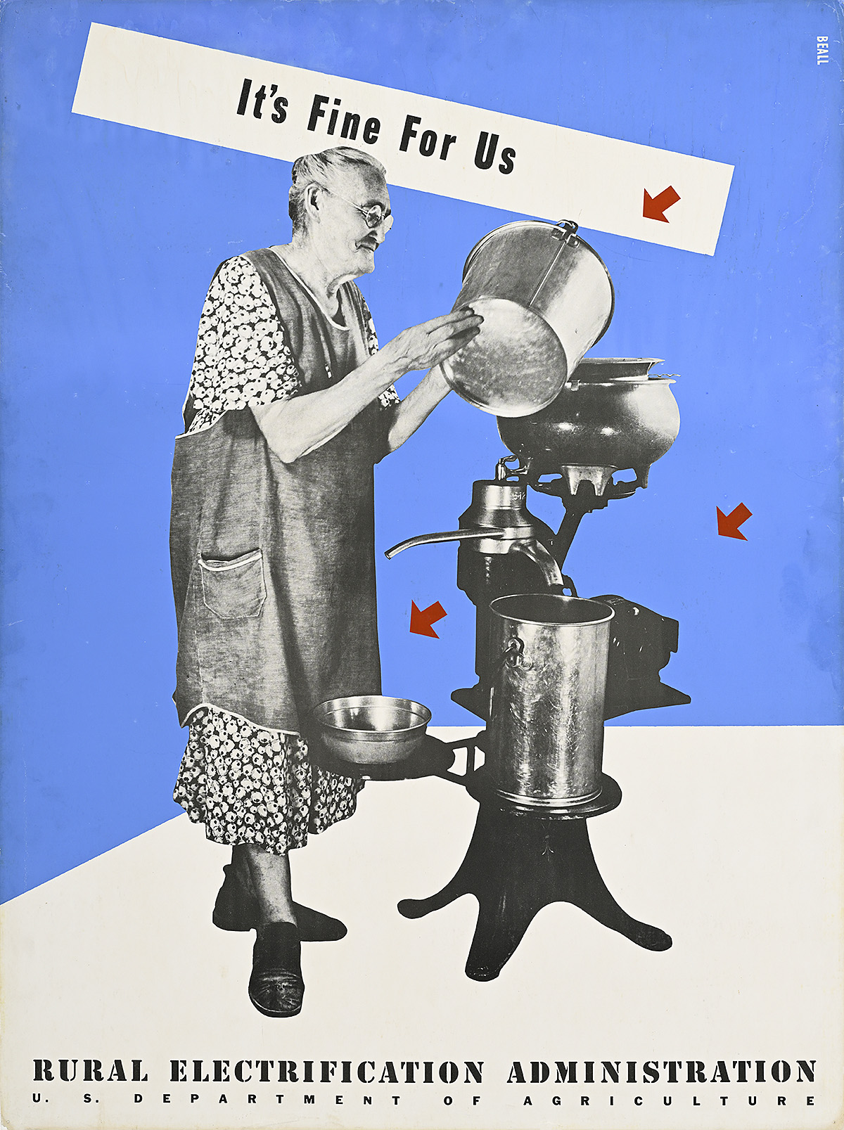
It’s Fine For Us/Rural Electrification Administration, 1939

A poster of an older white woman in an apron pouring liquid into an electric milk separator on a blue-and-white background.

Lester Beall (1903–69)

  • A key component of the routine of the Electric Circuses was educating consumers on the myriad time-saving benefits of electricity, as it soon became apparent that most farmers who signed up for electric cooperatives were merely adding lighting inside their homes. 
  • Without incorporating a variety of electric appliances into their daily routines, rural families could not increase their productivity, and were therefore not creating additional income from which they might pay back the five-dollar (approximately $114 today) membership loan to the local cooperative. 
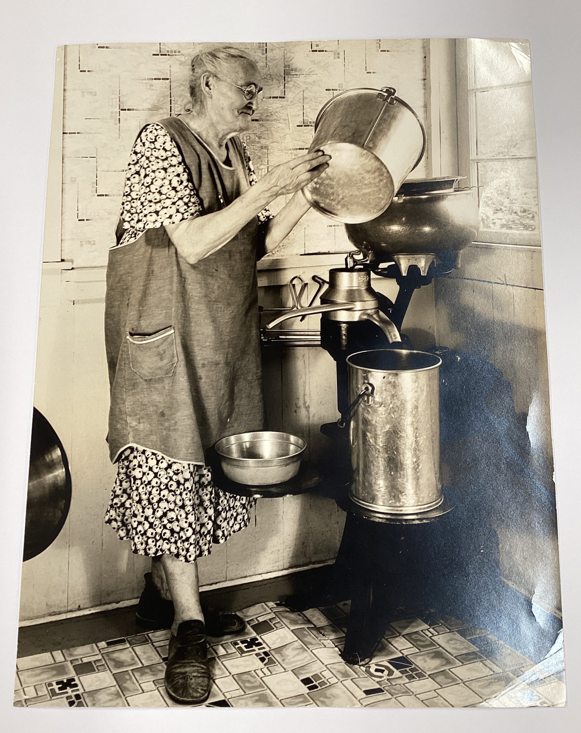
  • In this poster, Beall shows a woman using an electric milk separator; raw milk is poured into the top basin, which spins like a centrifuge, separating the milk from the cream and sending them down individual spouts. The cream could then be made into butter or added back in various ratios to the skimmed milk. Before the introduction of electricity, a similar machine would have been cranked by hand, frequently causing spills if not done at a correct and even speed, processing a much lower volume of milk, and often resulting in spoilage.

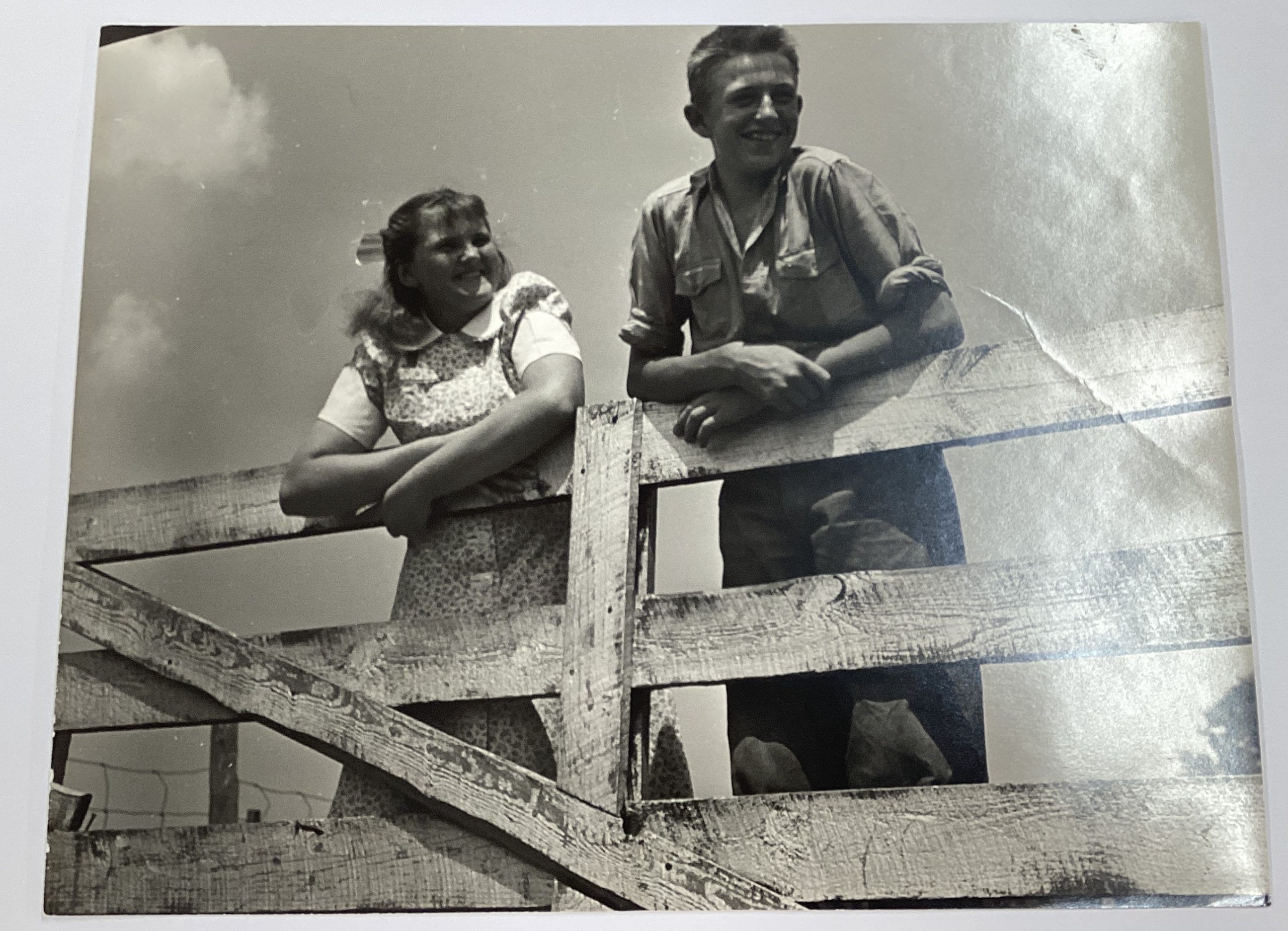
A black-and-white photograph of a smiling girl and boy, both white, hanging on a wooden gate.

A black-and-white photograph of a smiling white electrical worker holding a power line in a field.

A black-and-white photograph of an older white man in a rocking chair turning the knobs on a radio.

A black-and-white photograph of an older woman in an apron pouring liquid into an electric milk separator.

Original Photographs, 1939

Lester Beall (1903–69)

RIT Cary Graphic Arts Collection

  • These original photographs are from Lester Beall’s personal archive and were used as the basis for his second poster series for the REA, indicating a shift between pure graphic illustration and the inclusion of photomontage. 
  • Although he was an accomplished and enthusiastic photographer who often incorporated his own shots into his work, it is not clear that Beall took these photographs himself as there is no record of him traveling while working on this assignment. The images, however, appear to be of a single family, with the young boy appearing in two of the staged compositions.

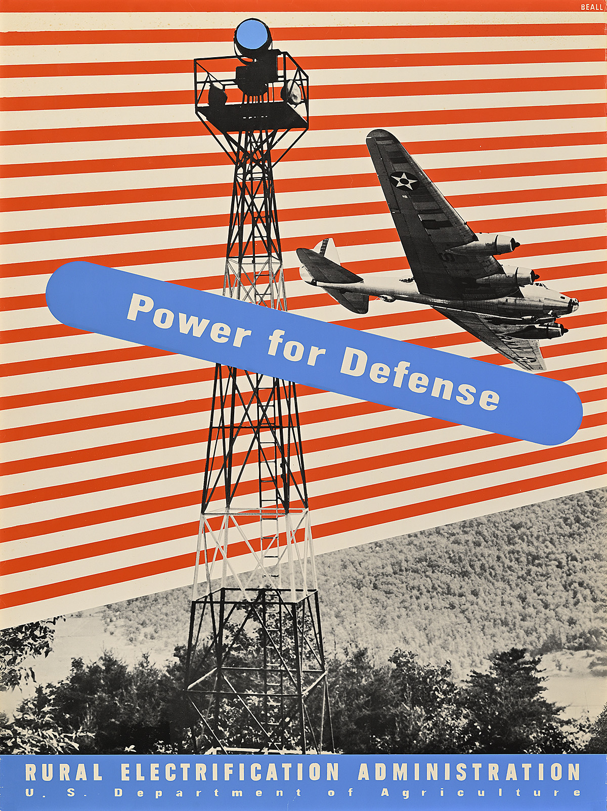
Power for Defense/Rural Electrification Administration, 1941

A poster of a military plane next to an electricity pylon on a red-and-white striped ground.

Lester Beall (1903–69)

  • By the time this poster was published, Congress was tired of funding what felt like the never-ending programs of President Roosevelt’s New Deal, especially with the increasing likelihood that the country would go to war. Nevertheless, within a year, around 50 percent of rural homes would be electrified—this number would increase to 90 percent before the end of the decade and to 97 percent by 1960. 
  • Rather than highlighting the benefits of home electrification, Beall emphasizes the need for electricity in the rural areas of the country as part of a larger strategy for national defense. He shows a B-17 Flying Fortress operated by the U.S. Air Force next to a civilian-run observation tower equipped with spotlights. More than fourteen thousand posts like these were erected in the lead-up to America’s entry into World War II to help patrol the skies for enemy planes. 
  • As these posters were also used in cities to persuade a politically influential population to support President Roosevelt’s policies, this design was most likely directed at those who might have disapproved of the United States entering the war but favored a robust defense against hostile enemies. Messaging like this both acknowledged the prevailing isolationist mentality of most Americans while preparing them for the country’s almost inevitable entry into the conflict.

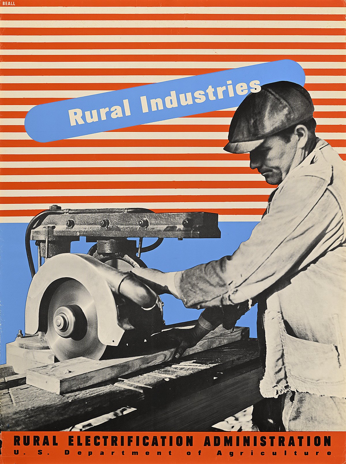
Rural Industries/Rural Electrification Administration, 1941

A poster of a man cutting a board with a power saw on a red-and-white striped ground.

Lester Beall (1903–69)

  • While urban dwellers generally embraced progress and social change, these ideas were met with less enthusiasm in rural parts of the country. People wanted their way of life to remain as it had been when they were prosperous—whether they were wheat farmers in Oklahoma or coal miners in Appalachia. 
  • By the late 1930s, it was obvious that certain industries were neither necessary nor profitable. The government encouraged the introduction of new jobs that incorporated electrification. Here, a man uses a circular saw to quickly and precisely cut wood, doing the work in seconds rather than hours. It is interesting that he appears to be the same figure who featured in the previous two posters, indicating that the photographs were staged (most likely by Beall).

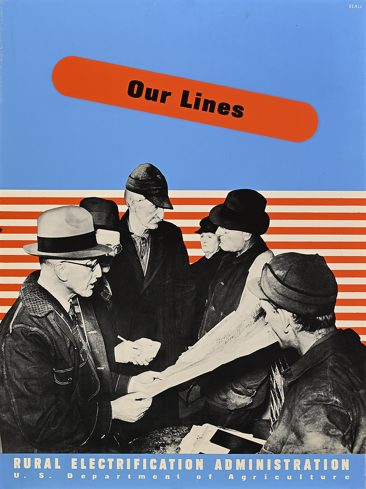
Our Lines/Rural Electrification Administration, 1941

A poster of 4 white men and 1 woman in coats looking at a map against a striped and solid ground.

Lester Beall (1903–69)

  • Beall’s third and final series for the REA is more patriotic in tone than the previous designs, combining crisp photography with modern patterns that evoke the American flag with a red, white, and blue palette and the use of dots and lines as representative of the stars and stripes. 
  • Here, members of a cooperative are shown discussing what appear to be plans for local power lines. Combined with the phrase “our lines,” this image is meant to emphasize the communal ownership of electricity provided through the REA’s program—a meaningful concept to a portion of the population so deeply ravaged by the Depression, many of which saw their farms fall into foreclosure. 
  • The unwillingness of many people, particularly rural Americans, to accept free food or other “handouts” represented a major challenge to the government’s relief efforts. There was a pervasive belief that if one were suffering, it was of one’s own doing. The names of those put on government relief were also usually published in the local paper, adding to a family’s shame despite the fact that in many rural counties, 80 percent of citizens were recipients of aid.

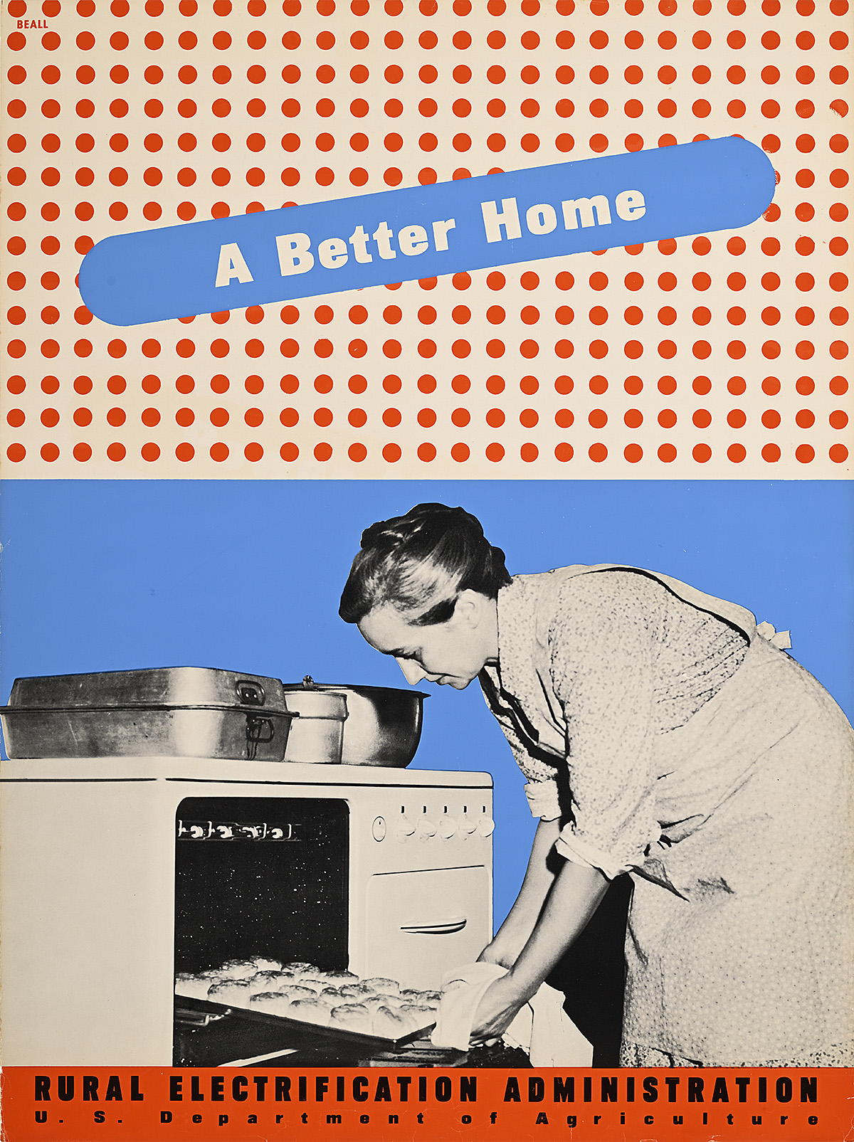
A Better Home/Rural Electrification Administration, 1941

A poster of a white woman removing bread from an oven on a ground divided between solid blue and red polka dots.

Lester Beall (1903–69)

  • The promise of “a better home” was a key marketing strategy to interest rural women in electrification. In addition to a variety of time-saving benefits offered by electric appliances, women in particular were told that electricity would make their homes safer—less disease, less dirt, less risk of fire. 
  • Before they were electrified, rural homes rarely had iceboxes, meaning that everything from milk to meat had a very limited shelf life and was highly susceptible to dangerous bacteria. Despite growing much of America’s food, the farmer’s diet was therefore often based on canned goods rather than on fresh produce. Refrigeration alleviated many of these issues.
  • Most rural homes were heated solely by the central kitchen stove, typically run on coal, wood, or dried cow dung. In addition to requiring near-constant tending, these stoves produced ash that had to be cleaned out regularly as well as a tremendous amount of soot that dirtied and darkened the room. 
  • As a visual counterpoint to the inevitable filth of the traditional rural kitchen, Beall incorporates the brightest photograph of any in the REA series, presenting a woman in a spotless housedress and apron tending to food in a clean, white oven.

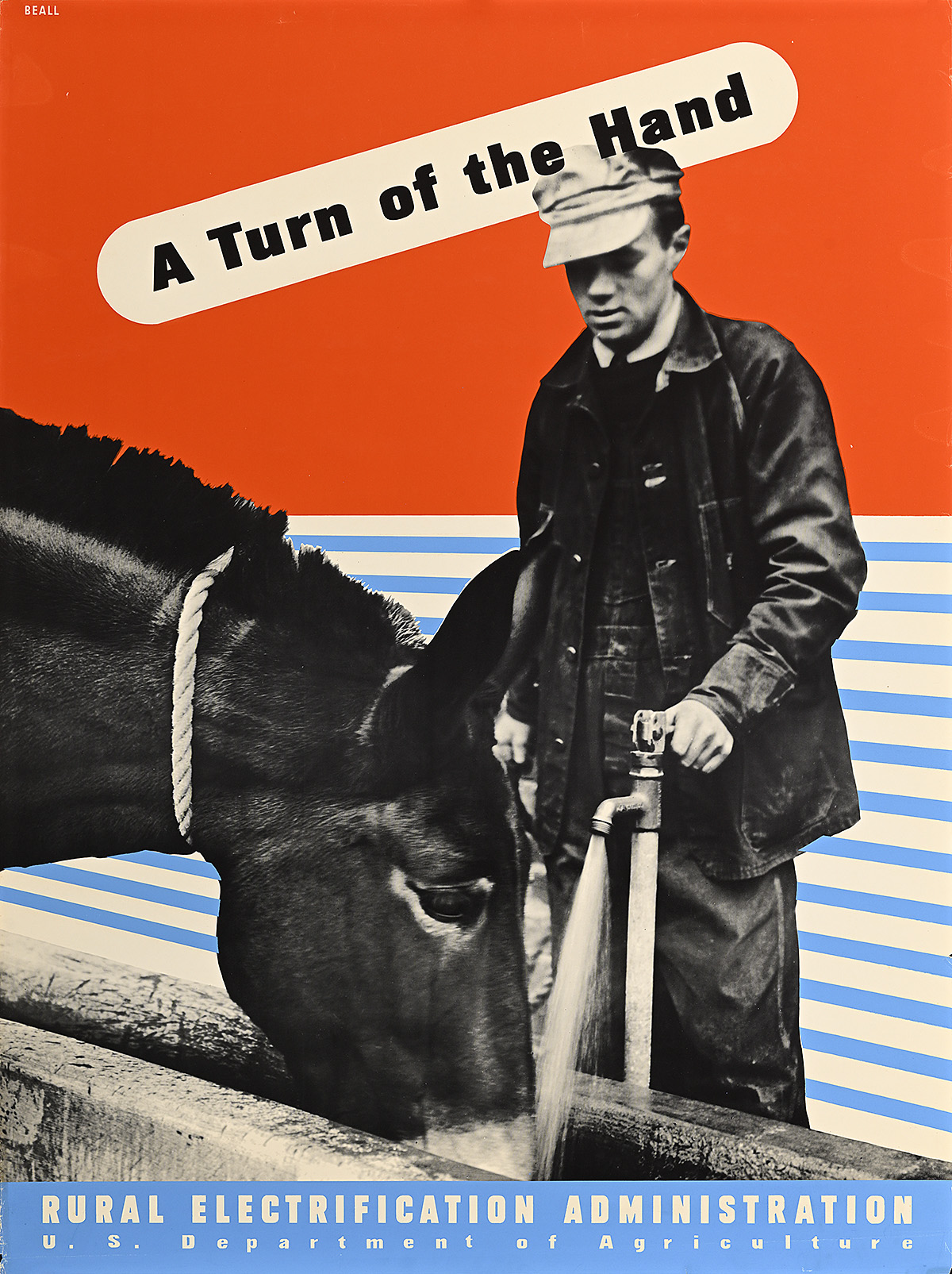
A Turn of the Hand/Rural Electrification Administration, 1941

A poster of a white farmer turning on a water faucet for a donkey on a red ground with blue-and-white stripes.

Lester Beall (1903–69)

  • One of the most important conveniences offered by electricity was indoor plumbing. Before this, rural citizens would have had to either pump water by hand or haul buckets of water from a well or, if they had a small wind turbine on their farm, rely on that to provide water. In all instances, there was insufficient pressure to bring a consistent flow of water into the home. 
  • Electric pumps allowed rural residents to enjoy amenities like baths, washing machines, and flushing toilets—all of which reduced the spread of disease. Other farm chores that had traditionally been labor-intensive, like bringing ample drinking water to large herds of livestock or simple land irrigation, could now be completed with “a turn of the hand.”
  • Today, the REA is called the Rural Utilities Service and is best known for being used by President Obama in his 2008 Farm Bill to bring broadband access to rural communities in an attempt to provide equitable connection to the internet.

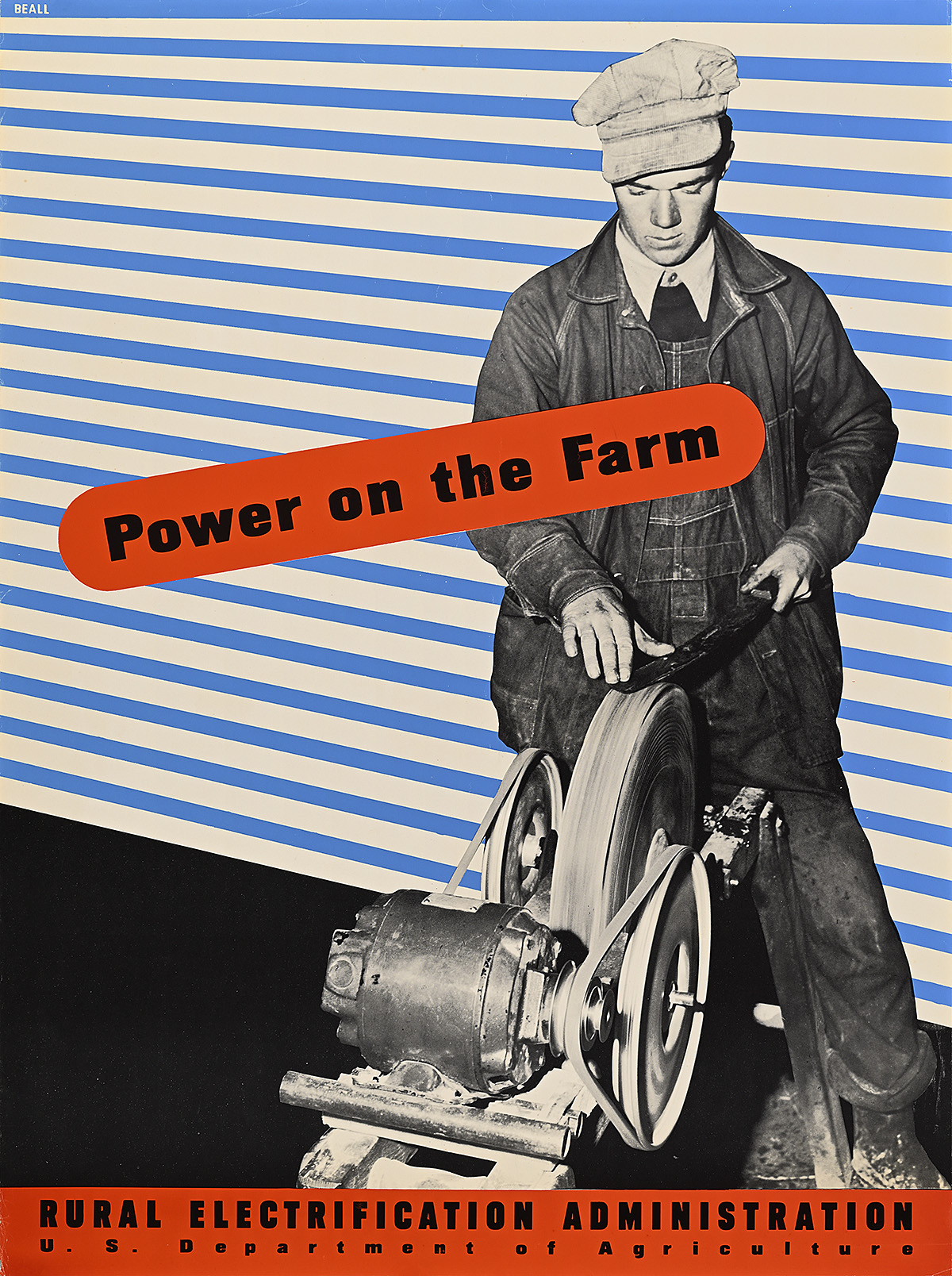
Power on the Farm/Rural Electrification Administration, 1941

A poster of a white farmer sharpening a tool on an electric grinding machine on a blue-and-white striped ground.

Lester Beall (1903–69)

  • The 1930s introduced the golden age of photojournalism, with publications like LIFE magazine presenting stories almost entirely through photographs that were seen as more trustworthy than written reporting. The government also hired hundreds of photographers like Arthur Rothstein and Dorothea Lange to travel the country, documenting the lives of suffering Americans and the efforts of federal agencies helping them. 
  • Beall’s use of photography in his second and third REA poster series reflects this documentary trend, highlighting seemingly unstaged images of working-class Americans enjoying the benefits of electricity.
  • Imagery of real people using electrified machines was an essential selling point for the REA, as rural citizens were highly distrustful of government interference. By the mid-1930s, they had been hearing for more than a decade that relief was coming while their situations only became more dire.
  • Beall manages to make modernity appear approachable in this design by integrating subject and style. The figure is using an electrified whetstone—a sharpening device essential to any work requiring a blade. He is dressed in blue-collar clothing and looks like the average, rural laborer but is positioned against an incredibly bold and progressive background. He and his general way of life are not being forced to change. He is merely updating a familiar tool.  

Nationalism vs. Modernism 

As the Great Depression dragged on through the 1930s, the United States continued to grapple with the same issues that had plagued the country more than a decade before: a stalled economy and a desire to avoid becoming too entrenched in international problems. The 1920s had seen the U.S. population double from that of the 1890s, with mass immigration from Southern and Eastern Europe accounting for one-third of this statistic. An additional 1.5 million Black Americans relocated from the rural South to the North in what was known as the first wave of the Great Migration. Most of these people, the majority of whom were male, settled in large cities, moving into “slums”—overcrowded and poorly maintained housing seen as contributing to the destruction of the ideal American family unit. While the government attempted to handle these issues, groups like the Ku Klux Klan reestablished themselves, pushing against Jews, Catholics, and Black Americans with renewed fervor, and blaming them for the ongoing financial and social crises. 

Having lost more than one hundred thousand lives during World War I, the idea of the United States entering World War II was not a popular prospect. The majority of the population felt that taking care of its own and leaving Europe to the Europeans was the prudent choice. These views were at odds with that of President Roosevelt, whose New Deal policies were simultaneously facing increased opposition in Congress. He attempted to balance a more aggressive foreign policy with official neutrality to placate political sentiment in Washington. Under the banner of national security and defense, he enacted the Lend-Lease program that allowed the United States to supply munitions to foreign allies without directly sending troops, thereby avoiding official entry into a foreign conflict. These efforts not only allowed Britain to continue fighting but also boosted the domestic economy and created millions of jobs for Americans.

After 1939, Lester Beall’s graphics took a decidedly patriotic turn, still relying on a red, white, and blue color palette but emphasizing the traditional American values of freedom, security, and self-reliance. Before the Office of War Information was created in 1942, acting as a governing body over wartime propaganda, the Office for Emergency Management allowed for unique opportunities for modernists to step in and help inspire the country. While illustration was still the most popular form of American poster art, a handful of modernists, both homegrown like Beall and émigrés from Europe, were enlisted by visionary art directors to create novel federal campaigns. These modernist efforts, however, were short-lived and would become temporarily overshadowed by the more narrative, illustrational style of artists like Norman Rockwell once the country officially entered the war. In the postwar period, the United States again embraced modern design, with Beall enjoying a profoundly successful career during which he created numerous iconic brand identities until his death in 1969. The period between 1937 and 1941, however, proved the most dynamic and rich for his poster output, paving the way for a uniquely American expression of modernism.

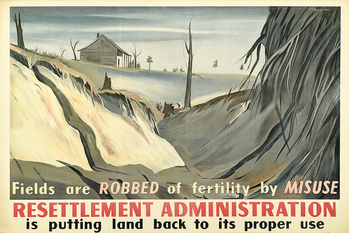
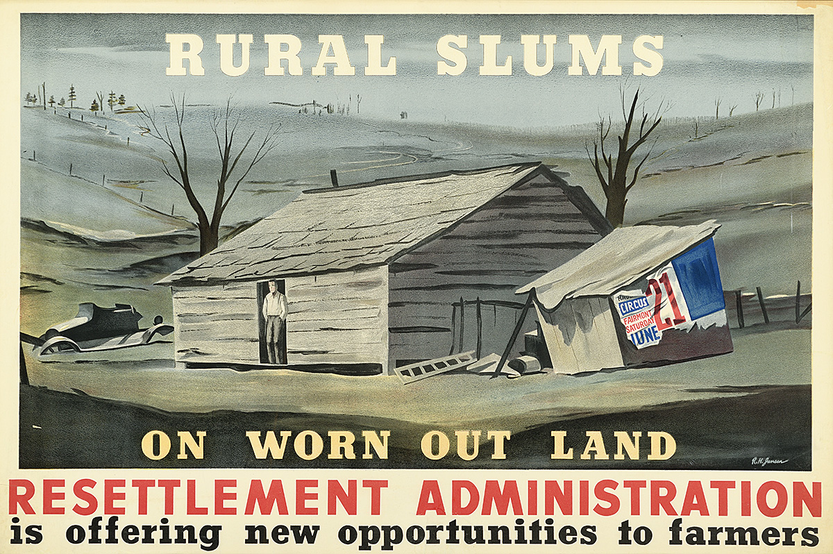
Resettlement Administration, c. 1935

A poster of devastated farmland with dead trees and a house in the background.

Richard H. Jansen (1910–88)

Poster House Permanent Collection

  • In 1935, President Roosevelt established the Resettlement Administration to relocate devastated farmers from the Great Plains. During the 1910s and ’20s, this region had been marketed primarily to European and Mexican immigrants as the ideal place to move, with an abundance of rich soil and opportunities for making money. The reality was that this part of the country was notorious for its droughts, near-constant winds, and generally unsuitable conditions for high-yield agriculture. 
  • Encouraged by the government to increase production during World War I to feed the Allies and then needing to produce even more once prices dropped after the war in order to make a living, farmers became stuck in a downward cycle and were pushed into abject poverty even before the Great Depression officially started. 
  • By the 1930s, the land had been so overfarmed that the prairie grasses that both held water and kept the soil in place with their deep root systems had been destroyed. Without them, ever-present winds ravaged the flat land made infertile through drought, creating mountainous dust storms, some as much as 200 miles wide and 10,000 feet tall, carrying thick dirt at 60 miles per hour across multiple states. These increasingly frequent storms blackened the skies for hours or days, literally suffocating both people and animals and leaving piles of dirt in their wake. In April of 1935, it became known as the Dust Bowl.

An advertisement of a shadow of a working boy in front of decrepit buildings.

Rural Slums, c. 1935

A poster of a man standing in the doorway of a crumbling farmhouse surveying the ruined land around it.

Richard H. Jansen (1910–88)

Poster House Permanent Collection

  • Farms went into foreclosure, forcing families that had previously owned their properties to become tenant farmers and enter an even more impossible financial situation, unable to grow anything and pay the rent owed to their new landlords. Millions of families were forced to leave their homes or die, resulting in mass migration westward to California. 
  • This classic, illustration-based poster highlights the tremendous loss of prosperity in this area, with an automobile now partially submerged in dirt and a poster from 1930 advertising a traveling circus peeling off a shed. 
  • The Dust Bowl was the largest man-made ecological disaster on record, displacing more than 2.5 million people. While this poster promotes “new opportunities” for those forced to leave their homes, the reality was that the hundreds of relief camps built in California were met with hostility by locals (most memorably explored in the book The Grapes of Wrath) and people were given little or no work. Immigrants who had begun the century owning property for the first time were now subject to shame and stigma, unable to provide for their families.

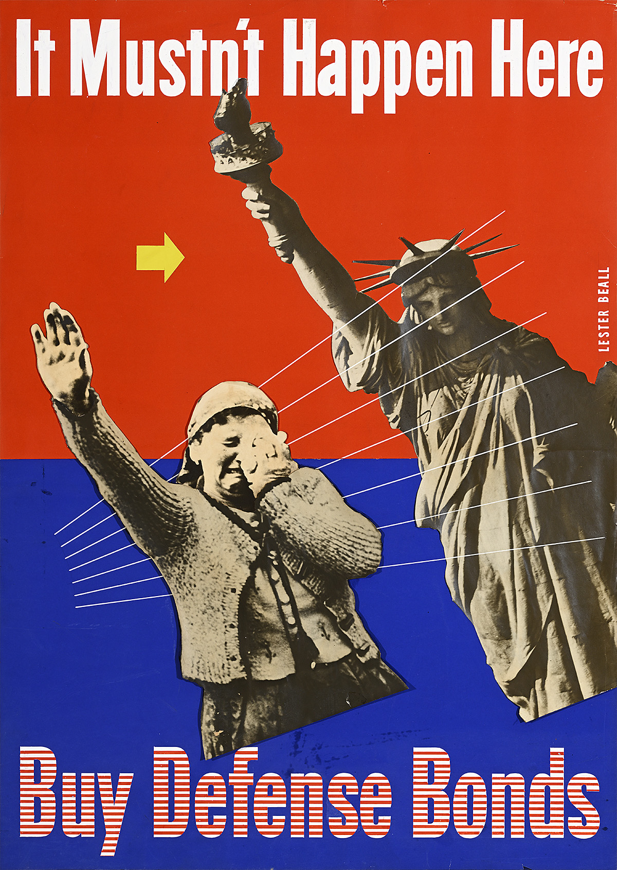
It Mustn’t Happen Here/Buy Defense Bonds, 1939

A maquette of a weeping woman raising her right arm in the Nazi salute, mimicking the Statue of Liberty with her raised torch.

Lester Beall (1903–69)

Merrill C. Berman Collection

  • Before it was canceled, Beall was commissioned to create the poster for the Freedom Pavilion at the 1939 World’s Fair. This maquette is a variation on that design, featuring alternative text for a bond drive and a slightly different composition. It was most likely produced in an effort to salvage the original graphic concept. This poster was also never realized.
  • The 1939 World’s Fair in New York was meant to be a bastion of progressive ideals, and featured work by some of the most exciting modernists in America, including Paul Rand, Joseph Binder, and Ladislav Sutnar. It was also promoted as the most international of the world’s fairs in recent history, with 60 countries represented (by contrast, only 21 had participated in the 1934 Chicago World’s Fair).
  • As a response to rising anti-Semitism, a proposal was put forth to host a Freedom Pavilion that would highlight the achievements of pre-Nazi Germany as well as those of current German exiles like Albert Einstein, Sigmund Freud, and Thomas Mann.
  • In January 1939, the Jewish Telegraph Agency announced that the State Department had approved the pavilion, and a campaign was launched to raise $250,000 ($5.3 million today) to fulfill the project, with the land already donated by the fair’s organizers. Within a month, however, plans for this pavilion were abandoned due to lack of time to properly complete the exhibits.

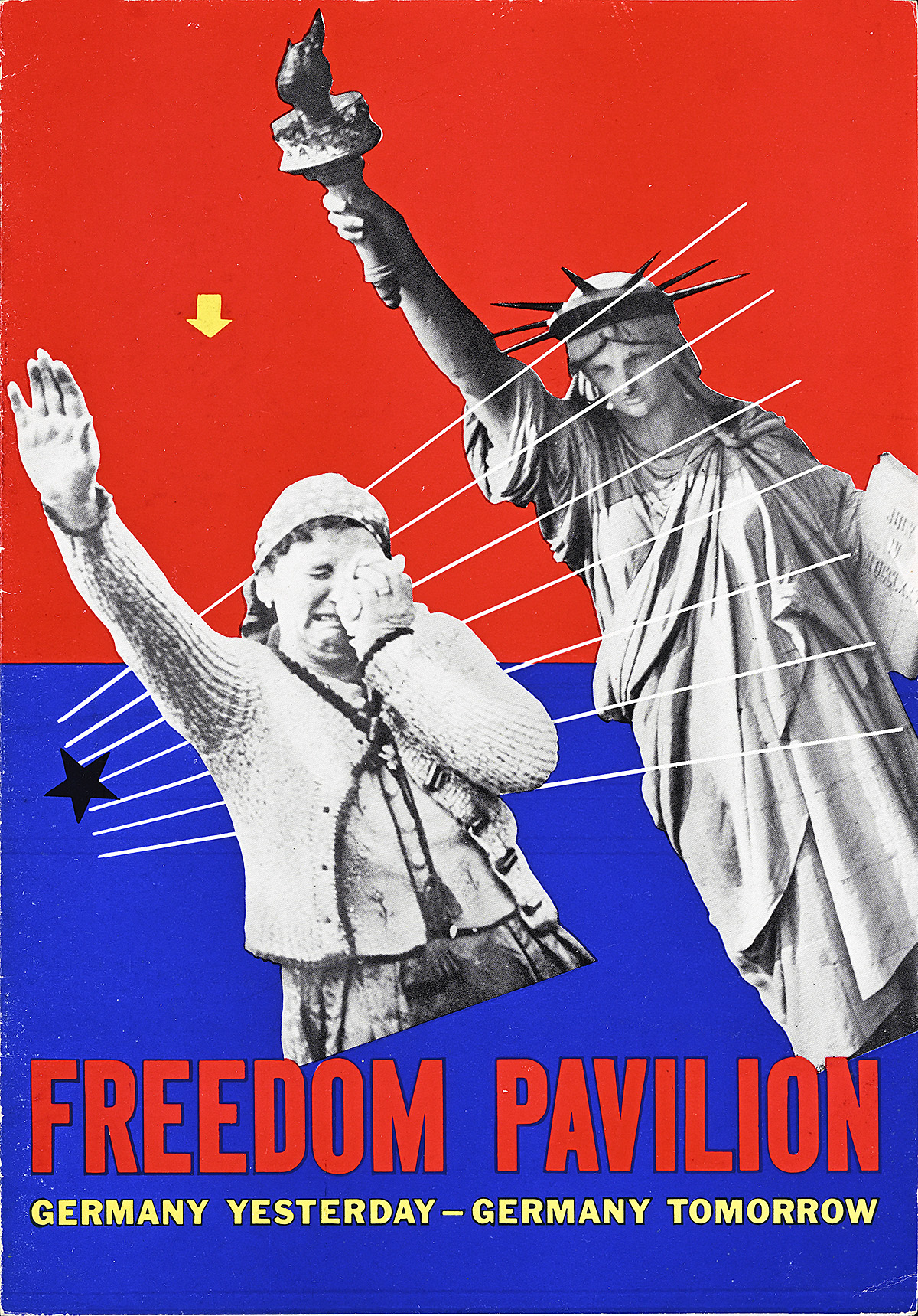
Freedom Pavilion Brochure, 1939

A brochure of a weeping woman raising her right arm in the Nazi salute, echoing the pose of the Statue of Liberty with her raised torch.

Lester Beall (1903–69)

Display, Graphic Design Collection

  • While Beall’s poster was not produced, this promotional pamphlet for the Freedom Pavilion survives, detailing some of its intended highlights, including displays of science, art, religion, and anthropology. 
  • By merely changing the caption and the direction of the yellow arrow, the message of the composition has been transformed from fear-inducing to hopeful—a testament to Beall’s remarkable approach to design. 
  • While some sources say that Germany was disinvited from the World’s Fair, official documents indicate that Hitler actually withdrew his country’s participation in May 1938 in response to anti-German sentiment in America as well as for financial reasons. 
  • The mere idea of a “Nazi pavilion” had spawned numerous protests and political lobbying against both the fair and New York mayor, Fiorello La Guardia, who was vocal in his support of the fair but also deeply anti-Nazi. It is notable, however, that the forces behind the fair had been willing to deal with the bad publicity to ensure German participation, even going so far as to offer the country the largest exhibition space of any foreign participant.

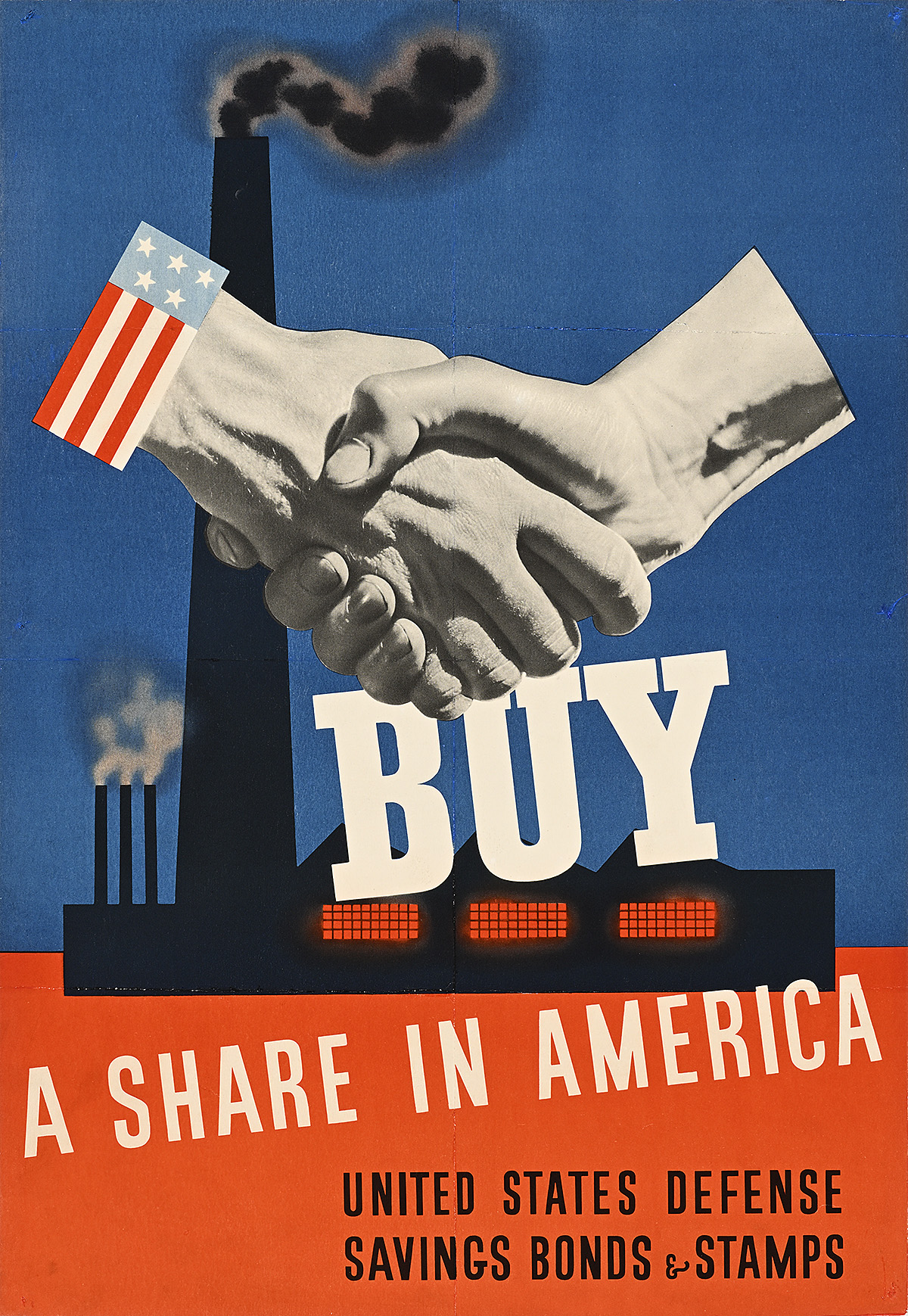
Buy a Share in America, 1941

A poster of 2 hands, one with a U.S, flag cuff, shaking across factory smokestacks in the background.

John C. Atherton (1900–52)

Poster House Permanent Collection

  • This design was the overall winner within the Treasury Department category in the Competition for National Defense Posters held by MoMA in New York. Interestingly, John Atherton also took second prize for a different poster in the Army Air Corps Recruiting Poster category. 
  • Unlike many of the other accepted designs in the competition, Atherton’s image is quite modern, combining photomontage, dynamically placed typography, and bold graphics in a patriotic color palette. It stands apart from much of his other work in which he favored the classic illustrational style best associated with the Saturday Evening Post
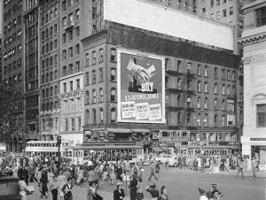
  • This image was printed in a variety of sizes, both by the Treasury Department and by banks that sold defense bonds and stamps. Three Midtown Manhattan banks pooled their resources to rent a giant billboard space on the corner of 42nd Street and Fifth Avenue in New York, incorporating their names and addresses at the bottom of the design. 
  • Before America’s entry into World War II, defense bonds were sold to members of the public to support issues of national security, with the promise that they would be repaid with interest once the conflict subsided. Bonds like these might have helped projects similar to the construction and electrification of the observation towers seen in one of Beall’s earlier posters.

An image of a city with an advertisement on a building with hands shaking.

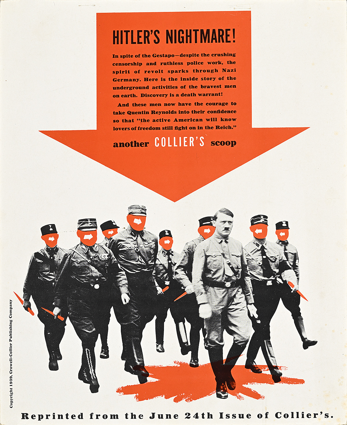
Hitler’s Nightmare, 1939

A cover of a red arrow with text pointing down at Adolf Hitler leading soldiers across a pool of blood.

Lester Beall (1903–69)

Merrill C. Berman Collection

  • As with the Churchill design, this is a promotional enlargement of a Collier’s cover meant to entice advertisers to buy space in the magazine. In one of his most avant-garde compositions, Beall replaces the heads of Hitler’s soldiers with arrows that point to the dictator as they cross a pool of blood. This kind of dark humor draws heavily on Dadaism. 
  • While a significant portion of the United States thought that the rise of a totalitarian government would alleviate the Depression, this sentiment shifted drastically when Germany invaded Poland in 1939. In response, most Americans became staunchly anti-Hitler and gradually more sympathetic to the idea of involvement in a foreign war. 

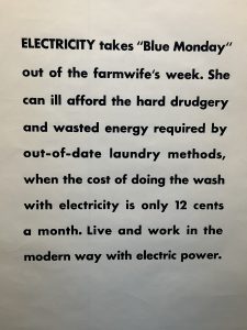
Black text on a black background advertising electric power.

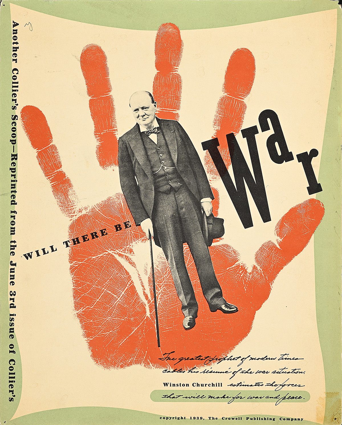
Will There Be War, 1939

A magazine layout of Winston Churchill in a suit standing in front of a blood-red handprint.

Lester Beall (1903–69)

Merrill C. Berman Collection

  • Collier’s was a progressive American magazine known for its investigative journalism. Winston Churchill was not an infrequent contributor, writing about World War I as well as a series on global political issues, including the piece referred to here on the possibility of war in Europe. He stopped producing these articles when he was reappointed First Lord of the Admiralty in September 1939 at the outbreak of war, just three months after this was published.
  • Throughout the 1930s and ’40s, Beall provided regular layouts for Collier’s, most of which, like this one, promoted the magazine to potential advertisers. 
  • This composition is an excellent example of Beall’s signature “thrusts and counterthrusts” approach to design; he creates visual tension by offsetting the cut-out photograph of Churchill against the larger motif of the hand. The type is also dynamically placed, playing with scale, angle, and structure. 
  • While the red hand is a unique visual element in its own right, it may also be a reference to the “blood and tears” Churchill suggests that unprepared European countries will shed in the upcoming war.

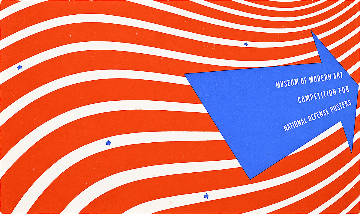
MoMA Competition for National Defense Posters, 1941

A pamphlet of white text on a blue arrow on a ground of swirling red-and-white stripes.

Lester Beall (1903–69)

Merrill C. Berman Collection

  • After his landmark exhibition at MoMA in 1937, Beall was occasionally asked to design the museum’s printed materials. Here, he uses red, white, and blue as well as a large arrow to create a brochure promoting a competition for national-defense posters. 
  • More than six hundred artists submitted designs to the competition, intended to promote two defense-focused government organizations: the Treasury (through bonds) and the U.S. Air Corps that patrolled the coast. Thirty of the best posters were chosen by a panel consisting of curators, two executives from the advertising agency J. Walter Thompson, and representatives from both branches of government. 
  • While the pamphlet is decidedly modern, the majority of the posters selected for the exhibition reflect the predominant American illustrational style. Advertising agencies like J. Walter Thompson usually pushed for material that the average consumer would be more likely to understand, and often eschewed modernism in favor of nostalgic or narrative imagery. 
  • When the winning posters were displayed at MoMA, an exhibition was also staged highlighting British national-defense posters—a choice that underscores the special relationship between the two countries in the lead-up to America’s entry into the war.

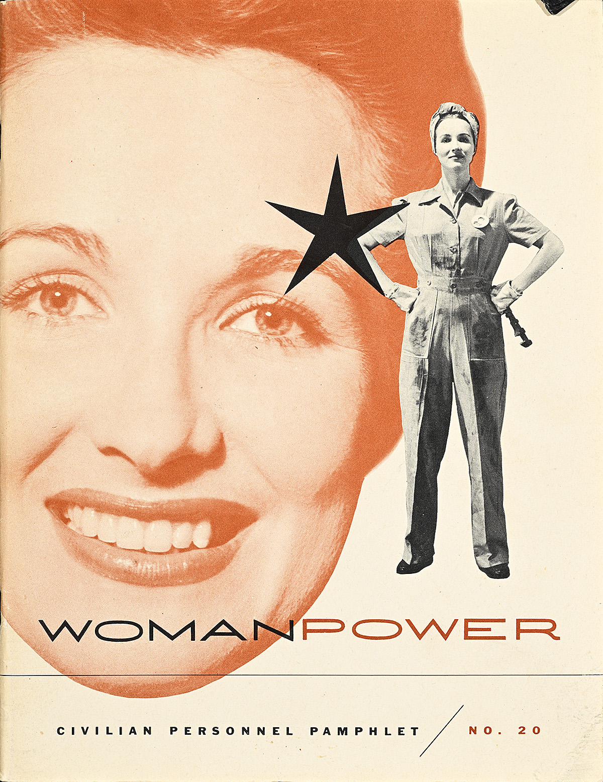
Woman Power, 1945

A booklet of a uniformed white woman, hands on hips, in front of the huge smiling face of another white woman.

Lester Beall (1903–69)

Display, Graphic Design Collection

  • The huge demand for war supplies led to more than six million women joining the industrial workforce. Indeed, the foreword of this publication notes that the War Department is “the world’s largest employer of women.” This represented a dramatic shift from previous generations in which very few women over 30 were employed, and only 1 in 10 mothers worked outside the home. 
  • War Department work proved especially attractive to Black women who had previously been denied serious employment beyond being maids for white families. After President Roosevelt issued an executive order to end discrimination within the defense industry, more than 600,000 Black women enlisted for higher-paying work with the government.  
  • Beall’s cover design and interior layouts for this War Department booklet highlighting the tremendous skills women bring to the labor market is a fantastic example of how modernist design could be embraced by a government agency. In a style similar to that of his Churchill layout for Collier’s, he creates visual tension by playing with scale, layering, and dramatically cropped photography.

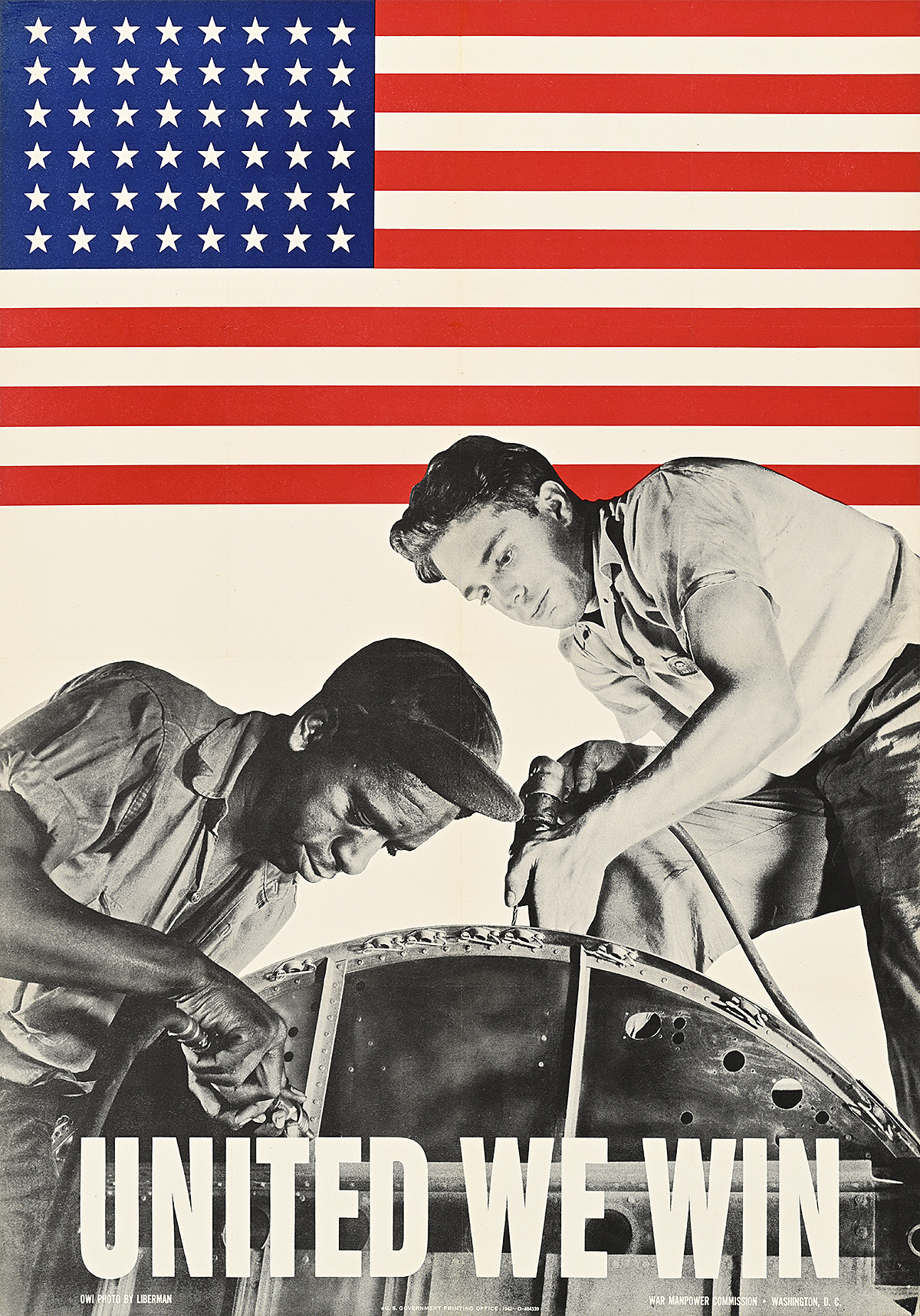
United We Win, 1942

A poster of 2 male factory workers, one Black, one white, working on plane parts under a U.S. flag.

Alexander Liberman (1912–99)

Poster House Permanent Collection

  • Once the Lend-Lease program was enacted, factory production in the United States rapidly increased, providing millions of Americans with much-needed work. 
  • By the early 1920s, more than a million Black citizens had left the South to find factory work in the Northeast and Midwest, primarily focusing on the packing, automotive, and metalworking industries. Their work, however, was considered “unskilled labor” and therefore not generally represented by the American Federation of Labor, creating racial tensions within various labor unions. Black people were also typically paid less than their white counterparts for the same work and fired first.
  • The demand for rapidly increased production in the early 1940s meant that certain racist policies were less strictly enforced by employers in favor of profits. Here, two actual employees of Republic Aviation Corporation—Lewis Ward and Walter Shippe—are shown using a pop riveter on the fuselage of a plane on Long Island, New York. 

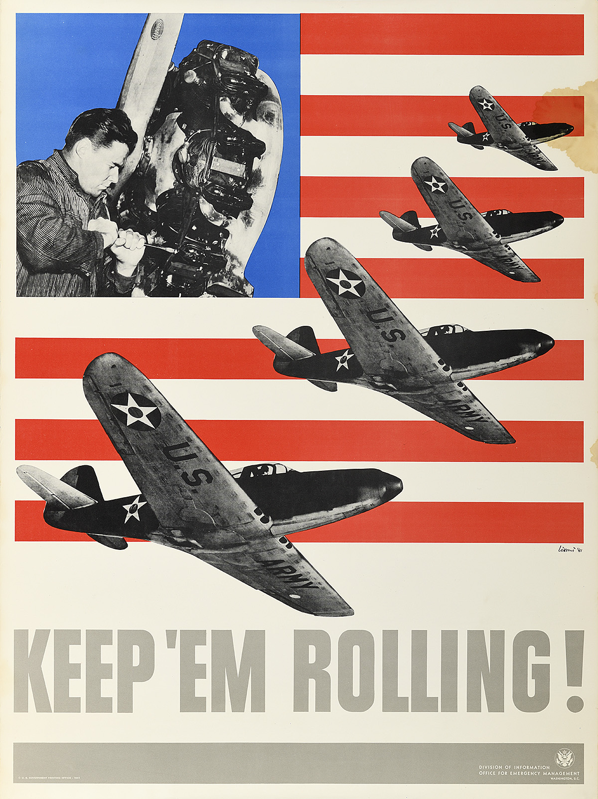
A poster of a factory worker and 4 fighter planes printed over a simplified U.S. flag.

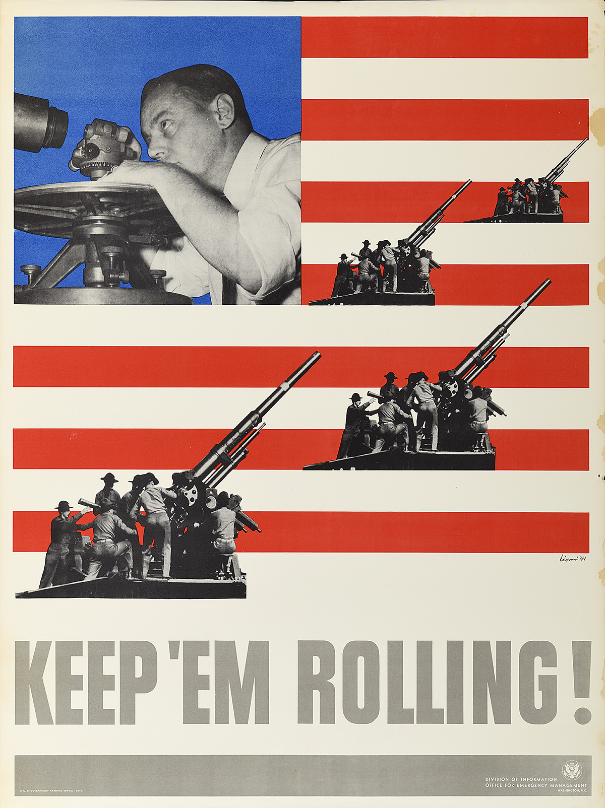
A poster of a factory worker and 4 anti-aircraft guns printed over a simplified U.S. flag.

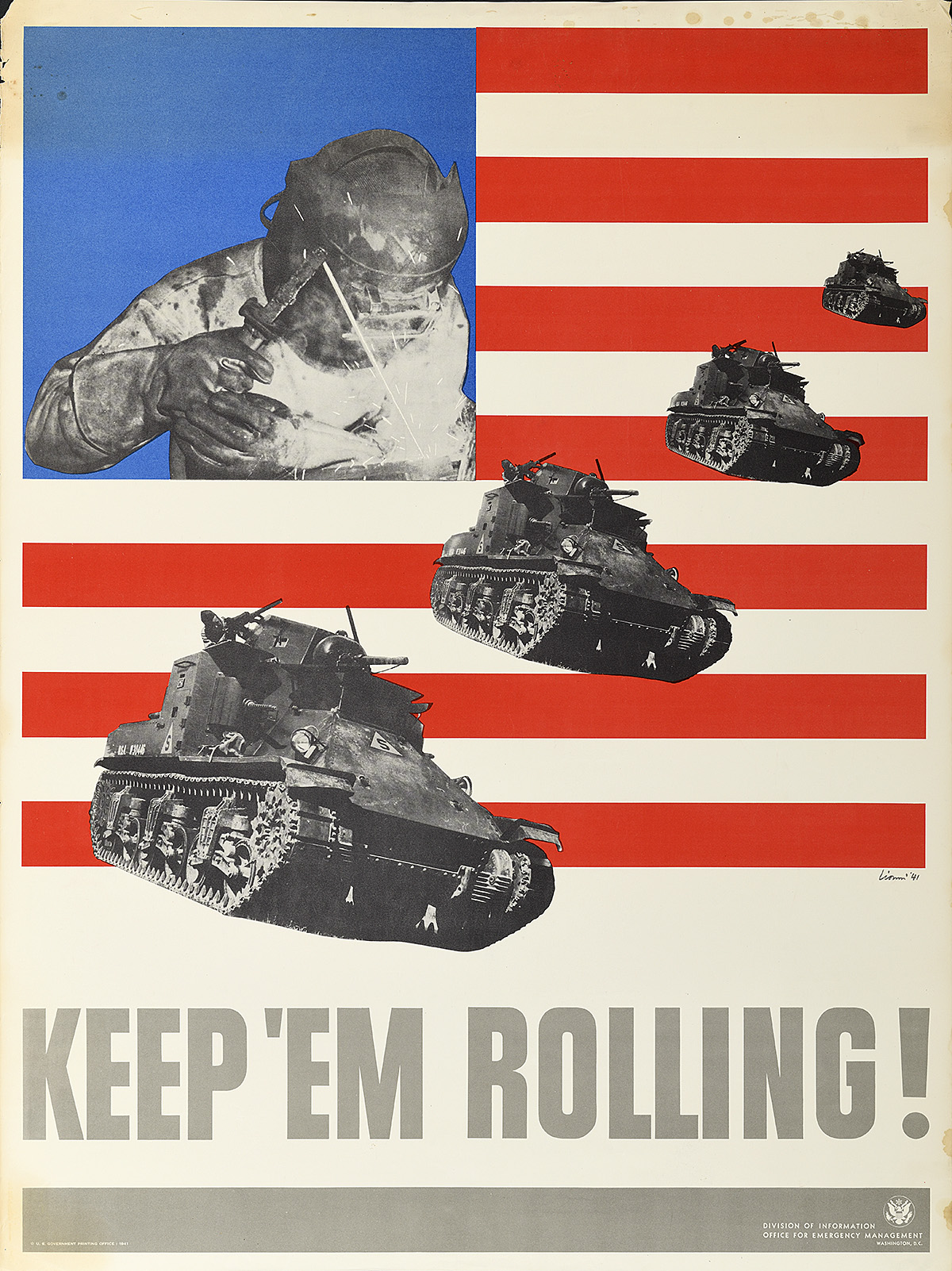
A poster of a factory worker and 4 tanks printed over a simplified U.S. flag.

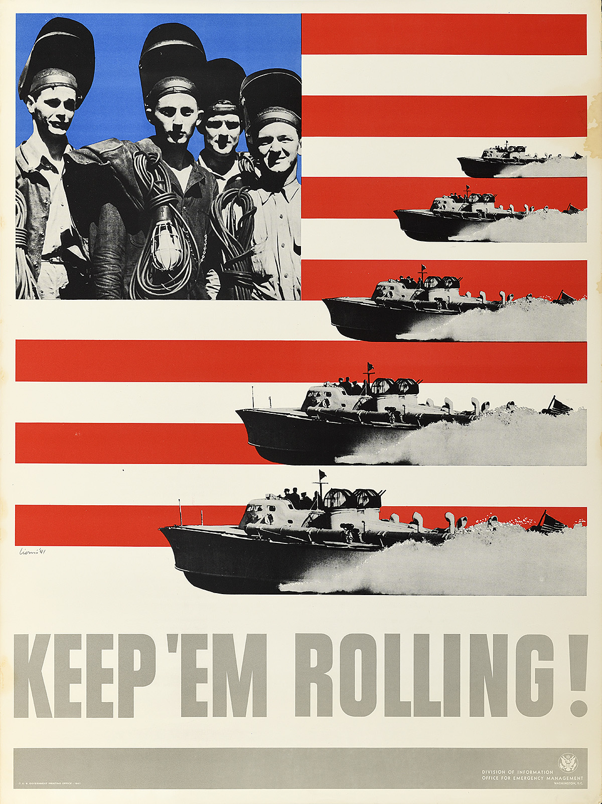
A poster of 4 shipbuilders and 4 attack ships printed over a simplified U.S. flag.

Keep ’Em Rolling!, 1941

Leo Lionni (1910–99)

Poster House Permanent Collection

  • This set of four posters was created by Italian émigré designer Leo Lionni. Their crisp, patriotic colors and cut-out photomontage suggest that they might have been inspired by Beall’s earlier REA series. 
  • Printed in 1941 by the Office for Emergency Management, these images predate America’s entry into the war in December of that year. While officially neutral at this point, the United States had instituted the Lend-Lease Act in March that allowed the country to send munitions to England for the government to “borrow.” President Roosevelt claimed that providing Great Britain with these weapons was an extension of national defense and kept the conflict from coming to the United States. 
  • The posters feature a variety of American-made supplies, including an antiaircraft gun, an M2 light tank, a T1 motor torpedo boat, and a Bell P-39 Airacobra. These photographs were most likely taken from promotional military materials and have little relationship to what was actually sent abroad. Accompanying them are images of American workers who were essential to building these munitions—in fact, once the Lend-Lease program went into effect and factory work increased, unemployment was reduced to less than 10 percent for the first time since the beginning of the Depression.

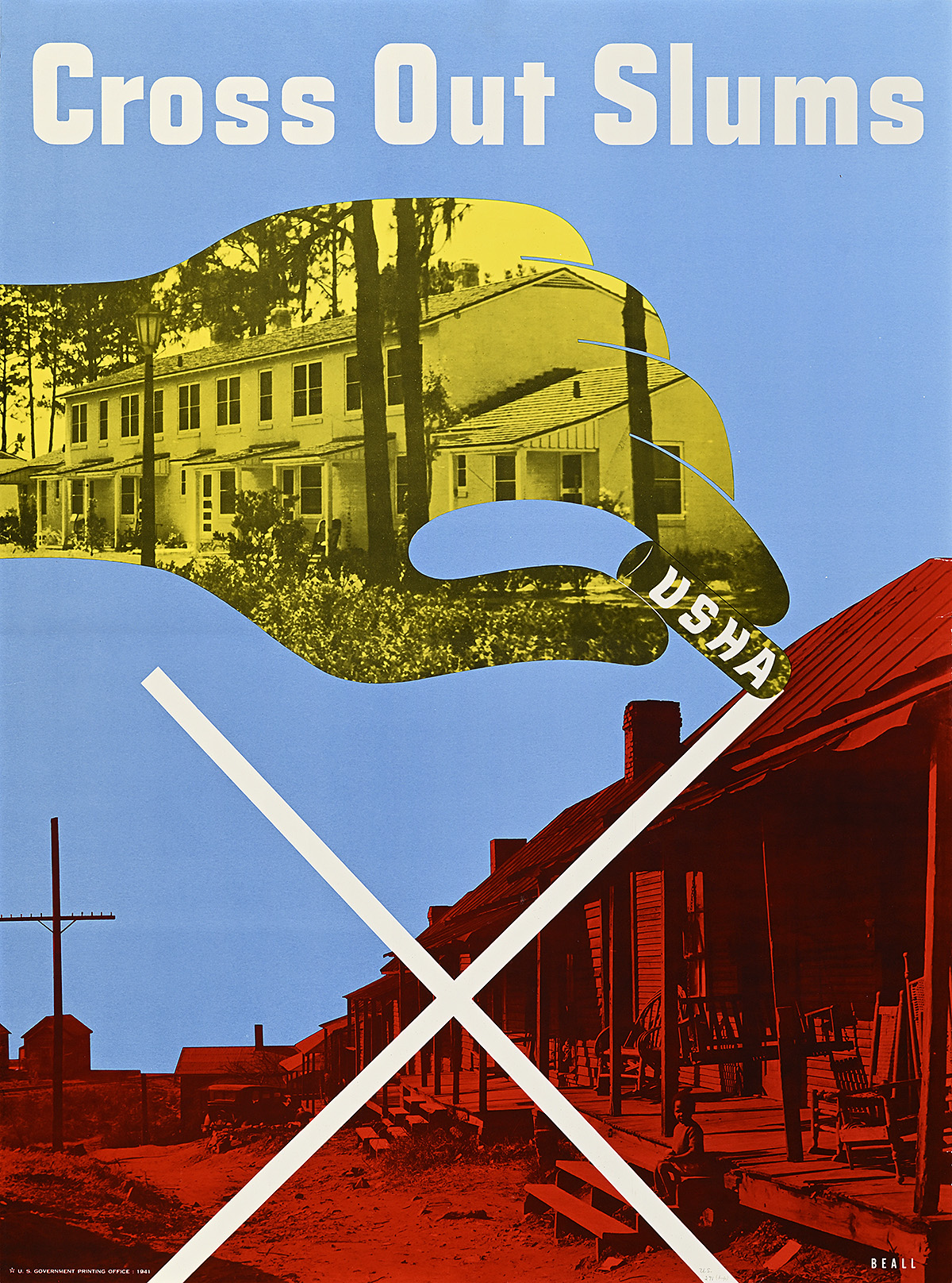
Cross Out Slums, 1941

A yellow hand with an image of nice housing crosses out decrepit red structures with USHA chalk.

Lester Beall (1903–69)

  • It is interesting to compare these two posters by Beall with the previous two designs for the Resettlement Administration. While they deal with slightly different issues, they demonstrate how stylistically advanced Beall’s work was compared to that of most American poster artists at the time. 
  • The Great Depression forced millions of people to leave their homes in the hope of finding work in major cities. Farmers abandoned their farms or were forced out by foreclosure, immigrants poured in from Southern and Eastern Europe, and Black Americans migrated from enslavement capitals in the South to the North. This mass influx of people led to the creation of slums (also known as “Hoovervilles” after President Hoover, under whom the Depression began)—overcrowded, ramshackle housing marked by disrepair and poor sanitation, and considered a prime example of urban blight. While politicians frequently blamed social issues for these slums, they were actually the by-product of poor urban planning, unregulated construction, and an inability to absorb a dispossessed population.
  • Established in 1937, the United States Housing Authority was charged with providing loans for the creation of low-cost housing, primarily in urban areas, in order to clean up neighborhoods and provide a better standard of living. This would eventually lead to what is known today as public housing.

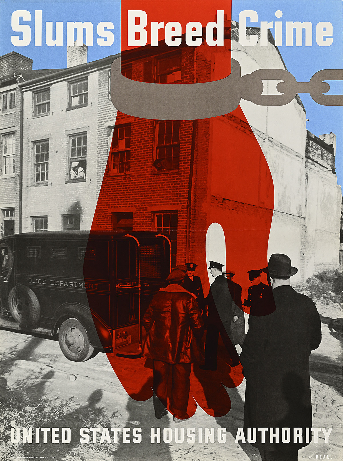
Slums Breed Crime, 1941

A poster of a shackled, red hand over a scene of police in a slum arresting a handcuffed Black man.

Lester Beall (1903–69)

  • In both this and the previous poster, Beall recycles the hand motif he had used in the early part of his career for the Chicago Tribune, creating a layered graphic with multiple levels of impact and storytelling. 
  • As with the REA poster series, designs like these were mainly targeting urban, white, male viewers in Washington, D.C. to enlist support for Roosevelt’s New Deal projects. Here, the idea that “slums breed crime” is represented by a photograph of Black men being arrested in a Black neighborhood—a sensationalized image intended to inspire fear. 
  • Occupied mainly by poor, Black families and single, immigrant men, urban slums were frequently presented as evidence of the destruction of the social fabric of America and the family unit. Progressive policies often relied on this type of conservative outrage in order to gain popular favor.
  • Many of the housing projects that emerged during the New Deal involved the eviction of Black families to create whites-only, segregated neighborhoods. In the companion image to this poster, the crossed-out street is inhabited by a solitary Black child sitting on his porch, while the replacement homes appear to be solidly middle-class and white. 

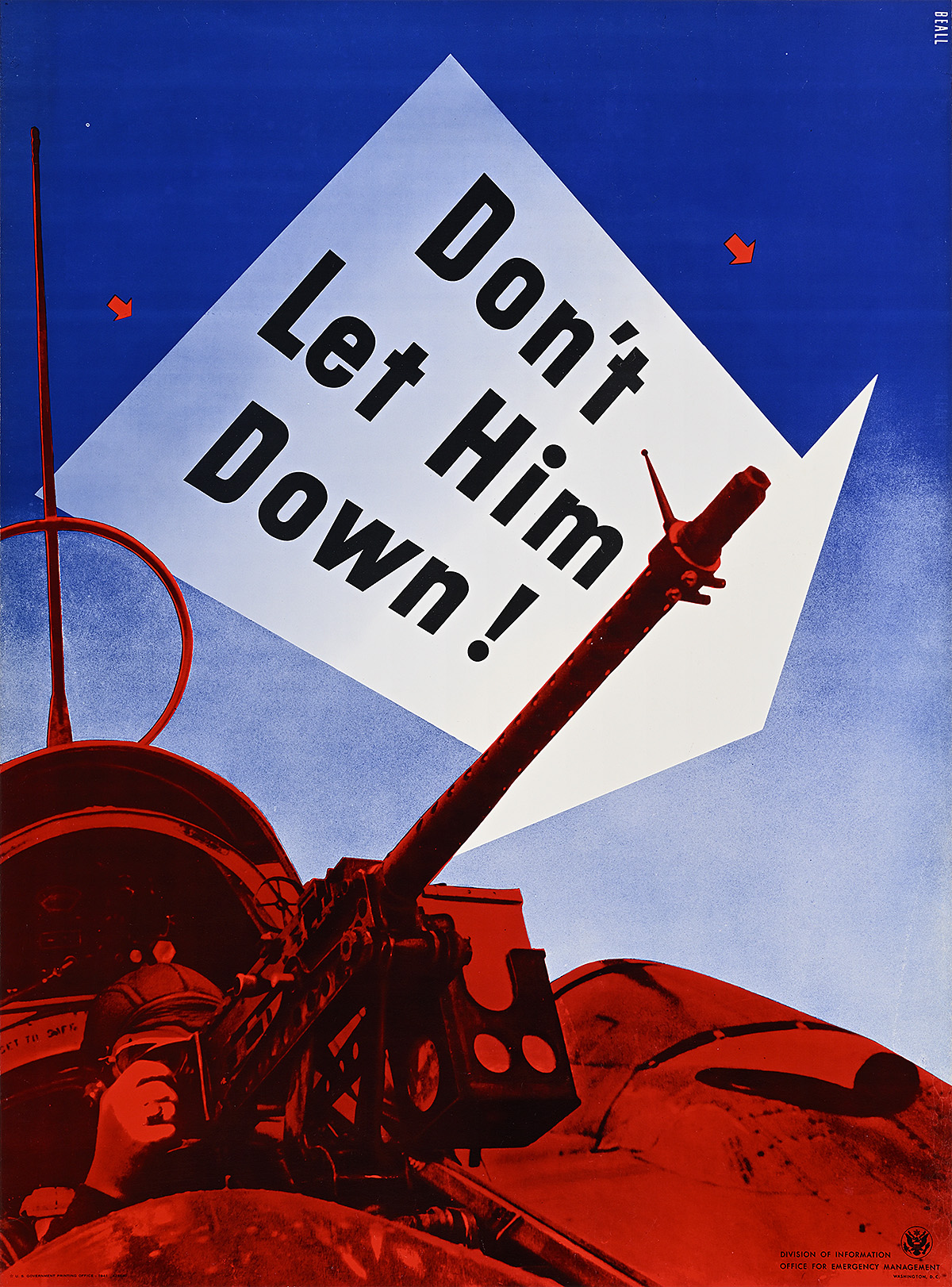
Don’t Let Him Down!, c. 1942

A poster of a fighter pilot manning an anti-aircraft gun in red below text in a white arrow in the blue sky.

Lester Beall (1903–69)

  • When the United States entered World War II in December 1941, Beall was 38 years old—one year older than the draft age limit, meaning he was not required to serve. Instead, he spent the war years creating several propaganda posters and printed materials for the Office of Production Management and other government agencies. 
  • This is Beall’s best-known poster from the period; it was reproduced in numerous magazines as well as displayed in a variety of poster exhibitions held to raise support for the war effort. 
  • Unlike Lionni’s previous designs, created before the United States entered the war, the slogan on this poster indicates that the viewer is supporting an American soldier. The color palette also implies that the plane is flying in the dark, meaning that the design could not have been printed earlier than February 1942 when the U.S. participated in its first nighttime military operations. The pilot is armed with an M2 Browning machine gun, while the circular device above the gunner’s head is a rudimentary form of GPS that used radio signals to triangulate one’s location.

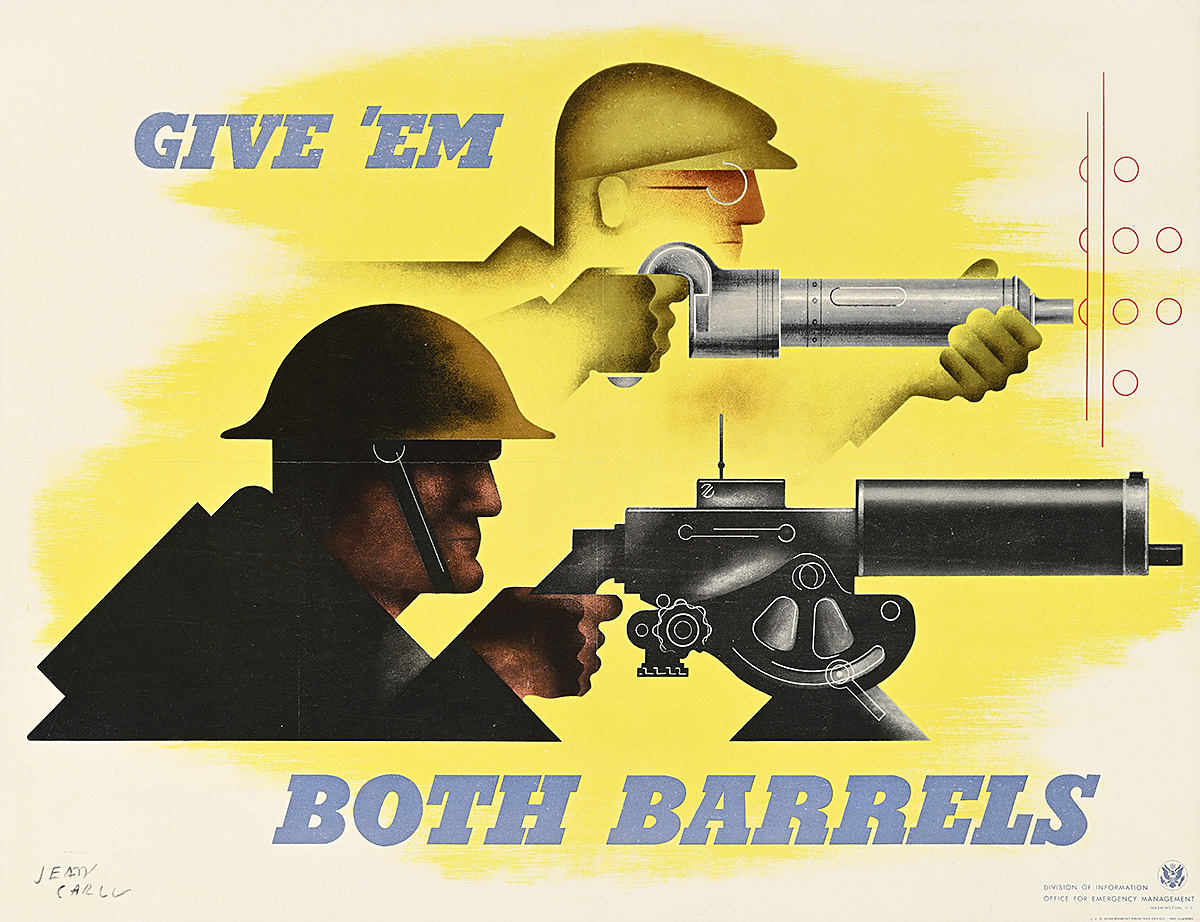
Give ’Em Both Barrels, 1941

A poster of a soldier in profile with a machine gun, his outline echoed by that of a factory worker behind him with a rivet gun.

Jean Carlu (1900–97)

Poster House Permanent Collection

  • Only in operation from May 1940 through June 1942, the Office for Emergency Management helped coordinate and disseminate information surrounding issues of national defense. Here, French poster artist Jean Carlu (who moved to the United States in 1939) shows parallel images of a factory worker hot riveting a ship and a soldier manning a stylized M1917 Browning machine gun. 
  • Before an official propaganda arm of the government was created during the war, President Roosevelt turned to notable art directors like Charles T. Coiner of the advertising agency N.W. Ayer & Son to help produce posters and other visual materials. Coiner had previously worked with the government on the National Recovery Administration, coming up with its Blue Eagle logo. 
  • Coiner and others like him were fans of European and American modernism, and handpicked designers to create striking images like this one and the previous poster by Beall. 

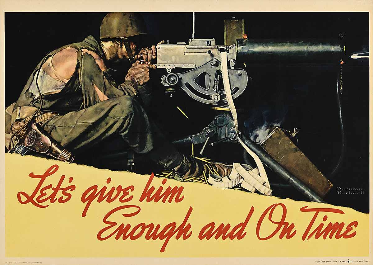
Let’s Give Him Enough and On Time, 1942

A poster of a solider in a ragged uniform manning a machine gun in the darkness.

Norman Rockwell (1894–1978)

Private Collection

  • With the establishment of the Office of War Information in 1942, American propaganda shifted away from modernism. Influential advertising agencies from Madison Avenue pushed to have more of a say in the kind of imagery deemed suitable for the public, conducting surveys that “proved” most people found modernist design confusing.
  • From then on, almost all government posters reflect an illustrational style considered more palatable for Americans—like this design by Norman Rockwell, intended to encourage the production of munitions. 
  • It is interesting to compare this poster with those by Carlu and Beall expressing essentially the same concept. In each composition, a gunner faces right, poised to fire at the enemy, while the text demands more supplies from those at home. They are representative of the tensions within American poster design in the early 1940s, a soft battle between graphic modernism and narrative realism.

Pull Quotes

“From this basic awareness of Modernism, Beall built piece by piece an approach to graphic design that was innovative in the United States.”—R. Roger Remington

“The posters are icons in the history of graphic design.”—R. Roger Remington 

“Beall demonstrated with these posters that the language of communication was not necessarily bound to timeworn cliches and literal conventions.”—Jerome Snyder, design writer

“The belief persisted among many Americans that the needy, new poor and old poor alike, were personally culpable for their plight…spongers and bums with no legitimate claim on the public’s empathy or purse.”—David M. Kennedy, Depression historian 

“I am tempted to say that one third of farmers of the United States live under conditions which are so much worse than the peasantry of Europe that the city people of the United States should be thoroughly ashamed.”—Henry Wallace, Secretary of Agriculture

“[Beall] almost single-handedly launch[ed] the modern movement in American design.”—Philip B. Meggs, design historian

[Beall is] the conscience of American design.”—Ann Ferebee, design historian

Curation

Angelina Lippert

Design

Ola Baldych

Production

Ola Baldych 

Randee Ballinger

Installation & Builds

John F. Lynch

Rob Leonardi

Henry Pedestals

Graphics Installation

Keith Immediato

Metal Work

Nikki Romanello

Printers

Full Point Graphics

XD Four


Special Thanks

Mark Resnick, American graphic design scholar

Allison Rudnick, Metropolitan Museum of Art

Dr. Mary Okin, Living New Deal

Steven Galbraith, RIT Cary Graphic Arts Collection

Shani Avni, RIT Cary Graphic Arts Collection

Neil Medland, electrical expert

Dr. Nicholas Harlow, military historian

Jim Lapides, poster historian

Mickey Ross, The Ross Art Group

The staff at The Wolfsonian, FIU

Stephen Coles, Letterform Archive

Catherine Bindman, editor

Anita Sheih, proofreader

Sofía Jarrín, Spanish translator