The Anatomy of a Movie Poster: The Work of Dawn Baillie

The modern movie poster is one of the most ubiquitous expressions of popular culture. It asonrves as the visual ambassador for a film, introducing audiences to characters, ideas, franchises, and stories—it is tasked with summing up the mood and purpose of a movie to entice people to see it. More so than any other part of film advertising, the poster is what people remember, what catches their eye on the street, and what fans sometimes take home with them to celebrate their love for a particular movie. When the trailers are no longer played and the promotional campaign winds down, the poster remains. 

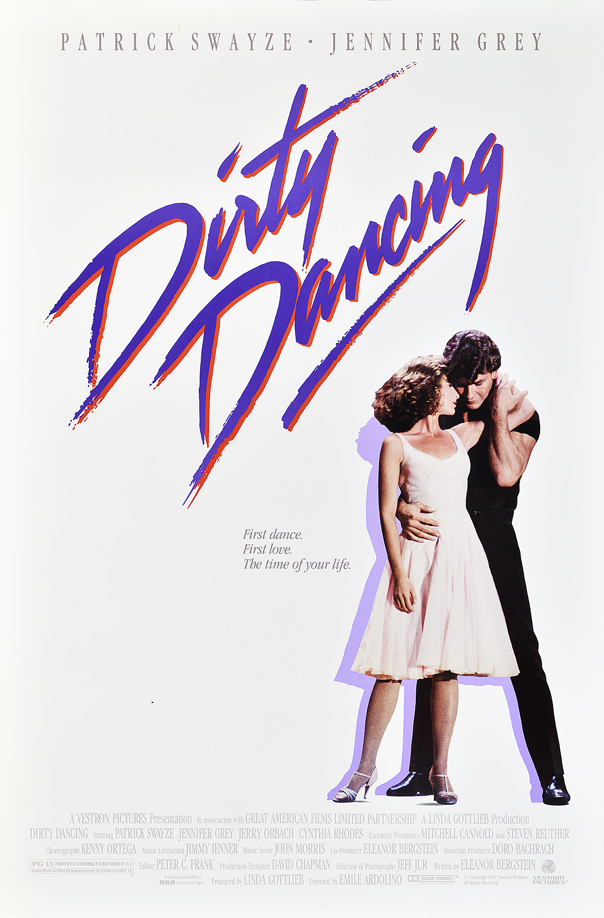
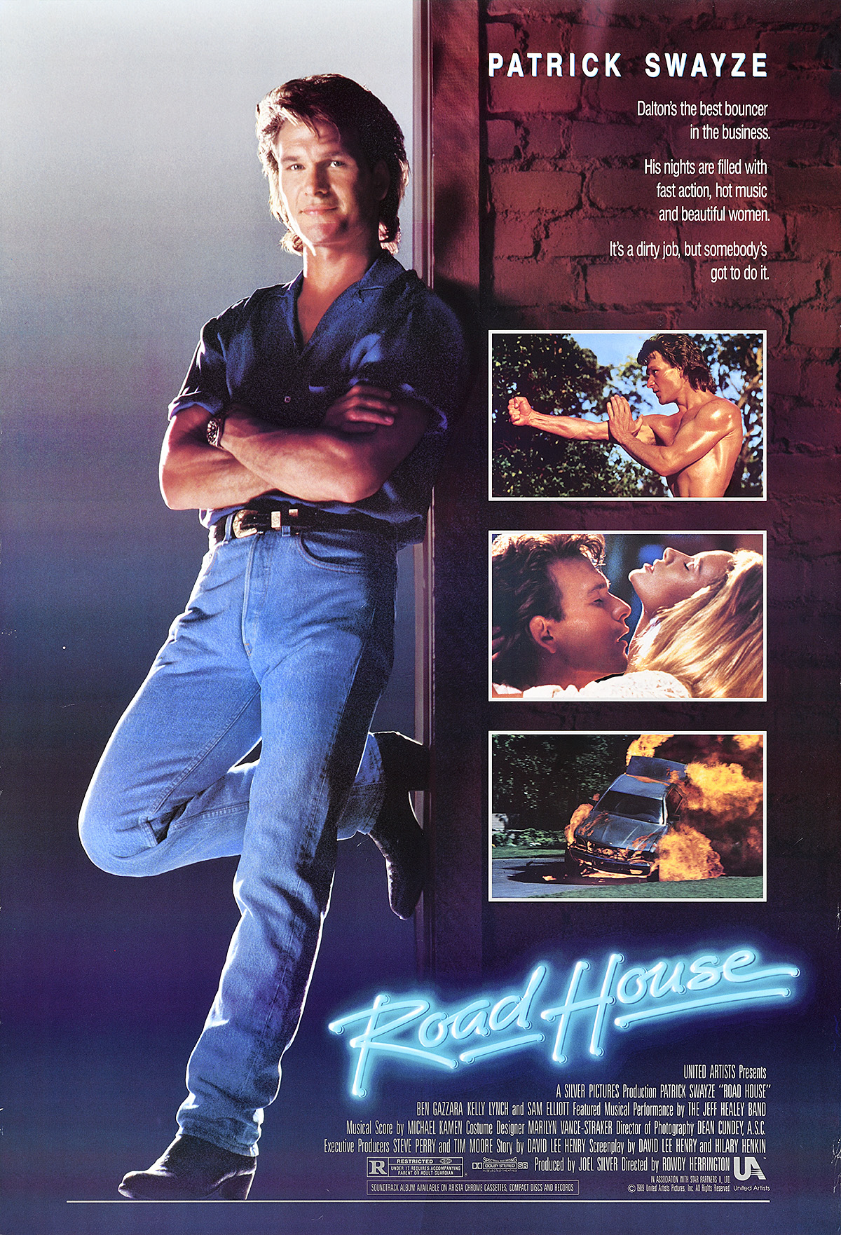
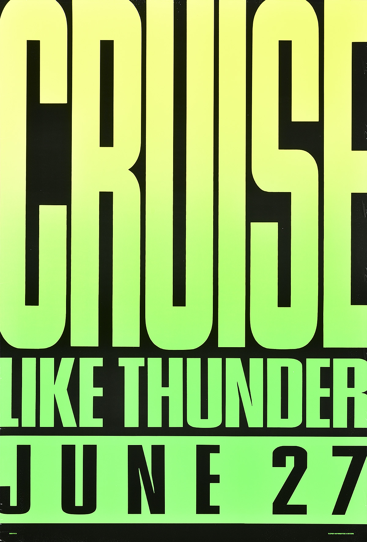
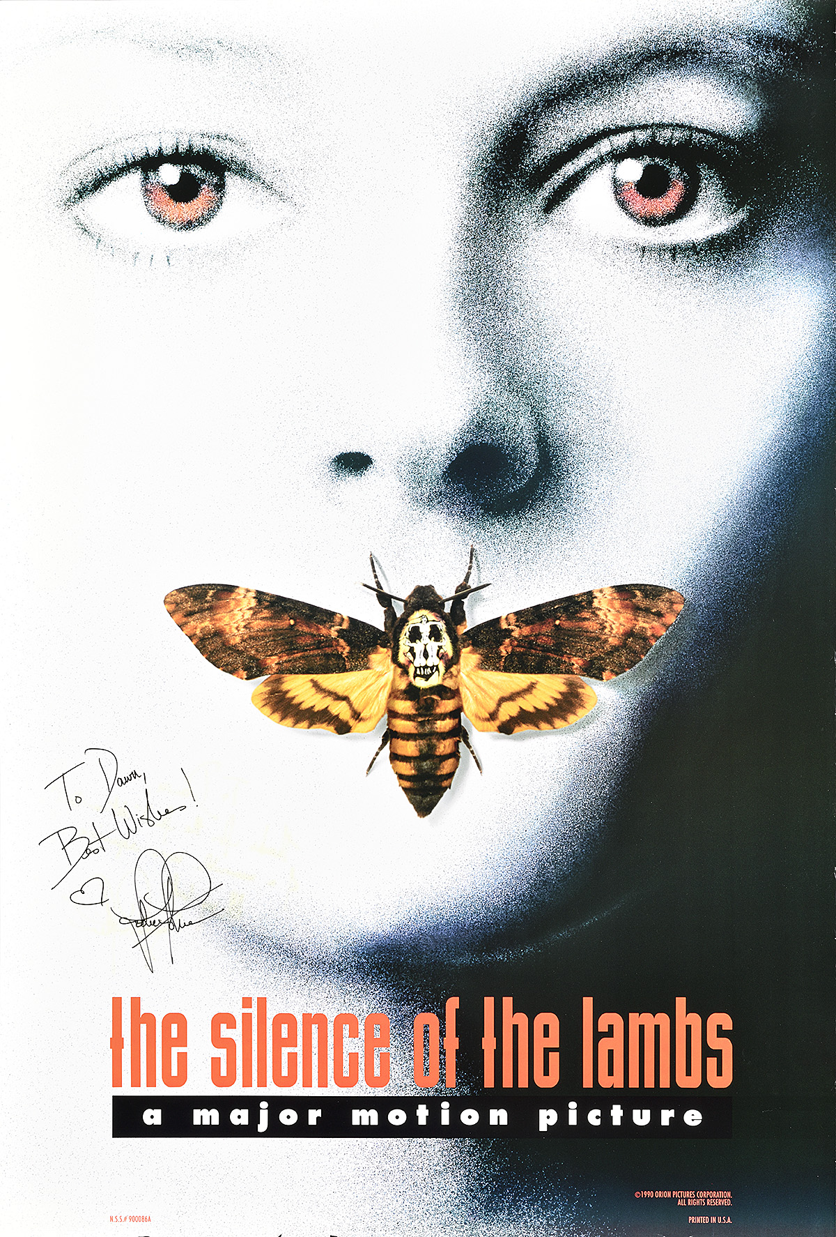
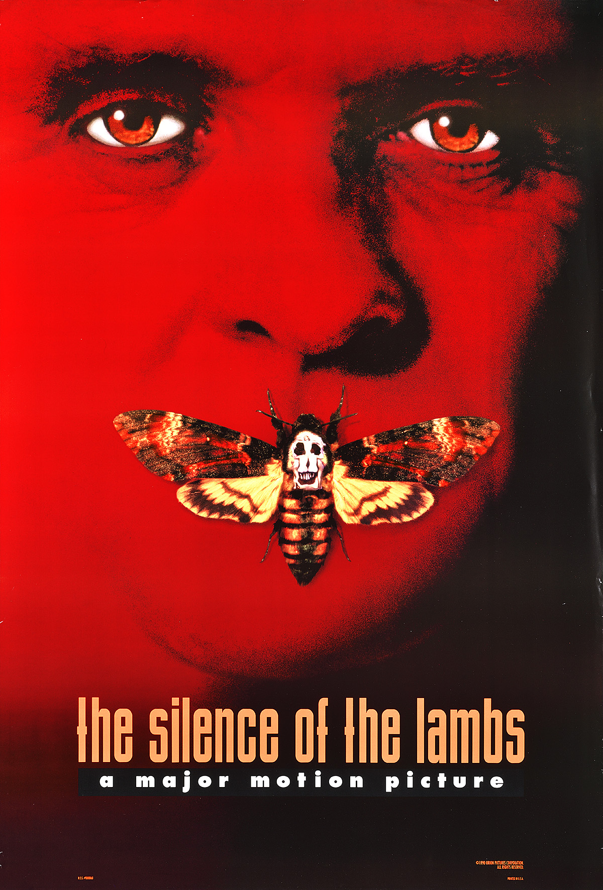
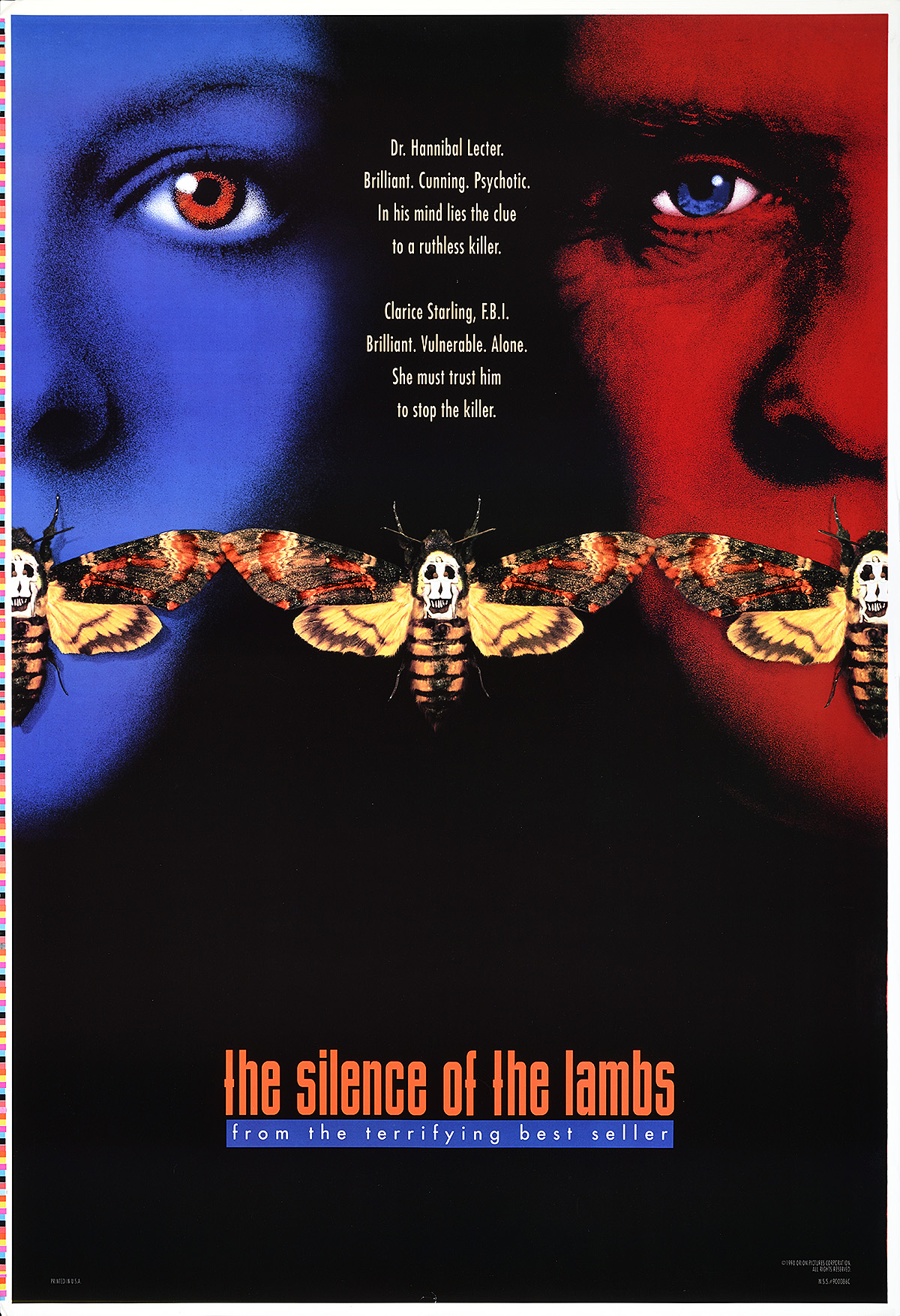
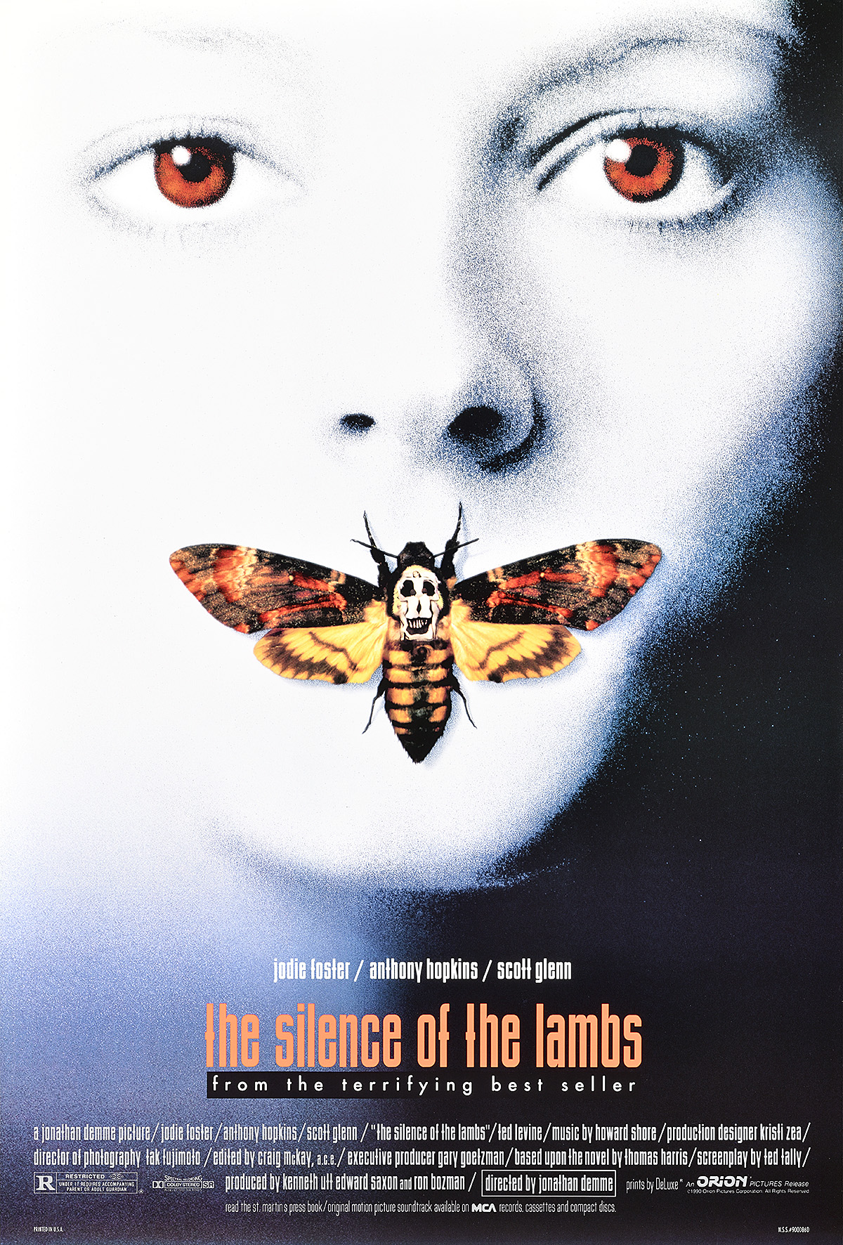
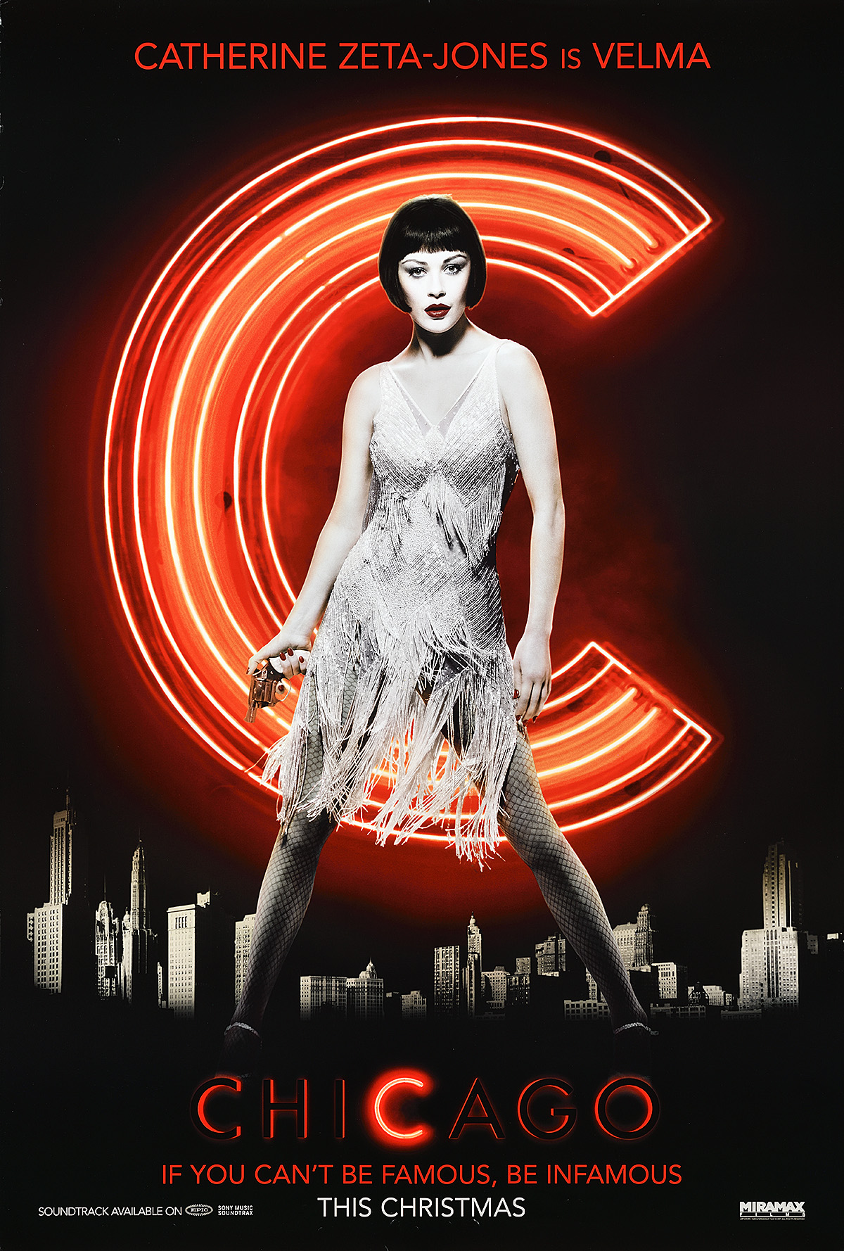
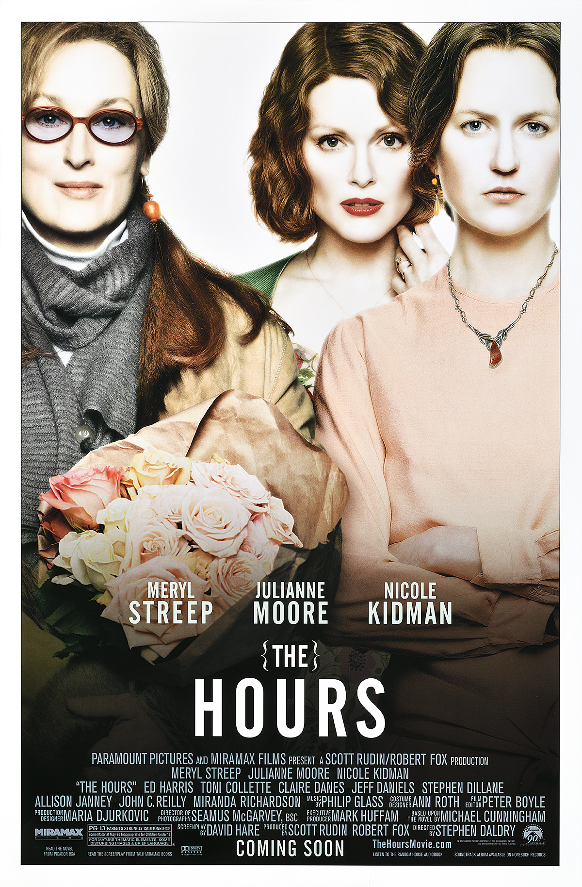
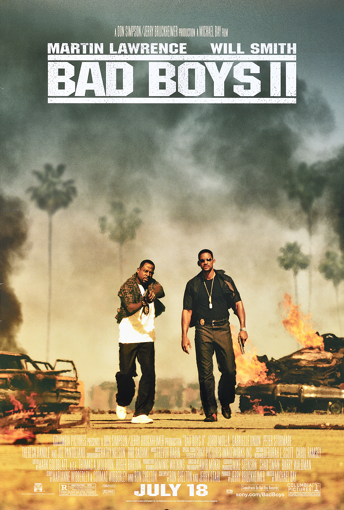
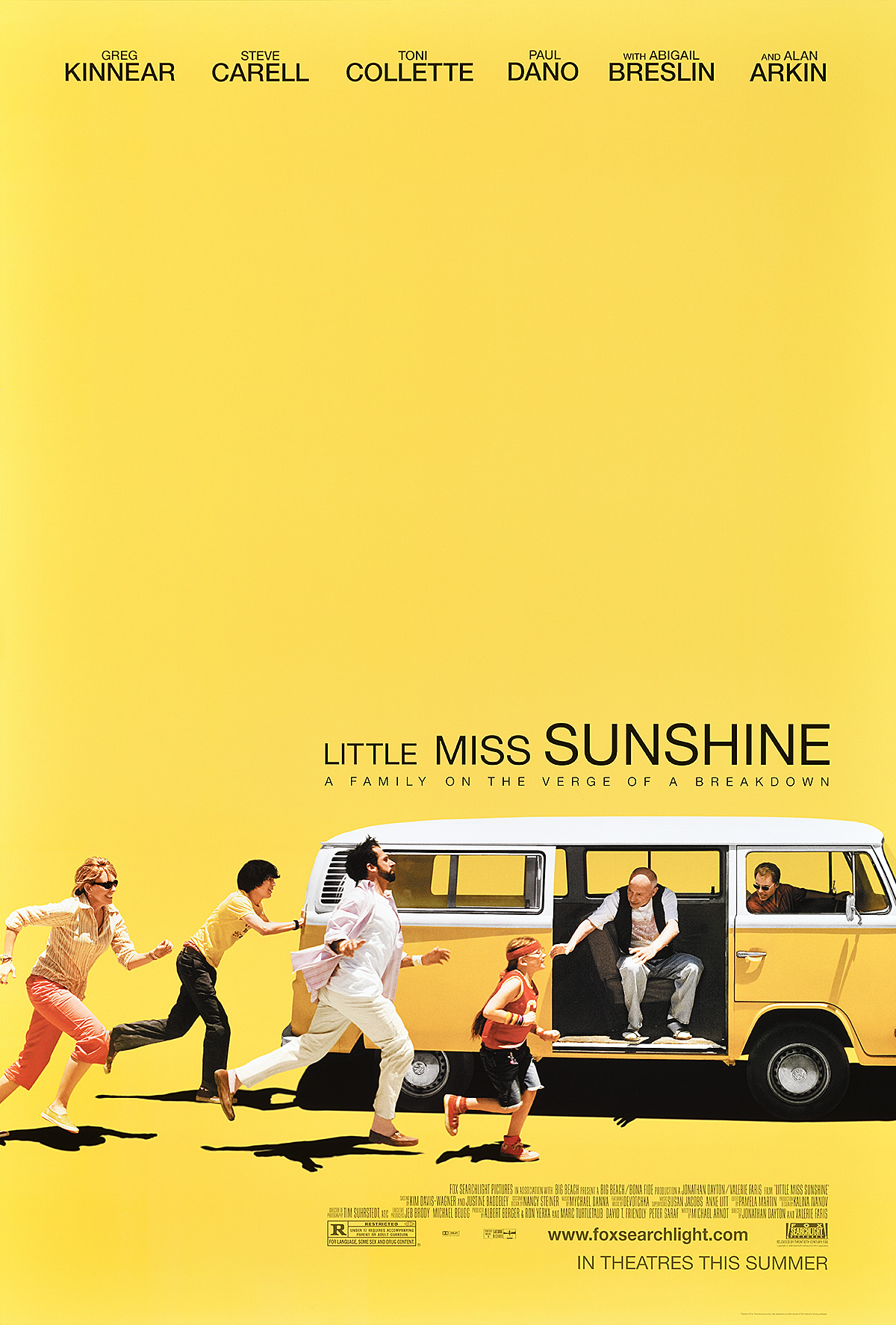
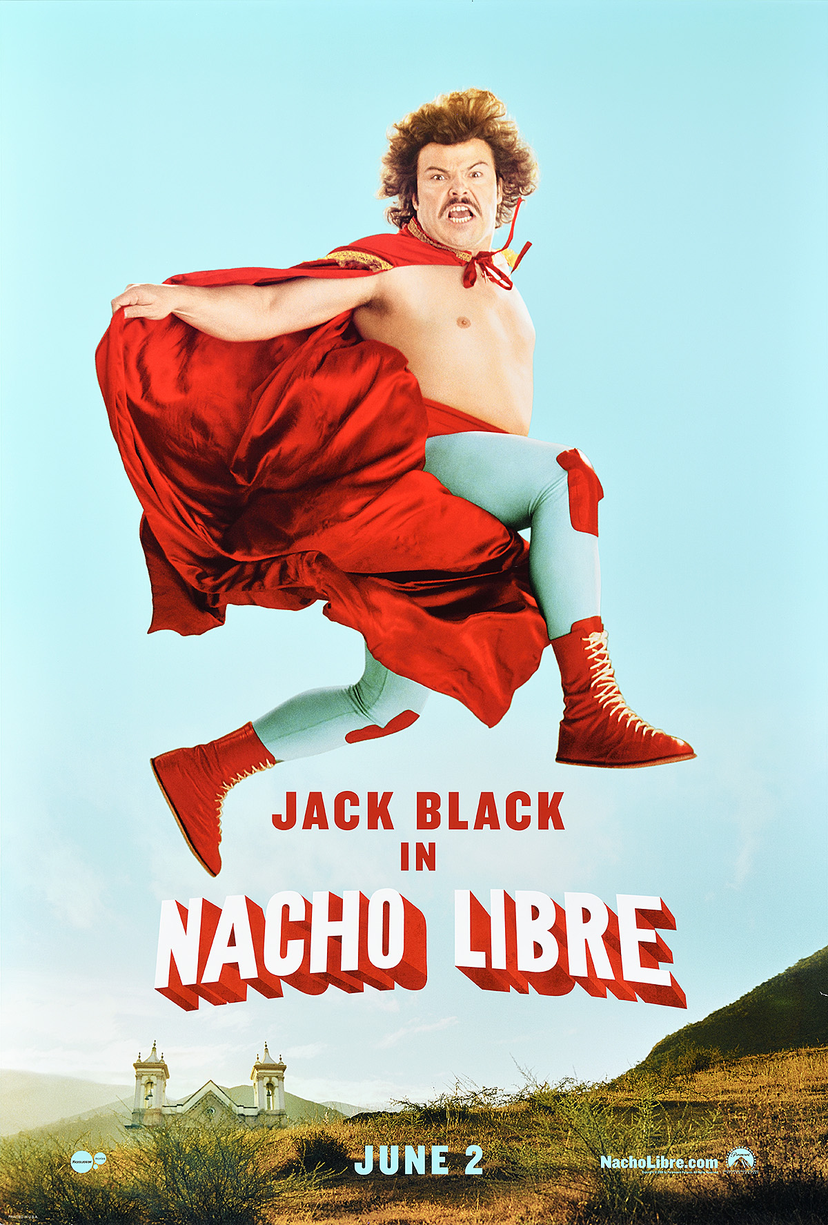
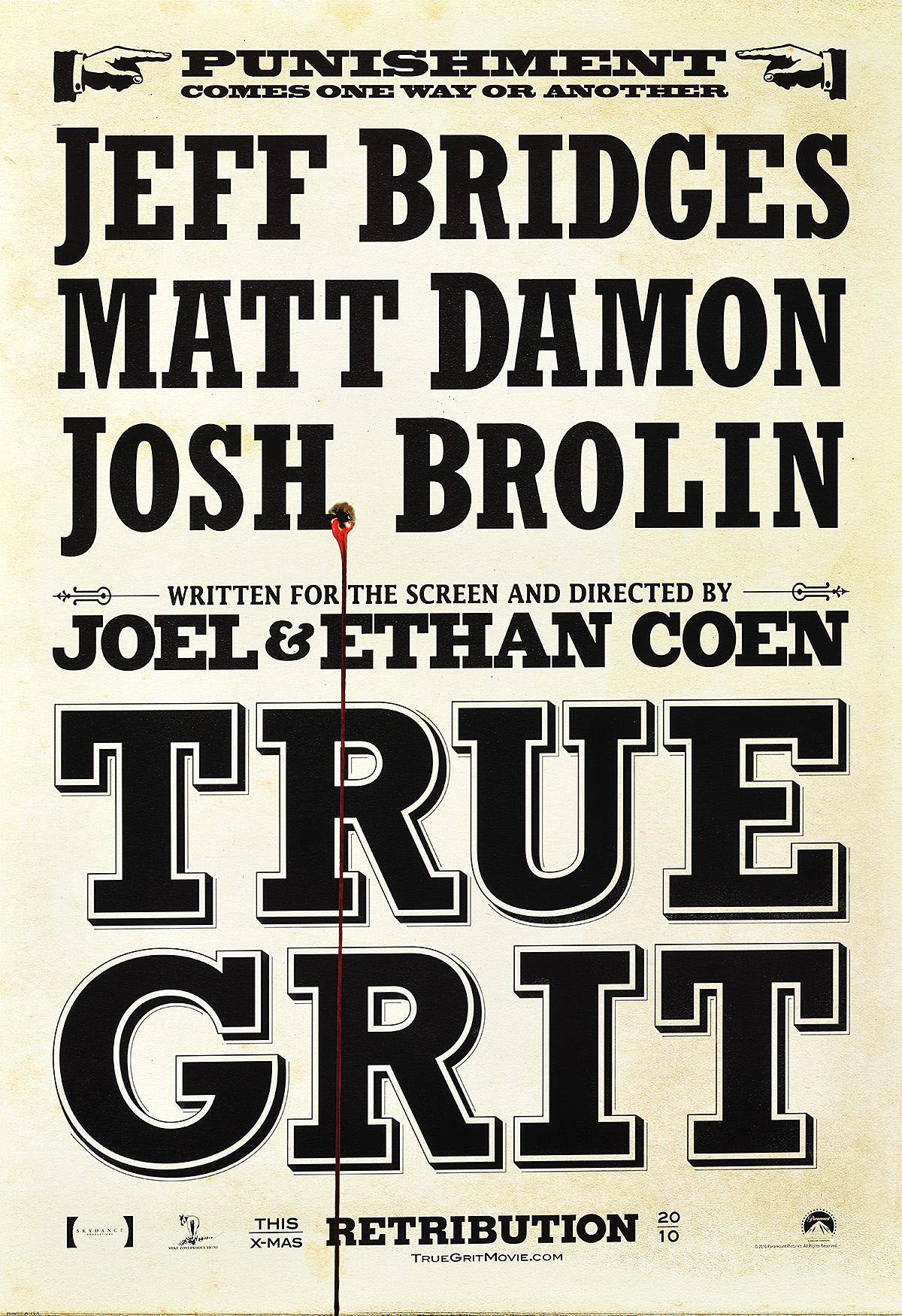
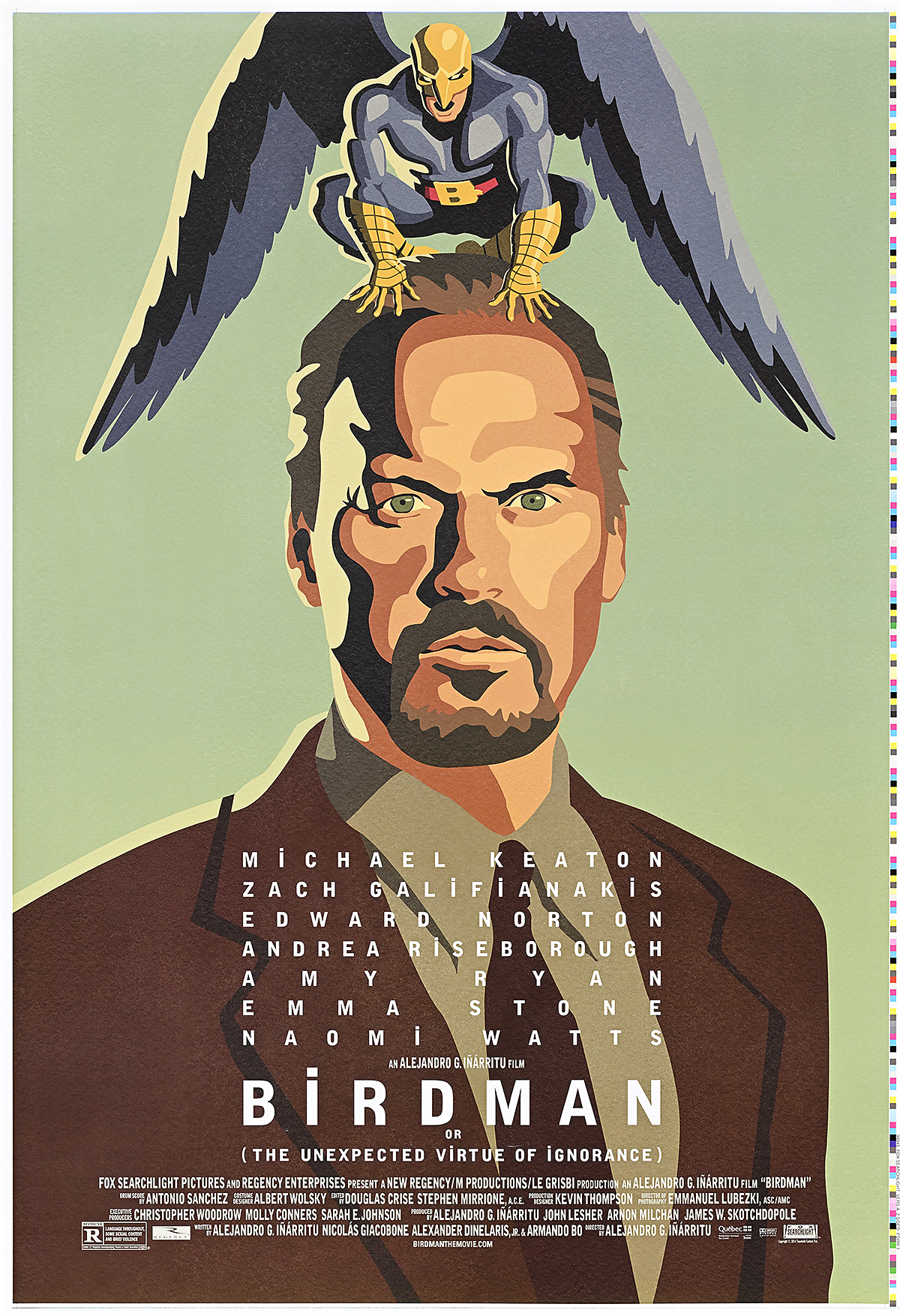
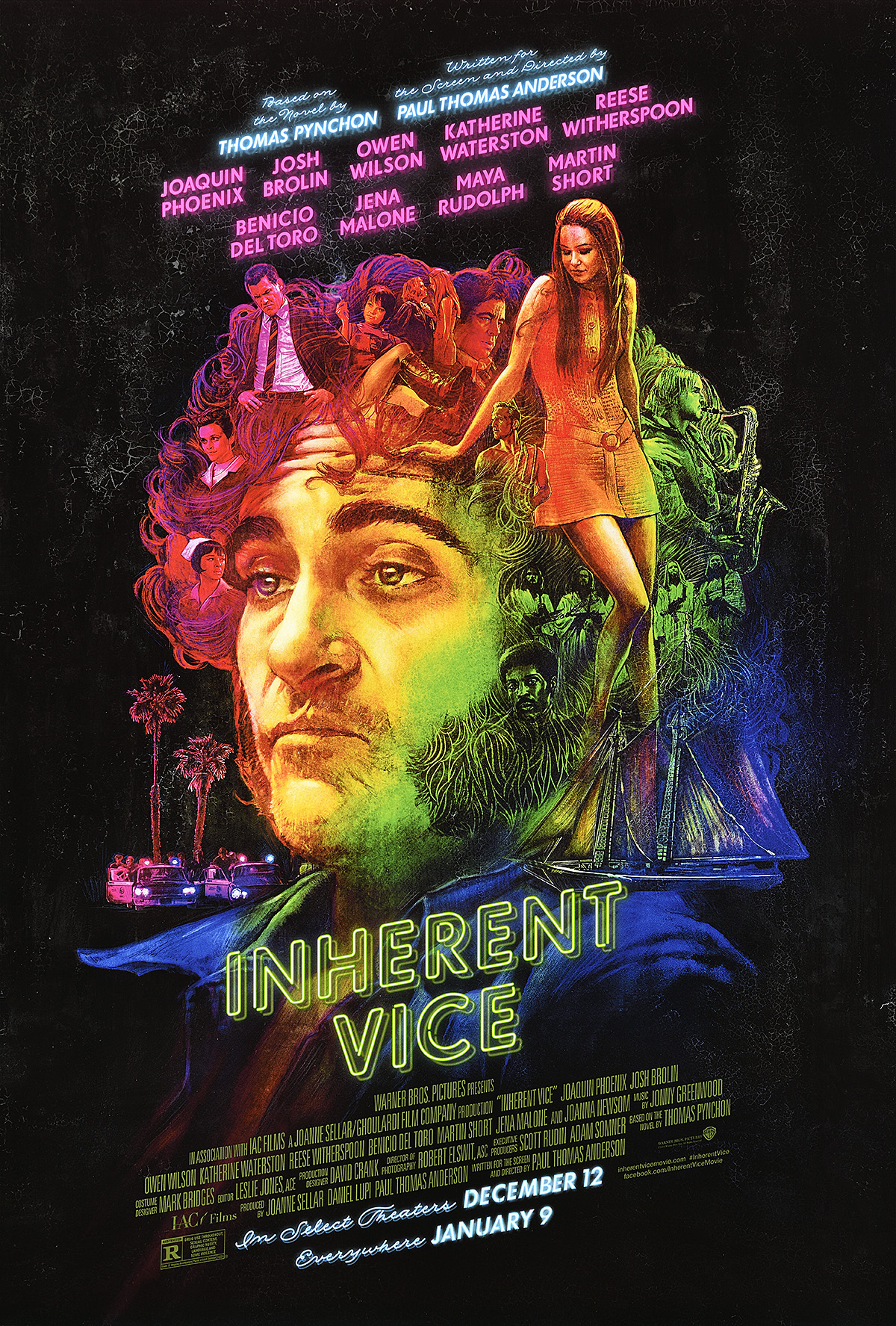
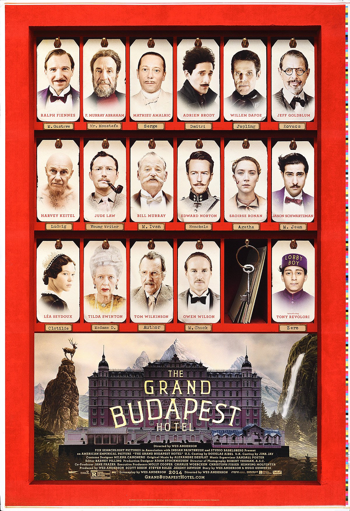
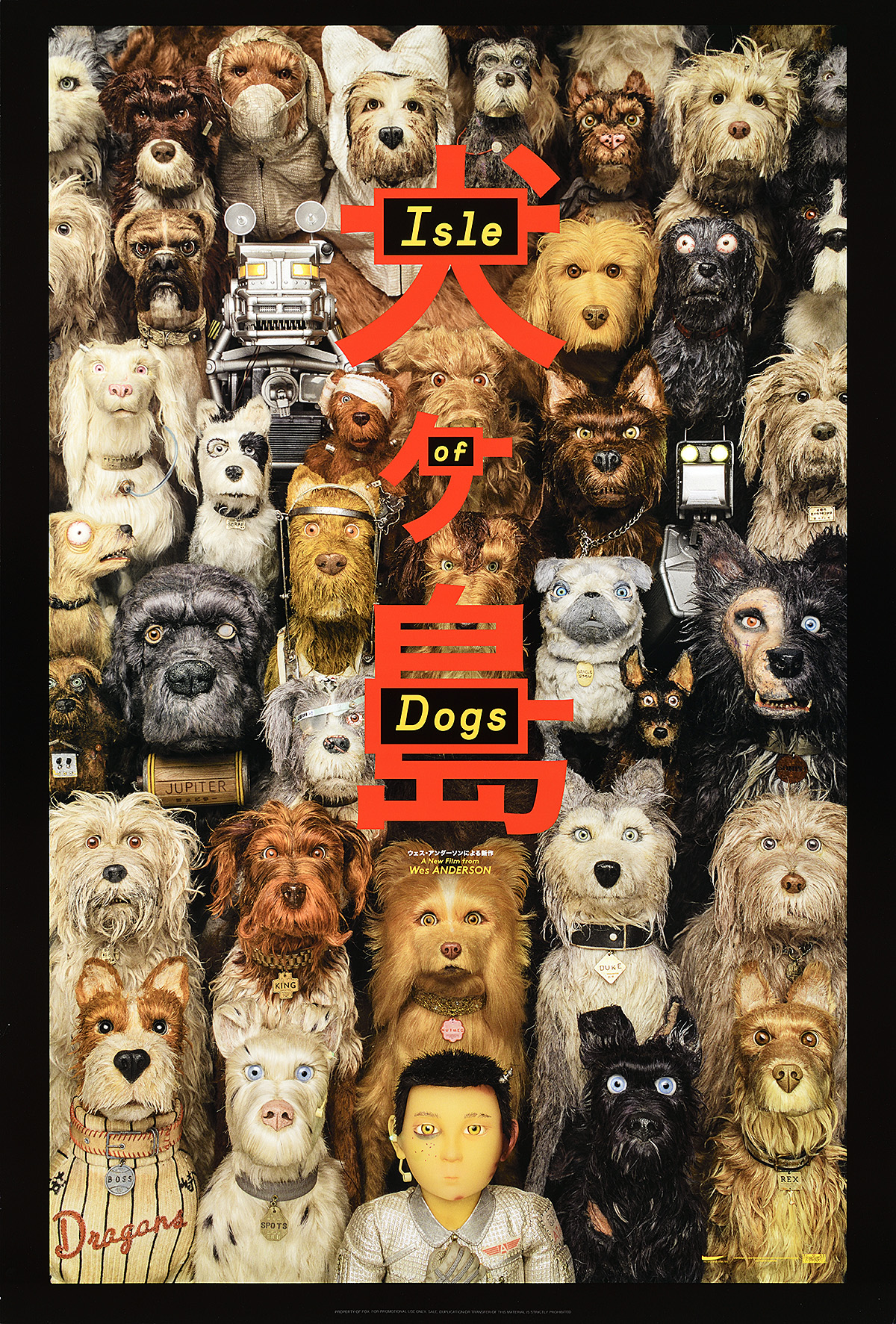
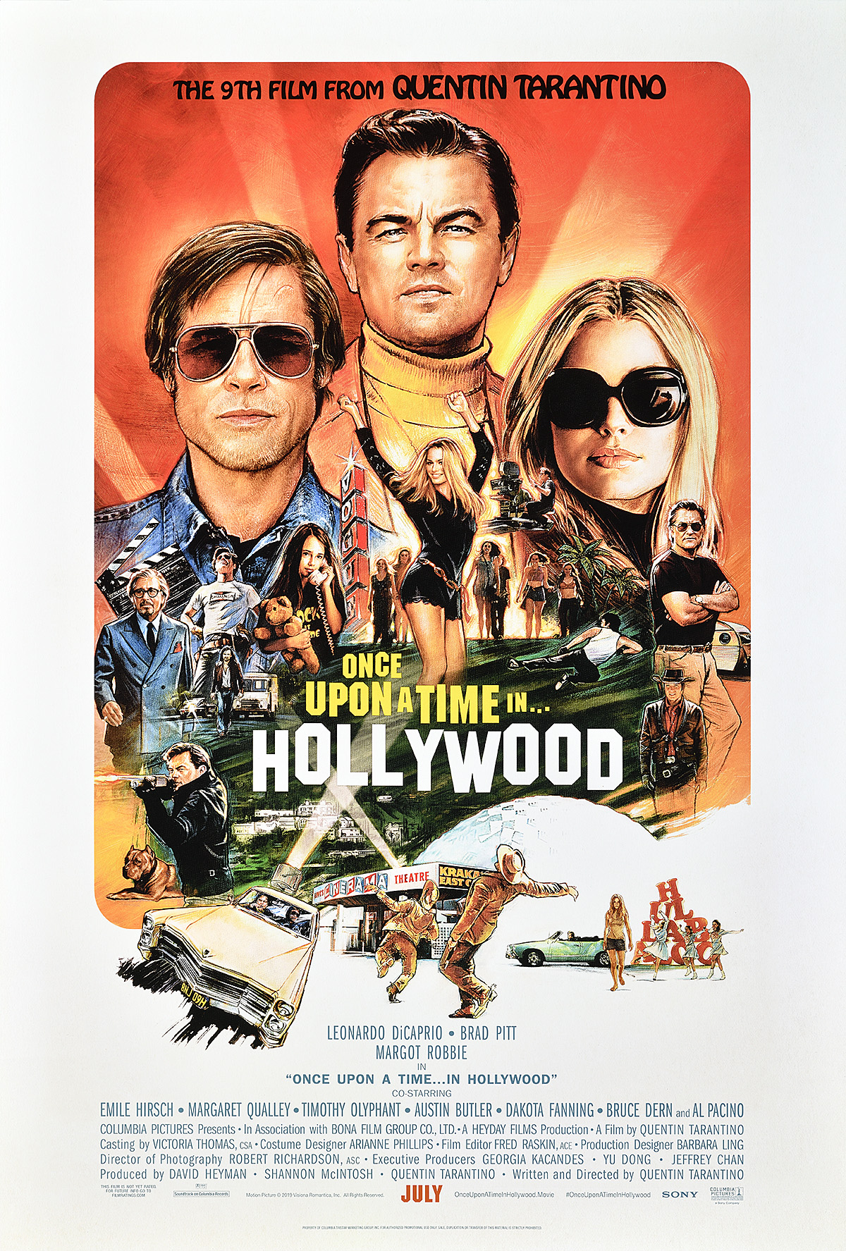
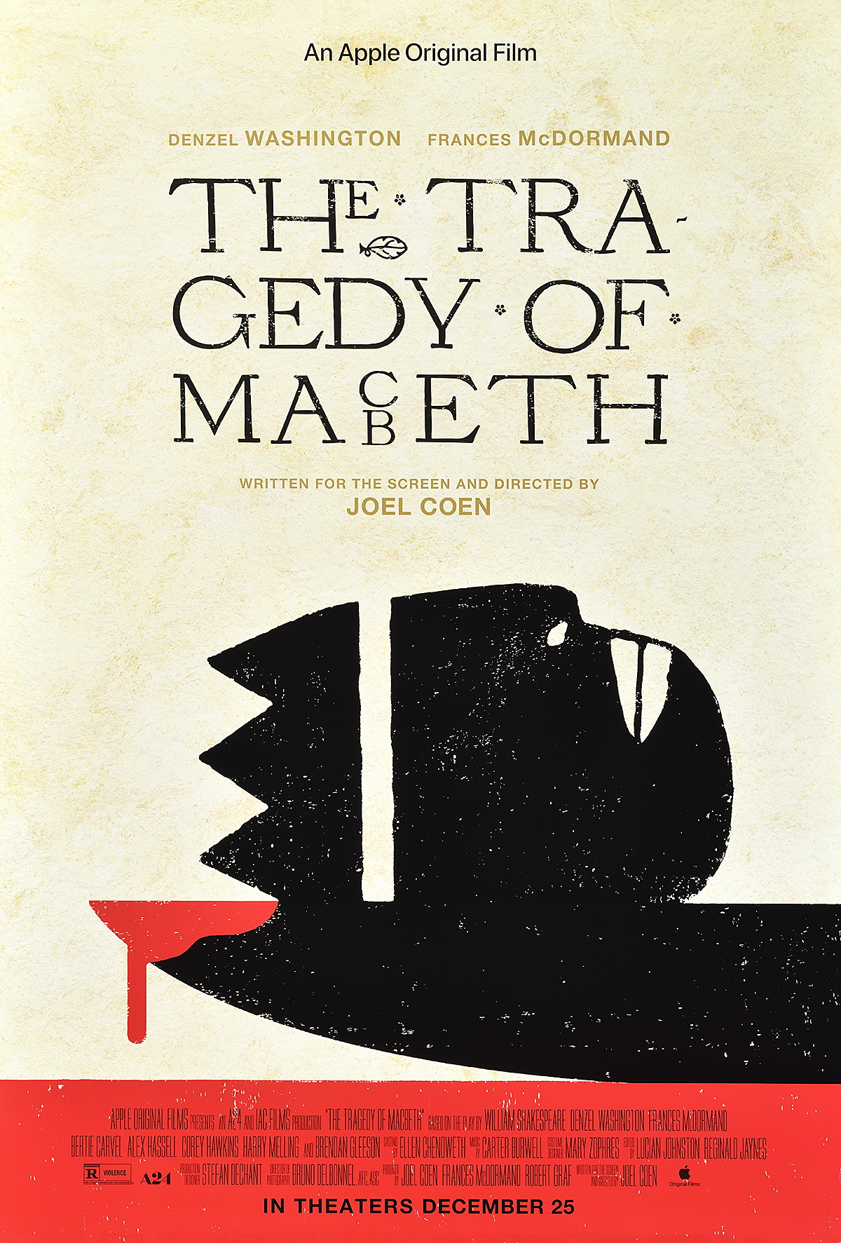
In a career that has spanned nearly four decades at three design agencies, Dawn Baillie (née Teitelbaum) has worked on some of the most iconic and beloved posters in modern cinema history. Few designers can claim something as recognizable as Dirty Dancing as their first professional project. Fewer still have the abundance of award-winning masterpieces in their portfolios that have helped define Dawn’s career. From The Silence of the Lambs to Little Miss Sunshine, Dawn Baillie has designed and art directed posters that stand out for their remarkable simplicity and unconventional execution, a restrained and intellectual combination that leaves the viewer both curious and eager to see a film. In 2012, she was also the inaugural winner of the Saul Bass Award. 

Dawn Baillie also has the distinction of being the first woman to cofound an American print agency. She was a pioneer in a field dominated by men, opening doors and blazing trails while creating exceptional work. This exhibition chronicles not only her impressive career from junior designer to creative director and business owner, but also showcases the evolution of the production of movie posters over the past 35 years, from paste-ups to the introduction of computer technology. Many industry terms are used throughout the wall text and are noted in bold and linked. For additional explanation, we encourage viewers to reference our free handout, A Little Book of Movie Poster Terms, available near the entrance or through this link: A Little Book of Movie Poster Terms.


Unless otherwise noted, all posters in this exhibition were part of a generous gift by the designer to Poster House. 

Every effort has been made to properly credit all those involved in the production of each poster. Since Dawn shares a last name with her husband, Clive Baillie, we refer to her here by her first name to avoid confusion. While we maintain her married name throughout, any work produced before 1994 would have been as Dawn Teitelbaum.


Large text is available at the Info Desk. 

Guías con letra grande están disponibles en informaciones. 


Please be advised that there is an audio component to the exhibition. Earplugs are available near the entryway or at the Info Desk.

This exhibition is supported, in part, by public funds from the New York State Council on the Arts (NYSCA) and the New York City Department of Cultural Affairs in partnership with the City Council.

Section 1, Seiniger Advertising: From Art School to Junior Designer

While she was growing up in Hollywood, the many movie theaters along Hollywood and Sunset Boulevards served as Dawn Baillie’s art gallery. The new posters that she saw every week, most notably the arresting image for the 1976 film The Omen, convinced her that making film posters would be the perfect profession—something she even noted in her high-school yearbook. By the time she was getting ready to graduate from Otis College of Art and Design in Los Angeles (known from 1978 to 1991 as Otis Art Institute of Parsons School of Design), however, no professor had allowed her the opportunity to try her hand at designing a poster. After some convincing, though, she created a reimagined image for the cult 1971 film Harold and Maude. That painting ultimately helped to get her the job that allowed her to break into the movie-poster business. 

While working odd jobs, most notably as an extra, Dawn reached out to several contacts given to her on set, one of which led to Tony Seiniger of Seiniger Advertising. Unable to afford pricey 4×5 transparencies of her work, she carried a portfolio to the meeting containing her physical paintings. Tony saw something special in her design for Harold and Maude and hired her—but to do what was not quite clear. With “fake it til you make it” acting as her personal mantra, she volunteered to do anything in the design studio, from mock-ups for posters to standees and trade ads. She quickly worked her way up, always taking on more projects across numerous departments and maintaining grueling hours. She would stay at Seiniger for three years, during which time she designed around a dozen posters, and was involved in many more. 

A poster of a man and a woman in a dancing embrace under the text 'Dirty Dancing.'

Dirty Dancing, 1987

Agency: Seiniger Advertising

Creative Directors: Tony Seiniger (b. 1939) & Tom Martin (b. 1953)  

Designer: Dawn Baillie (b. 1964)

Client: Sharon Streger, Vestron Pictures 

Gift of Dawn Baillie, Poster House Permanent Collection

  • While Dawn had worked on a handful of other posters after joining Seiniger Advertising, this is the first one over which she had some control as the lead designer. She presented between 15 and 20 comps—at the time, the standard number of rough poster ideas for a campaign—all produced through black-and-white xeroxes. Tony chose a few he liked best, and these were then recreated in color for further consideration. 
  • Dawn has always been fascinated by experimentation, so when a new production possibility becomes available, she tends to take full advantage of it. Here, she added the Compspurple drop shadows behind the couple and the title because she had just learned how to make chromatecs (rub-down type). 
  • The image of Patrick Swayze and Jennifer Grey was chosen from unit photography—photographs taken on set during the production. Dawn reviewed contact sheets full of thousands of images and ordered those that most vividly conveyed emotion or action, as well as those in which the stars were most recognizable. She felt this was the most romantic image as well as one that hinted at a chance of possibility. 
  • Poster production for films comes with a lot of contractual rules, many of which focus on the billing block (the big list of names and companies typically at the bottom of a poster). While Dawn felt the large and dramatic typography of the title would add action to an otherwise static composition, the production manager immediately cut off the bottom of the “g” in “dancing” because it was larger than what was permitted in relation to the billing block. 

A poster of 2 boys wearing large brimmed hats and sungalsses leaning on the hood of a Mercedes car.

Big Shots, 1987

Agency: Seiniger Advertising

Creative Director: Tony Seiniger (b. 1939)

Designer: Dawn Baillie (b. 1964)

Lettering Artists: Kelly Hume (b. 1959) & Dawn Baillie (b. 1964)

Photography Art Direction: Dawn Baillie (b. 1964)

Client: 20th Century Fox

Gift of Dawn Baillie, Poster House Permanent Collection

  • In 1987, Canon loaned its new CLC-1—a digital, full-color copier—to Seiniger Advertising to evaluate it for use within the film-advertising industry. Prior to this, the only copy machines on the market printed at fixed ratios in black and white, and color copies were hugely expensive. This is the first movie poster built with this color xerox technology. 
  • Dawn was assigned to experiment with the CLC-1 while she was working on Big Shots, the first film where she art directed the photoshoot. This new technology allowed her to adjust compositions in color from the beginning, cutting out and rearranging elements until she was completely satisfied, rather than sending out select mock-ups to be made into color comps. 
  • While the CLC-1 allowed agencies to create comps in-house, the introduction of color to the process meant that designers had to cover lines left by X-ACTO knives to make the compositions appear seamless. This was most often achieved through airbrushing and filling in with colored pencils. 
  • After the composition was considered complete, the lettering was added as a chromatec and the whole thing was recopied in color as a single image that could be shown to the client. Dawn added the little hat to the “i” of the logo to make it more lively. 

A poster of a suave suited man in front of a series of images of palm trees, a city, and gunfights.

No Man’s Land, 1987

Agency: Seiniger Advertising

Creative Director: Tony Seiniger (b. 1939)

Designer: Dawn Baillie (b. 1964)

Special Photographer: Nels Israelson (b. 1958)

Client: Orion Pictures

Gift of Dawn Baillie, Poster House Permanent Collection

  • Designers are not always given a detailed brief when tasked with making a movie poster. For No Man’s Land, Dawn was handed a stack of photos and told to “make it stylish and show some action.” 
  • Around the time this poster was produced, the cost of commercial printing decreased, allowing for budgets to include such design upgrades as moving from a four-color process to a six-color process. Dawn had recently learned about gloss and matte varnishes, and was eager to experiment with them. Here, she contrasts a matte-black border with glossy photographs and lettering, the latter created by a double hit of red. 
  • The composition combines the three major types of photography typically found in movie posters. The action imagery on the right is unit photography taken during filming; the portrait of Charlie Sheen is special photography, in which an actor poses for a unique photoshoot especially for the advertising campaign; and the Los Angeles background is stock photography, taken from a preexisting library of available imagery. 

A poster of a man in a Santa Claus suit being electricuted by Christmas lights on a roof.

National Lampoon’s Christmas Vacation, 1989

Agency: Seiniger Advertising

Creative Director: Tony Seiniger (b. 1939)

Designer & Art Director: Dawn Baillie (b. 1964)

Illustrators: Chris Consani (b. 1951) & Dave Christensen (b. 1944)

Client: Joel Wayne, Warner Brothers

Gift of Dawn Baillie, Poster House Permanent Collection

  • This project marked one of the first times Dawn served as the art director on a poster, guiding two other people while she designed and assembled the composition. The idea, however, came from Tony Seiniger, the creative director. 
  • Once the client approved the concept, the agency hired Chris Consani, an outside illustrator, to paint the image. At the time, agencies usually consulted The Workbook—a publication promoting all the available artists in the field—to find potential fits; however, because illustration is expensive and time-consuming, they often ended up hiring artists they had worked with previously. 
  • While the painting was great, Chevy Chase’s likeness required additional expressions, so Dawn had the original art scanned, and worked with Dave Christensen, an in-house sketch artist, to create alternative heads of the actor that could be superimposed on the composition. 
  • To assemble the final image, Dawn resized a C-print of the painting (with the new head) to the dimensions of a movie poster and repositioned some of the individual gift boxes. She then designed the typography and inserted it into the composition with chromatecs. Once the client had approved the design, a dye transfer print was made showing how the image and type were meant to fit together—and from all of this, the printer produced the final poster. 

A poster of a man looking earnestly at the viewer wearing a cowboy hat and holding a whip.

Indiana Jones and the Last Crusade, 1989

Agency: Seiniger Advertising

Art Directors: Tony Seiniger (b. 1939) & Mike Kaiser (Dates Unknown)

Designer: Dawn Baillie (b. 1964)

Illustrator: Drew Struzan (b. 1947)

Logo: Lance Anderson (Dates Unknown)

Copywriter: Mike Kaiser (Dates Unknown)

Client: Paramount Pictures 

Gift of Dawn Baillie, Poster House Permanent Collection

  • This is the teaser poster for Indiana Jones and the Last Crusade. Typically produced around a year before a film is released, a teaser poster is meant to build excitement and usually contains fewer elements and less information than the final payoff poster
  • In preparation for the poster, Tony Seiniger art directed a photoshoot of Harrison Ford and gave the images to Dawn along with his notes. As the designer, her job was to create a variety of potential layouts that, once approved, would be executed by an illustrator in the style of the posters for the first two Indiana Jones movies.  
  • While Richard Amsel had designed the poster for Raiders of the Lost Ark, Drew Struzan had produced the artwork for its international release as well as for the subsequent film in the series, Indiana Jones and the Temple of Doom. As Dawn’s original ambition had been to illustrate film posters (rather than design them), working with Struzan was incredibly exciting for her.

A poster of a man leaning on a wall with images of him shirtless, having sex, and a blown up car.

Road House, 1989

Agency: Seiniger Advertising

Creative Director: Tony Seiniger (b. 1939) 

Designer & Art Director: Dawn Baillie (b. 1964)

Client: UA United Artists

Gift of Dawn Baillie, Poster House Permanent Collection

  • Dawn served as both designer and art director for this poster, taking the loose brief of “show some action” along with a stack of unit photography from the film, and creating potential compositions. 
  • Working on a lucigraph, Dawn produced layouts using her favorite still photographs for the poster and presented them as comps for Tony’s approval. The final design provides the viewer with the necessary “free samples” of sex appeal and action next to an inviting photograph of Patrick Swayze (shot as special photography). 
  • By the late 1980s, copy (lines of text) on posters was becoming shorter, and was usually cut down to a pithy tagline like the one seen in the poster for Christmas Vacation. In many instances, the more confidence a studio had in a movie, the less copy was needed to sell it. Here, however, despite the star power of the film’s actors (and its subsequent cult-like success), a copywriter’s excessive turns of phrase appear at the upper right. 
  • While Dawn was very happy with her original treatment of the title, made to look like neon lettering, the production manager who executed the final logo artwork altered it to the extent that it ultimately lost that effect. These small differences emphasize how subtle changes can occur at any point in the poster-making process, completely changing the designer’s original intention.

A poster of a suited man using suction cups to climb a window in front of a cityscape.

Who’s Harry Crumb?, 1989

Agency: Seiniger Advertising

Creative Director: Tony Seiniger (b. 1939)

Designer & Art Director: Dawn Baillie (b. 1964)

Photographer: Steve Schapiro (1934–2022)

Copywriter: Steven H. Miller (Dates Unknown)

Client: TriStar Pictures

Gift of Dawn Baillie, Poster House Permanent Collection

  • Who’s Harry Crumb? was one of the last posters Dawn designed while working at Seiniger Advertising. It marked a moment when she was gaining confidence in pitching her own ideas for a poster. Working with an in-house illustrator, she presented Tony with a variety of wild concepts for the design; this was one of a few that resulted in a special photoshoot with John Candy.
  • The decision to reference a pop-cultural moment in a movie poster can be risky, as it often falls flat or feels gimmicky. Here, though, turning John Candy into a human-sized suction-cup Garfield, the comic-strip orange cat that was seemingly in everyone’s car in 1989, became a fabulous visual conceit, inviting the viewer to be in on the joke. 
  • While Dawn originally thought she would add the suction cups in post-production, they had been made as physical props for Candy to use during the shoot. To complete the final iteration of the poster, she tilted the photograph of the actor and airbrushed in stock images of the cityscape, the plane, and the sky. She also drew the window frame and streaks on the glass. 

Section 2, Lured to Dazu

During her three years working at Seiniger Advertising, Dawn was promoted from the position of production artist to assistant art director under Tom Martin, one of the creative directors. Known for her dedicated work ethic and intuitive approach to design, she began receiving numerous offers from other agencies. Young and ambitious, she took the best deal—a full art-director role with Dazu, a recently revamped agency in New York City that wanted to expand further into Hollywood.

A poster of a man holding the collar of his cow jacket, standing in front of a disclaimer list.

The Adventures of Ford Fairlane, 1990

Agency: Dazu

Designer & Art Director: Dawn Baillie (b. 1964)

Logo Artist: Mick Haggerty (b. 1948)

Client: 20th Century Fox

Anonymous Gift, Poster House Permanent Collection

  • When Dawn was assigned by her new employer, Dazu, to create this image, her instructions were to lean into the fact that the movie’s star, Andrew Dice Clay, was a comedian who specialized in being offensive. Her idea, therefore, was to have a copywriter create a giant disclaimer listing all the people who would be insulted by the film. 
  • This version of the poster was ultimately removed from circulation. It is rare that a poster gets this far into the production process, with everything approved and printed, only to be withdrawn. However, one small aspect of the design forced the studio to order that all copies be destroyed. Can you guess which detail killed the poster? 
  • Months before this poster was due to be released, Mick Haggerty—one of Dawn’s professors in college—designed the teaser poster, the logo from which is incorporated in this design. It is fairly common for the logo—the decorative typographic treatment of the title of the film—to be transferred from a teaser poster to a payoff poster and to additional film-marketing materials. The design that replaced this poster incorporated elements from the teaser in a more neutral image.

A poster of vertical yellow to green ombré text that states, 'Cruise. Like Thunder. June 27.'

Days of Thunder, 1990

Agency: Dazu

Designer & Art Director: Dawn Baillie (b. 1964)

Client: Lucia Ludovico, Paramount Pictures

Gift of Dawn Baillie, Poster House Permanent Collection

  • This is one of two complementary teaser posters created to promote the NASCAR movie Days of Thunder, starring Tom Cruise. As teaser posters are intended to create excitement around an upcoming film without revealing too much information, Dawn made the announcement look like a concert poster. 
  • The Day-Glo, ombré lettering was created using silkscreen—an unusual and expensive printing choice that would not be used today for a film poster. As with her previous designs, however, Dawn was drawn to the possibilities of printing, always eager to experiment. 
  • From the early 1990s, Dawn frequently began to incorporate tall, thin typography into her posters, particularly OPTI Binderstyle that she had first seen in Rolling Stone magazine. Such a tall lowercase font felt incredibly modern, allowing the designer to visually “shout” and “whisper” at the same time. This is perhaps the largest size in which Tom Cruise’s name has ever appeared on a movie poster.

A signed poster of an overexposed white woman's face with orange eyes and a moth over her mouth.

The Silence of the Lambs, 1991

Agency: Dazu

Designer & Art Director: Dawn Baillie (b. 1964)

Photographers: Ken Regan (1940–2012), Lee Varis (b. 1953), & Kevin Stapleton (Dates Unknown)

Client: Orion Pictures

Gift of Dawn Baillie, Poster House Permanent Collection

  • Since an account executive quit right around the time this project was brought to Dazu, Dawn ended up being the only person working on the poster. Her imagery for The Silence of the Lambs would go on to become her most highly praised design, frequently listed as one of the most important and impactful movie posters of all time.  
  • This series of posters was created during a time of technological transition when computer finishing was being introduced. The differences between the two processes are best seen through a comparison of the original teaser design on the far left with the payoff image on the far right. 
  • In the original teaser design, Dawn was still working by hand. Using unit photography by Ken Regan, she airbrushed out the highlights on Jodie Foster’s face and had a mezzotint (black-and-white image made on a stat camera) printed, into which she then airbrushed the Day-Glo orange of the eyes.
  • The payoff poster of the same composition was finished by a computer technician directed by Dawn. As the technology was in its infancy, it was comparatively crude, resulting in higher contrasts, sharper gradations, and an overall less refined image. 
  • Before computer finishing, a designer would order a photo composition of the image as a dye transfer or C-print. This person would then retouch the photograph by hand and fix any seams between elements that had been added separately. The printer would receive both the final, camera-ready art as well as a mechanical of the type on an FPO (For Position Only) mock-up of the poster—this mechanical would be referenced by the printer to position the typography on top of the final design prior to printing. 

A red poster of a middle aged man's face with red eyes and a moth covering his mouth.

A poster of half of woman and man's face with moths over their mouths and inbetween them.

A poster of an overexposed white woman's face with red eyes and a moth covering her mouth.

The Silence of the Lambs, 1991

Agency: Dazu

Designer & Art Director: Dawn Baillie (b. 1964)

Photographers: Ken Regan (1940–2012), Lee Varis (b. 1953), & Kevin Stapleton (Dates Unknown)

Client: Orion Pictures

Gift of Dawn Baillie, Poster House Permanent Collection

  • Less well known than the image showing just Jodie Foster, the two other designs were created as teaser posters. As a standard leading actor’s contract required, Anthony Hopkins had to have equal likeness and prominence in all promotional materials—as such, the two more boldly colored posters were created a little later than the original design as a “make good” on that part of the contract. 
  • While all movie theaters would have received the full set of posters from the film’s distributor, it was up to them to choose which poster to show at the box office. Most went with the original design. 
  • The photograph of the death’s-head hawkmoth was taken from a specimen Dawn had rented from the Natural History Museum of Los Angeles. While the insect does have a skull-like design on its back, director Jonathan Demme asked that Salvador Dalí’s famous 1951 photograph of naked women forming a skull be incorporated into the design. This concept was printed in the teaser poster, but the Motion Picture Association demanded the removal of the nudes; for the payoff design, account executive Bryan Allen therefore hired models dressed in bodysuits to recreate the formation. 
  • The placement of the moth over Anthony Hopkins’s mouth does not make much sense in relation to the plot of the film, and one of Dawn’s earlier ideas had been to show his character wearing the now-famous muzzle. 
  • Dawn chose red for Hopkins’s poster to imply evil when it was displayed next to the “innocent” white poster showing Jodie Foster. She brought blue into the combined design to create a visual vibration between the characters, as introducing contrasting colors of equal value can induce that effect.   

Section 3, BLT: From Art Director to Tomato

In the early 1990s, computers were introduced to the movie industry; however, they were expensive and few agencies were willing to invest in that technological leap. After her experience directing a computer operator to finish her poster for The Silence of the Lambs, Dawn wanted to be trained in that process so she could have more control over the final product. 

Colleagues Clive Baillie and Rick Lynch shared Dawn’s interest in working with computers, and had impressive portfolios of their own. While Dawn was receiving a lot of interest from clients after winning numerous awards for her poster for The Silence of the Lambs, Clive had just completed the ghoulishly macabre poster for The Addams Family and Rick had produced the edgy, smoldering images for Dangerous Liaisons and Bugsy—all decidedly different approaches to movie-poster design that nonetheless represent complementary creative skills. 

In 1992, the three of them broke away from Dazu, forming BLT out of the first letters of their respective last names (while Dawn would later marry Clive, they kept the “T” for Teitelbaum). This marked the first time a woman was among the founders of an American print agency specializing in entertainment design. They began with a total of six people on staff and taught themselves how to work with computers, becoming one of the earliest adopters of the technology in Hollywood. This allowed them to create presentations both faster and with higher volume than other studios, providing clients with significantly more options. 

Today, BLT is one of the foremost entertainment design agencies in the world, employing at its high point more than 250 people to service productions in film, television, and theater across key art, audio/visual, and social media. In 2022, Dawn, Rick, and Clive made the decision, in appreciation of their incredible staff, to transition BLT Communications to 100 percent employee ownership. At the time this exhibition text was being written, Dawn and her team had just finished work on posters for Asteroid City and Barbie, and, as a creative director, she will continue to collaboratively shape the pop-cultural landscape of advertising. 

A poster of a man and woman gazing towards each other. The man in the day, the woman at night.

Sleepless in Seattle, 1993

Agency: BLT

Designer & Art Director: Dawn Baillie (b. 1964)

Photographer: Timothy White (b. 1956) 

Client: Bill Loper & Ricky Strauss, TriStar Pictures

Gift of Dawn Baillie, Poster House Permanent Collection

  • Sleepless in Seattle was one of the first posters Dawn worked on at BLT using Photoshop. Prior to this, the few agencies that built posters on computers had used Color Studio, a program that did not easily allow revisions to a composition. Even with this transition to Photoshop, however, the construction of the image was still incredibly complex, as the application did not introduce its “layers” feature until 1995, allowing the user to swap out visual elements more easily. Here, once an object was placed in the composition, it was very difficult to remove.  
  • No one on Dawn’s team used a mouse while designing on a computer. Instead, everyone had a Wacom tablet and pen—a stylus that was used to draw on a sensitive tablet, allowing the user more control over the final image. 
  • Dawn was toward the end of her first pregnancy while working on this poster and realized that she could not do all the work on her own, especially once her daughter was born. She hired Steven Stewart as her creative assistant, a designer who stayed with her for many years while growing his own career. 

A poster of a bald man wearing red sunglasses, with a blonde woman in the reflection.

Natural Born Killers, 1994

Agency: BLT

Designer & Art Director: Dawn Baillie (b. 1964)

Photographer: Sidney Baldwin (Dates Unknown)

Special Shoot Art Direction: Dawn Baillie (b. 1964)

Logo Design: Concept Arts

Client: Michael Smith, Warner Brothers 

Gift of Dawn Baillie, Poster House Permanent Collection

  • This poster for the cult film Natural Born Killers was created out of a photoshoot Dawn art directed in Chicago while the movie was being shot at Joliet Prison. Between takes, the actors would rush over to a makeshift soundstage in costume and pose for the photographers. No action shots or unit photography was used.  
  • The original concept for the poster showed Woody Harrelson and Juliette Lewis on a small TV screen, suggesting that everyone in America was glued to their television sets as they watched this couple on a murderous rampage. Like the design for The Adventures of Ford Fairlane, that version of the poster was pulled prior to distribution (although for less controversial reasons). 
  • This final poster was taken from one of Dawn’s earlier comp suggestions, emphasizing character over the larger concept of the film. Dawn’s approach to this image is similar to her treatment of Jodie Foster in The Silence of the Lambs; both incorporate a mezzotint photograph with a pop of color around the eyes. 
  • Dawn’s original type treatment for this version of the poster looked more like that of a newspaper headline; however, the client wanted it to feel more like a tabloid and changed it. The billing block was also set at an angle to imply that this was an action film—a stylistic choice that would be adopted by many designers of film posters over the next decade.

A poster of a smiling fat man wearing glasses, a blazer, suspenders, and a bowtie.

The Nutty Professor, 1996

Agency: BLT

Creative Director & Art Director: Dawn Baillie (b. 1964)

Designer: Steven Stewart (b. 1956)

Photographer: Bruce McBroom (b. 1939) & Peter Tangen (Dates Unknown)

Client: Bill Loper & Ann Frame Russo, Universal Pictures

Gift of Dawn Baillie, Poster House Permanent Collection

  • As this poster was made while The Nutty Professor was being filmed, BLT did not have access to Eddie Murphy in costume. To create the character’s inflated body, Dawn’s team rented a giant, latex prop balloon and taped extra-large men’s clothing around it. The goal was to make his figure a graphic element within the design. 
  • Since Murphy did not pose for a special shoot for this poster, the image of his head came from 35mm unit photography and was photoshopped into the composition. The jacket also had to be added after the poster was designed, as the original photograph showed the actor wearing a blue suit and the production was insistent that it include his tweed jacket. This splicing and warping of images resulted in a quality discrepancy within the poster.
  • This is an early example of typography set in Photoshop rather than sent to a type house and set from specs (drawn and traced instructions on how the type should look so that it prints correctly that the typographer then matches). Billing blocks, however, were created in Quark (the only vector software before the introduction of Adobe Suite); today, they are created in Illustrator because of the many detailed components that have to be stacked.

A poster of a woman shooting a gun in front of a background of a man looking over his shoulder.

Out of Sight, 1998

Agency: BLT

Art Director & Designer: Dawn Baillie (b. 1964)

Logo Design: Concept Arts

Photographer: Merrick Morton (b. 1955)

Digital Finishing: Imagic

Client: Marc Shmuger, Bill Loper, & Ann Frame Russo, Universal Pictures

Gift of Dawn Baillie, Poster House Permanent Collection

  • While almost the entire team at BLT helped produce comps for a presentation for the Out of Sight campaign, Dawn’s retro-inspired design was the one ultimately selected. She reverted to old-school techniques she had used while working at Seiniger, taking unit photography of both actors and xeroxing them for added visual noise and higher contrast. Those xeroxes were then scanned into Photoshop and saturated with primary colors. 
  • Before the advent of digital photography, agencies typically sent a member of staff to sift through thousands of slides of unit photography. A few days or weeks later, an album of CDs would arrive containing their selections. The agency would draw from these image libraries when making comps. 
  • As this movie came out early in Jennifer Lopez’s acting career, her contract did not have the same requirements for equal prominence as George Clooney’s. This discrepancy, however, allowed for a more interesting composition, with Clooney depicted as a looming villain behind the silhouette of the gun-toting Lopez. 
  • While keeping all the typography in the lower half of the poster fits with the vintage style of the design, it also highlights some of the rules around billing blocks. If the lead actors’ names are above the title in a poster, they are considered part of the artwork and therefore do not need to be a specific percentage of the size of the title. If, however, they only appear below the title, they have to be reproduced at a precise percentage of its size—this is why the names of Lopez and Clooney are much larger than those of most of the other actors’ names in this exhibition.

A poster of a TV screen billboard in a city with a sleeping man under text stating 'Live.'

The Truman Show, 1998

Agency: BLT

Creative Director & Art Director: Dawn Baillie (b. 1964)

Designer: Steven Stewart (b. 1956)

Photographers: Melinda Sue Gordon (Dates Unknown) & Robert Cameron (Dates Unknown)

Copywriter: Paul Sopocy (b. 1974)

Client: Nancy Goliger, Paramount Pictures

Gift of Dawn Baillie, Poster House Permanent Collection

  • For The Truman Show campaign, Paramount challenged BLT’s creative groups to develop different compositions that would convey the essence of the film without revealing too much of the story. 
  • Dawn had the idea to show the lead character doing something mundane, like sleeping, on a giant screen below the word “LIVE” as the world watched. The success of this image helped solidify Dawn’s relationship with the producer Scott Rudin, and they went on to work together on dozens of film and theater projects over the subsequent decades. 
  • Rather than use any of the special photography of Jim Carrey taken for earlier promotional comps, the image is unit photography combined with stock images of Chicago, a crowd, and a helicopter. 
  • By the late 1990s, Photoshop had advanced enough to allow much more complex design builds. This poster involves dozens of photographs put together through numerous layers—a technique that would have been impossible just a few years earlier. Prior to this, a designer would have had to order photographs, strip them out of their original context, and airbrush between each individual image to make them appear seamless. Even then, the design would appear more static and collage-like than this final composition. 

A poster of a book on a desk with an image of a large family on the cover and objects in the pages.

The Royal Tenenbaums, 2001

Agency: BLT

Creative Director: Wes Anderson (b. 1969)

Art Directors/Designers: Dawn Baillie (b. 1964) & Steven Stewart (b. 1956)

Photographers: Richard Avedon (1923–2004), James Hamilton (b. 1946), & Alon Amir (b. 1970)

Copywriter: Richard Yellen (Dates Unknown)

Group Portrait Photoshoot Art Director: John Sabel (Dates Unknown)

Client: Oren Aviv & John Sabel, Touchstone Pictures

Gift of Dawn Baillie, Poster House Permanent Collection

  • This was Dawn’s first poster for a Wes Anderson film. While Rick Lynch had created the poster for Rushmore a few years earlier, Dawn’s close relationship with the producer resulted in her being asked to work directly with Anderson, who wanted to be involved in the design of the marketing materials.
  • Dawn arrived at Anderson’s office with a concept for a central image of a book that had elements of the story tucked into its pages. The cover was composed of various Richard Avedon portraits of the cast that she had assembled into a harmonious family photo. Later, she worked with Anderson to place the remaining items around the tableau before photographing it as a still life with a 4×5 camera. In order to make the objects sticking out of the book clearly visible, she split its spine and fanned the pages.
  • The black border around the poster is known as a “window frame” and is typically used to mark where the edges of a lightbox would cover the design. As a very hands-on director with a highly individual aesthetic, all posters for films by Wes Anderson include this frame so that no compositional element is lost once the poster is in circulation. 

A poster of a man with his arms on the ground and feet up in the air with a giant 'Z' behind him.

Zoolander, 2001

Agency: BLT

Art Director & Designer: Dawn Baillie (b. 1964)

Photographer: Frank W. Ockenfels 3 (b. 1960)

Photoshoot Art Director: Dawn Baillie (b. 1964)

Client: Lucia Ludovico, Paramount Pictures

Gift of Dawn Baillie, Poster House Permanent Collection

  • This poster reflects the fun that art directors can have when they are developing an advertising concept. Dawn wanted something eye-catching and gestural, so she physically demonstrated this pose for Ben Stiller to imitate during the photoshoot. The result is one of the most memorable movie posters of the early 2000s. 
  • The photograph is rotated 90 degrees—Stiller is actually lunging in the original image rather than pressing his hands against the floor. 
  • In order to get the correct vibrancy for the green of the “Z,” the printer had to run the poster through the press twice in what is known as a special hit. 
  • As in the poster for The Royal Tenenbaums, this design incorporates a window frame so that the parts of the image that bleed to the edge would not be cut off when it was posted in theaters.

A poster of a flapper posing dramartically in front of a neon 'C' and city scape.

Chicago, 2002

Agency: BLT

Art Director: Dawn Baillie (b. 1964)

Photographer: Albert Watson (b. 1942)

Photoshoot Art Director: Dawn Baillie (b. 1964)

Designer: Jeroen de Waal (b. 1976)

Client: David Brooks, Matthew Cohen, & Tod Tarhan, Miramax Films

Gift of Dawn Baillie, Poster House Permanent Collection

  • This is one of three character posters Dawn art directed for Chicago. Unlike the payoff poster, a character poster highlights an individual figure within a film. Today, this type of imagery is primarily used for social-media campaigns or wild-postings, while in the 2000s and earlier it would have appeared on a poster in theaters as promotion for high-budget productions. 
  • While all of the character posters have the same stock Chicago skyline as the payoff poster, a special photoshoot was held for each actor in character, complete with an on-set choreographer to create Broadway-inspired poses and give the costumes movement. 
  • The images of the actors were shot by Albert Watson in both black and white and color on an 8×10 camera, while the neon “C” in the background was created entirely in Photoshop. Just a few years earlier, the neon letter would have been physically fabricated or illustrated separately as Photoshop was not yet advanced enough to do the job. 

An overexposed poster of 3 white women of different ages looking at the viewer.

The Hours, 2002

Agency: BLT

Creative Director: Dawn Baillie (b. 1964)

Photographer: Albert Watson (b. 1942)

Photoshoot Art Director: Dawn Baillie (b. 1964)

Designers: Dawn Baillie (b. 1964) & Jeroen de Waal (b. 1976)

Client: Nancy Golinger, Paramount Pictures

Gift of Dawn Baillie, Poster House Permanent Collection

  • This poster demonstrates the technical skills of Albert Watson as a photographer. He shot all of the actors separately in different locations around the world on an 8×10 camera over the course of a few months—from Los Angeles to London to New York City. Despite this, Watson was able to recreate the specific lighting conditions for each shoot, resulting in a uniformity of product while also providing the team with incredibly detailed, rich images of each actor that gave their characters a solid sense of presence in the poster. 
  • While Dawn originally suggested that Nicole Kidman be shot in profile, her prosthetic nose made the actor unrecognizable and the photograph was therefore not seen as a useful marketing tool.
  • In what would later become known within BLT as “The Hours treatment,” Dawn blew out the highlights of each photograph to make the figures appear more graphic. This technique is a hallmark of much of her output, one that she prefers to the kind of poster that simply recreates a scene from a film. 

A poster of 2 ununiformed cops walking away from a smoky scene with palm trees and cars on fire.

Bad Boys II, 2003

Agency: BLT

Art Directors: Dawn Baillie (b. 1964) & Alon Amir (b. 1970)

Designer: Dawn Baillie (b. 1964)

Creative Director: Rick Lynch (b. 1960)

Special Photographer: Timothy White (b. 1956)

Client: Josh Goldstine & Dianna Mannheim, Columbia Pictures

Gift of Dawn Baillie, Poster House Permanent Collection

  • As with a handful of her other projects, Dawn was not originally assigned to this poster; however, after an emergency all-hands-on-deck weekend, she came up with an appropriately bad-ass image to kick off the campaign for Bad Boys II.
  • Although the characters appear to be outside in the image, the photoshoot took place in a studio. Dawn built this by combining images of the actors with stock photographs of palm trees and a cityscape. As Miami did not have many tall buildings at the time, she simply squashed the skyline of another city to make it seem convincingly shorter while adding depth of field to the composition. She also incorporated a heat-distortion effect in the background. 
  • While the studio ultimately selected one of Dawn’s comps, many additional changes were made by the original team before it was printed, including alterations to the color of the sky so it would match the other campaign colors. With such collaborative projects, it is normal for designers and art directors to hand off their work and not see it again until after it is printed.

A poster of yellow legs jumping out from shoes, pants, and floating tighty-whitey underwear.

The SpongeBob SquarePants Movie, 2004

Agency: BLT

Creative Director: Dawn Baillie (b. 1964)

Art Director: Dawn Baillie (b. 1964)

Designer: Coby Gewertz (Dates Unknown)

Client: Lucia Ludovico, Paramount Pictures

Gift of Dawn Baillie, Poster House Permanent Collection

  • As her children were massive fans of SpongeBob, Dawn was especially passionate about landing this project. She also understood what kids found funny about the character, and therefore pushed for the inclusion of tighty-whities on the final poster. 
  • This is one of a handful of teaser images made for the first SpongeBob film. By the early 2000s, it was becoming more common not only for a single movie to generate multiple teaser and payoff posters, but also for different agencies to be involved in these projects simultaneously. 
  • When an agency is working on posters for an animated production, it might obtain assets from the cartoon or CGI film that will then be enlarged and drawn on in order to be of a high enough resolution to work as a poster. In the case of this design, the SpongeBob illustrators copied the approved comp concept in their style, and BLT then manipulated those images into a final poster layout. 

A poster of 4 figures running towards an open VW Van with 2 people inside on a yellow background.

Little Miss Sunshine, 2006

Agency: BLT

Creative Director: Dawn Baillie (b. 1964)

Designer: Douglas Tomich (b. 1974)

Unit Photographer: Eric Lee (Dates Unknown)

Finisher: XL-Brand

Client: Stephanie Allen, Fox Searchlight

Gift of Dawn Baillie, Poster House Permanent Collection

  • The teaser and payoff posters for Little Miss Sunshine were created at the same time, allowing for a very strong brand identity, expressed primarily by the color yellow, that featured across the campaign. 
  • Since the client wanted to include a significant number of quotes on the poster, the design required a lot of negative space. This was solved by pushing the imagery to the lower register of the poster and creating horizontal drama. 
  • All the images of the actors were taken from various shots of unit photography and assembled in the design. The addition of very deliberate and stark shadows beneath them adds a graphic element to the composition—something that appears in almost all of the posters art directed by Dawn. 
  • As the creative director on this project, Dawn’s main role was overseeing the entire presentation and making sure a wide range of concepts was thoughtfully explored and executed by her team.

A poster of a shirtless man jumping in the air wearing a cape that's tangled in his legs.

Nacho Libre, 2006

Agency: BLT

Creative Director: Dawn Baillie (b. 1964)

Designer: Jeroen de Waal (b. 1976)

Photographers: Sheryl Nields (b. 1967) & Jaimie Trueblood (b. 1971)

Photography Art Director: Dawn Baillie (b. 1964)

Logo: Luis Sola (b. 1948)

Client: Josh Greenstein, Paramount Pictures

Gift of Dawn Baillie, Poster House Permanent Collection

  • While Dawn’s team made a handful of payoff posters for Nacho Libre, this particular image was the one most frequently used to promote the film. 
  • Dawn and photographer Sheryl Nields went to Oaxaca, Mexico where the movie was being filmed and set up a special shoot with Jack Black between takes. Referencing a variety of Dawn’s sketched ideas for posters, they directed Black to jump through the air against a gray, seamless backdrop. What is not obvious is that during the process Nields was lying on the floor with her camera to get the best angle, while Black was jumping on solid cement without a trampoline. 
  • The background of the poster was also shot by Nields on location in Mexico, and reflects the landscape near where the movie was being filmed. Like the photographs of Jack Black, these images were shot on film and then scanned into Photoshop for assembly. 
  • While text is typically designed and added to a poster in Photoshop, a separate file of vector type accompanying a low-resolution image of the art is often sent to the printer. In this case, however, because the title qualifies as art type, it was part of the original composition. 

A 'wanted'-style poster of the movie title and names with a bullet hole and blood dripping from it.

True Grit, 2010

Agency: BLT

Creative Director: Dawn Baillie (b. 1964)

Art Director & Designer: Douglas Tomich (b. 1974)

Client: Josh Greenstein & Erik Counter, Paramount Pictures

Gift of Dawn Baillie, Poster House Permanent Collection

  • This teaser poster for True Grit is unusual in that it relies entirely on typography to sell the film, allowing for the title and the names of the actors and directors to be uncharacteristically large. 
  • The design is modeled after classic “Wanted” posters commonly associated with the Wild West. While it was created digitally, the manicules (images of a hand pointing with its index finger) and decorative display type of the title both reference traditional American letterpress printing.

A illustration-style poster of a man with a superhero-looking bird man crouched on his head.

Birdman or (The Unexpected Virtue of Ignorance), 2014

Agency: BLT

Creative Directors: Dawn Baillie (b. 1964) & Alejandro González Iñárritu (b. 1963)

Art Director & Designer: Jeroen de Waal (b. 1976)

Illustration: BLT

Finisher: BLT

Client: Mark Carroll, Larry Baldauf, & Natalya Baryshnikova, Fox Searchlight

Gift of Dawn Baillie, Poster House Permanent Collection

  • While editing Birdman, director Alejandro González Iñárritu discovered Mexican artist Julio Ruelas’s 1906 etching, Criticism. Captivated by the image, he showed it to Dawn as a possible source of inspiration for the payoff poster. Her job was to direct her team to create a modern take on the concept that fit with the psychological trajectory of the film. 
  • An in-house digital illustrator reinterpreted Ruelas’s composition through the lens of classic 1980s superhero comics, bringing a nostalgic air to the dark internal issues plaguing Michael Keaton’s character. Like the film, the resulting image is both humorous and introspective. 
  • The project actually began as the concept for the poster within the film for the fictitious Birdman trilogy in which Keaton’s character had starred in his youth. This image is the teaser poster.
  • The typography is based on the opening credits that BLT also designed for the movie. As many of these elements are produced simultaneously, finding such moments of visual cohesion serves to establish a clear, marketable identity for a production.

A poster of a man's head, in rainbow color, made up of various figures' heads and bodies.

Inherent Vice, 2014

Agency: BLT

Creative Director: Dawn Baillie (b. 1964)

Art Directors & Designers: Doug Tomich (b. 1974) & Nguyen Nguyen (b. 1973)

Unit Photographer: Wilson Webb (b. 1971)

Illustrators: Suren Galadjian (b. 1974) & Steve Chorney (b. 1951)

Finisher: BLT

Client: John Stanford, Warner Brothers

Gift of Dawn Baillie, Poster House Permanent Collection

  • Based on the postmodern novel by Thomas Pynchon, Inherent Vice is a bizarre detective story fueled by psychedelic drugs and references to the counterculture of the 1970s. Given the wild nature of the script, Dawn’s team had free rein to produce an appropriate promotional concept. 
  • The design for this poster was originally created using unit photography. Once the composition was finalized, a large-format print was produced on matte paper, over which Steve Chorney painted to create the illustration. The in-house team at BLT then tweaked the image, pulled colors from the cover of the first edition of the novel, and added details. 
  • In addition to the payoff poster, eight incredibly detailed character posters highlighting the star-studded cast were produced in the same style, as well as a billboard with moving pink legs. 

A poster of lobby key cubbies with tags of figures' faces, over an image of an giant pink hotel.

The Grand Budapest Hotel, 2014

Agency: BLT

Creative Directors: Wes Anderson (b. 1969) & Dawn Baillie (b. 1964)

Art Directors & Designers: Dawn Baillie (b. 1964) & Phil Haney (b.1976)

Photographer: Martin Scali (Dates Unknown)

Logo: Wes Anderson (b. 1969) & Annie Atkins (b.1980)

Finisher: BLT

Clients: Larry Baldauf, Stephanie Allen, & Graham Retzik, Fox Searchlight

Gift of Dawn Baillie, Poster House Permanent Collection

  • For The Grand Budapest Hotel, Dawn was inspired by old-fashioned lobby key cubbies as a means of creating a grid to display the large, star-studded cast of this Wes Anderson film. 
  • Unlike the composition for The Royal Tenenbaums, this poster combines unit photography of each actor within a digitally rendered, three-dimensional box meant to look like red lacquer. 
  • The uniform size of the key cubbies allowed for a lot of design flexibility; posters for other territories show them arranged in different formats around the image of the hotel, which alternated between daytime and nighttime views. Some of them were even enlarged to create individual character posters or icons for digital advertising, like themed playlists on music-streaming services. 
  • The color-control bar on the right edge of this poster indicates that it is a press proof—a print that the creative team uses to confirm the consistency of the color quality of a design. An art director would typically work with the printer to make sure the colors matched those in the mock-up. An untrimmed press proof like this was also shown to all those who needed to have a final say on a design before signing off on the image and sending it to production.

A poster of rows of animated dog puppets, with one human puppet in the center bottom row.

Isle of Dogs, 2018

Agency: BLT

Creative Directors: Dawn Baillie (b. 1964) & Wes Anderson (b. 1969)

Designers: Kristie Kam (b. 1990) & Phil Haney (b. 1976)

Logo: Wes Anderson (b. 1969)

Finisher: BLT

Client: Larry Baldauf, Natalya Baryshnikova, & Mark Carroll, Fox Searchlight

Gift of Dawn Baillie, Poster House Permanent Collection

  • After she was assigned Isle of Dogs, Dawn presented a sketch to director Wes Anderson with her ideas. Her team then animated a sketch as a proof of concept. Once Anderson had approved it, his production team set up all the puppets in the film to mimic their positions in the sketch and shot the composition in digital high resolution. 
  • Animated versions of this design were used on social media, now a standard part of every agency’s production process. The images also became individual character posters. 
  • As with many designs for Wes Anderson’s films, the poster has a built-in window frame so that no elements are lost once the physical poster is placed in a lightbox.

An illustration-style poster of various Hollywood style scenes in front of 2 men and a woman.

Once Upon a Time in Hollywood, 2019

Agency: BLT

Creative Director: Dawn Baillie (b. 1964)

Art Director & Designer: Jeroen de Waal (b. 1976)

BLT Illustrators: Steve Chorney (b. 1951), Suren Galadjian (b. 1974), & Walter Gutierrez (b. 1991)

Unit Photographer: Andrew Cooper (Dates Unknown)

Finisher: BLT

Client: Josh Greenstein, Dave Fruchbom, & Matthew Hurwitz, Sony Pictures

Gift of Dawn Baillie, Poster House Permanent Collection

  • As a movie about Hollywood in the 1960s, the film itself included numerous faux movie posters featuring the characters in the film. BLT used the illustrational style of posters from that era to create much of the prop-poster imagery seen in the movie. 
  • In order to further visually connect the film to that particular time in Hollywood, Dawn’s team produced the final composition by combining unit photography of all the characters in a montage style. Illustrator Steve Chorney then painted on top of this composite design to make it look like a 1960s American film poster. 
  • Throughout his career, Quentin Tarantino has often noted that Butch Cassidy and the Sundance Kid is one of his favorite films. Knowing this, Dawn’s team decided to incorporate Hobo, the 1910 typeface used in the title sequence and promotional materials for Butch Cassidy, in the top register of the poster. These types of Easter Eggs are joyous moments for designers.

A geometric-style poster of a king's head laying down with blood seeping from the top of his head.

The Tragedy of Macbeth, 2021

Agency: BLT

Creative Director: Dawn Baillie (b. 1964)

Art Directors/Designers: Kristie Kam (b. 1990) & Stephen Kelly (b. 1991)

Illustrator: Edel Rodriguez (b. 1971)

Client: Graham Retzik, A24

Anonymous Gift, Poster House Permanent Collection

  • The Covid-19 pandemic meant that the production of The Tragedy of Macbeth was only halfway complete by the time Dawn’s team was supposed to begin working on the poster. With limited unit photography to work from and no special shoots available, they needed a creative alternative that stayed true to the film. 
  • This image is the result of a brainstorming session between Graham Retzik (the head of creative marketing for A24), Dawn, the trailer agency, and actor Frances McDormand. Dawn came up with three artists whose work she felt reflected the tone of the movie and hired them to present some concepts. 
  • Edel Rodriguez’s simple iconography was chosen, beautifully reflecting the Medieval-style typographic title treatment designed by the production. Dawn’s team then crafted his imagery into the final composition.

Quotes

“The history of the film poster is the ongoing story of the link between cinema and society.”—Emily King, design historian

“The hours can be arduous, but the creative epiphanies make it worthwhile.”—Dawn Baillie

“To get a read on her instincts is a way to hone not just what the marketing is but what the film is.”—Greta Gerwig 

“Dawn lights up the viewer’s anticipation for what they are about to see.”—Scott Rudin, producer

“Dawn has the ability to interpret my ideas into something like Playbills for the movies: the posters set up the audiences and give the movie an identity even before the projector begins to whir.”—Wes Anderson

“The illustration she  and her team crafted seamlessly blended the nostalgic essence of ’80s superhero movie posters with a touch of humor, resulting in a captivating image that achieved the perfect balance and contained the film’s DNA.”—Alejandro González Iñárritu, director

“When you think you’ve cut your story down to its fighting weight and you’ve sweated every minute of its length, in walks Dawn to show you how you could have told the whole thing in one image—and told it better.”—Scott Rudin, producer

Curation

Angelina Lippert

Exhibition Design

Darling Green

Production

Ola Baldych

Mihoshi Fukushima Clark

Installation 

John F. Lynch 

Wood Work

Rob Leonardi

South Side Design & Builds

Graphic Installation

Keith Imediato

ProInstall Graphics

Printers

Full Point Graphics

XD Four


Special Thanks

Greg Yolen, producer

Tim Sommerfeld, entertainment marketing consultant 

Meg de Waal, Margaret Herrick Library

Terry Press, entertainment marketing consultant

Nancy Kirkpatrick, film marketing strategist

Clive Baillie, CEO, BLT

Tony Seiniger, creative director

Ashley Falls, Clio Entertainment 

Catherine Bindman, editor

Anita Sheih, proofreader