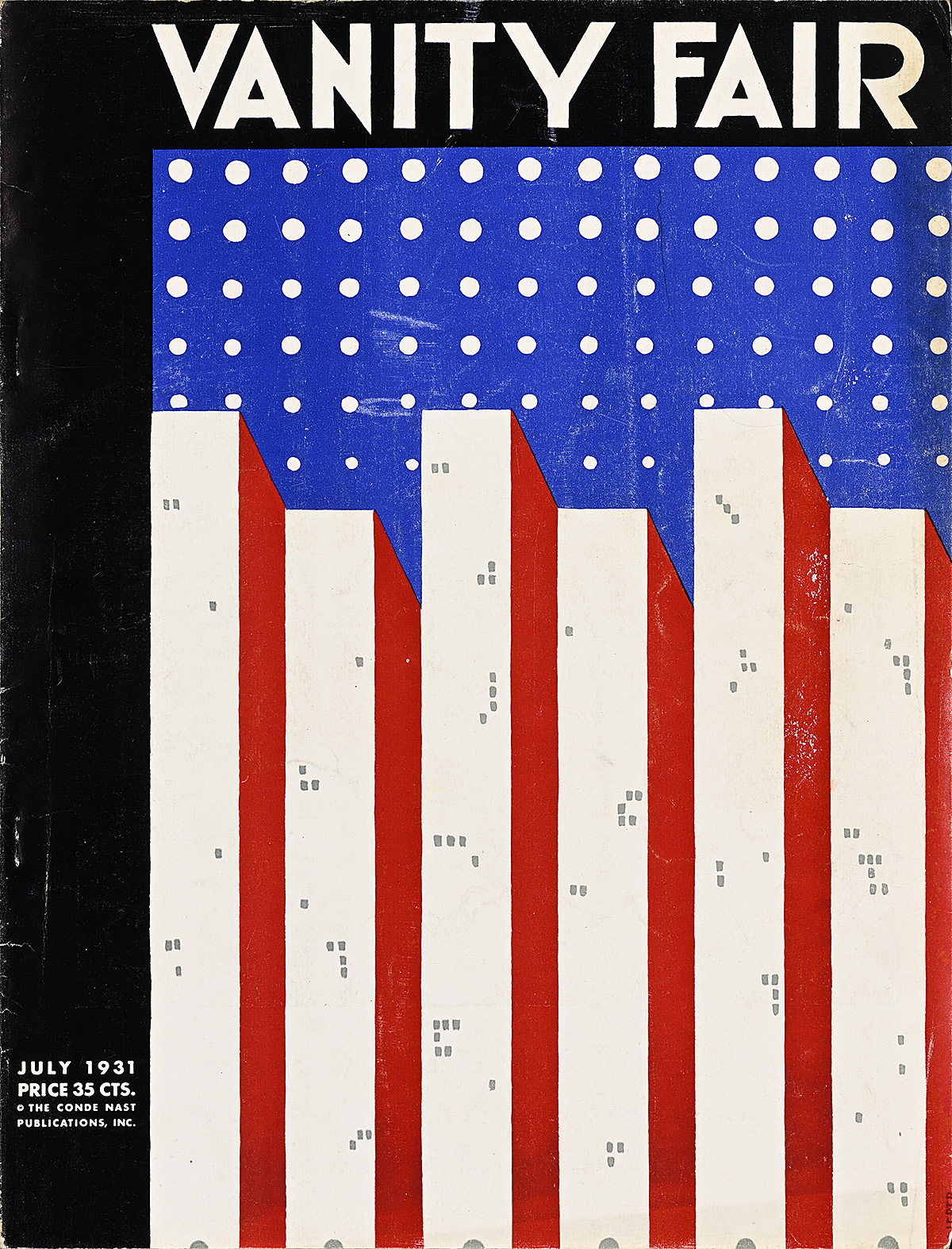
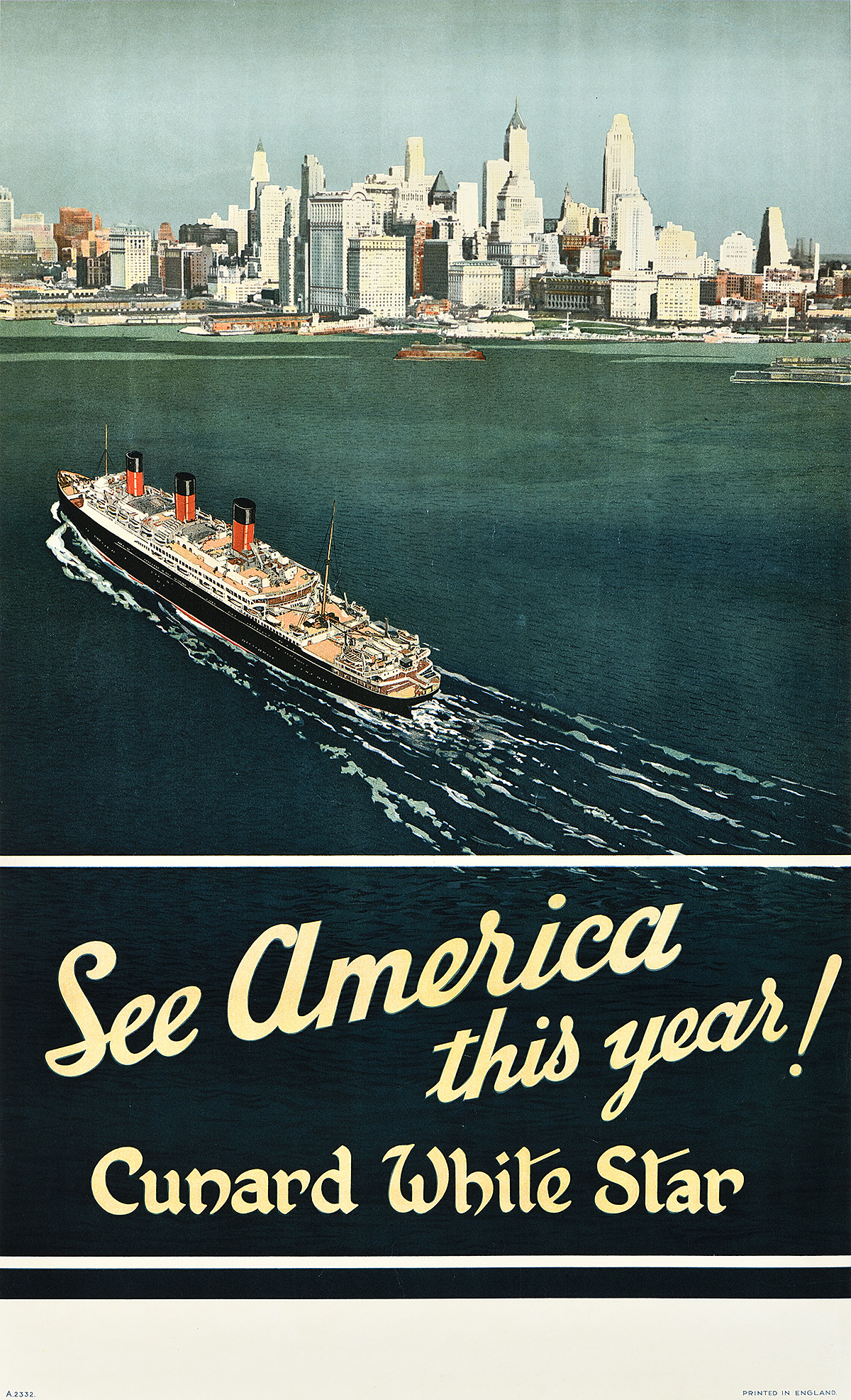
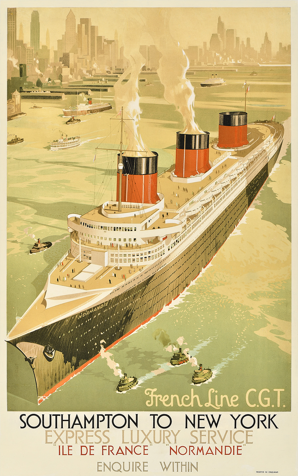
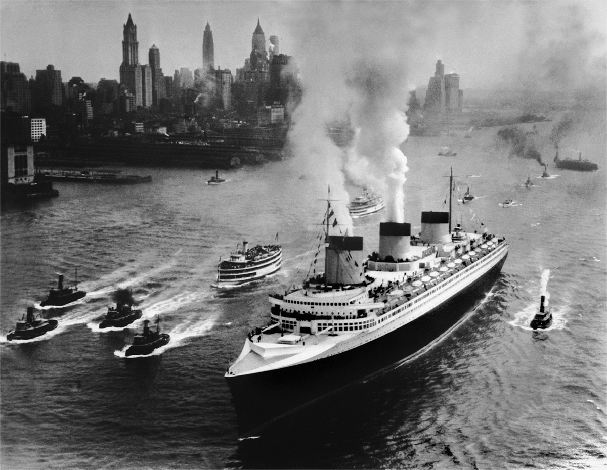
Wonder City of the World: New York City Travel Posters

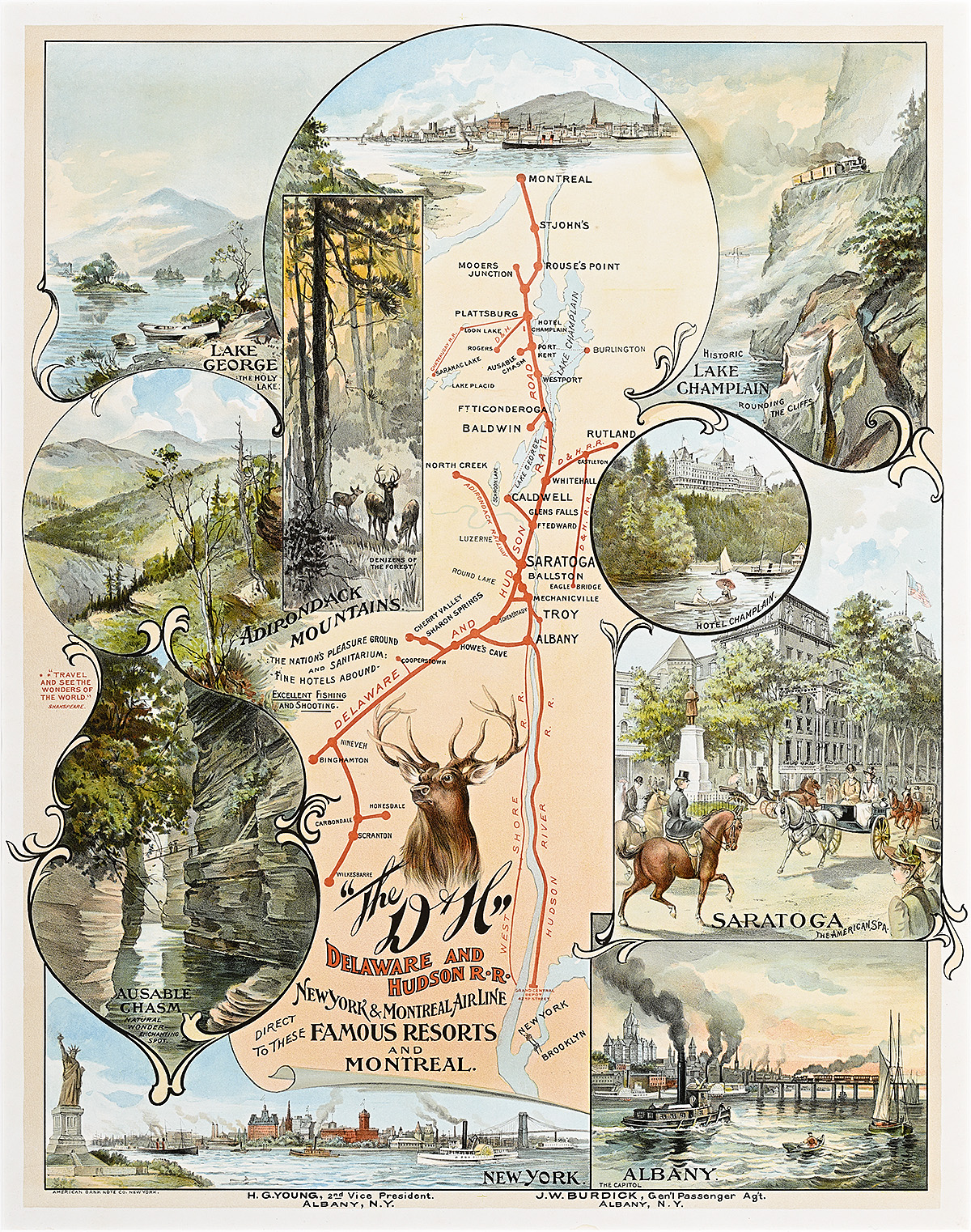
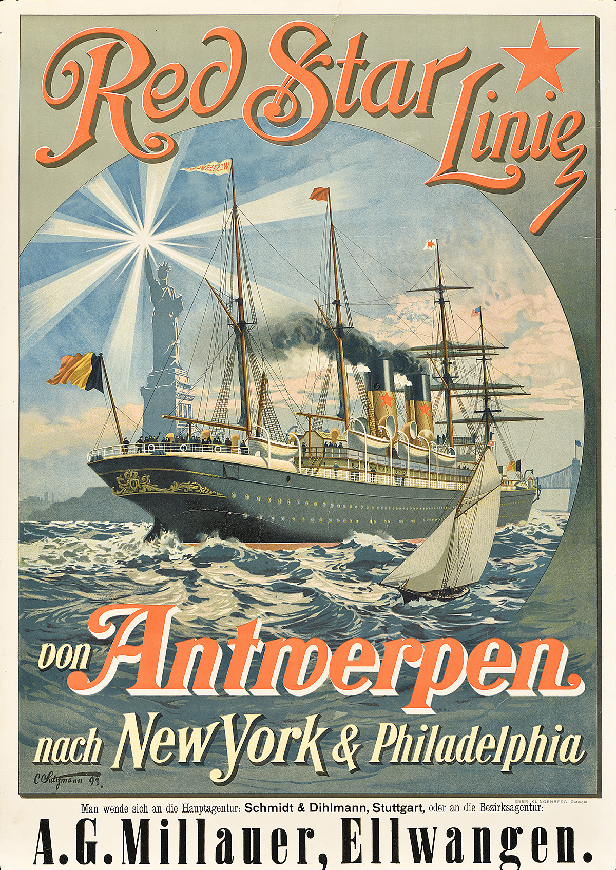
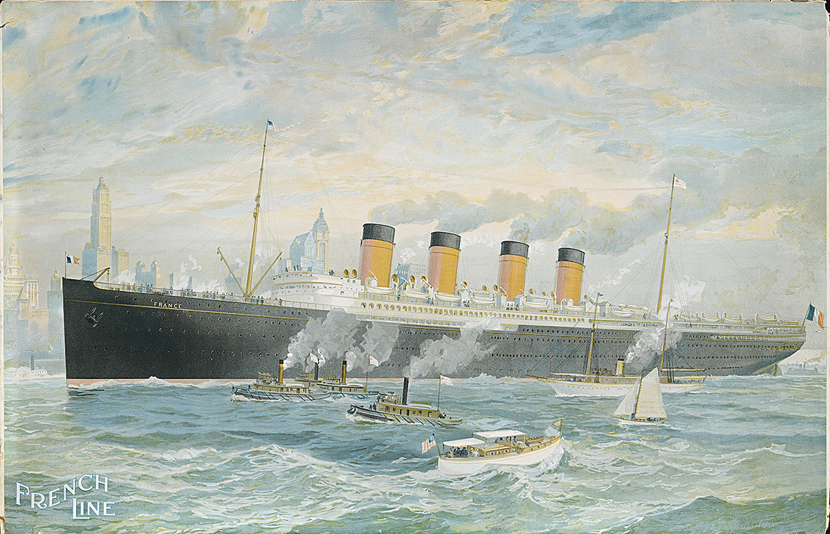
New York wasn’t always a “Wonder City.” For centuries, the area at the mouth of what is now New York Harbor was home to the Lenape people. In 1524, the first European explorer, Giovanni da Verrazzano, sailed into what is now New York Bay, and in 1609, almost a century later, Henry Hudson’s exploration on behalf of the Dutch East India Company helped establish New Amsterdam, a Dutch-controlled settlement. With approximately 520 miles of coastline—more than Los Angeles, San Francisco, Miami, and Boston combined—New York was an important port long before it was a prominent tourist destination. Its natural, deep-water harbor and protected landings made it a desirable, accessible, and safe haven for ships. The opening of the Erie Canal in 1825 connected the Hudson River to the Great Lakes, giving merchants access to the interior of the country and making New York Harbor even more commercially attractive. By the time the Civil War began in 1861, New York was one of the three biggest ports in the world.

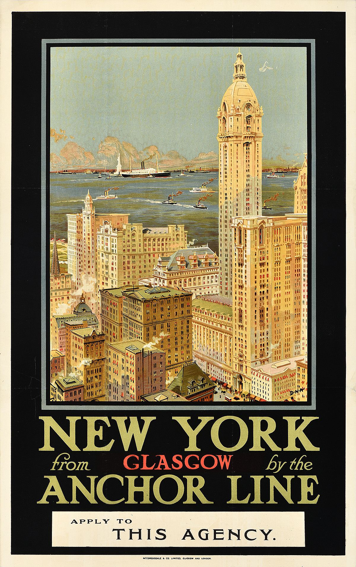
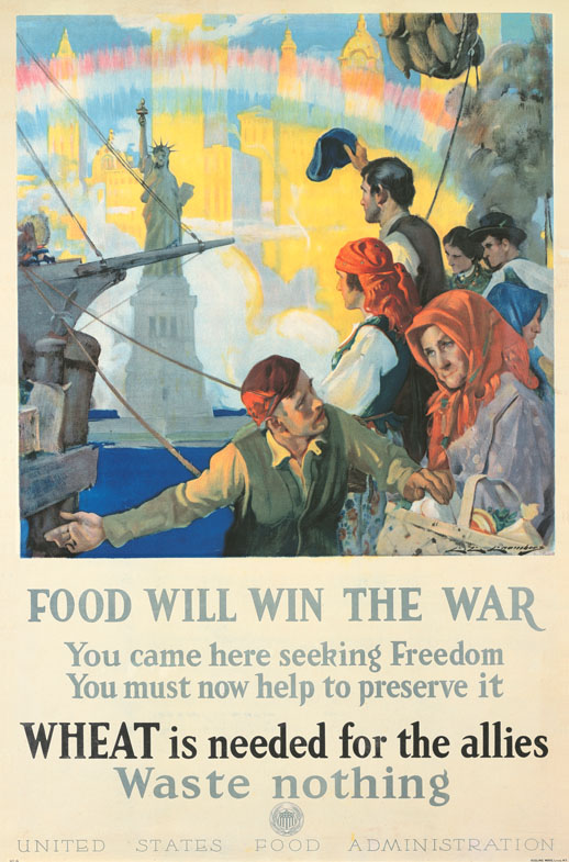
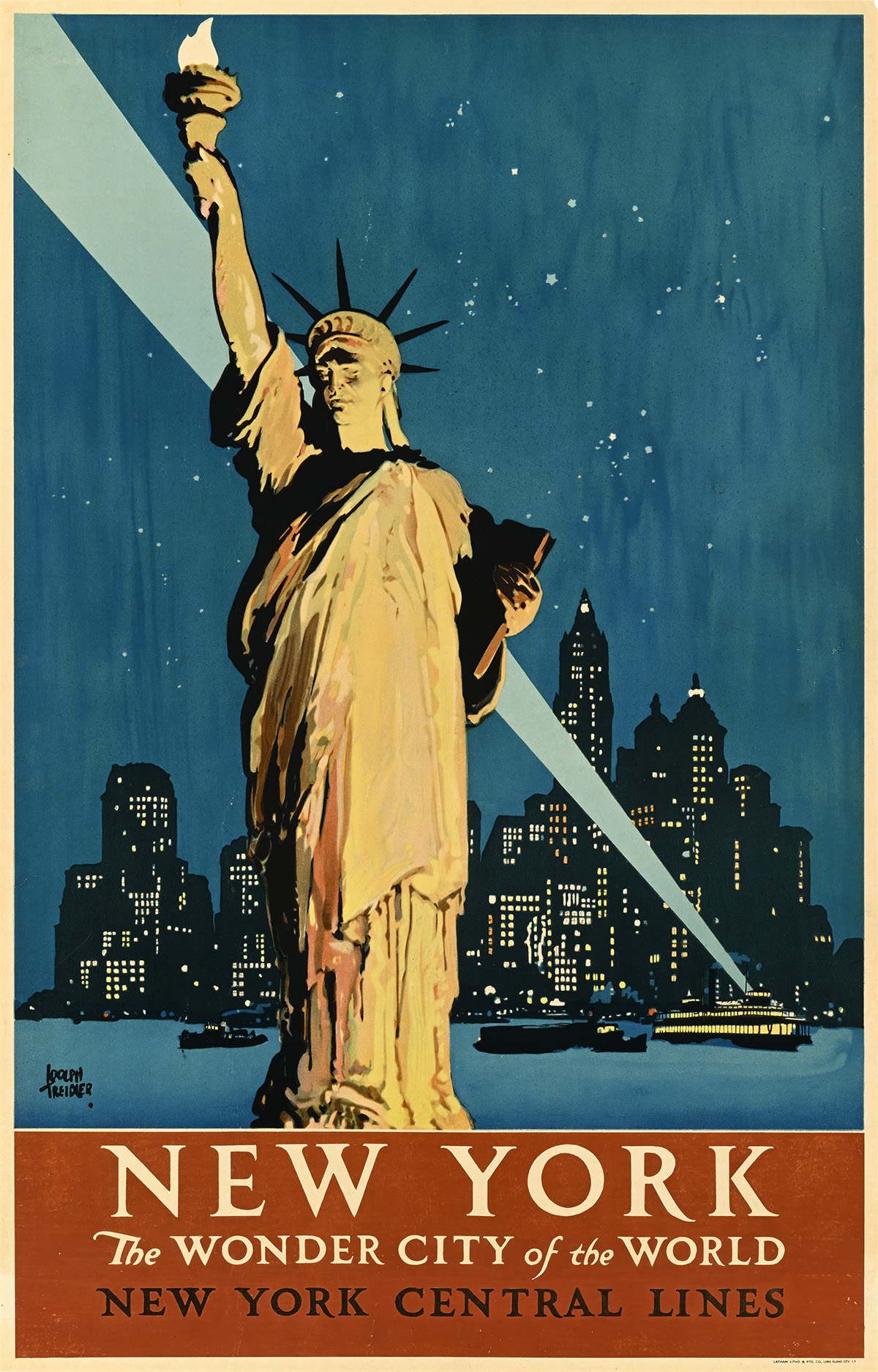
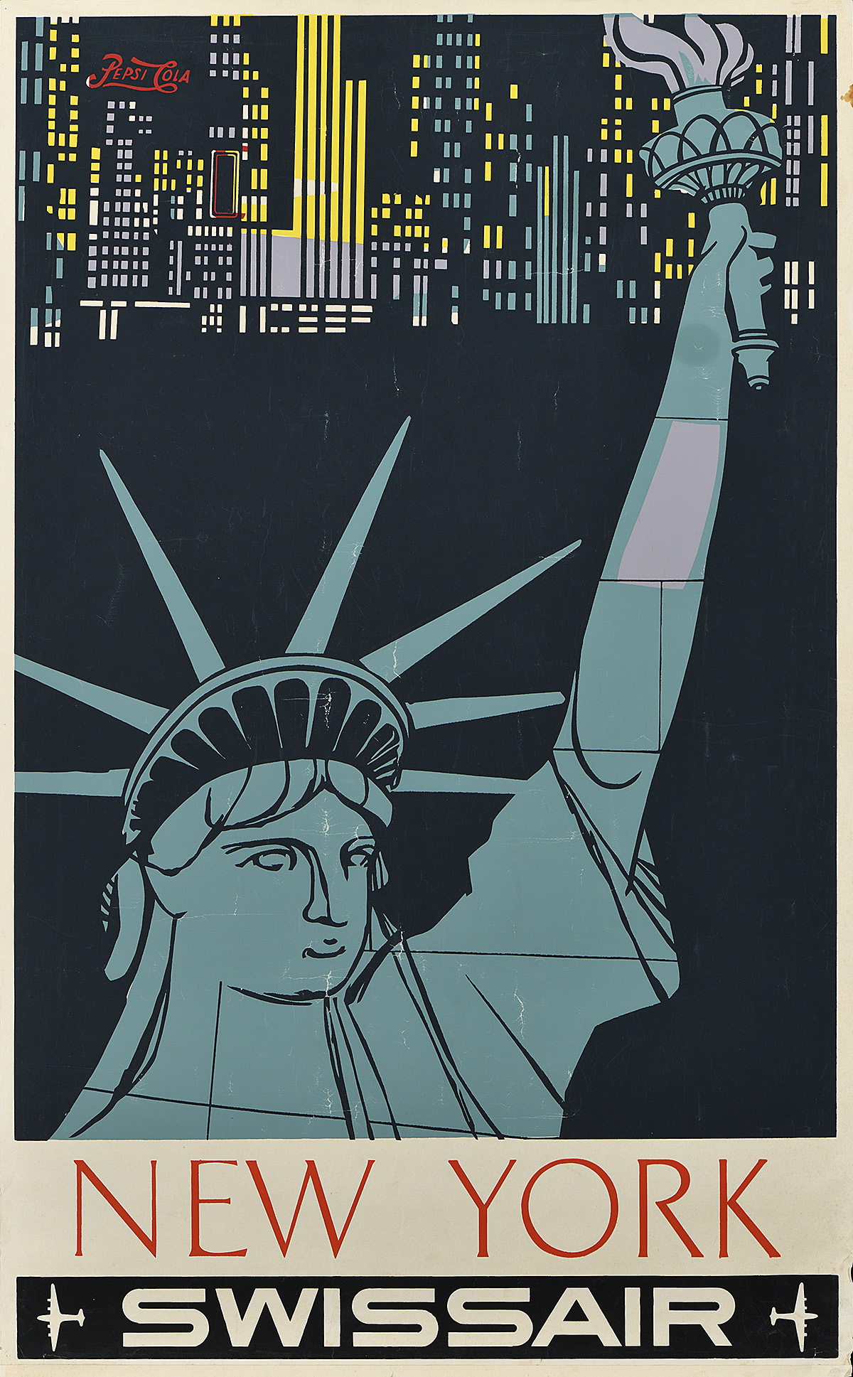
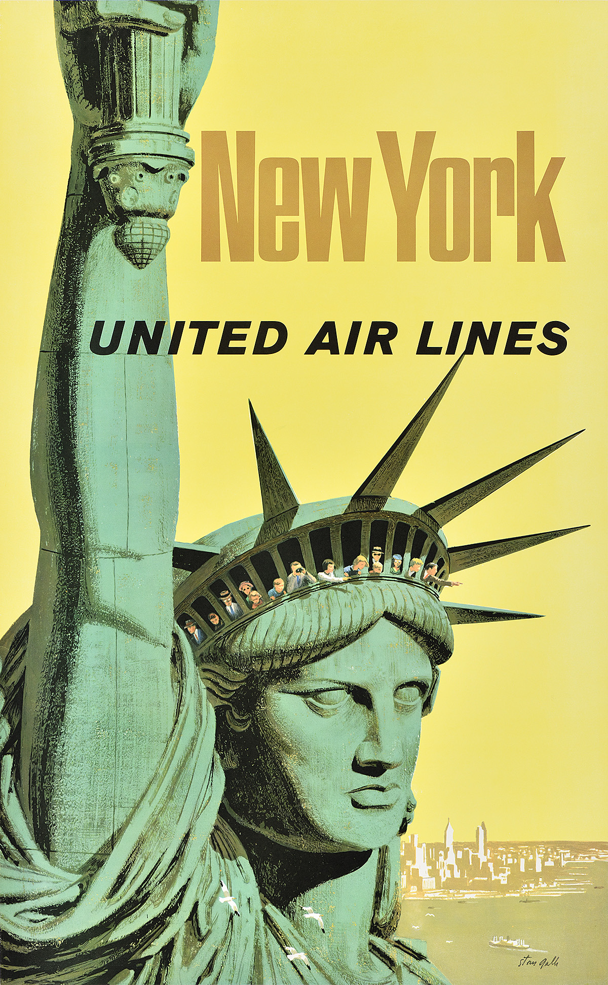
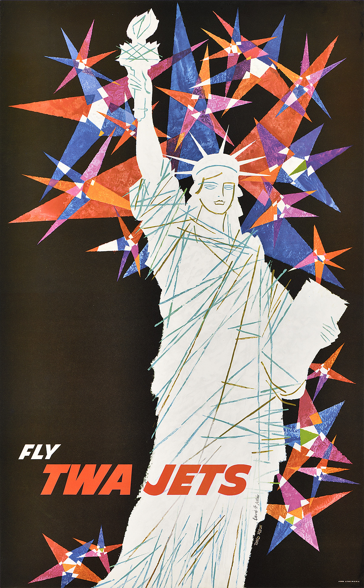
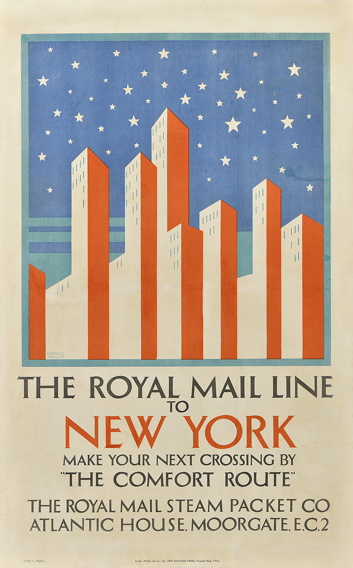
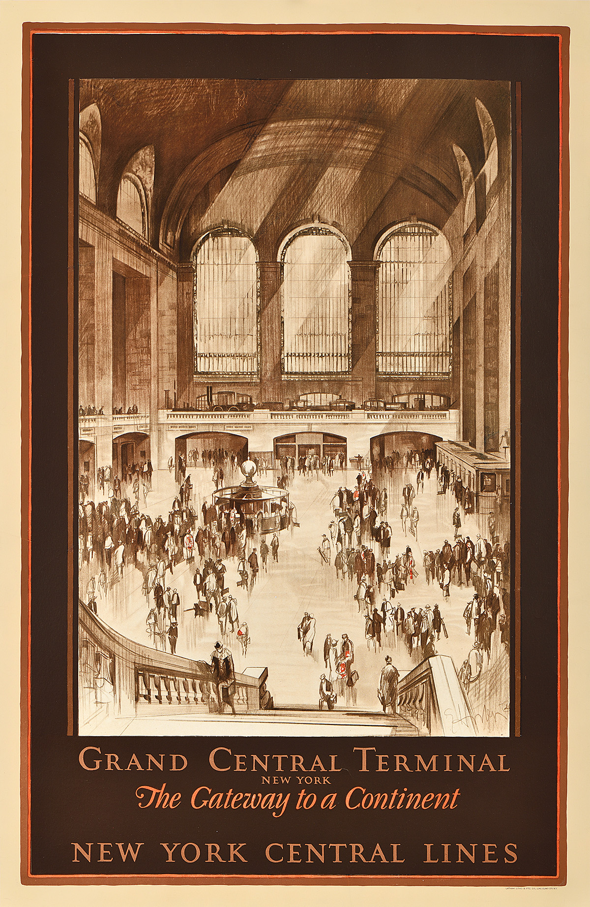
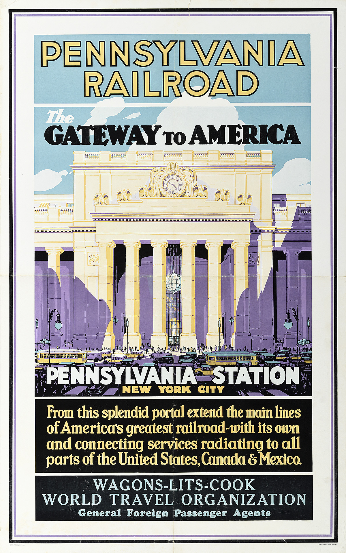
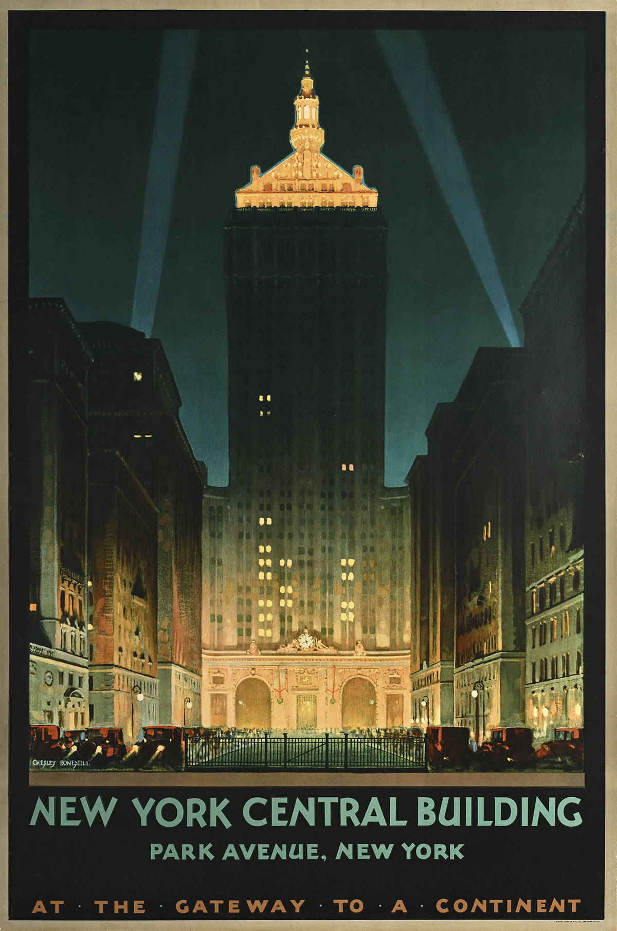
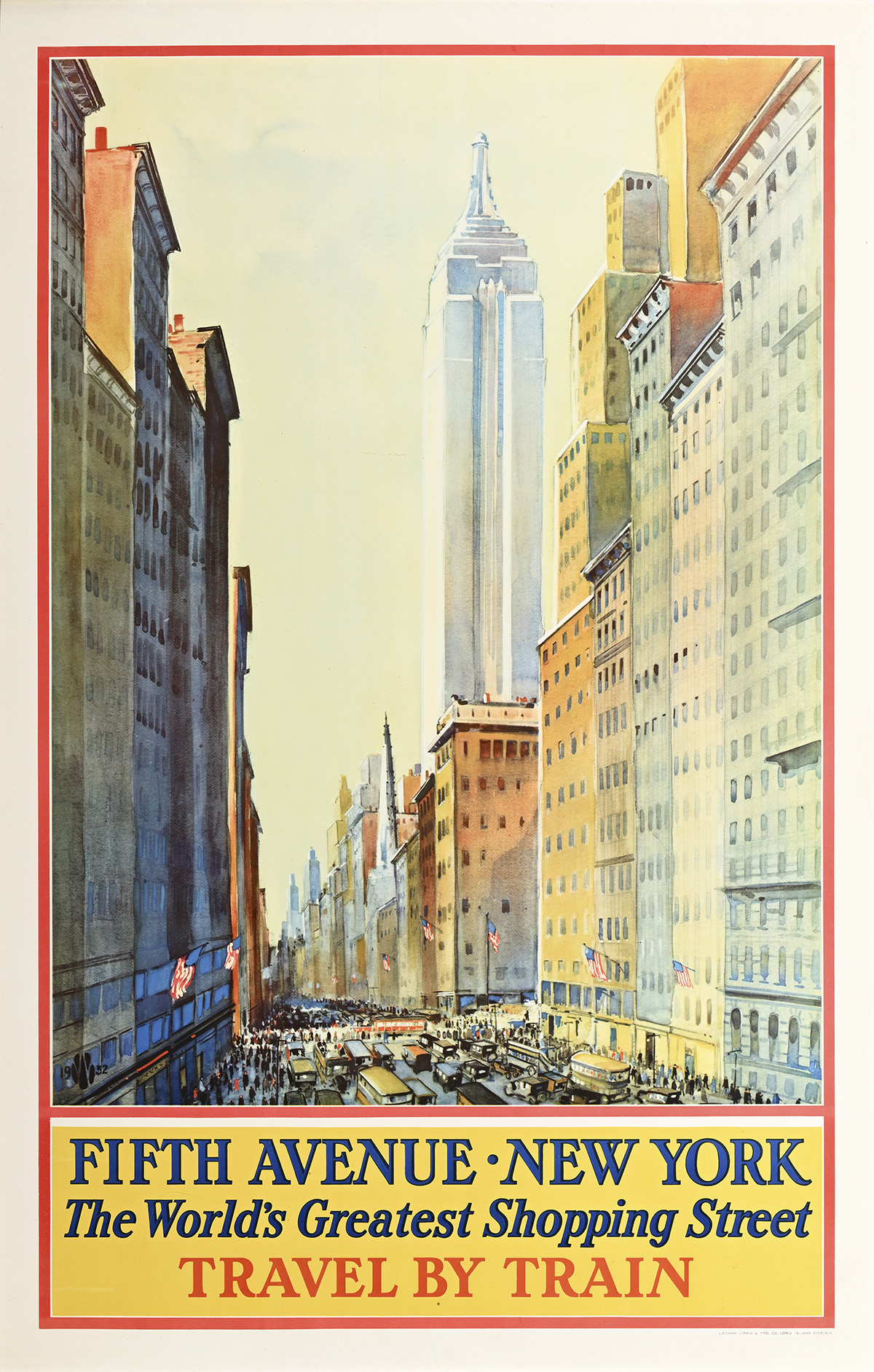
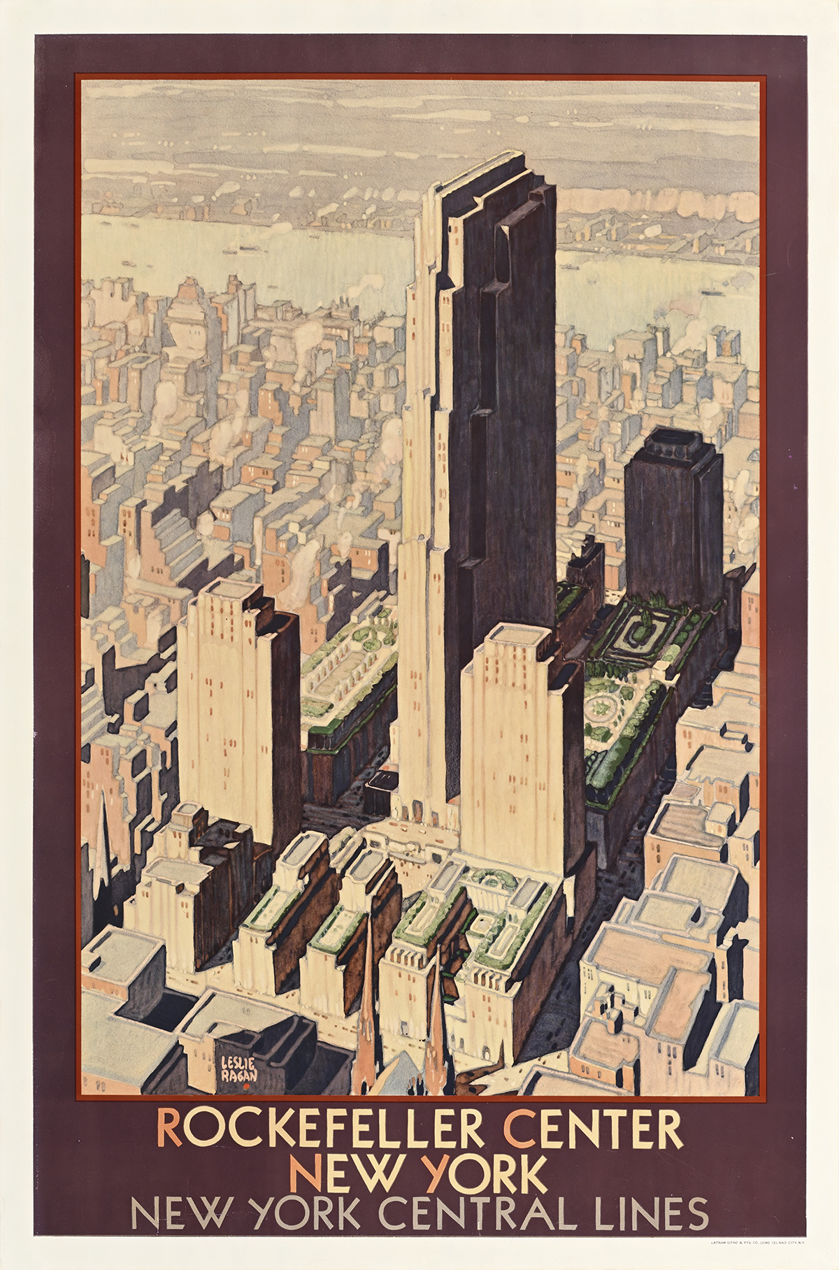
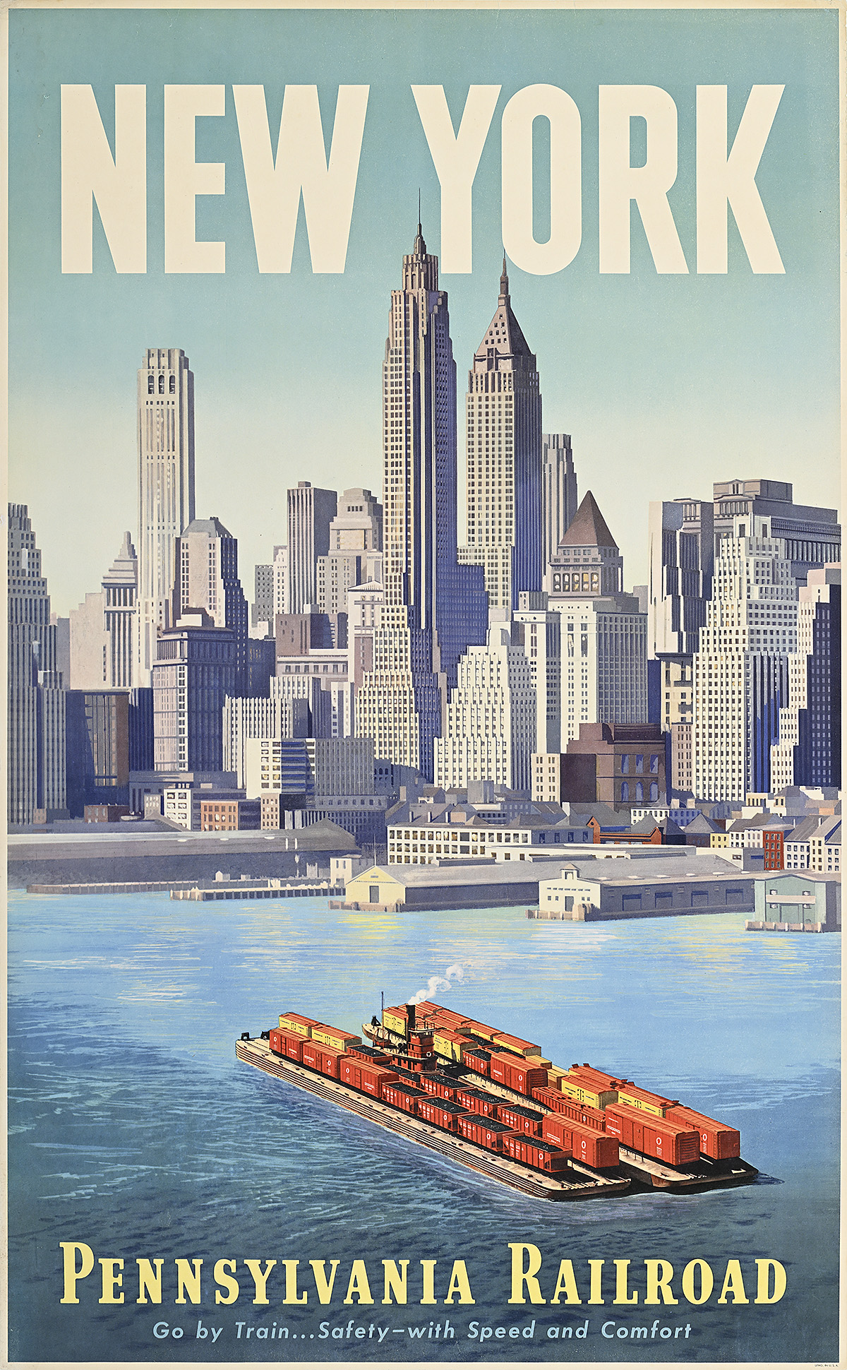
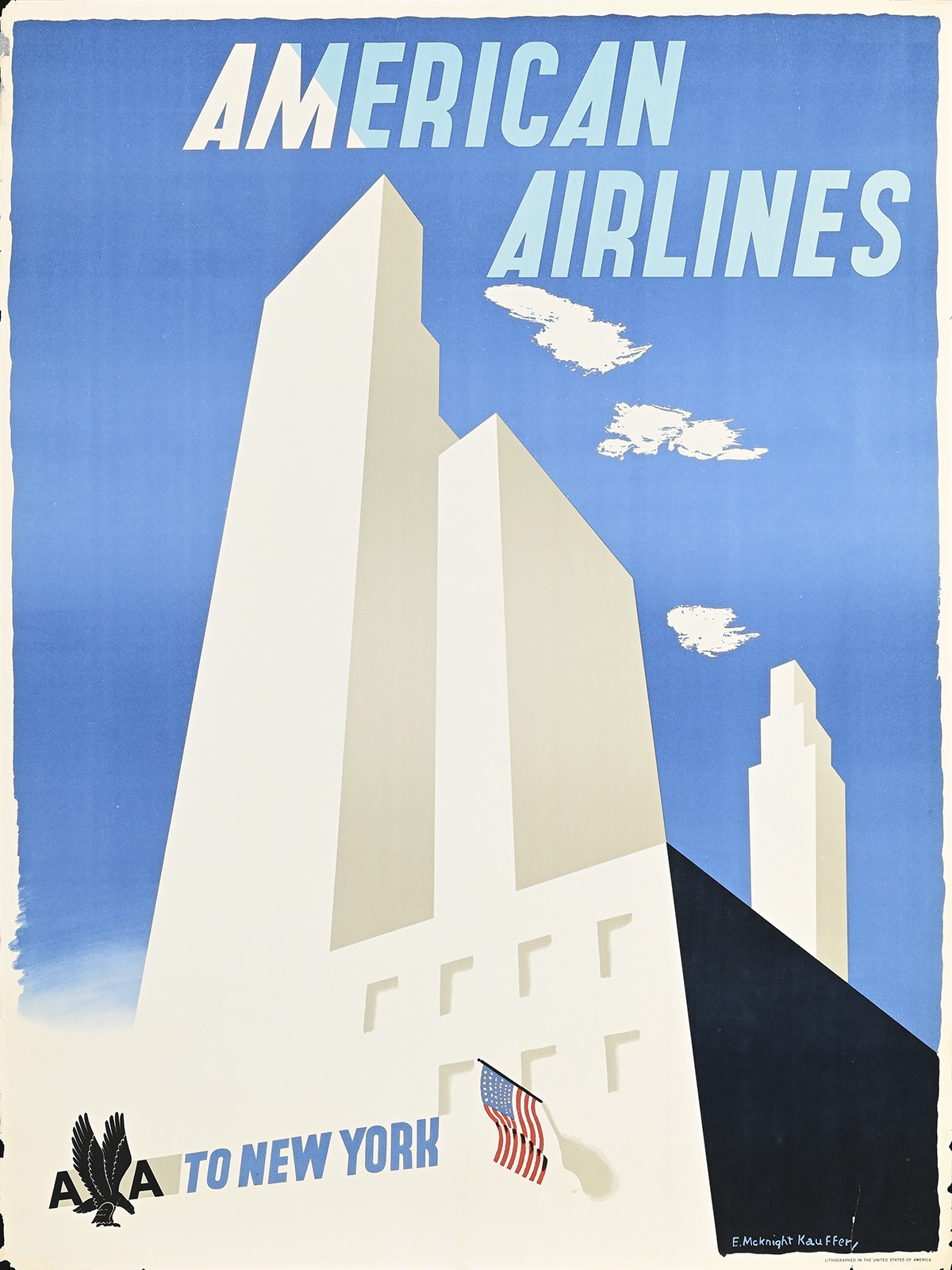
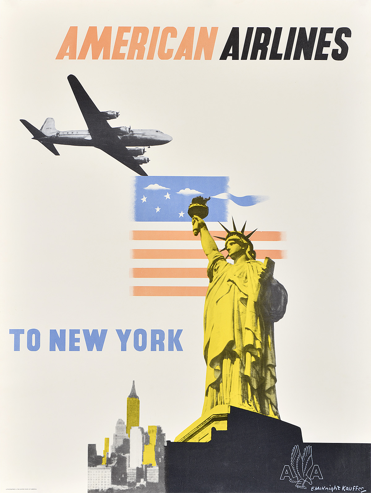
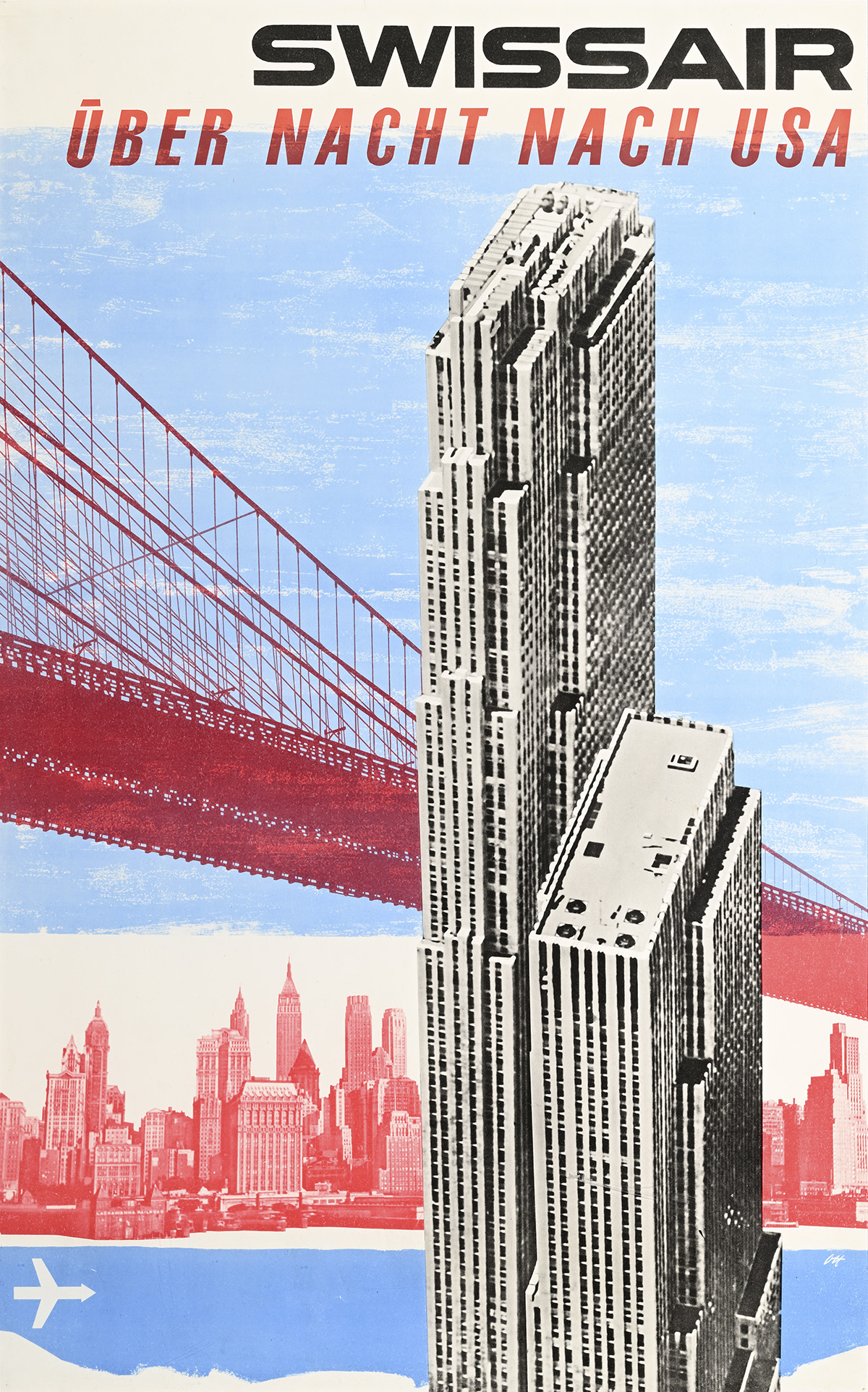
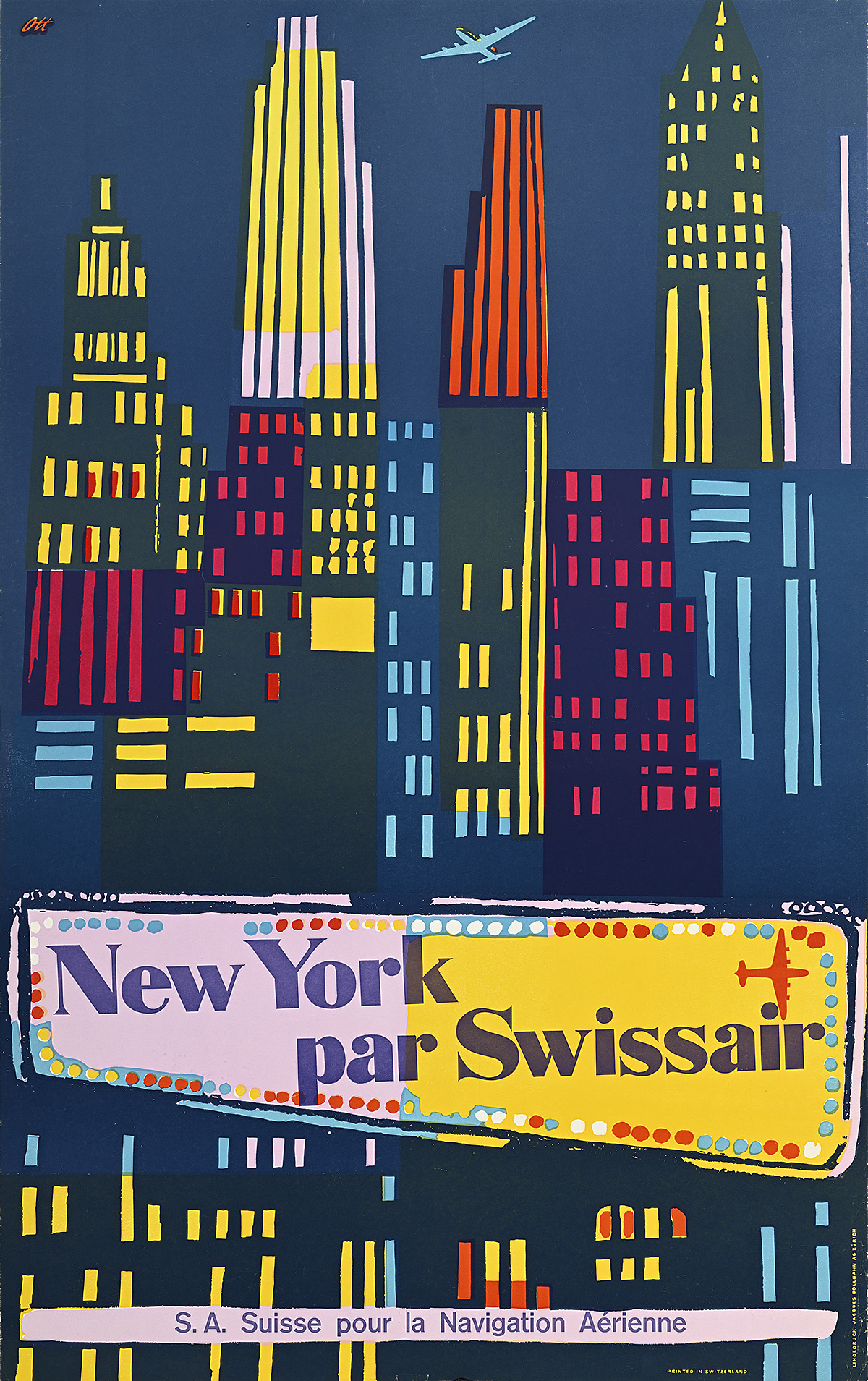
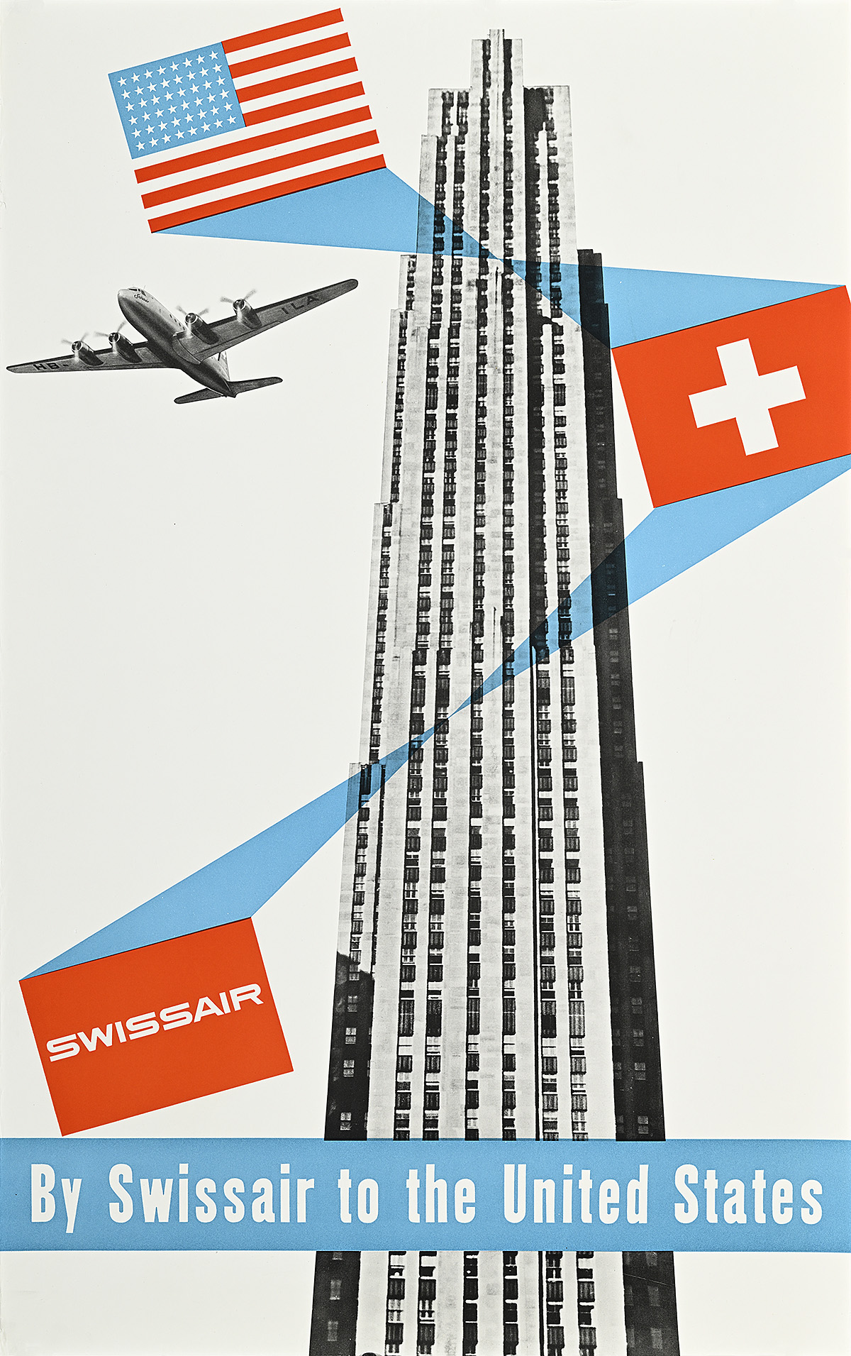
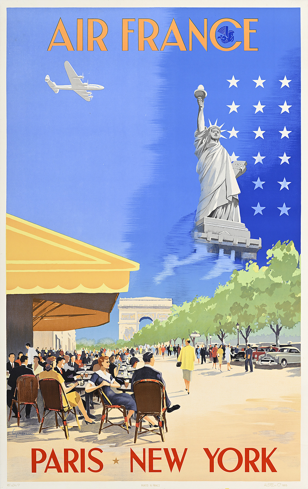
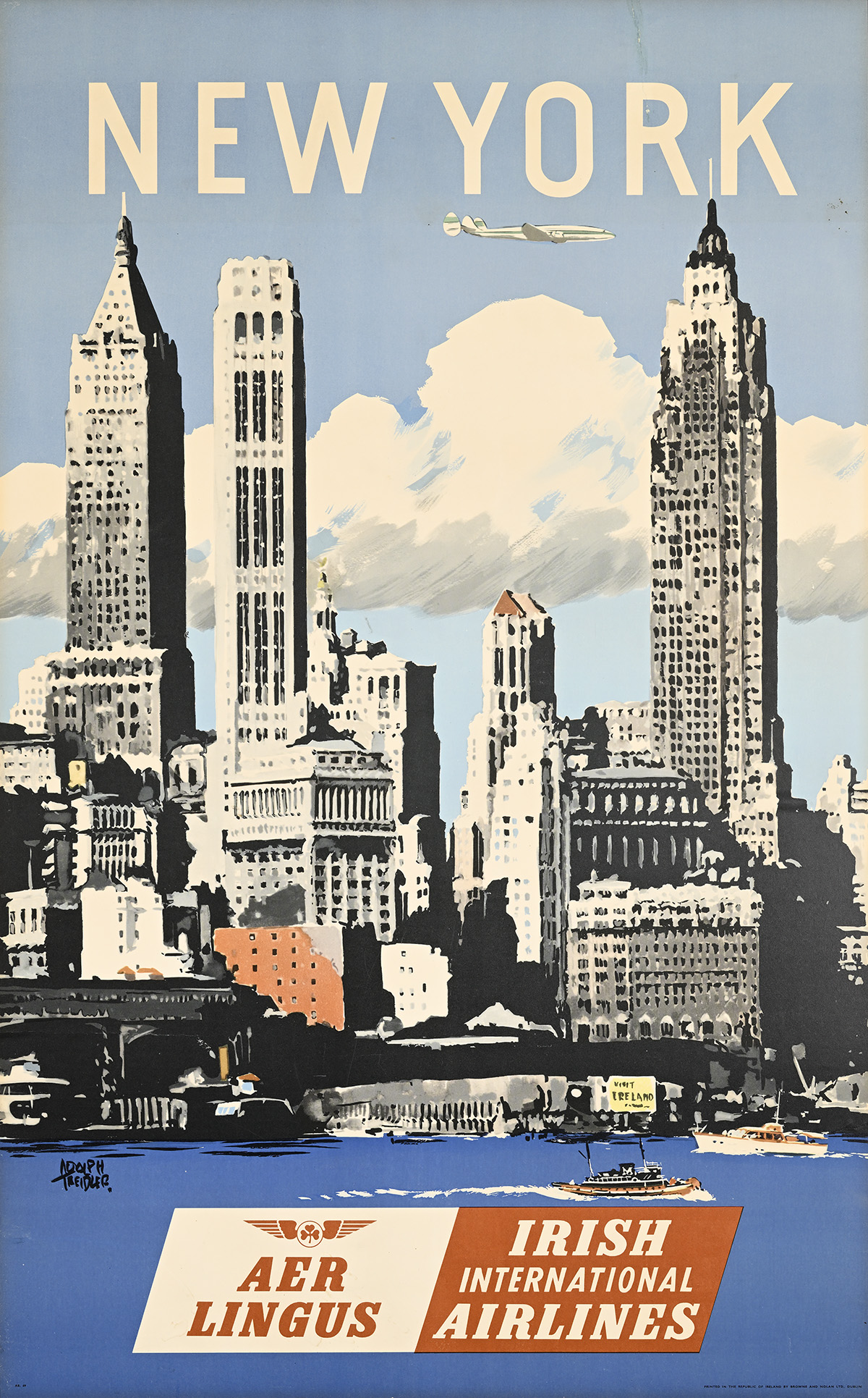
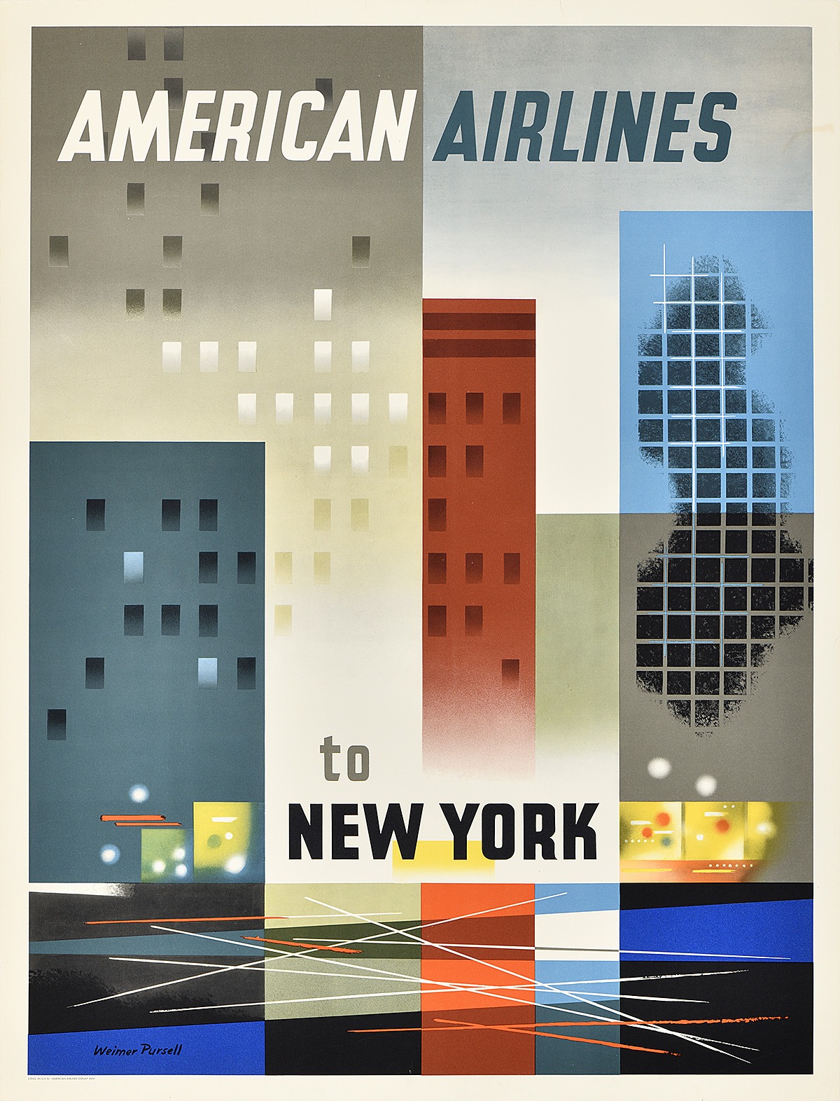
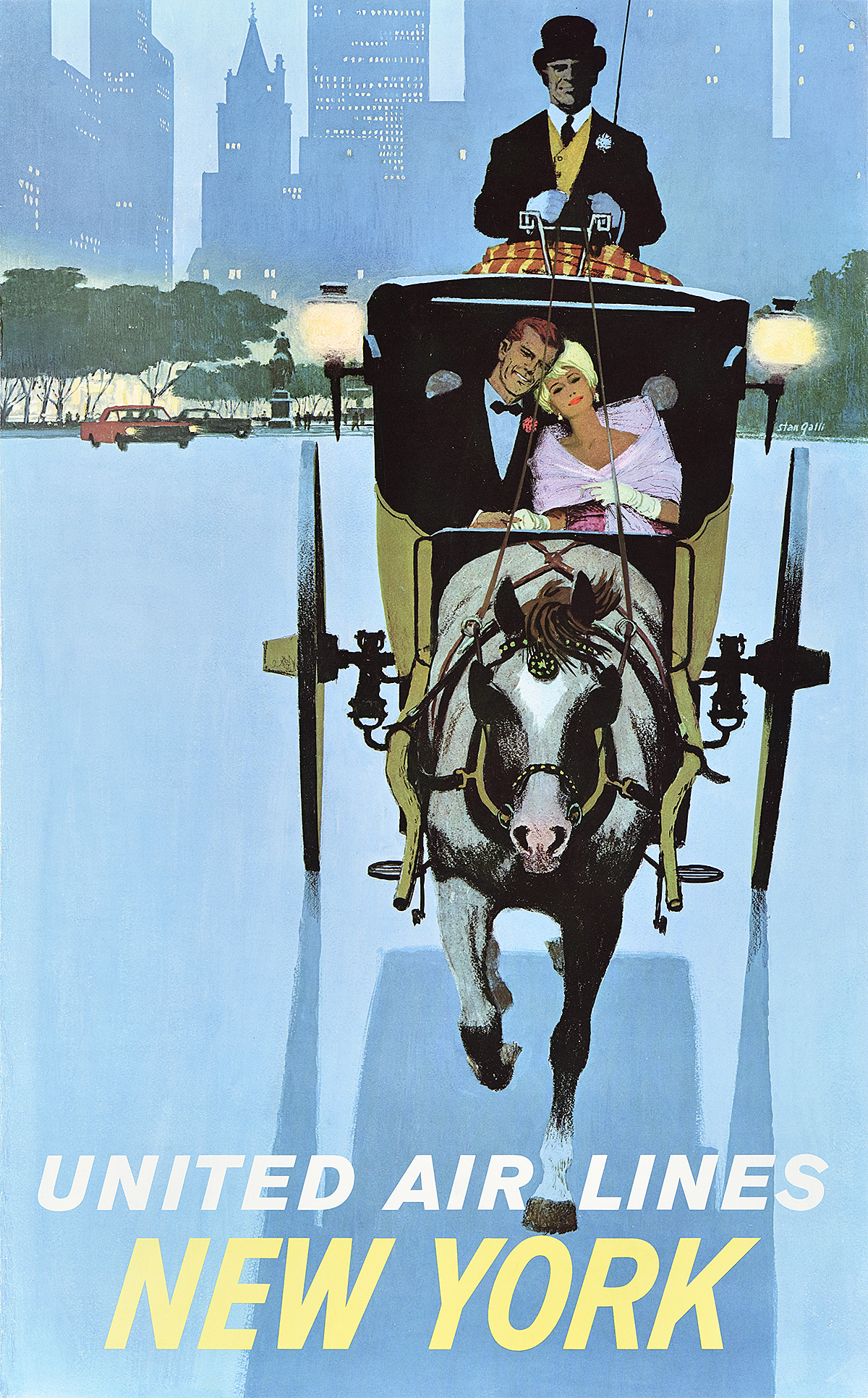
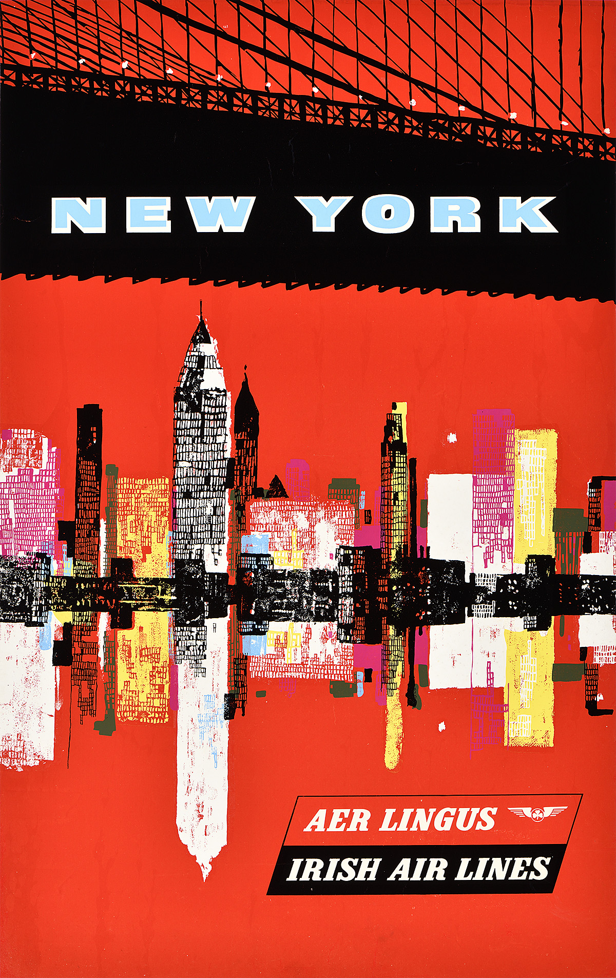
As the city grew, it became a hub for rail transport and sea travel; a point of entry for immigrants, merchandise, and dreams; and the commercial capital of the nation. It soon evolved into a bustling, thriving urban center. The opening of the Brooklyn Bridge in 1883 and the dedication of the Statue of Liberty in 1886 introduced two impressive landmarks that began to shape the city’s modern visual identity. When, in 1898, greater New York was consolidated into a single city consisting of five boroughs, it also emerged as one of the world’s largest urban areas, second only to London in terms of population. Further, from the 1870s, a series of skyscrapers slowly began to populate the skyline; the process escalated in the 1890s—when the term began to be commonly used—establishing the densest concentration of tall buildings in the world at the time. From the 1870s, too, a system of elevated trains ran throughout the city; these were fully electrified in the early 1900s, and, by 1904, a subway was running underground. It was hardly an exaggeration to call this buzzing, dramatic, unique place a “Wonder City.”

The phrase, the brainchild of marketers, had appeared in newspaper and magazine advertisements and articles sporadically through the final decades of the 19th century. A number of cities around the country and in Europe also used it in their promotions at that time. By 1914, the phrase had also appeared on a New York souvenir booklet. Such popular keepsakes, along with postcards and postcard books, spread images of the city and its nickname. Previous efforts by advertisers to sum up New York in a distinctive manner had been less successful; phrases like the “American Cosmopolis,” “The First City of the World,” “City of Marvels,” and “The Foremost City in the World” never really gained traction. Nonetheless, the fact that New York was truly a “Wonder City” was apparent to all. 

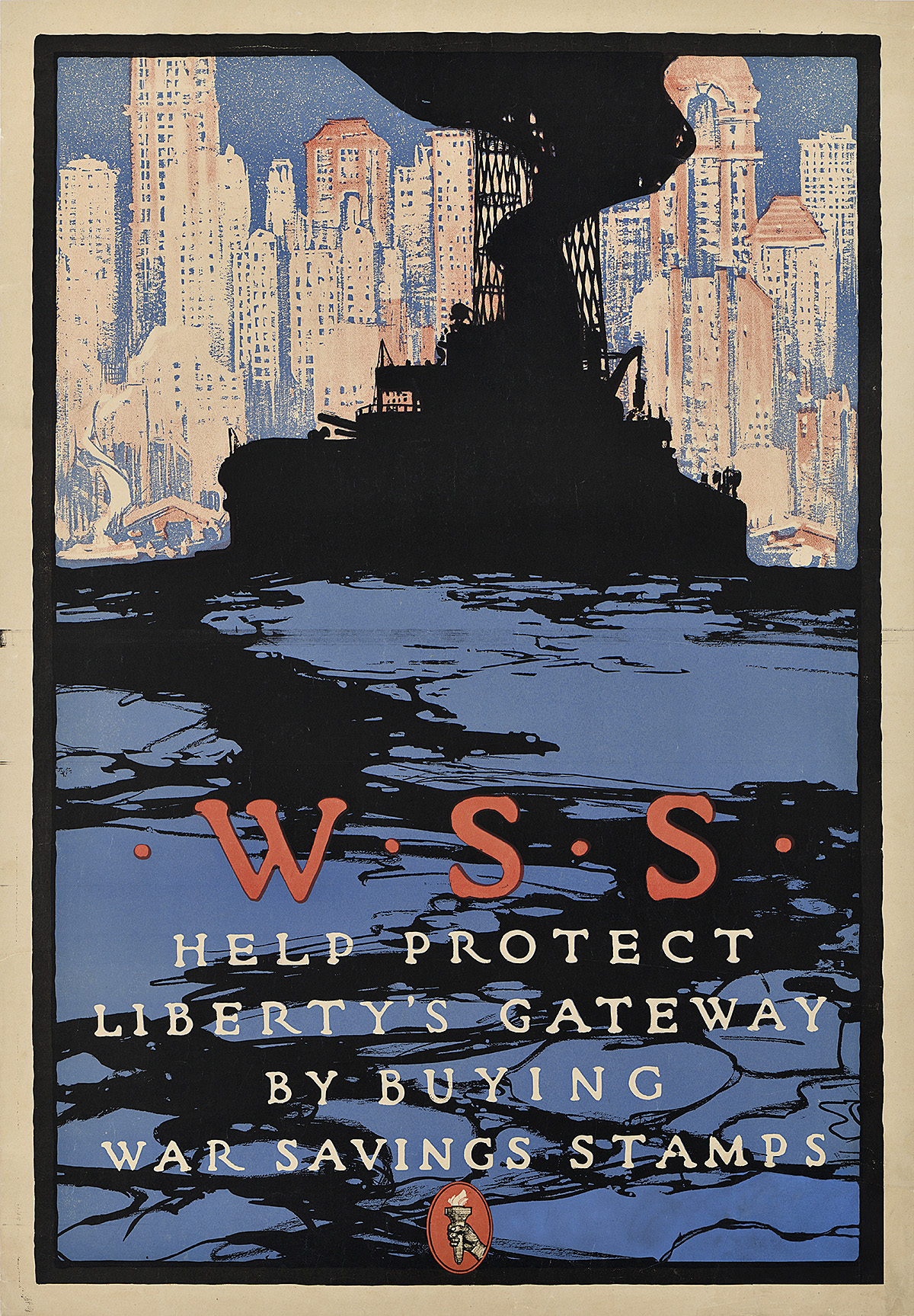
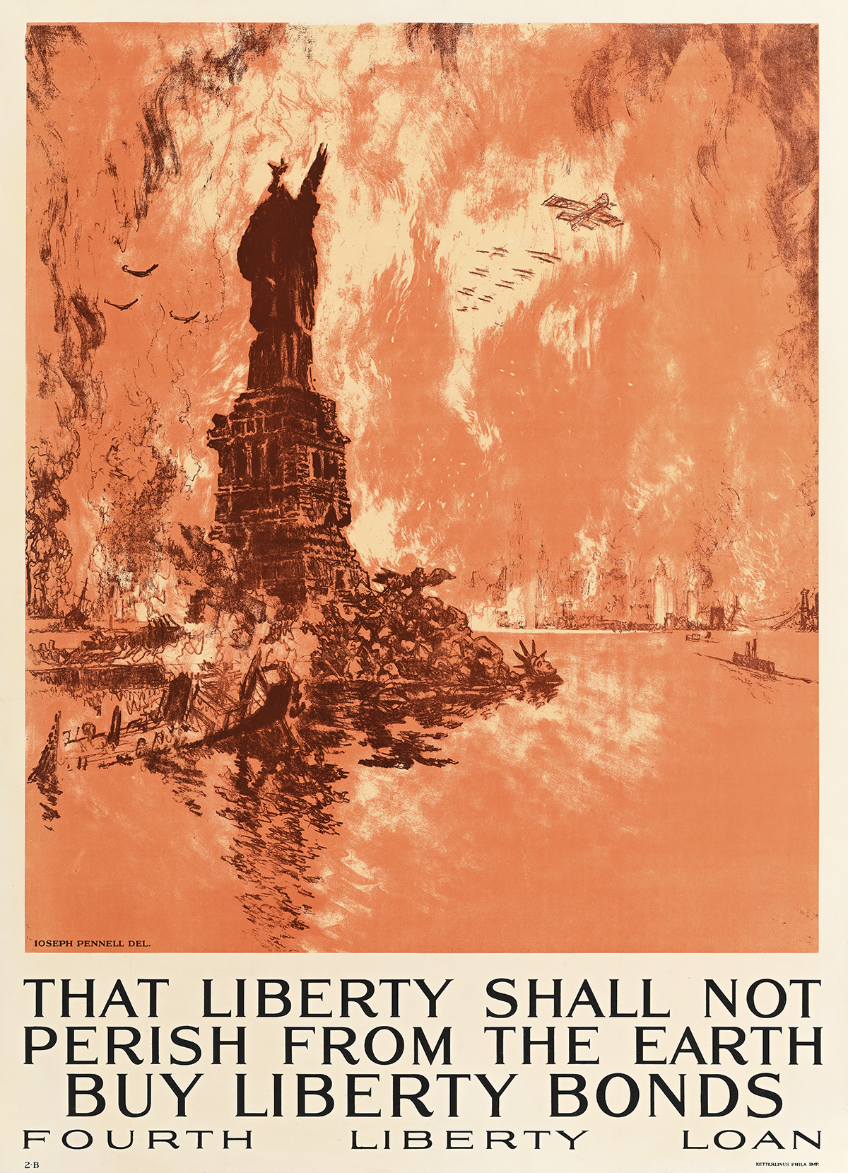
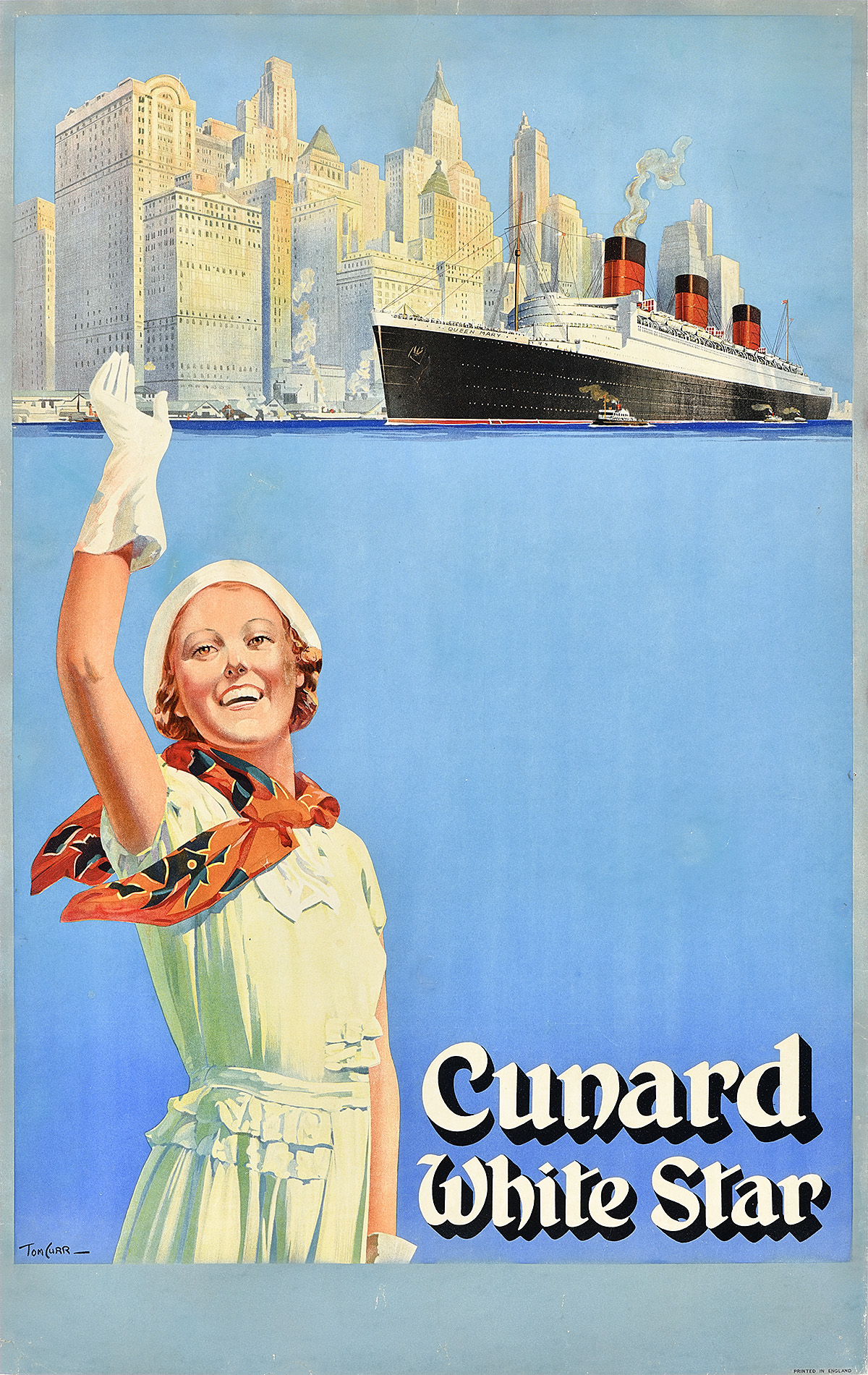
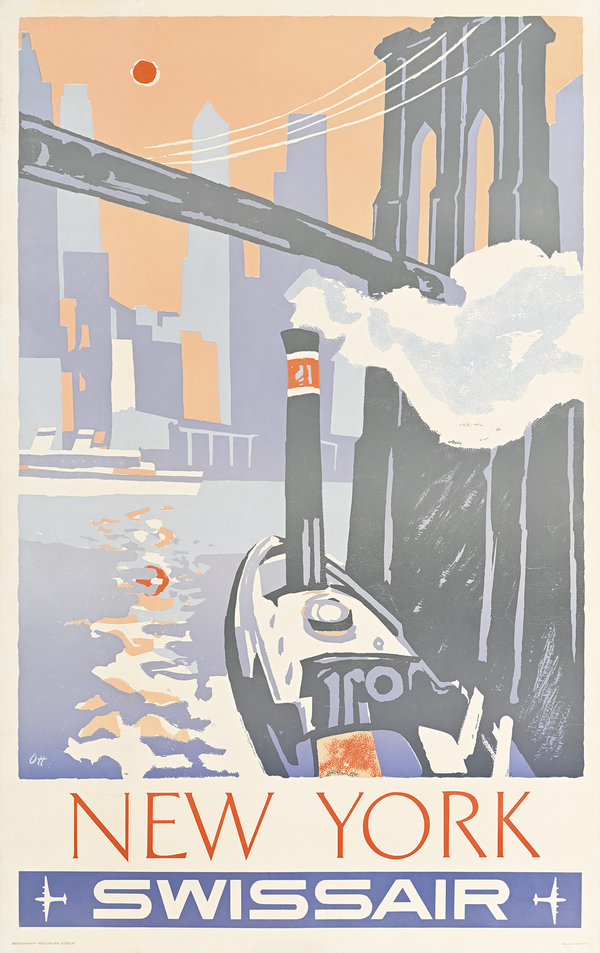
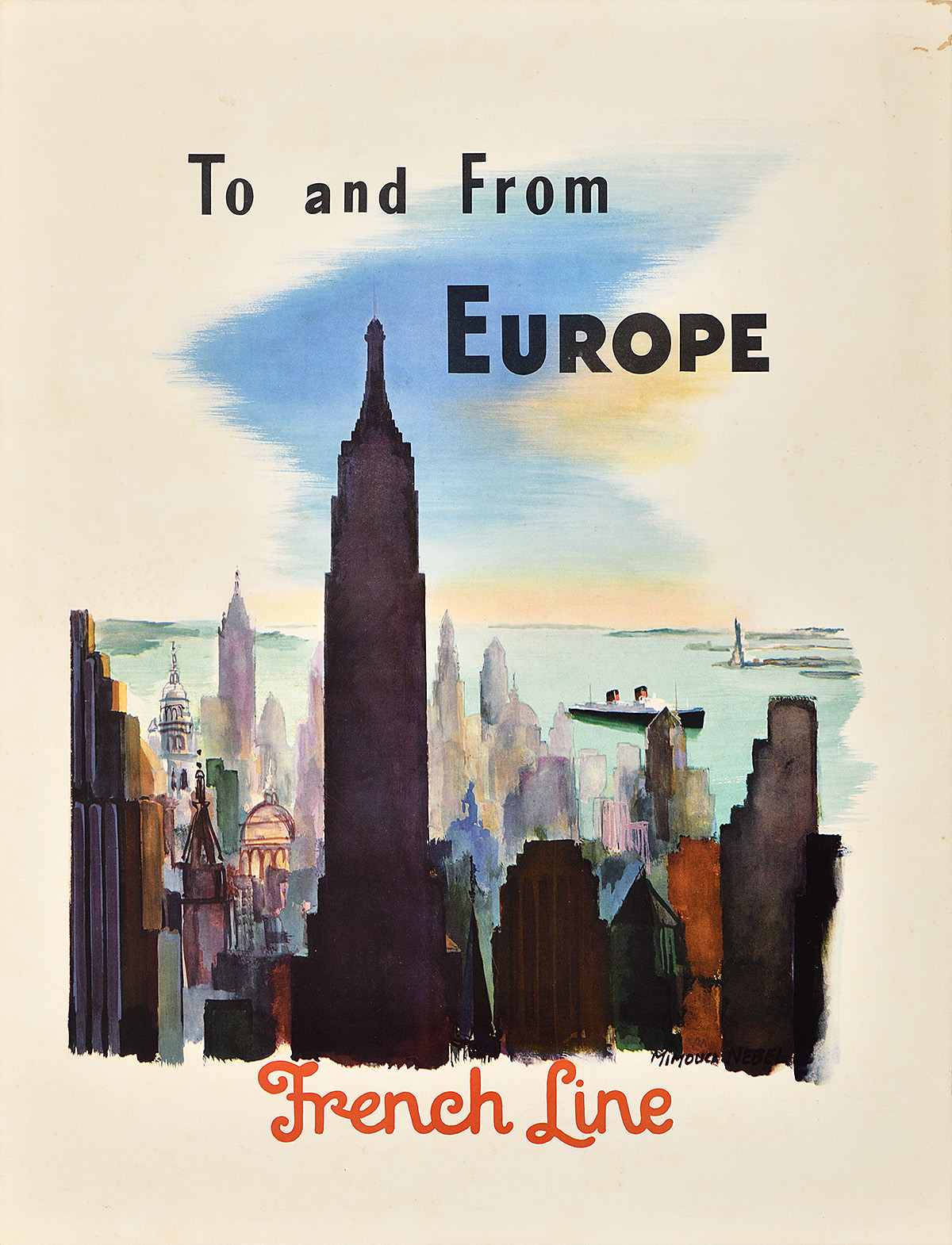
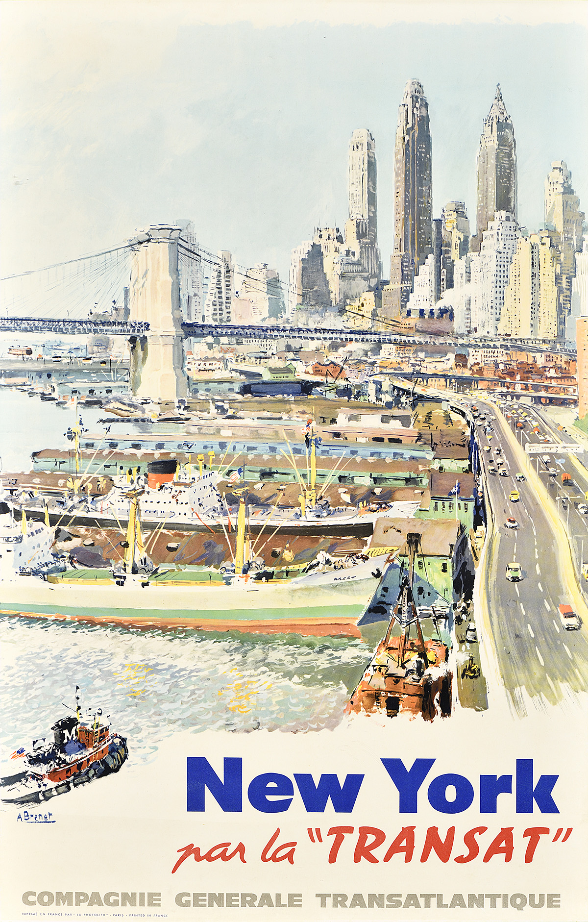
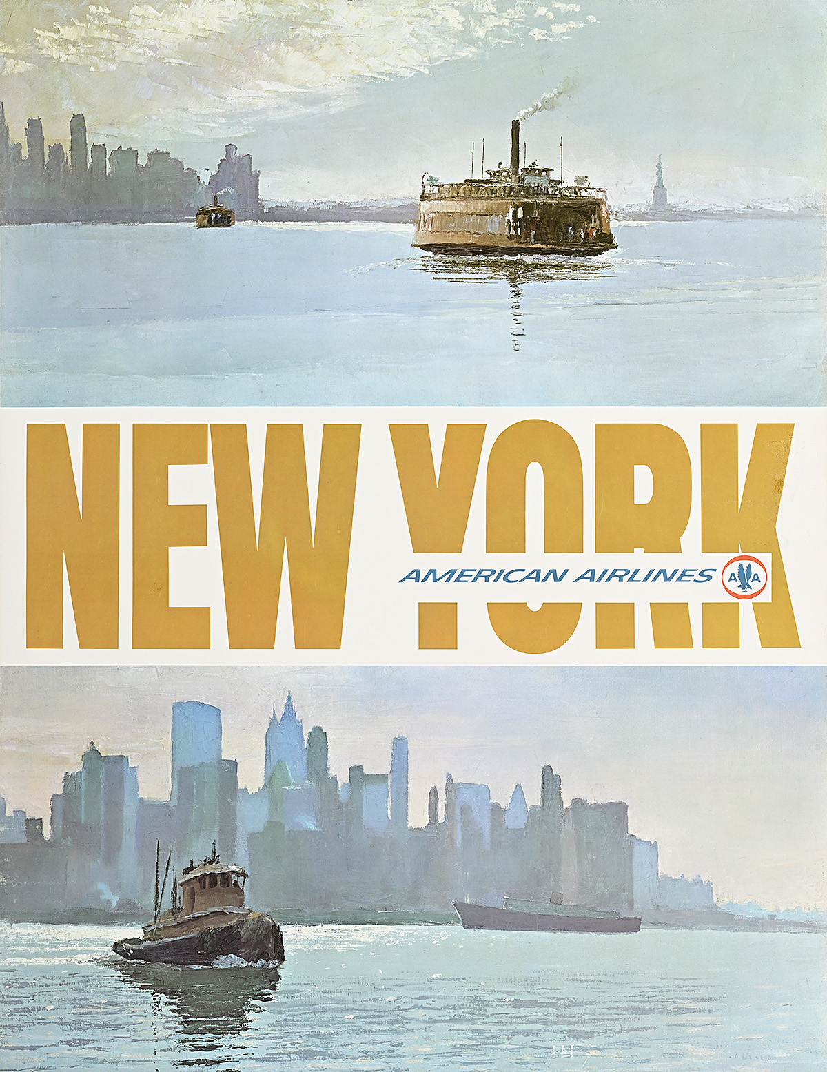
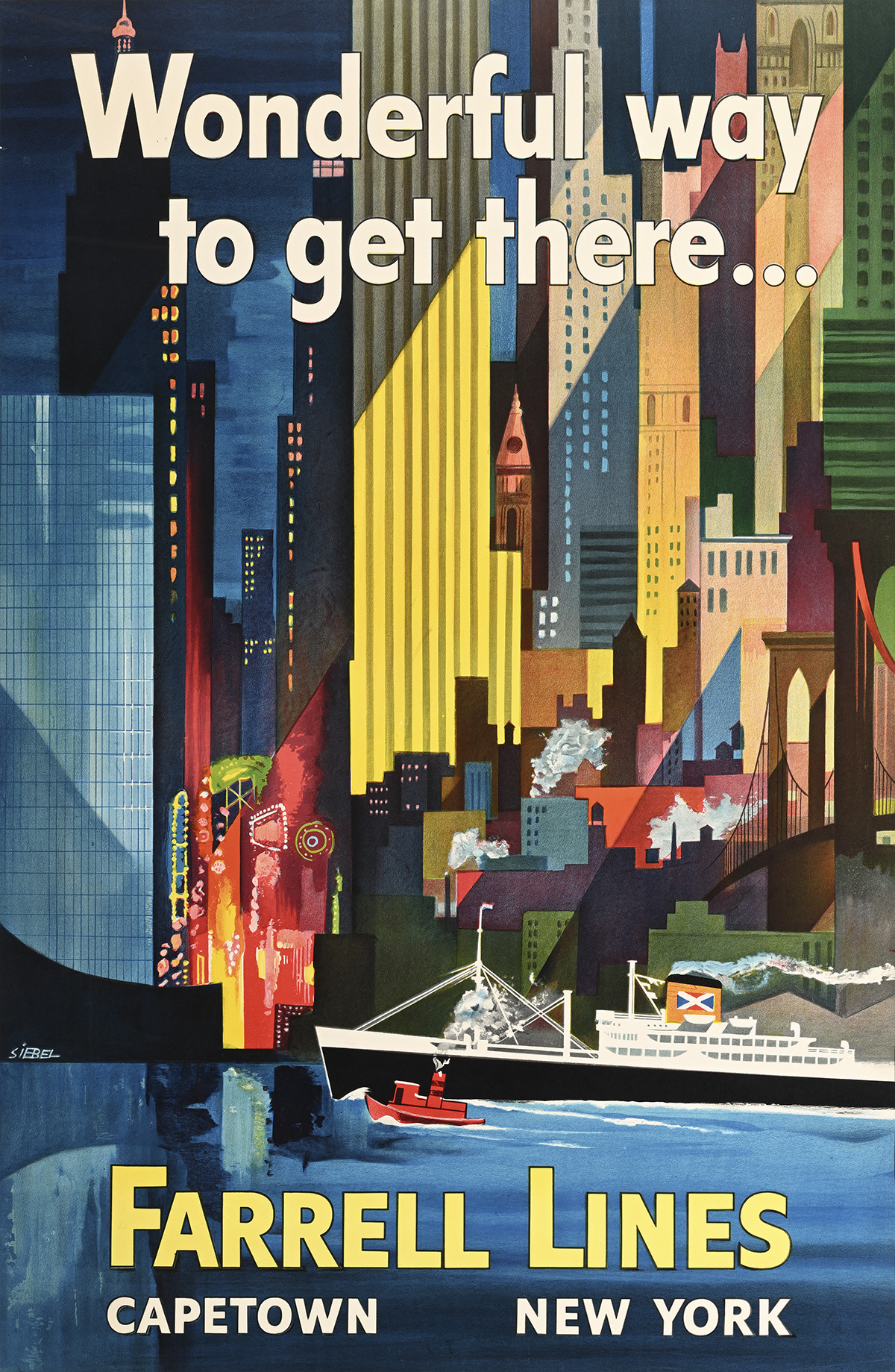
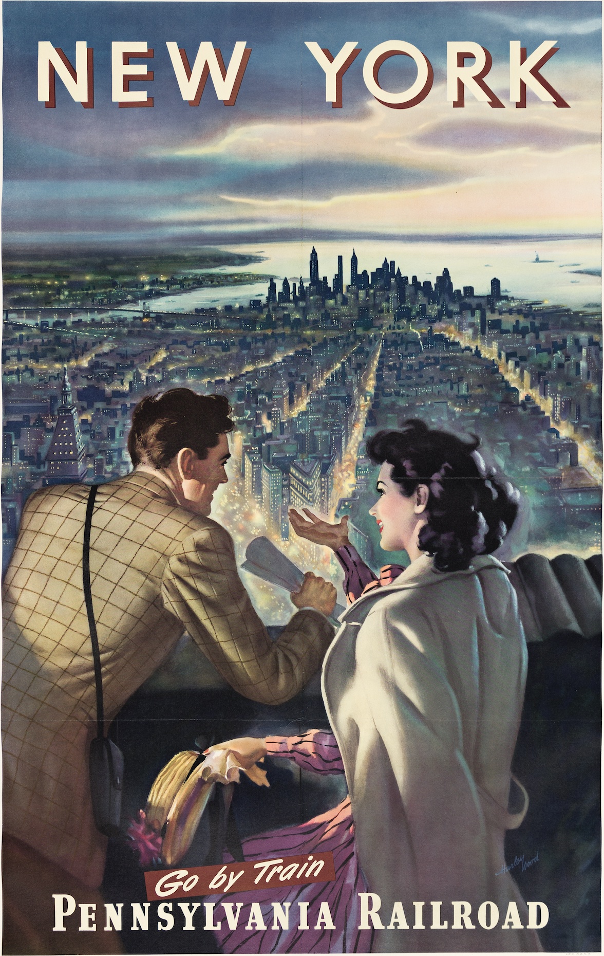
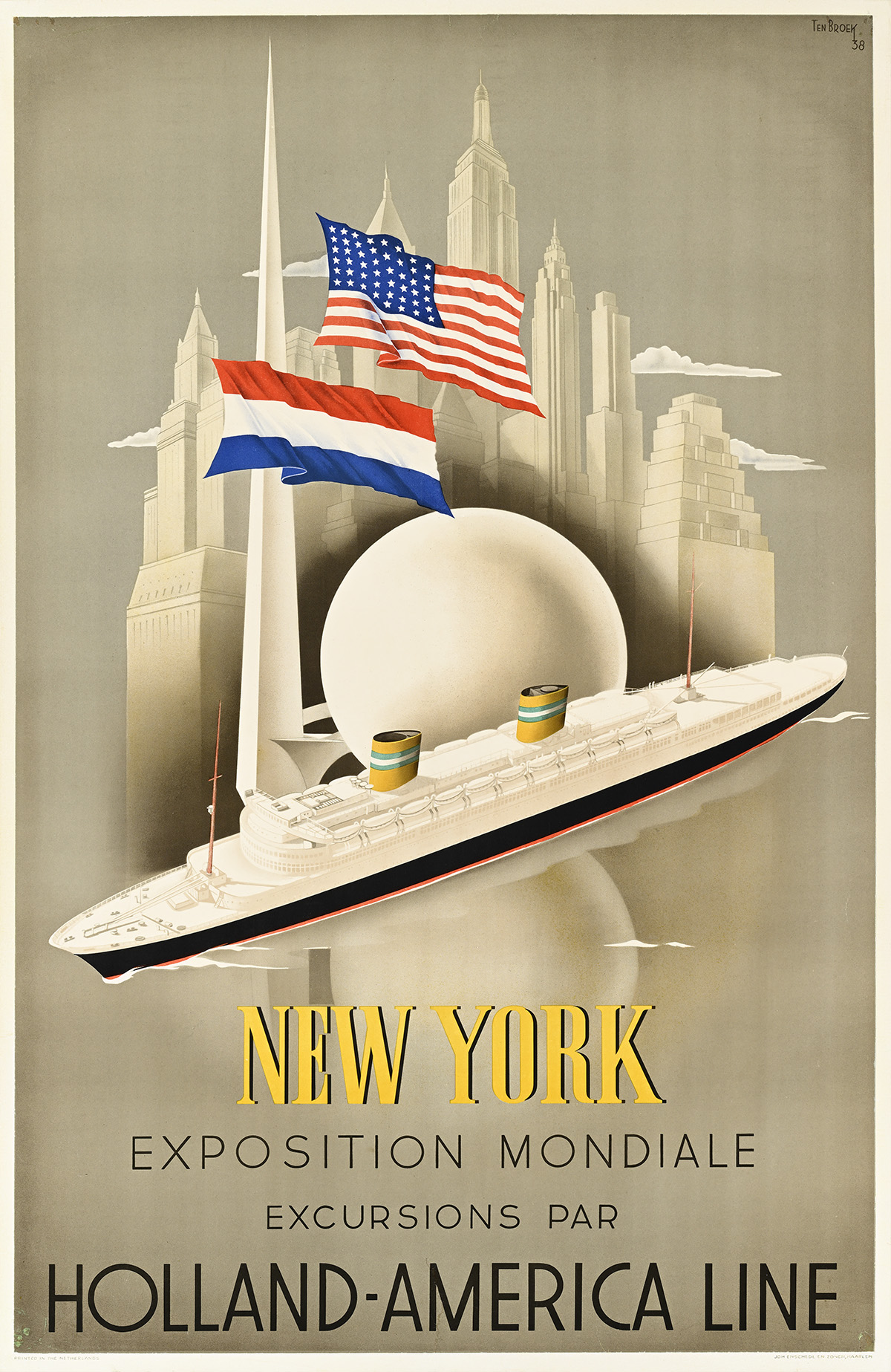
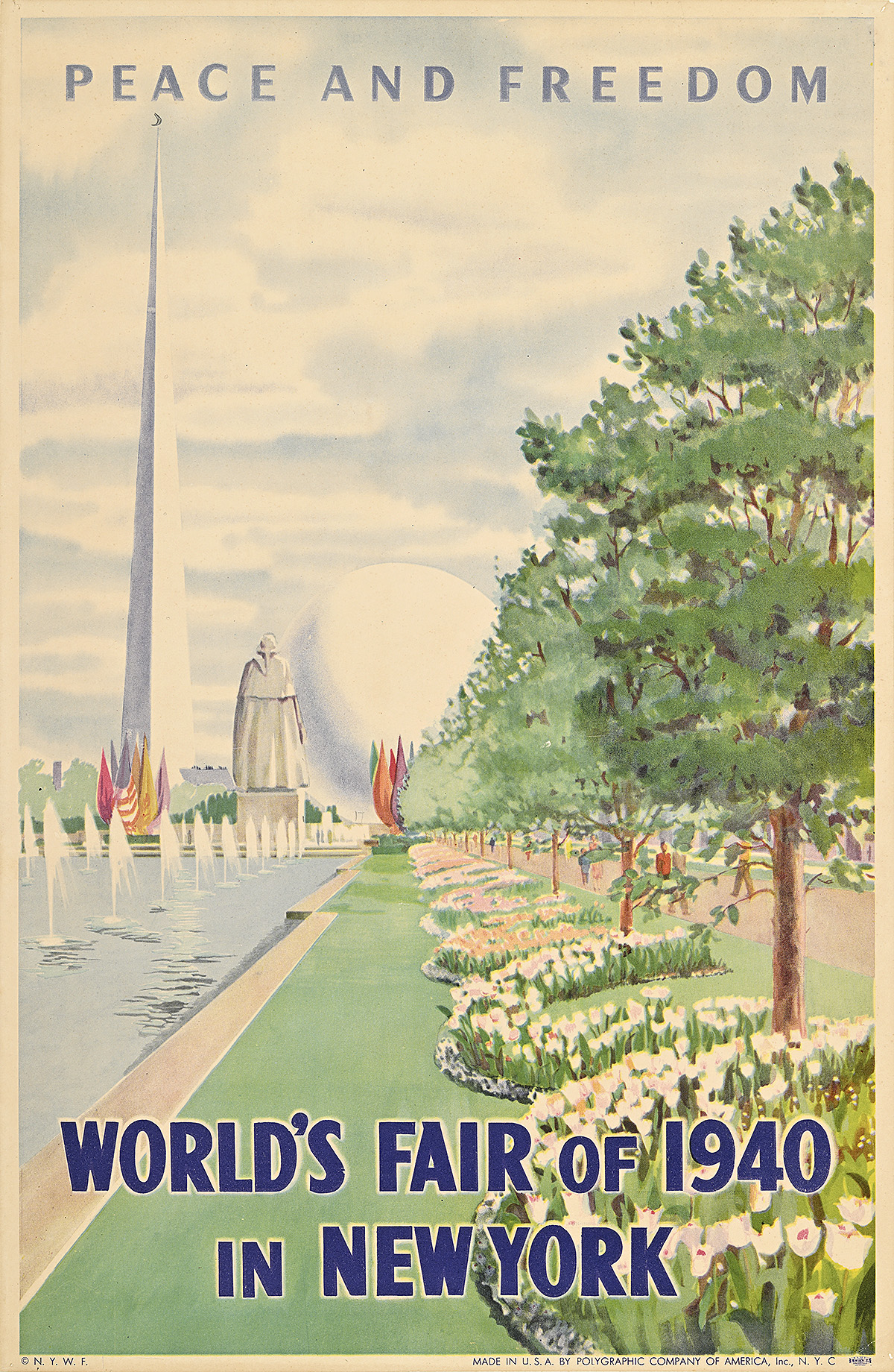
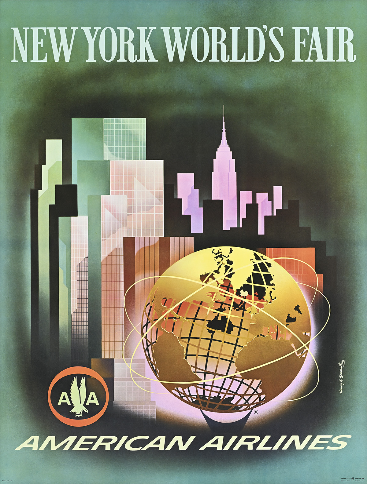
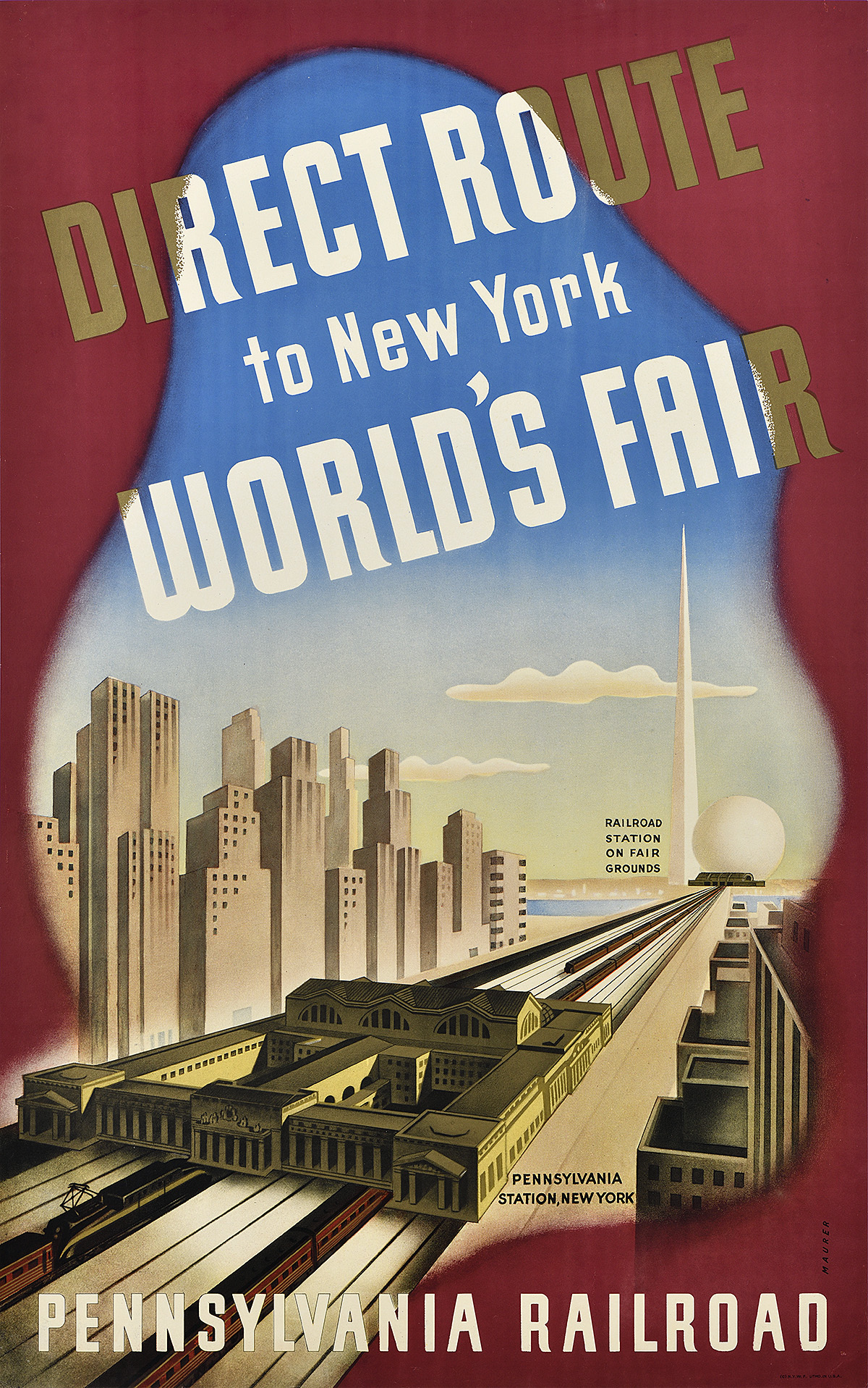
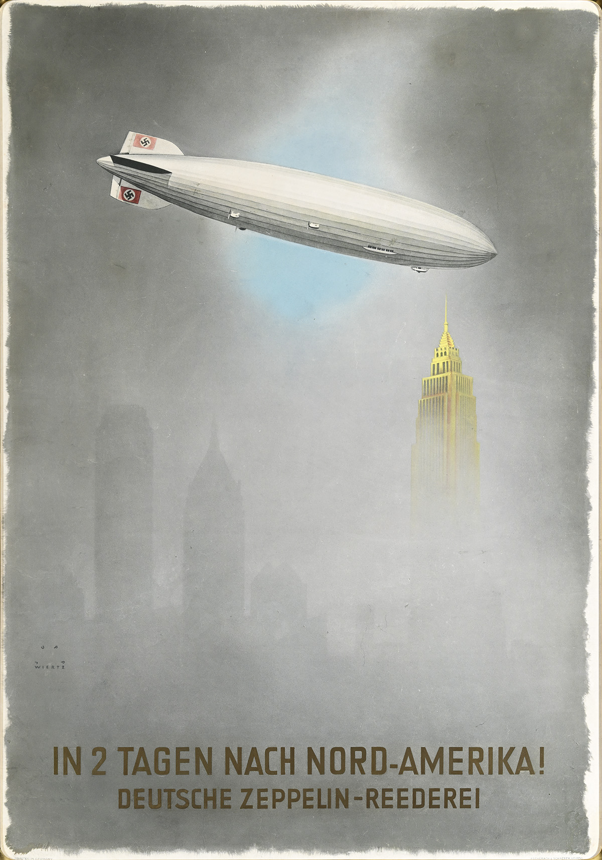
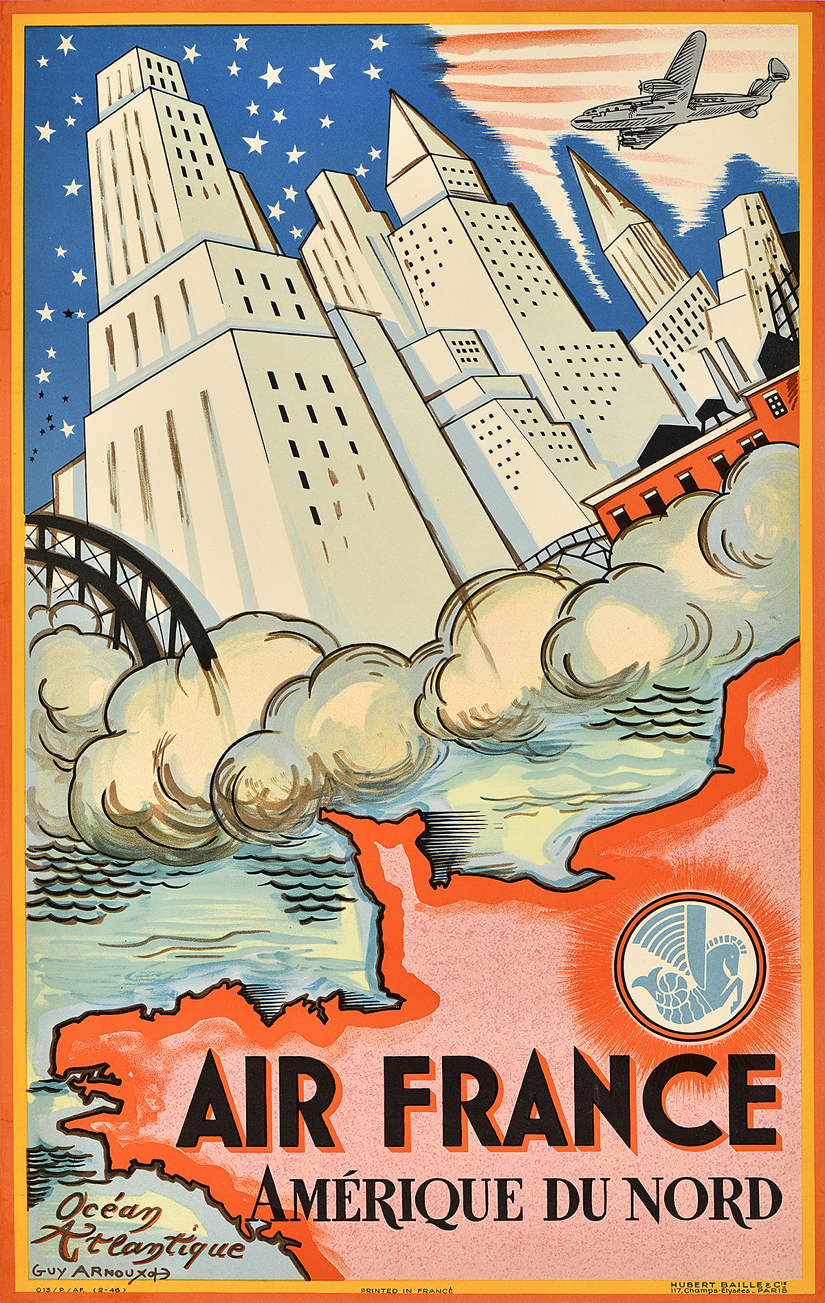
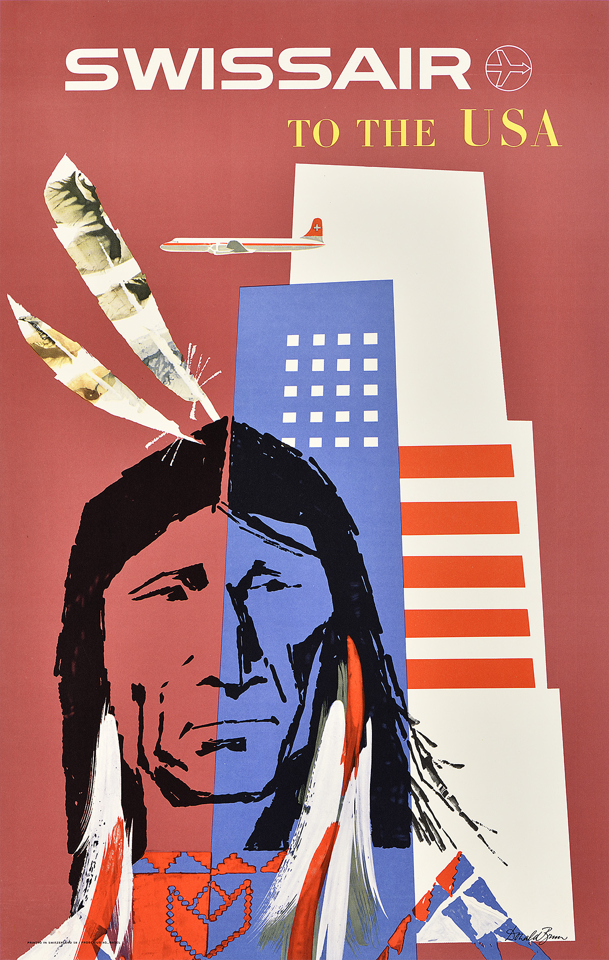
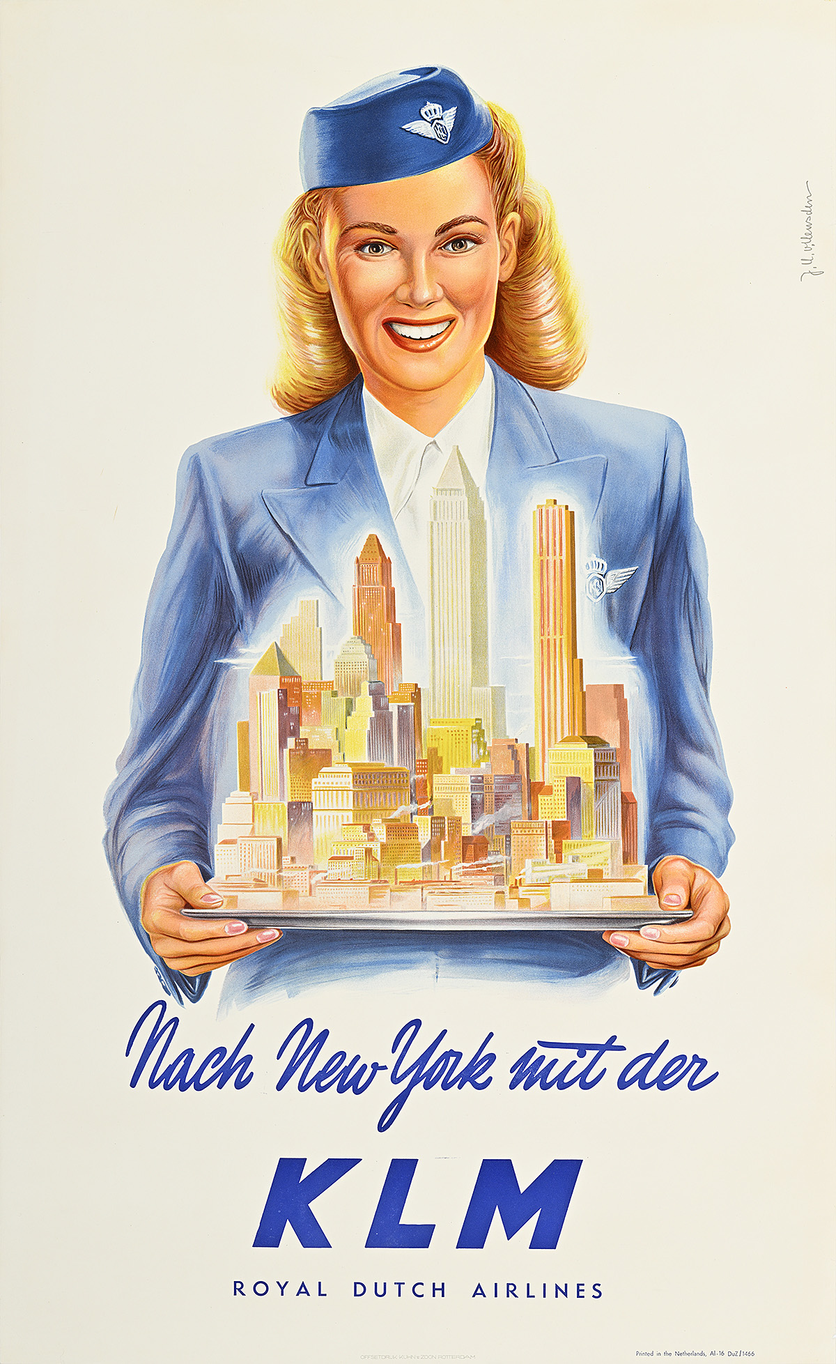
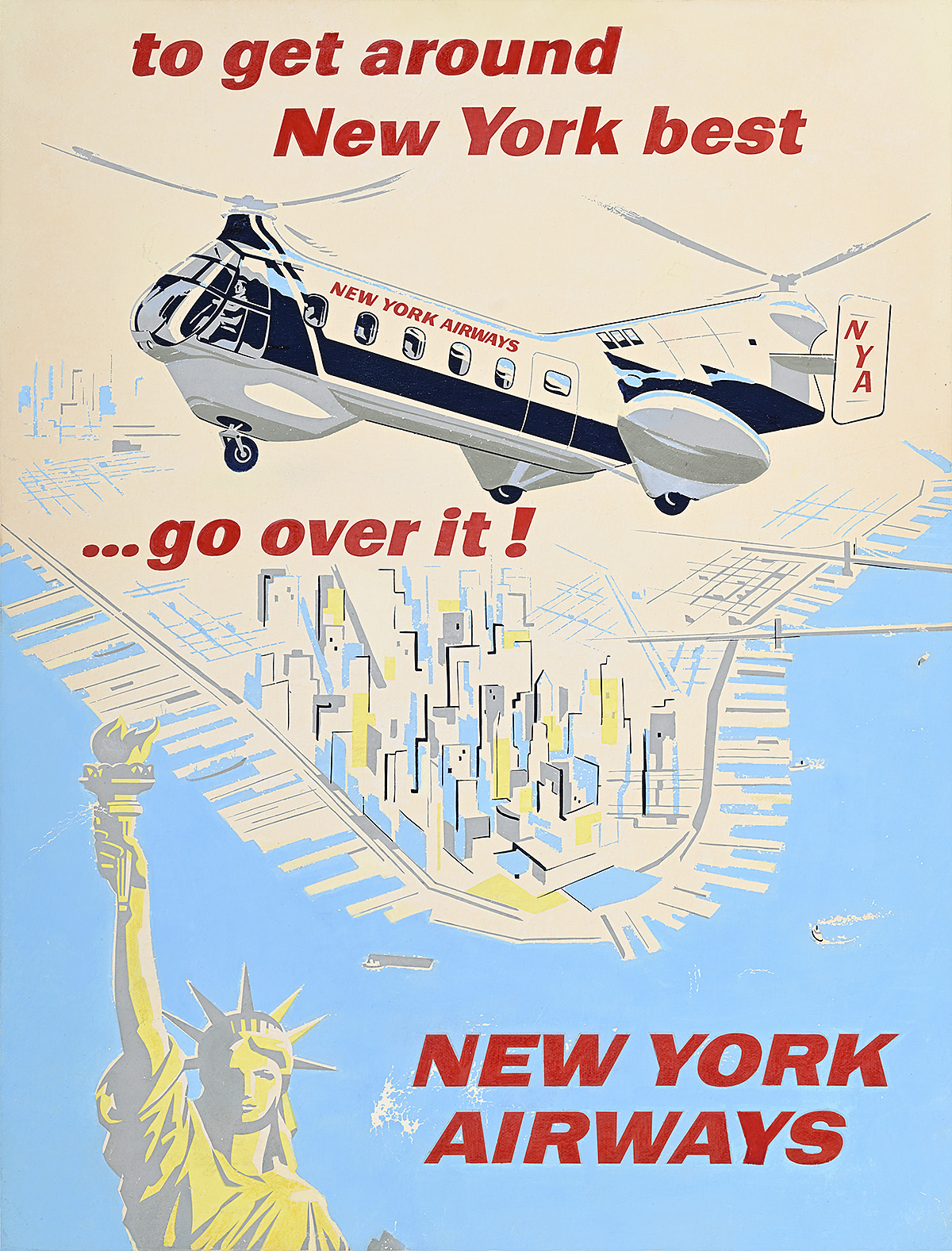
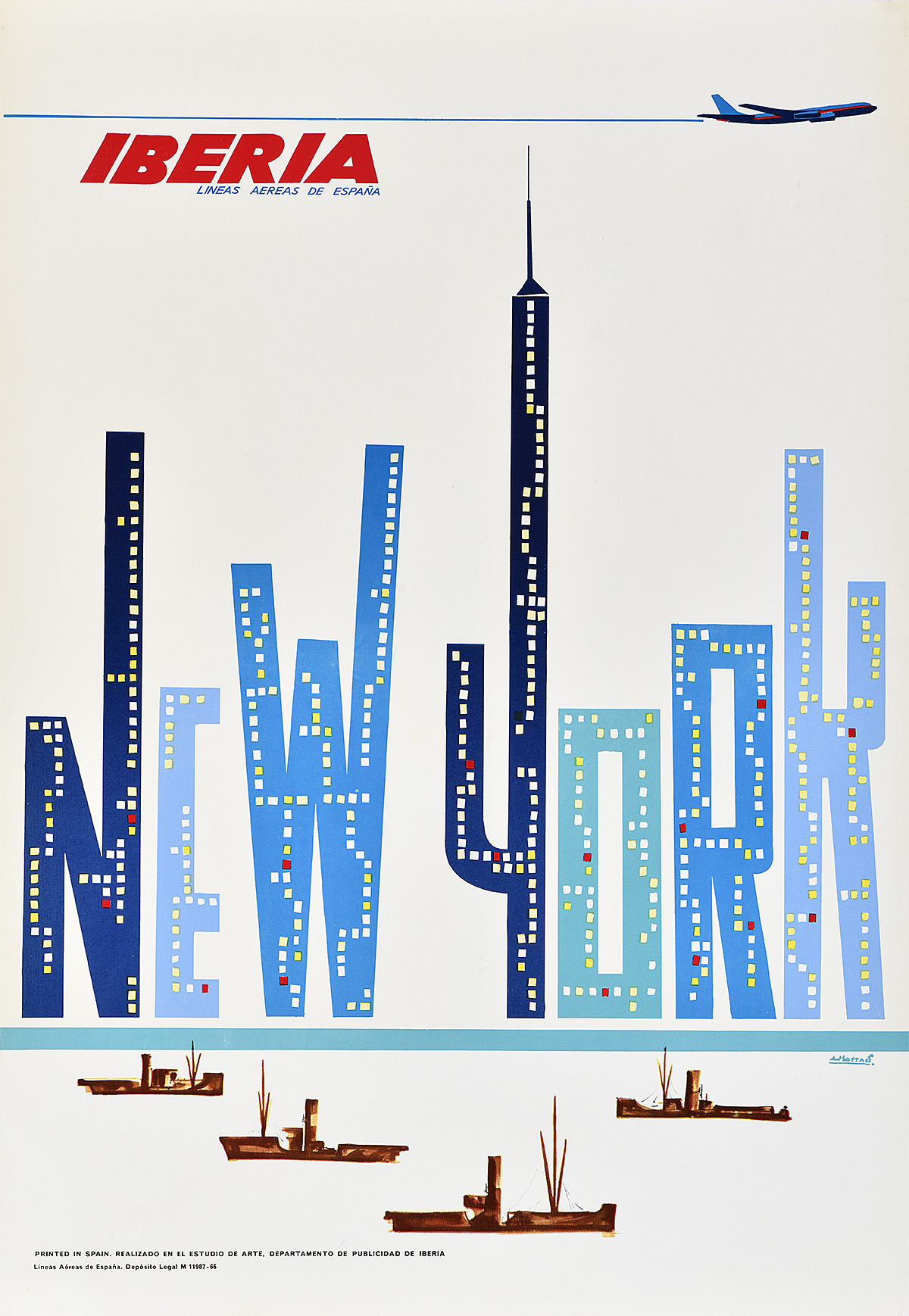
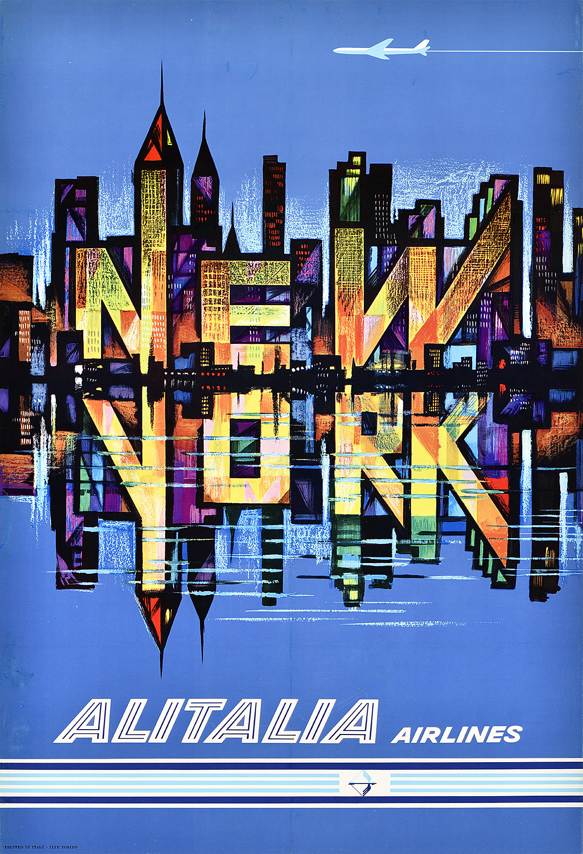
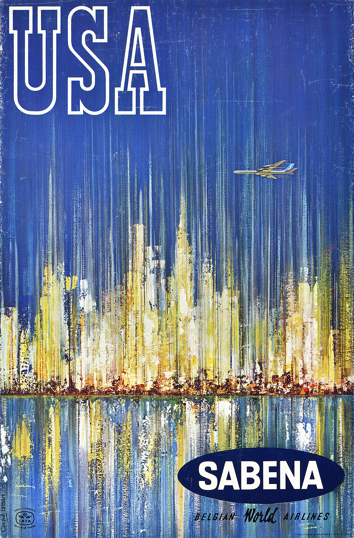
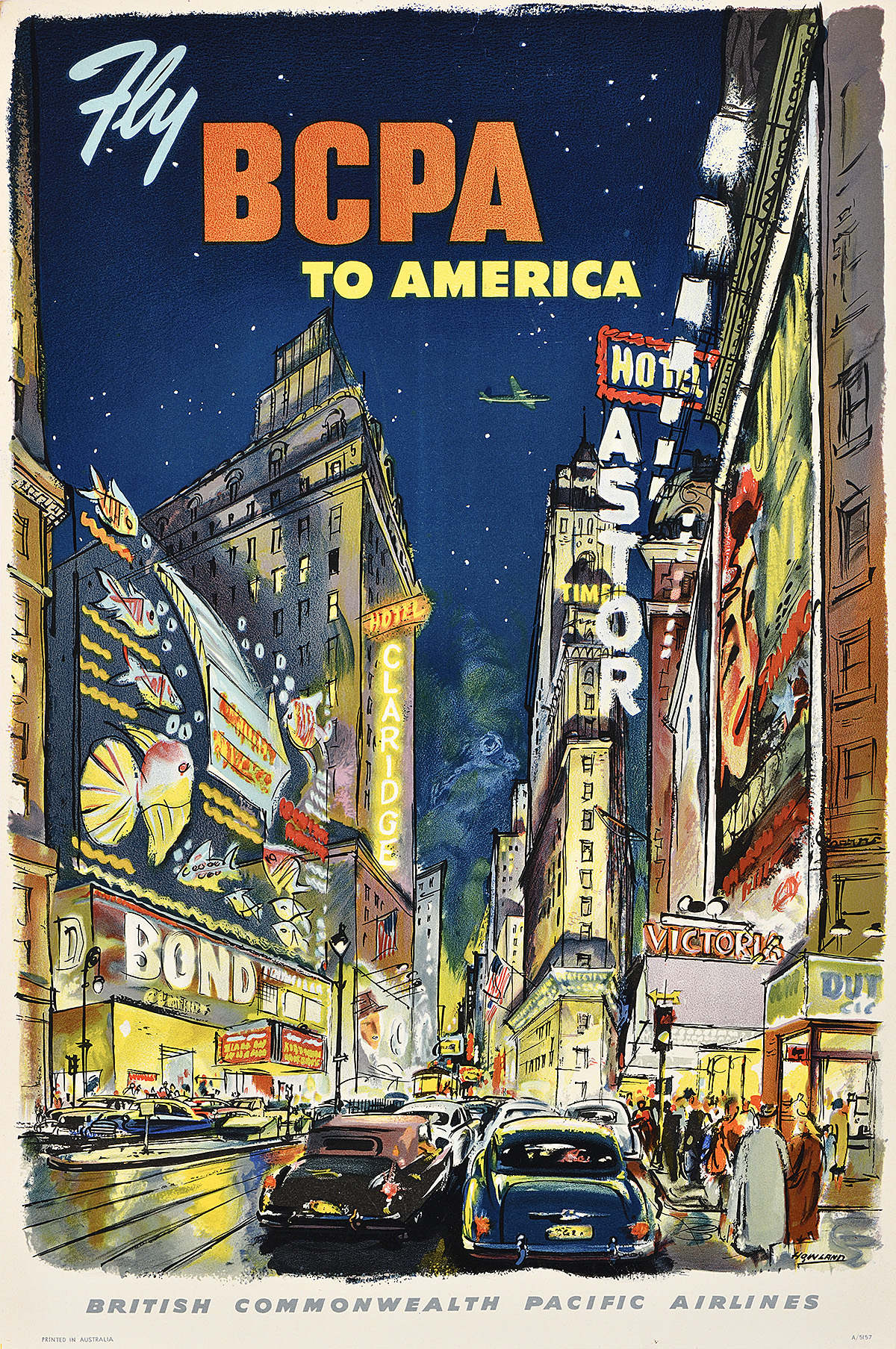
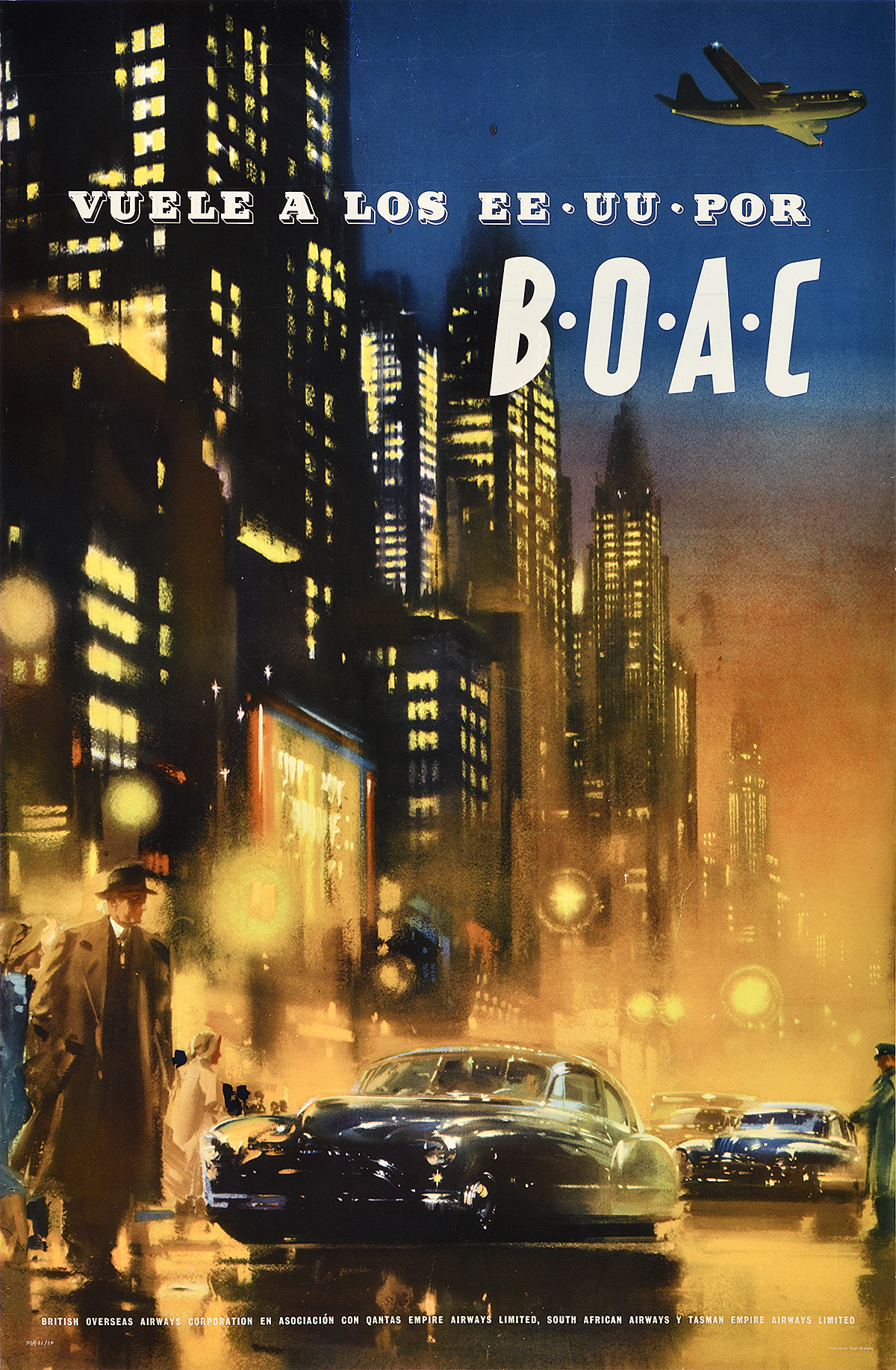
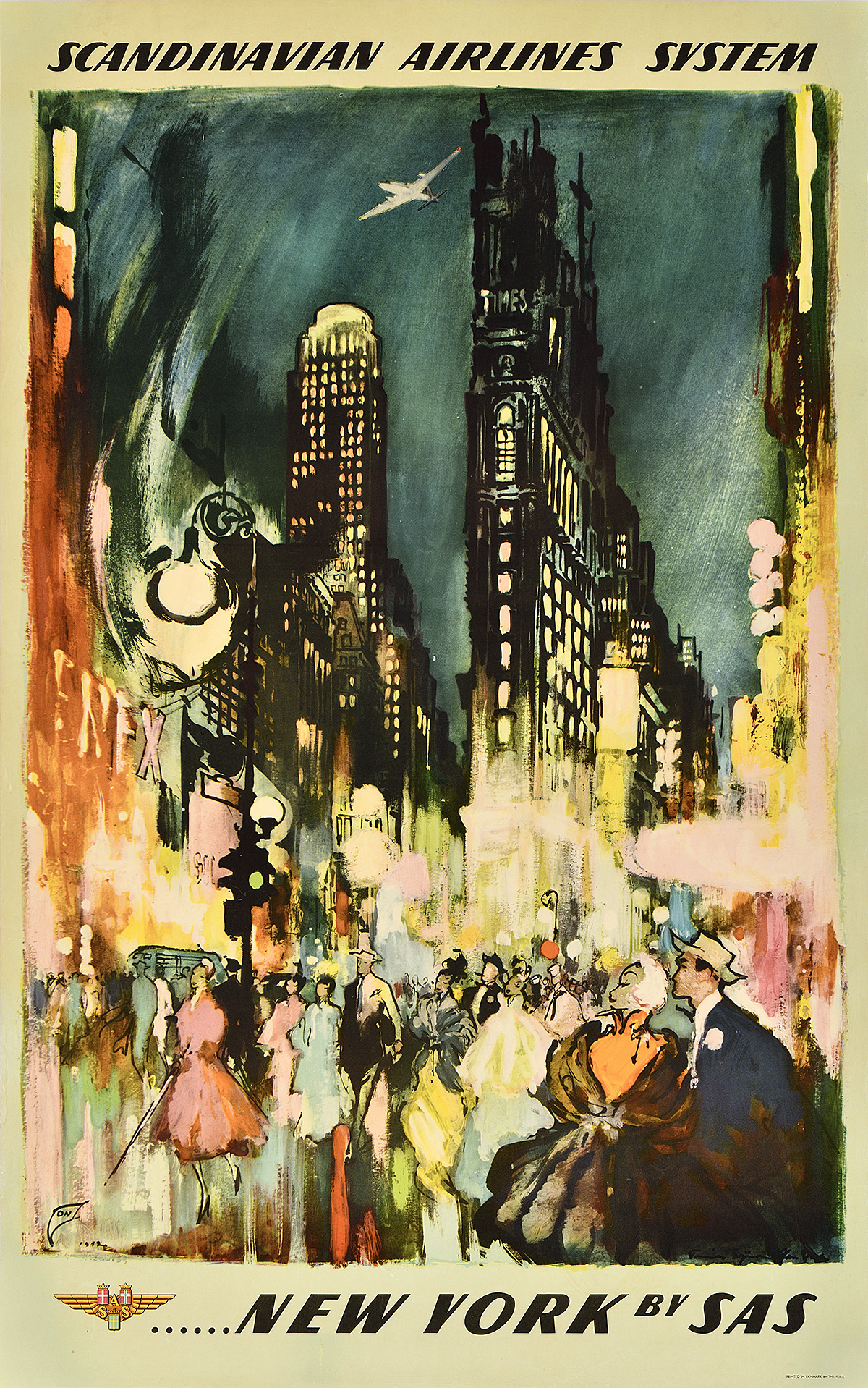
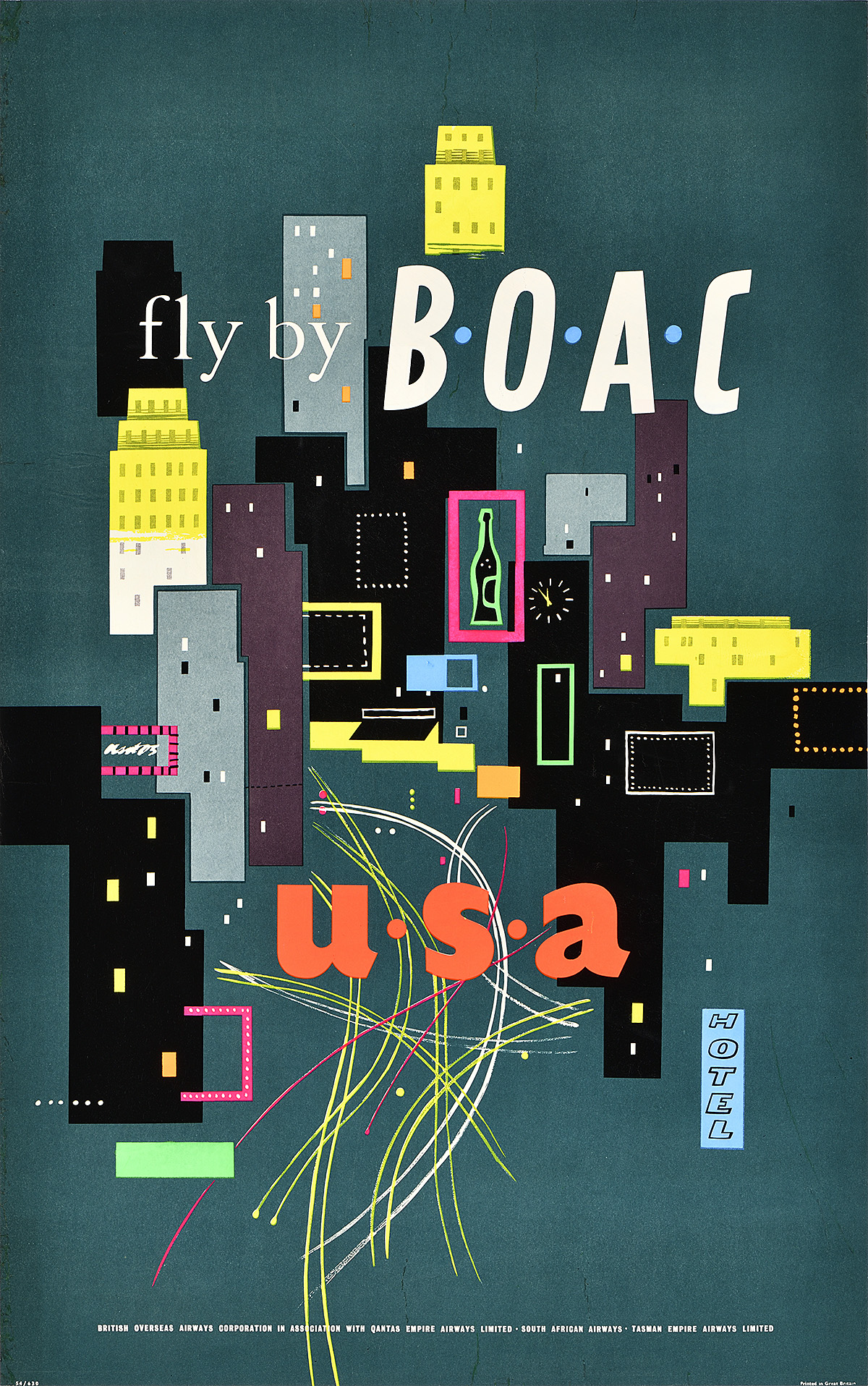
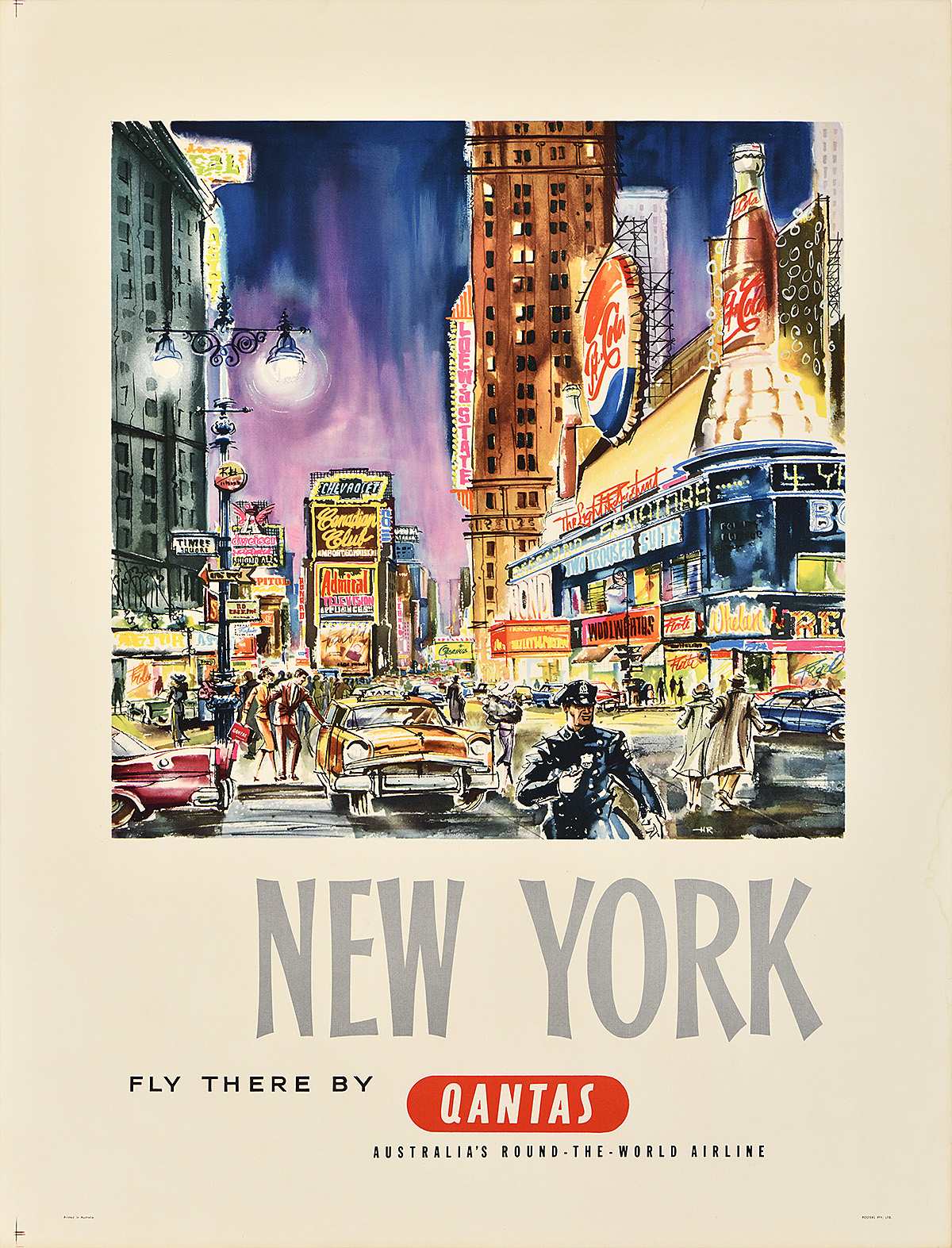
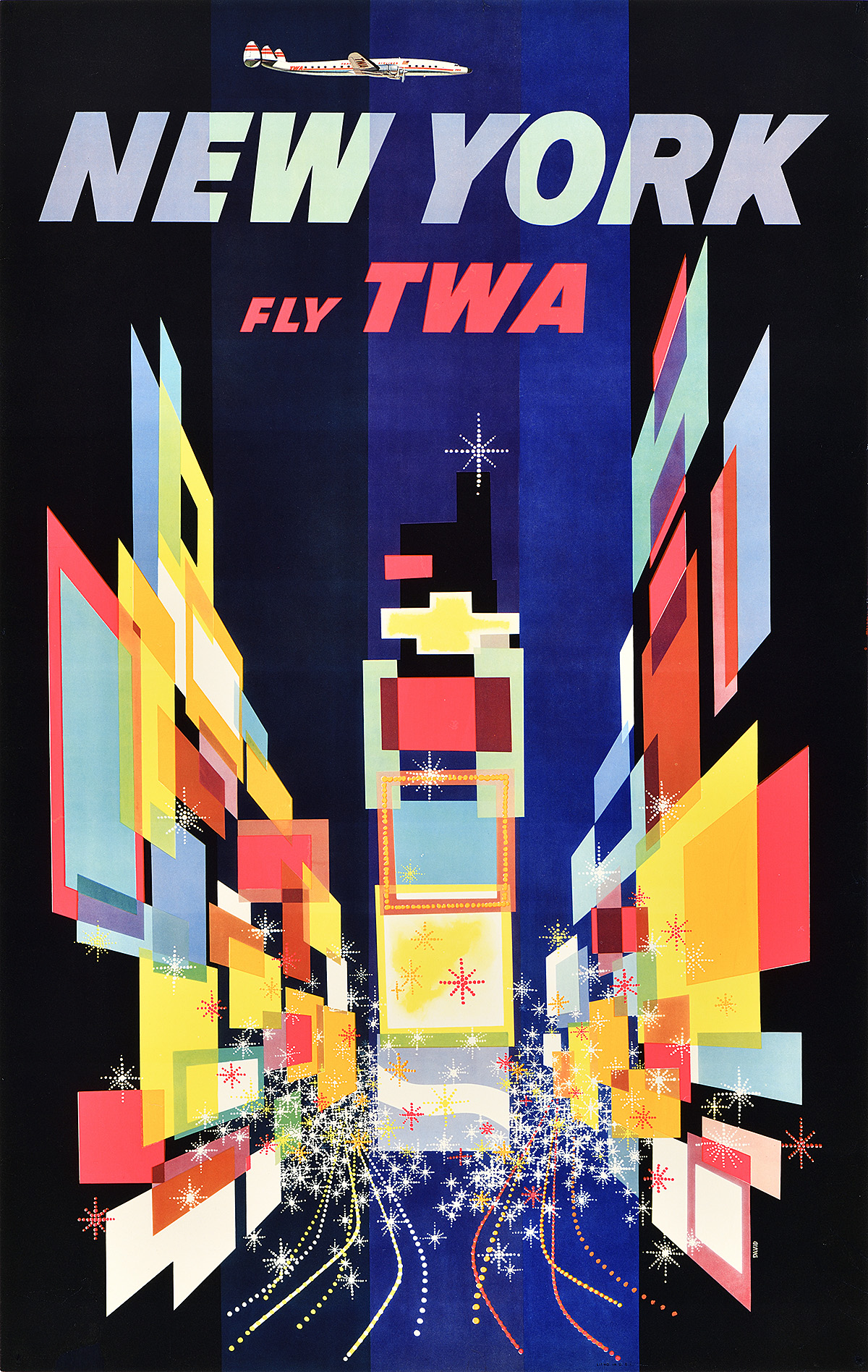
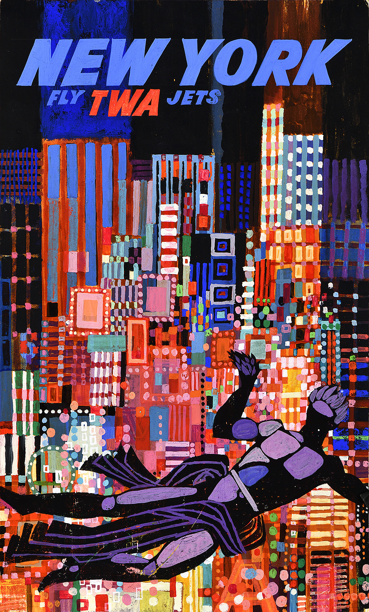
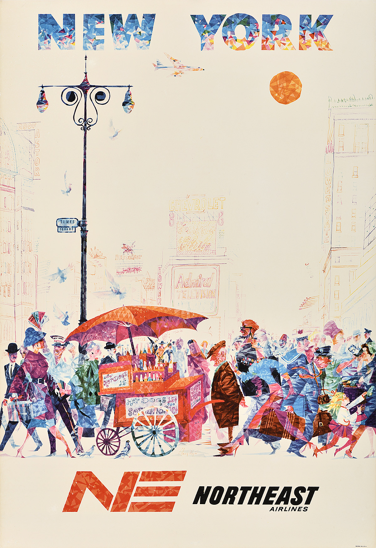
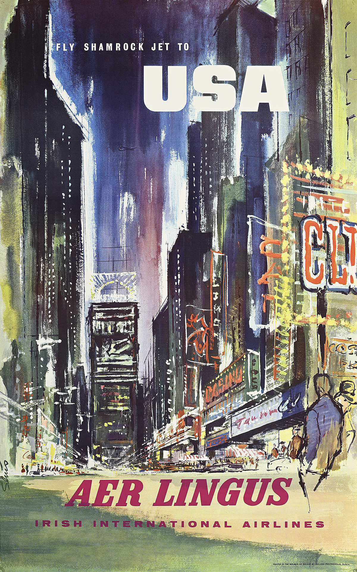
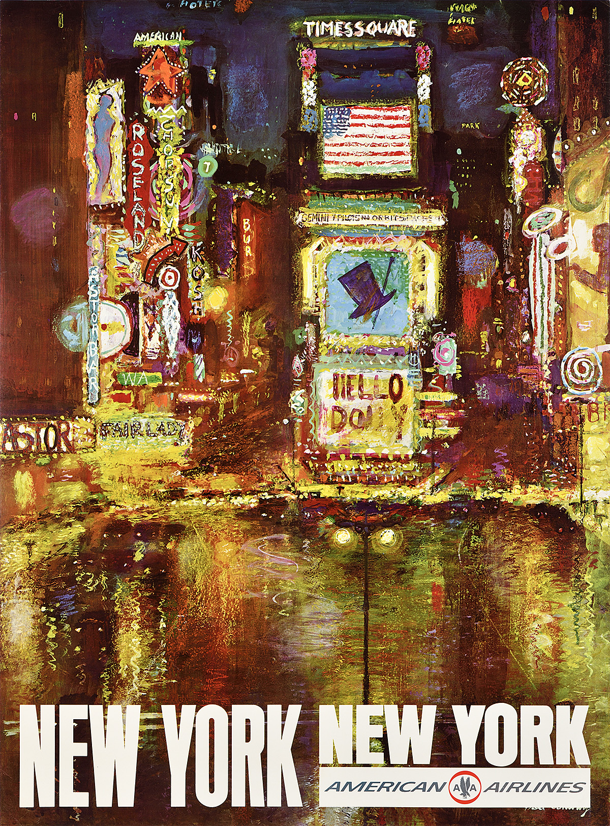
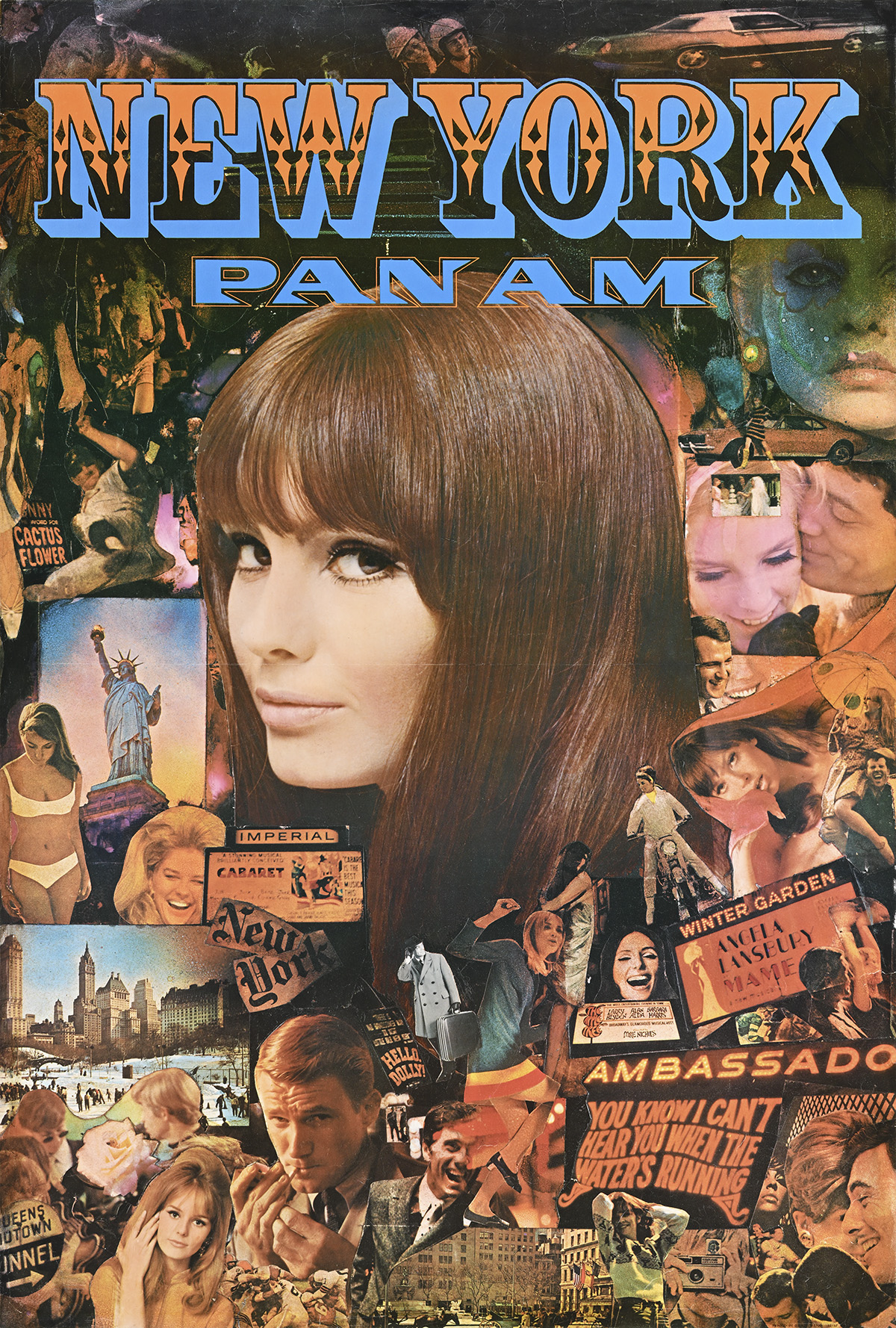
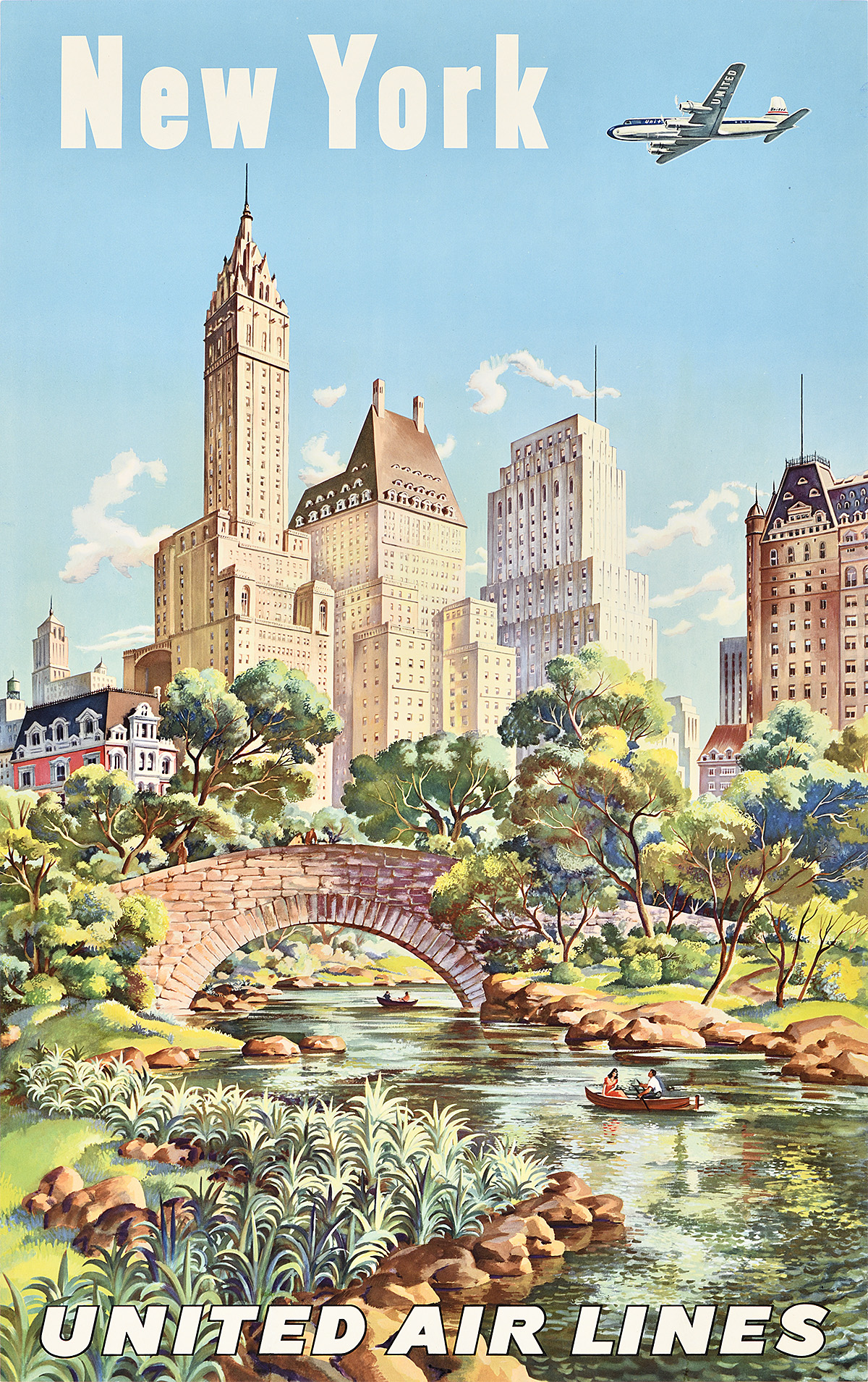
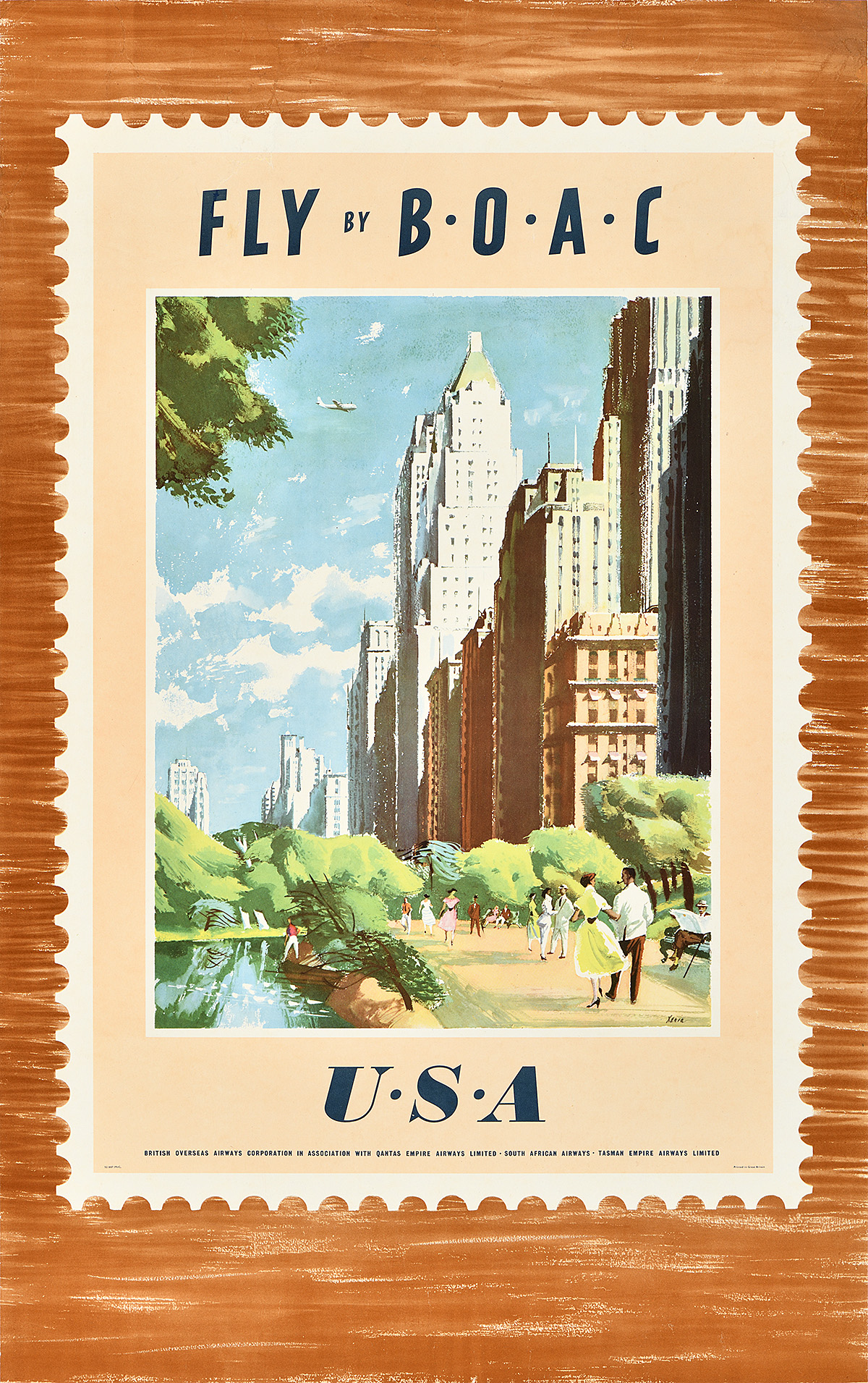
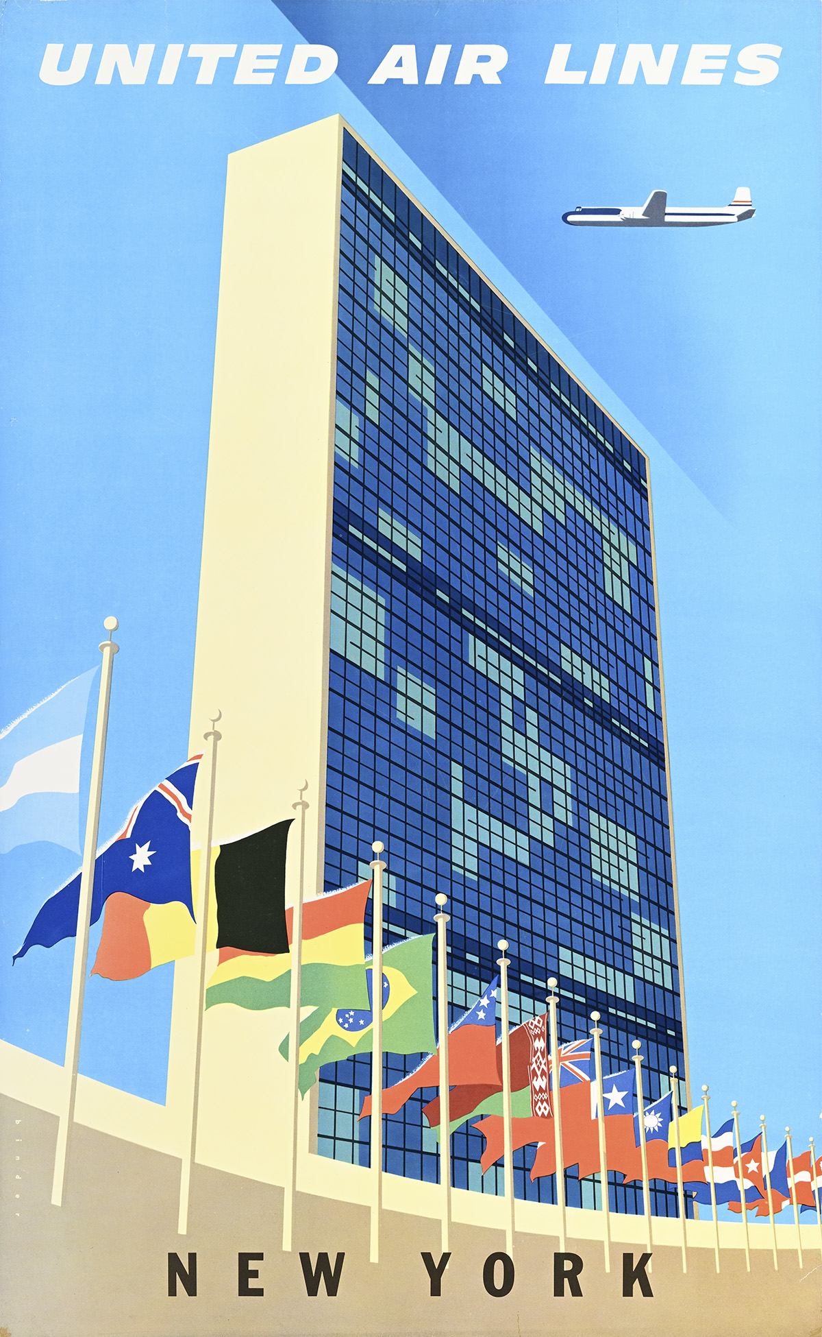
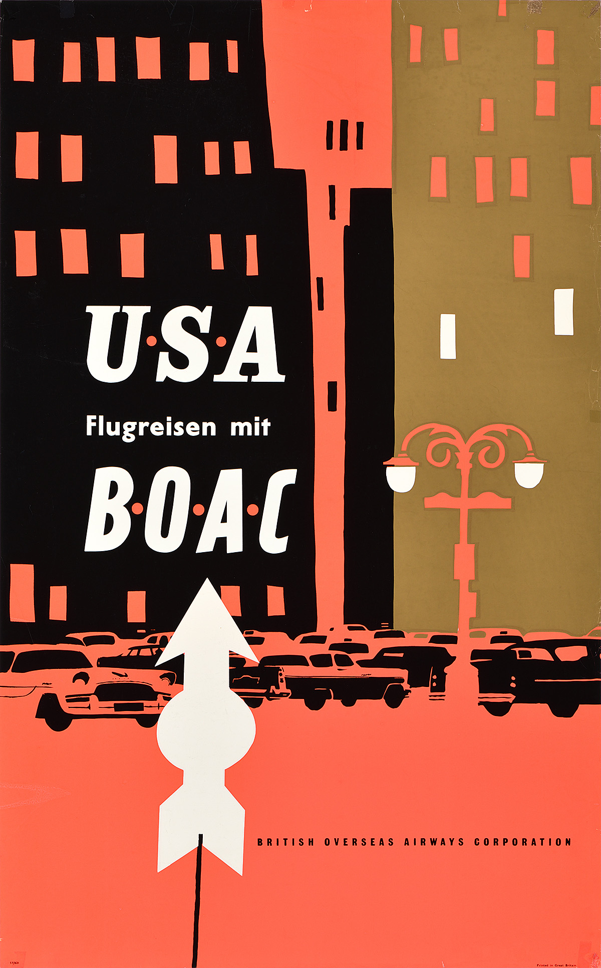
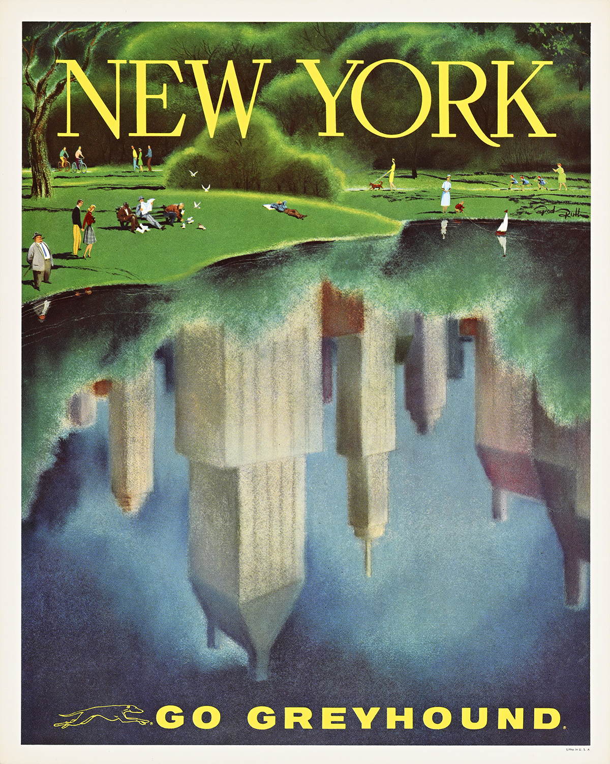
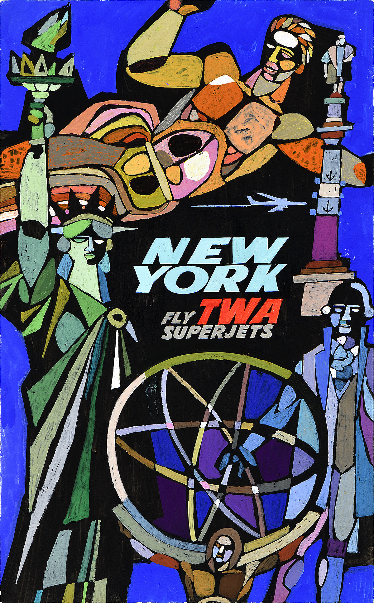
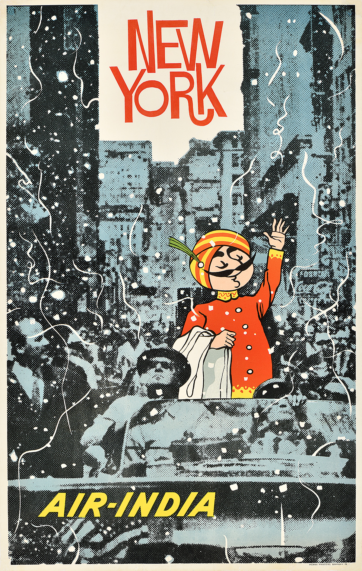
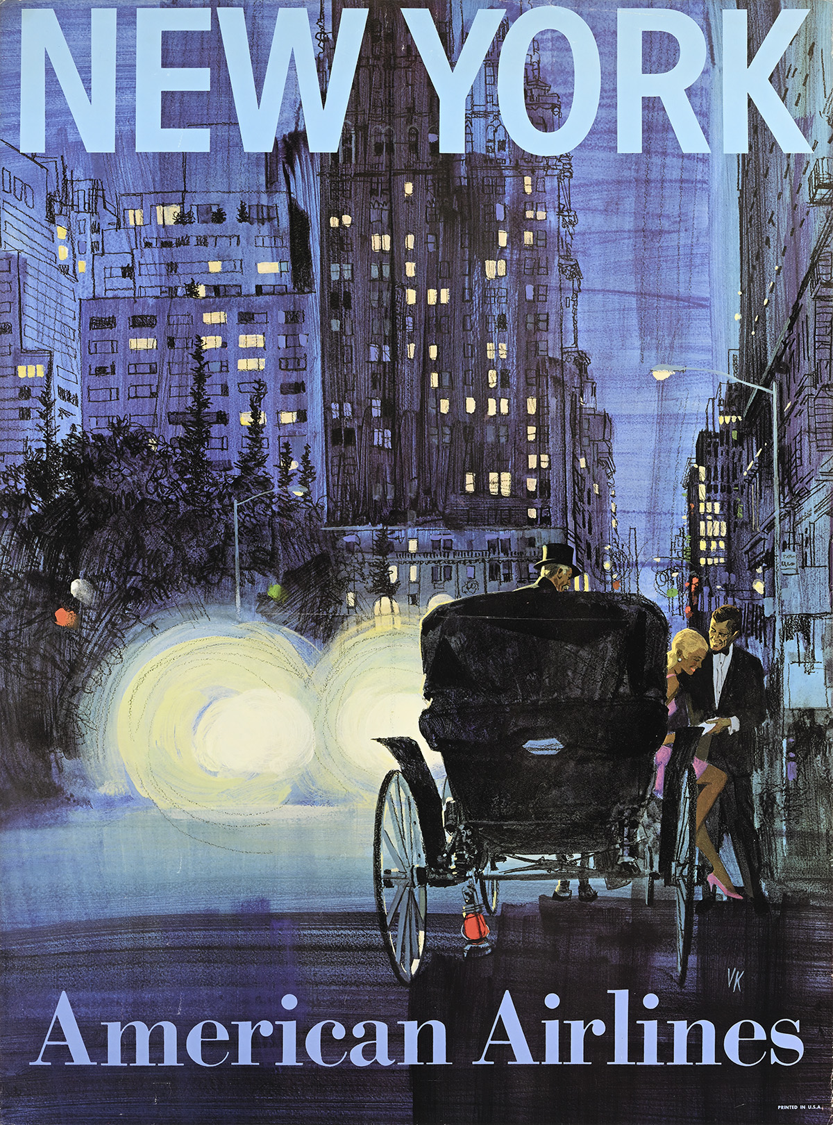
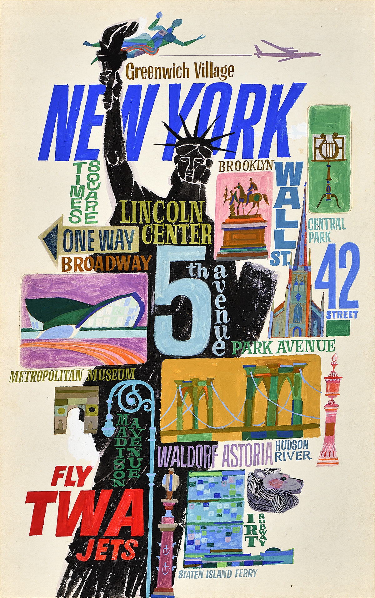
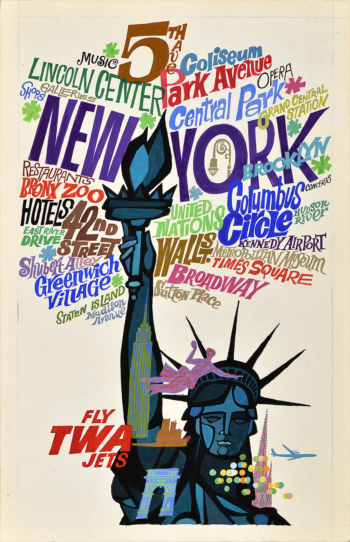
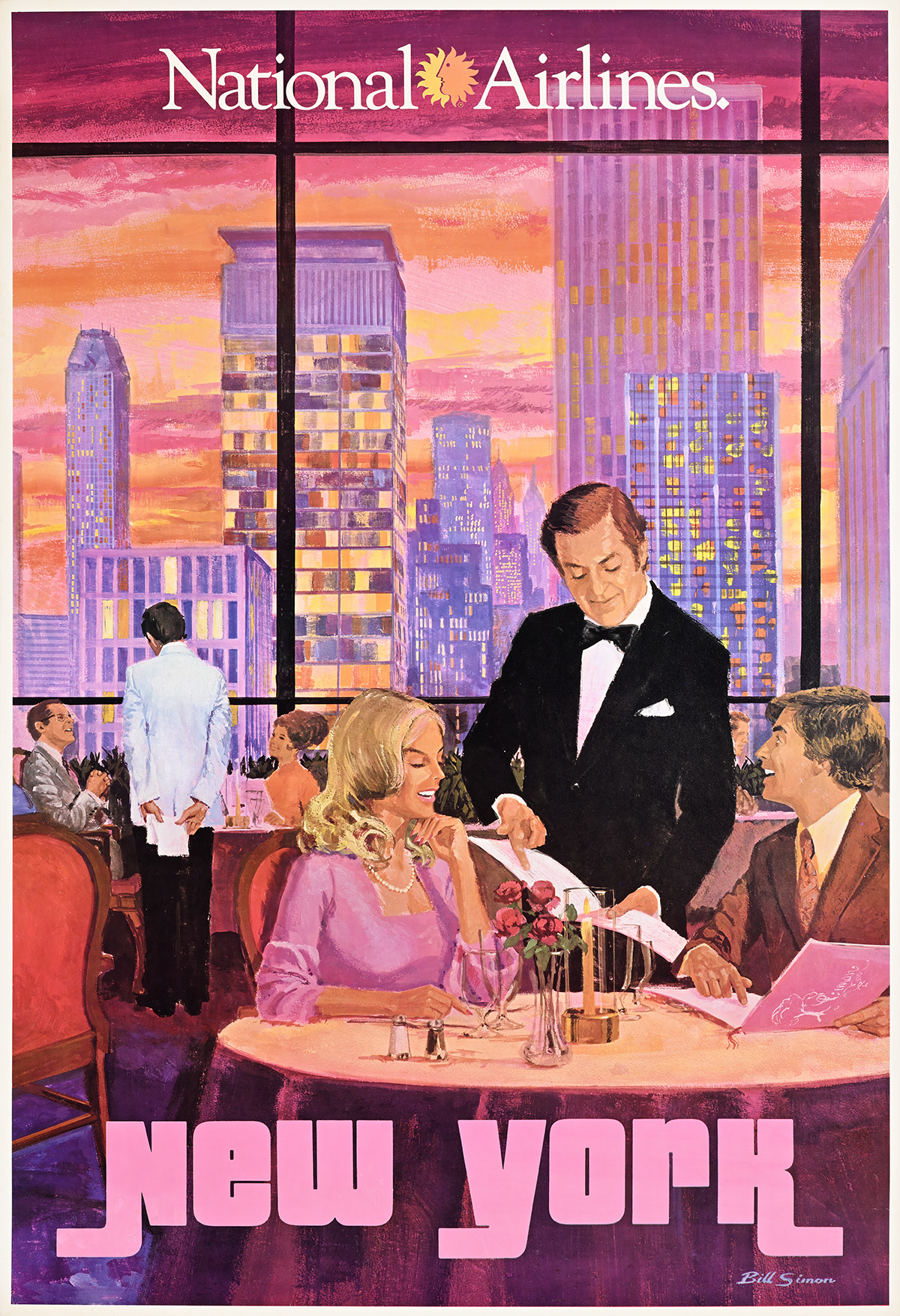
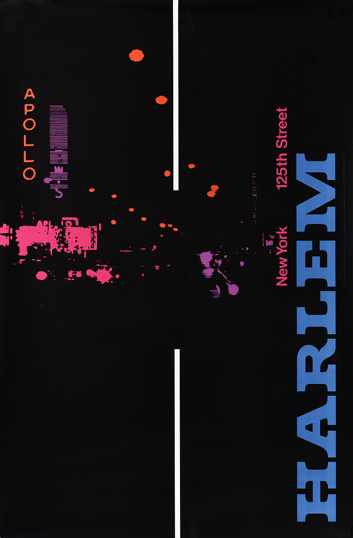
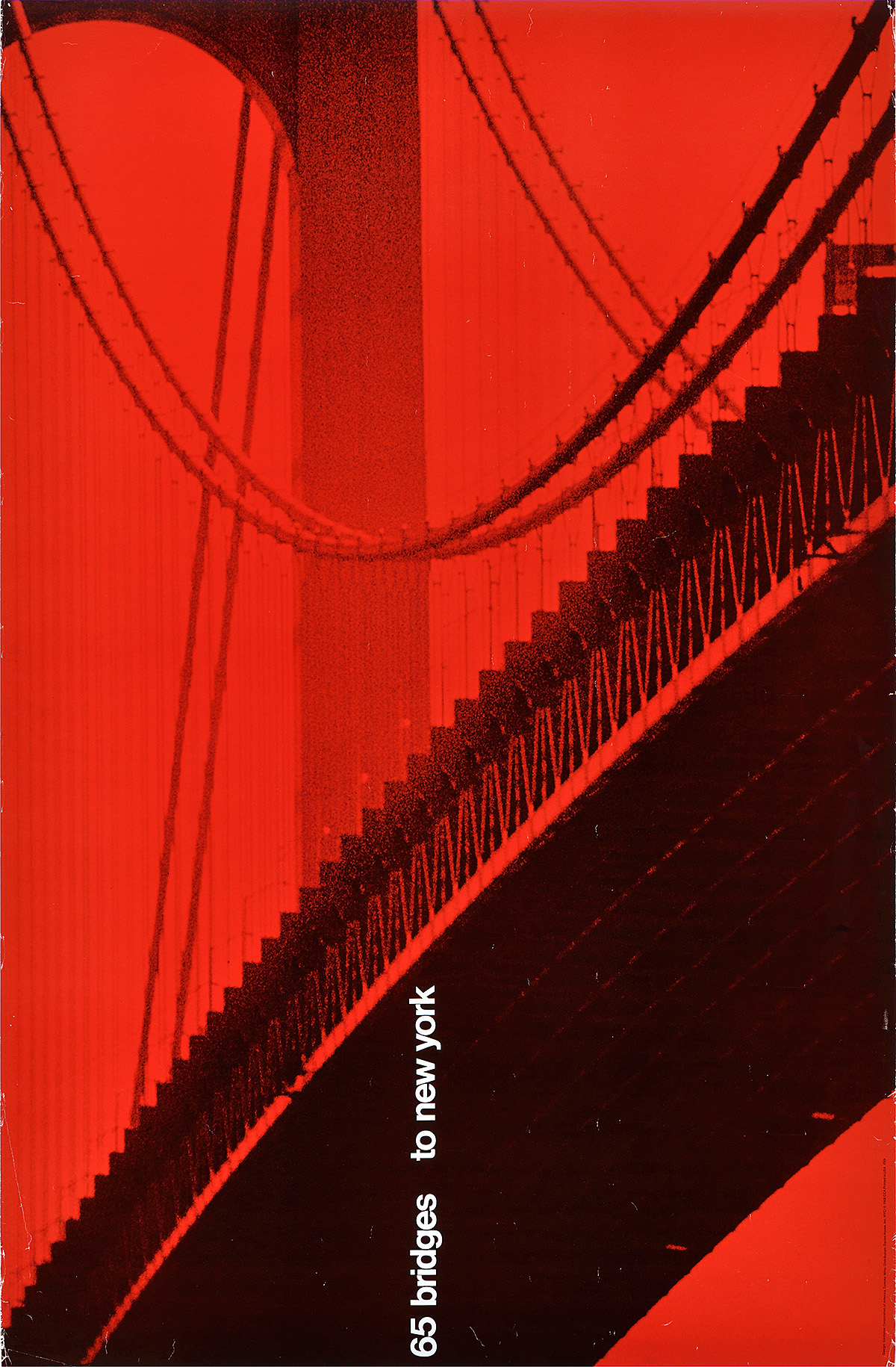
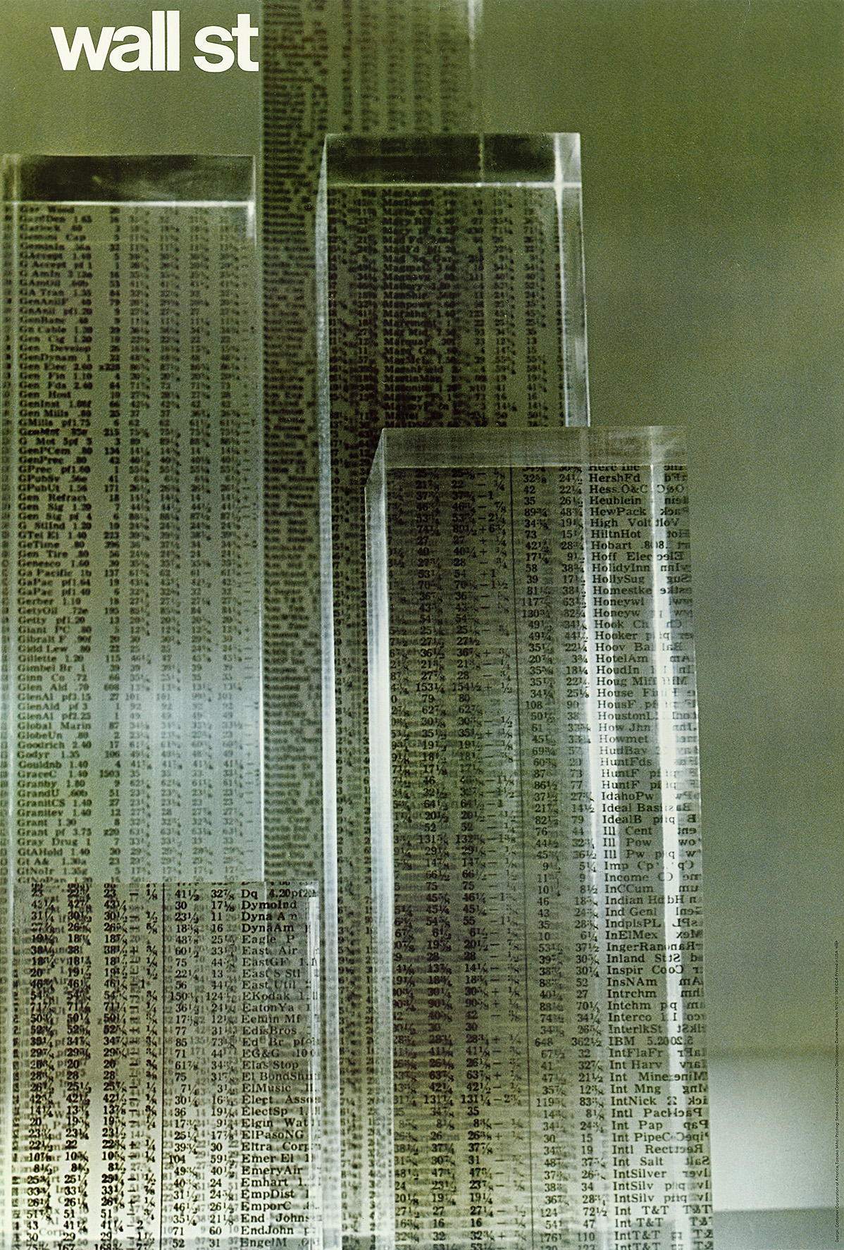
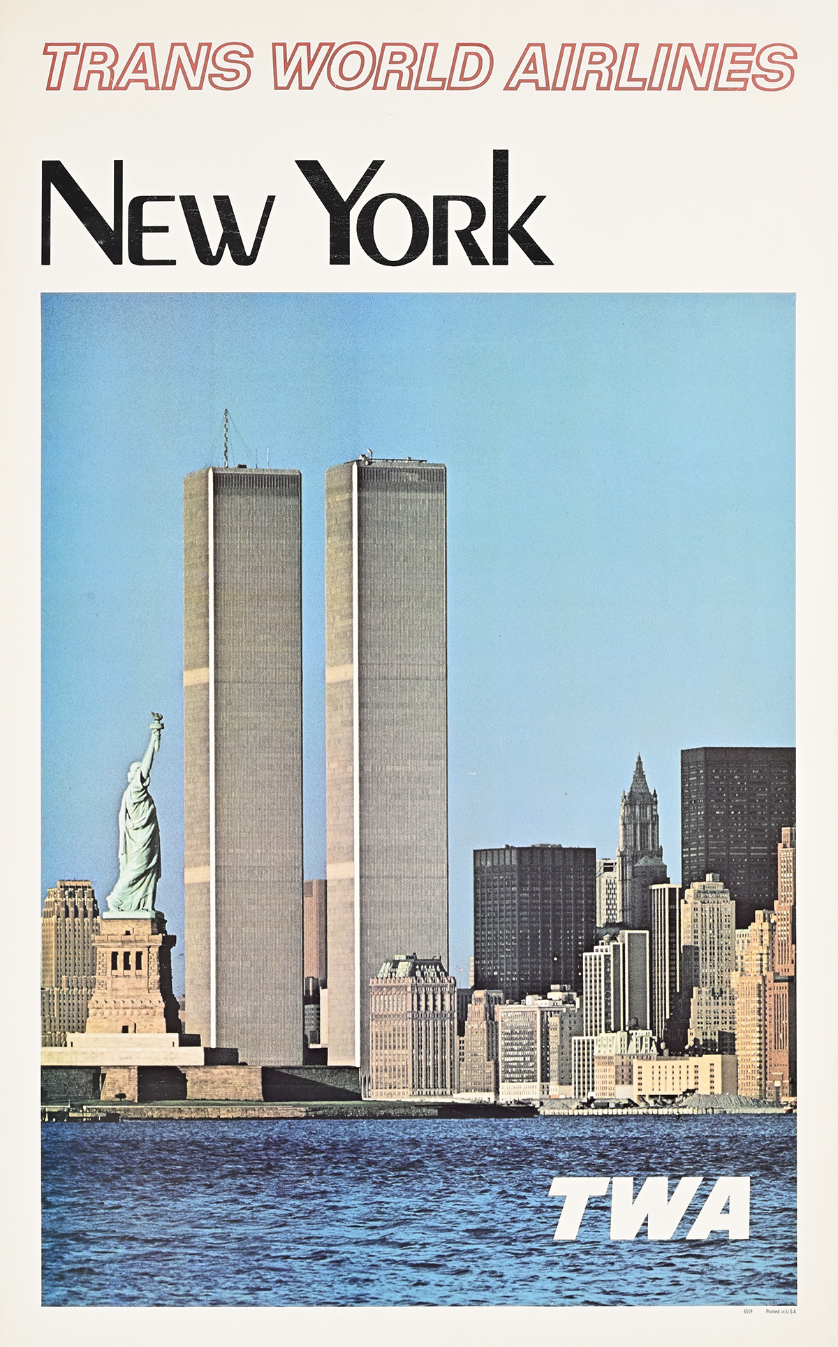
New York’s explosive growth from the end of the 19th century ultimately produced more travel posters than were designed for any other city in the world, a host of images as varied as its ever-shifting identity, showing it from the water, from the ground, and, eventually, from the air. This exhibition will track how New York City was represented to travelers, immigrants, and tourists over the decades. It is a visual, graphic experience, one that encourages the viewer to exult in all the ways artists captured the multitude and the magnitude of the thriving metropolis, selling the hustle and the bustle, the bright lights and the imposing structures, sometimes representing moments of intimacy and slice-of-life imagery within the urban canyons and among the ziggurats. 

Large text is available at the Info Desk.

Guías con letra grande están disponibles en informaciones.

Early New York Tourism 

Much of early American tourism, which began in the years after the War of 1812, was centered in the Hudson River Valley. The wealthy would go on a “Fashionable Tour,” heading up toward the luxurious destinations of Saratoga Springs and Ballston Spa. By the 1820s, due to improvements in transportation, tourism was no longer an exclusively upper-class pursuit, and travel and hotels became more widely accessible. Beginning in the 1870s, Saratoga was the nation’s top high-end destination due to its hot springs and casinos. During these years, tourism in New York City also flourished, and the city was the subject of multiple guidebooks and travelogs; it was not, however, promoted by illustrated posters until the final decade of the 19th century.


A poster of a Delaware and Hudson railroad map with various scenes, including the Manhattan skyline.

“The D&H”/Delaware and Hudson R.R., c. 1890 ​

Designer Unknown

W. Currey Collection, Elizabethtown, NY

  • This poster is one of the earliest to depict New York City’s skyline and one of the few showing a view of Manhattan before skyscrapers began to dominate the skyline. The Statue of Liberty and the Brooklyn Bridge are visible, as well as the spire of Trinity Church (the tallest building in New York City until 1890).
  • Although two other prominent structures, the New York Produce Exchange (the red building with the tower) and the Washington Building that stands to the left of the church, are identifiable, the view hardly relates to the iconic skyline that became associated with the city in the following century.
  • The most prominent vignette here shows the Grand Union Hotel in Saratoga Springs, one of the largest hotels in the world at the end of the 19th century. The use of such individually framed scenes in travel posters was a European convention rarely used by American designers. 
  • The Delaware & Hudson Railroad began in the early 1820s as a component of the Delaware and Hudson Canal Company, bringing coal from Pennsylvania mines to the canal for shipment to New York City via the Hudson River. The railroad maintained its independence until 1991, when it was purchased by the Canadian Pacific Railway.

A poster of a large ship with many sails, sailing past a Statue of Liberty with streams of light.

Red Star Linie/Antwerpen, 1893

Carl Saltzmann (1847–1923)

Private Collection, New York

  • This poster depicts one of Red Star Line’s most famous vessels, the Westernland. Built in 1883, the ship was the company’s first to incorporate a steel hull, two funnels, and three different classes of passenger accommodation. The Red Star Line ran regularly scheduled crossings between Belgium and the United States until 1934, when the company went bankrupt. Both Albert Einstein and Irving Berlin immigrated to the United States aboard one of its vessels. 
  • This advertisement was intended to encourage immigration rather than tourism to New York City. As the image predates New York’s famous skyline, it incorporates the city’s two most recognizable landmarks at the time: the Statue of Liberty (officially opened in October 1886) and the Brooklyn Bridge (opened in May 1883).​
  • Between 1873 and 1934, almost two million passengers came to the United States on the Red Star Line, the majority from Germany and Eastern Europe.

A poster of a series of buildings with golden tints in front of a body of water with a boat on it.

New York/Anchor Line, c. 1910

D.N.A.  

Private Collection, New York

  • This poster depicts some of the most architecturally detailed renderings of Manhattan’s early skyscrapers, including the Singer Building, the tallest building in the city from its completion in 1908 until the following year, when it was surpassed in height by the Metropolitan Life Tower. This sweeping southern view from the intersection of Maiden Lane and Broadway also showcases the Washington Life Insurance Building, the Trinity and United States Realty Buildings, and the City Investing Building, all of which had been completed within the previous decade.   ​
  • Shipping companies almost always pictured one of their vessels in their travel posters. Here, Anchor Line’s Furnessia—its only ship with a single funnel making the New York-Glasgow crossing at this time—is shown passing in front of the Statue of Liberty.
  • Founded in 1855, Anchor Line was a Scottish shipping company that was ultimately acquired by Cunard in 1911. As posters published after that point typically include the Cunard name, this design had to be printed between the construction of the previously mentioned landmarks and the merger of the two companies. 
  • In 1968, the Singer Building became the tallest building ever to be demolished.​

A horizontal poster of a large long ship with 4 funnels, on water with a skyline behind it.

French Line, c. 1920

Richard Rummell (1848–1924)

Private Collection, New York

  • The poster advertises French Line’s most celebrated ship, the SS France. It had been refurbished and restored to commercial service in early 1920 after being requisitioned by the French Navy during World War I.
  • When the France made its maiden transatlantic journey in 1912—shortly after the sinking of the Titanic—it was the first of a series of extremely luxurious ocean liners that would come to dominate the route in the years between the wars. In fact, this second of three French Line ships to be given the name, was also known as the “Versailles of the Atlantic.” 
  • Most of its first-class passengers were well-heeled Americans, among them diplomats, businessmen, and artistic types who appreciated the ship’s Grand Siècle decor with ornate gilded furnishings in the style of the court of Sun King Louis XIV. They also enjoyed the fine dining, excellent service, and numerous entertainments, as well as such modern amenities as hot and cold water in the cabins. 
  • In this poster, showing the ship on its arrival in New York Harbor, three prominent skyscrapers are visible in the skyline behind: from left to right we can see the Woolworth Building (1913), at the time the tallest building in the world; the Park Row Building (1899); and the Singer Building (1908).  
  • The composition is based on a painting by Brooklyn-based artist Richard Rummell. He established his illustration office on Broadway in Manhattan in the 1880s, and was known for his panoramic images, among them a series of views of American colleges.

Emblem of a Nation

In the three decades between the dedication of the Statue of Liberty in 1886 and the entry of the United States into World War I in 1917, New York City became so prominent in the national and international imagination that it was frequently used as a visual shorthand to represent America as a whole. This is especially evident in fundraising posters produced during the war.


A poster of immigrants waving at the Statue of Liberty in front of a rainbow, next to a ship.

Food Will Win the War, 1917

Charles Edward Chambers (1883–1941)

Gift of Peter A. Blatz, Poster House Permanent Collection

  • On May 5, 1917, Herbert Hoover was appointed head of the U.S. Food Administration; he had already told President Woodrow Wilson that “second only to military action [food] was the dominant factor” in winning the war. 
  • That agency published this poster during World War I as an appeal to new immigrants to help their adopted country save wheat and other food to feed the Allies. The message—that the United States has offered them so much that now they must sacrifice something in return—is reinforced by visual reminders of the magnitude of their arrival in New York Harbor and the abundance in this new land, one they must now ration on behalf of their new country.
  • The awe-inspiring, golden skyline—perhaps playing off the old adage that the city’s streets were paved with gold—would have been recognizable to and instilled pride in those who arrived from Europe by ship. Clearly visible are the Woolworth Building, the Municipal Building, and the Singer Building.​​ 
  • To reach a wide range of immigrants, this poster was printed in multiple languages, including English, Yiddish, Spanish, Italian, and Hungarian.

A poster of a silloutte of a battleship protecting the New York City skyline.

War Savings Stamps, 1918

Designer Unknown 

Poster House Permanent Collection

  • This poster shows the skyline of Lower Manhattan being protected by one of the 33 battleships in the United States Navy—many of which were built at the Brooklyn Navy Yard. The Singer Building, the Woolworth Building, and some of the many docks surrounding the Lower Manhattan shoreline are also depicted on either side of the vessel’s lattice mast.
  • War Savings Stamps were a national fundraising initiative introduced by the U.S. government during the war that allowed citizens to invest five dollars in the war effort—a more affordable price than war bonds. Thrift stamps, valued at 25 cents each, could also be purchased and accumulated until the five dollar level was achieved. Posters for the promotion of this program were displayed throughout the country during this time. 
  • The term “Liberty’s Gateway” often referred to Ellis Island. Here, however, New York City itself is that gateway and must be protected at all costs.

A poster of the Manhattan skyline on fire with the Statue of Liberty's head in the Hudson River.

That Liberty Shall Not Perish from the Earth, 1918​

Joseph Pennell (1857–1926) 

Private Collection, New York 

  • This nightmare scenario, eerily similar to the final scene in the 1968 film Planet of the Apes, shows New York City in flames with a squadron of German bombers overhead and a U-Boat in the bay. The Statue of Liberty is in ruins, her head lying in pieces at the water’s edge, and the Brooklyn Bridge has collapsed, its cables and deck dangling into the East River.
  • To raise the money needed to fight the war, Treasury Secretary William McAdoo proposed combining tax revenue with war-bond sales. Between the time the United States formally entered World War I on April 6, 1917, and the armistice on November 11, 1918, the country had issued four separate series of bonds, which were referred to as “Liberty Bonds.” The least expensive of these cost fifty dollars. The fifth and final round, known as a “Victory Loan,” was issued after the armistice.​
  • Posters for Liberty Bonds incorporated various persuasive, psychological tactics, engaging viewers through fear, patriotism, sex appeal, pride, family, democracy, and freedom. This is one of the most powerful of the dozens of different compositions created for each of the five drives.
  • Originally, Joseph Pennell wanted the poster to read, “Buy Liberty Bonds or you will see this.” However, the Division of Pictorial Publicity (a committee created during World War I to design propaganda posters) decided to change the title, adapting the final line of Abraham Lincoln’s Gettysburg Address: “that this nation, under God, shall have a new birth of freedom—and that government of the people, by the people, for the people, shall not perish from the earth.”​

Lady Liberty

The Statue of Liberty is 305 feet tall from the base of its pedestal to the top of its torch. At the time of its construction, it was not only the tallest structure in New York City, but also in the entire country. It held this status until the World Building was completed in 1890, surpassing the statue’s height by just a few feet. The Statue of Liberty was built with an interior iron skeleton, technology that was being used at the same time on skyscrapers. Although it was not the first landmark in New York City’s skyline, it was raised during a construction boom that lasted through the Great Depression. In spite of its renown, however, the Statue of Liberty was not declared a National Monument until 1924​.


A poster of the Statue of Liberty against a nighttime city skyline with a spotlight behind it.

New York/The Wonder City of the World, 1927

Adolph Treidler (1886–1981) 

The Collection of Berick Treidler & Lian Dolan 

  • This poster shows a dramatic nighttime view of the tip of Manhattan behind the Statue of Liberty. ​Although several structures are identifiable in silhouette (including the Singer Building and the Woolworth Building), this is the first poster to present the cityscape at night as a single entity, one that would soon become iconic in such images.  ​
  • From Manhattan’s early days as a Dutch settlement, ferries plied the waterways around it. This poster most likely shows the Gowanus, the Nassau, or the Bay Ridge—all single-funnel ferries commissioned in 1907, and each eventually scrapped in 1940.​
  • In 1927, this poster won Second Honorable Mention within the Posters and Car Cards category in the Art Directors Club’s Sixth Annual of Advertising Art. ​

A poster of the Statue of Liberty with a skyline at the top and a Pepsi-Cola sign in the corner.

Swissair, 1951​

Henri Ott (1919–2009) 

Private Collection, New York

  • This is part of a series of linocut posters designed by Henri Ott for Swissair in the 1950s.
  • Ott’s colorful interpretation of New York City at night is one of the earliest mid-century modernist views of the city’s skyline in a poster. He was clearly not attempting to create a realistic image of the skyline as none of the buildings are identifiable; instead, the city’s structures and lights are represented as an abstract entity. 
  • The neon Pepsi-Cola sign is the only recognizable landmark behind the Statue of Liberty—an unexpected and likely unsolicited product placement. As it was installed in Long Island City on top of a bottling plant in 1940, the sign would not have been visible from the Statue of Liberty, nor was it on top of a tall building as depicted here. As of 2003, it is permanently situated in Long Island City’s Gantry Plaza State Park and can be seen from the East Side of Manhattan. In 2016, it was granted official landmark status.

A poster of the head and arm of the Statue of Liberty with many people looking out from her crown.

New York/United Air Lines, c. 1960​

​Stanley Walter Galli (1912–2009) 

Private Collection, New York

  • This poster shows the top of the Statue of Liberty facing south-east to welcome ships approaching New York Harbor from the Atlantic.
  • As the statue has her back to the city, visitors to the crown, with its 25 windows and seven spikes, cannot actually see the skyscrapers of Lower Manhattan.​
  • In addition to using the skyscrapers as a point of perspective, Stanley Galli also set three seagulls against the statue to emphasize its enormous size, an effect that appears to reference an element in A.M. Cassandre’s celebrated poster design of 1935, in which he shows a flock of seagulls against the hull of the giant ocean liner, the SS Normandie. ​
  • After the terror attacks of September 11, 2001, the crown was closed to the public and only reopened in October 2022.​

A poster of a drawn Statue of Liberty with lines across her and surrounded by colorful starbursts.

Fly TWA Jets, c. 1960

David Klein (1918–2005)

Private Collection, New York

  • This poster presents the Statue of Liberty swathed in a swirl of multicolored starbursts. They might be intended to represent fireworks, the reflection of the city’s lights in the water, or the contrails of a jet flying overhead. Regardless, the design is an exuberant celebration of Lady Liberty.
  • The sculptor Frédéric Auguste Bartholdi had originally wanted the torch to be formed from sheets of gilded copper so that it could be illuminated by external lights; however, before its inauguration in 1886, nine arc lamps were inserted within the torch as requested by the U.S. Lighthouse Board. The lamps were permanently extinguished in 1902.
  • From the late 1950s through the 1960s, David Klein designed dozens of posters for TWA spanning an array of styles, from mid-century modernism to narrative illustration to, as shown here, abstract proto-psychedelia.

New York from the Sea

Transatlantic travel continued throughout the Depression, with many of the most luxurious ships still making the crossing. The stately RMS Queen Mary had been commissioned six months before the stock market crash of 1929, and while immigration to America continued, albeit at a much slower rate, advertising during these years focused more on well-to-do passengers. Poster designers depicted New York as an overwhelming, unbelievable city. Rather than showing some of the experiences visitors might have there, however, their compositions typically emphasized the sheer spectacle of the gigantic city. Ships took pride of place in designs that highlighted their size through dramatic perspectives that compared them to New York’s towering skyscrapers, effectively suggesting that passengers might find the means of transport at least as impressive and enthralling as the destination.


A poster of geometric vertical rectangular red and white buildings on a blue star background.

The Royal Mail Line to New York, c. 1925 ​

Horace Taylor (1881–1934) 

Poster House Permanent Collection

  • This early, abstract image of New York combines an immediately recognizable skyline with the stars and stripes and red, white, and blue of the American flag.
  • As part of its reparations after World War I, Germany was required to surrender many of its ships to the Allies, and its shipping industry was decimated. The Royal Mail Line filled the commercial gap by providing service across the Atlantic from Hamburg through Cherbourg and Southampton, dominating the route through the 1920s. This British company promoted itself as “The Comfort Route” on its international services, implying class, attentiveness, courtesy, and elegance.
  • This geometric, creative vision of the city was the inspiration for a number of other posters and magazine covers, one of which can be found in the nearby ephemera case. It also appeared on brochures for the shipping line.

A magazine cover of geometric vertical red and white rectangles on a blue star background.

Vanity Fair, July 1931

Hugh Gray Lieber (1896–1961)

Private Collection, NYC

  • This arresting, geometric cover for Vanity Fair has clear stylistic parallels with Horace Taylor’s poster for the Royal Mail Line.

A poster of a bird's-eye view of a long ship with 3 funnels moving towards a New York City skyline.

See America this Year!/Cunard White Star, c. 1935 

Designer Unknown

Poster House Permanent Collection

  • This poster shows the RMS Majestic sailing into New York toward the Hudson River. Pier 54 at 14th Street, where the ship docked, is visible in the distance.
  • The composition represents one of the earliest uses of photography in a travel poster promoting New York as a destination.
  • As the Cunard Line and the White Star Line merged in 1934, and the RMS Majestic took its final crossing on February 13, 1936, this poster is a record of a very small period of time in the history of these shipping companies.

A poster of a long ship with 3 funnels, moving towards the viewer, in front of a skyline.

French Line/Southampton to New York, 1935 

Designer Unknown 

Poster House Permanent Collection

  • Launched in 1935, the SS Normandie was one of the most elegant ships ever to sail. Its interiors exemplified the finest French craftsmanship of the era, reflecting the prevailing Art Deco style. It also captured the Blue Riband—an award allocated for the fastest crossing of the Atlantic by a passenger ship—on its maiden voyage, making it the most expedient and efficient liner of its time. 
  • The poster is based on one of the many aerial photographs taken on June 3, 1935, of the Normandie sailing up the Hudson River along Manhattan’s West Side to its berth at Pier 88 at 55th Street. In celebration of its much-heralded arrival, it was accompanied by tugboats and followed by steamers, ferries, and other smaller vessels. 
  • French Line originally used Pier 57 at 15th Street as its main berth; however, the era of the superliner in the 1930s required the city to build extra-long docks to safely accommodate ships like the Queen Mary, the Normandie, and the Queen Elizabeth. Constructed by the Public Works Administration, the special dock, one thousand feet in length, was chiseled from the schist along the coastline of Manhattan​.
  • Upon the outbreak of World War II, the Normandie was interned at her berth in New York by the United States government and ultimately seized as enemy property in 1940 when Germany invaded France. On February 9, 1942, as the Normandie was being converted into a troop transport ship, it caught fire and sank.

A black and white photograph of a ship with 3 funnels moving away from the New York City skyline.

**This image is for reference only and does not appear in the exhibition

A poster of a white woman waving with a long ship with 3 funnels and a skyline behind her.

Cunard White Star, c. 1937

Tom Curr (1887–1958)

Poster House Permanent Collection

  • This poster shows the RMS Queen Mary steaming up the Hudson River past the lower tip of Manhattan as it is escorted by tugboats to its berth at Pier 92, located at 50th Street. 
  • Visible within the packed cityscape of Lower Manhattan are the Whitehall Building, the City Bank-Farmers Trust Building (known today as 20 Exchange Place), the Standard Oil Building, the Bank of Manhattan Trust Building, and the Cities Service Building (now 70 Pine Street).
  • In 1934, after the Great Depression had affected transatlantic travel and all but halted ship production in Great Britain, Cunard and White Star merged to form Cunard-White Star Line. This corporate union allowed for the completion of the RMS Queen Mary in 1936, one of the most famous ocean liners of the period.
  • The Queen Mary’s maiden voyage began on May 27, 1936, and for the next three years it crossed the Atlantic just under 50 times until the outbreak of World War II. In March of 1940, it sailed to Australia to be retrofitted as a troop transport, resuming commercial passenger service on July 25, 1947.​
  • After its final voyage in 1967, it was permanently moored in Long Beach, California, where it still serves as a floating hotel and museum.​

A poster of a head of a tugboat with a long funnel moving under the Brooklyn Bridge.

New York/Swissair, 1951

Henri Ott (1919–2009) 

Poster House Permanent Collection

  • Henri Ott created more than 20 designs for Swissair promoting various destinations, all of them in linocut. Also known as linoleum printing, the process is similar to woodcut in which a design is carved or cut into a surface, creating raised lines that can then be printed.
  • Here, the artist presents a romanticized view of Manhattan, seen from the East River on a tugboat as it passes under the Brooklyn Bridge at sunrise. This type of view—a gritty, everyday snapshot of the fringes of modern life in the big city—was represented by many Depression-era artists and reflected the influence of their immediate predecessors in the Ashcan School.​ As such, it is one of the earliest posters that describes a specific atmosphere rather than displaying the technological marvels of the massive metropolis. 

A watercolor-style poster of a bird's-eye view of buildings with a zig zag water and sky background.

French Line/To and From Europe, c. 1950

Mimouca Nebel (Dates Unknown) 

Poster House Permanent Collection

  • After World War II, Germany was required to give members of the Allied nations many of its vessels as part of the reparations agreement. The SS Europa had been owned by Norddeutscher Lloyd Bremen, and was given to French Line, which renamed it the SS Liberté. From August 1950, this became the company’s flagship vessel. This poster was one of the first to feature the Liberté as part of French Line’s fleet.  
  • Reminiscent of a watercolor painting, this evocative composition shows a bird’s-eye view of Lower Manhattan, looking south past the silhouette of the Empire State Building. In the distance, the SS Liberté floats up the Hudson River in the direction of Pier 57 at 15th Street, where the Compagnie Générale Transatlantique (French Line) had its terminal.​
  • This design is distinguished from other posters advertising New York City since it features three distinctly old-fashioned buildings among the modern skyscrapers in downtown Manhattan: the tower of the Municipal Building, the dome of the Sohmer Piano Building, and the Metropolitan Life Insurance Company Tower.​

A poster of the Manhattan skyline along the river showing a highway, boats, and a bridge.

New York par la “Transat, c. 1955 

Albert Brenet (1903–2005) 

Private Collection, New York

  • This is one of the few posters that highlights the legacy of Manhattan’s commercial shipping industry, focusing on the myriad docks and boats that populated the East River.
  • Looking south from the Manhattan Bridge, the viewer’s eye travels along the FDR Drive as it sweeps beneath the Brooklyn Bridge toward the Financial District.​ Meanwhile, the Brooklyn Bridge, City Bank-Farmers Trust Building, the Cities Service Building, and the Manhattan Company Building dominate the skyline, and at the far right can be seen a small section of the recently completed Alfred E. Smith Houses.​
  • Manhattan’s prominence as a commercial port ended in the early 1950s. In 1951, Port Newark in New Jersey had modernized, quickly surpassing New York in popularity due to its easy access to rail lines and highways, along with ample room for cranes and hoists to load and unload ships. By the mid-1950s, shipping companies had almost fully migrated to the Garden State.​

A poster of 2 scenes of boats near the Manhattan skyline above and below a 'New York' banner.

New York/American Airlines, c. 1960

Designer Unknown

Private Collection, New York

  • While at first glance this composition may appear to be based on photographs, it is actually derived from a detailed oil painting of two New York scenes. Above, a ferry glides across Upper New York Bay, while below, a tugboat passes against the misty skyline of Lower Manhattan. 
  • While tugboats were ubiquitous along the Hudson River in the 19th and early 20th centuries, by the 1960s they were rarely seen. This poster thus combines nostalgia with the contemporary cityscape to promote air travel to New York. 

A colorful and collaged-style poster of a long large boat floating past skyscrapers.

Farrell Lines/Wonderful way to get there…, c. 1951

Frederick “Fritz” Siebel (1913–91) 

Collection of Jolean & David Breger 

  • In 1948, American South African Lines was renamed Farrell Lines, providing passenger and cargo service between South Africa and New York. By the early 1950s, two single-funnel sister ships—the African Enterprise and the African Endeavor—plied the route between Cape Town and Manhattan. The all-first-class vessels were equipped to carry 82 passengers each. It is not clear which of the two ships is depicted in this poster.
  • To promote travel to New York City, Frederick Siebel created an imaginary, collaged cityscape and urban portrait, incorporating iconic monuments, buildings, and neighborhoods like the Brooklyn Bridge, the United Nations, and Times Square. In vibrant, stained-glass tones he showcases the city simultaneously dappled in sun and lit up at night.

New York By Rail

During the 1920s and ’30s—the golden age of domestic rail travel in the United States—train companies in the Northeast created advertisements that predominantly focused on individual sights: points of progress, pride, and accomplishment within the city, as well as architectural highlights and evidence of modern innovation along their routes. European travel posters of the same era typically emphasized centuries-old cathedrals or beautiful natural vistas, but for the American domestic market, railroads promoted symbols of prowess, power, and pride. Although such posters were primarily designed to sell train tickets by encouraging travelers to visit the metropolis, they simultaneously glorified the ambitious urban projects financed by the railroad magnates and titans of American industry whose ambitions had helped to shape the city.


A sepia-toned poster of Grand Central Station: a large open area with arched windows and entryways.

Grand Central Terminal/New York Central Lines, 1927

Earl Horter (c. 1880–1940)  

Poster House Permanent Collection

  • This poster shows the main concourse in Grand Central Terminal, looking east. ​As trains do not pass through Grand Central, but begin and end their routes there, it is a terminus, not merely a station.
  • The enormous task of designing and constructing Grand Central Terminal began in 1903 and finished in 1913. It was the third structure bearing this name to be built at this location; in 1871, it opened as Grand Central Depot before its reconstruction and enlargement in 1898, when it was renamed Grand Central Station.
  • A model of the DeWitt Clinton, the first steam-powered locomotive to operate in New York State, is shown with its three carriages on the East Balcony in the background. The model was built by the New York Central Railroad for display at the 1876 Philadelphia Centennial, and, in 1893, it was displayed at the World’s Columbian Exposition (World’s Fair) in Chicago. In 1920, it was installed in Grand Central Terminal as an attraction. Since 1934, the model has been housed at the Henry Ford Museum in Dearborn, Michigan. ​
  • New York City architectural-history buffs will notice that the stairway leading up to the East Balcony is not shown; it was not added until the terminal was restored in the 1990s.

A poster of a white columned building with a clock at the top and shadows across it.

Pennsylvania Railroad/The Gateway to America, 1929

Ivar Gull (Dates Unknown)

Poster House Permanent Collection

  • Ground was broken for Pennsylvania Station in 1904, and construction began two years later; the McKim, Mead & White masterpiece finally opened in 1910. This is one of the only posters depicting the architectural icon.  
  • Once the Pennsylvania Railroad began to invest in electrification to lower operating costs and meet the requirements of smoke-abatement laws in cities that it served, construction on underwater tunnels became possible, allowing it to link New Jersey with Midtown Manhattan. The building covered two city blocks between Seventh and Eighth Avenues and 31st and 33rd Streets. 
  • The term “Gateway to America” was originally used to describe Ellis Island and was chosen by the Pennsylvania Railroad as a counterpoint to New York Central Railroad’s slogan asserting that Grand Central Terminal was the “Gateway to a Continent.”
  • From the 1920s, the Pennsylvania Railroad began commissioning exceptional posters, a number of which were designed by Ivar Gull, who also illustrated its timetables. This poster was left blank in the lower register so travel agencies could overprint their own information.

A poster of a tall building with a pointed roof illuminated at night with 2 spotlights behind it.

New York Central Building, 1930

Chesley Bonestell (1888–1986)  

Collection of Jolean & David Breger 

  • Before Grand Central Terminal was completed in 1913, the area between 45th and 48th Streets was an exposed trainyard. To create the terminal, extensive excavation allowed the tracks, platforms, and train shed to be constructed underground, while the area above ground could be developed, a commercial urban project referred to as “Terminal City.” Numerous hotels (including the Biltmore, the Commodore, and the still-extant Roosevelt), and a post office, in addition to apartment and office buildings were included in this ambitious new plan.
  • The New York Central Building (known today as the Helmsley Building) straddles Park Avenue and was built on the area above the Grand Central trainyard. Constructed between 1927 and 1929, it was the corporate seat of the railroad company and the last significant addition to Terminal City.

A poster of a busy street and tall buildings lining the sides, including the Empire State Building.

Fifth Avenue/New York, 1932 

Frederic Kimball Mizen (1888–1964) 

Collection of Jolean & David Breger 

  • The Empire State Building opened in May 1931, and was constructed in just over 13 months. The antenna so associated with its silhouette today was not added until 1951, bringing its height to 1,472 feet. ​
  • This poster was printed shortly after the skyscraper’s completion and is most likely its earliest appearance on a poster.  ​
  • During the 1930s, a group of 30 railroads created the “Travel by Train” campaign, hoping to counter the growing popularity of the automobile. The coalition produced around a dozen posters highlighting major destinations around the country, none of which promote a specific train company. 
  • With the exception of Marble Collegiate Church’s spire on 29th Street, this view of Fifth Avenue is not architecturally accurate; however, it does showcase the Fifth Avenue Coach Company’s double-decker buses and the fact that the street had two-way traffic—which it did until 1966. ​

A poster of a bird's-eye view of buildings and a park by a bay, with landmarks in the background.

New York/The Upper Bay from Lower Manhattan, 1935 ​

Leslie Ragan (1897–1972) 

Private Collection, New York

  • This poster shows a dramatic bird’s-eye view of Battery Park, with New York Harbor, the Statue of Liberty, Ellis Island, and New Jersey in the background. Also visible are the roofs of the rectangular U.S. Custom House and the New York Produce Exchange, as well as a sliver of the 741-foot-tall City Bank-Farmers Trust Building on the left and the ziggurat-style pyramid roof of the Standard Oil Building.  ​
  • The view is based on a photograph taken on April 13, 1933, by Percy Loomis Sperr from the observation deck of the Cities Service Building at 70 Pine Street in Manhattan’s Financial District. The building—originally known as 60 Wall Tower—was constructed between 1930 and 1932.
  • Sperr was a prolific photographer who documented New York as it underwent a period of great growth and change. Between the 1920s and the 1940s, he took more than thirty thousand photographs of the city.​

3 sepia-toned photographs on a brown card depicting different angles of skyscraper buildings.

**This image is for reference only and does not appear in the exhibition

A poster of a bird's-eye view of a regtangular shaped building towering over surrounding buildings.

Rockefeller Center/New York, c. 1935

Leslie Ragan (1897–1972)  

Poster House Permanent Collection 

  • This poster predates the final completion of Rockefeller Center, built between 1931 and 1939. By 1936, the buildings depicted in the poster had already been constructed, yet Ragan’s view is not an entirely accurate rendering of the complex since it includes several buildings that were not ultimately realized. 
  • Ragan frequently relied on preexisting artwork when designing posters. Here, he was most likely inspired by a promotional postcard issued before the project was completed that featured similarly constructed towers flanking the central RCA Building (known today as 30 Rockefeller Plaza). In the center’s finished state, those structures are quite different; one is even oriented in the opposite direction. Also visible in the poster are seven roof gardens—only five were actually completed. 
  • The enormity of Rockefeller Center, shown here from a bird’s-eye view, is emphasized by its comparison to St. Patrick’s Cathedral in the foreground and the Hudson River and New Jersey in the distance, as well as by the impressive shadow it casts over neighboring buildings.​
  • The Gothic spire of St. Nicholas Collegiate Reformed Protestant Dutch Church is depicted at the corner of 48th Street and Fifth Avenue at the lower left of the composition. It was razed in the summer of 1949 to make way for the Sinclair Building.​

A poster of a long boat carrying orange shipping containers towards the New York shoreline.

New York/Pennsylvania Railroad, c. 1950

Designer Unknown

Poster House Permanent Collection

  • As in many posters for the Pennsylvania Railroad, this image showcases the towers of the Financial District. Shown from the left are the Standard Oil Building at 26 Broadway, the City Bank-Farmers Trust Building at 20 Exchange Place, the Cities Service Building at 70 Pine Street, the Manhattan Company Building at 40 Wall Street, the Irving Trust Company Building at 1 Wall Street, and the Bankers Trust Company Building at 14 Wall Street. 
  • The foreground is dominated by one of the Pennsylvania Railroad’s car-float operations in New York that moved freight to and from its yards in New Jersey to Manhattan by water.

A poster of a white couple on a roof, looking over the New York City skyscraper landscape.

New York/Pennsylvania Railroad, 1952

Harley Wood (Dates Unknown)

Collection of Edward J. McCann, PA

  • In this poster for the Pennsylvania Railroad’s service to New York City, a glamorous couple is shown enjoying the view toward downtown Manhattan from the top of the Empire State Building. The lighted avenues below seem to mimic rail lines like those in many classic French railway posters, turning the terrace of the building into a romantic caboose at the back of a train. 
  • Interestingly, the poster fails to include the safety fence that was installed around the building’s perimeter in 1947 after a series of attempted suicides. 
  • The Pennsylvania Railroad was not alone in using the “Go by Train” tagline on its posters; various American, British, and Australian train companies also used it to broadly encourage rail travel. 
  • This view proved popular for the company; it used it in more photographic detail for a poster produced about a decade later (but without the couple), as well as for the covers of its timetables. 

The New York World’s Fairs

New York was host to two World’s Fairs in the 20th century. The 1939 New York World’s Fair was the largest single event in the United States before World War II. Marketed around the world, the fair was enormously popular and received approximately 44 million visitors during its two-year run. Planned during the Depression, it was intended to help lift the city’s struggling economy while encouraging public optimism for the future with its theme of “The World of Tomorrow.” Television was among the many futuristic novelties presented to the world at the fair, with RCA broadcasting the opening ceremony in the first regularly scheduled television transmission in the United States. In 1964, another World’s Fair was held on the same grounds in Queens.


A poster of the Trylon and Perisphere against a night sky, a small train and ship in the foreground.

New York World’s Fair: The World of Tomorrow, 1939

Joseph Binder (1898–1972)

Collection of William W. Crouse

  • In a visualization of “The World of Tomorrow,” Joseph Binder boldly depicts the Trylon and Perisphere, the two largest structures built for the 1939 World’s Fair. Designed by architects J. André Fouilhoux and Wallace Harrison, they were known collectively as the Theme Center and appeared on almost all promotional items for the event. 
  • The lower half of the poster focuses on the transport of residents of the world at large to the fair, showing a train arriving from an overnight journey and a ship making its way across the Atlantic, both in the direction of the illuminated skyline of Manhattan.   
  • Binder’s composition is one of the finest examples of American Art Deco graphic design. Despite his fame as a designer, he was not originally commissioned to create the poster; instead, he submitted this image to a competition for the World’s Fair in 1938 and won first prize.

A brown poster of a long skinny ship in front of the New York skyline and the Trylon and Perisphere.

New York/Holland-America Line, 1938 

Willem Frederick ten Broek (1905–93)

Collection of William W. Crouse

  • For all the great domestic graphic advertising produced for the 1939 New York World’s Fair, some of the best and rarest images were designed by foreign shipping lines. Both the Cunard-White Star Line and the Holland-America Line created posters promoting their passenger service to the event. Unlike American posters, they not only show the Trylon and Perisphere, but also use stylized Art Deco renderings of New York’s skyline to entice clients. Many posters like this were printed in multiple languages to reach a broad audience. 
  • Here, the elegant Nieuw Amsterdam is shown steaming into New York, the smoothness of the crossing suggested by the unmoving reflection in the water of the Trylon and Perisphere. The ship’s original name was the Prinsendam; however, it was changed to Nieuw Amsterdam to honor the original Dutch name of New York City. 
  • It is not certain how often Holland-America Line actually offered this World’s Fair service, as the Nieuw Amsterdam only made 17 transatlantic crossings after its maiden voyage in 1938, many of which predate the opening of the fair. After the outbreak of World War II in 1939—just four months after the fair began—the ship stopped transatlantic service and was briefly used to cruise to the Caribbean. When the Netherlands fell to Germany in May 1940, the vessel was taken over by the British Ministry of Transport and converted to a troop ship. It began to offer passenger service again in October 1947.

A poster of a side view of a lake at a park, with the Perisphere and Trylon in the background.

World’s Fair of 1940 in New York, 1940

Designer Unknown

Poster House Permanent Collection

  • Built on a former ash dump, the World’s Fair literally rose like a Phoenix onto the Queens landscape, covering 1,216 acres. 
  • This poster, published for the fair’s second year, provides a well-manicured view of Fountain Lake, with the Perisphere and Trylon in the background. These two monumental structures were intended to evoke an optimistic, technologically progressive future. The Perisphere was 180 feet in diameter, connected to the 610-foot-high spire of the Trylon by what was then the world’s longest escalator. 
  • The Perisphere housed “Democracity,” a diorama designed by Henry Dreyfuss that depicted a utopian city of the future.

A geometric-style poster of an Earth statue with 3 oribital rings on the New York City skyline.

American Airlines/New York World’s Fair, 1961 

Henry K. Bencsath (1909–96) 

Poster House Permanent Collection

  • ​The Unisphere in Flushing Meadow Park, now a New York City landmark, was designed by Gilmore D. Clarke as part of the 1964 New York World’s Fair. Built on the footprint of the Perisphere from the 1939 World’s Fair, the steel Unisphere is 140 feet high and weighs 900,000 pounds. 
  • This structure was chosen as the emblem for the fair, representing the theme “Peace Through Understanding” and celebrating the beginning of the Space Age.​ Its three orbital rings are intended to signify the first man-made satellites.
  • While the poster advertises American Airlines’s service to the fair, U.S. Steel paid for the construction of the Unisphere in exchange for publicity. Its name appears in small print at the lower right corner of this poster.​

A poster of Pennsylvania Station on railroad tracks with the Trylon and Perisphere behind it.

Pennsylvania Railroad/World’s Fair, 1939​

Sascha Maurer (1897–1961) 

Poster House Permanent Collection

  • The Long Island Railroad—a subsidiary of the Pennsylvania Railroad—built a new World’s Fair station along its existing tracks in Flushing, Queens. The ultra-modern station, which reflected “The World of Tomorrow” theme, can be seen here in the distance by the Trylon and Perisphere. 
  • The foreground of the composition shows the original Pennsylvania Station next to a stylized version of the Manhattan skyline.​ The train tracks cutting through the city emphasize the “Direct Route” from Midtown to the fair, a tagline that was included in all advertising for the event. These rides were also promoted as costing only ten cents for the ten-minute journey.
  • Sascha Maurer was a prominent graphic designer who worked for several major East Coast railroad companies, among them the New York Central Line, the Pennsylvania Railroad, and the New Haven Railroad. This is one of three images he created for the 1939 New York World’s Fair.

New York from the Air 

With the emergence of transatlantic air travel after World War II, airline companies began to promote different aspects of city life in their advertising. While airmail service had been introduced between Europe and South America during the 1930s, airlines only had the capacity to transport passengers across the Atlantic with the arrival of “flying boats” later that decade. Commercial flights, however, did not become commonplace until after the end of World War II. Although plane travel became increasingly popular during the late 1940s, these early flights were expensive, much like the high-priced crossings on luxury ocean liners. Graphic designers now also had to find novel ways to present a city whose image was already established in the public imagination. These new airline posters thus often featured aerial views and unusual perspectives.


A poster of an airship with Nazi swastikas on its tail flying through clouds towards a skyscraper.

Deutsche Zeppelin-Reederei, 1936

Jupp Wiertz (1881–1939)

Private Collection, NYC

  • This is the earliest poster promoting international air travel to New York City. It advertises a two-night crossing aboard the Hindenburg Zeppelin from Germany, showing the skyscrapers of Lower Manhattan nearly disappearing under fog. A dramatic gap in the cloudy sky illuminates the spire of the Cities Service Building—still standing today at 70 Pine Street. Visible from left to right are the silhouettes of the Irving Trust Company Building (known today as 1 Wall Street) and the Manhattan Company Building at 40 Wall Street.
  • Many historians have incorrectly identified the illuminated skyscraper here not as the Cities Service Building but as the Empire State Building, the most iconic structure in the city at the time. While it was under construction, there was a plan to include a dirigible docking station at the top of its tower. This idea, while excellent for marketing, was quickly abandoned as winds proved too unpredictable at 1,350 feet to safely allow passengers to disembark. Jupp Wiertz was most likely inspired by a 1936 newsreel that showed the airship soaring past these buildings.
  • The Hindenburg made nine complete flights over the Atlantic from Germany to Lakehurst, New Jersey. On its tenth crossing on May 6, 1937, its illustrious career came to an end when it burst into flames while trying to land. The airship bore swastikas on its tail fins, emblems of the Nazi party, which frequently used dirigibles for propaganda purposes.

A poster of skyscrapers on clouds over a map of France in front of a stars-and-striped sky.

Air France/Amérique du Nord, 1946​

Guy Arnoux (1886–1951) 

Private Collection, New York

  • On July 1, 1946, Air France began offering direct flights to New York. Here, Guy Arnoux represents North America with a proverbial “city in the clouds” set against a patriotic stars-and-stripes sky. As in so many earlier posters, New York City serves as visual shorthand for the entire country. ​
  • Arnoux’s abstract rendering of Manhattan combines skyscrapers with earlier architectural elements like chimneys and water tanks. The curved structure on the left is most likely one of the massive lunette windows in the original Pennsylvania Station or the arc of the Hell Gate Bridge over the East River.​
  • Air France acquired its first Lockheed Constellation in 1946. In anticipation of its regular service, which did not begin until 1947, Arnoux included an image of one at the upper right of the poster. These propeller-driven, four-engine planes were the first pressurized cabin aircraft to be widely used for commercial travel, greatly improving the quality and safety of flights. From Paris to New York, the journey took 20 hours and required one stop, in Gander, Newfoundland, for refueling.

A poster of an airplane flying above an island bordered by two rivers.

TWA/Etats-Unis, c. 1947

Frank Soltesz (1912–86)

Poster House Permanent Collection

  • This poster depicts a Lockheed Constellation (familiarly known as a “Connie”) on its final descent into New York City’s LaGuardia Airport. The airline would ultimately operate out of Idlewild Airport (later known as John F. Kennedy Airport) in 1949. 
  • TWA began its postwar operations in early 1946, with a fleet of ten “Connies.” Its logo featuring an arrow piercing the company’s initials was in use through 1947, but continued to appear in advertisements until the following year.  
  • This poster proved so popular that multiple variants, incorporating distinctive colored borders and text, were published into the 1950s. This version was intended for the French market and boasts some of the airline’s new destinations—the Middle East, India, Africa, Europe, and the United States—with a sweeping view of Manhattan standing in for all of them. It was in circulation between 1946 and 1948.

A poster of a tall rectangular white building against a blue sky, viewed from below.

American Airlines to New York, 1948

Edward McKnight Kauffer (1890–1954)  

The Merrill C. Berman Collection

  • After designing legendary posters for the London Underground during the 1920s and ’30s, American artist Edward McKnight Kauffer moved back to the United States from England, bringing with him a European modernist approach to poster design that the New York Times described as “intellectually dynamic.” 
  • While Kauffer saw New York City as a “depressing canyon of mortar, steel, bricks and glass [compared to London],” he understood the special qualities that the metropolis lent to advertising. This is one of the few posters of the period that presents the city from below, as someone on the street would see it, constantly forced to look up—making it a figurative allegory of postwar optimism.
  • While Kauffer was familiar with European tastes, this poster is aimed specifically at an American audience. Until 1950, American Airlines was a national carrier—a subsidiary known as American Overseas Airlines flew the Atlantic from 1945 to 1950. 

A poster of an airplane flying over an American flag behind the Statue of Liberty and a skyline.

American Airlines to New York, c. 1948

Edward McKnight Kauffer (1890–1954)

Private Collection, New York

  • Kauffer was struck by the contradiction between the pace of life in New York City and the static prettiness of posters promoting it as a destination. In 1921, he wrote that the business of advertising was to reflect the actual urban experience; an encounter with a poster on the street should feel as real as seeing a fire-engine at speed. He attempted to embrace this concept in his graphic designs, an approach that set his work apart from that of his colleagues in America. 
  • This avant-garde composition is the first promoting New York City to incorporate photo collage. In it, a Douglas DC-6, first used by American Airlines late in 1946, soars over the cityscape and a prominent, golden version of the Statue of Liberty. The exceptional use of white space and collaged photo elements would have been seen as incredibly radical at the time. 

A poster of a stereotypical Native American man on top of a building made out of the American flag.

Swissair to the USA, 1958​

Donald Brun (1909–99) 

Poster House Permanent Collection

  • From the late 19th century, poster designers commonly used formulaic images of Indigenous peoples and local culture to promote certain destinations. Native peoples of the Americas were frequently included in travel posters, “exotifying” the location and imbuing it with an air of “authenticity,” no matter how ridiculous the construct. 
  • This is one of four posters Donald Brun designed in 1958 for Swissair, each of which shows a person in the traditional attire of their homeland. While all inappropriate and promoting stereotypes, this design is especially insensitive given that the Lenape people inadvertently “sold” Manhattan to the Dutch in 1626, and were subsequently forced off their ancestral land.
  • In contrast to Brun’s other posters, this composition combines the historical with the modern—two universally recognized signs of the New World, an Indigenous person and a skyscraper, graphically interwoven with an architectural interpretation of the American flag. 
  • Europeans, particularly Germans, have a longstanding fascination with Native American culture. Fictional stories of the American frontier were spread through the exceptionally popular writings of the German author Karl May, most notably his 1893 Winnetou trilogy that influenced European views of Indigenous peoples.

A poster with a photographic skyscraper layered over a bridge and the New York City skyline.

Swissair/USA, 1949 

Henri Ott (1919–2009) 

Private Collection, New York

  • Designed for a Swiss audience, this dynamic photo-collage poster combines disparate New York City landmarks, including part of the Brooklyn Bridge; the view of Manhattan’s West Side from the Hudson River, including the freight and passenger ferry terminals of the Lackawanna and the Central Railroad of New Jersey, respectively; and an unusual, aerial view of two of the main buildings at Rockefeller Center.
  • The predominance of the red, white, and blue of the American flag reflects the tradition of using New York City to represent all of the United States. 
  • This poster is from the inaugural year of Swissair’s service to America, a fairly avant-garde choice for a company wanting to introduce its New York service to its passengers. 

A poster of an airplane flying above the New York skyline lit up in vibrant colors.

New York par Swissair, 1951

Henri Ott (1919–2009)

Poster House Permanent Collection

  • Printed with a variety of textual variants, this poster is often also seen promoting travel to the United States via Frankfurt. West Germany did not have an airline that flew transatlantic routes until 1955, and Swissair took advantage of this, offering service to a variety of West German destinations from the United States. 
  • Swiss neutrality during World War II allowed Swissair to easily obtain foreign landing rights in the aftermath, quickly offering international service to destinations other airlines could not. In addition to its unique ports of call, the stereotypically Swiss virtues of punctuality and cleanliness were deployed in its advertising. 
  • In 1951, Henri Ott was commissioned to produce a series of posters for Swissair as it rolled out the DC-6B aircraft for its long-haul routes. He designed a variety of linocut images in vibrant colors, with this one for the United States focusing on the skyscrapers of New York City.

A poster of an airplane flying by a skyscraper, the American and Swiss flags, and the Swissair logo.

Swissair/United States, c. 1951

Henri Ott (1919–2009)

Poster House Permanent Collection

  • This photomontage design by Henri Ott proudly announces that Swissair uses Douglas DC-6B aircrafts for flights to the United States. Assisted by tailwinds, these planes could fly nonstop on the eastbound journey to Europe; however, they always had to make stops at Gander, Newfoundland and, occasionally, also in Shannon, Ireland on westbound flights. 
  • Variants of this poster note that passengers could connect to other U.S. destinations through a partnership with United Air Lines, a feature that continues today through code-share programs. The building here is the RCA Tower at Rockefeller Center; the Swiss National Travel Office would have had a clear view of this structure when it moved to 10 West 49th Street in 1951. 
  • European airfare pricing was based on the British pound until 1949, at which point a devaluation of that currency caused chaos in the industry. Swissair had to be rescued from bankruptcy, and the Swiss government—which owned 30 percent of the airline—bought two new DC-6B planes and leased them to the company. In 1955, the airline was finally profitable enough to buy the planes outright.

A poster of Parisian cafe dwellers looking up at a plane flying towards the Statue of Liberty.

Air France/New York-Paris, 1951

Vincent Guerra (Dates Unknown)

Poster House Permanent Collection

  • This Air France poster again combines French and North American imagery, juxtaposing a relaxed scene along the Champs-Élysées with a star-spangled night sky that illuminates the Statue of Liberty. At the upper left, the famed Lockheed Constellation flies toward New York. 
  • Nestled within the “C” of France is a winged seahorse composed of the bust of Pegasus from Greek mythology and the tail of the Dragon of Annam, a Vietnamese symbol. This creature was the original emblem of Air Orient, one of the founding airlines of Air France, and was incorporated into the brand’s logo when it was created. The motif was updated by Charles Loupot in 1951, the year this poster was printed.
  • This winged seahorse was a holdover from the era when seaplanes played a key role in long-distance air travel, symbolically marrying the sea and the air. It became affectionately known as “the shrimp” by Air France employees.

A gritty poster of gray skyscrapers and an active harbor, with a plane flying in the background.

New York/Aer Lingus, c. 1960 ​

Adolph Treidler (1886–1981) 

The Collection of Berick Treidler & Lian Dolan 

  • Aer Lingus officially entered the Jet Age in 1960, when it incorporated Boeing 720s in its overseas routes to Boston and New York. As this poster features a Lockheed Constellation in the upper register, the design had to be printed before that technological development.  
  • This gritty and majestic image of New York, presenting the active harbor and dynamic skyline of Manhattan as seen across New York Bay from Governors Island, is clearly based on a photograph. Also visible are the Manhattan Company Building, the City Bank-Farmers Trust Building, and the Cities Service Building in the Financial District, as well as Whitehall Terminal in the foreground. 
  • The artist playfully includes a bright yellow “Visit Ireland” billboard along the waterfront for added effect.

A poster of a light-skinned flight attendant holding a tray with the New York City skyline on it.

KLM/New York, c. 1952 

J.U. Vilendsen (Dates Unknown)

Poster House Permanent Collection

  • Starting in the early 1950s, KLM began offering its first-class passengers Delft Blue miniature houses filled with Dutch gin. These souvenirs have become collectors’ items and the tradition continues to this day. 
  • Here, instead of Delftware Dutch buildings, the flight attendant holds a tray of New York skyscrapers—potentially a lot of gin!
  • The cityscape on the tray gives a generalized view of Manhattan as seen from the Staten Island Ferry.

An poster of a double turbine helicopter flying over a map of the bottom of Manhattan.

New York Airways, c. 1962

Designer Unknown

Private Collection, New York

  • New York Airways began flying passengers from Manhattan’s West 30th Street Heliport  to Idlewild Airport (now known as John F. Kennedy Airport) in 1953. In 1962, it introduced the twin-turbine Boeing Vertol 107-II on a route that now began at the Downtown Manhattan Heliport that had opened in late 1960. Flights to JFK took ten minutes. 
  • In 1957, New York Airways hired Perry H. Young, Jr., the first Black American pilot to be hired by an American airline for regularly scheduled service. He flew for New York Airways until 1979, when the airline filed for bankruptcy. Young had previously made history as the first Black American flight instructor for the United States Army Air Corps. 
  • Between 1965 and 1967, New York Airways also flew from the top of the Pan Am Building (now the MetLife Building) at Park Avenue and 45th Street to JFK Airport; however, this was stopped due to noise complaints. These flights resumed in 1977, but they were shut down again after only three months following an accident in which one of the helicopters toppled on the roof, killing five people.

A cartoon-style poster of skyscraper making up the words, 'New York' in front of 4 long boats.

Iberia/New York, 1966 ​

Designer Unknown

Private Collection, New York

  • In this clever design, the name of the city, composed of skyscrapers, forms a stylized version of New York’s celebrated skyline. The designer plays with the height of the letters, even turning one into the Empire State Building, complete with spire. In the foreground, tugboats and trawlers populate the river, a reference to the city’s busy harbor and great nautical heritage.
  • A similar typomorphic construction, in which letters are turned into a cityscape, was used for the title treatment in the poster for Woody Allen’s 1979 film Manhattan. This, however, is the first time this kind of typographic motif appears in a poster.  
  • Iberia began direct service to New York in 1954 aboard its Lockheed Super Constellation. The airline acquired and began operating three DC-8s in 1961, one of which is shown at the upper right.

A movie poster of a movie 'Manhattan' of a silhouette of a couple sitting on a bench by the river.

**This image is for reference only and does not appear in the exhibition.

A poster of skyscrapers in front of water illuminated with the words, 'New' and 'York.'

New York/Alitalia, c. 1960 ​

Designer Unknown 

Private Collection, New York

  • Here, an anonymous designer employs a clever typographic conceit somewhere between an ambigram and a pictorial alphabet, in which the buildings of Manhattan’s skyline and their corresponding reflection in the river spell out the name of the city.​
  • Alitalia was founded in 1946 under the name Alitalia-Aerolinee Italiane Internazionali. In 1957, it merged with two smaller companies and adopted the name “Alitalia.”
  • The company entered the Jet Age in 1960, expanding its international destinations that same year, when the Olympic Games were held in Rome. Throughout the 1960s, Alitalia invested heavily in Rome’s new Leonardo da Vinci-Fiumicino Airport, its new hub. It ceased operations in 2021, after it was sold to ITA Airways.

A poster of an illuminated, rain-streaked Manhattan skyline with a plane flying overhead.

USA/SABENA, 1967

Designer Unknown

Private Collection, New York

  • This poster depicts a view of Manhattan’s skyline as if seen through a rain-streaked window, with rays of light extending from the river to the sky as they are reflected in the water.​ The fact that the city’s skyline can be so abstracted and yet still recognizable underscores its iconic status. 
  • Unlike the rest of the composition, the airplane is clearly depicted. In 1960, the Belgian airline SABENA began using Boeing 707s for its transatlantic routes. Here, the company’s prominent “S” is visible on the tail fin.​
  • SABENA is an acronym for Société Anonyme Belge d’Exploitation de la Navigation Aérienne (Belgian Corporation for Air Navigation Services). It began offering flights in the 1930s, providing service primarily to European destinations and the Belgian colonies. SABENA was the national airline for Belgium until 2001, when its assets were sold to what would become Brussels Airlines.  ​

Times Square: The Heart of New York

Times Square is not just 42nd Street and Broadway. It is a five-block stretch from 42nd Street to 47th Street—a bow-tie-shaped area formed by the crossing of Broadway and Seventh Avenue at 45th Street—from which it gets its nickname, “The Crossroads of the World.” It was once the center of New York’s horse-and-carriage industry and was known as Longacre Square after Long Acre in London, originally home to coach and carriage makers. As Lower Manhattan became increasingly commercial and industrial, theaters and other establishments moved farther uptown, ultimately settling in this district. 

Two seminal events in 1904 enhanced the renown of Times Square: the opening of New York’s first underground subway line—with a stop at 42nd Street and Broadway—and the decision to construct the new headquarters of the New York Times at One Times Square, right at 42nd Street and Broadway. In April of that year, New York’s mayor, George B. McClellan, Jr., officially named the area Times Square in honor of its most illustrious tenant. While the New York Times would relocate to 43rd Street in 1913, the name was there to stay. In 1907, Times Square was the site of the first New Year’s Eve ball drop, an annual event that is still held there today. 

A poster of a bustling Times Square at night, lit with many lights and displaying advertisements.

Fly BCPA to America, c. 1947 ​

Keith Howland (1925–2004)  

Private Collection, New York

  • This poster highlights two of Times Square’s most legendary advertisements: the neon Wrigley’s Spearmint Gum sign—in place from 1936 to 1960—that featured colorful tropical fish blowing bubbles next to a pack of gum, and the electric-light and neon billboard for Camel cigarettes, installed between 1941 and 1946, that featured the Camel Man blowing four-foot-high “smoke” rings from his mouth. 
  • The Wrigley’s sign, originally created by graphic designer Dorothy Shepard, was replaced in 1948 by the equally famous Bond Clothing Stores’s waterfall—a masterpiece by Douglas Leigh, an advertising wunderkind of the era. ​​
  • Keith Howland designed several posters for British Commonwealth Pacific Airlines (BCPA) during its seven years of operation between 1947 and 1954 (when it was taken over by Qantas). This composition captures the brief moment between the founding of the airline and the removal of the Wrigley’s sign.​
  • Also visible on the Times Building is its famous “zipper”—an electric news ticker comprised of almost fifteen thousand light bulbs.​

A poster of a city street on a rainy night with lights glowing, cars, and a plane flying overhead.

B.O.A.C., 1950

Frank Wootton (1914–98) 

Private Collection, New York

  • While this poster promotes travel to the United States, New York City is once again used as emblematic of the country as a whole. Although the poster was printed in numerous languages, this variant was aimed at Spanish-speaking viewers.  ​
  • This quintessential view of the city does not focus on recognizable sights such as the lights of Broadway or Times Square, but provides an evocative glimpse of the countless illuminated windows of Midtown office buildings and the glow of street lights on a rainy night.
  • An unmistakably American addition to the urban landscape, ​the 1949 Chevrolet Deluxe two-door sedan in the foreground was in production between 1941 and 1952. A large vehicle of this kind would have been especially fascinating to a European viewer of the poster. 
  • At the upper right, a Boeing 377 Stratocruiser, recognizable by its bulbous nose, speeds through the night sky. ​The aircraft, which went into service for BOAC in 1950, was based on the design for the B-29 Superfortress used during World War II, and was designed to compete with the Lockheed Constellation and the Douglas DC-6.

A dreamy poster of a crowd of people walking through Times Square and several prominent buildings.

Scandinavian Airlines System/New York, 1952  ​

Otto Nielsen (1916–2000)   

Private Collection, New York

  • This poster shows the glamorous hustle and bustle of Times Square and the fashionable crowd in the streets beneath the Times Building from which the area derives its name. ​While not expressly depicted, the pervasive neon glow associated with the area is reflected in the composition’s vibrant tones. 
  • The New York Times was a tenant in its namesake building at 1 Times Square between 1905 and 1913, when it moved to its new headquarters on 43rd Street. Shown here is the original Times sign near the top of the building, which remained there after the newspaper relocated.​ Also visible are the letters “enex,” part of the famous neon Kleenex installation featuring the comic-strip character Little Lulu, a feature of Times Square from the late 1940s through the mid-1960s. 
  • This is one of a few posters that highlights the area’s architecture, most notably through the inclusion in the background of the Continental Building, completed in 1931 at 41st Street and Broadway.  
  • SAS was founded in 1946 through the conglomeration of three existing airlines from Denmark, Sweden, and Norway. That same year, the company inaugurated its first flight from Stockholm to New York. 

A geometric-style poster of rectangles of buildings, signs, and traffic, representing Times Square.

B.O.A.C./U.S.A., 1954 

Dick Negus (1927–2011) & Philip Sharland (1923–86)

Private Collection, New York

  • In what might be seen as a precursor to David Klein’s poster for TWA showing Times Square, this composition, filled with abstract representations of buildings, lights, neon signs, and rapidly flowing traffic, is the first to apply rudimentary Atomic Era design principles to an advertisement for travel to America.​ Although it does not mention New York by name, the visual connection to Times Square is obvious.​
  • Unlike Klein’s TWA poster, however, this image bears no resemblance to the actual Times Square. Instead, Negus and Sharland present an imaginary cityscape that suggests the vibrant, pulsating energy at the heart of New York.

A watercolor-style poster of a bustling Times Square at night with a Pepsi-Cola sign.

New York/Qantas, c. 1958 ​

Harry Rogers (1929–2012) 

Private Collection, New York

  • This poster depicts a charming twilight scene in Times Square, looking north. The giant Pepsi sign on the right was in place from 1955 to 1960, replacing the famous Bond waterfall. 
  • The statue of the composer George M. Cohan on the corner of 46th Street and Broadway is notably absent from the image as it was not installed until 1959—these types of visual clues help poster historians ascribe a time period to an undated work.  ​
  • The city’s multicolored taxi cabs are another interesting detail—they did not adopt their uniform yellow color until 1967. 
  • Qantas began its “round the world service” in 1958, with Super Constellations leaving from Melbourne flying both to the East and to the West. It was the only international airline at the time that had the right to operate across the United States.

A geometric-style poster of Times Square from the street level with a plane flying overhead.

New York/TWA, 1956

David Klein (1918–2005) 

Private Collection, New York

  • One of the most famous graphic images of New York, this poster depicts a kaleidoscopic, abstract view of Times Square looking north toward 47th Street. With his brilliant use of colorful geometry, Klein deftly evokes the billboards, lights, traffic, energy, and excitement of the area. 
  • The composition contains two discernable pictographic landmarks within Times Square that serve to orientate the viewer’s perspective. At the top of the central building is the yellow Chevrolet logo—a neon sign that was in place from the 1920s through the early 1960s. On the lower section of that same building is also the recognizable swoosh of the Pepsi logo installed there between the mid-1940s and the middle of the following decade.​
  • This poster proved so popular that it was reprinted multiple times. This, however, is the rarer, first edition of the design that features a detailed image of a TWA Lockheed Constellation above the text. As TWA entered the Jet Age, later versions replaced this propeller aircraft with a simple silhouette of a jet plane. ​
  • A year after it was issued, a copy of this poster was acquired by the Museum of Modern Art for its permanent collection, and was included in the institution’s earliest travel poster exhibition in the spring of 1957.

A poster of a Prometheus sculpture in front of buildings made up of colorful squares and lines.

New York/Fly TWA Jets, c. 1960​

David Klein (1918–2005)

Private Collection, New York

  • This painted study for an unrealized poster presents Paul Manship’s recumbent Prometheus sculpture removed from Rockefeller Center and set against a dazzling evening cityscape. ​
  • While none of the buildings are recognizable, one can still discern billboards, neon signs, and advertising signs.
  • As in Klein’s poster for TWA featuring Times Square, each structure is irregular in form and unique in color, size, and shape.

A poster of a large crowd of people in Times Square crossing a street around a hotdog cart.

New York/Northeast, c. 1961​

Charles Robert Perrin (1915–99)

Private Collection, New York

  • Rather than focus on notable landmarks or famous buildings, Charles Perrin highlights two of the city’s equally pervasive but less glamorous features: pigeons and a hot dog cart.​
  • While his focus is on the sheer variety of people crowding the city’s streets, Perrin also documents the signs of many of Times Square’s most notable advertisers in the background: Anheuser-Busch, Chevrolet, Canadian Club, Admiral Television, and Howard Johnson.
  • Electrified, cast-iron, twin-lamp posts first appeared in New York in 1892, when 50 of them were installed on Fifth Avenue.  
  • Northeast Airlines was formed in 1940, ultimately merging with Delta Air Lines in 1972. It began using Convair 880 jets in 1960, indicating that this poster, which features one in the upper register, could not have been printed before that date. By 1966, Northeast Airlines had changed its livery to yellow and white, and its planes became known as “the Yellowbirds.”​

A painted-style poster of Times Square from the street level with a couple in the corner looking on.

USA/Aer Lingus, c. 1962

Piet Sluis (1929–2008)

Private Collection, New York 

  • Times Square represented an unlikely promotional lure for Aer Lingus during the early 1960s. At this point, even the New York Times, after whose building the area had originally been named, was forced to describe 42nd Street as “the worst block in town.”
  • In 1960, the airline entered the Jet Age, acquiring three speedy Boeing 720s for its transatlantic service, and in 1964 it built on this success by investing in the larger Boeing 707s for its New York passengers. Aer Lingus was flying more passengers than ever to New York.
  • But Times Square remained a tourist destination, if an unsavory one. If any of these unsuspecting travelers, inspired by the poster, had actually chosen to explore the area during their visit, perhaps en route to see a popular Broadway show like My Fair Lady, more than a few might have been shocked by the seediness of an area then dominated by sex shops, drug deals, prostitution, and gang violence. Times Square had, in fact, become a prime symbol of the decline of the great city.

A rainy and gloomy poster of Times Square at night and the lights reflecting off the ground.

New York/American Airlines, c. 1965

Frederick E. Conway (1900–73) 

Private Collection, New York 

  • This poster shows an imaginary, rainy view of Times Square at night. The lights, as if seen through a streaked car window, blur above the slick streets as the colors merge into pinwheels and splotches.​
  • Perhaps suggesting the experience of a tourist overwhelmed by the sights and sounds of the area, the image exposes the viewer to a jumble of signage that represents the essence of Times Square but not its reality. Although designed to look like an actual snapshot of the theater district, many of the signs in this poster did not actually exist or were situated elsewhere in the neighborhood.
  • Two pop-culture references help to determine the date of this poster: Hello Dolly premiered on Broadway in 1964, and the headline “Gemini Pilots in Orbit” that appears on the news “zipper” would have been announced between 1965 and 1966.

A collage-style poster of a woman's face glancing at the viewer, surrounded by city life images.

New York/Pan Am, c. 1967​

Designer Unknown

Private Collection, New York 

  • This poster is a collage of snapshots of New York City and its inhabitants toward the end of the 1960s. With images that might have been cut directly from lifestyle magazines of the era, the decoupage composition reflects the vigorous, youthful, sexy side of the metropolis. ​
  • Although a small handful of famous vistas and tourist attractions are included, this advertisement is clearly directed at visitors who do not care about the city’s history or its artistic heritage. It is an unabashed celebration of youth culture and New York nightlife. 
  • The approximate date of this unsigned poster can be determined by the various theatrical performances referenced in the collage. Between 1966 and 1969, Angela Lansbury appeared in the Broadway production of Mame at the Winter Garden Theatre. Meanwhile, You Know I Can’t Hear You When the Water’s Running premiered at the Ambassador Theatre in 1967, the same year that Cactus Flower with Lauren Bacall opened at the Royale Theatre (now the Bernard B. Jacobs Theatre) and Cabaret debuted at the Imperial Theatre.

Streetscapes & Urban Oases

In addition to its tall buildings, the sheer scale of the chaos and drama of life in New York City seemed to enthrall many who had never experienced it. Artists, seeking to convey the symphony of the city’s sounds in images, incorporated synesthetic elements in their work. Much like cinematographers, poster designers had to set the scene for people not familiar with the city. For some of them, New York meant the “concrete” or “asphalt” jungle—two terms that first emerged in the 1920s. For others, it was a visual “City Symphony,” a representation of the disorder and confusion of modern life, while a few chose to focus on the more quiet, peaceful, and even romantic parts of the city tucked away between the tall buildings, offering respite from the frenetic pace.

A poster of a bridge over a pond with buildings in the background and a plane flying overhead.

New York/United Air Lines, c. 1950 ​

Joseph Feher (1908–87) 

Poster House Permanent Collection 

  • Rather than focusing exclusively on the impressive cityscape, Joseph Feher juxtaposes the urban with the pastoral. The foreground is dominated by a picturesque rendering of the Gapstow Bridge over the Pond in Central Park. Behind it stand several Fifth Avenue landmarks, including the Sherry-Netherland Hotel, the Savoy-Plaza Hotel (replaced by the GM Building in 1968), and the Squibb Building, as well as a sliver of the celebrated Plaza Hotel.  
  • The plane at the upper right is a Douglas DC-6 that United Air Lines brought into service in the late 1940s. Known as the “Skymaster,” it was an updated version of the DC-4 and was the main competitor to the Lockheed Constellation used by other airlines.

A poster of a stamp with couples strolling in Central Park next to a pond with buildings behind.

Fly B.O.A.C./U.S.A., 1952 ​

Xenia (Dates Unknown)

Private Collection, New York

  • Reminiscent of a postage stamp, this poster shows off a bucolic view of buildings on Fifth Avenue as couples stroll around the Pond in Central Park. Although it is not an entirely accurate depiction, it creates the sense of an oasis within the city.
  • When Frederick Law Olmsted and Calvert Vaux designed Central Park, they incorporated existing swampland to create the Pond. Set below street level, it is a place where visitors can peacefully commune with nature away from the discordant bustle of the city around them.
  • BOAC was formed in 1939, and began regularly scheduled flights to New York in 1946, aboard either Lockheed Constellations or, starting in 1949, Boeing 377 Stratocruisers—one of which is depicted here. At that time, the journey took almost 20 hours and required stops for refueling in both Shannon, Ireland and Gander, Newfoundland. 

A poster of a glass-curtain skyscraper with flags from multiple countries in front.

United Air Lines/New York, 1957

Joseph Binder (1898–1972)

Poster House Permanent Collection

  • This poster is part of a larger series created by Joseph Binder for United Air Lines. In it, he uses the relatively new United Nations Secretariat Building and the curved roof of the General Assembly Building to promote travel to New York. 
  • Completed in 1951, the Secretariat Building was an architectural triumph and the city’s first glass-curtain skyscraper. It was designed in the International Style by a multinational team of ten architects, including Le Corbusier, under the direction of Wallace K. Harrison (who was also involved in the construction of Rockefeller Center). As the United Nations was also meant to function as a symbol of a peaceful, progressive future, its style eschews historical reference in favor of pure modernism. 
  • The flags arranged outside the United Nations represent its member states, always displayed in alphabetical order. In 1957, there were 82 members; today, there are 193 member states representing every officially recognized country in the world, as well as two observer states, representing the Holy See (Vatican City) and the State of Palestine. In this composition, the flags of Argentina, Australia, Belgium, Bolivia, Brazil, Burma, Byelorussia, Canada, Chile, the Republic of China, Colombia, Costa Rica, Czechoslovakia, Denmark, and the Dominican Republic are visible.

A poster of abstract skyscrapers, shops, and traffic made up of various squares and lines.

American Airlines/New York, 1956  ​

Weimer Pursell (1906–74) 

Poster House Permanent Collection

  • This dynamic image, with its abstract skyscrapers, shop windows, and traffic-filled streets, is an exceptional example of American mid-century modernism in graphic design. Since it incorporates many of the same conceits as David Klein’s TWA poster of Times Square made that same year, it is interesting to consider which came first. 
  • The large, glass-faced building on the right side of the poster represents a brand-new kind of skyscraper, like the Lever House in Midtown, the first commercial structure in New York City, built between 1950 and 1952 with glass-curtain walls.

A poster of an elegant couple in a horse-drawn carriage, with a man driving, during a calm evening.

United Air Lines/New York, c. 1957  ​

​Stanley Walter Galli (1912–2009)
Private Collection, New York 

  • In this beautiful composition, Stanley Galli shows an elegant couple in a hansom cab as it enters Central Park at 59th Street and Fifth Avenue, representing a quieter, more intimate aspect of New York City life. 
  • The twilight cityscape behind the romantic tableau includes the William Tecumseh Sherman Monument in Grand Army Plaza and the silhouette of the Crown Building on 57th Street and Fifth Avenue. ​
  • While automobiles began outnumbering horses in Manhattan as early as 1912, it was not until 1917 that horse-drawn street cars fell out of use. Horse and carriages were ultimately relegated to Central Park, where they became a permanent part of the city’s tourist culture. This practice has become increasingly controversial as animal rights activists protest the use (and abuse) of horses in the carriage industry. 

A mostly red poster of chaotic traffic in front of simplistic, asymmetric buildings.

U.S.A./B.O.A.C., 1957

Designer Unknown 

Private Collection, New York

  • This is one of British Overseas Airways Corporation’s last posters promoting transatlantic travel prior to its entry into the Jet Age. On October 4, 1958, the airline made the first regularly scheduled, commercial jet flight across the Atlantic, flying a redesigned de Havilland Comet 4, and beating its main rival, Pan Am, by three weeks.​
  • The frenetic street scene, in which cars appear to be going in every direction, perfectly captures the chaotic traffic of Manhattan as experienced by someone unfamiliar with it. Similarly disarranged, the buildings are depicted in an asymmetric, almost naive, expressionist style with uneven and unaligned windows.​
  • The composition incorporates both imagined and nostalgic motifs: the twin-style bishop’s crook lamppost was never installed in Manhattan, and the classic New York bus-stop sign, silhouetted in the foreground, was in use only from the 1920s to the early 1950s.​
  • As this poster was printed in Great Britain, and published in several different languages, it is conceivable that the artist would not have been aware of these inaccuracies. However, the bus-stop sign still directs attention to the name of the airline, visually emphasizing the brand within the composition. 

A poster of buildings reflected in water under a bridge, in front of a red background.

New York/Aer Lingus, c. 1959 

Designer Unknown 

Private Collection, New York

  • This twilight view of Manhattan seen from under the Brooklyn Bridge shows a perspective that had been popular in such imagery since the 1930s, when guidebooks such as King’s Views of New York featured photographs with similar vistas.​
  • Among the mainly abstract structures within this eye-catching and vividly colored scene are buildings similar to the Cities Service Building, the Bank of Manhattan Trust Building, the City Bank-Farmers Trust Building, and the Irving Trust Company Building.​
  • The best way to date this poster is through the history of the airline’s American service and the different names used to identify the company: Aer Lingus’s first transatlantic flight—from Dublin to New York—was on April 28, 1958. The division within Aer Lingus that handled international flights was named Aerlinte Éireann. In 1960, Aerlinte Éireann was renamed Aer Lingus and began describing itself as “Irish International Airlines” in 1960.

A poster of people at a park at the edge of a pond with buildings reflected in the water.

New York/Go Greyhound, c. 1960 

Rod Ruth (1912–87)  

Collection of Andrew Zavelson, Chicago

  • This poster promoting bus travel to New York captures a calm, sunny afternoon in the south-east corner of Central Park, where families relax along the edge of the Pond. It is an unexpectedly lyrical and artistic image depicting everyday life in the shadow of the big city.
  • Greyhound had its own Art Deco-style bus station in New York City next to the original Pennsylvania Station. When Penn Station was torn down in 1963, the Greyhound terminal followed shortly thereafter. The bus company began to operate out of the current Port Authority Bus Terminal (constructed in 1950) in 1963. ​
  • The “Go Greyhound” slogan was introduced in 1956—ironically, the same year that the Interstate Highway Act went into effect, a 13-year program that enhanced and enlarged America’s highway system to facilitate long-distance travel by car.

A poster of 5 famous statues in New York, in a circle, made up of various shapes and colors.

New York/Fly TWA Superjets, c. 1960​

David Klein (1918–2005) 

Private Collection, New York

  • In this painting for an unrealized poster, Klein focuses on New York’s artistic and cultural heritage, presenting some of the city’s most famous statues: the Statue of Liberty; Prometheus in the plaza of Rockefeller Center; George Washington in front of Federal Hall National Memorial on Wall Street; Christopher Columbus at the center of Columbus Circle; and Atlas, the bronze statue by Lee Lawrie, in the courtyard of the International Building of Rockefeller Center.​
  • In 1960, TWA branded itself the “SuperJet Airline” as part of a new marketing campaign. In March of that year, it began promoting the Boeing 707. While it was not the only airline to operate this aircraft, it got ahead of its competitors by employing creative advertising.

A poster of a mustachiod figure wearing a turban waving to a crowd of people while in a parade.

New York/Air-India, 1960  ​

Rustom (Dates Unknown)

Private Collection, New York

  • Part of a larger campaign for Air-India, this poster features the airline’s famous mascot, the Maharaja. This is the only poster in the series, however, to incorporate photographic elements.​
  • The Maharaja is always depicted as a rather mischievous character, typically involved in an activity intrinsically connected to the destination being advertised. Here, he is shown riding through the “Canyon of Heroes” in Manhattan’s Financial District in his very own ticker-tape parade. 
  • The first ticker-tape parade was held in New York in 1886, with an impromptu event marking the dedication of the Statue of Liberty. During the 1920s, they began to be held more regularly, and soon became a New York City tradition. ​
  • These parades also became international in scope and celebrated such prominent figures as Theodore Roosevelt, General John Pershing, Charles Lindbergh, Gertrude Ederle (the first woman to swim across the English Channel), and Amelia Earhart, as well as European royalty and international sports stars.​

A poster of couple leaving a carriage with a car's headlights emerging, during a twilight evening.

New York/American Airlines, c. 1960

Van Kaufman (1918–95)

Poster House Permanent Collection 

  • Similar in style to Galli’s poster for United Air Lines, this design features an elegant couple emerging from a hansom cab. Here, however, the romantic scene is dominated by the imposing nature of the city at night, the glaring lights of an oncoming car serving as a stark reminder of the reality of the urban environment.​
  • A widely distributed 1964 postcard features a line of hansom cabs outside the Plaza Hotel. On the verso, it noted “unique, in a city noted for progress and speed is the sight of the top-hatted drivers slowly trotting along on their horse-drawn carriages next to sleek and shiny automobiles.” ​

A painting-style poster made up of text and images of of various locations in Manhattan.

New York/Fly TWA Jets, c. 1963

David Klein (1918–2005)

Private Collection, New York

  • In this painting for an unrealized poster, David Klein combines typography and images in a collaged representation of New York. Many of the featured details do not appear in other compositions by the artist, among them Augustus Saint-Gaudens’s General William Tecumseh Sherman Monument in Manhattan’s Grand Army Plaza, the iconic lions on the steps of the New York Public Library, the United Nations Building, and a street sign and fire call box.​
  • Most importantly, Klein depicts the TWA Flight Center at JFK Airport, designed by Eero Saarinen and Associates and dedicated in May 1962. This celebrated modernist design never actually appeared in any of the airline’s extensive poster campaigns.​

A poster of the Statue of Liberty with text of Manhattan locations surrounding her torch.

Fly TWA Jets/New York, c. 1964

David Klein (1918–2005)

Private Collection, New York

  • This painting for an unrealized poster is an exceptional typographic montage of New York City neighborhoods, buildings, locations, and destinations. 
  • The text radiates from the Statue of Liberty’s torch, illuminating the myriad attractions of the great city. The use of words rather than images allows the artist to represent the city’s activities and arteries more broadly, referencing such attractions as galleries, restaurants, shops, and the Bronx Zoo, as well as thoroughfares like the East River Drive, Madison Avenue, and Park Avenue.​
  • The inclusion of the name “Kennedy Airport” helps to date the design, as it was known as Idlewild Airport until December 1963.​
  • Much of the imagery below the typography found its way into a published poster designed by the artist for the city. The Washington Arch is the only notable exclusion.

A poster of a waiter showing a menu to a couple at a fancy restaurant with skyscrapers behind them.

National Airlines/New York, c. 1964

Bill Simon (Dates Unknown)

Private Collection, NYC

  • National Airlines was a Florida-based carrier that operated from 1934 to 1980, when it was acquired by Pan Am.
  • In the 1960s, Bill Simon produced a series of vibrant posters for the airline, many showing uniquely intimate or unusual aspects of a given destination. In this example, a couple is shown enjoying the hospitality at “Stouffer’s Top of the Sixes,” the celebrated rooftop restaurant at 666 Fifth Avenue, against the glamorous backdrop of the Manhattan skyline visible through the plate-glass windows. This restaurant, open between 1958 and 1996, was known not for its food but for its special brand of New York style, and as an ideal place for a graduation celebration or a proposal.
  • As a cute Easter Egg, the artist included his name on the cover of the pink menu in the lower right corner.

A poster of the letter H made up of fluorescent pinks, neon signs, and lights on a black background.

Harlem, 1968​

Peter Teubner (b. 1935)

Poster House Permanent Collection

  • In a clever integration of the letter “H,” Peter Teubner captures the liveliness of Harlem’s 125th Street in fluorescent pink, including the neon marquee of the Apollo Theatre and an electric symphony of traffic and street lights.​
  • Although not a travel poster, this is one in a series of ten images called “Aspects of New York City” designed on behalf of the Container Corporation of America by various artists. The posters were hung in public places around the city to celebrate its beauty and diversity. ​
  • In spite of Harlem’s international renown, very few posters promote it, making this a particularly significant design.
  • The Container Corporation of America manufactured humble corrugated cardboard boxes but from its founding in 1928, its advertising always featured the latest in graphic design.

A red poster of a zoomed in bridge taken from below and surrounded by fog.

65 Bridges to New York, 1968

Tomoko Miho (1931–2012)

Poster House Permanent Collection

  • This is one of four posters created by the Japanese-American designer Tomoko Miho for the Container Corporation’s “Aspects of New York City” series. It shows a nearly abstract close-up of the Verrazzano-Narrows Bridge shrouded in fog. 
  • As a child, Miho spent three years in an internment camp in Arizona with her family. Later, she designed catalogs for Herman Miller, the American furniture company known for its modernist aesthetic. 
  • Since the Department of Transportation lists 803 bridges within New York City that fall under its purview, it is not possible to identify the 65 bridges referenced by Miho.

A poster of glassy skyscrapers with rows of printed stock-price listings, creating windows.

Wall St, 1968

Tomoko Miho (1931–2012)

Poster House Permanent Collection

  • To represent Wall Street, Tomoko Miho combined architecture and finance, creating the skyscrapers from blocks of glass and printed stock-price listings.
  • Miho’s work champions both modernism and minimalism and was largely influenced by the Swiss International Style, which she learned about on a months-long trip to Europe in 1960. There, she met prominent designers Giovanni Pintori, Hans Erni, Herbert Leupin, and Ristomatti Ratia.

The End of an Era

The number of visitors to New York City drastically declined after the events of September 11, 2001, when the Twin Towers of the World Trade Center were attacked by terrorists who had hijacked four planes, two of which were targeted at New York City. It took almost five years for New York tourism to reach its pre-9/11 level—but the date of the attacks marks an effective end to the proliferation of poster designs intended to lure travelers to the city. Since then, an increased reliance on the internet and social media has mitigated the need for “old-fashioned” printed advertising, and, as a result, hardly any notable posters promoting travel to New York City have been published. 

The skyline continues to change, evolve, and grow ever higher—One World Trade Center is now the tallest building in the United States, and five other buildings have been constructed throughout Manhattan, each taller than the Empire State Building. Yet neither these structures, nor the new silhouette of the city, have appeared in travel posters. The genius of construction and marvels of engineering continue to define the city’s appearance, but these new buildings, in all their glory, have failed to capture the imagination of the world in the same way as the original Twin Towers. While people turn to their mobile devices for inspiration and information on travel, the placards that enthralled previous generations become all the more scintillating and elusive. 

A poster of the New York City skyline with the twin towers taller than all the other buildings.

Trans World Airlines/New York, c. 1976

Designer Unknown

Poster House Permanent Collection

  • Erected between 1966 and 1973, the World Trade Center was a complex of seven buildings located in the Financial District of Lower Manhattan. From the time of its construction, the 110-story Twin Towers became a defining feature of the New York City skyline. 
  • This poster shows how the Towers dwarfed the surrounding architectural landscape, and points to the evolution of the Financial District by including the old and the new side by side. 
  • While the poster is undated, it had to be printed prior to the installation of an enormous antenna on top of One World Trade Center in 1979. 
  • The most curious aspect of this design is the unexpected use of the Peignot typeface to spell out “New York.” Designed by A.M. Cassandre in 1937, it does not have a lower case. In this instance, the letters roughly emulate the jagged skyline, with some extending higher than others.

Ephemera

The effectiveness of graphic design as a means of expressing the essence of New York is perhaps best demonstrated by the fact that such images have often been used on the covers of books and brochures of photographs of the city. A photograph, while effective at representing a scene in a straightforward way, cannot have the multiple levels of interpretation that can be derived from strong graphic design. From the 1930s onward, train and shipping companies frequently used images from contemporary posters on their printed timetables and brochures as an effective way to reinforce their brands. Designs intended solely for the covers of brochures and pamphlets were also printed. By the 1960s, covers of maps and guidebooks to New York also began reflecting contemporary design elements, another indication that photography alone could not embody the distinctive character of the Wonder City.

Quotes:

“And New York is the most beautiful city in the world? It is not far from it. No urban night is like the night there…Squares after squares of flame, set up, and cut into the aether. Here is our poetry, for we have pulled down the stars to our will.”—Ezra Pound

“To Europe she was America. To America, she was the gateway to the earth. But to tell the story of New York would be to write a social history of the world.”—H.G. Wells

“New York is a diamond iceberg floating in river water.”—Truman Capote

“One of the most striking sights in the world in its way—is the appearance from the water, of lower Manhattan Island, where the big skyscrapers stand. It has great art possibilities.”—American Printer, 1918

“Sometimes, from beyond the skyscrapers, the cry of a tugboat finds you in your insomnia, and you remember that this desert of iron and cement is an island.”—Albert Camus

“There is a new world force vibrating with growth, vivid in its contrast of light and dark, ruthless in its angular heights, a city of interlaced planes, prisms and cubes.”—Edward McKnight Kauffer 

“Silence? What can New York—noisy, roaring, rumbling, tumbling, bustling, story, turbulent New York—have to do with silence?”—Walt Whitman

“Broadway at night is incomparable for eccentricity if compared with any street in Europe or with any other street in America.”—Edward McKnight Kauffer

“Only skyscrapers under construction reveal the bold constructive thoughts, and then the impression of the high-reaching steel skeletons is overpowering.”—Mies van der Rohe

“At night…the streets become rhythmical perspectives of glowing dotted lines, reflections hung upon them in the streets as the wistaria hangs its violet racemes on its trellis.”—Frank Lloyd Wright 

“An island sixteen miles long, solid-founded, numberless crowded streets, high growths of iron, slender, strong, light, splendidly uprising toward clear skies.”—Walt Whitman

Curation

Nicholas Lowry

with contributions by

Tim Meland

Catherine Bindman

Exhibition Design

Ola Baldych

Production

Mihoshi Fukushima Clark

Randee Ballinger 

John F. Lynch

Installation

John F. Lynch

Rob Leonardi

Wood Work

Rob Leonardi

Henry Pedestals

South Side Design & Builds

Graphic Installation

Keith Immediato

Metal Work

Nikki Romanello

Printers

Full Point Graphics

XD Four


Special Thanks

Anthony Robins, New York City historian

Andrew S. Dolkart, New York City historian

Matthew Postal, historian 

Daniel Finamore, maritime historian

Bob Van der Linden, Smithsonian 

Nick Fry, Barriger Railroad Library, UMSL

Daniel Levine, Avant Guide Travel Series

Laura ten Eyck, cartography specialist

Doug Miller, Pan Am Historical Foundation

Cédric Angoujart, French Lines & Compagnies 

Michael Zega, train historian 

Zana Allen, TWA Museum Archives

Carolyn Russo, Smithsonian

Sophia Williamson, art historian

Carly Johnson, art historian

Catherine Bindman, editor 

Anita Sheih, proofreader 

Darling Green, initial sketches


This exhibition is supported, in part, by public funds from the New York State Council on the Arts (NYSCA) and the New York City Department of Cultural Affairs in partnership with the City Council.